library(tidyverse)
library(plotly)
library(lubridate)1 Plots to Visualize Download Trends
The following code creates various plots that allow us to visualize different trends over time in the cran download counts of ggplot2 packages.
First import the necessary packages.
Read in the package daily download count files generated using the cranDownloads function of packageRank in the appendices.
dc_top_packages <- read_csv("generated_data/dc_top_packages.csv")
dc_cran_packages <- read_csv("generated_data/dc_cran_packages.csv")
Creates an interactive time series plot that shows daily download counts of the top 30 ggplot packages across time.
dc_history_plot <- ggplot(dc_top_packages, aes(x = date, y = count, color = package)) +
  geom_smooth(se = FALSE, linewidth = .5) +
  labs(title = "Downloads Across Time", x = "Date", y = "Download Count")

#uses plotly package to make plot interactive
dc_history_plotly <- ggplotly(dc_history_plot)
dc_history_plotly
Creates an interactive plot that shows most downloaded dates and the respective download counts of the top 30 ggplot packages.
#finds max download count dates
max_date_df <- dc_top_packages %>%
  group_by(package) %>%
  slice(which.max(count)) %>%
  select(package, max_date = date, max_downloads = count)

#scatterplot of the most downloaded dates and respective download counts
max_dc_plot <- ggplot(max_date_df, aes(x = max_date, y = max_downloads, color = package)) +
  geom_point() +
  labs(title = "Max Download Dates by Package", x = "Max Download Date", y = "Download Count")

#uses plotly to be interactive
max_dc_plotly <- ggplotly(max_dc_plot)
max_dc_plotly
Creates an interactive plot that shows the average daily download count of all cran packages over time.
#finds average download count for all dates
average_dc <- dc_cran_packages %>%
group_by(date) %>%
summarize(average_dc = mean(count, na.rm = TRUE))
average_dc_plot <- ggplot(average_dc, aes(x = date, y = average_dc)) +
geom_point(size = 0.05) +
labs(title = "Average Downloads by Date", x = "Date", y = "Download Count")
#uses plotly to be interactive
average_dc_plotly <- ggplotly(average_dc_plot)
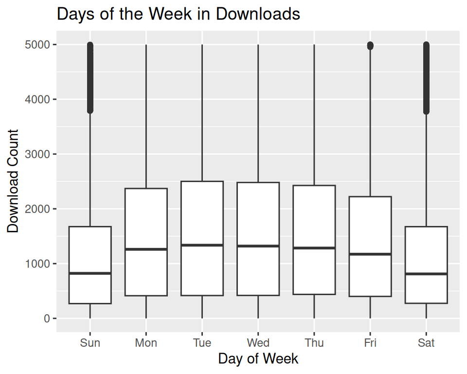
average_dc_plotlyCreates boxplots that show the daily download count of the top 30 ggplot packages for every month and every day of the week.
#determines separates daily download count data by month and by day of the week
seasonal_data <- dc_top_packages %>%
  mutate(month = month(date, label = TRUE),
         day_of_week = wday(date, label = TRUE))

#create seasonal plots by month and day of week
dc_monthly <- ggplot(seasonal_data, aes(x = month, y = count)) +
  geom_boxplot() +
  ylim(0, 5000) +
  labs(title = "Months in Downloads", x = "Month", y = "Download Count")
dc_monthly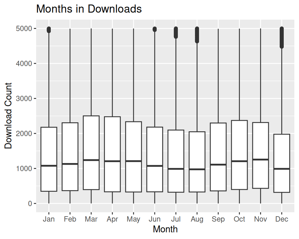
dc_daily <- ggplot(seasonal_data, aes(x = day_of_week, y = count)) +
  geom_boxplot() +
  ylim(0, 5000) +
  labs(title = "Days of the Week in Downloads", x = "Day of Week", y = "Download Count")
dc_daily