library(tidyverse)
df <- read_csv("data/affordablehousing.csv")5 Affordable Housing
5.1 Introduction
I selected this data set because I wanted to learn more about the distribution of affordable housing in New York City. I want to learn more about where affordable housing is offered throughout the different boroughs. I’m curious to see if there are concentrations of affordable housing in certain areas. There are 2 different programs that have ocurred between 2014 and today. Housing New York plan (1/1/2014-12/31/2021) and the Housing Our Neighbors: A Blueprint for Housing & Homelessness plan (1/1/2022-present). These plans help to improve the quality of housing, support people experiencing homelessness, and increase homeownership opportunities. Source: https://www.nyc.gov/site/hpd/about/housing-blueprint.page
5.2 Data
5.2.1 Description
This data is collected through various Housing Preservation and Development programs. Each row contains one buildings in a specific housing development or preservation project. Each column contains details about the location of the building, when construction occurred on the building, details about the number of units divided into income level, and the number of bedrooms. This dataset is 8,983 rows and 41 columns. It is updated quarterly and was last updated March 20th, 2026.
This data does duplicate buildings if it was involved in multiple projects. There are also some projects that were created to assist homeowners or special populations that are marked CONFIDENTIAL so we don’t have all of the data for certain projects. In addition many of the projects are still in progress so there is no building completion or project completion date.
5.2.2 Missing Value Analysis
library(redav)
plot_missing(df, num_char = 10, max_cols = 13, max_rows = 5)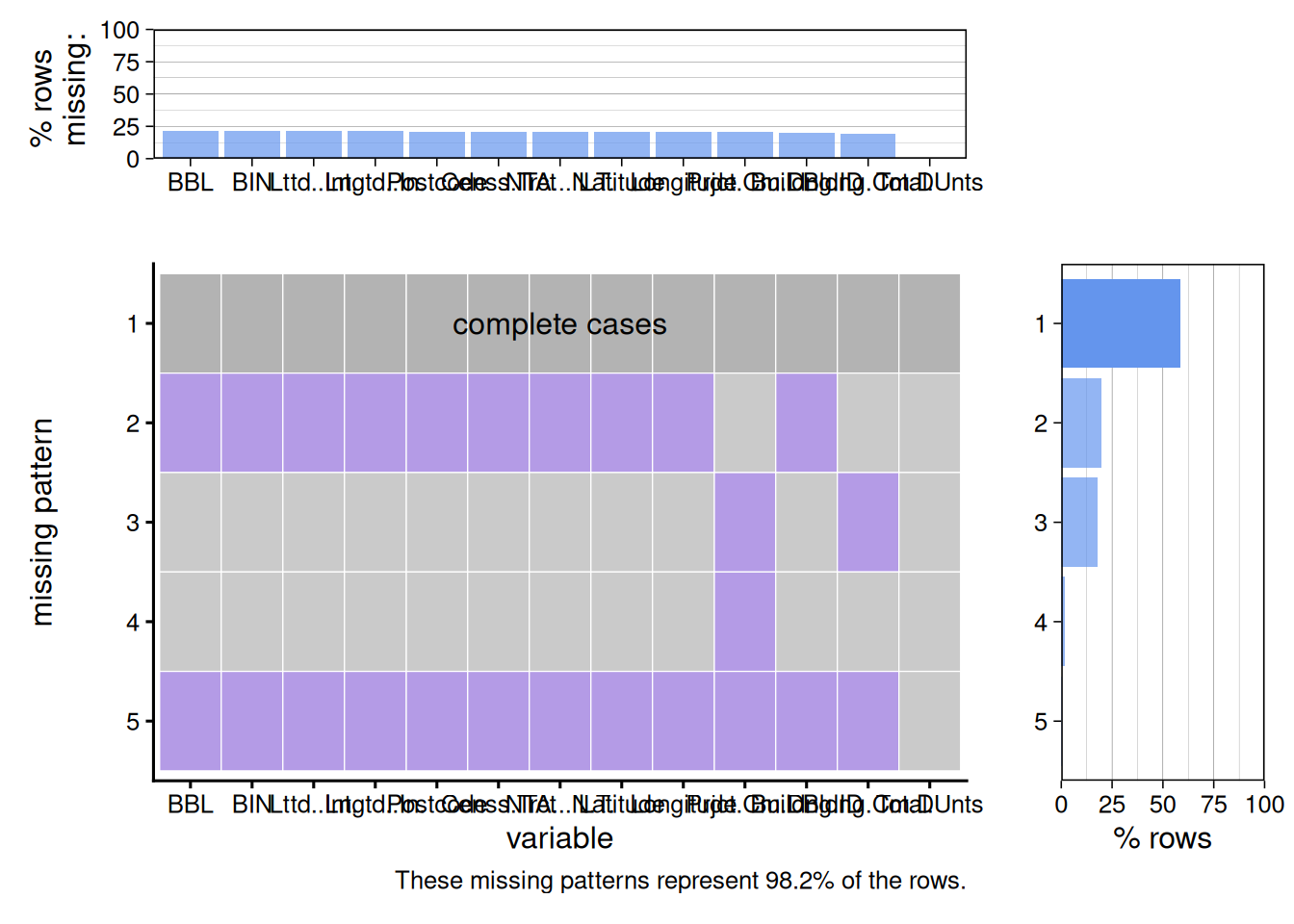
From this graph, we can see that a majority of the columns with missing data contain no information about the location of the project, but do have a date project and building completion date. This helps to verify the statement in the introduction of the data set that there are projects labeled as “CONFIDENTIAL” with redacted information. The next row with the most missing data is those with information about the location but no project and building completion date.
missing <- df |> filter(is.na(`Building ID`)) |> pivot_longer(cols = c(`Counted Rental Units`, `Counted Homeownership Units`), names_to = "Type", values_to = "Counted Units") |> aggregate(`Counted Units` ~ Type, FUN = sum)
ggplot(missing, aes(x = Type, y = `Counted Units`)) +
  geom_col()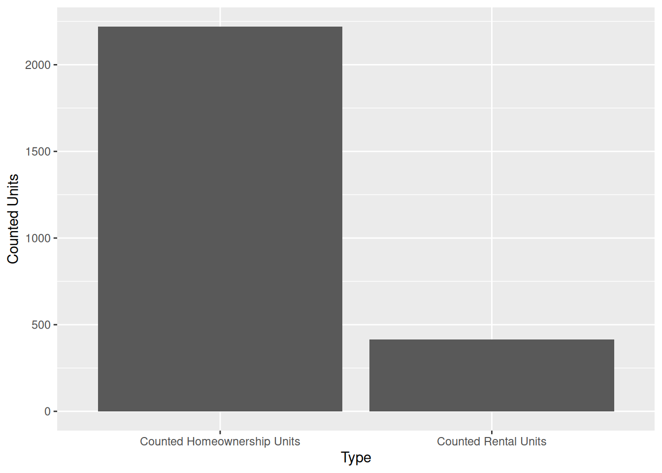
From this graph we can see that a majority of the projects with missing data are projects that involve homeownership units. This also helps us to verify the statement provided in the data set introduction that some information was redacted because it was related to homeownership.
missing_rental <- df |> filter(is.na(`Building ID`),`Counted Rental Units` > 0 ) |> select(`Extremely Low Income Units`:`Other Income Units`) |> pivot_longer(cols = c(`Extremely Low Income Units` : `Other Income Units`), names_to = "Income", values_to = "Counted Units") |> aggregate(`Counted Units`~ Income, FUN = sum)
ggplot(missing_rental, aes(y = fct_reorder(Income, `Counted Units`), x = `Counted Units`)) +
  geom_col()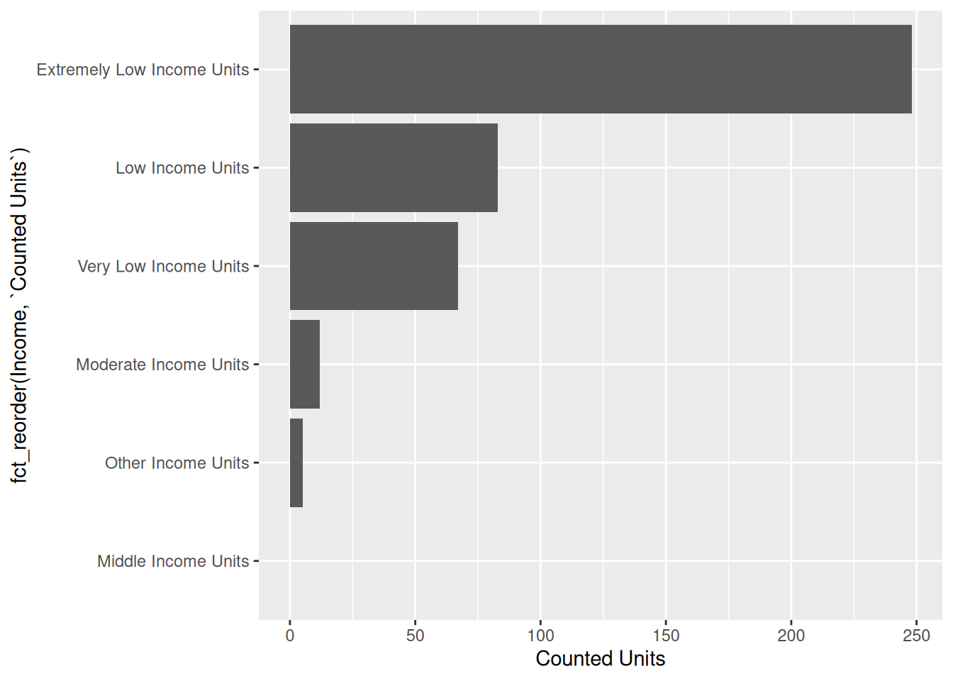
From the introduction we know that some information was considered confidential because it was related to a “special population”. Based on our graph of the rental units with redacted information based on income level, we can see that a majority of the rental units with redacted information are “Extremely Low Income Units”.
maybe also need to add one about dates i lowkey dont know just be like oh these started more recently so they’re not done duh
5.3 Results
5.3.1 Question 1
Distribution of location of housing across neighborhoods
library(sf)
boroughs <- read_sf("data/nyc_boroughs/nybb.shp")
points_sf <- df |>
  select(Longitude, Latitude) |>
  na.omit() |>
  st_as_sf(coords = c("Longitude", "Latitude"), crs = 4326)
ggplot() +
  geom_sf(data = boroughs) +
  geom_sf(data = points_sf, size = .1)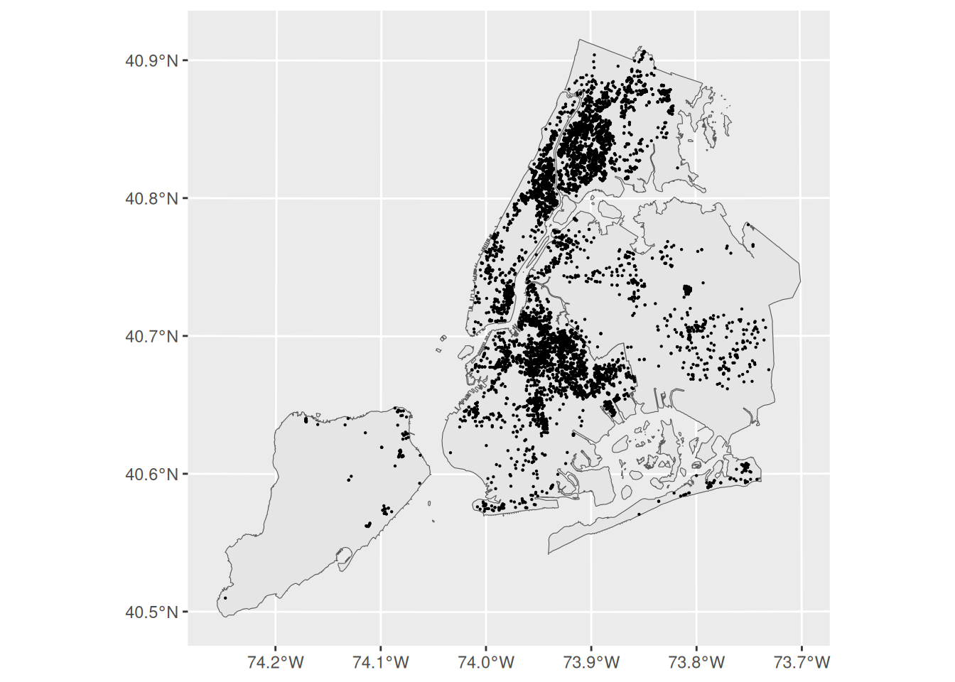
We can see there is a high concentration of affordable housing projects in the Bronx. Not too many in Lower Manhattan on the west side or by FIDI. Very spread out in Queens and barely any in Staten Island. There is however a large clump in the north eastern part of Brooklyn.
pop <- read_csv("data/nyc_pop.csv", col_select = c(Borough, `2020 - Boro share of NYC total`)) |> filter(Borough != "NYC Total")

pop <- pop |> mutate(`2020 - Boro share of NYC total` = as.numeric(str_remove(`2020 - Boro share of NYC total`, "%")))

df$`Project Start Date` <- as.Date(df$`Project Start Date`, format = "%m/%d/%Y")

df_2020 <- df[df$`Project Start Date` >= "2020-01-01" & df$`Project Start Date` <= "2020-12-31",]

library(dplyr)

percentages <- df |>
  count(Borough, name = "count") |>
  mutate(percent = count / sum(count) * 100) |>
  select(-count) |>
  as.data.frame()
compare_percent <- left_join(pop, percentages)
compare_percent <- pivot_longer(compare_percent, cols = `2020 - Boro share of NYC total`:percent, names_to = "category", values_to = "percentages")
ggplot(compare_percent, aes(x = Borough, y = percentages, fill = category)) +
geom_col(position = "dodge") +
theme_minimal()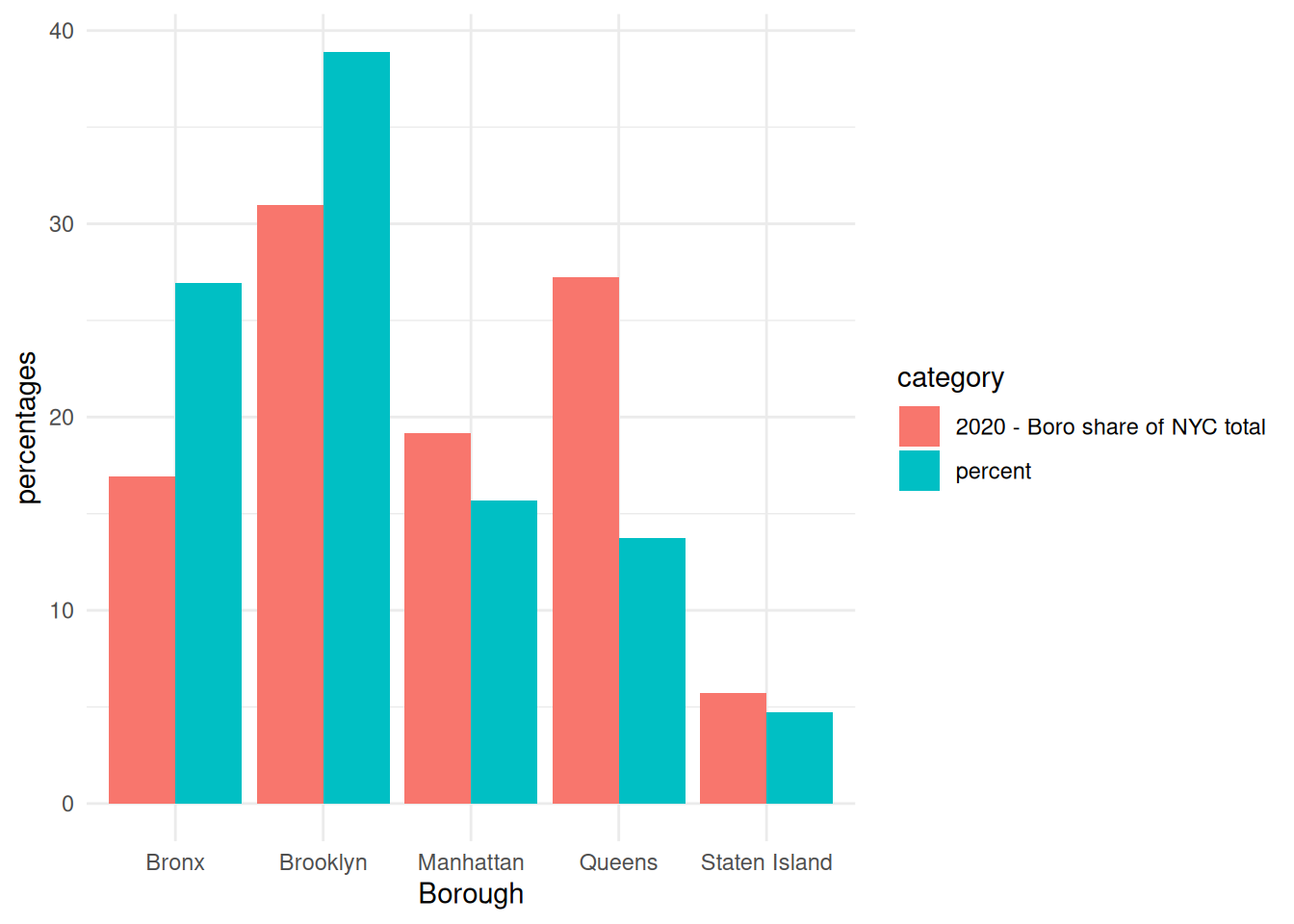
brooklyn and the bronx have a higher percentage of housing projects than the percentage of their population in 2020.
5.3.2 Question 2
cols <- c("Extremely Low Income Units",
          "Very Low Income Units",
          "Low Income Units",
          "Moderate Income Units",
          "Middle Income Units",
          "Other Income Units")
points_sf <- df |>
  select(all_of(cols), Longitude, Latitude) |>
  na.omit() |>
  rowwise() |>
  mutate(
    max_val = max(c_across(all_of(cols)), na.rm = TRUE),
    across(all_of(cols),
           ~ ifelse(.x == max_val, .x, NA))
  ) |>
  ungroup() |>
st_as_sf(coords = c("Longitude", "Latitude"), crs = 4326) |> pivot_longer(cols =`Extremely Low Income Units`:`Other Income Units`, names_to = "income level", values_to = "units" )ggplot() +
geom_sf(data = boroughs) +
geom_sf(data = points_sf, size = 0.2) +
facet_wrap(~ `income level`)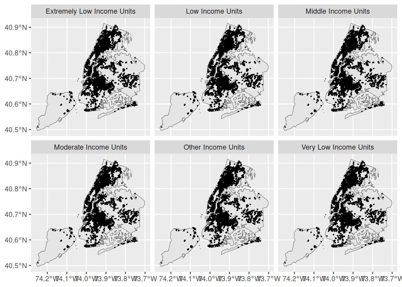
all graphs look the same and im not sure why its not working
5.3.3 Question 3
does lower income mean more bedrooms?