Chapter 18 Chinese Translation of Bar Chart and Cleveland Dot Plot
Changhao He
Source: https://edav.info/bar.html
https://edav.info/cleveland.html
18.1 图表:条形图

18.1.1 综述
这一章节包含了如何制作条形图。
18.1.2 太长不看
我想要一个漂亮的例子。不是明天,不是在早饭之后,而是现在!
这里就是一个显示了皇家游轮泰坦尼克号乘客生还率的条形图:
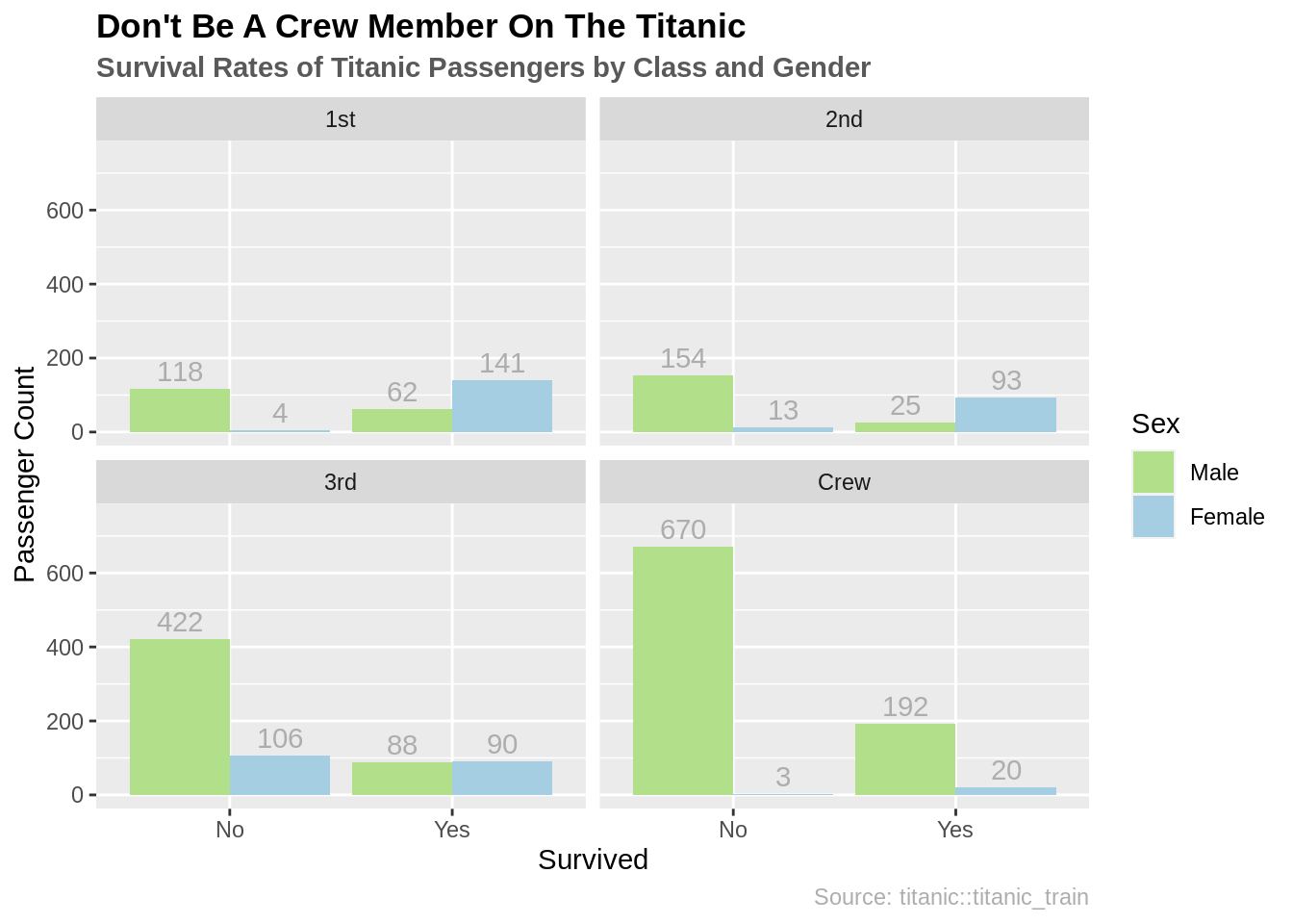
接下来是代码:
library(datasets) # 数据
library(ggplot2) # 绘图工具
library(dplyr) # 数据处理

# 结合儿童和成年人的数据
ship_grouped <- as.data.frame(Titanic) %>%
  group_by(Class, Sex, Survived) %>%
  summarise(Total = sum(Freq))

ggplot(ship_grouped, aes(x = Survived, y = Total, fill = Sex)) +
  geom_bar(position = "dodge", stat = "identity") +
  geom_text(aes(label = Total), position = position_dodge(width = 0.9),
            vjust = -0.4, color = "grey68") +
  facet_wrap(~Class) +
  # 排版
  ylim(0, 750) +
  ggtitle("Don't Be A Crew Member On The Titanic",
          subtitle = "Survival Rates of Titanic Passengers by Class and Gender") +
  scale_fill_manual(values = c("#b2df8a", "#a6cee3")) +
  labs(y = "Passenger Count", caption = "Source: titanic::titanic_train") +
  theme(plot.title = element_text(face = "bold")) +
  theme(plot.subtitle = element_text(face = "bold", color = "grey35")) +
theme(plot.caption = element_text(color = "grey68"))想要知道关于这个数据的更多信息,在控制台输入?datasets::Titanic。
18.1.3 简单的例子
我的眼睛比我的胃还大,请更加简单一点!
让我们来用HairEyeColor这个数据。刚开始,让我们来看女性发色的不同分类。
colors <- as.data.frame(HairEyeColor)

# 通过dplyr只获取女性发色
colors_female_hair <- colors %>%
  filter(Sex == "Female") %>%
  group_by(Hair) %>%
  summarise(Total = sum(Freq))

# 浏览数据
head(colors_female_hair)
## # A tibble: 4 × 2
## Hair Total
## <fct> <dbl>
## 1 Black 52
## 2 Brown 143
## 3 Red 37
## 4 Blond 81让我们根据这个数据来做一些图形。
18.1.3.1 用base R做条形图
barplot(colors_female_hair[["Total"]],
        names.arg = colors_female_hair[["Hair"]],
        main = "Bar Graph Using Base R")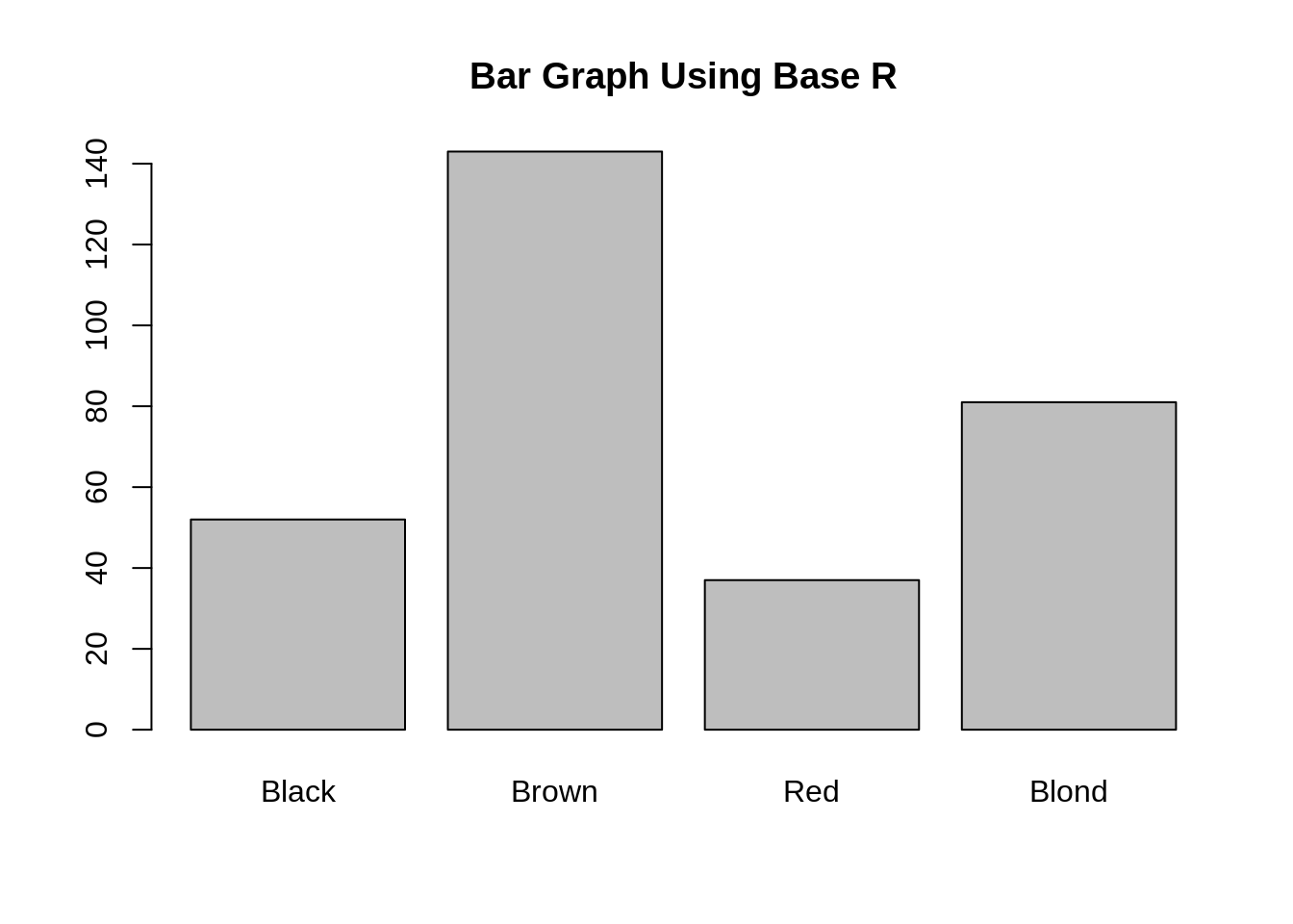
我们建议用Base R来做那些只是为了你自己的简单条形图。和其他所有的Base R一样,它设置起来很简单。注意:Base R需要一个矢量或者矩阵,因此在条形图调用时需要用双中括号(获取每一列作为列表)。
18.1.3.2 用ggplot2做条形图
library(ggplot2) # 绘图工具

ggplot(colors_female_hair, aes(x = Hair, y = Total)) +
  geom_bar(stat = "identity") +
  ggtitle("Bar Graph Using ggplot2")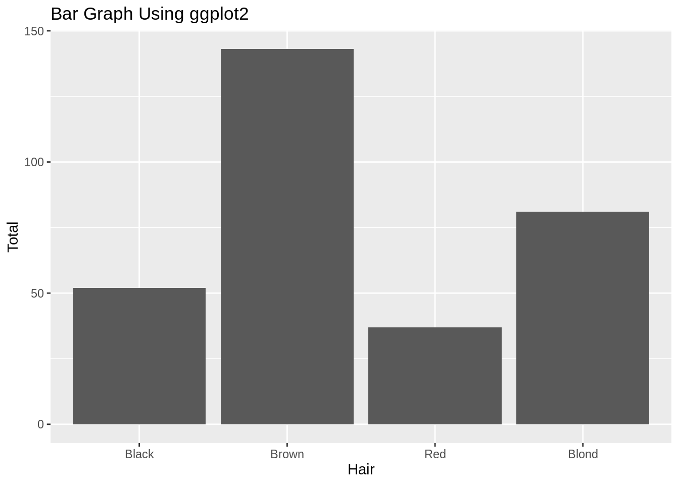
ggplot2中的条形图非常简单。你输出一个数据框,让它知道你想要哪一部分映射到不同的轴上。注意:在这个例子里,我们有一个含有数值的表,并想要通过独立的柱的高度来画出这些数值。因此,我们规定y轴为Total这一列,但我们也需要规定stat = "identity在geom_bar()里,从而让它知道怎么正确的绘图。通常你会有每一行都是一个观测值的数据集,同时你想要把这些观测值通过柱来分组。在这种情况下,y轴和stat = "identity不需要特别规定。
18.1.4 理论
想要知道绘制分类数据的更多信息,阅读教科书第四章。
18.1.5 何时使用
条形图最好用在分类数据。通常你会有一个你想要把它分成不同组的因子数据的集合。
18.1.6 注意事项
18.1.6.1 不要用于连续数据
如果你发现你的条形图看起来不太对,请确保你的数据是分类的而不是连续的。如果你想通过柱来绘制连续数据,那是直方图的功能。
18.1.7 修改
这些修改假设你在使用ggplot2。
18.1.7.1 旋转条形图
为了旋转方向,添加coord_flip()就可以了:
ggplot(colors_female_hair, aes(x = Hair, y = Total)) +
  geom_bar(stat = "identity") +
  ggtitle("Bar Graph Using ggplot2") +
  coord_flip()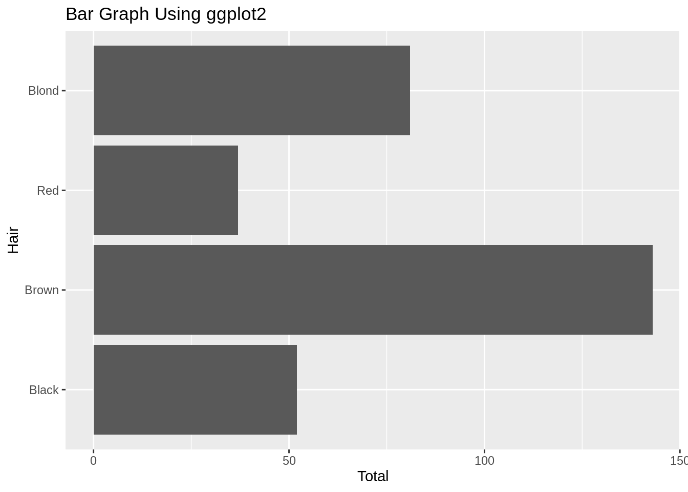
18.1.7.2 对柱子重新排序
在base R和ggplot2里对于字符型数据柱是通过首字母顺序排列的,对于因子型数据柱是通过层次来排列的。但是,因为因子型数据的层次的默认顺序是首字母顺序,所以在两种情况下柱都会通过首字母顺序排列。请看这个教程来获得关于条形图里的柱应该怎么排序细致的解释,和如何通过forcats程序包来帮助你完成重新排序。
18.1.8 外部资源
- Cookbook for R: 讨论了关于因子层次的重新排序。
- DataCamp Exercise:一些用
ggplot2做条形图的一些简单练习。 - ggplot2 cheatsheet:在你身边总是好的。
18.2 图表:克利夫兰点图

这个页面是一项正在进行的工作,我们感谢任何你可能有的贡献。如果你想帮助改进这个页面,请考虑对我们的版本库做出贡献。
18.2.1 综述
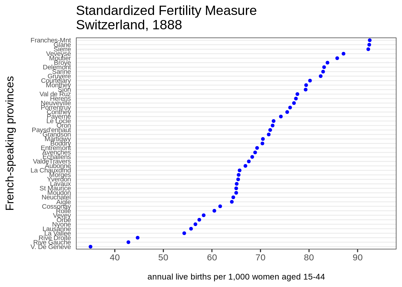
这一章节包含了如何做克利夫兰点图。克利夫兰点图是简单条形图的一个很好的替代品,特别是如果你有不止一些的项的时候。不需要太多的项就会让条形图看起来很凌乱。在相同的空间里,更多的数值可以被包含在一个点图里面,而且点图也更容易阅读。R 有一个内置的基本函数,dotchart(),但是因为它是一个画起来很简单的图形,在ggplot2或者base里面“从零开始”让我们有更多的定制选项。
代码:
# 创造一个能被再使用的点图主题。
theme_dotplot <- theme_bw(14) +
    theme(axis.text.y = element_text(size = rel(.75)),
        axis.ticks.y = element_blank(),
        axis.title.x = element_text(size = rel(.75)),
        panel.grid.major.x = element_blank(),
        panel.grid.major.y = element_line(size = 0.5),
        panel.grid.minor.x = element_blank())

# 把行的名字变成数据框的一列。
df <-  swiss %>% tibble::rownames_to_column("Province")

# 创造一个图表。
ggplot(df, aes(x = Fertility, y = reorder(Province, Fertility))) +
    geom_point(color = "blue") +
    scale_x_continuous(limits = c(35, 95),
        breaks = seq(40, 90, 10)) +
    theme_dotplot +
    xlab("\nannual live births per 1,000 women aged 15-44") +
    ylab("French-speaking provinces\n") +
    ggtitle("Standardized Fertility Measure\nSwitzerland, 1888")
18.2.2 多点图
在这个例子里面我们将用2010年纽约城公立学校的一个样本的SAT平均分数的数据:
df <- read_csv("data/SAT2010.csv", na = "s")

set.seed(5293)
tidydf <- df %>%
  filter(!is.na(`Critical Reading Mean`)) %>%
  sample_n(20) %>%
  rename(Reading = "Critical Reading Mean", Math = "Mathematics Mean",
         Writing = "Writing Mean") %>%
  gather(key = "Test", value = "Mean", "Reading", "Math", "Writing")

ggplot(tidydf, aes(Mean, `School Name`, color = Test)) +
  geom_point() +
  ggtitle("Schools are sorted alphabetically", sub = "not the best option") + ylab("") +
  theme_dotplot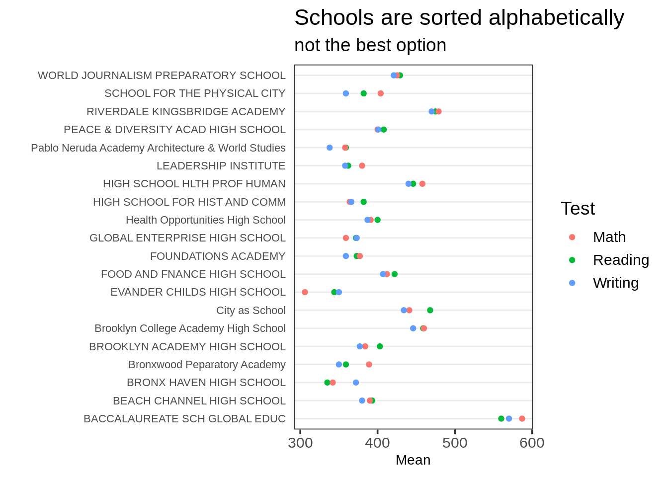
注意School Name是按照因子层次排序的,默认是首字母顺序。一个更好的选择是通过一个Test中的层次集来排序。通常最好是尝试通过不同的层次集来排序,然后观察出现的模式。
为了执行双重排序,就是先通过Test然后再通过Mean来排列School Name,我们会使用forcats::fct_reorder2()。这个函数会通过对两个矢量的排序来对.f(一个因子或者字符矢量)进行排序。对于这种图形,.x是彩色的点所表示的变量,.y是投射到y轴的连续变量。
假设我们希望通过阅读的平均分来对学校进行排序。我们可以在我们对Mean进行排序时,通过限制Test变量到“阅读”来完成该排序:
ggplot(tidydf,
       aes(Mean, fct_reorder2(`School Name`, Test=="Reading", Mean, .desc = FALSE),
           color = Test)) +
  geom_point() + ggtitle("Schools sorted by Reading mean") + ylab("") +
theme_dotplot 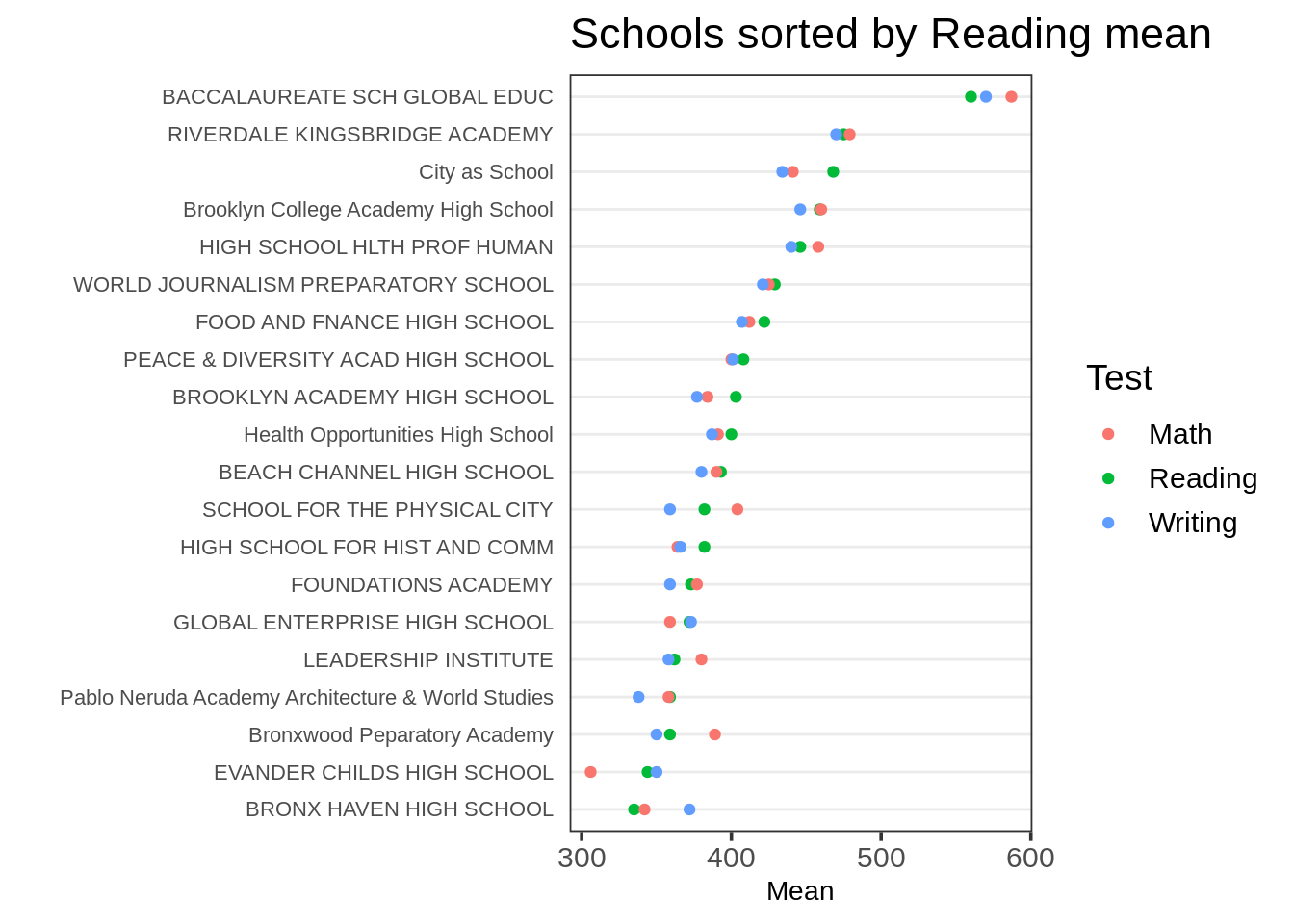
(非常感谢Zeyu Qiu对于直接在因子层次上对.x进行设置的小建议,这是一个更好的方式相较于我们下面讨论的,顺应fct_reorder2()的默认对因子层次进行重新排列。)
虽然这是首选方法,但有些情况下直接指明你希望通过对于第一个变量(Test)的第一个因子层次或者最后一个因子层次排序,而不用把它拼写出来会更加简单。
如果没有特别指明一个变量,fct_reorder2()默认会通过对.x的最后一个因子层组进行排序,这种情况下“写作”是Test的最后一个因子层次。
ggplot(tidydf,
       aes(Mean, fct_reorder2(`School Name`, Test, Mean, .desc = FALSE),
           color = Test)) +
  geom_point() + ggtitle("Schools sorted by Writing mean") + ylab("") +
  theme_dotplot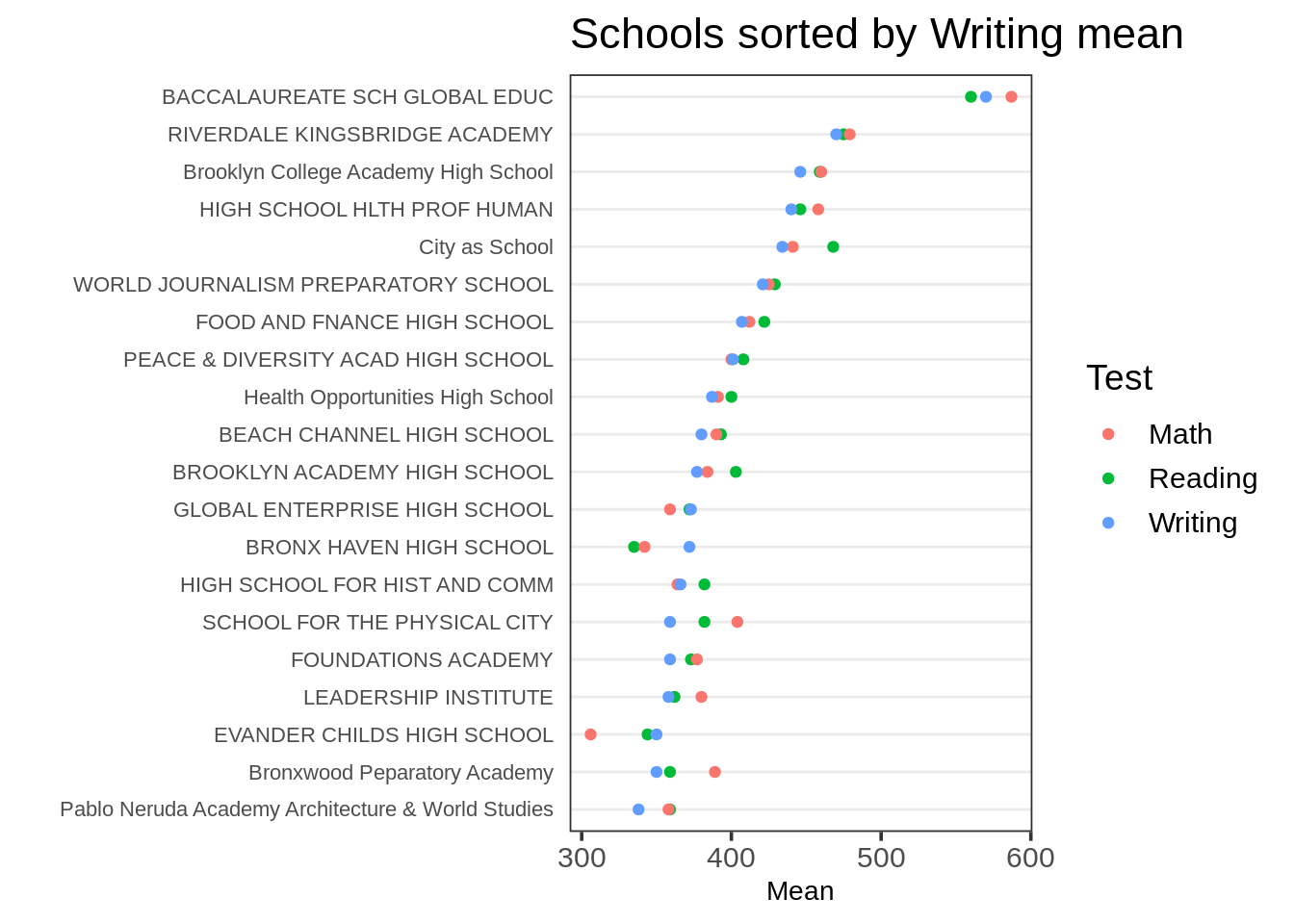
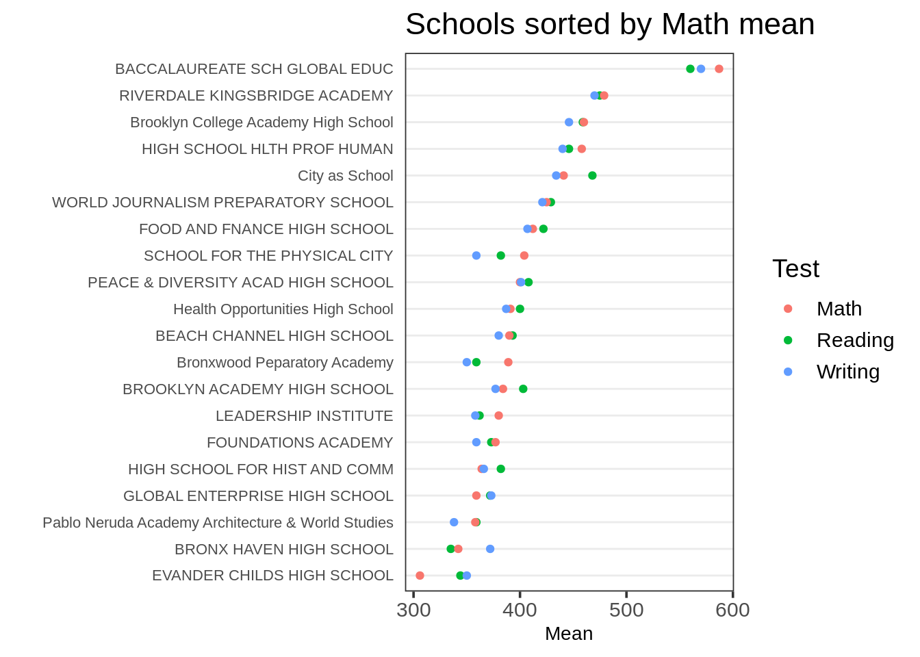
如果你想要通过对.x的第一个因子层次进行排序,在这里是“数学”,你需要forcats的开发版本,你可以通过:devtools::install_github("tidyverse/forcats")来安装。
把默认排序函数last2()改为first2():
ggplot(tidydf,
       aes(Mean, fct_reorder2(`School Name`, Test, Mean, .fun = first2, .desc = FALSE),
           color = Test)) +
  geom_point() + ggtitle("Schools sorted by Math mean") + ylab("") +
  theme_dotplot