Chapter 45 Choose Your Adventure - How to choose the right visualization for your data
Gee Hyun Kwon (gk2575) & Angela Simei Li (sl4525)
45.1 Introduction
Graphs and charts help us understand data better, but it isn’t always clear exactly how to choose the right visualization. We have developed a 3-step process “choose your adventure” to help you navigate through your next data visualization problem at hand.
45.1.1 Step 1. What would you like to show?
We have developed a flowchart to help you decide the type of graph you might need. We believe that there are four types of goals in visualizing a dataset.
- Comparison : Comparing the sizes against several datasets
- How many apples versus pears were sold by the same farmer?
- Composition : Understanding the makeup of a dataset
- How many college freshmen, sophomores, juniors, and seniors make up an undergraduate college?
- Relationship : Discovering the relationship between variables
- Is there a correlation between the city’s temperature and ice cream sales?
- Distribution : Checking how a group falls into different categories
- How many students in an exam made <60, 60-70, 70-80, 80-90, 90-100?
Based on the types, we recommend the following flowchart to pick the right visualization.
45.1.2 Step 2
It is often not enough to simply pick only one type of graph for complex questions. Here are some additional aspects to consider once you’ve picked the direction of the visualization through the flowchart.
- Is my data categorical or quantitative?
- This often plays a role in the ordering of the axis. Categorical data can often be placed alphabetically, whereas numerical data can often be displayed increasingly.
- Is faceting a good strategy for the graphs?
- Faceting means placing same x-y axis graphs repeatedly in a table format, but each graph has a different subject.
An example use of faceting is to show the growth height of all 6 vegetables in a vegetable garden through the same time period, and the 6 graphs of x-axis being time and y-axis being height are being placed in a 2x3 table format.
45.1.3 Step 3
Is overlaying two different types of graphs a good idea? Overlaying two different graphs could bring clarity to the visualization. However, unnecessarily overlaying could lead to confusion and clutter. A good example of overlaying two graphs is drawing a regression line through a chaotic scatter plot to highlight the trend of the dots.
Some common details to make-or-break a graph include:
- Title
- Legend of the graph
- Color of the graph, including using alpha blending to adjust transparency
- Displaying numbers over the graph or displaying numbers only on the axes
- Using normal scale or log scale for the axes
45.2 The Flow Chart

45.3 An Example Use Case
We will show an example use case of our flow chart using COVID statistics data.
# Data is from here:
# https://www.ecdc.europa.eu/en/publications-data/download-todays-data-geographic-distribution-covid-19-cases-worldwide

url <- "https://opendata.ecdc.europa.eu/covid19/casedistribution/csv/data.csv"
covid_data <- as.data.frame(read_csv(url))
covid_data$dateRep <- parse_date(covid_data$dateRep, "%d/%m/%Y")

df <- covid_data
glimpse(df)
## Rows: 61,900
## Columns: 12
## $ dateRep <date> 2020-12-…
## $ day <dbl> 14, 13, 1…
## $ month <dbl> 12, 12, 1…
## $ year <dbl> 2020, 202…
## $ cases <dbl> 746, 298,…
## $ deaths <dbl> 6, 9, 11,…
## $ countriesAndTerritories <chr> "Afghanis…
## $ geoId <chr> "AF", "AF…
## $ countryterritoryCode <chr> "AFG", "A…
## $ popData2019 <dbl> 38041757,…
## $ continentExp <chr> "Asia", "…
## $ `Cumulative_number_for_14_days_of_COVID-19_cases_per_100000` <dbl> 9.013779,…For this example, let’s pretend that the world is made up of only the following 5 European countries. We will be looking at data from the week 2020-04-06 ~ 2020-04-12.
names(df)[names(df) == 'countriesAndTerritories'] <- 'country'
countries <- c("France", "Germany", "Italy", "Sweden", "Romania")
df = df[df$country %in% countries, ]
df = df[(df$dateRep>= "2020-04-06" & df$dateRep<= "2020-04-12"),]
df_dcc <- df %>% select(dateRep, cases, country)
Let’s say that we are interested in comparing each countries in their total number of COVID infections.
Our path through the flowchart would be the following:
Comparison -> Time Variant? YES -> Line Chart
g <- ggplot(data = df_dcc, mapping = aes(x = dateRep, y = cases, color = country)) +
  geom_line() +
  ggtitle("Line graph of cases per country") +
  labs (x = "", y = "# of cases") +
  theme_grey(16) +
  theme(legend.title = element_blank())

g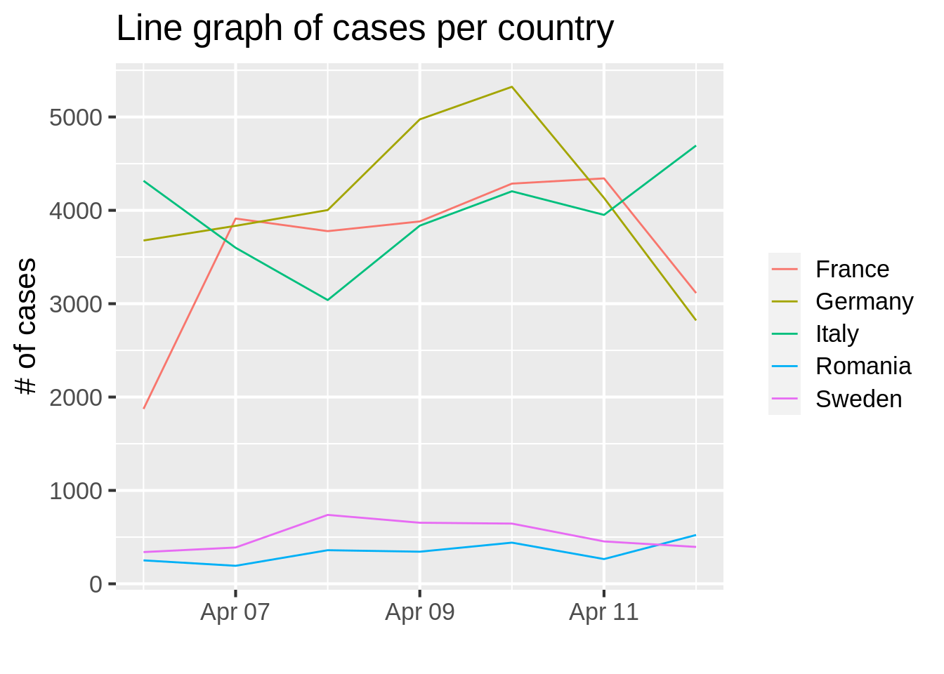
This graph answers the following questions (and many more, of similar format):
- On April 2020, which country had the most number of COVID infections? Which one had the least?
- Which country in general seems to be leading in the number of COVID infections?
Let’s say instead that you want to see the total number of infections, and what percentage each country contributes to that amount.
Our path through the flowchart would be the following:
Composition -> Time variant? YES -> Stacked Bar Chart
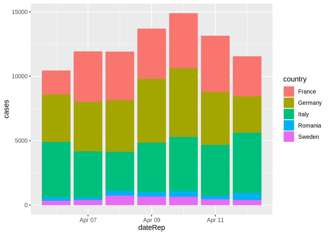
According to the flowchart, we should use a stacked bar chart that shows the number of infected through each segment of the bar.
This graph would answer the following questions:
- How many people in total were infected in a particular date ex) 2020-04-11?
- Which country contributed the most to the number of people infected?
- When did the total number of people infected worldwide reach its maximum during the given time period?
45.4 Conclusion
Our example here shows that even when using the same data, we can create multiple visualizations that answer different questions. Our flow chart makes this question-asking process more streamlined and helps create meaningful visualization. After all, if a visualization does not answer a question, what purpose does it serve?