37 Chord diagrams using circlize
Pia-Kelsey O’Neill
37.1 Overview
Chord Diagrams are circular visualizations that depict inter-relationships between categorical data. They can be used to depict the flow of migration between countries, interactions within a set of people and (relevant to my research as a neuroscientist) the transitions between behaviors in animals. In this tutorial, we will begin by presenting the anatomy of a chord diagram. Next, we’ll review some considerations for deciding whether chord diagrams are appropriate for your dataset. We will then become familiar with the chordDiagram function in R using two data sets to demonstrate simple (interactions between main characters in the sitcom Friends) and more complex (migration between Canadian provinces) uses for this beautiful visualization tool.
37.2 Introduction
37.2.1 Anatomy of a chord diagram
A chord diagram shows the connections between different categories of data. Data is separated into groups that are organized as tracks or sectors around a circle. The size of the track is proportional to the number of data points in that category. Arcs or chords then form connections between the tracks running across the expanse of the circle. The number of chords that extend from a track depends on the number of target categories. There are two important features of the arc:
Color. If there is a direction of data flow between the categories (migrants from one country to another) the color of an arc can be used to depict this directionality. Thus, an arc’s color should match the color of the parent track it comes from. Note that not all data has a directionality and thus color is less important (see Friends example below).
Thickness. The thickness of the arc represents the size of the flow between two categories so a wider arc represents more data flow and a thinner arc less data flow.
37.2.2 Considerations for making a Chord Diagram
Chord diagrams have high aesthetic appeal, but they may not always be the most appropriate method to show relationships between entities of data even if that data is categorical. Here, we’ll discuss a few questions you might ask about your data to determine if a chord diagram might be appropriate for you.
Are the relationships many-to-many? Chord diagrams work best for data in which each category has a relationship with multiple other categories (including itself). In other words, they are useful for displaying data in which the relationships are many-to-many. Datasets with one-to-many relationships might be better visualizing using alluvial or sankey diagrams.
How many categories? There are no limits on the number of groups that can be technically depicted on a chord diagram. But chord diagrams can become difficult to read and interpret when the number of groups is high. This is because many chords will be thinner and more difficult to disentangle. Adding interactivity can help by highlighting one sector at a time (see Interactivity using chorddiag below) but ideally, chord diagrams should contain about 10 or fewer categories. Adjustments might be made to the data beforehand to reduce the number of categories. For example, if you want to depict migration flow, instead of displaying migration between all countries in the dataset, you could group them into continents or regions or instead, display a subset of the countries.
What is the directionality of flow? Chord diagrams can be directional or non-directional. Directional data will have two chords for each sector, a chord going from a given category out to a target and the other coming from that target. Non-directional or symmetric data on the other hand only have one value per chord (the same value for each direction). Adjustments in color can be made to the chord diagram depending on the directionality of the data.
37.3 The chordDiagram function
To create chord diagrams we will use the chordDiagram function from the circlize package in R. The circlize package itself contains methods from the circos tool used for graphing circular representations, especially used in the field of Genomics. The chordDiagram help documentation describes how data should be arranged. We will summarize this briefly here:
chordDiagram takes a datafame of three columns:
- rn: The first column is the “from” column in an adjacency list where each row is a sector/track/category name.
- cn: The second column is the “to” column in an adjacency list where each row is a sector/track/category name.
- value: the values for the interaction or relation between columns 1 and 2, the number of counts between the two categories.
37.4 Basic Chord diagrams: Friends
In this example, we will use chord diagrams to make a simple visualization of the relationships between six main characters from the popular TV show Friends. We will visualize dyadic (pairwise) storylines between characters in the show across all episodes. Note that only dyads will be considered so for example, in Season 1 Ep.1, a plotline involving Chandler Joey and Ross will not be included in our chord diagram. The relationships here are non-directional (or symmetrical) meaning if for example, Joey is in a plot line with Rachel then Rachel is in a plotline with Joey.
df = read.csv("https://raw.githubusercontent.com/apalbright/Friends/master/raw_data/friendsdata.csv")
#The six friends are defined as follows: Chandler=1 Joey=2 Monica=3 Phoebe=4 Rachel=5 Ross=6
friends= combn(c("Chandler", "Joey", "Monica", "Phoebe", "Rachel", "Ross"),2)
relations = data.frame(from=friends[1,],to=friends[2,])
dyads = c("12","13","14","15","16","23","24","25","26","34","35","36","45","46","56")
total=list()
for (x in dyads){
total[x] = df%>%
    filter(dynamics==x)%>%
    count()
}
relations["Total"]=as.numeric(unlist(total))
chordDiagram(relations)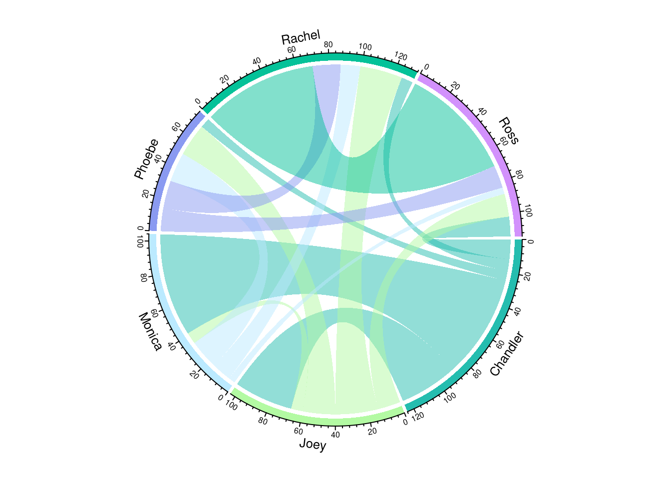
37.4.1 Customizing color
The color schemes in chordDiagram are by default random. You’ll notice that if you run the above code again the colors will change, and will appear different every time the function is called. Sometimes the random colors are very close in the spectrum. In order to better distinguish between different arcs, you can specify colors as well as adjust the transparency and border features of the arcs.
chordDiagram(relations,
             grid.col = c("#cc99c9", "#9ec1cf", "#9ee09e", "#fdfd97", "#feb144", "#ff6663"),
             transparency = 0.1,
             link.lwd = 1,    # Set arc line width
             link.border = 1) # Set arc border color to black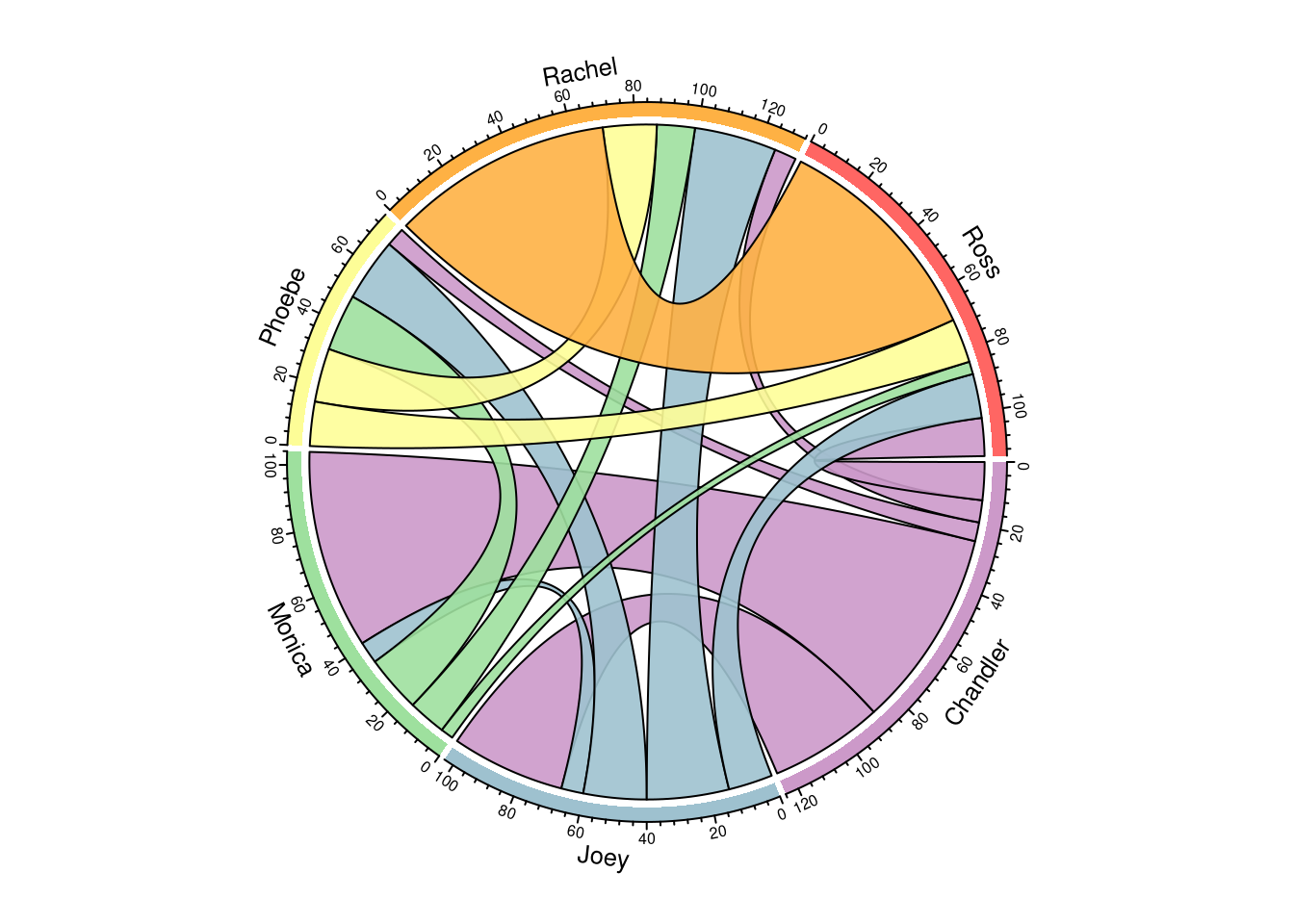
circos.clear()37.4.2 Adding Interactivity using the chorddiag package
Highlighting specific relationships one-by-one can make the chord diagram easier to read and understand. Here we’ll add interactivity to our chord diagram using a second R package, chorddiag.
mat_friends=c(0,36,63,6,7,12,
              36,0,7,20,26,14,
              63,7,0,18,12,4,
              6,20,18,0,17,14,
              7,26,12,17,0,70,
              12,14,4,14,70,0)
relations2= matrix(mat_friends,nrow=6,ncol=6,byrow=TRUE)
friends = c("Chandler", "Joey", "Monica", "Phoebe", "Rachel", "Ross")
dimnames(relations2) <- list(from = friends,
                    to = friends)
groupColors = c("#cc99c9", "#9ec1cf", "#9ee09e", "#fdfd97", "#feb144", "#ff6663")
chorddiag(relations2, groupColors=groupColors, showTicks = 0)
Now, mousing over a chord highlights that particular relationship. We also simplified the visual by removing the tick marks on the outer edge of the circle. This data is instead displayed in the tag that pops up tag when you mouse over the chord.
Further improvements: Since we know that this dataset is non-directional, the color patterns above are not necessary. Mousing over a chord shows equal number of relations between Friends in a pair (i.e. Ross–>Rachel and Rachel–>Ross are both 70 storylines). With directional data, the color of a chord matches that of the parent track. Here, it would make more sense to use a gradient of color that changes from one Friend to the other. This is described in more detail in this blog post by Nadieh Bremer.
37.5 Complex Chord Diagrams: Canada Migration
We will now look at a more complex dataset that has more categories and is directional. We’ll use the Migration dataset from the carData package in R which shows the number of migrants that travel between 10 provinces in Canada within a period between 1966-1971.
canada = Migration%>%select(source, destination, migrants)
chordDiagram(canada,
             grid.col = brewer.pal(10, 'Set3'),
             transparency = 0.1,
             link.lwd = .2,    # Set arc line width
             link.border = 1) # Set arc border color to black)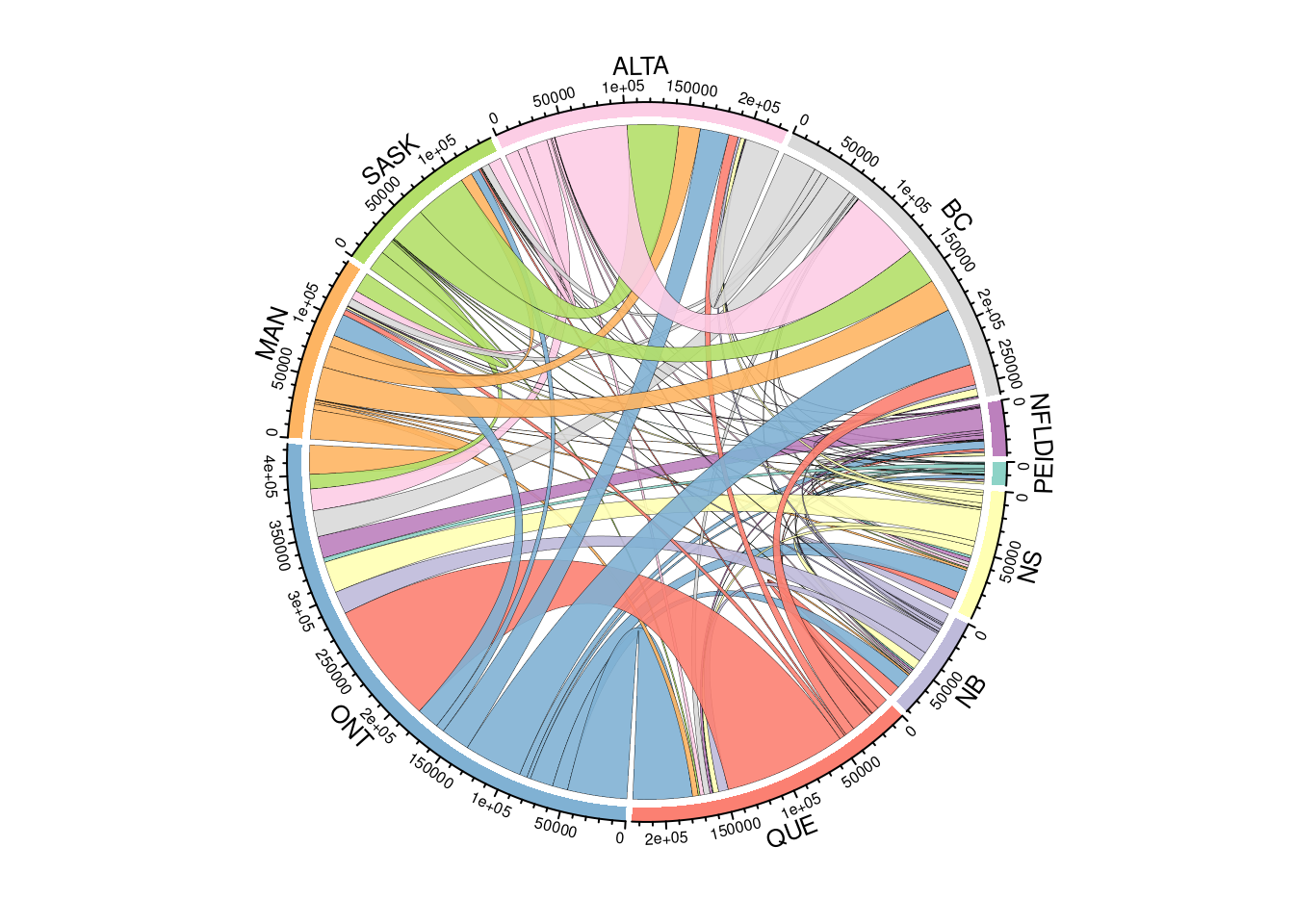
37.5.1 Simplifying data
We can simplify the data we’re visualizing by taking out some of the thinner chords. Perhaps we’re interested in the larger groups of migrants. We’ll select a threshold of groups greater than 12,000.
canada_subset=canada%>%filter(migrants>12000)%>%group_by(source)

chordDiagram(canada_subset,
             grid.col = brewer.pal(9, 'Set3'),
             transparency = 0.1,
             link.lwd = .2,    # Set arc line width
             link.border = 1) # Set arc border color to black)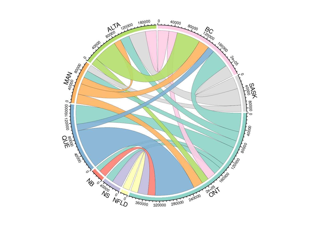
Doing this greatly simplifies our chord diagram and makes the individual chords a bit easier to distinguish. However, we do lose some data. For example, our thresholding cut out all migration data to and fron Prince Edward Island.
37.6 Summary
Chord diagrams make attractive visualization tools for depicting the relationships between data categories. They are a great way to communicate information for the right data. However, they can fall prey to over-cluttering which can make the diagram difficult to interpret. Caution should be taken when deciding whether to use the chord diagram for your data. If it is reasonable to minimize the number of categories and connections you will display then the chord diagram might be helpful. Otherwise, using a different type of diagram such as alluvial, sankey, or arc diagrams may be more appropriate.
37.7 Sources
- Chapter 14 of the circlize package book which details the chordDiagram function.
- Friends dataset from researcher Alex Albright.
- chorddiag package from Matthias Flor.
- Blog post on adding a color gradient to symmetric data by Nadieh Bremer.
- Storytelling using animated chord diagrams by Nadieh Bremer.
- Five example uses of chord diagrams.