15 Introduction of machine learning in R
Feifan Li
library(caret)
library(mlbench)
library(naivebayes)
library(rpart)
library(randomForest)
library(ggplot2)
library(lattice)
library(recipes)
library(dplyr)
library(AppliedPredictiveModeling)
library(gridExtra)
library(caTools)
15.1 Introduction
Nowadays, Machine learning is a very useful tool in a such data-driven world. Social applications like Facebook or WhatsApp made data very accessible, and the companies can use the data to do magic things like customer classification, fraud detection, decision making, or advertising strategy. The data helps companies to serve customers in a more effective way. And one of the most important tool to process and interpret the data is machine learning. It will help to reveal many hidden patterns behind those numbers. Hence, this tutorial will help you to get a basic understanding about how to use machine learning in R. Since R is very efficient in data processing and data visualization, machine learning can be incorporated in an easy way.
15.2 Required Packages:
In this tutorial, we will need to import some packages. Some of them depend on the others.
Packages required:
1.caret
2.mlbench
3.naivebayes
4.rpart
5.randomForest
6.ggplot2
7.lattice
8.recipes
9.dplyr
10.AppliedPredictiveModeling
11.gridExtra
12.caTools
15.3 Data Preprocessing
15.3.1 Load DataSet
For this tutorial, we will just import the built-in dataset in the R library, iris. There are several different ways to read dataset in R. First of all, if the file is a csv file, we can use the “read_csv” to read in. If the file is a R file, we can use the “load” command to import dataset. And if the file is a txt file, we can use “read.delim”: by specifying the separator, it can break the lines into chunks.
15.3.2 Split the Dataset
Before we preprocess the data, we need to split the dataset into train set and test set. For the train set, we will train our model on this set and test model’s accuracy on the test set. This split ensures the independency between the train and test stes.
For the ratio, we usually assume 80% versus 20%, which means 80% of the data are in training set, while the remaining 20% is in the test set. We can adjust this ratio based on actual dataset. However, if we set this ratio too large, this will assign most of the dataset into train set, which leaves little data for tests. On the other hand, if this ratio is too low, the model cannot receive sufficient training, influencing its accuracy.
trainIndex <- createDataPartition(iris$Species, p = 0.8,
                                  list = FALSE,
                                  times = 1)

train_set <- iris[trainIndex,]
test_set <- iris[-trainIndex,]

#check size
nrow(train_set)
## [1] 120
nrow(test_set)## [1] 3015.3.3 Scaling
There are two different ways to adjust the scale of data: Scaling and Centering. For scaling, it basically calculates the Z score of each datapoint, and the formula is \(X-u/\sigma\). Moreover, another way is centering, which just subtracts the data with mean.
From the graph below, we can see that standardizing the datapoints shifts the mean to 0 but it did not change the overall distribution
Scaled_values <- preProcess(iris, method = c("center", "scale"))
train_scaled <- predict(Scaled_values, train_set)
test_scaled <- predict(Scaled_values, test_set)

ggplot(train_set, aes(x=Species, y=Sepal.Length))+
  geom_point() +
  ggtitle("Distribution of datapoint before scailing")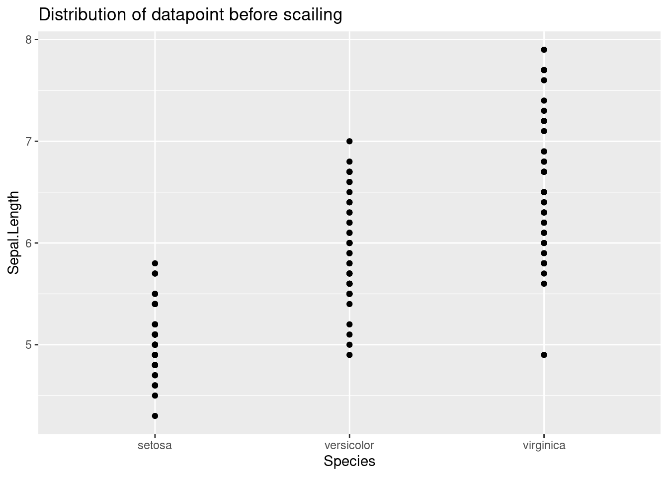
ggplot(train_scaled, aes(x=Species, y=Sepal.Length))+
  geom_point() +
  ggtitle("Distribution of datapoint after scailing")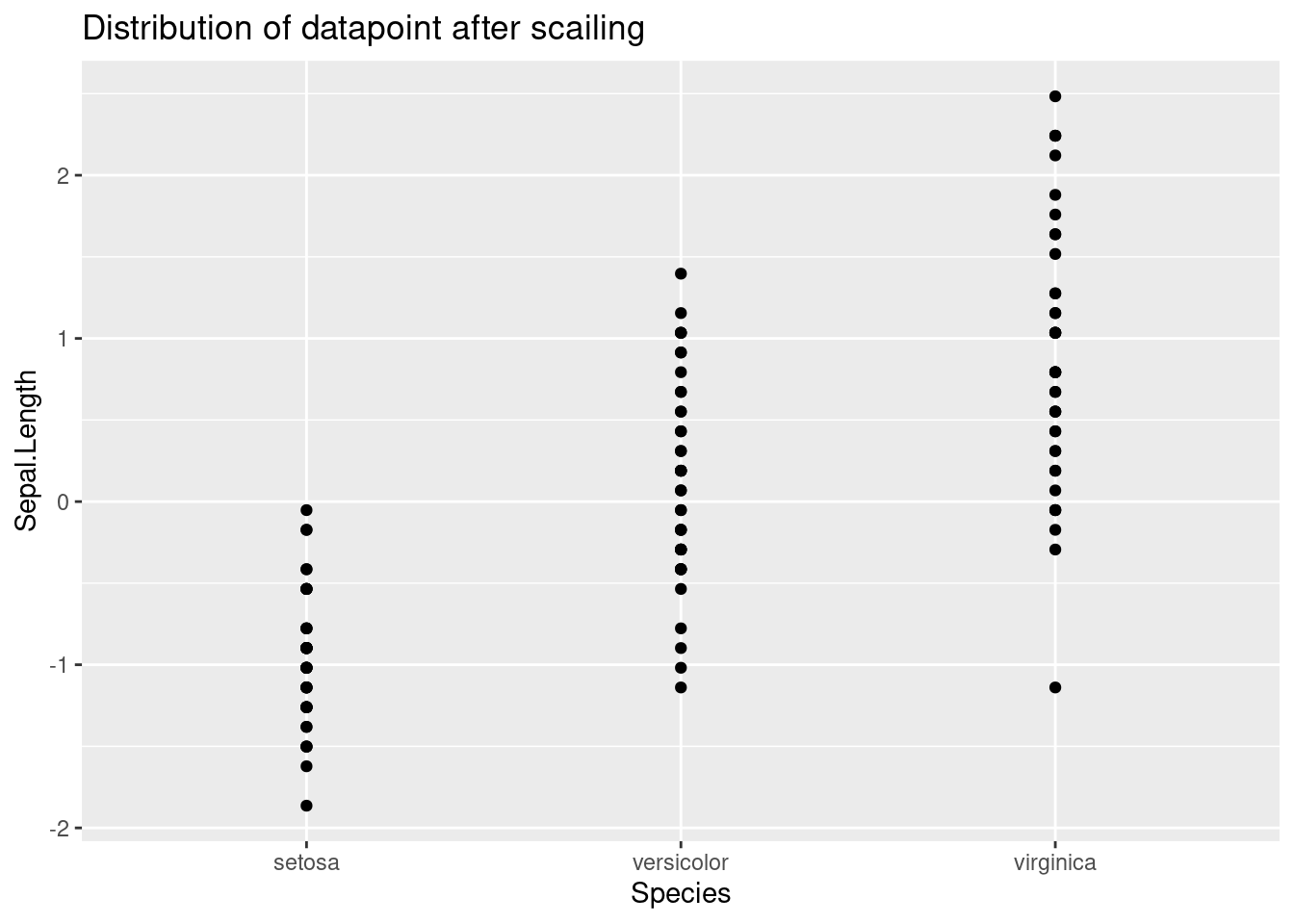
15.3.4 Missing Value
In most of the datasets, there usually contains some missing values. In this case, we need to impute them with values, and there are several ways to achieve this goal, including mean, KNN, Random Forest, or special symbols. In this tutorial, I will briefly discuss the most common two methods: KNN and mean.
Mean One easy way to fill in the missing value is using mean. For example, if one column or feature contains several missing values, we can compute the average of non-missing values and fill this value to those missing positions. The advantage of this method is that it is efficient and easy to implement; however, filing with mean does not accurately predict that value, which influences the accuracy.
KNN
Another common way is to use K nearest neighbor. To be specific, for a datapoint, we can compute its K nearest neighbor. And using the average of neighbors’ values to fill in missing positions. One advantage of this method is that the accuracy is usually higher than filing with mean. However, KNN imputation will take much longer time to compute results, especially in the datasets with high dimensions, and this is called “the curse of dimensions”.
15.3.5 Dimension Reduction
For some datasets, they include over 50 or 100 features, and directly training model on the original dataset will consume huge amount of time. Therefore, we need to reduce the dimensions of this dataset to make our training efficient. Common methods like PCA (Principle Component Analysis) or LDA (Linear Discriminant Analysis) will be useful in dimension reductions. In this tutorial, I will talk about PCA.
PCA, Principle Component Analysis, is an effective method of reducing the dimensions. The main mechanism of PCA is that it keeps the data with the largest variance, which preserves most of the information.
pc <- prcomp(train_set[,c(1,2,3,4)],
             center = TRUE,
             scale. = TRUE)

#print resutls after PCA
print(pc)
## Standard deviations (1, .., p=4):
## [1] 1.7140150 0.9505853 0.3726395 0.1402852
##
## Rotation (n x k) = (4 x 4):
## PC1 PC2 PC3 PC4
## Sepal.Length 0.5126322 -0.41716082 0.7073138 0.2507834
## Sepal.Width -0.2892793 -0.90666813 -0.2821309 -0.1211304
## Petal.Length 0.5785387 -0.02997950 -0.1531270 -0.8005913
## Petal.Width 0.5646404 -0.05505437 -0.6298107 0.530555215.3.6 Feature Selection
Besides PCA, another way to reduce dimension is feature selection. Specifically, we can use some metrics to filter out unimportant features, keeping the important ones. And the most common metric that we use is Pearson Coefficient. By calculating pearson coefficient, we can measure how strong the dependent variable is related to the independent variable. Then, we can drop the features with low coefficient.
target = iris$Sepal.Length

cor(iris$Sepal.Width,target)
## [1] -0.1175698
cor(iris$Petal.Length,target)## [1] 0.8717538
cor(iris$Petal.Width,target)## [1] 0.817941115.3.7 Categorical Features
For categorical features, the machine learning models cannot directly process them like numerical features. In this case, we need to convert categorical features into numerical ones. One method is called One hot Encoding. For example, it we have strings “red”,“green”, and “yellow”. Then, “red” can be represented as 100, green is 010, and yellow is 001. Even though one hot encoding can convert categorical features, it has an obvious disadvantage: it will significantly increase the dimensions of the dataset, which will slow the efficiency of our model.
15.4 Exploratory Data Analysis
Before we train and fit our model on the dataset, we can firstly do some exploratory analysis to visualize the dataset in a clear way.
First of all, we can use box-plot to display the overall distribution of each feature and how it is related to the target (Species). From the graph, we can see that the species “Iris-Virginica” has the highest value in nearly all four features, while the “Iris-Setosa” has the lowest.
p1 <- ggplot(data=train_set,aes(x=Species,y=Sepal.Length))+
  geom_boxplot(fill="red")

p2 <- ggplot(data=train_set,aes(x=Species,y=Sepal.Width))+
  geom_boxplot(fill="blue")

p3 <- ggplot(data=train_set,aes(x=Species,y=Petal.Length))+
  geom_boxplot(fill="green")

p4 <- ggplot(data=train_set,aes(x=Species,y=Petal.Width))+
  geom_boxplot(fill="gray")

grid.arrange(p1,p2,p3,p4,nrow=2)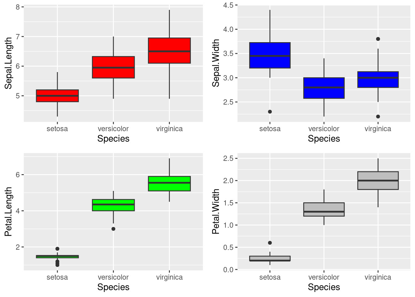
After showing the distribution, we can visualize the number of each kind in the dataset. From the pie chart below, we can see that three classes have equal proportions: each of them occupy 1/3 of the total data points.
ggplot(data=train_set,aes(x=Species,fill=Species))+
  geom_histogram(stat="count",width=1)+
  coord_polar("x",start=0) +
  ggtitle("Proportion of three classes")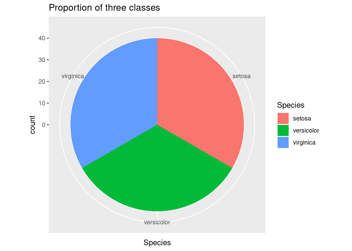
Lastly, we can explore the colinearity between features. From the scatter plot below, we can see that there exist a strong positive relationship between Petal length and Petal width.
g1 <- ggplot(data=train_set,aes(x=Sepal.Length,y=Sepal.Width))+
  geom_point()+
  geom_smooth()

g2 <- ggplot(data=train_set,aes(x=Sepal.Length,y=Petal.Length))+
  geom_point()+
  geom_smooth()

g3 <- ggplot(data=train_set,aes(x=Sepal.Length,y=Petal.Width))+
  geom_point()+
  geom_smooth()

g4 <- ggplot(data=train_set,aes(x=Sepal.Width,y=Petal.Length))+
  geom_point()+
  geom_smooth()

g5 <- ggplot(data=train_set,aes(x=Sepal.Width,y=Petal.Width))+
  geom_point()+
  geom_smooth()

g6 <- ggplot(data=train_set,aes(x=Petal.Length,y=Petal.Width))+
  geom_point()+
  geom_smooth()

grid.arrange(g1,g2,g3,g4,g5,g6,nrow=3)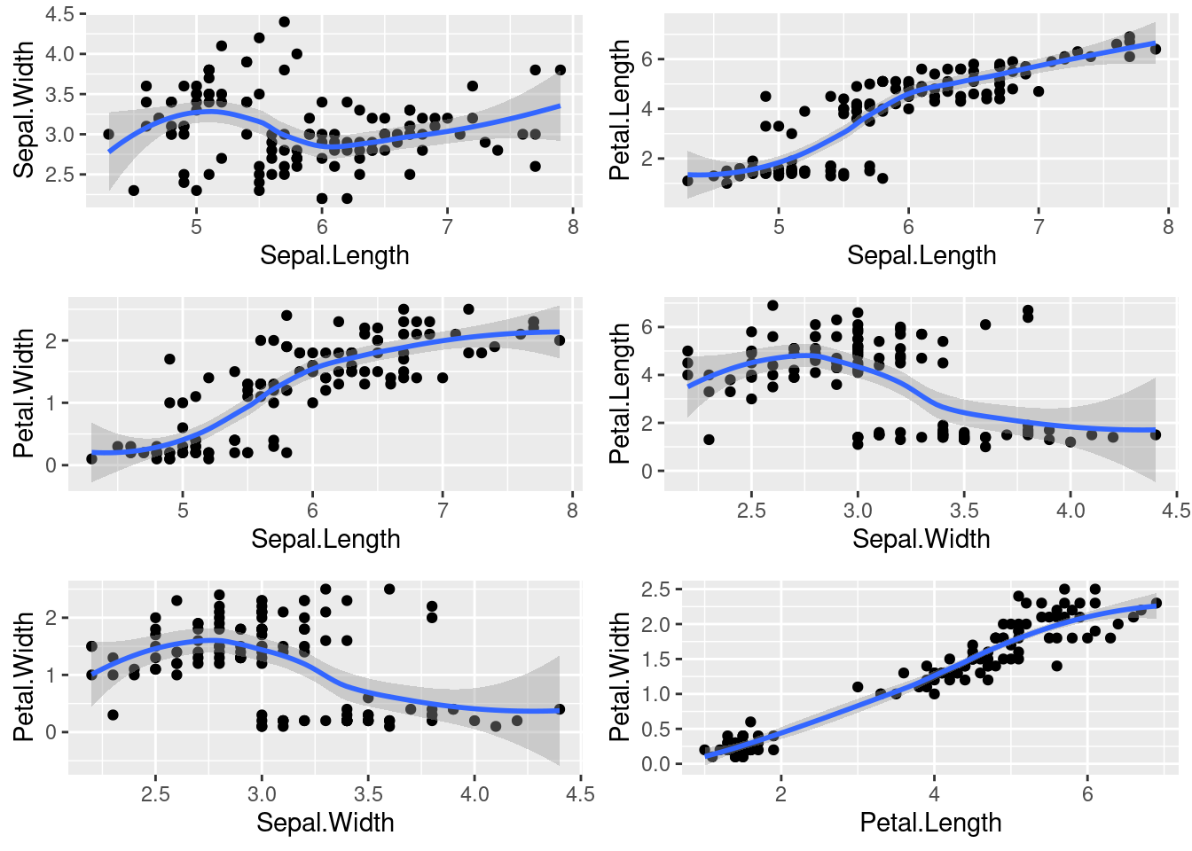
15.5 Training Model
In the previous part, we can get a basic understanding about the overall patterns of the dataset. And in this section, we will start to train and fit some machine learning models on it. First of all, to train and evaluate our model in an efficient way, we can use K-fold cross validation. The general procedure is that we firstly shuffle the data in a random way and split the data into several groups. And for each iteration, we test our model on one group, and train on the remaining groups. The graph below will illustrate this process in a clear way.
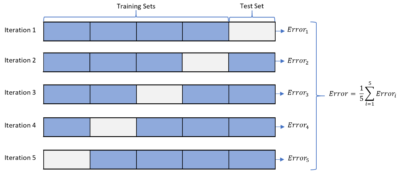
K Fold Cross Validation Process
r_cv <- trainControl(method="repeatedcv",
                        number=10,
                        repeats=5)
15.5.1 KNN
One of the most intuitive machine learning model is KNN, K nearest neighbor. The idea is that we firstly compute the closest K neighbors; then, we can use majority voting to derive our result. For example, if k=5, and three out of the five neighbors have the label of 1, while the other two have label of 0, our result is 1. One advantage of this algorithm is that it has no training process. For small datasets, we can complete the prediction in a short amount of time. However, when the dimension of dataset increases, this algorithm will suffer from the curse of dimension
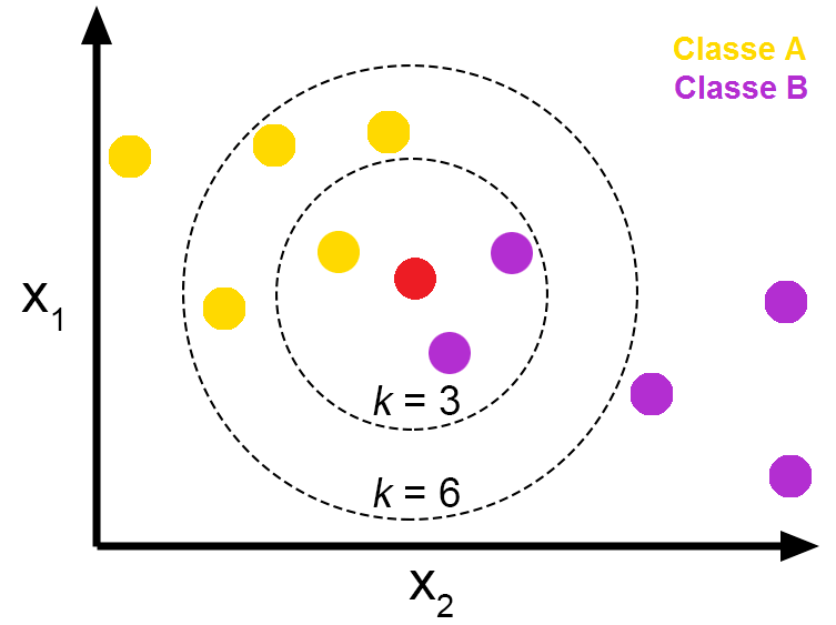
K Fold Cross Validation Process
set.seed(10)
KNN <- train(Species~.,
             data=train_set,
             method="knn",
             metric="accuracy",
             trControl=r_cv)

ggplot(KNN)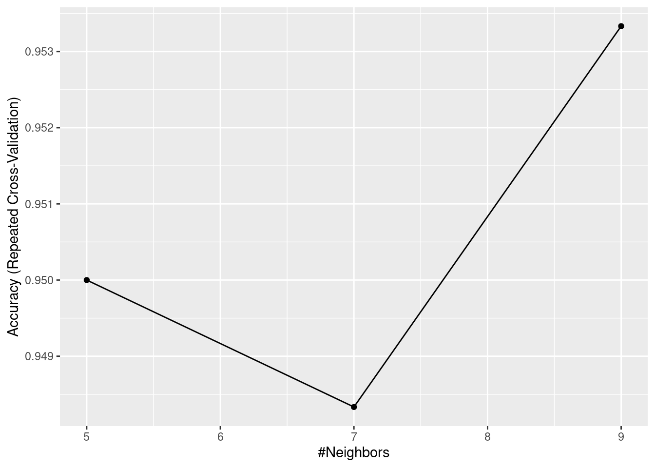
Advantage:
1. very easy to implement, nearly no training process
2. can deal with non-linear problems
3. efficient and accurate for small dataset
Disadvantage:
1. Extremely slow for large dataset
2. Require feature scaling. Inappropriate scales will significantly influence its accuracy
3. Suffer from curse of dimensions. When the data has large number of features, the algorithm does not work well.
15.5.2 Random Forest
Another common machine learning model is Random Forest. It utilizes the idea of bagging, which bootstraps samples from the dataset. And for each iteration, we train a decision tree based on the samples provided. For the last step, we can assemble all these different decision trees together. And the final results will be the average output of all trees. The accuracy of the random Forest is much better than a single decision tree.
set.seed(10)
RF <- train(Species~.,
             data=train_set,
             method="rf",
             metric="accuracy",
             trControl=r_cv)

ggplot(RF)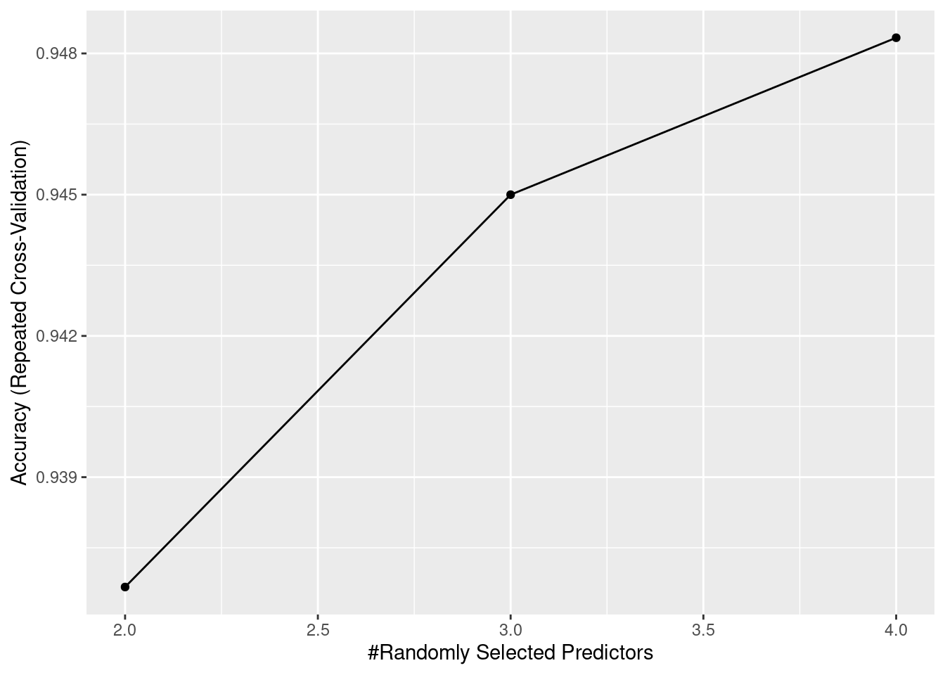
Advantage:
1. higher accuracy than single decision tree
2. can deal with both classification problems and regression problems
3. low variance due to bagging
Disadvantage: 1. When the number of trees is large, it will take huge amount of time to train
2. Compared to normal decision tree, it has low interpretability. It looks like a black box, cannot visualize the process easily.
3. Still likely to overfit
15.5.3 SVM
A powerful machine learning model is called SVM, Support Vector Machine. The idea behind this algorithm is that it tries to find a hyperplane that can separate two classes in a way that maximize the margin, which can be regarded as the optimal classification. Another key feature of SVM is called kernel trick. It will allows SVM to deal with the datasets that have high dimensions. The kernel function can compute the inner product in the original space, so we do not have to project them into high dimensions, which saves huge amounts of computation. This trick also helps us to deal with non-linear problems: for the data that are not linear-separable in low dimension is separable in higher dimension.
set.seed(10)
SVM <- train(Species~.,
             data=train_set,
             method="svmRadial",
             metric="accuracy",
             trControl=r_cv)

ggplot(SVM)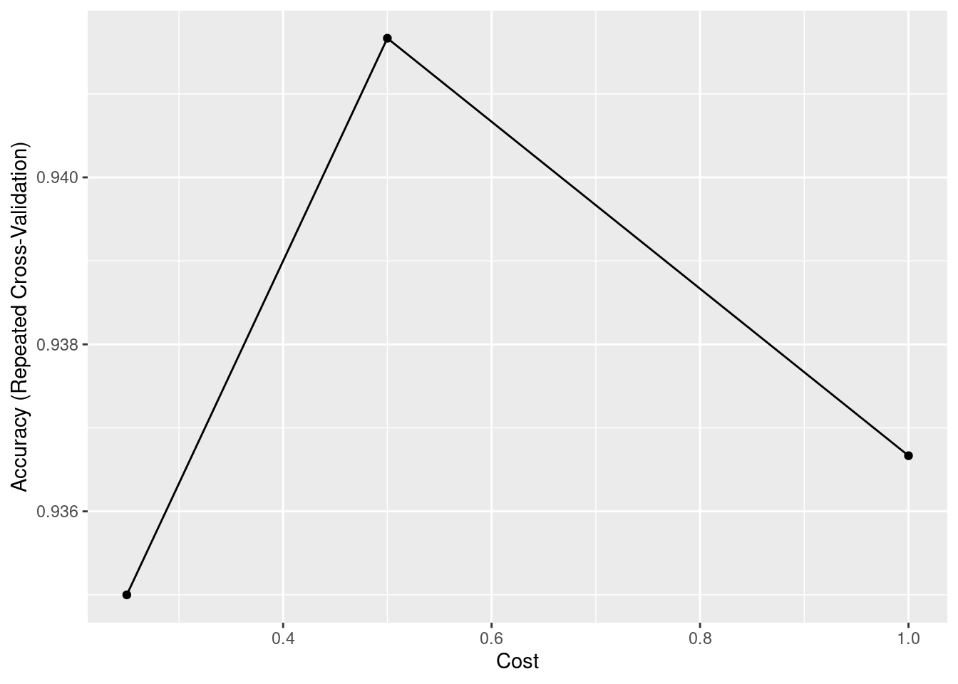
At here, besides radial basis kernel function, there are actually many other kernel function. For example, linear kernel function can useful for linear-separable problems. And polynominal kernel function can project datapoints into higher dimensional space, making it easier to classify. In reality, we need to try different kernel functions to see which one works better.
Advantage:
1. Very effective for data with high dimensions
2. can deal with both linear and non-linear separable problems
3. highly accurate and not influenced by outliers
Disadvantage:
1. When the size of dataset is large, it will take very long time to train
2. low Interpretability, like a black box
3. There are many parameters that we need to tune, hard to choose the best kernel function.
15.5.4 Gradient Boosting
Gradient boosting receives more and more attention in recent years, especially XGBoost. This machine learning model is widely used in many competitions and projects. The main idea of gradient boosting is to train a series of weak learning. Unlike bagging, the generation of this model can only be completed after the last model is fully trained. At each iteration, the weak learner will be trained to fit the residual. And after several iterations, we add all these weak learners together, constituting a strong learner. There are many variations of Gradient Boosting like AdaBoost, XGBoost, or LightGBM.
set.seed(10)
GBM <- train(Species~.,
             data=train_set,
             method="gbm",
             metric="accuracy",
             trControl=r_cv,
             verbose = FALSE)

ggplot(GBM)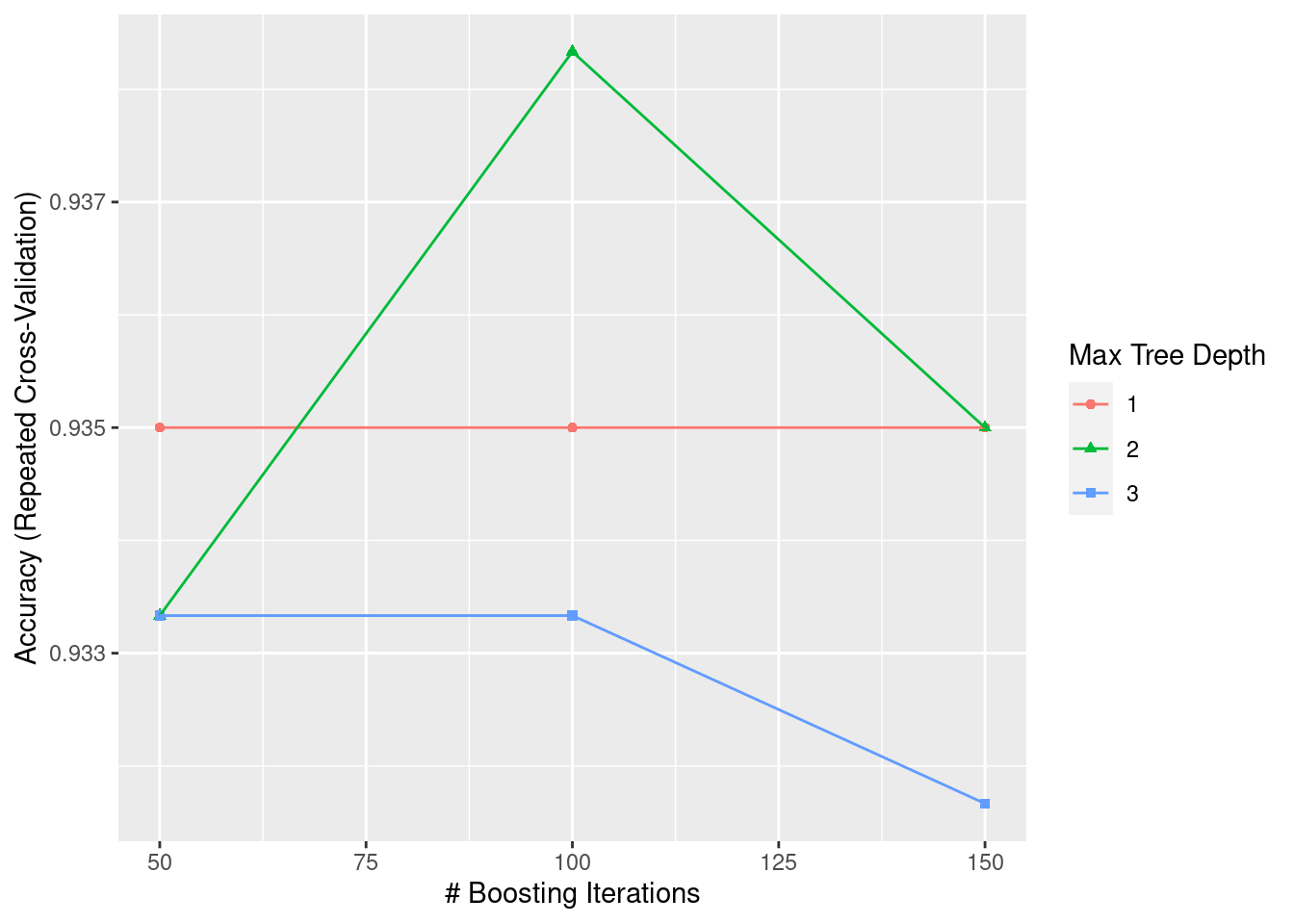
Advantage:
1. results are highly accurate
2. no need for data scailing and preprocessing. It can handle both numerical and categorical features
3. can deal with missing values
Disadvantage:
1. When the dataset is too large, it will become very computationally expensive
2. low Interpretability, like a black box
3. Too many parameters that we need to tune, taking very long time to find the best set of parameter.
15.5.5 Naive Bayes
Naive Bayes is one of the most famous algorithm in the family of supervised learning. This algorithm is founded based on Bayes’ theorem, the theorem is showed in picture attached below. And there are many types of Naive Bayes Classifier, such as Bernoulli Naive Bayes, Gaussian Naive Bayes, or Laplace Naive Bayes. We need take a closer look at the actual dataset in order to determine which type we should use.

Bayes Theorem
set.seed(10)
Naive_Bayes <- train(Species~.,
             data=train_set,
             method="naive_bayes",
             metric="accuracy",
             trControl=r_cv)

Naive_Bayes
## Naive Bayes
##
## 120 samples
## 4 predictor
## 3 classes: 'setosa', 'versicolor', 'virginica'
##
## No pre-processing
## Resampling: Cross-Validated (10 fold, repeated 5 times)
## Summary of sample sizes: 108, 108, 108, 108, 108, 108, ...
## Resampling results across tuning parameters:
##
## usekernel Accuracy Kappa
## FALSE 0.9500000 0.9250
## TRUE 0.9516667 0.9275
##
## Tuning parameter 'laplace' was held constant at a value of 0
## Tuning
## parameter 'adjust' was held constant at a value of 1
## Accuracy was used to select the optimal model using the largest value.
## The final values used for the model were laplace = 0, usekernel = TRUE
## and adjust = 1.Advantage:
1. Algorithm is very straightforward, easy to implement
2. Training process is fast because the computations of the probabilities can be completely instantly
3. memory efficient
Disadvantage:
1. This algorithm is founded on the basis that each variable is conditionally independent, and we cannot assume such independence in real life
2. not accurate in many cases
3. Hard to determine which type of Naive Bayes that we should use to maximize the accuracy.
15.5.6 Compare Models
We can compare all these five models together
results <- resamples(list(Naive_bayes=Naive_Bayes, GBM=GBM, KNN=KNN, SVM=SVM, RF=RF))
summary(results)
##
## Call:
## summary.resamples(object = results)
##
## Models: Naive_bayes, GBM, KNN, SVM, RF
## Number of resamples: 50
##
## Accuracy
## Min. 1st Qu. Median Mean 3rd Qu. Max. NA's
## Naive_bayes 0.7500000 0.9166667 1.0000000 0.9516667 1 1 0
## GBM 0.7500000 0.9166667 0.9166667 0.9383333 1 1 0
## KNN 0.8333333 0.9166667 1.0000000 0.9533333 1 1 0
## SVM 0.7500000 0.9166667 0.9166667 0.9416667 1 1 0
## RF 0.8333333 0.9166667 0.9166667 0.9483333 1 1 0
##
## Kappa
## Min. 1st Qu. Median Mean 3rd Qu. Max. NA's
## Naive_bayes 0.625 0.875 1.000 0.9275 1 1 0
## GBM 0.625 0.875 0.875 0.9075 1 1 0
## KNN 0.750 0.875 1.000 0.9300 1 1 0
## SVM 0.625 0.875 0.875 0.9125 1 1 0
## RF 0.750 0.875 0.875 0.9225 1 1 0From the statistic above, we can see that KNN has the best performance for our dataset.
15.6 Metric & Evaluation
In order to evaluate the performance of our machine learning models, we need to use several metrics. And for different kinds of problems, we should adopt different metrics. For example, for regression problems, we can use R-squared to measure the strength of regression. For classification problems, we can use confusion matrix or ROC curve. In this section, we will talk about these metrics in details
15.6.1 Regression
For regression problems, the most common metric that we use is R-squared. \(R^2\) measures the proportion of the dependent variable that is explained by the independent variable. The range of \(R^2\) is between 0 and 1. If the value is 1.0, that means every datapoint is perfectly fitted; however, if the value 0.0, that means no datapoint is fitted correctly. One problem with this metric is that as the number of variables increases, the \(R^2\) increases as well. Hence, in order to negate this effect, Adjusted R-Squared is introduced, which is divided by the degree of freedom.

R-Squared
15.6.2 Classifcation
Confusion Matrix
For classification problems, confusion matrix can be regarded as an intuitive way to visualize the performance. In confusion matrix, the correct results are True Positive (TP) and TN (True Negative), while the incorrect ones are False Negative (FN) and False Positive (FP). Based on these four values, we can compute precision and recall. Precision will measure how accurately that our model predict, and recall will indicate whether all relevant cases are retrieved. In reality, precision and recall are usually negative related. In this case, F1 score is introduced, which combines both precision and recall, a very representative metric of model’s performance.
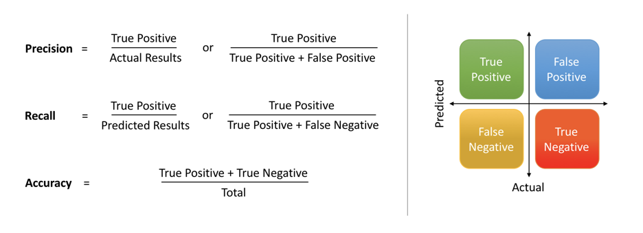
Confusion Matrix
results <- predict(KNN, test_set)
confusionMatrix(results, as.factor(test_set$Species))
## Confusion Matrix and Statistics
##
## Reference
## Prediction setosa versicolor virginica
## setosa 10 0 0
## versicolor 0 10 0
## virginica 0 0 10
##
## Overall Statistics
##
## Accuracy : 1
## 95% CI : (0.8843, 1)
## No Information Rate : 0.3333
## P-Value [Acc > NIR] : 4.857e-15
##
## Kappa : 1
##
## Mcnemar's Test P-Value : NA
##
## Statistics by Class:
##
## Class: setosa Class: versicolor Class: virginica
## Sensitivity 1.0000 1.0000 1.0000
## Specificity 1.0000 1.0000 1.0000
## Pos Pred Value 1.0000 1.0000 1.0000
## Neg Pred Value 1.0000 1.0000 1.0000
## Prevalence 0.3333 0.3333 0.3333
## Detection Rate 0.3333 0.3333 0.3333
## Detection Prevalence 0.3333 0.3333 0.3333
## Balanced Accuracy 1.0000 1.0000 1.0000ROC curve
Another nice metric that we often use is ROC curve. This graph is drawn on the basis of True positive rate (TPR) and False positive rate (FPR). And the area under this curve is called Area Under Curve (AUC). If the area is equal to 1, that means the machine learning model predicts perfectly on every datapoint. If the area is 0.5, then the model behaves like a fair coin. And if it is 0, that means the model makes false predictions every time.
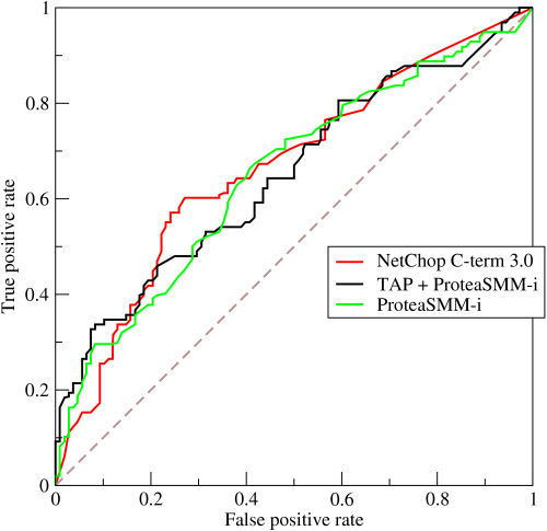
ROC Curve
15.7 Conclusion
In this tutorial, we can grasp a basic understanding about the general procedures of machine learning model training. First of all, before we start to train the model, we should preprocess the data, which will significantly improve the efficiency of model training. For numerical features, we can use standardization or centering to adjust the scale, which prevents the data distortions. For categorical features, we may use one-hot encoding to convert categorical features into numerical ones. Then, to reduce the dimension of the dataset, we can use PCA to transform the data in a more simplified form. Furthermore, the second step is EDA, which gives audiences an insight about the overall patterns of the data that we are going to train. This part can be easily done by using R because R language is very suitable for data visualization and data analysis. For the fourth step, we will start to train our machine learning model. There are various types of machine learning model that we choose: KNN, Random Forest, SVM, Gradient Boost, Naive Bayes, etc. As for which one we should choose, it depends on the actual dataset and user’s experience. For the last step, in order to assess the performance of model, we need to use several metrics. For regression, we can use R-squared or Adjusted R-squared; for classification, we can use confusion matrix or ROC curve. In general, this tutorial is only an introduction to machine learning, there are many other complicated algorithms or data processing procedures, leaving space for users to explore.