Chapter 15 Base R vs. ggplot2
Winnie Gao
One of the biggest reasons why more and more people choose to use R nowadays is due to a extremely powerful package called ggplot2 perfectly integrated in R for producing pretty plots with relatively short codes. A lot of people apply ggplot2 in their code to conveniently create exploratory plots. However, sometimes complains are also heard about ggplot2, such as being enforced to create data frame before plotting, a number of graph types unable to be neatly fitted in ggplot2, etc. At the same time, R itself can produce plots without installing packages. Since R basics has fewer restrictions for producing plots, people can create various plots according to their own needs. But for the same reason, its shortcomings are also due to the lack of ready frameworks, so R basics usually requires more code to adjust if people want to draw plots as good-looking as ggplot2. On this page, let us discuss if R basics can also complete what ggplot2 do for some types of graphs that is not that common in our daily practice: Cleveland Dot plot, Parallel Coordinate plot and Mosaic plot.
- Cleveland Dot Plot
Similar with the more common scatter plots, Cleveland dot plots also map two variables of interest onto x-axis and y-axis. The only difference is that, in Cleveland dot plots, on the y-axis are usually some texts, resulting that each line contains only one dot. But we can apply the same procedure for scatter plot here to plot a Cleveland Dot Plot.
As an example, let’s use the data set game metascore that is also used in Problem Set2:
ggplot(score, aes(x = metascore, y = reorder(title, metascore))) +
    geom_point() +
  xlab("Metascore") +
  ylab("Game Title") +
  ggtitle("Game Metascore")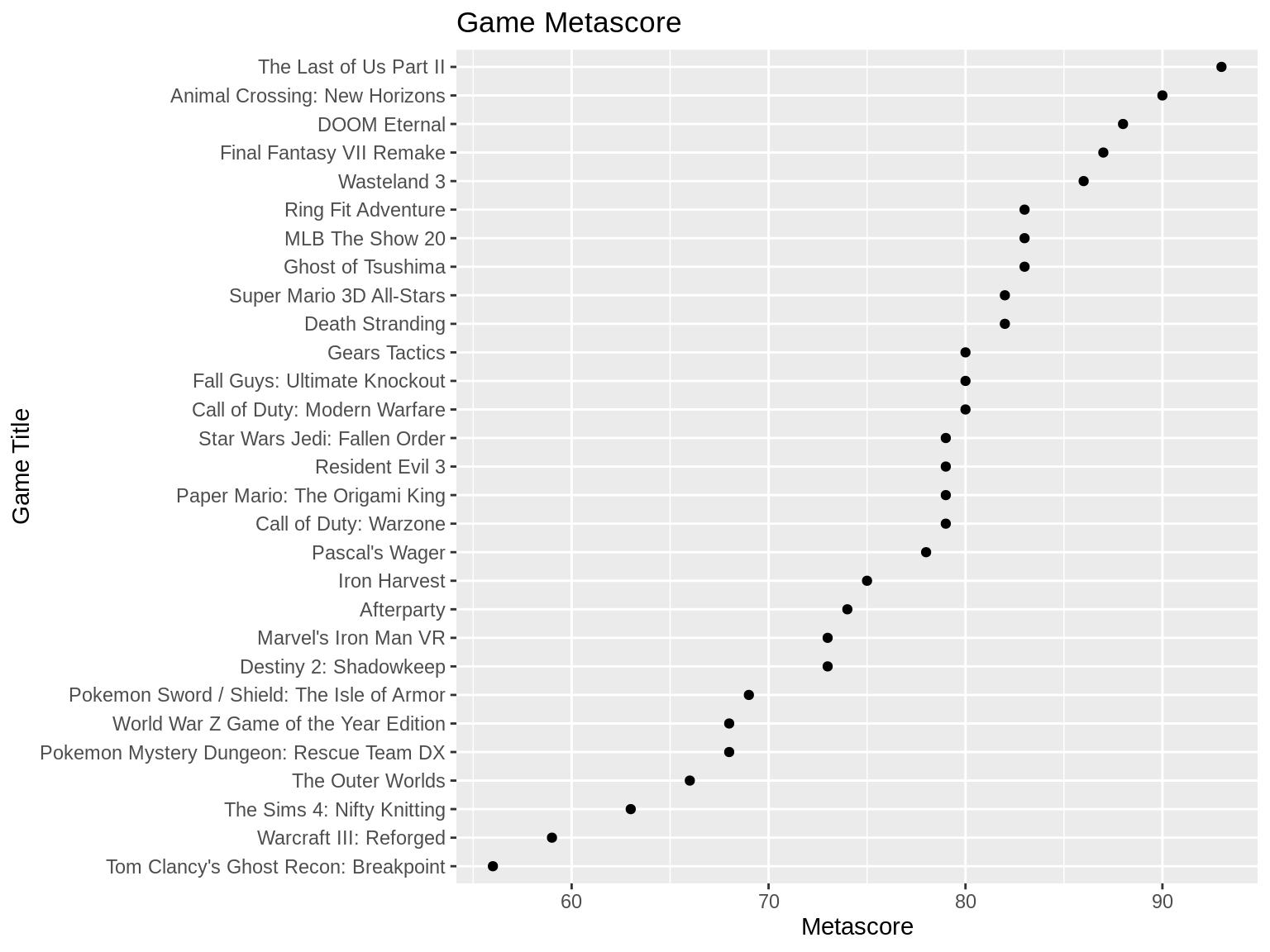
Let’s see if we can plot with r basics.
Luckily, there is a function written in R that can directly plot the Cleveland plot called dotchart. There are several parameters dotchart: 1. x: the values that you want to put in the plot; 2. labels: the values that you want to put on y-axis, usually the texts or string values; 3. cex: how big you want to circle or labels to be. Here is the example:
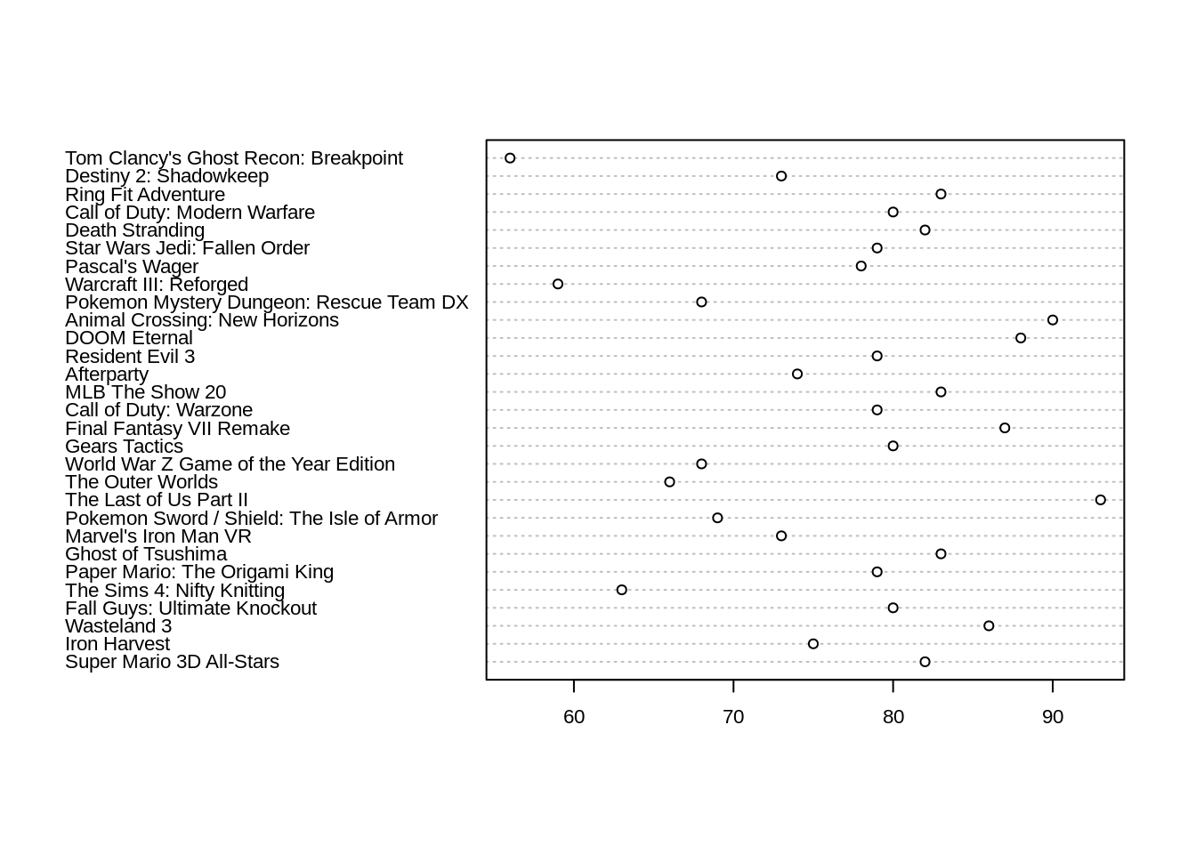
With in one line, we can roughly get a Cleveland dot plot. However, we always want the circles to be ordered with largest values ont the top. To fulfill this, what we need to do is only to reorder our data before we plot it.
order_score = score[order(score$metascore),]
dotchart(order_score$metascore, labels=order_score$title, cex=.7)
title("Game Metascore", xlab="Metascore", ylab="Game Title")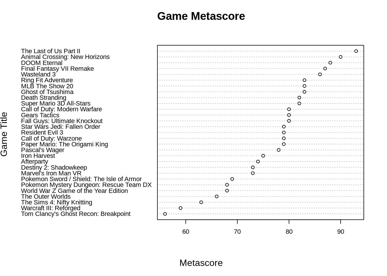
Even though the two plots by ggplot2 and r-basics are not exactly the same, both of them convey the some information. And surprisingly, the code using R basics is not longer than that using ggplot2.
- Parallel Coordinates Plot
Then, let’s try parallel Coordinate plots in ggplot2. There is some other useful packages such as GGally, parcoords and MASS that can also create parallel coordinate plots conveniently, but today let’s first use ggplot2 because sometimes we don’t want to load to many packages.
As an example, we will use mtcars data set. At the beginning, there is an important step: rescaling. Since different variables might be in different scales, rescaling help better present our data. Here, let’s use std. Also, in order to plot the brand name on the x-axis and other variables on vertical axies, we have to reshape our data frame first.
On purpose of a better visualization, let’s group data points with same key together:
Now, we have shaped our data in an order that is ready to plot.
ggplot(mtcars, aes(x = key, y = value, group = factor(brand))) +
  geom_path(position = "identity") +
  geom_point()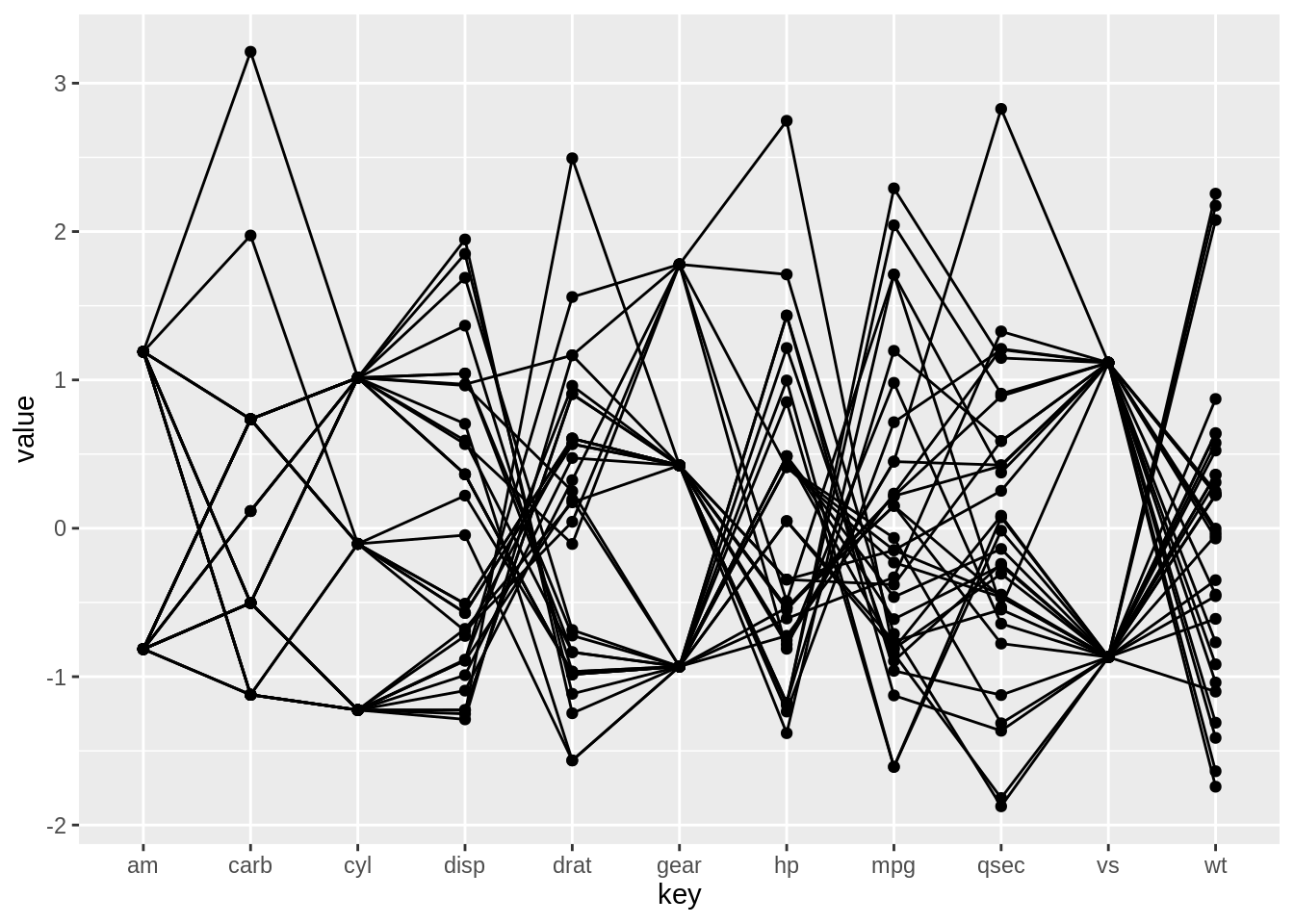
Since we do not have too many car brands here, we can also color each line to see which brand it belongs to.
ggplot(mtcars, aes(x = key, y = value, color = brand, group = factor(brand))) +
  geom_path(position = "identity") +
  geom_point()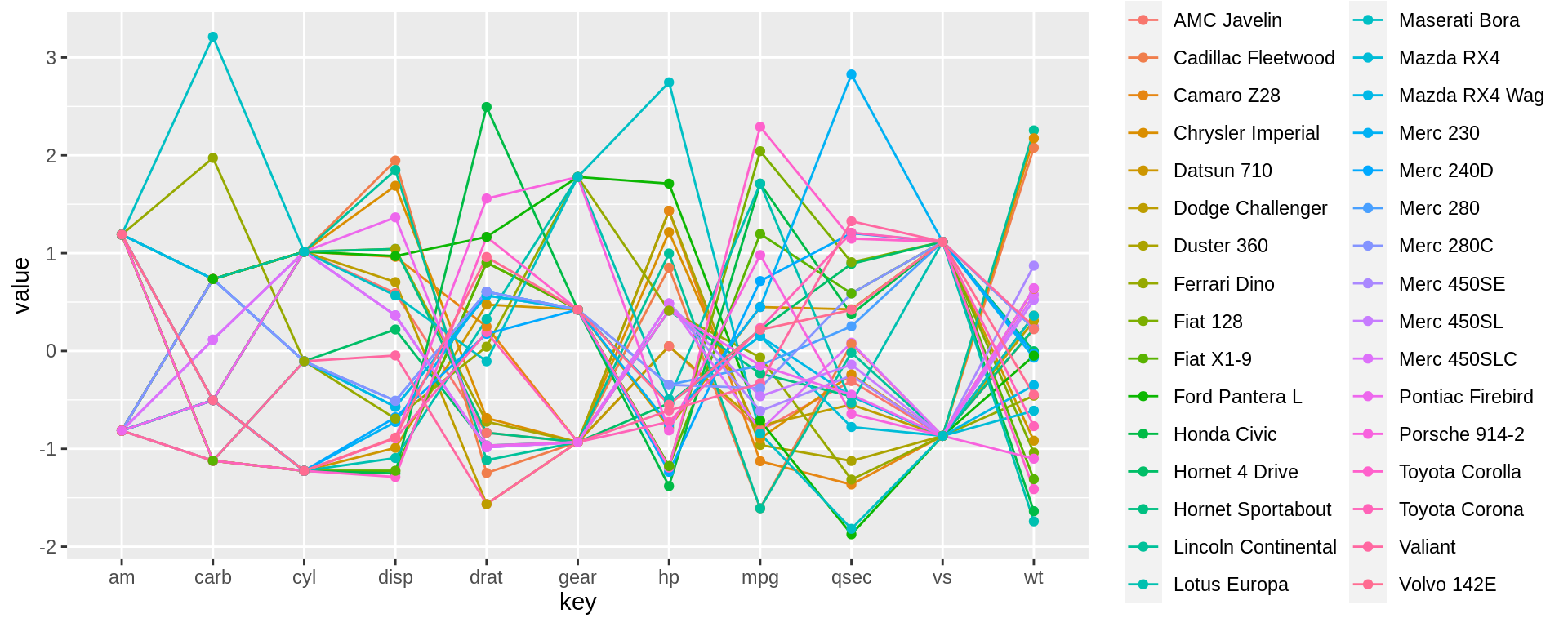
Even though there isn’t a function in ggplot2 that can directly produce a parallel coordinate plot, reshaping our data frame and use geom_path can also complete the plot. Next, let’s see how we should do using r basics only.
First, let’s read the data frame again.
With r basics, we could use line() function to create lines that connect adjacent values for each variables. And for loop can help run through all variables and add the line plots onto the same plot.
plot(as.numeric(mtcars[1, 2:ncol(mtcars)]), type = "b", ylim=c(-2, 3.1), xlab = "key", ylab = "value", xaxt = "n")
axis(1, at=1:11, labels=colnames(mtcars)[2:12])
title(xlab = "key", ylab = "value")
for (i in 2:nrow(mtcars)) {
  lines(as.numeric(mtcars[i, 2:ncol(mtcars)]), type = "b")
}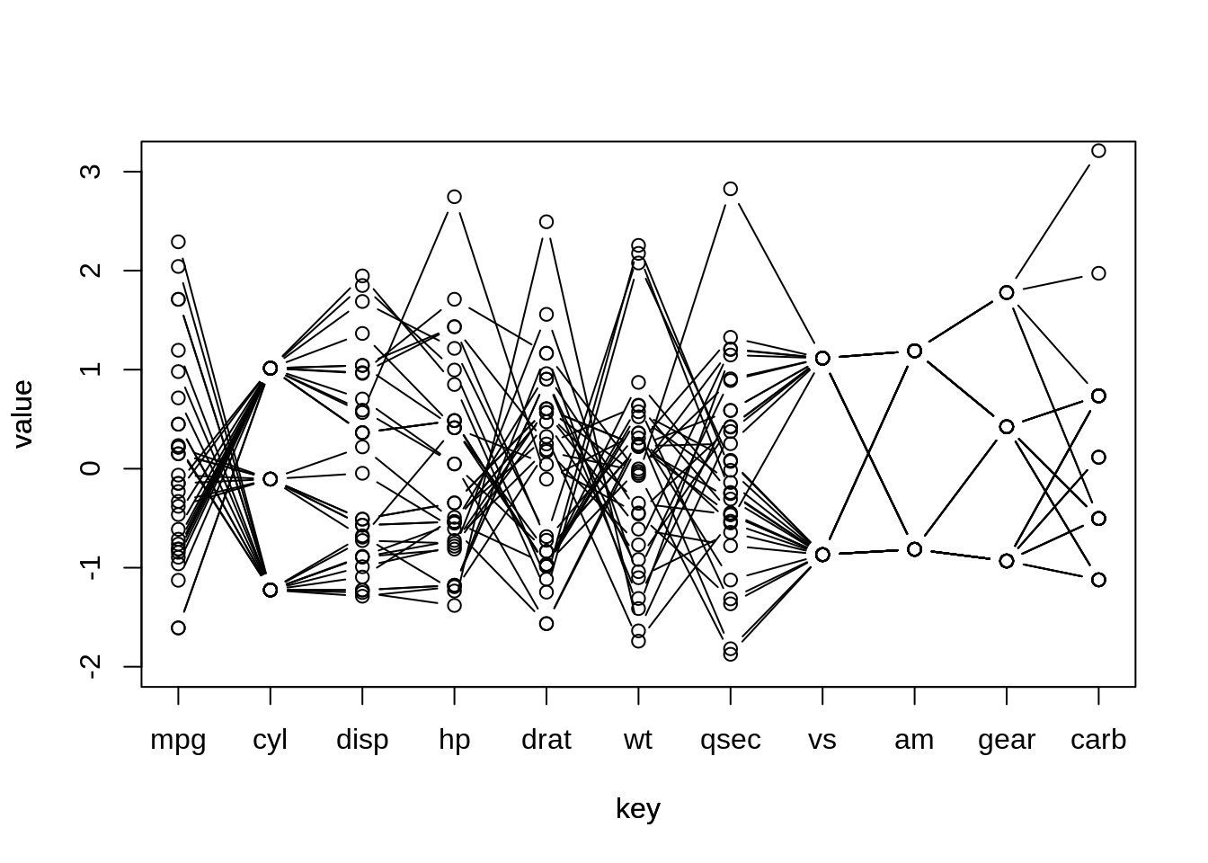
We can also create a parallel coordinate plot using basic r functions. Basically, as long as we understand what relationships between variables we want to present using our plot, we can make one even only using a single line() function. But obviously, it takes much longer procedure to create. For your interest, we can also apply color to this line plot:
plot(as.numeric(mtcars[1, 2:ncol(mtcars)]), type = "b", ylim=c(-2, 3.1), xlab = "key", ylab = "value", xaxt = "n", col = 1)
axis(1, at=1:11, labels=colnames(mtcars)[2:12])
title(xlab = "key", ylab = "value")
for (i in 2:nrow(mtcars)) {
  lines(as.numeric(mtcars[i, 2:ncol(mtcars)]), type = "b", col = i)
}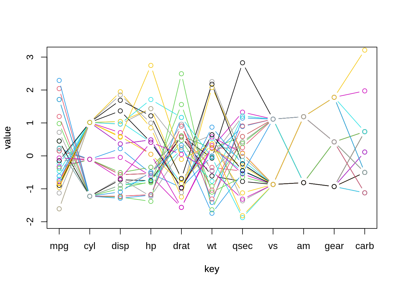
However, after careful observation, we can see that there are fewer number of points in this plot. This is because some of our data points have values very close to each other. When we plot these data points in circle and line, one will cover others. To avoid this problem, we can apply some jittering on our plot.
Comparing plotting with ggplot2 and r basics, I would recommend you use ggplot2. And it is even more convenient to plot with other packages as I mentioned above. But if you only have a few data points to plot and do not want to load more packages for a single plot, r baiscs is indeed a choice.
- Mosaic Plot
Finally, let’s try one more type of plot: mosaic plot. As a example, we will use the diamond data set in r and try to explore the relationship between cut and clarity. Therefore, our first step is to group the data frame by cut to calculate its corresponding proportion for each level of clarity.
data(diamonds)
df = diamonds %>%
  group_by(cut, clarity) %>%
  summarise(count = n()) %>%
  mutate(cut.count = sum(count),
         prop = count/sum(count))
After reshaping the data into the form we want, we can now start to draw using geom_bar. (External resource: https://stackoverflow.com/questions/19233365/how-to-create-a-marimekko-mosaic-plot-in-ggplot2)
ggplot(df, aes(x = cut, y = prop, width = cut.count, fill = clarity)) +
  geom_bar(stat = "identity", position = "fill", colour = "black") +
  geom_text(aes(label = scales::percent(prop)), position = position_stack(vjust = 0.5)) + # if labels are desired
  facet_grid(~cut, scales = "free_x", space = "free_x") +
  scale_fill_brewer(palette = "RdYlGn") +
  theme(panel.spacing.x = unit(0, "npc")) + # if no spacing preferred between bars
theme_void() 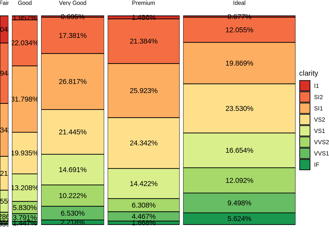
R has its own written function for masic plot called mosaicplot(), which can directly produce a mosaic plot by pluging the varaibles you want to plot.
t = table(diamonds$cut, diamonds$clarity)
mosaicplot(t, main = "Mosaic: cut vs. clarity", xlab = "cut", ylab = "clarity", las = 1)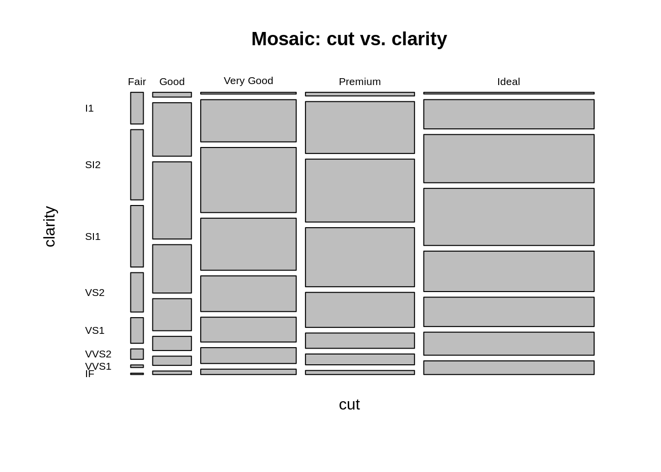
As required, we can change the direction of cutting by specifying the parameter dir inside the function:
mosaicplot(t, main = "Mosaic: cut vs. clarity", dir = c("h", "v"), xlab = "clarity", ylab = "cut", las = 1)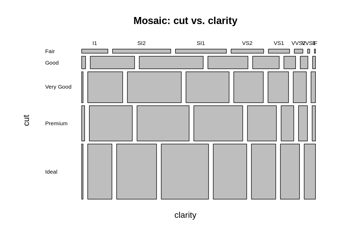
Surprisingly, mosaic plot by r basics takes less time and fewer lines of code. There are some other useful packages that can produce beautiful mosaic plots such as vcd.
- Conclusion
Today, I introduced how to plot Cleveland Dot Plots, Parallel Coordinate Plots and Mosaic Plots using both ggplot2 and written-in R functions. And as I mentioned above, there are always some fantastic package that are built specifically for some types of plots. However, if you do not want to load too many packages in your working directory, R basics is always a choice to work with. From the procedure of building nice plots using written-in functions, we can see that we do not need to stick on a specific function. Instead, as long as we fully understand the relationship and logic behind the data we want to present, we can always free style and use any types of code and any functions we would like. So, after reading this page, why not give a try!
- External Resource:
- Cleveland Dot Plot using R: https://stat.ethz.ch/R-manual/R-patched/library/graphics/html/dotchart.html
- Cleveland Dot Plot using ggplot2: https://edav.info/cleveland.html
- Parallel Coordinate Plot using ggplot2: https://www.r-graph-gallery.com/parallel-plot-ggally.html
- Mosaic Plot using r: https://www.tutorialgateway.org/mosaic-plot-in-r/
- Mosaic Plot using ggplot2: https://stackoverflow.com/questions/19233365/how-to-create-a-marimekko-mosaic-plot-in-ggplot2