Chapter 10 Radar Chart
Mohan Duan and Run Zhang
Here we introduce two kinds of plot that not covered in our class: radar chart.
10.1 Introduction of Radar Chart
A radar chart is a graphical method of displaying multivariate data in the form of a two-dimensional chart of three or more quantitative variables represented on axes starting from the same point.
Pros:
- great tool to compare different entities easily.
- easier for reader to understood than a column diagram.
- useful in drawing comparisons on the basis of different parameters.
Cons:
- if there are so many variables to compare, radar chart can be over-crowded.
- not ideal for making trade-off decisions or comparing vastly distinctive variables.
- radar charts can distort data to some extent.
Here we explain a tool for drawing radar chart in R
10.2 Basic Radar Chart
- Using package ‘fmsb’
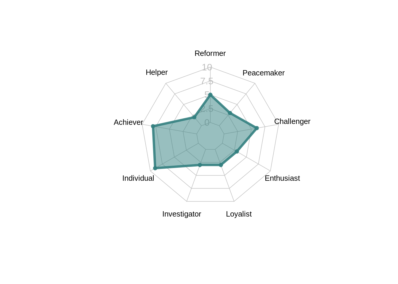
- creating data of the nine enneagram type descriptions for person A
personA <- as.data.frame(matrix(sample(2:9, 9, replace = T), ncol = 9))
colnames(personA) <- c("Reformer", "Helper", "Achiever", "Individual",
                       "Investigator", "Loyalist", "Enthusiast", "Challenger", "Peacemaker")
personA
## Reformer Helper Achiever Individual Investigator Loyalist Enthusiast
## 1 5 2 8 9 3 3 3
## Challenger Peacemaker
## 1 6 3- set the min and max of each personality to show on the plot
- Using ‘radarchart()’ to plot radar graph

10.3 Customize Radar Chart
The ‘radarchart()’ function offers several options to customize the chart:
Polygon features:
‘pcol’ → line color
‘pfcol’ → fill color
‘plwd’ → line width
Grid features:
‘cglcol’ → color of the net
‘cglty’ → net line type (see possibilities)
‘axislabcol’ → color of axis labels
‘caxislabels’ → vector of axis labels to display
‘cglwd’ → net width
Labels:
- ‘vlcex’ → group labels size
radarchart( personA  , axistype=1 ,

    ##custom polygon
    pcol=rgb(0.2,0.5,0.5,0.9) , pfcol=rgb(0.2,0.5,0.5,0.5) , plwd=4 ,

    ##custom the grid
    cglcol="grey", cglty=1, axislabcol="grey", caxislabels=seq(0,10,2.5), cglwd=0.8,

    ##custom labels
    vlcex=0.8
    )
10.4 Radar Chart with several individuals
10.4.1 basic plot
For next application, we are going to measure data scientists based on the skills required for data scientists. * Required Skills for a Data Scientist:
* Programming: SQL,Python, R, JAVA,MATLAB
* Machine Learning(ML): Natural Language Processing, Classification, Clustering,Ensemble methods, Deep Learning
* Visualization: Tableau, SAS, D3.js, Python, Java, R libraries
* Big Data: MongoDB, Oracle, Microsoft Azure, Cloudera
* Communication
Reference: https://www.mastersindatascience.org/careers/data-scientist/
- create data
ds_data <- as.data.frame(matrix( sample( 0:20 , 15 , replace=F) , ncol=5))
colnames(ds_data) <- c("Programming" , "ML" , "Visulization"
                    , "Big Data","Communication"  )
rownames(ds_data) <- paste("data scientist" , letters[1:3] , sep="-")
ds_data
## Programming ML Visulization Big Data Communication
## data scientist-a 0 9 18 12 13
## data scientist-b 3 17 7 10 8
## data scientist-c 4 1 15 16 19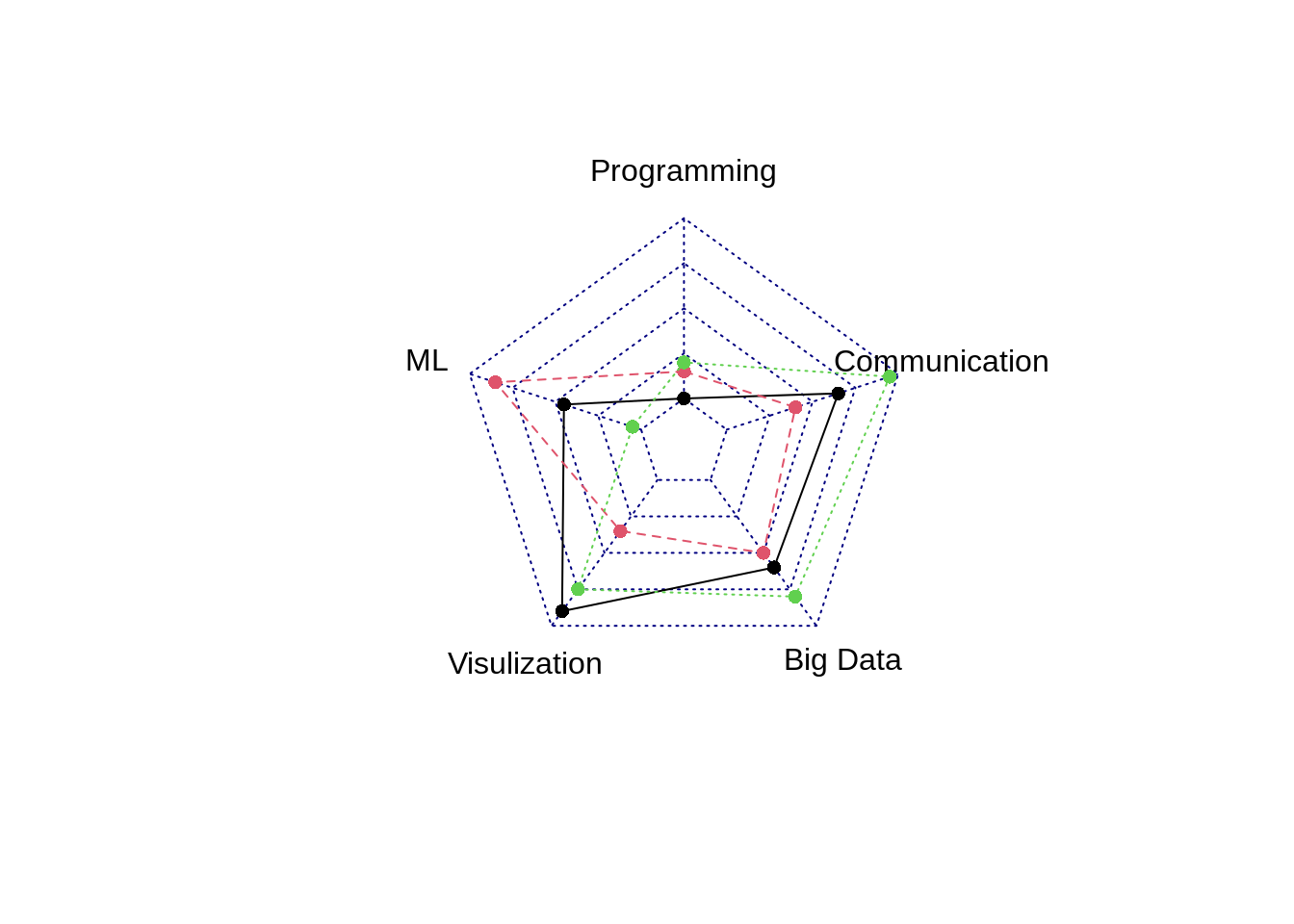
10.4.2 customize
The ‘radarchart()’ function offers several options to customize the chart:
Polygon features:
‘pcol’ → line color
‘pfcol’ → fill color
‘plwd’ → line width
Grid features:
‘cglcol’ → color of the net
‘cglty’ → net line type (see possibilities)
‘axislabcol’ → color of axis labels
‘caxislabels’ → vector of axis labels to display
‘cglwd’ → net width
Labels:
- ‘vlcex’ → group labels size
## Color vector
colors_border=c( rgb(0.2,0.5,0.5,0.9), rgb(0.8,0.2,0.5,0.9) , rgb(0.7,0.5,0.1,0.9) )
colors_in=c( rgb(0.2,0.5,0.5,0.4), rgb(0.8,0.2,0.5,0.4) , rgb(0.7,0.5,0.1,0.4) )

## plot with default options:
b<- radarchart( ds_bind  , axistype=1 ,
    ##custom polygon
    pcol=colors_border , pfcol=colors_in , plwd=4 , plty=1,
    ##custom the grid
    cglcol="grey", cglty=1, axislabcol="grey", caxislabels=seq(0,20,5), cglwd=0.8,
    ##custom labels
    vlcex=0.8
    )
b
## NULL## Add a legend
legend(x=0.7, y=1, legend = rownames(ds_bind[-c(1,2),]), bty = "n", pch=20 , col=colors_in , text.col = "grey", cex=1.2, pt.cex=3)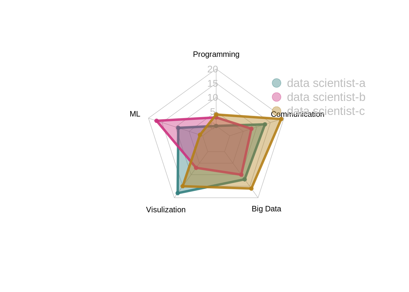
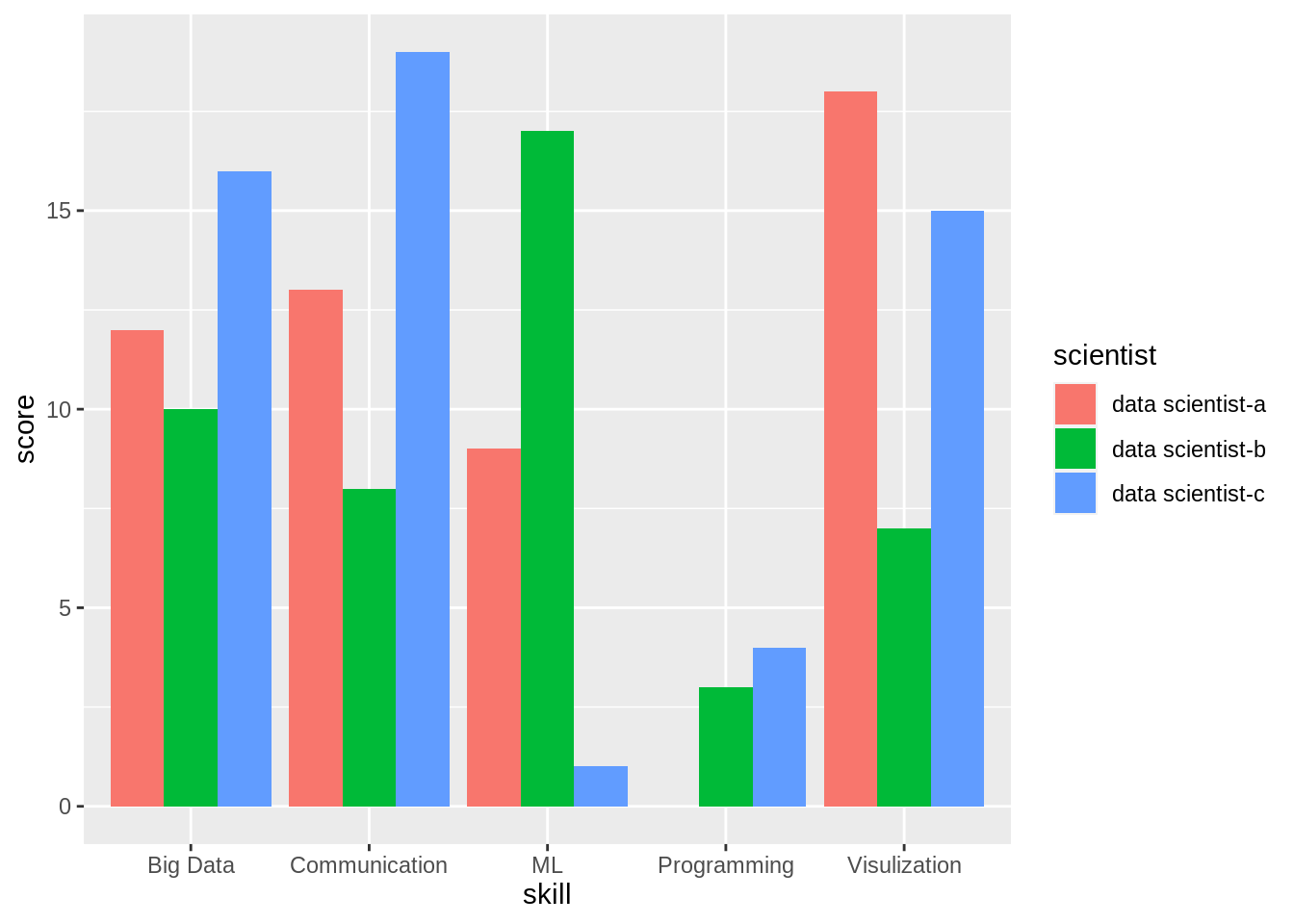
10.4.3 Radar vs. Bar Chart
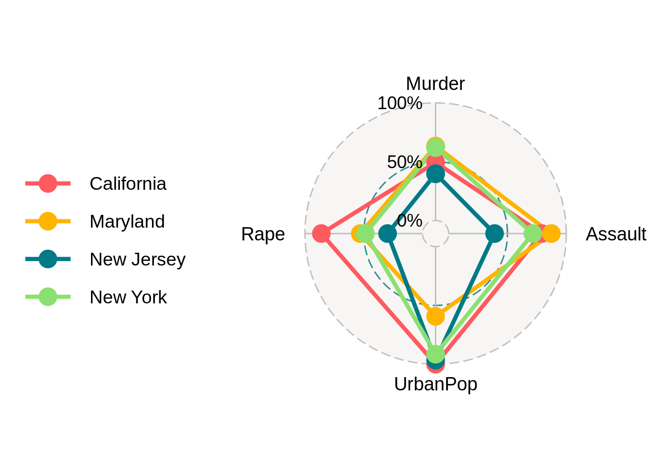
data(USArrests)
tidy_ds <- ds_data %>%
  tibble::rownames_to_column( "scientist")
tidy_ds <- pivot_longer(tidy_ds,!c("scientist" ), names_to = "skill", values_to = "score") ggplot(tidy_ds, aes(x = skill, y = score, fill = scientist)) +
geom_bar(position = "dodge", stat = "identity")