Chapter 14 Introduction to violin plots
Yiwen Cai, Xuanhao Wu
14.1 Overview
A violin plot is a method of plotting the distribution of numeric data across different categories. For example, temperature distribution compared between day and night, or distribution of car prices compared across different car makers.
In this tutorial, we will talk about how to plot violin plots in R using both the ggplot and the vioplot package. Also, we will have a detailed discussion on differences between box plots and violin plots and things to consider when using violin plots for visualization.
14.2 Theory
Violin plots show the probability density of the data at different values, usually smoothed by a kernel density estimator. Wider sections in violin plots represent a higher probability;the skinnier sections represent a lower probability.
The choice of the kernel bandwidth will control the smoothness of the graph. Lower kernel bandwidth generates lumpier plots. However, graphs with lower kernel bandwidth perform better in identifying minor clusters. Therefore, experiments are needed in order to get the ideal kernel bandwidth used for smoothing.
The ordering of the group shown in the violin plot is also important as the ordering will give insights to the graph.
14.3 Basic violin plot
chickdata <- read.csv(file = "resources/introduction_vioplot_data/chick_weights.csv")
chickdata$feed <- as.factor(chickdata$feed)
chickdata$sex <- as.factor(chickdata$sex)
head(chickdata)
## id weight sex feed
## 1 1 179 male Horsebean
## 2 2 160 male Horsebean
## 3 3 136 female Horsebean
## 4 4 227 male Horsebean
## 5 5 217 female Horsebean
## 6 6 168 male Horsebeanggplot(chickdata, aes(x = feed, y = weight)) +
geom_violin(aes(fill = feed), trim = FALSE) +
geom_boxplot(width = 0.1) +
theme_classic() +
theme(legend.position = "none")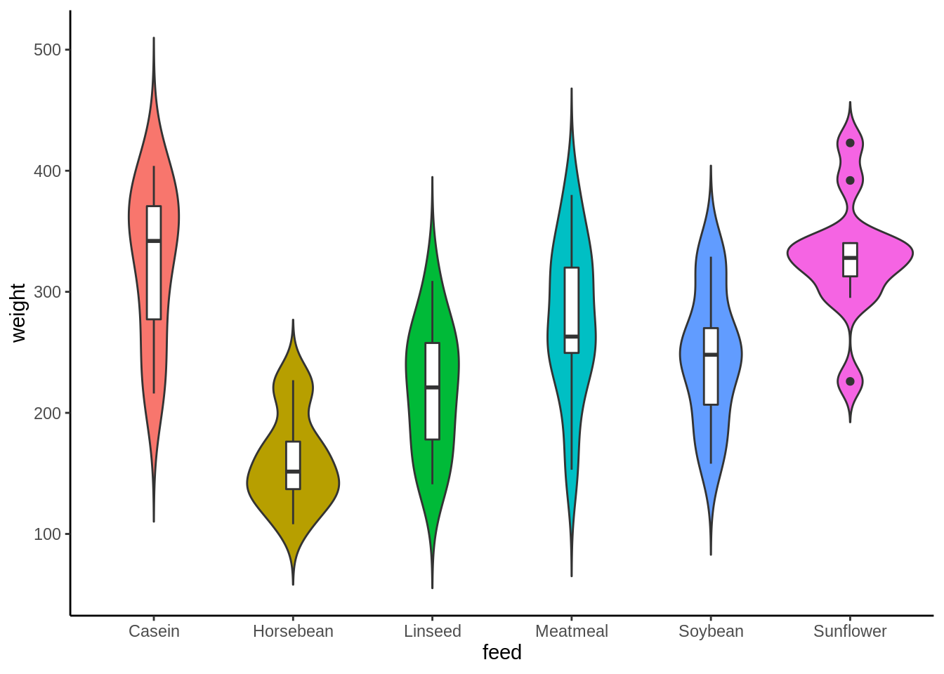
Or we can flip the axes to get a horizontal violin plot. Like horizontal bar charts, swapping axes gives the category labels more room to breathe. And when the sample size is not large, we can present the sample points instead of the box plots.
ggplot(chickdata, aes(x = feed, y = weight)) +
  geom_violin(aes(fill = feed), trim = FALSE, bw = 10) +
  geom_point()+
  coord_flip() +
  theme_classic() +
  theme(legend.position = "none")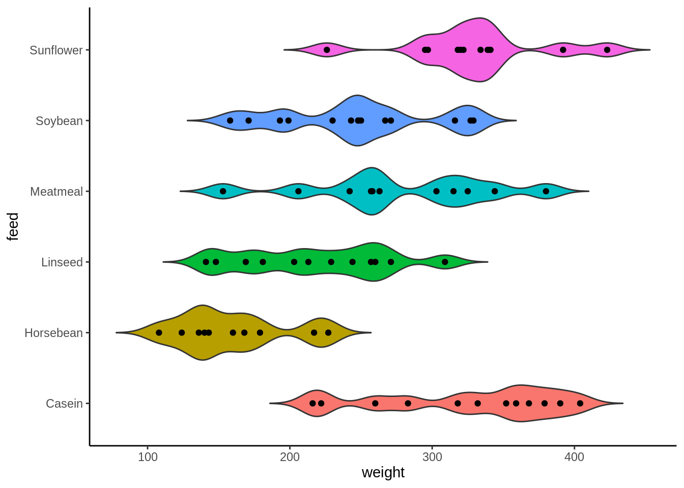
14.4 Grouped violin plot
Violin plots can also illustrate a second-order categorical variable. You can create groups within each category.
ggplot(chickdata, aes(x = feed, y = weight, fill = sex)) +
    geom_violin(position = position_dodge(0.7), trim = FALSE) +
    geom_boxplot(position = position_dodge(0.7), color = "white",
        width = 0.1, show.legend = FALSE) + theme_classic()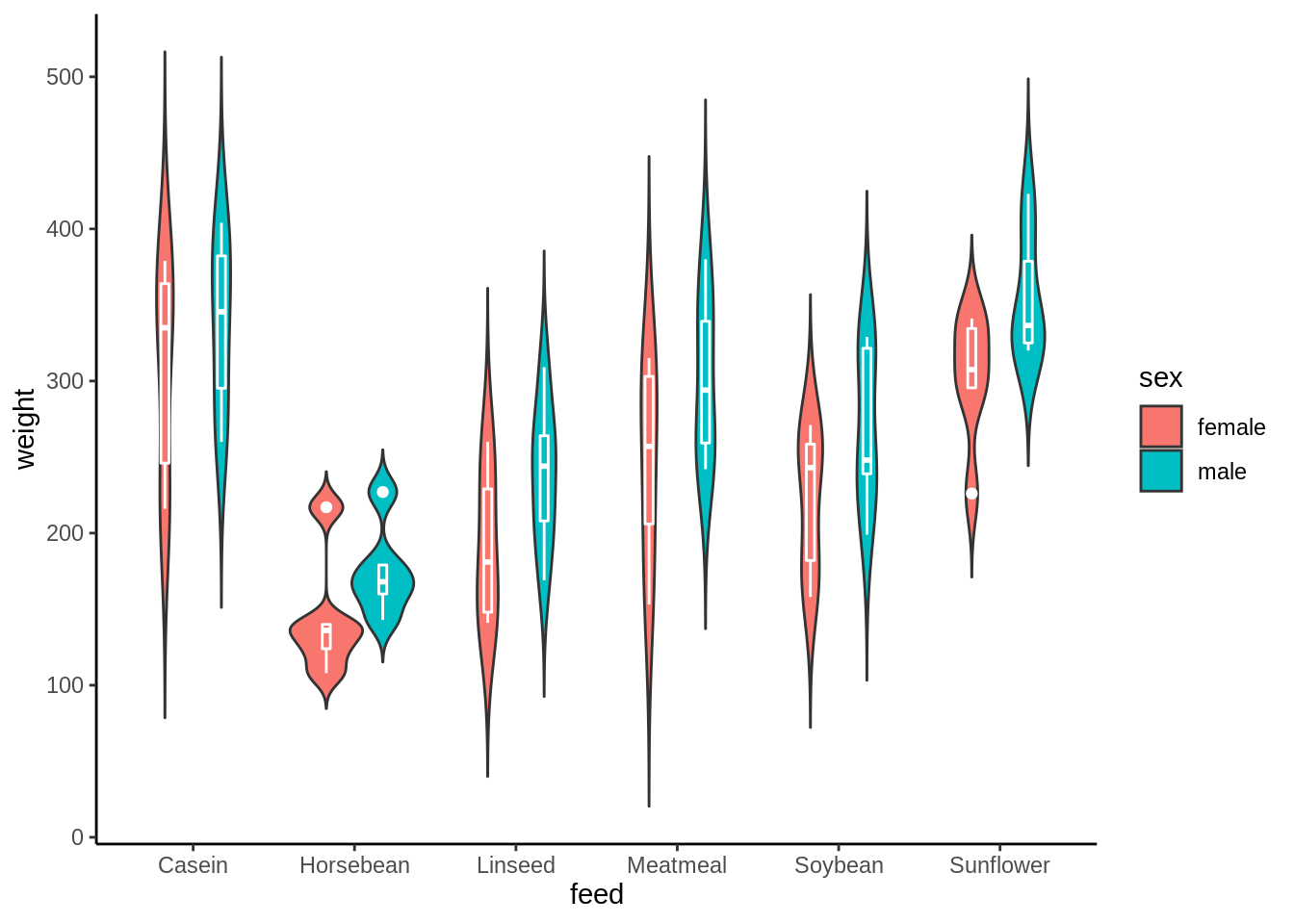
14.5 Grouped violin plot with split violins
Instead of drawing separate plots for each group within a category, you can also create split violins.The split violins can help you compare the distributions of each group more directly.
Here we use the vioplot package in R to create split violins.To get a one sided plotting of violin plots,you can change the side parameter from the default one “both” to “left” or “right”
fchick = chickdata[chickdata$sex == "female", ]
mchick = chickdata[chickdata$sex == "male", ]
vioplot(weight ~ feed, data = fchick, col = "palevioletred", plotCentre = "line",
    side = "left", ylim = c(0, 500), names = levels(fchick$feed))
vioplot(weight ~ feed, data = mchick, col = "lightblue", plotCentre = "line",
    side = "right", ylim = c(0, 500), add = T)
legend("bottomright", fill = c("palevioletred", "lightblue"), legend = c("female",
    "male"), title = "Sex")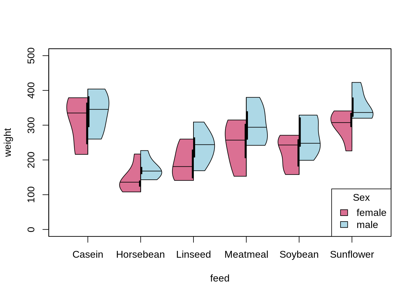
Here the horizontal lines inside the one-sided graph represents the median line in different groups.
14.6 violin plot versus box plot
While similar to box plot, violin plot is more informative of the variations of the data especially when the data itself is multimodal. In this case a violin plot shows the presence of different peaks, their position and relative amplitude.
mu<-2
si<-0.6
bimodal<-c(rnorm(1000,-mu,si),rnorm(1000,mu,si))
uniform<-runif(2000,-4,4)
normal<-rnorm(2000,0,3)
vioplot(bimodal,uniform,normal,names=c("bimodal","uniform","normal"))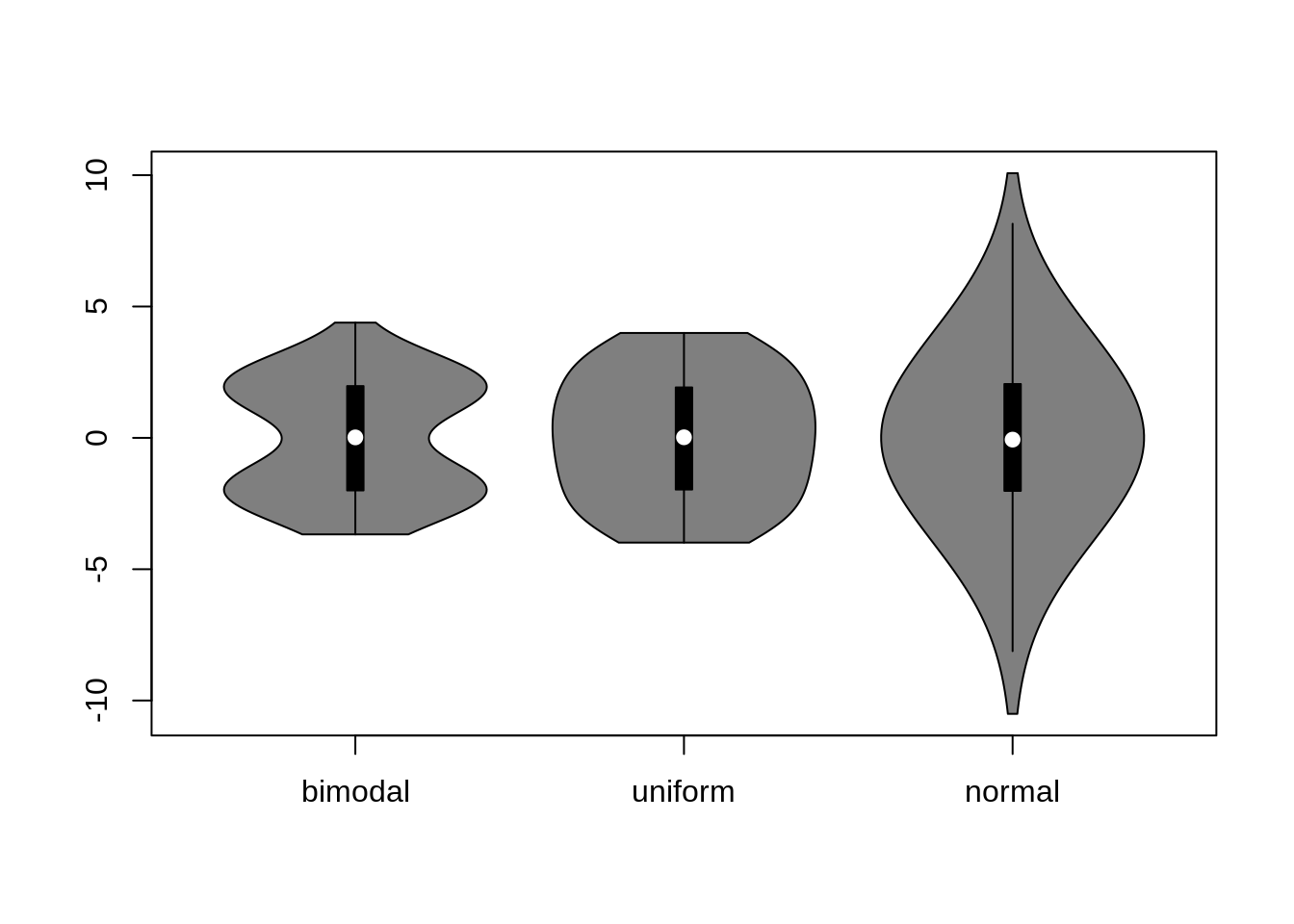
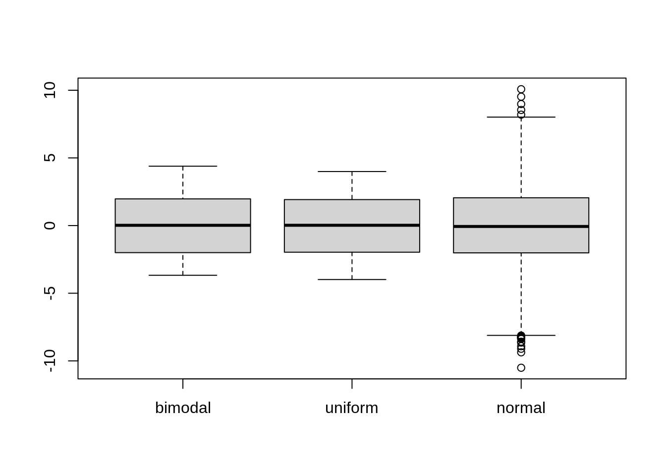
As we can see above, the boxplots are convenient for comparing summary statistics (such as range and quartiles). And violin plots shows the full distribution of the data better.
However, violin plots are less popular. Because of their unpopularity, their meaning can be harder to grasp for many readers not familiar with data visualization. In this case,plotting a series of stacked histograms or kernel density distributions can be used as alternatives.