Chapter 18 Illustrate commonly used graphs in R
Annai Wang and Jinyan Lyu
18.1 Numerical Variables with Abalone and Mtcars
In this section, we will explore some plots commonly used in ggplot2, such as scatterplot, heatmap to analyze datasets. Since plot is a very straightforward way for us to see relationships (if any) in the datasets, we would like to know more about visualization tools in R to apply them in our study/research so that we could have a better understanding of the story behind the datasets.
First, we will look at the most commonly used plots in R, the scatterplots. (The dataset we used here is abalone from ucidata package, and dataset mtcars)
##   sex length diameter height whole_weight shucked_weight viscera_weight
## 1   M  0.455    0.365  0.095       0.5140         0.2245         0.1010
## 2   M  0.350    0.265  0.090       0.2255         0.0995         0.0485
## 3   F  0.530    0.420  0.135       0.6770         0.2565         0.1415
## 4   M  0.440    0.365  0.125       0.5160         0.2155         0.1140
## 5   I  0.330    0.255  0.080       0.2050         0.0895         0.0395
## 6   I  0.425    0.300  0.095       0.3515         0.1410         0.0775
##   shell_weight rings
## 1        0.150    15
## 2        0.070     7
## 3        0.210     9
## 4        0.155    10
## 5        0.055     7
## 6 0.120 8## mpg cyl disp hp drat wt qsec vs am gear carb
## Mazda RX4 21.0 6 160 110 3.90 2.620 16.46 0 1 4 4
## Mazda RX4 Wag 21.0 6 160 110 3.90 2.875 17.02 0 1 4 4
## Datsun 710 22.8 4 108 93 3.85 2.320 18.61 1 1 4 1
## Hornet 4 Drive 21.4 6 258 110 3.08 3.215 19.44 1 0 3 1
## Hornet Sportabout 18.7 8 360 175 3.15 3.440 17.02 0 0 3 2
## Valiant 18.1 6 225 105 2.76 3.460 20.22 1 0 3 1Scatterplot
A scatterplot displays the relationship between 2 numeric variables. Each dot represents an observation. For example, we would like to see if there is any relationship between abalone’s length and height(both are numeric variables), we can then draw a scatterplot.
plot1 <- ggplot(abalone,aes(length,height))+
  geom_point(color="lightblue")+
  geom_smooth(color="yellow")+
  geom_rug()+
  ggtitle("scatterplot for length and weight")
plot1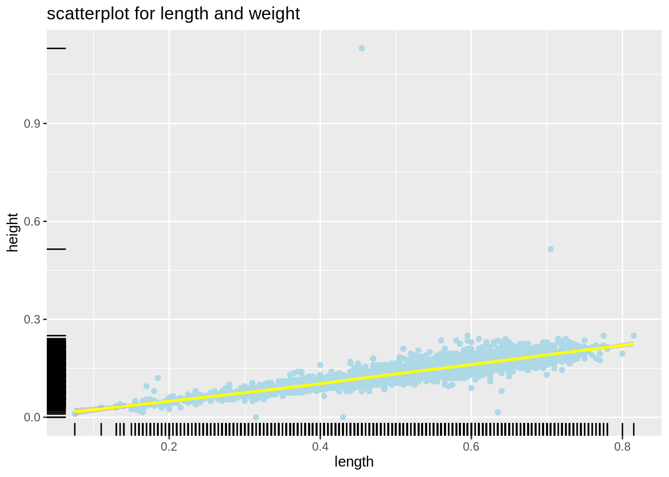
From the plot, we can observe that there is a strong positive relationship between length and height for abalone. Also, geom_rug() illustrate the distribution of dots. We observe that dots are clustered between 0-0.3 for height, and spread seperatly in length.
Then we would like to explore more in this relationship, we will separate those observations by sex here to see if sex plays a role between length and height.
plot2 <- ggplot(abalone,aes(length,height))+
  geom_point(aes(color=factor(sex)),alpha=0.3)+
  ggtitle("scatterplot for length and height based on sex")
plot2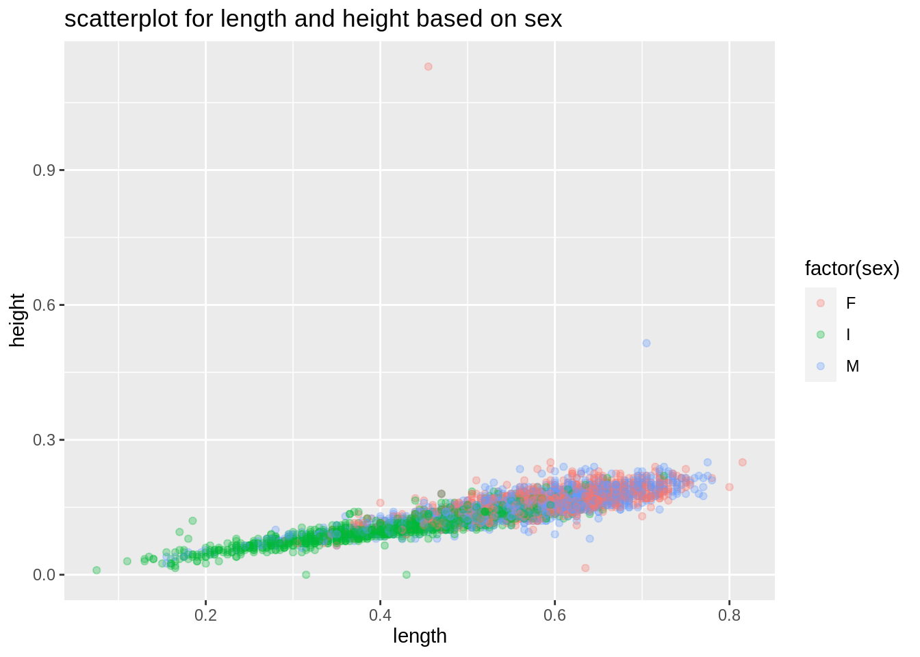
From the plot, we can see such relationships between length and height still holds, regardless of sex.
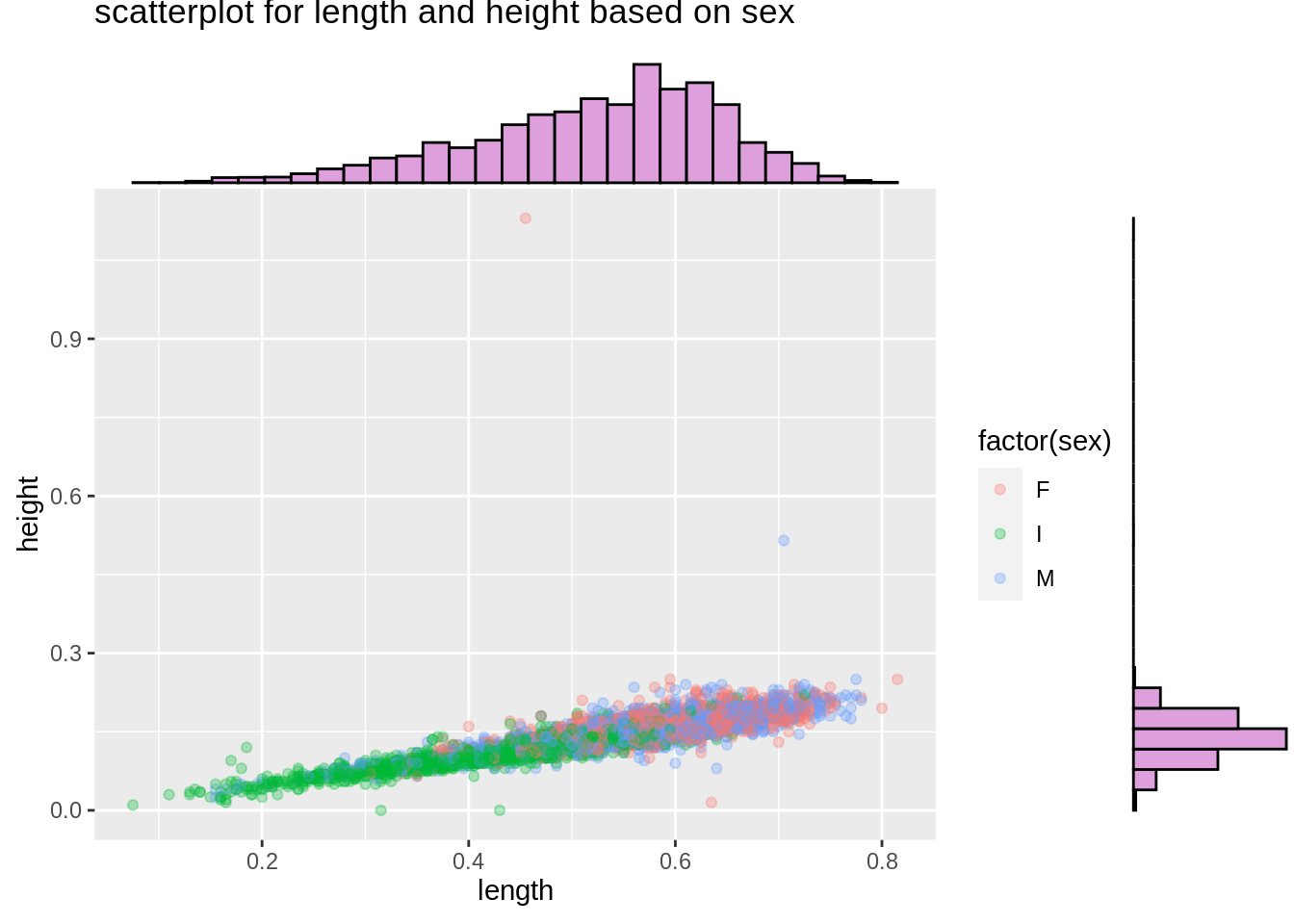
Scatterplot-Marginal Distribution
Then we would like to see the marginal distribition for length and height based on sex. We will use ggMarginal() to help us create marginal distribution. We could create histogram, density curve and boxplot to observe marginal distributions.
mt_plot <- ggplot(mtcars,aes(mpg,wt))+
  geom_point(aes(color=factor(vs)),alpha=0.5)+
  ggtitle("scatterplot for mpg and wt based on vs")
ggMarginal(mt_plot,type="density",fill="slateblue")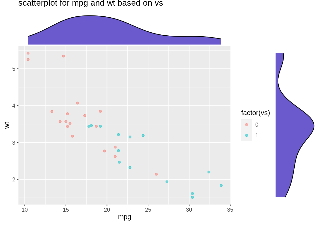
mt_plot1 <- ggplot(mtcars,aes(mpg,disp))+
  geom_point(alpha=0.3)+
  ggtitle("scatterplot for mpg and disp")
ggMarginal(mt_plot1,type="boxplot")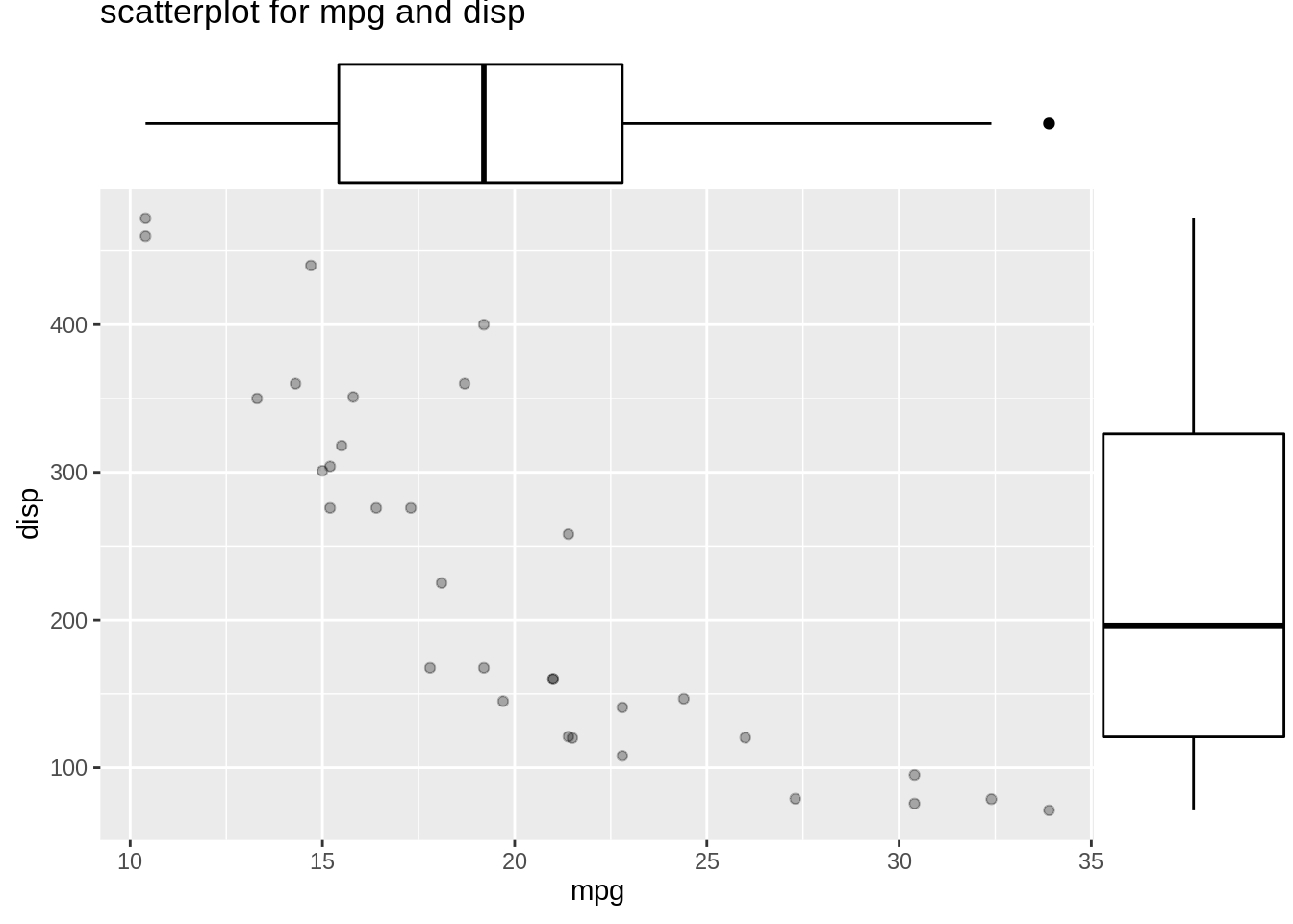
2D Density Curve
Now we can create a 2D density curves for numeric variables 1) shell_weight and diameter and 2) rings and whole_weight. The 2D density curve plot helps to avoid overlapping in dataset by dividing the scatterplot into several fragments, which helps us better understand scatterplots. (Fun fact: two plots look pretty like oyster/abalone)
plot3 <- ggplot(abalone,aes(diameter,shell_weight))+
  geom_point(aes(color="gray"))+
  geom_density2d_filled(alpha=0.5)+
  geom_density_2d(size = 0.5, colour = "black")+
  ggtitle("2D density curve for diameter and shell_weight")
plot3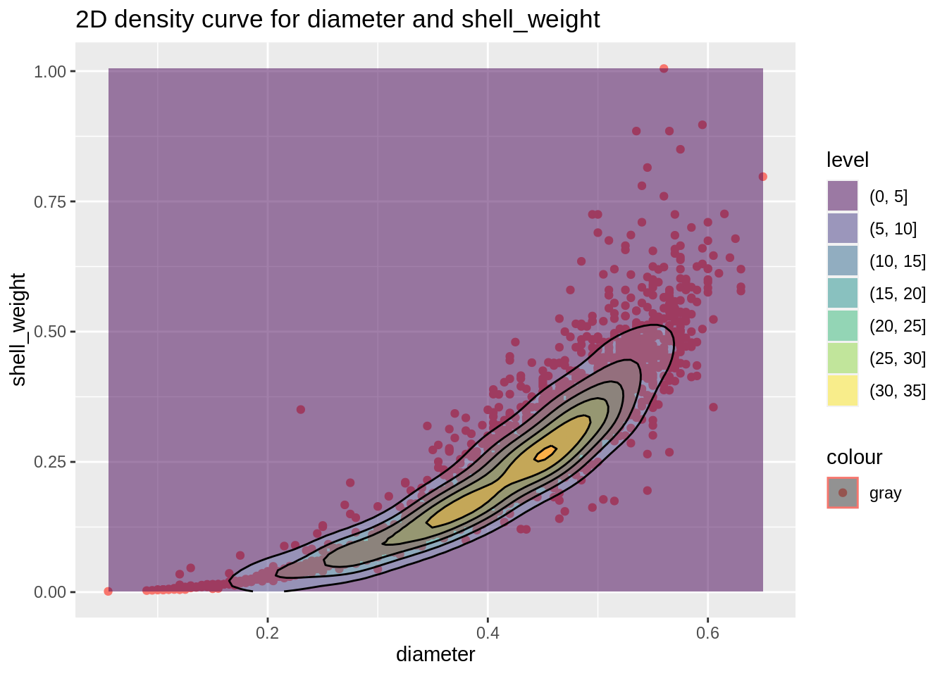
plot4 <- ggplot(abalone,aes(rings,whole_weight))+
  stat_density_2d(aes(fill = ..level..), geom = "polygon", colour="white")+
  ggtitle("2D density curve for rings and whole_weight")
plot4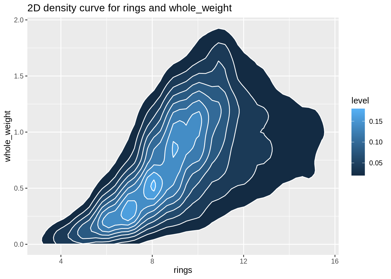
3D Scatter Plot
We use plotly to illustrate the 3D-plot.
Heatmap
Heatmap can be applied in both numerical and categorical variables, and it is a graphical representation of data where individual values contained in a matrix are represented as colors. Here are two examples.
new_data <- abalone %>%
  filter(height<=0.3)

plot5 <- ggplot(new_data, aes(height, length, fill= sex)) +
  geom_tile()+
  ggtitle("heatmap for height and length based on sex")
plot5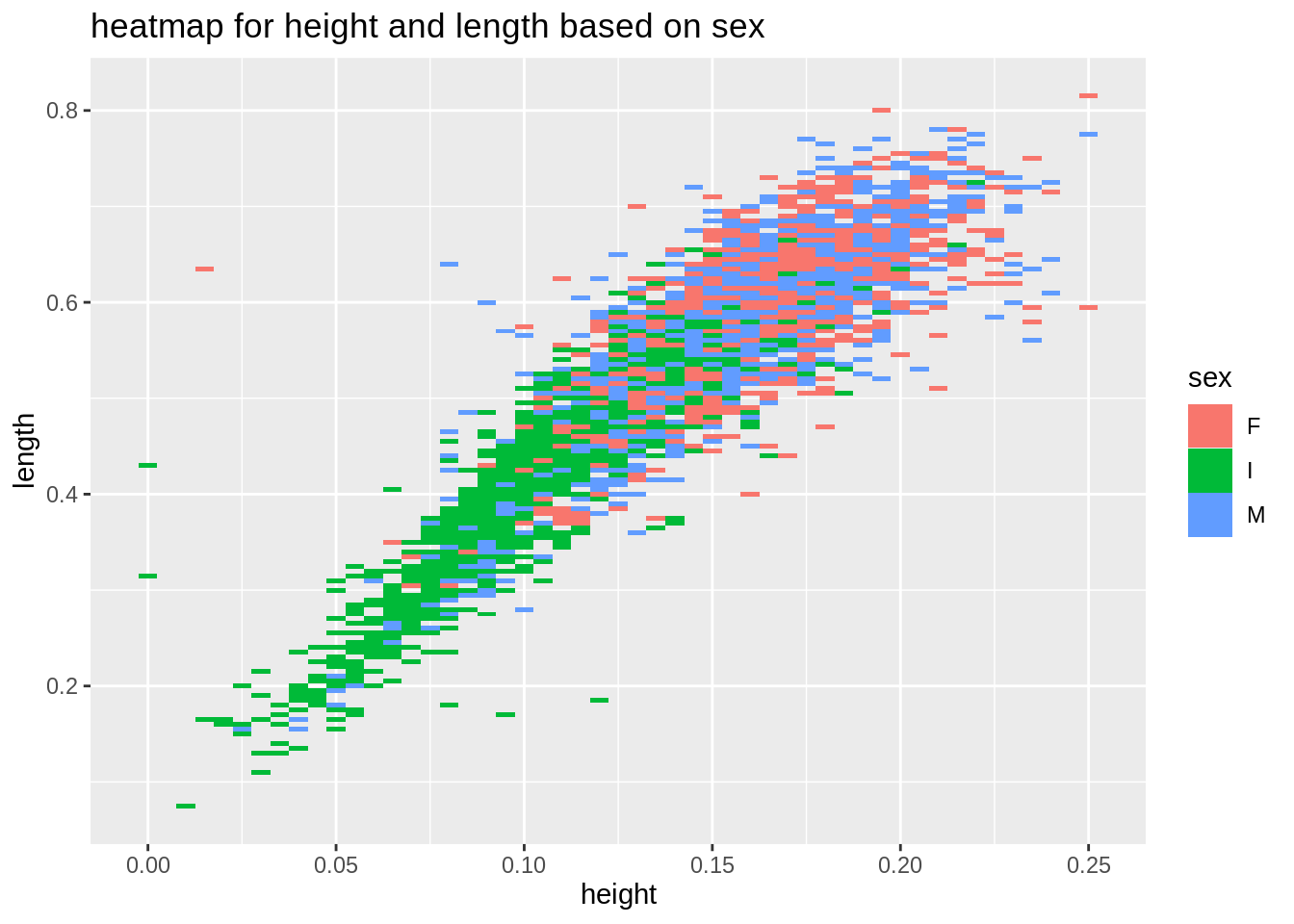
plot6 <- ggplot(abalone,aes(diameter,rings,fill=shell_weight))+
  geom_tile()+
  ggtitle("heatmap for diameter and rings based on shell_weight")
plot6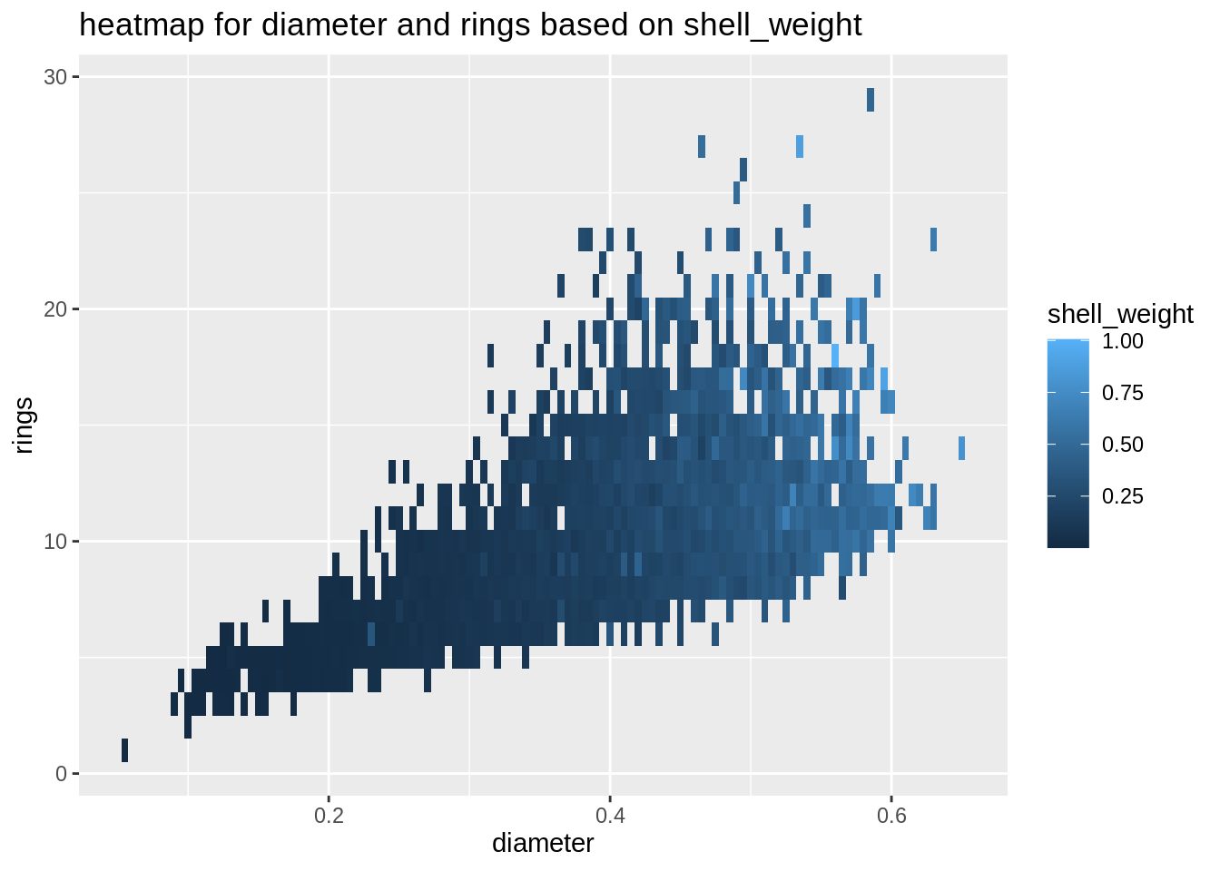
Bubble Chart
Bubble chart is also used for three numeric variables, and it is an extension of the scatterplot. Thus bubble chart is a visualization tool for us to see relationships among three numeric variables.
plot7 <- ggplot(abalone,aes(diameter,viscera_weight,size=length,color=sex))+
         geom_point(alpha=0.2)+
         scale_size(range=c(0.5,8))+
         ggtitle("bubble chart for diameter,viscera_weight and length based on sex")
plot7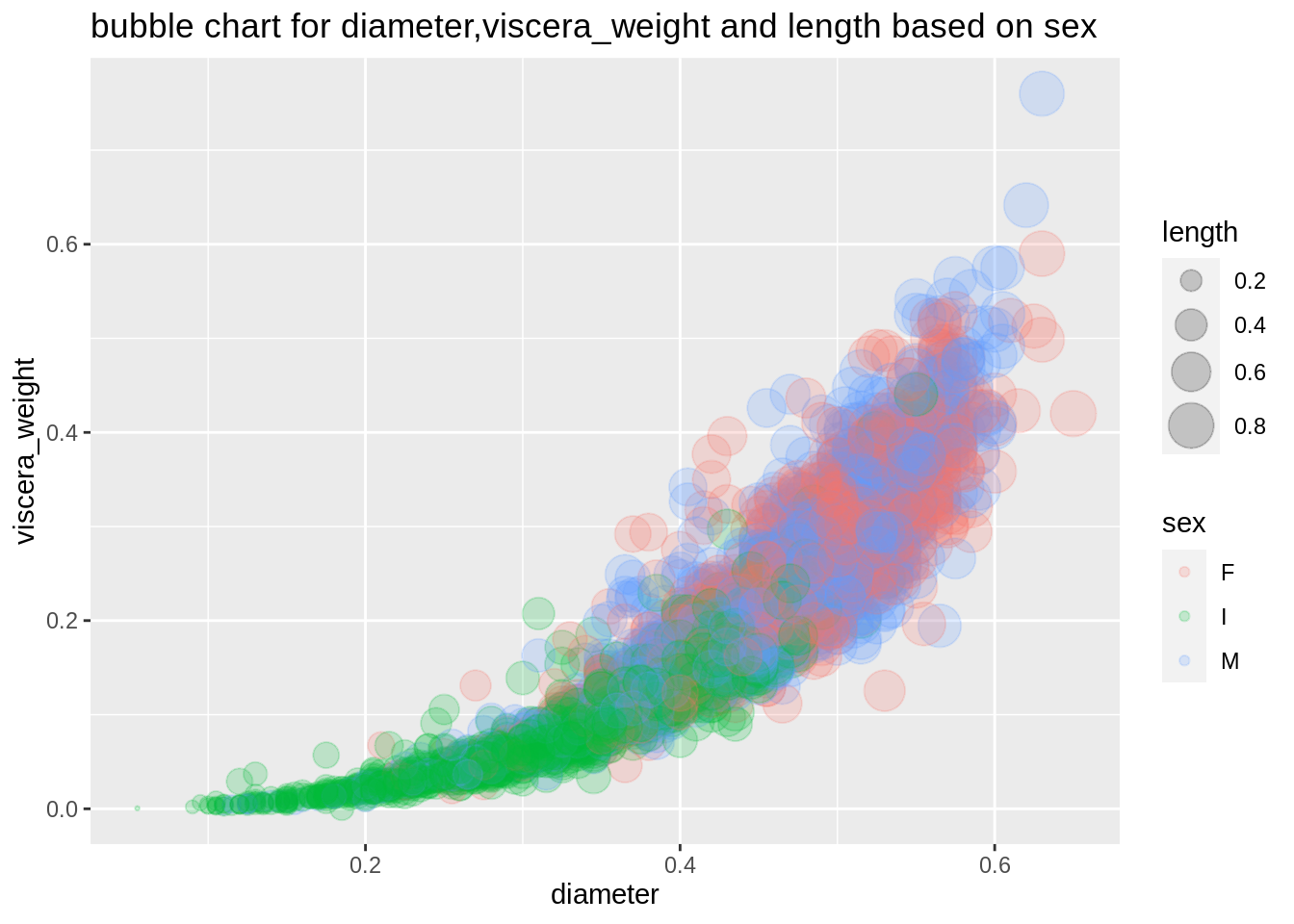
plot8 <- ggplot(mtcars,aes(wt,mpg))+
  geom_point(aes(size=qsec,color=as.factor(cyl)),alpha=0.3)+
  scale_color_manual(values = c("sky blue", "pink", "coral")) +
  scale_size(range=c(0.5,12))+
  ggtitle("bubble chart for wt,mpg and qsec based on cyl")
plot8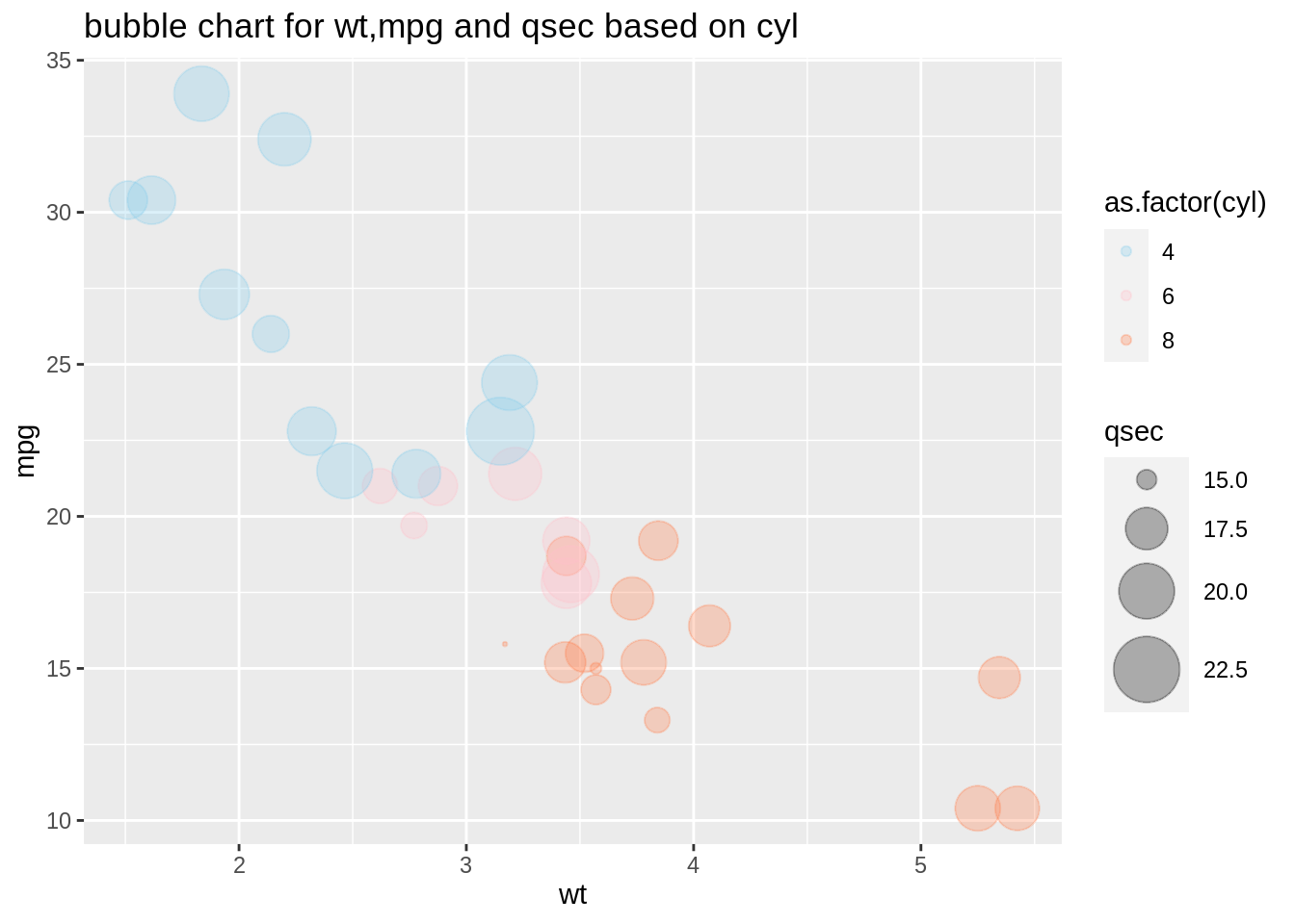
18.2 Categorical Graphs with Arthritis Data
Bubble Chart
We use Arthritis data set in the vcd package where data comes from a double-blind clinical trial investigating a new treatment for rheumatoid arthritis. A double-blind trial helps us reduce the potential effects of research bias when collecting data. We want to analyze whether the new treatment works, which affect on the variable improved.
To start our visualization analysis, we want to view our data first. We could find there are five variables: three of them are factors; age is a numerical variable; and ID is the number assigned to each patient. By tidyverse our data, we could create a new categorical variable ‘age group’. We cut the age into three groups: young, medium, and aged. 23 to 40 is young people; 41 to 57 is mid-age; and 58 to 74 is elder.
Then, we could summarize our new data set. And use the str function to double check the type of variables.
##   ID Treatment  Sex Age Improved
## 1 57   Treated Male  27     Some
## 2 46   Treated Male  29     None
## 3 77   Treated Male  30     None
## 4 17   Treated Male  32   Marked
## 5 36 Treated Male 46 Markedarthritis<-Arthritis%>%mutate(agegroup=cut(Arthritis$Age, 3, labels=c('Young', 'Medium', 'Aged')))
#cut by (22.9,40] (40,57] (57,74.1]
table(arthritis$agegroup)##
## Young Medium Aged
## 15 29 40## ID Treatment Sex Age Improved
## Min. : 1.00 Placebo:43 Female:59 Min. :23.00 None :42
## 1st Qu.:21.75 Treated:41 Male :25 1st Qu.:46.00 Some :14
## Median :42.50 Median :57.00 Marked:28
## Mean :42.50 Mean :53.36
## 3rd Qu.:63.25 3rd Qu.:63.00
## Max. :84.00 Max. :74.00
## agegroup
## Young :15
## Medium:29
## Aged :40
##
##
## ## 'data.frame': 84 obs. of 6 variables:
## $ ID : int 57 46 77 17 36 23 75 39 33 55 ...
## $ Treatment: Factor w/ 2 levels "Placebo","Treated": 2 2 2 2 2 2 2 2 2 2 ...
## $ Sex : Factor w/ 2 levels "Female","Male": 2 2 2 2 2 2 2 2 2 2 ...
## $ Age : int 27 29 30 32 46 58 59 59 63 63 ...
## $ Improved : Ord.factor w/ 3 levels "None"<"Some"<..: 2 1 1 3 3 3 1 3 1 1 ...
## $ agegroup : Factor w/ 3 levels "Young","Medium",..: 1 1 1 1 2 3 3 3 3 3 ...## ID Treatment Sex Age Improved agegroup
## 1 57 Treated Male 27 Some Young
## 2 46 Treated Male 29 None Young
## 3 77 Treated Male 30 None Young
## 4 17 Treated Male 32 Marked Young
## 5 36 Treated Male 46 Marked MediumBarplot
Bar graphs are used to show the relationship between numeric variables and categorical variables. This section also includes stacked bar charts and grouped bar charts, which show two levels of grouping. Here, we use bar charts directly to show the improved groups.
ggplot(arthritis, mapping = aes(Improved))+
  geom_bar(fill='red',alpha=0.3)+
  xlab('Improves')+
  labs(title = "Bar plot of improved")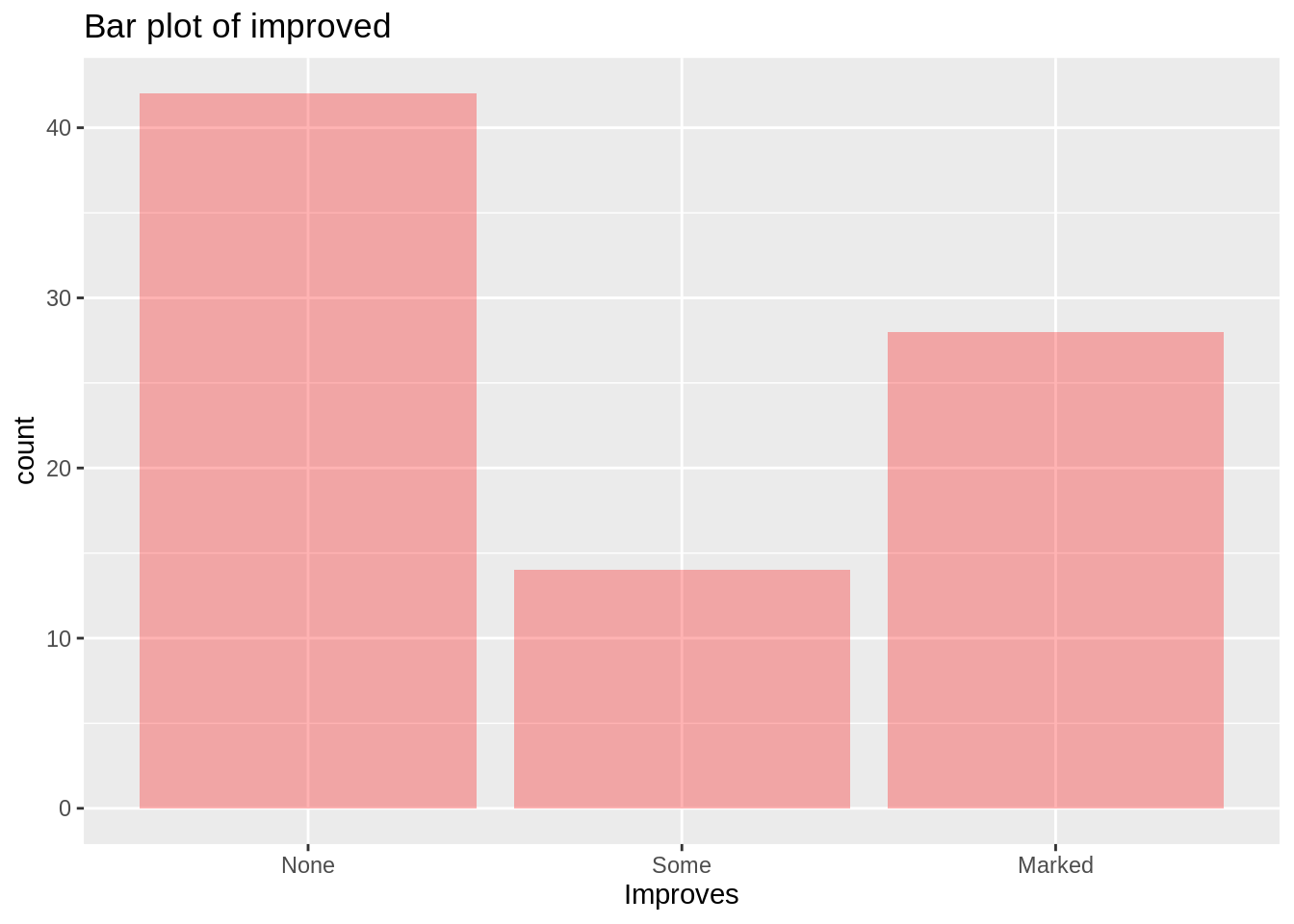
Or, we could use pipe method and geom_col function to help us count the frequency of three different age groups.
arthritis%>%group_by(agegroup)%>%
  mutate(count=n())%>%summarize(count =sum(count))%>%
  ggplot(aes(agegroup,count))+
  geom_col(color ="grey50", fill ="lightblue")+
  theme_grey(16)+
  labs(title = "Bar chart of three different agegroup")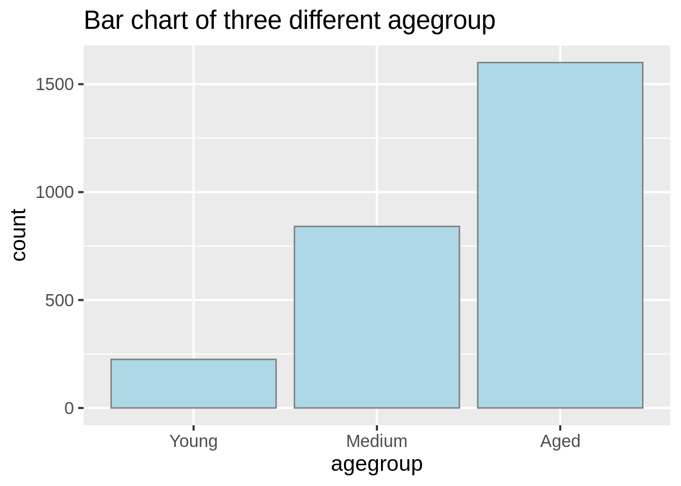
Stacked barplot and Group barplot
The grouped bar plot displays a numeric value for a set of entities split into groups and subgroups.
ggplot(arthritis, aes(fill=agegroup,y=Age,x=Improved)) +
    geom_bar(position="dodge", stat="identity")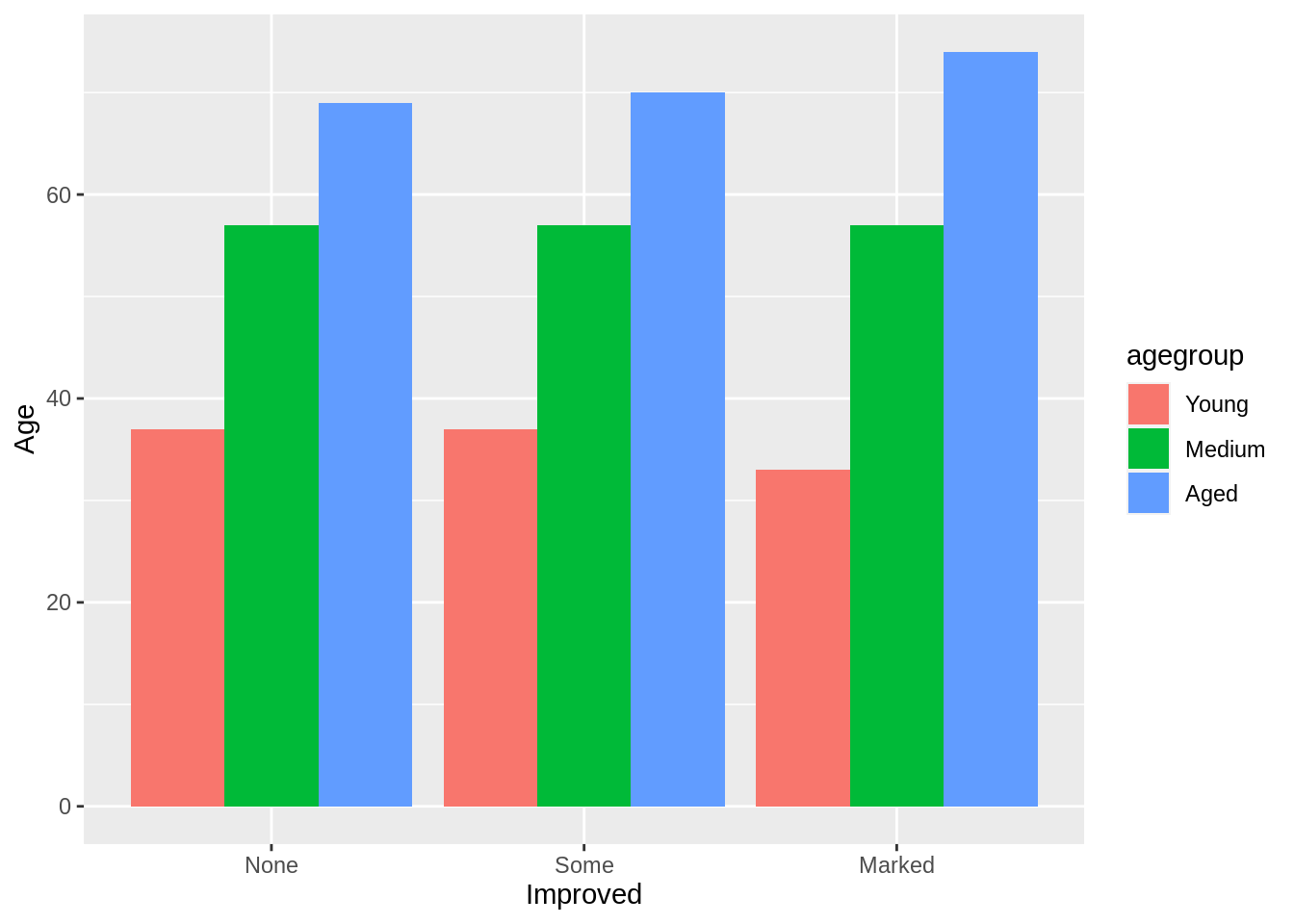
A stacked bar plot is very similar to the grouped bar plot above. The subgroups are just displayed on top of each other. By splitting the data, we could present the proportion of each age group in the improved bars.
a<-arthritis%>%group_by(Improved)%>% mutate(count=n())%>%mutate(prop = count/sum(count))
ggplot(a, aes(fill=agegroup,y=prop,x=Improved)) +
    geom_bar(position="stack", stat="identity")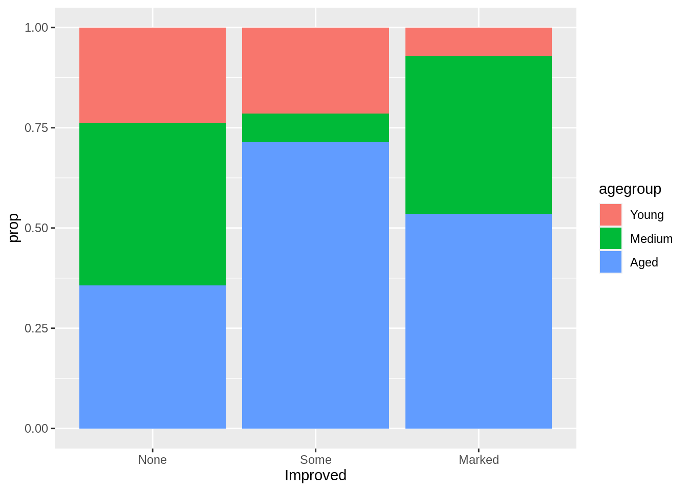
We could also display the stacked bar by adding a third variable.
ggplot(arthritis, mapping = aes(x=Improved, fill=Treatment))+
  geom_bar(alpha=0.5)+
  xlab('')+
  coord_flip()+
  labs(title = "")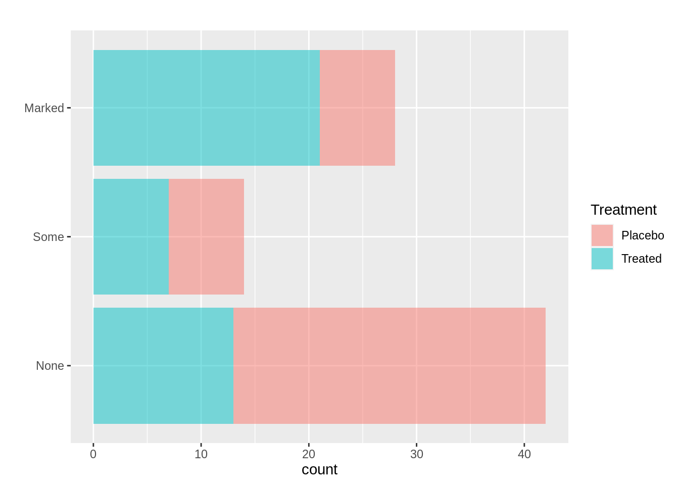
Also, we could facet the data by variable improved and then display the difference between treatment and placebo group.
ggplot(arthritis, mapping = aes(Treatment, fill=Improved))+
  geom_bar(alpha=0.7)+
  facet_wrap(~Improved)+
  xlab('')+
  labs(title = "")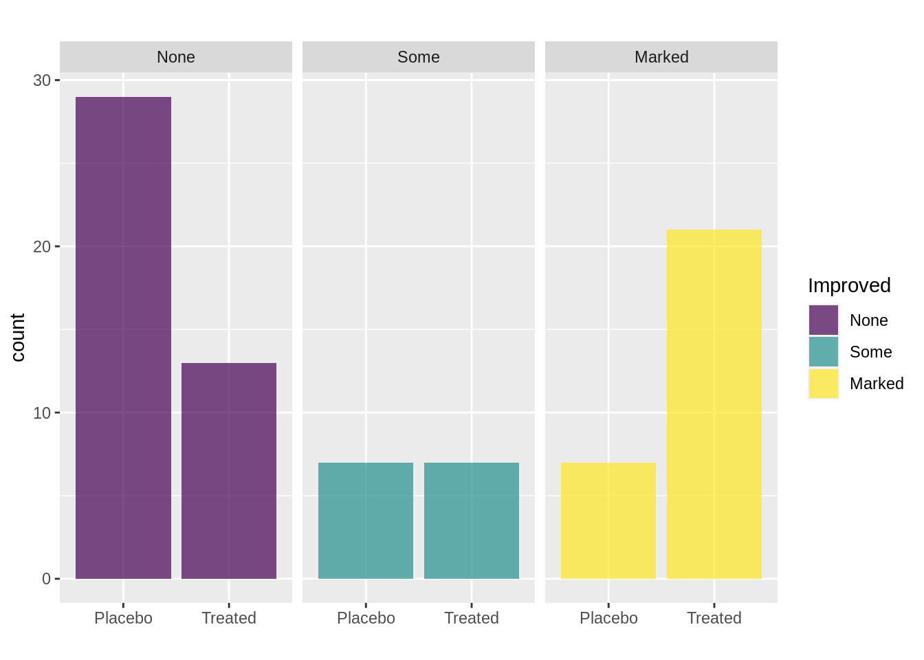
The bar plot compare different groups in bars with proportion or frequency. However, the bar plot, especially the stacked bar plot, does not show the difference in total amount of different groups. Hence, we could use the mosaic plot to fix this issue.
Mosaic plot
The mosaic plot allows us to examine the relationship between two or more categorical variables. We always want to split the dependent variable horizontally. And also, it important to add one variable each time.
colors = c("#E5F9E0", "#A3F7B5", "#40C9A2", "#2F9C95")
mosaic(Improved~Treatment,direction=c('v','h'),highlighting_fill =colors[1:3],arthritis)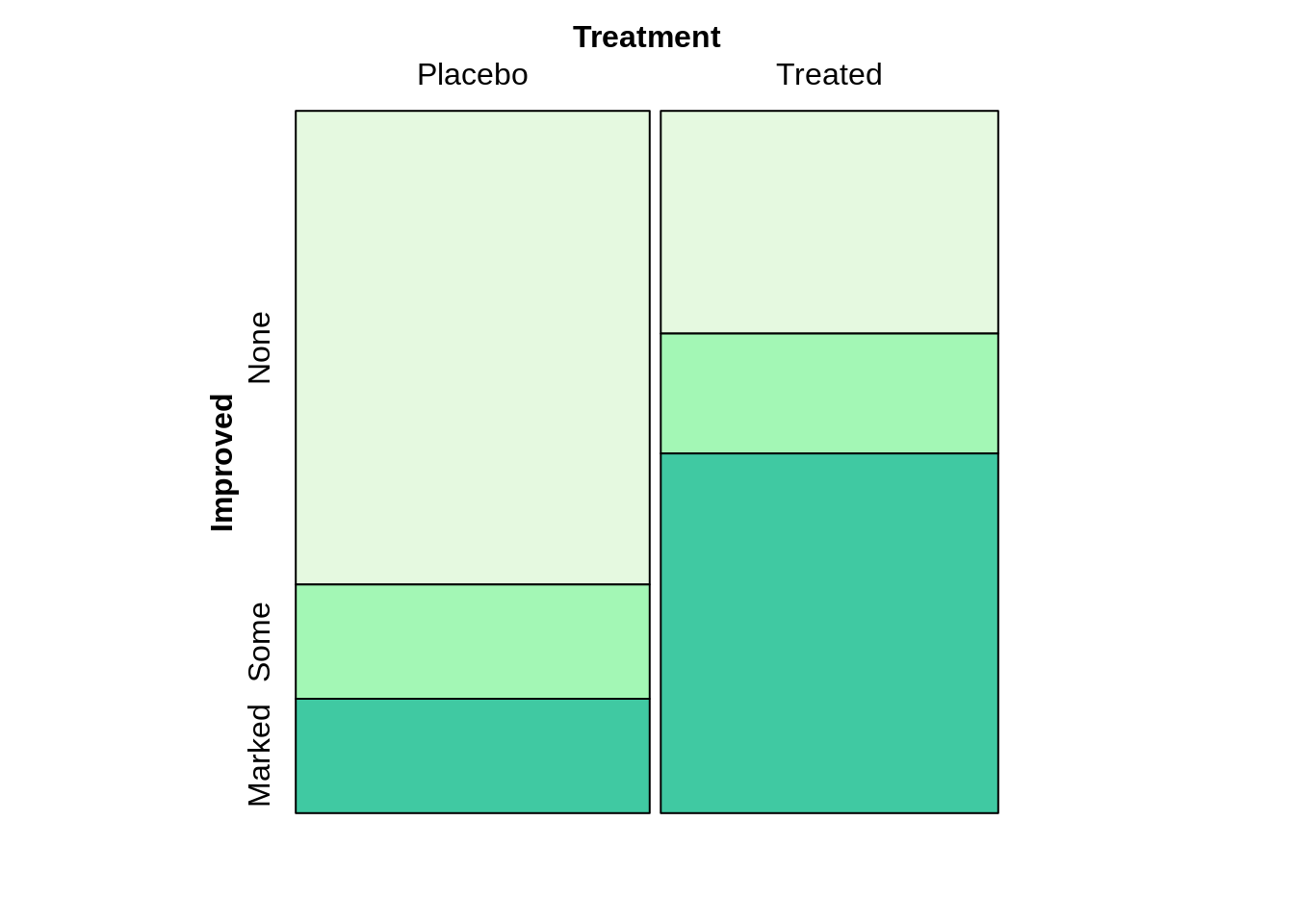
Improved~agegroup+Sex, we always treat Improved as dependent variable.
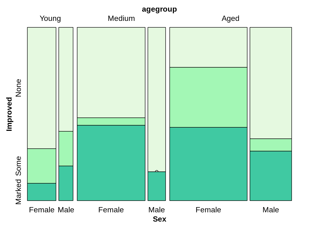
Treatment~agegroup+Improve+sex
mosaic(Improved~Treatment+agegroup+Sex, direction=c("v",'v','v','h'),highlighting_fill =colors[1:3],arthritis)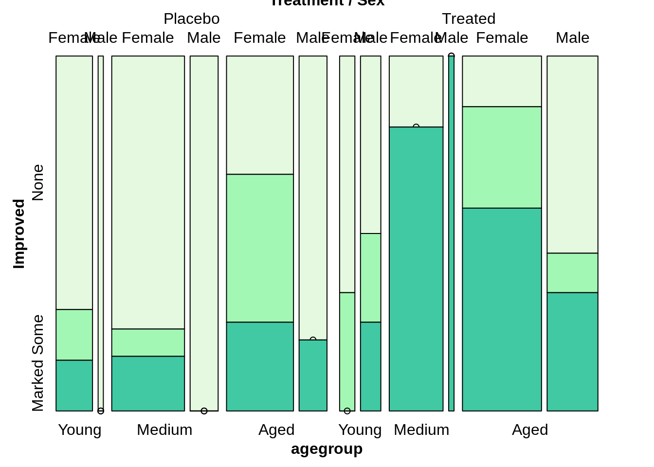
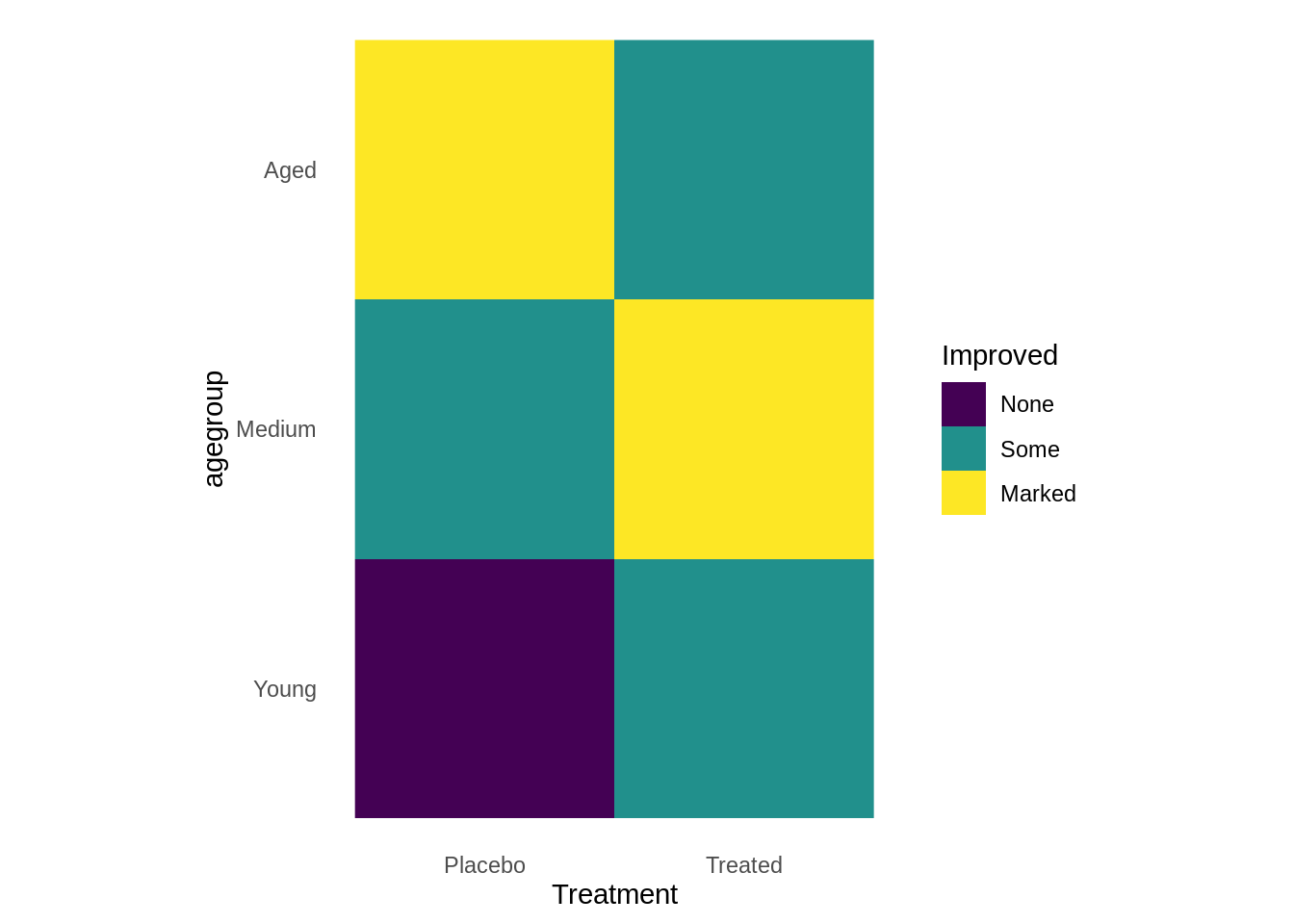
Heatmap
A heat map is a graphical representation of data, where each value contained in the matrix is represented by color. The first heatmap, we have two categorical data with filled in numerical variable age.
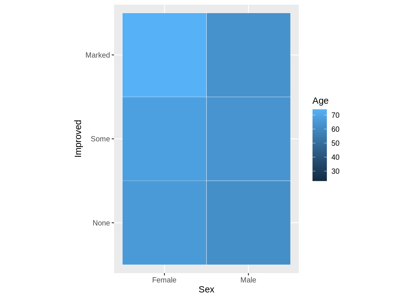
All three are categorical variables.
 ggplot(arthritis, aes(Treatment, agegroup, fill= Improved)) +
   geom_raster()+
   coord_fixed()+
   theme_classic()+
   theme(axis.line=element_blank(),axis.ticks=element_blank())