Chapter 11 Likert Scale: Definition, Examples, and Visualization
Jingyi An, Tingyi Lu
library(foreign) # use `foreign` to import SPSS files
library(likert)
library(ggthemes)
library(ggplot2)
library(dplyr)
library(tidyr)
library(tibble)
library(forcats)
library(HH)
11.1 What is Likert Scale?
Likert scale is a psychometric scale that is mostly applied for scaling responses in surveys / questionnaires. One can apply Likert-type questions to measure people’s feeling or perception on a variety of things like Satisfaction, Frequency, Agreement, likelihood, experience, and so on. Importantly, Likert scaling requires that distances between each response option are equal. This means, for instance, one cannot form a Likert-scale responses like the following: Strongly Disagree, Neutral, Somehow Agree, Strongly Agree.
Another important property of Likert scale is its bipolarity, which means it measures either the positive or negative side of a particular statement. Another way to explain this: one should observe symmetry and balance in a well-designed Likert scaling. The number of positive and negative responses should be symmetric about the “neutral” option.
A 3-level Likert scale that satisfies the properties could be:
- Disagree
- Neutral
- Agree.
A 5-level Likert scale could be:
- Strongly Disagree
- Somehow Disagree
- Neutral
- Somehow Agree
- Strongly Agree
Sometimes it’s not necessary to have a “neutral” option while one can still design a symmetric and balance Liker Scale. For instance, a 4-level Likert Scale could be:
- Very Unlikely
- Somehow Unlikely
- Somehow Likely
- Very Likely
11.2 Test Your Understanding of Likert Scale
Which of the following is a well-designed Likert scale? Why or why not?
A. Not Satisfied, Somehow Satisfied, Very Satisfied
B. Do more harm than good, Make no difference, Do more good than harm
C. No Impact, Moderate Impact, Huge Impact
11.3 Visualization of a Sample Likert Scale Data: Explore Climate Change in the American Mind
(You can find the data, codebook, and other documentation related to the data at: https://osf.io/jw79p/)
There are many ways to visualize Likert-scale data, and one of the most used would be bar charts. Among all kinds of bar charts, stacked bar charts, faceted bar charts, and diverging stacked bar charts are widely used based on one’s unique visualization needs. In this section, we would introduce how to visualize the sample dataset using these three kinds of bar charts, by ggplot2 and HH package, and what are some choices one would face when making visualization decisions.
11.3.1 Overview of the Data
Description on the dataset: The dataset contains 19 rounds of nationally representative surveys, measuring global warming beliefs and attitude, risk perceptions, policy preferences and information acquisition behaviors, of U.S. adults aged 18 and older, conducted by the Yale Program on Climate Change COmmunication (YPCCC) and the George Mason University Center for Climate Change Communication (Mason 4C) between 2008 and 2018. It contains 20,024 observations and 102 variables.
Variables to be observed: For the purpose of this module, we"ll be selecting 3 variables of Likert Scale: reg_CO2_pollutant, reg_utilities, fund_research.
reg_CO2_pollutant: How much do you support or oppose the following policies? Regulate carbon dioxide (the primary greenhouse gas) as a pollutant.
reg_utilities: How much do you support or oppose the following policies? Require electric utilities to produce at least 20% of their electricity from wind, solar, or other renewable energy sources, even if it costs the average household an extra $100 a year.
fund_research: How much do you support or oppose the following policies? Fund more research into renewable energy sources, such as solar and wind power.
The possible responses to each of the 3 questions are: Strongly oppose, Somewhat oppose, Somewhat agree, Strongly agree, and Refused.
Before visualize the data, one can create a summary table before doing the visualization to gain a better understanding of each question (can be either about frequency or proportion):
# subset the data to selected variables
CCAM_sub = CCAM[, c("reg_CO2_pollutant", "reg_utilities", "fund_research")]

# Two ways to create a summary table
# Use `table()`
# frequency / count
summary_q <- rbind(table(CCAM_sub$reg_CO2_pollutant),
                   table(CCAM_sub$reg_utilities),
                   table(CCAM_sub$fund_research))
rownames(summary_q) <- c("Require producing\n20% of electricity\nfrom clean energy",
                         "Regulate CO2\nas a pollutant",
                         "Fund more research\ninto renewable energy")
summary_q
## Refused
## Require producing\n20% of electricity\nfrom clean energy 540
## Regulate CO2\nas a pollutant 486
## Fund more research\ninto renewable energy 542
## Strongly oppose
## Require producing\n20% of electricity\nfrom clean energy 2147
## Regulate CO2\nas a pollutant 2676
## Fund more research\ninto renewable energy 1371
## Somewhat oppose
## Require producing\n20% of electricity\nfrom clean energy 3065
## Regulate CO2\nas a pollutant 3479
## Fund more research\ninto renewable energy 2209
## Somewhat support
## Require producing\n20% of electricity\nfrom clean energy 9605
## Regulate CO2\nas a pollutant 6706
## Fund more research\ninto renewable energy 9198
## Strongly support
## Require producing\n20% of electricity\nfrom clean energy 6049
## Regulate CO2\nas a pollutant 4043
## Fund more research\ninto renewable energy 9096# proportion
summary_q_prop <- rbind(prop.table(table(CCAM_sub$reg_CO2_pollutant)),
prop.table(table(CCAM_sub$reg_utilities)),
prop.table(table(CCAM_sub$fund_research)))
rownames(summary_q_prop) <- c("Regulate Carbon Dioxide as a pollutant",
"Produce 20% of electricity from clean energy",
"Fund more research into renewable energy")
summary_q_prop## Refused Strongly oppose
## Regulate Carbon Dioxide as a pollutant 0.02522657 0.10029898
## Produce 20% of electricity from clean energy 0.02794710 0.15388154
## Fund more research into renewable energy 0.02417916 0.06116167
## Somewhat oppose Somewhat support
## Regulate Carbon Dioxide as a pollutant 0.14318415 0.4487060
## Produce 20% of electricity from clean energy 0.20005750 0.3856239
## Fund more research into renewable energy 0.09854568 0.4103319
## Strongly support
## Regulate Carbon Dioxide as a pollutant 0.2825843
## Produce 20% of electricity from clean energy 0.2324899
## Fund more research into renewable energy 0.405781611.3.2 Stacked Bar Chart
ggplot2 has done a good job for basic visualization needs like stacked bar charts. In this subsection, we would visualize using ggplot2 for stacked bar charts with 2 choices: with and without the “refused/neutral” option.
# prepare data for plotting
CCAM_tidy <- CCAM_sub %>%
  pivot_longer(c(1:3), names_to = "Question", values_to = "Response")

CCAM_tidy <- CCAM_tidy %>% drop_na(Response)

CCAM_summary <- CCAM_tidy %>%
  group_by(Question, Response) %>%
  summarize(Freq = n()) %>%
  mutate(prop = Freq/sum(Freq))

CCAM_summary$Response <- factor(CCAM_summary$Response,
                                levels = c("Strongly oppose",
                                           "Somewhat oppose",
                                           "Refused",
                                           "Somewhat support",
                                           "Strongly support"))
# create a theme for plotting likert data
likert_theme <- theme_gray() +
theme(text = element_text(size = 11),
plot.title = element_text(size = 13, face = "bold",
margin = margin(10, 0, 10, 0)),
plot.margin = unit(c(2.4,0,2.4,.4), "cm"),
plot.subtitle = element_text(face = "italic"),
legend.title = element_blank(),
legend.key.size = unit(.7, "line"),
legend.background = element_rect(fill = "grey90"),
panel.grid = element_blank(),
axis.text.x = element_blank(),
axis.ticks = element_blank(),
axis.title = element_blank(),
panel.background = element_blank())
# create x labels for questions
q_lab <- c("reg_utilities" = "Require producing\n20% of electricity\nfrom clean energy",
"reg_CO2_pollutant" = "Regulate CO2\nas a pollutant",
"fund_research" = "Fund more research\ninto renewable energy")
# ggplot2 stacked bar chart with refused
ggplot(data = CCAM_summary, aes(Question, prop, fill = fct_rev(Response))) +
likert_theme +
theme(legend.position = "bottom") +
geom_col(position = "fill") +
geom_text(aes(Question, prop, label = as.integer(100*prop)), # add percentage
position = position_stack(vjust = .5),
fontface = "bold") + # center the label
scale_fill_brewer(type = "div", palette = "RdBu") + # use a diverging fill
coord_flip() +
scale_x_discrete(labels = q_lab) +
ggtitle("U.S. Adults Opinions on Climate Change-Relevant Regulations",
subtitle = '% (Attitude) on "The government should __"')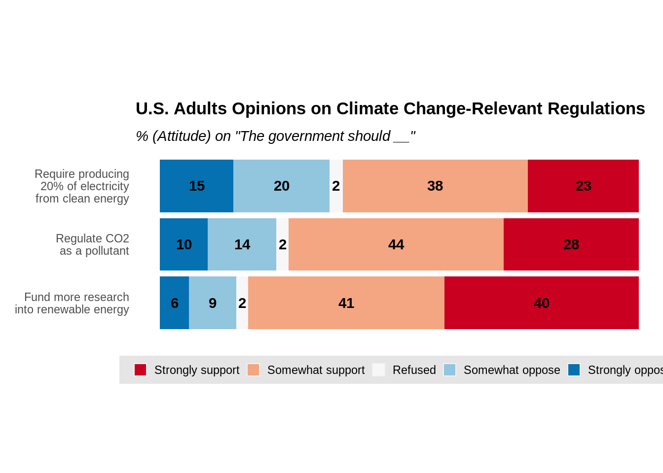
# ggplot2 stacked bar chart with refused removed

CCAM_rmrf <- CCAM_tidy[CCAM_tidy$Response!="Refused",]
CCAM_rmrf_summary <- CCAM_rmrf %>%
  group_by(Question, Response) %>%
  summarize(Freq = n()) %>%
  mutate(prop = Freq/sum(Freq))

ggplot(data = CCAM_rmrf_summary, aes(Question, prop, fill = fct_rev(Response))) +
  likert_theme +
  theme(legend.position = "bottom") +
  geom_col(position = "fill") +
  geom_text(aes(Question, prop, label = as.integer(100*prop)), # add percentage
            position = position_stack(vjust = .5),
            fontface = "bold") + # center the label
  scale_fill_brewer(type = "div", palette = "RdBu") + # use a diverging fill
  scale_x_discrete(labels = q_lab) +
  coord_flip() +
  ggtitle("U.S. Adults Opinions on Climate Change-Relevant Regulations",
          subtitle = '% (Attitude) on "The government should __", with "Refused" removed')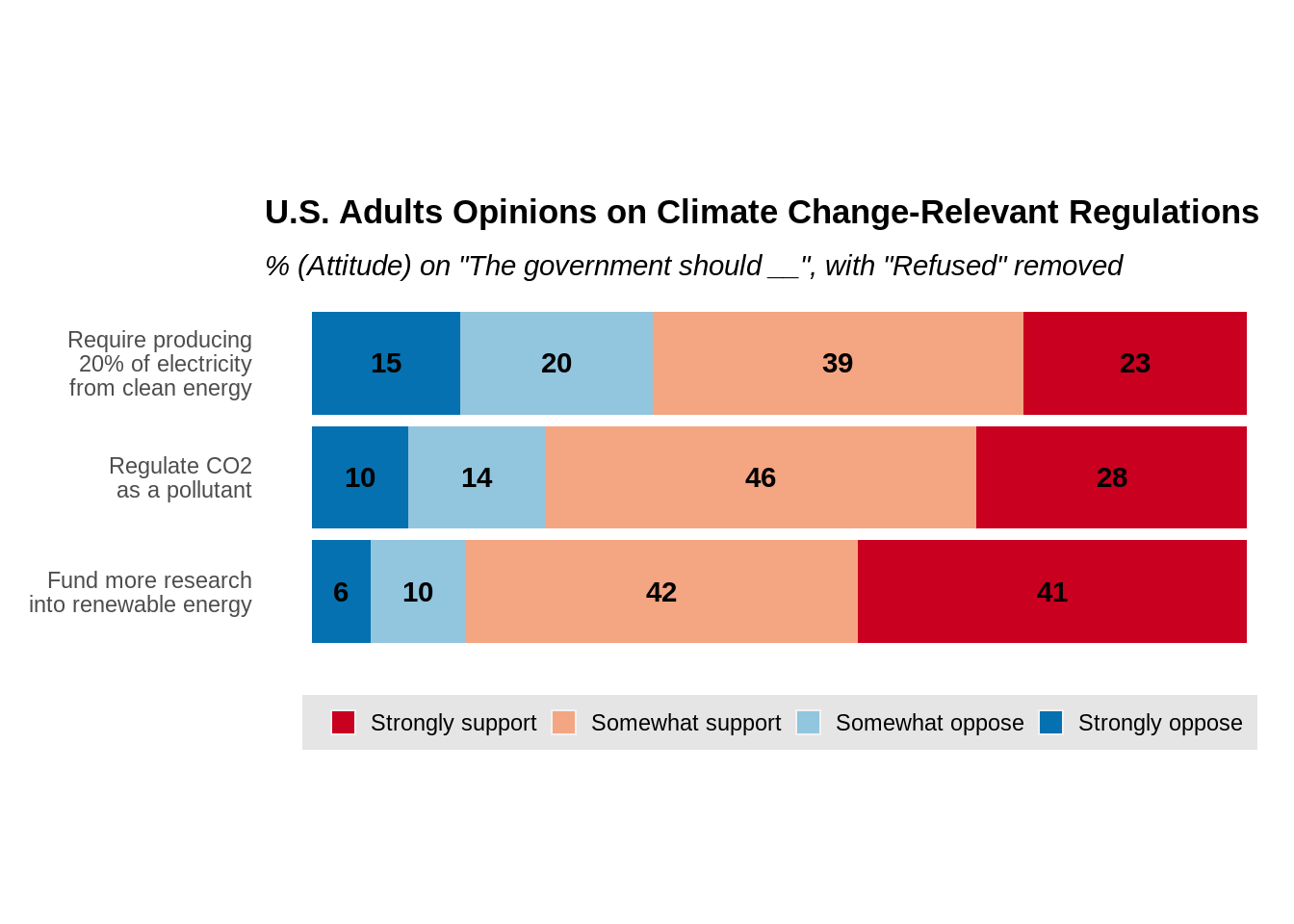
From the above plots, one may observe that, though stacked bar charts are easily created, the major disadvantage is that the comparison of non-polar responses are not straightforward. The comparison of response “Strongly Disagree” and “Strongly Agree” are obvious between questions but not for “Somewhat Disagree” and “Somewhat Agree”. Thus, it is usually practical to include percentage labels for each bar to overcome this problem, like what’s done in both charts.
11.3.3 Faceted Bar Charts
A faceted stacked bar chart would create a bar chart that facets on each response option. This makes it easier to compare each response option across different questions than a simple stacked bar chart. We will still use ggplot2 to create a faceted bar chart.
ggplot(data = CCAM_summary) +
  likert_theme +
  theme(strip.background  = element_blank(),
        axis.title = element_blank(),
        panel.background = element_blank(),
        legend.position = "none") +
  geom_col(aes(Question, prop, fill = Response)) +
  geom_text(aes(Question, prop, label = as.integer(100*prop)), # add percentage
            fontface = "bold",
            position = position_stack(vjust = 0.5)) + # center the label
  coord_flip() +
  facet_wrap(.~Response, nrow = 1) +
  scale_x_discrete(labels = q_lab) +
  scale_fill_brewer(type = "div") +
  ggtitle("U.S. Adults Opinions on Climate Change-Relevant Regulations",
          subtitle = '% (Attitude) on "The government should __"')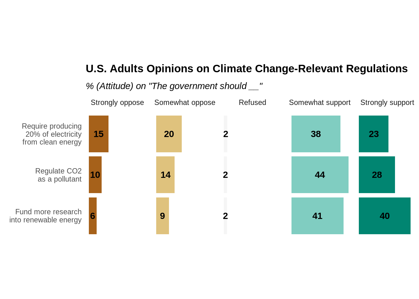
One can also have the “Refused / Neutral” response option removed if including the choice doesn’t have too much meaning. In our case, the percentage of “Refused” is relatively little and is the same for each question, so we feel comfortable to remove the “Refused” result for all questions. Below is the graph without the “Refused”.
ggplot(data = CCAM_rmrf_summary) +
  likert_theme +
  theme(strip.background  = element_blank(),
        axis.title = element_blank(),
        panel.background = element_blank(),
        legend.position = "none") +
  geom_col(aes(Question, prop, fill = Response)) +
  geom_text(aes(Question, prop, label = as.integer(100*prop)), # add percentage
            position = position_stack(vjust = .5),
            fontface = "bold") + # center the label
  scale_fill_brewer(type = "div") + # use a diverging fill
  scale_x_discrete(labels = q_lab) +
  facet_wrap(.~Response, nrow = 1) +
  coord_flip() +
  ggtitle("U.S. Adults Opinions on Climate Change-Relevant Regulations",
          subtitle = '% (Attitude) on "The government should __", with "Refused" removed')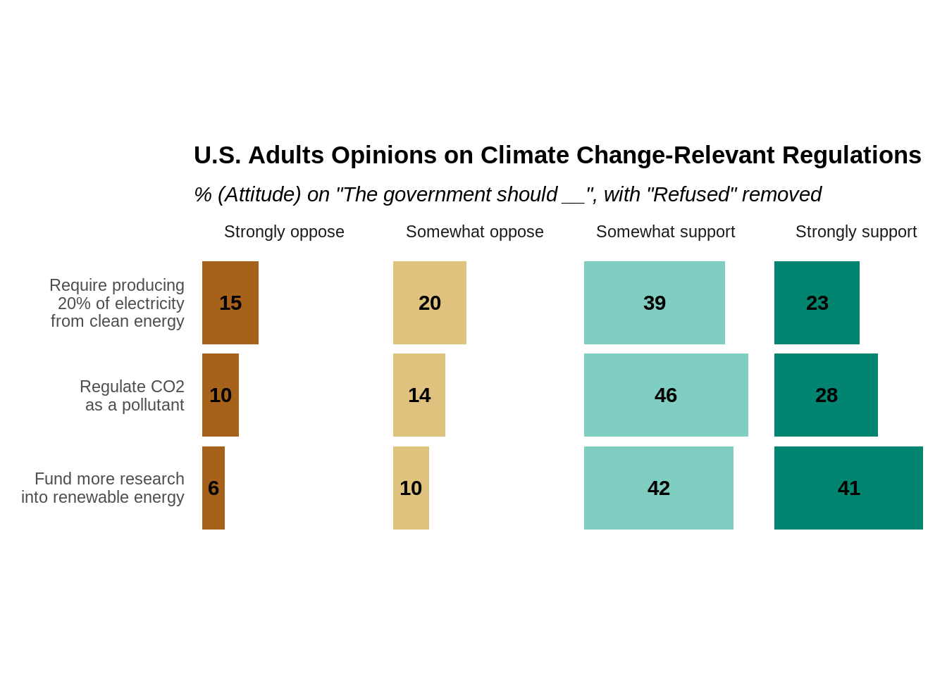
11.3.4 Diverging Stacked Bar Chart
Last but not least, one may visualize Likert scale by a diverged stacked bar chart, which has its positive and negative options heading on different directions with neutral option at the center. This type of charts make it more straightforward to compare the overall positive and negative opinions on a certain matter.
An easy way to create a diverged stacked bar chart is the likert function of the HH package.
summary_freq <- as.data.frame(summary_q)  # likert function uses a summary table
summary_freq <- rownames_to_column(summary_freq, "Question")
summary_freq <- relocate(summary_freq, "Refused", .after = "Somewhat oppose")


# Plot diverging stacked bar chart centered at "Refused"
likert(Question ~., data = summary_freq, as.percent = "noRightAxis",
       main = "U.S. Adults Opinions on Climate Change-Relevant Regulations",
       ReferenceZero = 3,
ylab = NULL) 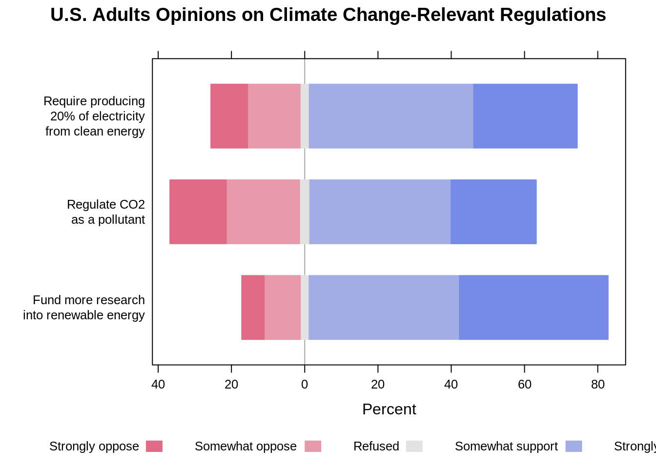
Similarly, one can have “Refused” removed if it doesn’t have too much meaning to the visualization.
summary_freq <- as.data.frame(summary_q)  # likert function uses a summary table
summary_freq <- rownames_to_column(summary_freq, "Question")
summary_freq <- relocate(summary_freq, "Refused", .after = "Somewhat oppose")

summary_freq_rmrf <- summary_freq[c(-4)]

# Plot diverging stacked bar chart with "Refused" removed
likert(Question ~., data = summary_freq_rmrf, as.percent = "noRightAxis",
       main = "U.S. Adults Opinions on Climate Change-Relevant Regulations",
ylab = NULL) 
The likert function also allows to order from the most positive by adjusting one of its variables.
# setting the positive.order to TRUE
likert(Question ~., data = summary_freq_rmrf, as.percent = "noRightAxis",
       main = "U.S. Adults Opinions on Climate Change-Relevant Regulations",
ylab = NULL, positive.order = TRUE) 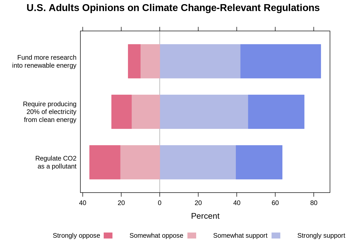
Again, the diverging stacked bar chart makes it really easy to compare the positive against the negative on each question and compare the positive and negative across different questions. The cons, however, is that it doesn’t do a good job in showing the comparison of each individual response option. For instance, it is not straightforward to tell whether more people strongly support the government to regulate CO2 or to require producing at least 20% of electricity from clean energy.
11.4 Arguments on each type of charts
It’s not surprised that people may find 100% stacked bar charts are inferior in visualizing Likert scale than the other two since it doesn’t work quite well in either comparing the positive against the negative or examining each response option. Perhaps it is only good when one has only 2 groups of results to compare against each other, and this way 100% stacked bar chart would be nice comparing differences between the two.
- When one wants to look at the differences between overall positive and negative results, diverging stacked bar charts would stand out, and they usually work better when the neutral/refused category doesn’t stand in the middle. Thus, it is also practical to either remove the neutral/refused category or put it aside.
- When one wants to take a closer look on each individual result, faceted bar charts definitely work the best.
Some of the articles we think are useful to closely examine the advantages and disadvantages of each type of chart we mentioned in this short tutorial:
A blog by Stephen Few on three types of charts: https://www.perceptualedge.com/blog/?p=2239
The case against diverging stacked bars: https://blog.datawrapper.de/divergingbars/
11.5 Reference
Yale Program on Climate Change Communication (YPCCC) & George Mason University Center for Climate Change Communication (Mason 4C). (2020). Climate Change in the American Mind: National survey data on public opinion (2008-2018) [Data file and codebook]. doi: 10.17605/OSF.IO/JW79PBallew, M. T., Leiserowitz, A.,
Roser-Renouf, C., Rosenthal, S. A., Kotcher, J. E., Marlon, J. R., Lyon, E., Goldberg, M. H., & Maibach, E. W. (2019). Climate Change in the American Mind: Data, tools, and trends. Environment: Science and Policy for Sustainable Development, 61(3), 4-18. doi: 10.1080/00139157.2019.1589300