Chapter 42 Beautiful visualization with ggplot2
Yuanghang Chen and Jiayin Lin
library(ggplot2)
library(extrafont)
library(grid)
library(gridExtra)
library(ggthemes)
library(reshape2)
如何在R中制作精美绘图:ggplot2速查表
Original Post Link: http://zevross.com/blog/2014/08/04/beautiful-plotting-in-r-a-ggplot2-cheatsheet-3/#quicksetup-the-dataset
即使是最有经验的R用户者在构建精美图形时也需要帮助。ggplot2库是用于在R中创建图形的了不起的工具,即使是近乎每天使用,我们也仍需要参考备忘录。到目前为止,我们已将这些关键东西保存在本地PDF中。但是为了我们自己(也希望是您自己)的利益,我们决定发布最有用的一些代码。
*最后更新于2016年1月20日(ggplot2 2.0将标题文本的vjust替换为margin)
您可能对其他与ggplot2相关的帖子也感兴趣:
R中ggplot2图形的幕后构造
使用ggplot2包在R中进行映射
R的新数据处理工作流程:dplyr,magrittr,tidyr,ggplot2
目录
- 快速设置:数据集
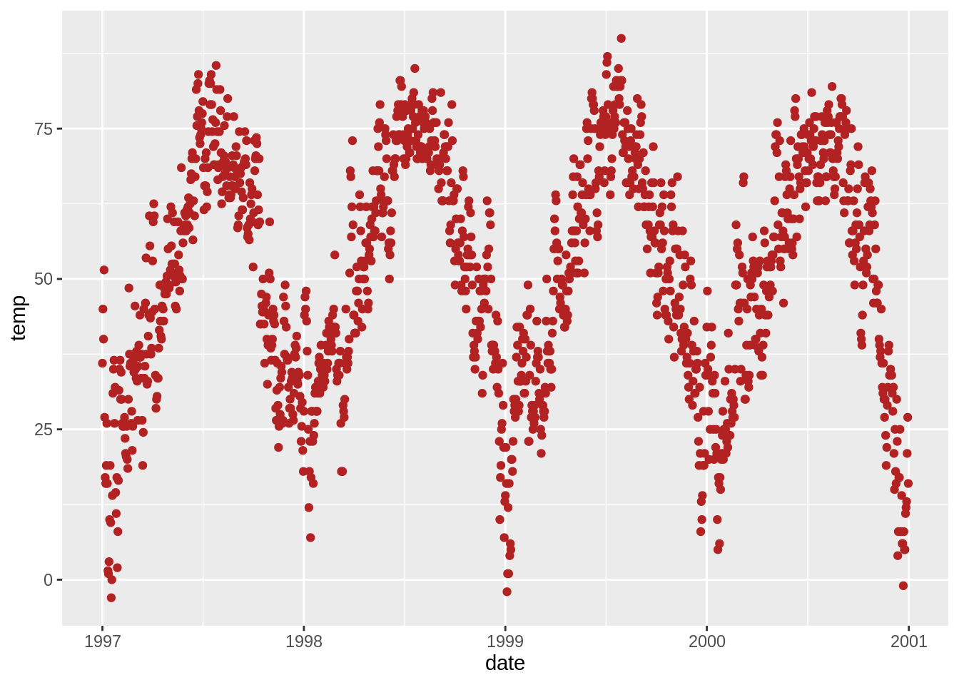
- ggplot2中的默认图
- 标题的使用
- 坐标轴的使用
- 图例的使用
- 背景颜色的使用
- 边距的使用
- 多面板图的使用
- 主题的使用
- 颜色的使用
- 注解的使用
- 坐标的使用
- 不同图像种类的使用
- 柔化的使用
- 交互式线上图表(比你想象的简单得多)
快速设置:数据集
我们使用的数据来源于国家发病率及死亡率空气污染研究(NMMAPS)。 为了使图形易于管理,我们将数据限制于1997-2000年的芝加哥数据。 有关此数据集的更多详细信息,请参阅Roger Peng的著作R在环境流行病学中的统计方法
您也可以在此处下载本文中使用的数据。 点击下载附件 chicago-nmmaps.csv
# nmmaps<-read.csv("chicago-nmmaps.csv", as.is=T)
nmmaps <- readr::read_csv("http://zevross.com/blog/wp-content/uploads/2014/08/chicago-nmmaps.csv")
nmmaps$date<-as.Date(nmmaps$date)
nmmaps<-nmmaps[nmmaps$date>as.Date("1996-12-31"),]
nmmaps$year<-substring(nmmaps$date,1,4)
head(nmmaps)
## [90m# A tibble: 6 x 10[39m
## city date death temp dewpoint pm10 o3 time season year
## [3m[90m<chr>[39m[23m [3m[90m<date>[39m[23m [3m[90m<dbl>[39m[23m [3m[90m<dbl>[39m[23m [3m[90m<dbl>[39m[23m [3m[90m<dbl>[39m[23m [3m[90m<dbl>[39m[23m [3m[90m<dbl>[39m[23m [3m[90m<chr>[39m[23m [3m[90m<chr>[39m[23m
## [90m1[39m chic 1997-01-01 137 36 37.5 13.1 5.66 [4m3[24m654 winter 1997
## [90m2[39m chic 1997-01-02 123 45 47.2 41.9 5.53 [4m3[24m655 winter 1997
## [90m3[39m chic 1997-01-03 127 40 38 27.0 6.29 [4m3[24m656 winter 1997
## [90m4[39m chic 1997-01-04 146 51.5 45.5 25.1 7.54 [4m3[24m657 winter 1997
## [90m5[39m chic 1997-01-05 102 27 11.2 15.3 20.8 [4m3[24m658 winter 1997
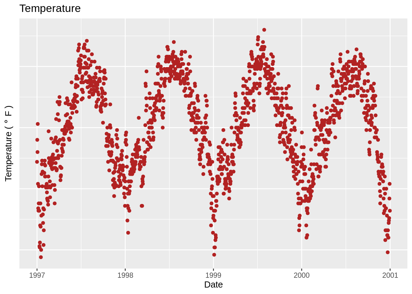
## [90m6[39m chic 1997-01-06 127 17 5.75 9.36 14.9 [4m3[24m659 winter 1997ggplot2中的默认图
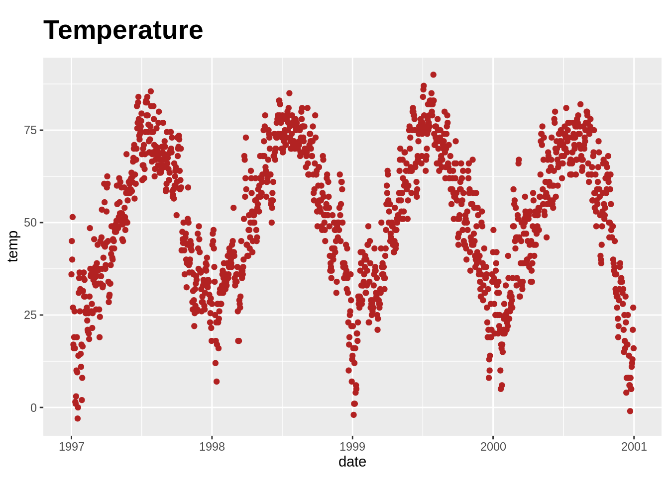
标题的使用
添加标题 (ggtitle()或labs())

或者,您可以使用g+labs(title =‘Temperature’)
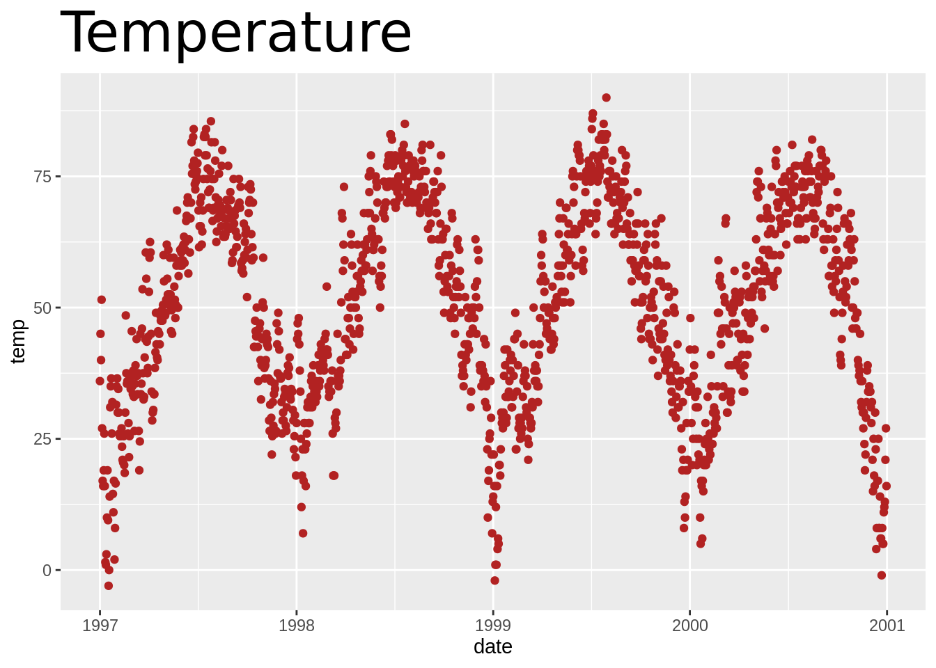
加粗标题并增加基线处间距(face, margin)
在ggplot2 2.0版本之前,我使用vjust参数使标题远离绘图。在2.0版中,此功能不再可行,此链接中的一则博客评论帮助我找到了替代的方法。margin参数使用margin函数,您通过提供顶部,右侧,底部和左侧的页边距(默认单位是points)可实现设置标题与绘图间距离的功能。
标题中使用非传统字体(family)
请注意,您也可以使用不同的字体。它不像这里看起来那么简单,如果您需要使用其他字体,请查看这篇文章。这在Mac上可能不行(如有问题,请发送信息告知我)。
如果您对此有疑问,可以看一下StackOverflow的讨论。
更改多行文字间间距(lineheight)
您可以使用lineheight参数更改行间距。 在此示例中,我将行间距进行了压缩(lineheight <1)。
g<-g+ggtitle("This is a longer\ntitle than expected")
g+theme(plot.title = element_text(size=20, face="bold", vjust=1, lineheight=0.6)) 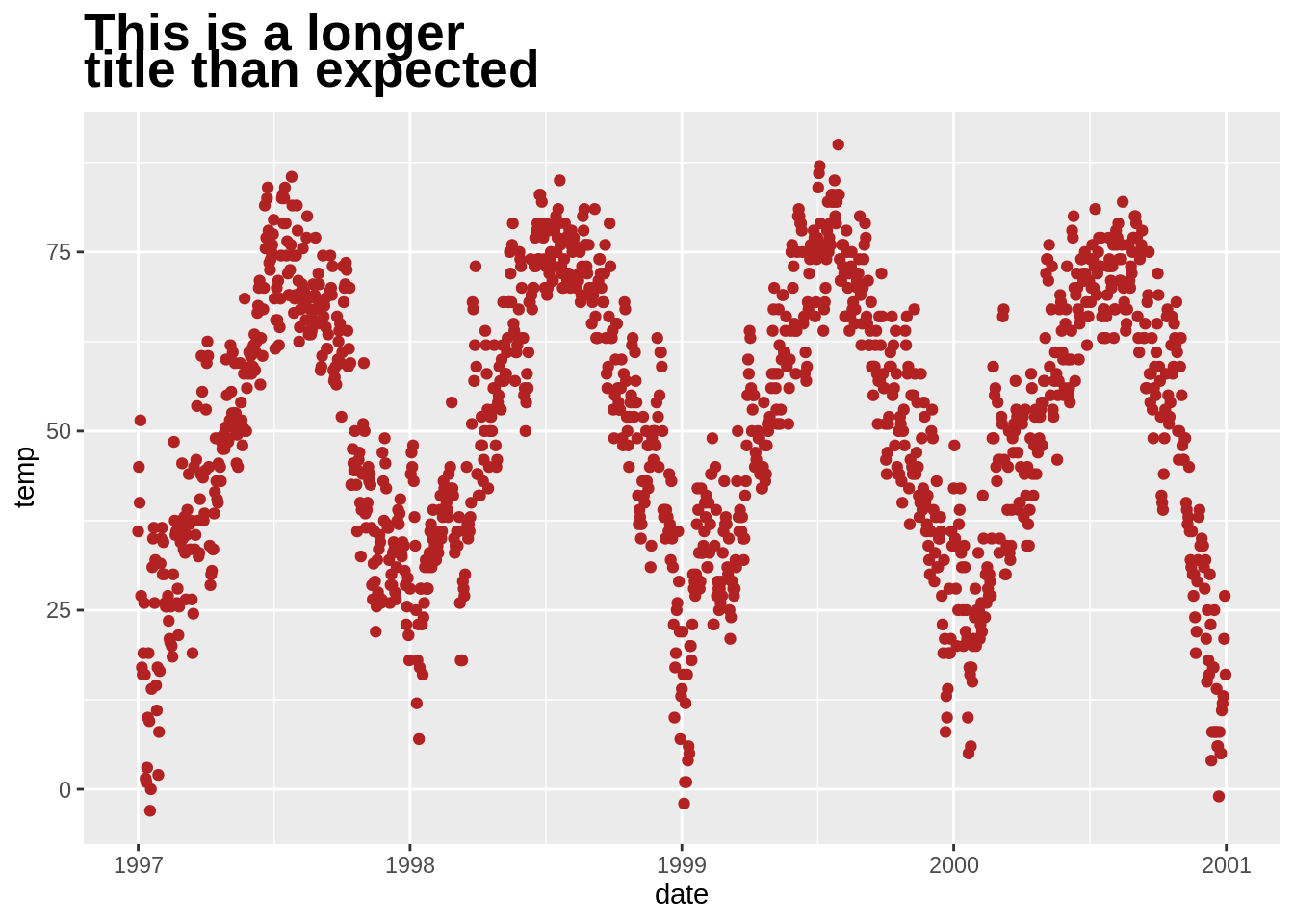
坐标轴的使用
添加x轴和y轴(labs(),xlab())
最简单的是:

去除坐标轴刻度及标签(theme(),axis.ticks.y)
除了为了演示,我通常不会这样做:
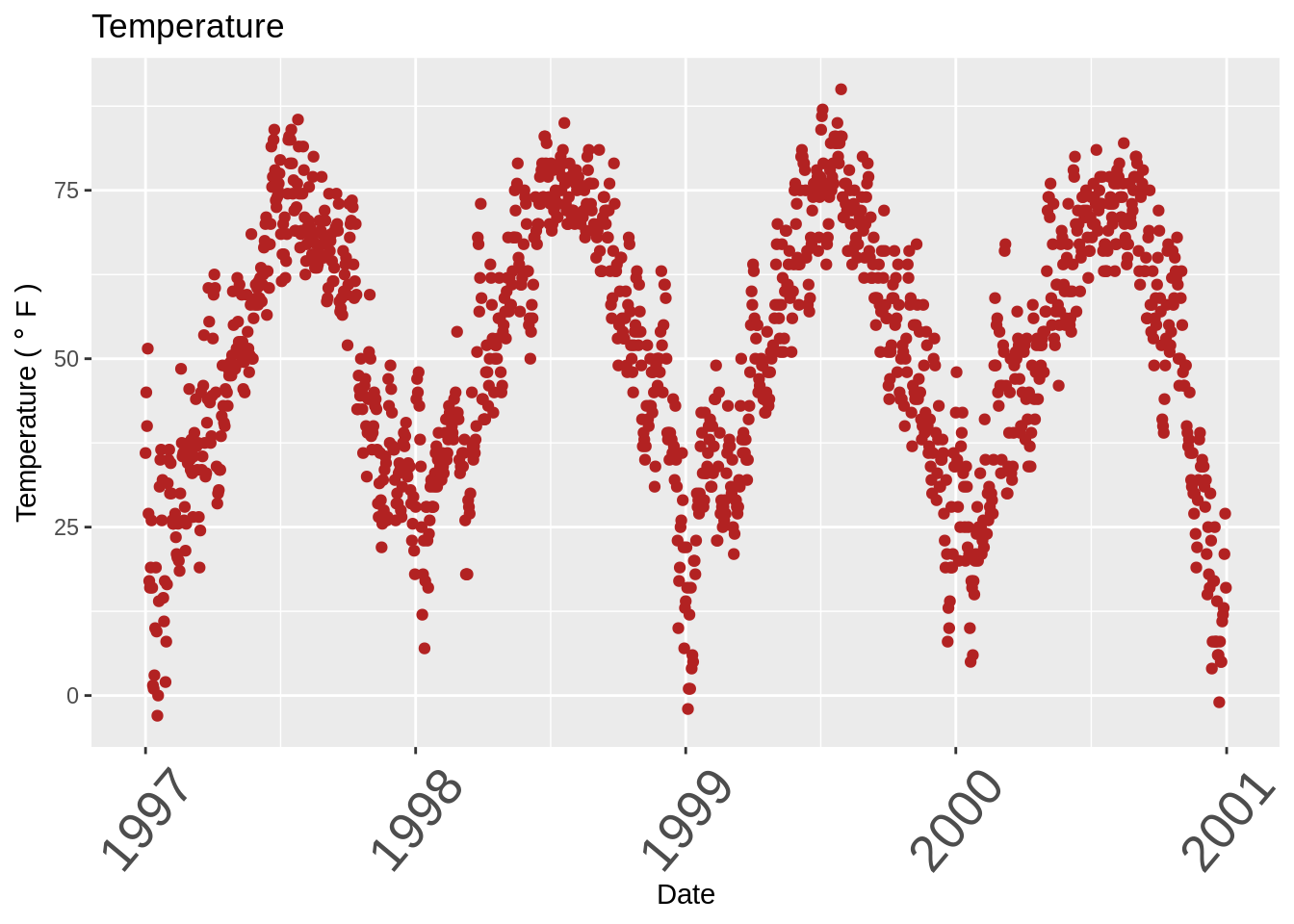
更改坐标轴刻度线文本字体大小及旋转(axis.text.x)
继续,尝试快速的说三遍“ tick text”。
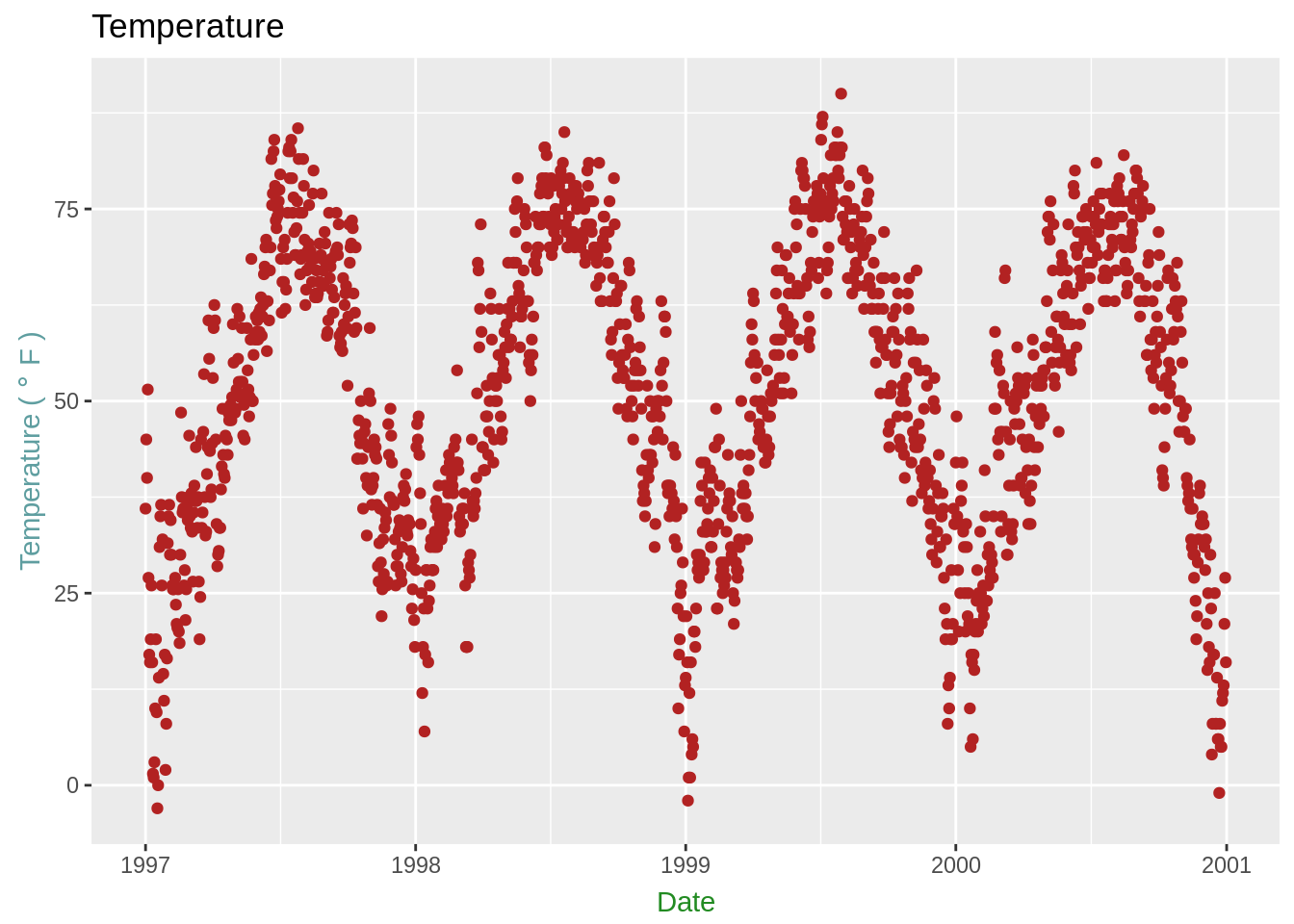
将标签远离绘图(并添加颜色)(theme(),axis.title.x)
我发现标签在默认设置下与绘图过于靠近,与有标题类似,我使用的是vjust参数。
g + theme(
      axis.title.x = element_text(color="forestgreen", vjust=-0.35),
      axis.title.y = element_text(color="cadetblue" , vjust=0.35)
          )
限制坐标轴范围(ylim,scale_x_continuous(),coord_cartesian()))
同样,此图是出于演示目的:
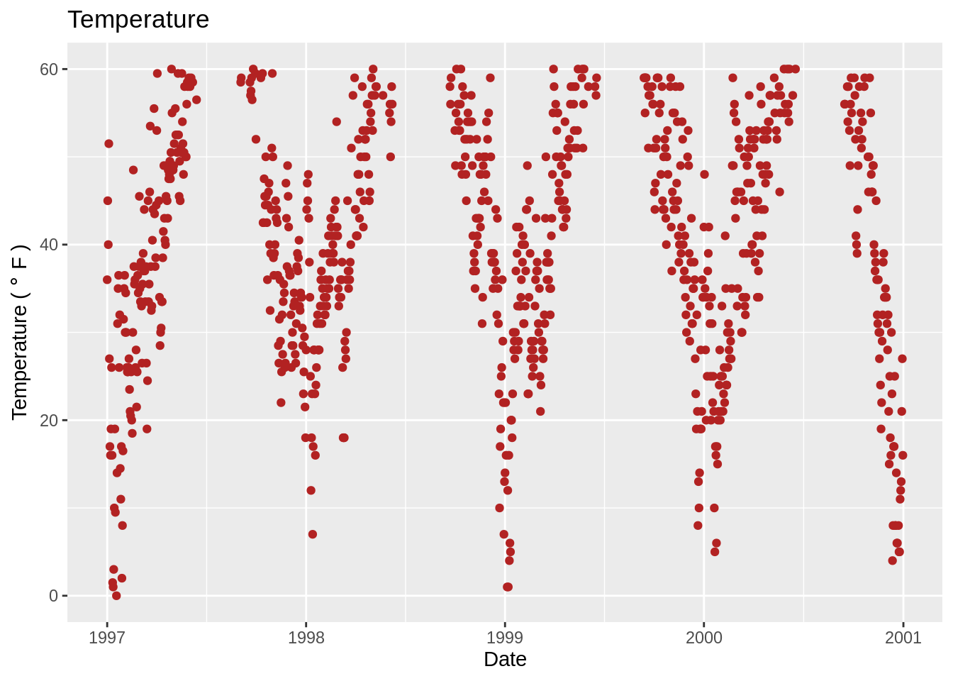
另一种方法:g + scale_x_continuous(limits = c(0,35)或g + coord_cartesian(xlim = c(0,35))。 前者删除范围之外的所有数据点,而后者调整可见区域。
如果您希望坐标轴相同(coord_equal()))
肯定有比这更好的方法。 在示例中,我正构建一副有着随机噪声的温度vs温度的图形(以演示为目的),并且希望两个轴的比例/范围相同。
ggplot(nmmaps, aes(temp, temp+rnorm(nrow(nmmaps), sd=20)))+geom_point()+
  xlim(c(0,150))+ylim(c(0,150))+
  coord_equal()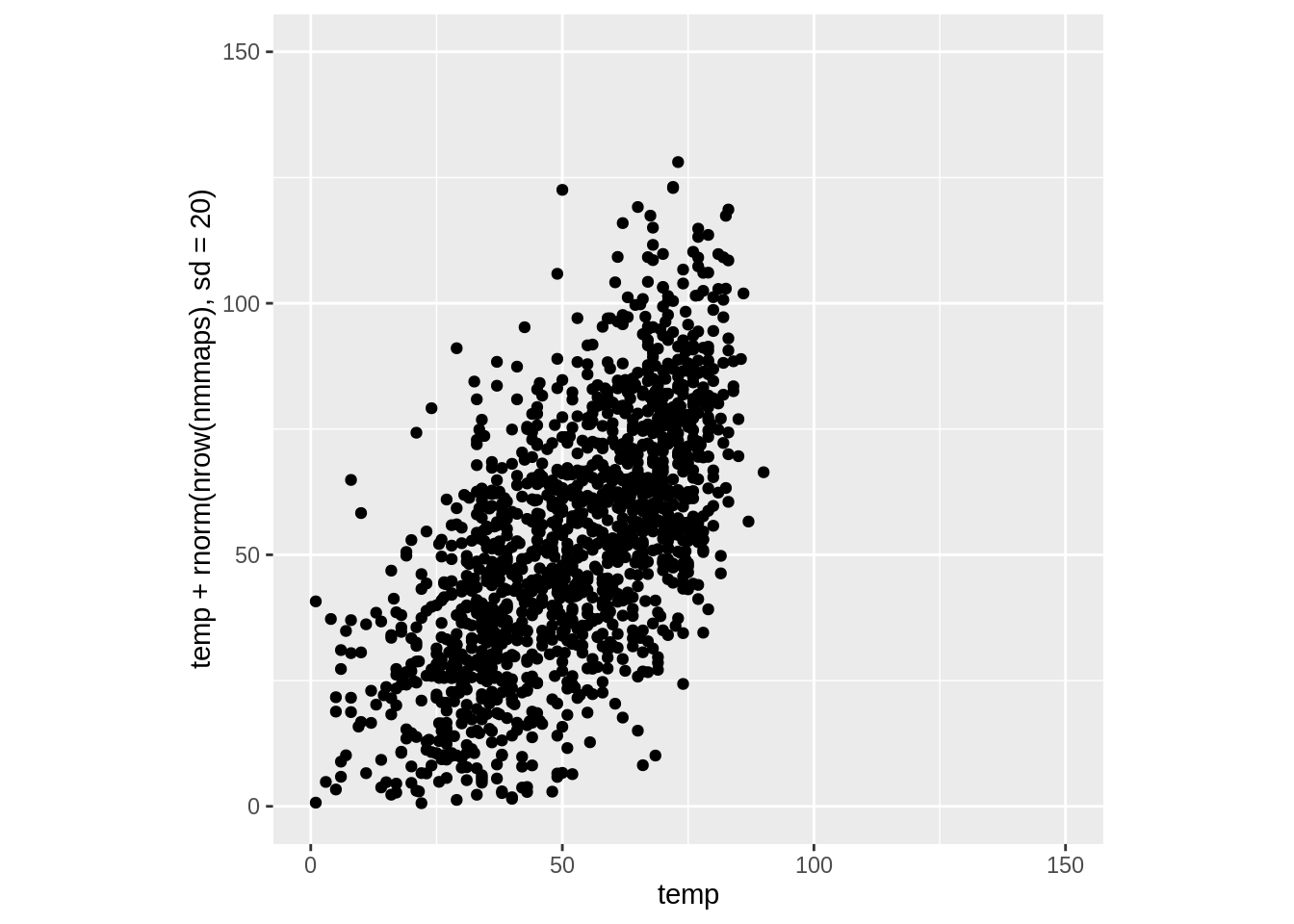
使用函数更改标签(label = function(x){})
有时,稍微更改一下标签会很方便,可能仅在标签中添加单位或百分号而不将其添加到数据中。在这种情况下,您可以使用一个函数。 以下即为一个例子:
ggplot(nmmaps, aes(date, temp))+
  geom_point(color="grey")+
  labs(x="Month", y="Temp")+
  scale_y_continuous(label=function(x){return(paste("My value is", x, "degrees"))})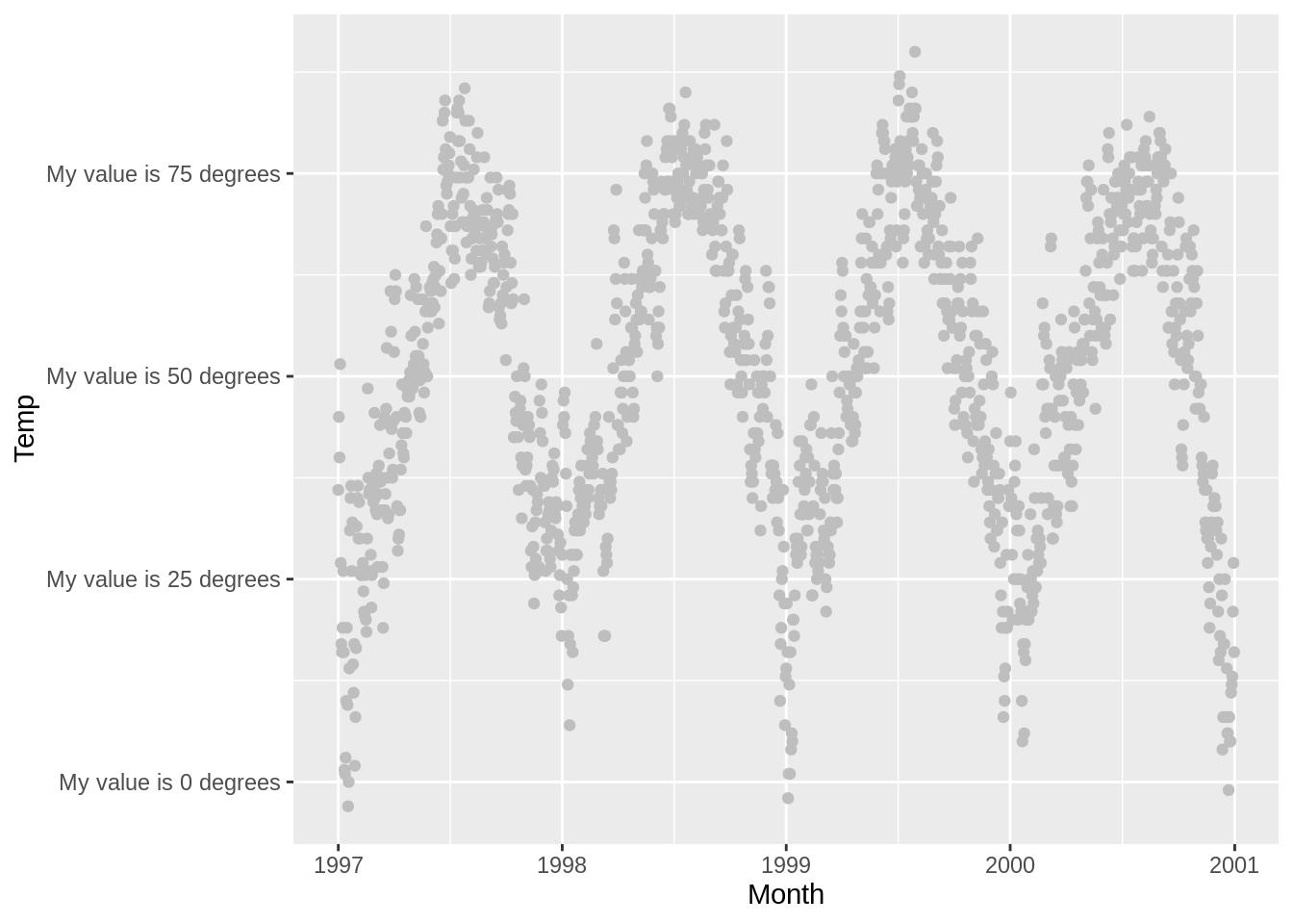
这里的图并不是很好看,但这很实用。
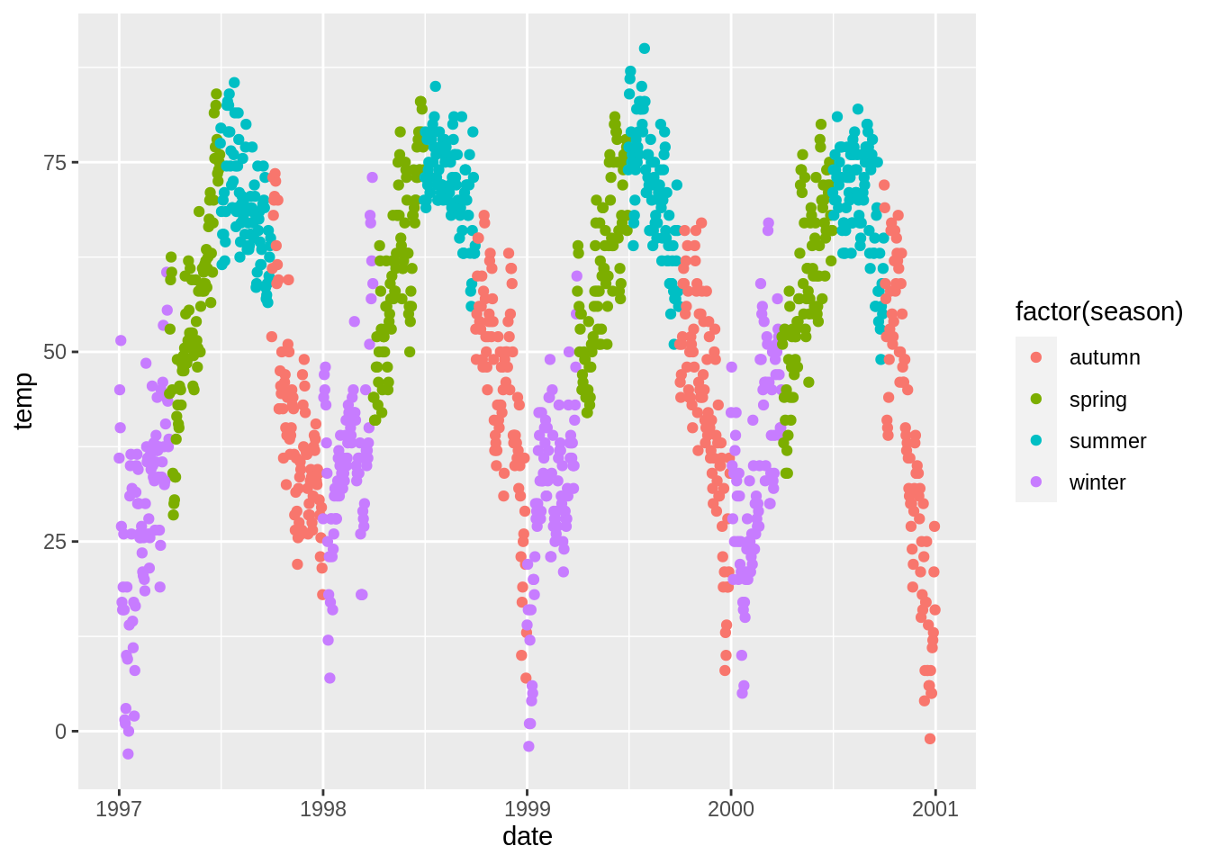
图例的使用
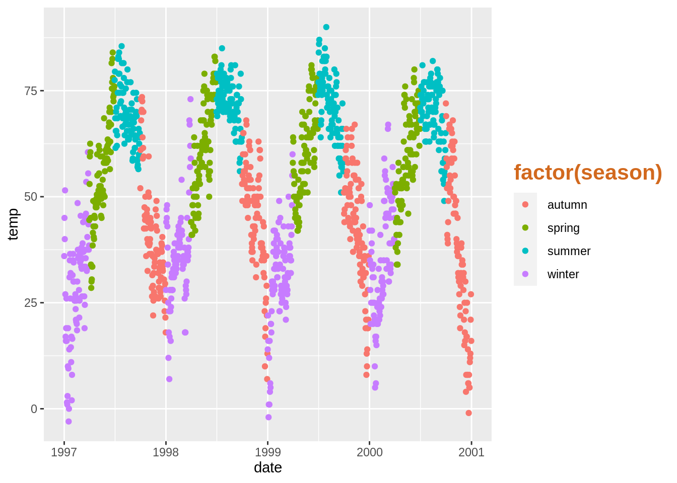
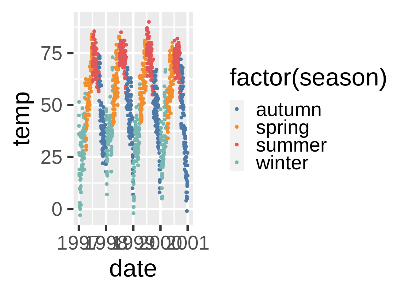
我们将根据季节对图形进行颜色编码。您可以看到,默认情况下,图例标题是我们在color参数中指定的。
关闭图例标题(legend.title)
更改图例标题款式(legend.title)
更改图例的标题(name))
要更改图例的标题,您可以在scale函数中使用name参数。 如果您不使用“scale”函数,则需要更改数据本身,以使其具有正确的格式。
g+theme(legend.title = element_text(colour="chocolate", size=16, face="bold"))+
  scale_color_discrete(name="This color is\ncalled chocolate!?")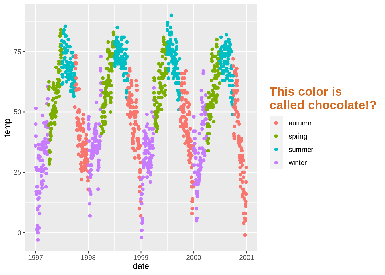
更改图例中的背景框(legend.key)
我对那些框的感觉比较复杂。如果你想完全摆脱它们,可以使用fill = NA。

更改仅图例中符号的大小(guides(),guide_legend)
图例中的点,尤其在没有框时容易丢失。 要覆盖默认值,请尝试:

去除图例中的图层(show_guide)
假设您有一个点图层,并在其中添加了标签文本。 默认情况下,点和标签文本都以这样的图例结尾(再次,谁会画这样的图?这只是为了演示):
您可以使用show_guide = FALSE关闭图例中的图层。 有用!
手动添加图例项(guides(),override.aes)
ggplot2不会自动添加图例,除非您将美学(颜色,大小等)映射到一个变量上。 不过,有时候我想拥有一个图例,以便清楚地了解您要绘制的内容。 这是默认值:
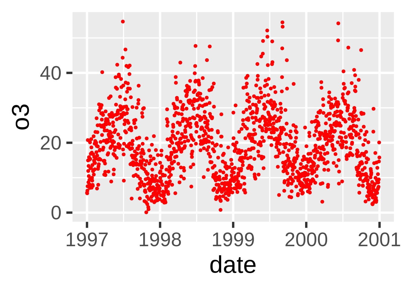
# here there is no legend automatically
ggplot(nmmaps, aes(x=date, y=o3))+geom_line(color="grey")+geom_point(color="red")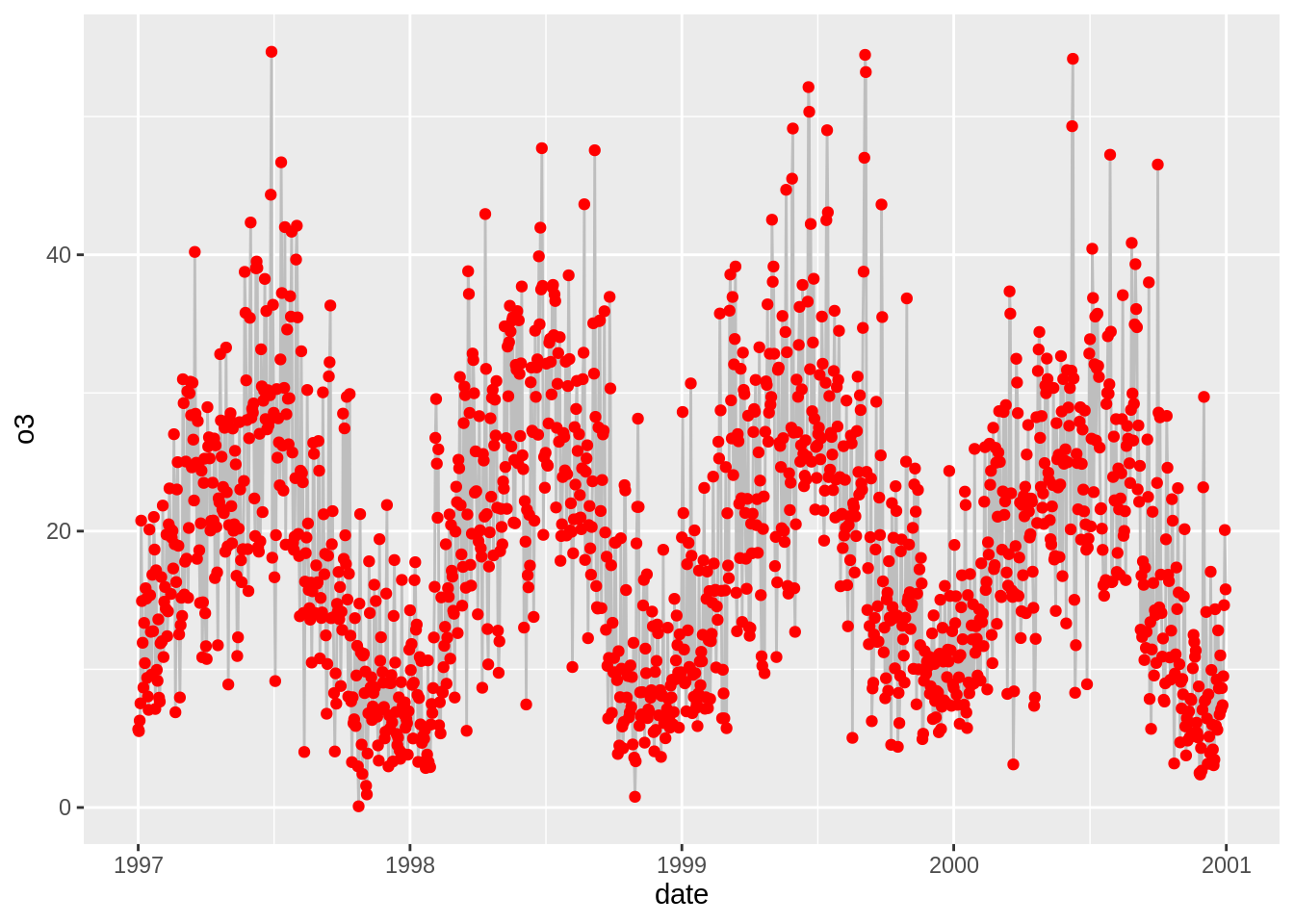
我们可以通过映射到一个“变量”来强制绘制图例。我们使用aes映射线和点并且我们不是映射到数据集中的变量,而是映射到单个字符串(因此,我们可以每种得到仅一种颜色)。
ggplot(nmmaps, aes(x=date, y=o3))+geom_line(aes(color="Important line"))+
  geom_point(aes(color="My points"))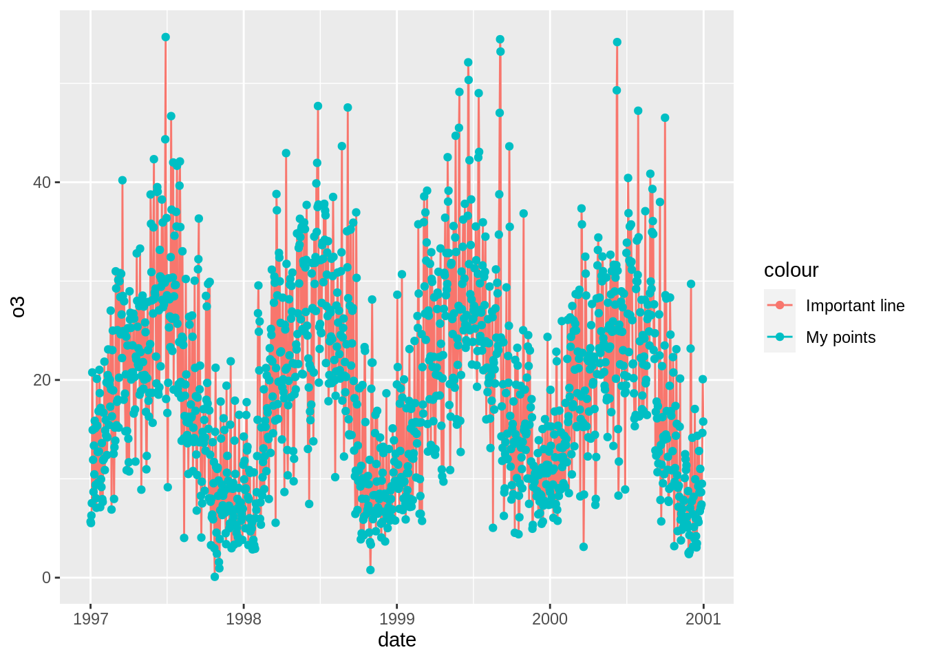
我们接近了,但这不是我想要的。 我想要灰色和红色。 要更改颜色,我们可以使用scale_colour_manual()。
ggplot(nmmaps, aes(x=date, y=o3))+geom_line(aes(color="Important line"))+
   geom_point(aes(color="Point values"))+
  scale_colour_manual(name='', values=c('Important line'='grey', 'Point values'='red'))
令人着迷的接近! 但是我们不希望点线都有。 线=灰色,点=红色。 最后一步是覆盖图例中的美学。 guide()函数允许我们控制图例之类的指南:
ggplot(nmmaps, aes(x=date, y=o3))+geom_line(aes(color="Important line"))+
   geom_point(aes(color="Point values"))+
  scale_colour_manual(name='', values=c('Important line'='grey', 'Point values'='red'), guide='legend') +
  guides(colour = guide_legend(override.aes = list(linetype=c(1,0)
                                                      , shape=c(NA, 16))))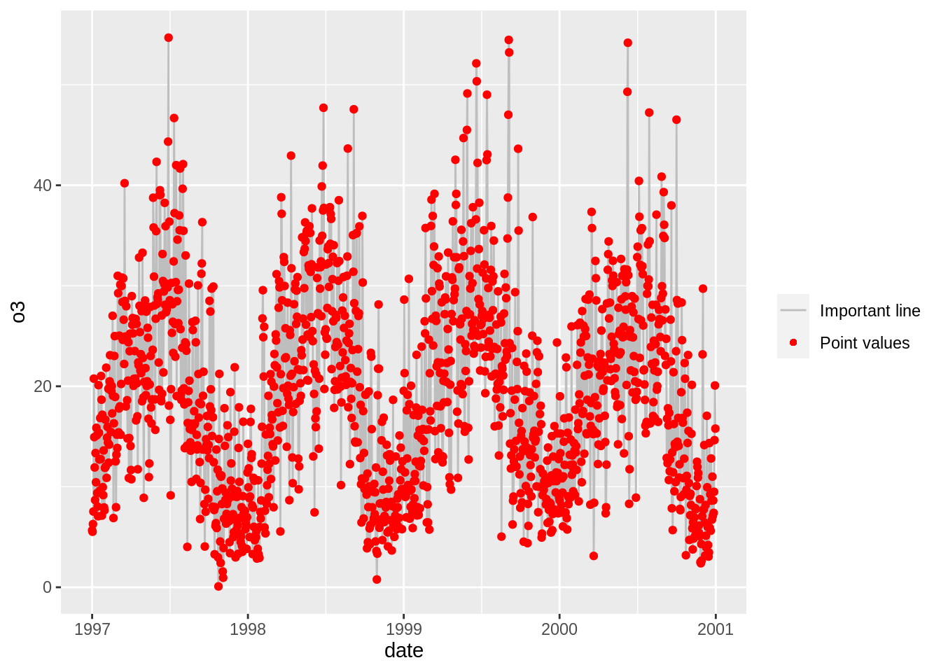
瞧!
背景颜色的使用
有多种方法可以使用一个函数来更改绘图的整体外观(请参见下文),但是如果您只想简单的更改面板的背景颜色,则可以使用以下方法:
更改面板颜色(panel.background)
ggplot(nmmaps, aes(date, temp))+geom_point(color="firebrick")+
  theme(panel.background = element_rect(fill = 'grey75'))
更改网格线(panel.grid.major)
ggplot(nmmaps, aes(date, temp))+geom_point(color="firebrick")+
  theme(panel.background = element_rect(fill = 'grey75'),
  panel.grid.major = element_line(colour = "orange", size=2),
  panel.grid.minor = element_line(colour = "blue"))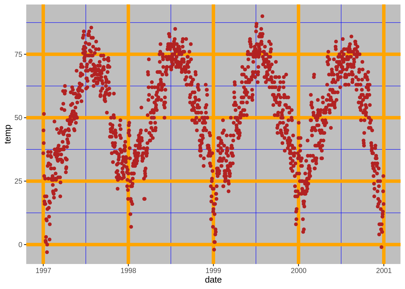
更改绘图背景(不是面板)颜色(plot.background)
ggplot(nmmaps, aes(date, temp))+geom_point(color="firebrick")+
  theme(plot.background = element_rect(fill = 'grey'))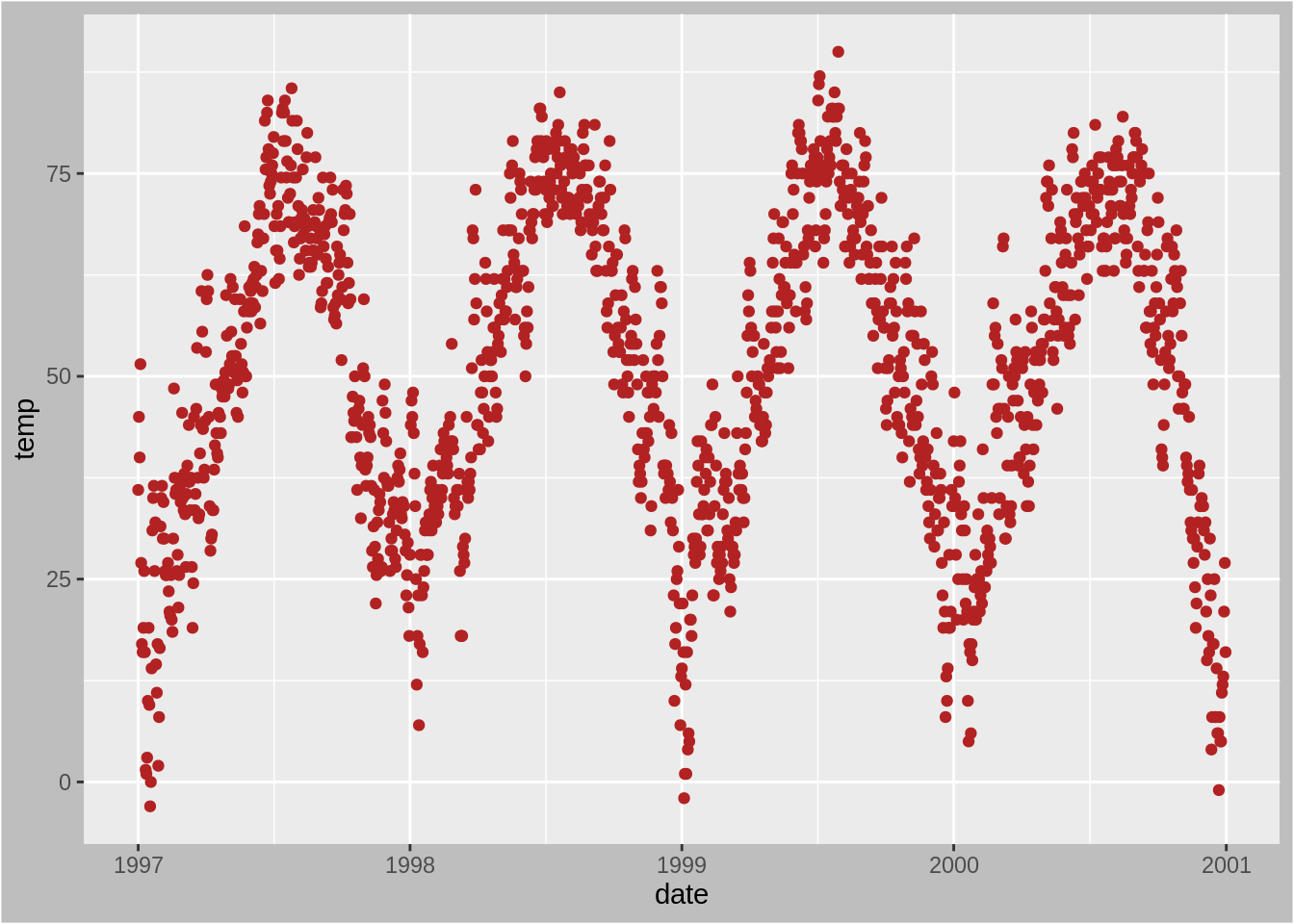
边距的使用
更改图形边距(plot.margin)
有时我发现我需要在绘图的一处页边距处添加一点空间。与前面的示例类似,我们可以对theme()函数使用参数。在这种情况下,参数为plot.margin。为了说明这一点,我将使用plot.background添加背景色,以便您可以看到默认值:
# the default
ggplot(nmmaps, aes(date, temp))+
  geom_point(color="darkorange3")+
  labs(x="Month", y="Temp")+
  theme(plot.background=element_rect(fill="darkseagreen"))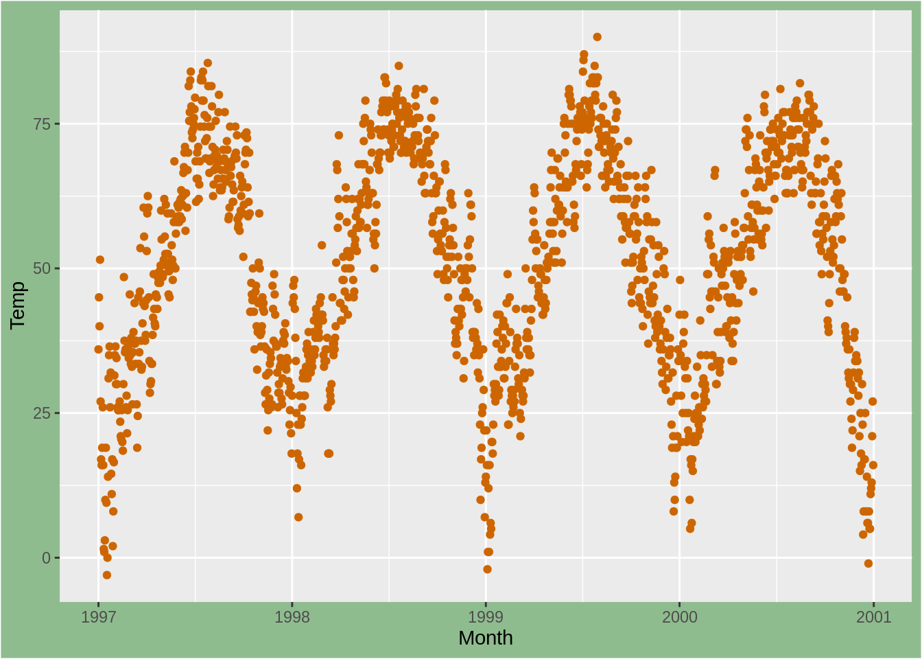
现在让我们在左侧和右侧添加额外的空间。参数plot.margin可以处理各种不同的单位(厘米,英寸等),但是它需要使用包中网格的功能单位来指定单位。 在这里,我左右两侧使用了6厘米的边距。
ggplot(nmmaps, aes(date, temp))+
  geom_point(color="darkorange3")+
  labs(x="Month", y="Temp")+
  theme(plot.background=element_rect(fill="darkseagreen"),
        plot.margin = unit(c(1, 6, 1, 6), "cm")) #top, right, bottom, left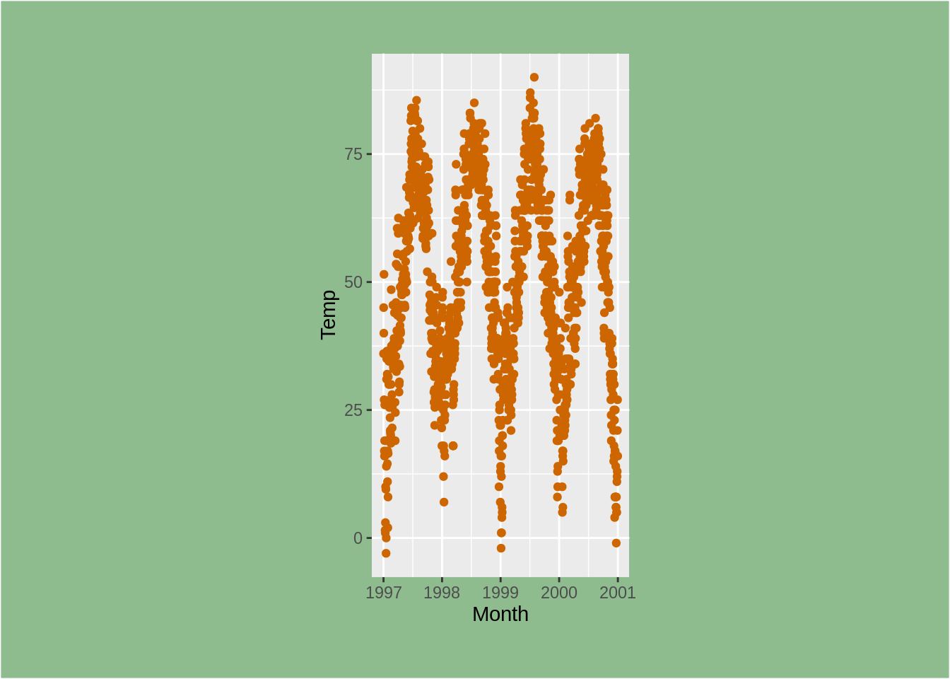
再次,不是一个漂亮的图!
多面板图的使用
ggplot2软件包具有两个不错的功能,可用于创建多面板绘图。 它们是相关的,但略有不同,facet_wrap本质上是基于单个变量创建了一系列图,而facet_grid可以基于两个变量。
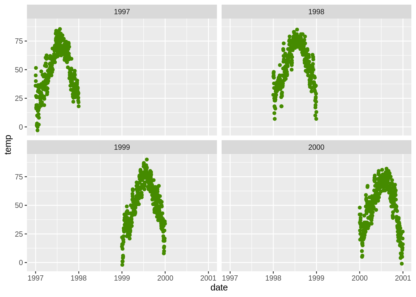
根据一个变量创建一行绘图(facet_wrap())
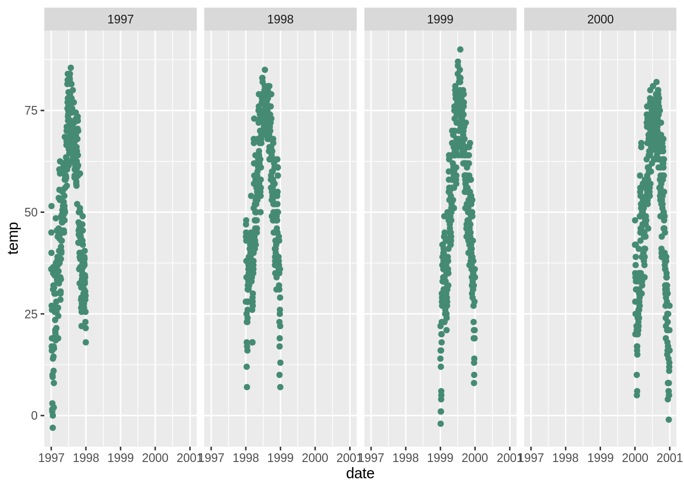
根据一个变量创建一个绘图矩阵(facet_wrap())
允许比例自由(scales))
ggplot2中多面板图的默认设置是在每个面板中使用相同的比例尺。但有时您希望通过面板自身的数据来确定比例。这通常不是一个好主意,因为它可能使您的用户对数据有错误印象,但是您如果你想使每个面板比例不同的话,可以这样设置scales =“ free”:
ggplot(nmmaps, aes(date,temp))+geom_point(color="chartreuse4")+
  facet_wrap(~year, ncol=2, scales="free")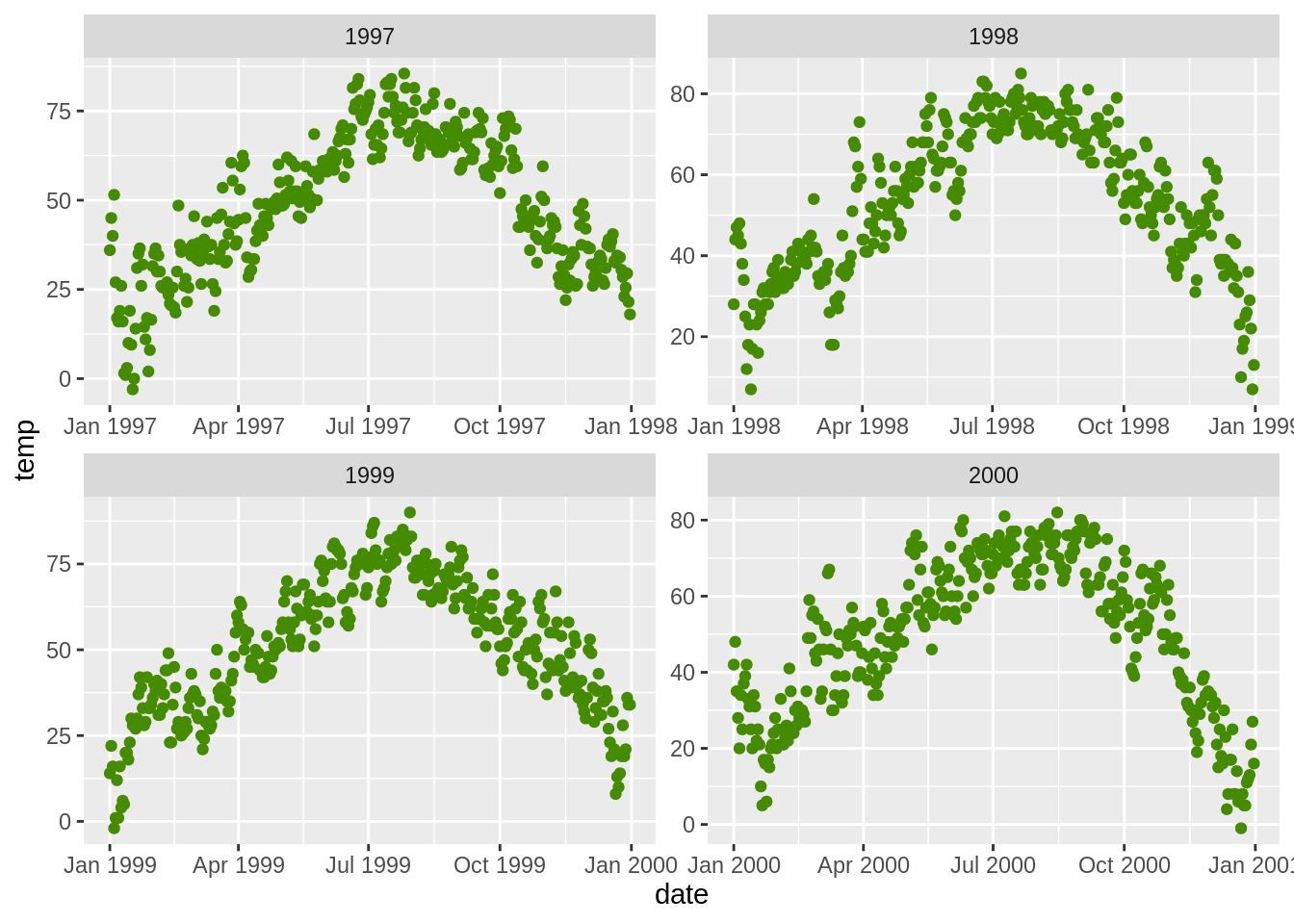
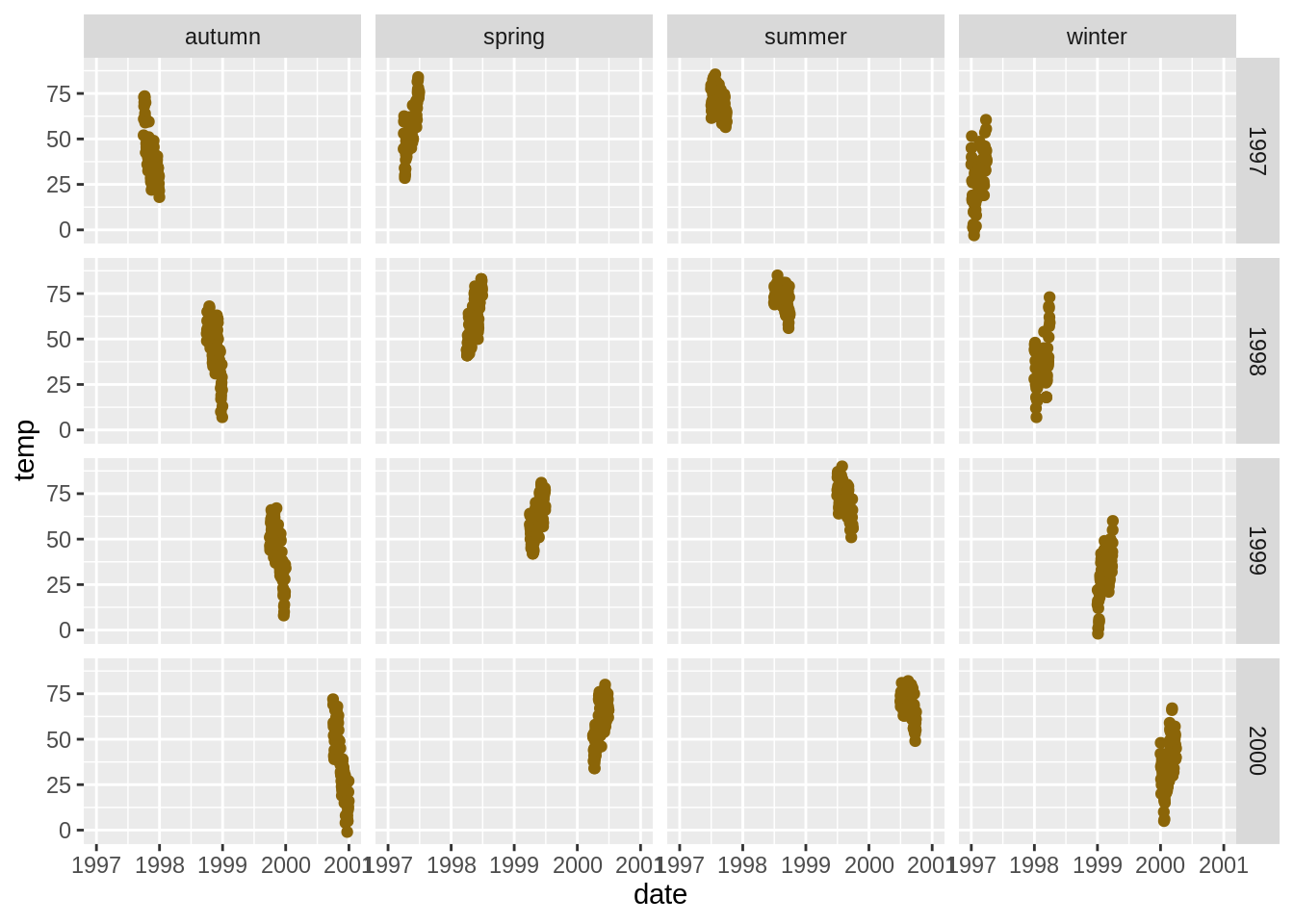
使用两个变量创建绘图网格(facet_grid())
并排放置两个(可能不相关的)图(pushViewport(),grid.arrange())
我发现这样做并不像传统的(基本)图形那样简单直接。 这儿有两种方法:
myplot1<-ggplot(nmmaps, aes(date, temp))+geom_point(color="firebrick")
myplot2<-ggplot(nmmaps, aes(temp, o3))+geom_point(color="olivedrab")

pushViewport(viewport(layout = grid.layout(1, 2)))
print(myplot1, vp = viewport(layout.pos.row = 1, layout.pos.col = 1))
print(myplot2, vp = viewport(layout.pos.row = 1, layout.pos.col = 2))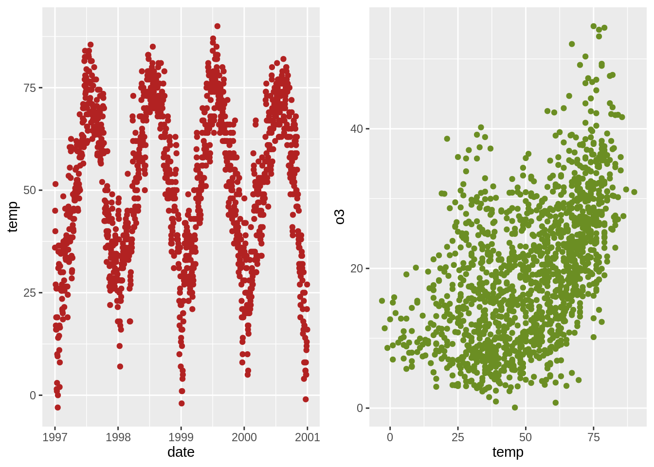

将行的排列方式改成列的排列方式,可以将facet_grid(season〜year)更改为facet_grid(year〜season)。
主题的使用
您可以使用自定义主题来更改绘图的整体外观。 例如,Jeffrey Arnold将ggthemes库与几个自定义主题组合在了一起。 有关列表,您可以访问ggthemes网站。 这儿有一个例子:
使用一个新主题(theme_XX())
ggplot(nmmaps, aes(date, temp, color=factor(season)))+
  geom_point()+ggtitle("This plot looks a lot different from the default")+
  theme_economist()+scale_colour_economist()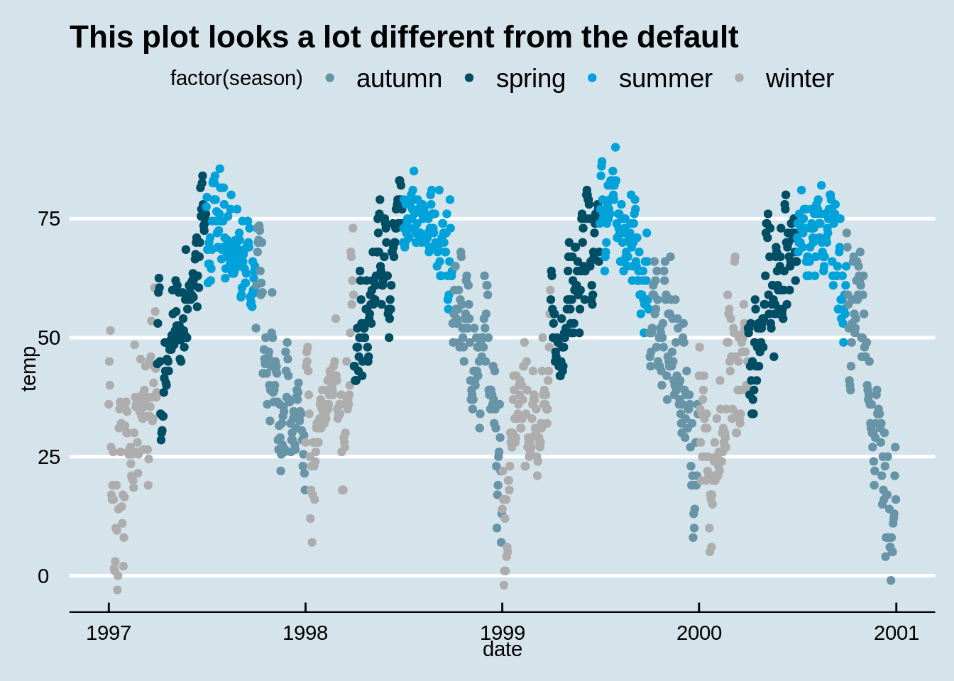
更改所有绘图文本元素的大小
就个人而言,我发现刻度文本,图例和其他元素的默认大小有点太小了。幸运的是,一次更改所有文本元素的大小非常容易。 如果您看了下面的“创建自定义主题”部分,将会注意到所有元素的大小都是相对于base_size的相对大小(rel())。因此,您只需更改base_size即可实现你的诉求。 这是代码:
有关创建自定义主题的提示
如果要更改整个部分的主题,可以像在theme_set中一样使用theme_set(theme_bw())。默认名称为theme_gray。如果要创建自己的自定义主题,则可以直接从grey theme中提取代码并进行修改。请注意,rel()函数更改的是 相对于base_size的大小。
## function (base_size = 11, base_family = "", base_line_size = base_size/22,
##     base_rect_size = base_size/22)
## {
##     half_line <- base_size/2
##     t <- theme(line = element_line(colour = "black", size = base_line_size,
##         linetype = 1, lineend = "butt"), rect = element_rect(fill = "white",
##         colour = "black", size = base_rect_size, linetype = 1),
##         text = element_text(family = base_family, face = "plain",
##             colour = "black", size = base_size, lineheight = 0.9,
##             hjust = 0.5, vjust = 0.5, angle = 0, margin = margin(),
##             debug = FALSE), axis.line = element_blank(), axis.line.x = NULL,
##         axis.line.y = NULL, axis.text = element_text(size = rel(0.8),
##             colour = "grey30"), axis.text.x = element_text(margin = margin(t = 0.8 *
##             half_line/2), vjust = 1), axis.text.x.top = element_text(margin = margin(b = 0.8 *
##             half_line/2), vjust = 0), axis.text.y = element_text(margin = margin(r = 0.8 *
##             half_line/2), hjust = 1), axis.text.y.right = element_text(margin = margin(l = 0.8 *
##             half_line/2), hjust = 0), axis.ticks = element_line(colour = "grey20"),
##         axis.ticks.length = unit(half_line/2, "pt"), axis.ticks.length.x = NULL,
##         axis.ticks.length.x.top = NULL, axis.ticks.length.x.bottom = NULL,
##         axis.ticks.length.y = NULL, axis.ticks.length.y.left = NULL,
##         axis.ticks.length.y.right = NULL, axis.title.x = element_text(margin = margin(t = half_line/2),
##             vjust = 1), axis.title.x.top = element_text(margin = margin(b = half_line/2),
##             vjust = 0), axis.title.y = element_text(angle = 90,
##             margin = margin(r = half_line/2), vjust = 1), axis.title.y.right = element_text(angle = -90,
##             margin = margin(l = half_line/2), vjust = 0), legend.background = element_rect(colour = NA),
##         legend.spacing = unit(2 * half_line, "pt"), legend.spacing.x = NULL,
##         legend.spacing.y = NULL, legend.margin = margin(half_line,
##             half_line, half_line, half_line), legend.key = element_rect(fill = "grey95",
##             colour = NA), legend.key.size = unit(1.2, "lines"),
##         legend.key.height = NULL, legend.key.width = NULL, legend.text = element_text(size = rel(0.8)),
##         legend.text.align = NULL, legend.title = element_text(hjust = 0),
##         legend.title.align = NULL, legend.position = "right",
##         legend.direction = NULL, legend.justification = "center",
##         legend.box = NULL, legend.box.margin = margin(0, 0, 0,
##             0, "cm"), legend.box.background = element_blank(),
##         legend.box.spacing = unit(2 * half_line, "pt"), panel.background = element_rect(fill = "grey92",
##             colour = NA), panel.border = element_blank(), panel.grid = element_line(colour = "white"),
##         panel.grid.minor = element_line(size = rel(0.5)), panel.spacing = unit(half_line,
##             "pt"), panel.spacing.x = NULL, panel.spacing.y = NULL,
##         panel.ontop = FALSE, strip.background = element_rect(fill = "grey85",
##             colour = NA), strip.text = element_text(colour = "grey10",
##             size = rel(0.8), margin = margin(0.8 * half_line,
##                 0.8 * half_line, 0.8 * half_line, 0.8 * half_line)),
##         strip.text.x = NULL, strip.text.y = element_text(angle = -90),
##         strip.text.y.left = element_text(angle = 90), strip.placement = "inside",
##         strip.placement.x = NULL, strip.placement.y = NULL, strip.switch.pad.grid = unit(half_line/2,
##             "pt"), strip.switch.pad.wrap = unit(half_line/2,
##             "pt"), plot.background = element_rect(colour = "white"),
##         plot.title = element_text(size = rel(1.2), hjust = 0,
##             vjust = 1, margin = margin(b = half_line)), plot.title.position = "panel",
##         plot.subtitle = element_text(hjust = 0, vjust = 1, margin = margin(b = half_line)),
##         plot.caption = element_text(size = rel(0.8), hjust = 1,
##             vjust = 1, margin = margin(t = half_line)), plot.caption.position = "panel",
##         plot.tag = element_text(size = rel(1.2), hjust = 0.5,
##             vjust = 0.5), plot.tag.position = "topleft", plot.margin = margin(half_line,
##             half_line, half_line, half_line), complete = TRUE)
##     ggplot_global$theme_all_null %+replace% t
## }
## <bytecode: 0x559400dc5018>
## <environment: namespace:ggplot2>
function (base_size = 12, base_family = "")
{
theme(
line = element_line(colour = "black", size = 0.5, linetype = 1, lineend = "butt"),
rect = element_rect(fill = "white", colour = "black", size = 0.5, linetype = 1),
text = element_text(family = base_family, face = "plain", colour = "black", size = base_size, hjust = 0.5, vjust = 0.5, angle = 0, lineheight = 0.9),
axis.text = element_text(size = rel(0.8), colour = "grey50"),
strip.text = element_text(size = rel(0.8)),
axis.line = element_blank(),
axis.text.x = element_text(vjust = 1),
axis.text.y = element_text(hjust = 1),
axis.ticks = element_line(colour = "grey50"),
axis.title.x = element_text(),
axis.title.y = element_text(angle = 90),
axis.ticks.length = unit(0.15, "cm"),
axis.ticks.margin = unit(0.1, "cm"),
legend.background = element_rect(colour = NA),
legend.margin = unit(0.2, "cm"),
legend.key = element_rect(fill = "grey95", colour = "white"),
legend.key.size = unit(1.2, "lines"),
legend.key.height = NULL,
legend.key.width = NULL,
legend.text = element_text(size = rel(0.8)),
legend.text.align = NULL,
legend.title = element_text(size = rel(0.8), face = "bold", hjust = 0),
legend.title.align = NULL,
legend.position = "right",
legend.direction = NULL,
legend.justification = "center",
legend.box = NULL,
panel.background = element_rect(fill = "grey90", colour = NA),
panel.border = element_blank(),
panel.grid.major = element_line(colour = "white"),
panel.grid.minor = element_line(colour = "grey95", size = 0.25),
panel.margin = unit(0.25, "lines"),
panel.margin.x = NULL,
panel.margin.y = NULL,
strip.background = element_rect(fill = "grey80", colour = NA),
strip.text.x = element_text(),
strip.text.y = element_text(angle = -90),
plot.background = element_rect(colour = "white"),
plot.title = element_text(size = rel(1.2)),
plot.margin = unit(c(1, 1, 0.5, 0.5), "lines"), complete = TRUE)
}## function (base_size = 12, base_family = "")
## {
## theme(
## line = element_line(colour = "black", size = 0.5, linetype = 1, lineend = "butt"),
## rect = element_rect(fill = "white", colour = "black", size = 0.5, linetype = 1),
## text = element_text(family = base_family, face = "plain", colour = "black", size = base_size, hjust = 0.5, vjust = 0.5, angle = 0, lineheight = 0.9),
##
## axis.text = element_text(size = rel(0.8), colour = "grey50"),
## strip.text = element_text(size = rel(0.8)),
## axis.line = element_blank(),
## axis.text.x = element_text(vjust = 1),
## axis.text.y = element_text(hjust = 1),
## axis.ticks = element_line(colour = "grey50"),
## axis.title.x = element_text(),
## axis.title.y = element_text(angle = 90),
## axis.ticks.length = unit(0.15, "cm"),
## axis.ticks.margin = unit(0.1, "cm"),
##
## legend.background = element_rect(colour = NA),
## legend.margin = unit(0.2, "cm"),
## legend.key = element_rect(fill = "grey95", colour = "white"),
## legend.key.size = unit(1.2, "lines"),
## legend.key.height = NULL,
## legend.key.width = NULL,
## legend.text = element_text(size = rel(0.8)),
## legend.text.align = NULL,
## legend.title = element_text(size = rel(0.8), face = "bold", hjust = 0),
## legend.title.align = NULL,
## legend.position = "right",
## legend.direction = NULL,
## legend.justification = "center",
## legend.box = NULL,
##
## panel.background = element_rect(fill = "grey90", colour = NA),
## panel.border = element_blank(),
## panel.grid.major = element_line(colour = "white"),
## panel.grid.minor = element_line(colour = "grey95", size = 0.25),
## panel.margin = unit(0.25, "lines"),
## panel.margin.x = NULL,
## panel.margin.y = NULL,
##
## strip.background = element_rect(fill = "grey80", colour = NA),
## strip.text.x = element_text(),
## strip.text.y = element_text(angle = -90),
##
## plot.background = element_rect(colour = "white"),
## plot.title = element_text(size = rel(1.2)),
## plot.margin = unit(c(1, 1, 0.5, 0.5), "lines"), complete = TRUE)
## }颜色的使用
对于一些简单的应用,在ggplot2中使用颜色是非常直接明了的,但是当你需要一些更高级的需要时,使用颜色就变得有一些挑战性。对于一些更为高级的应用,你应该参考Hadley’s Book,它涵盖了许多有用的内容。一些其他的资源,例如R Cookbook或者ggplot2 online docs,也是有用的参考。此外,哥伦比亚大学的Tian Zheng也创作了实用的PDF of R colors。
在使用颜色的时候,最重要的事情在于了解自己正在处理的是类别变量还是连续变量。
类别变量:手动选取颜色(select_color_manual)
ggplot(nmmaps, aes(date, temp, color=factor(season)))+
  geom_point() +
  scale_color_manual(values=c("dodgerblue4", "darkolivegreen4",
                              "darkorchid3", "goldenrod1"))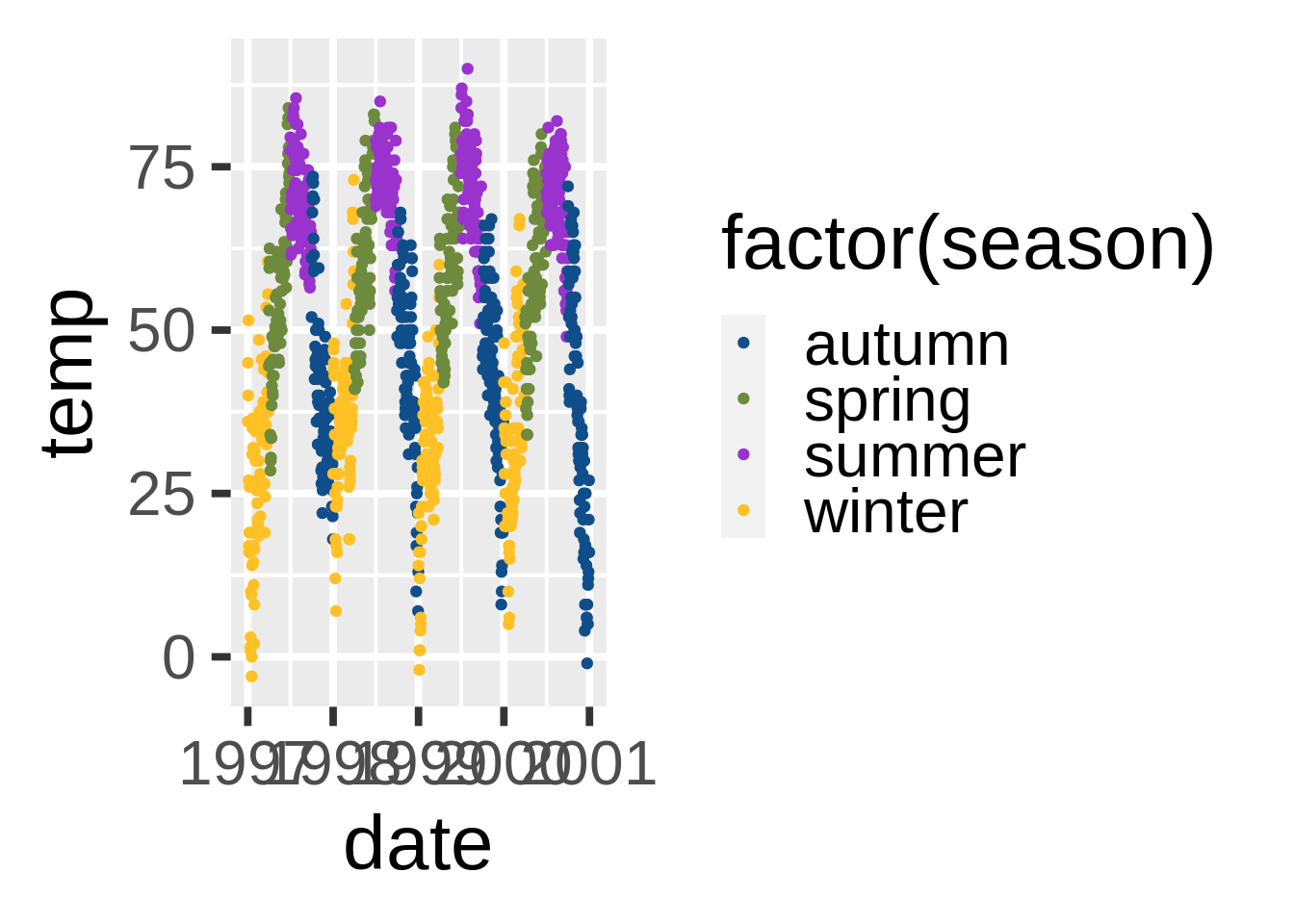
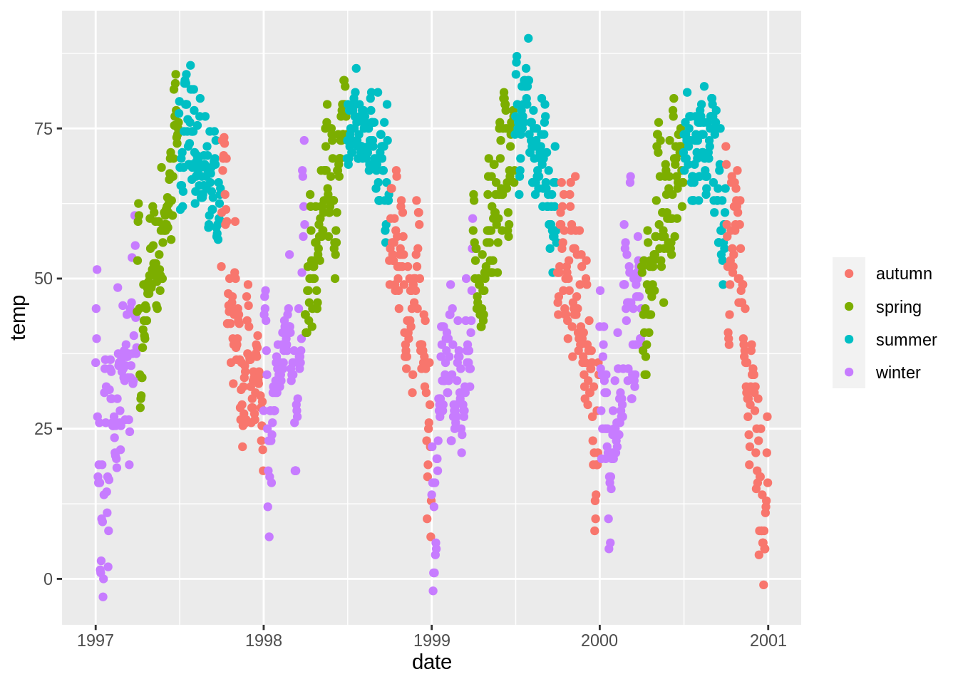
类别变量:使用内置调色板(根据colorbrewer2.org)(scale_color_brewer)
ggplot(nmmaps, aes(date, temp, color=factor(season)))+
  geom_point() +
  scale_color_brewer(palette="Set1")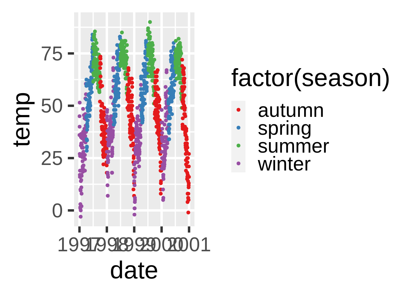
或者使用Tableau中的配色(需要ggthemes)
连续变量的颜色选择(scale_color_gradient(), scale_color_gradient2())
在这里的例子里,我们将用臭氧浓度(ozong)这一变量,一个与气温(temperature)有密切联系的连续变量(高气温=高臭氧浓度)。scale_color_gradient()是一个连续的变化曲线,而scale_color_gradient2()是离散的。
这里是默认的连续颜色主题(序列颜色):
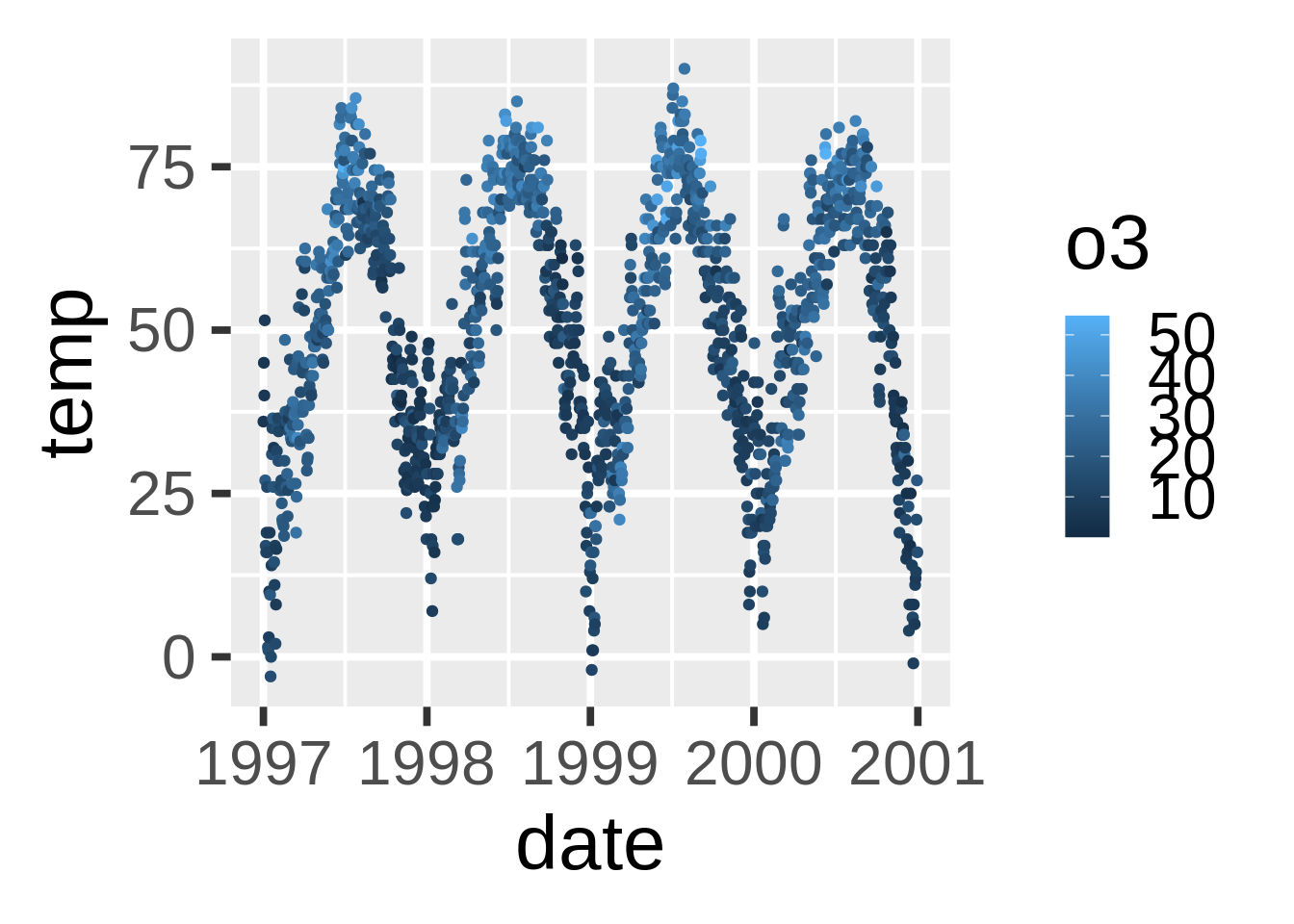
当你手动变更色序高低时(序列颜色):
ggplot(nmmaps, aes(date, temp, color=o3))+geom_point()+
  scale_color_gradient(low="darkkhaki", high="darkgreen")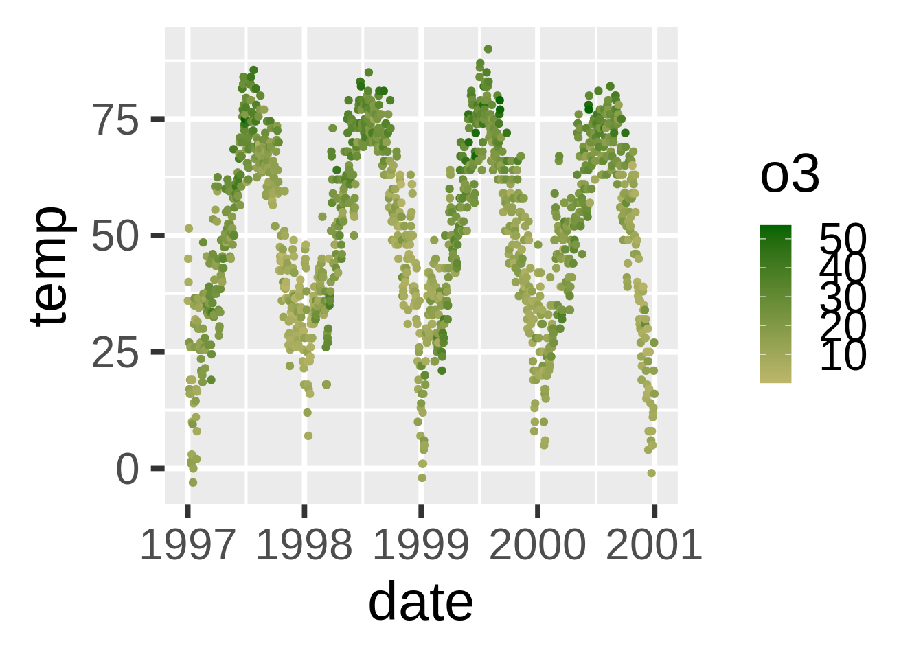
气温数据试正态分布的,因此可以考虑离散颜色主题。对于离散颜色,我们可以使用scale_color_gradient2():
mid<-mean(nmmaps$o3)
ggplot(nmmaps, aes(date, temp, color=o3))+geom_point()+
scale_color_gradient2(midpoint=mid,
                      low="blue", mid="white", high="red" )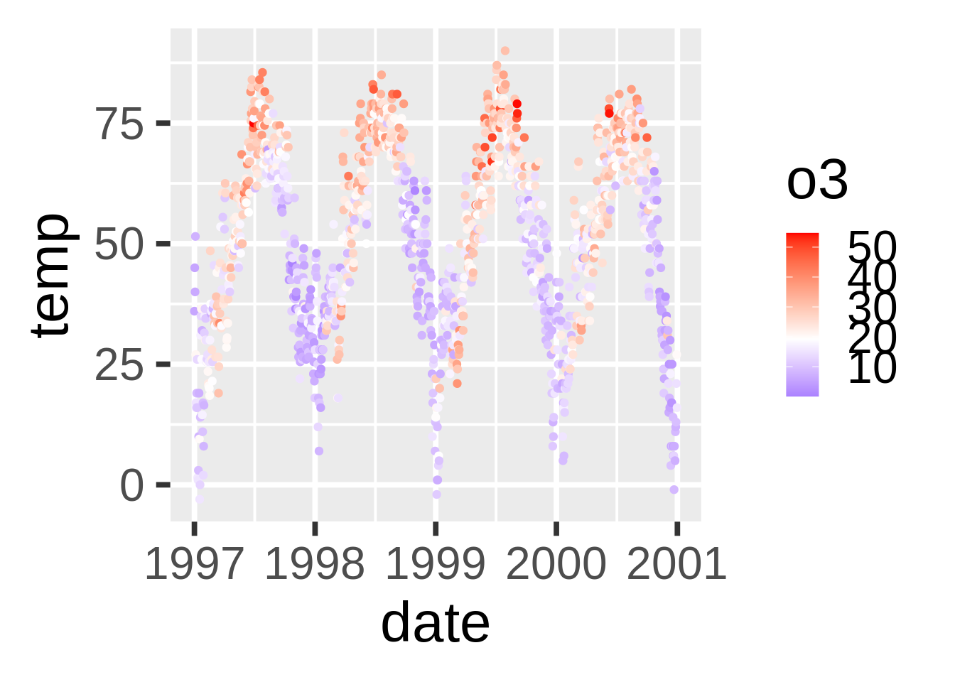
注解的使用
在左上、右上等处添加文字注解(annotation_custom()和text_grob())
我经常不知道如何在不固定编码的情况下将文字加入图像。使用ggplot2,你可以将注解的坐标设置成Inf但是那并不是最优解。这里有一个例子(来自此处代码)。它应用了grid库使得你可以根据比例(0代表低,1代表高)来设定位置。
grobTree创建了一个网格图像,而textgrob创建了一个文字图像。annotation_custom()来自于ggplot2并且使用grob作为输入。
my_grob = grobTree(textGrob("This text stays in place!", x=0.1,  y=0.95, hjust=0,
  gp=gpar(col="blue", fontsize=15, fontface="italic")))

ggplot(nmmaps, aes(temp, o3))+geom_point(color="firebrick")+
  annotation_custom(my_grob)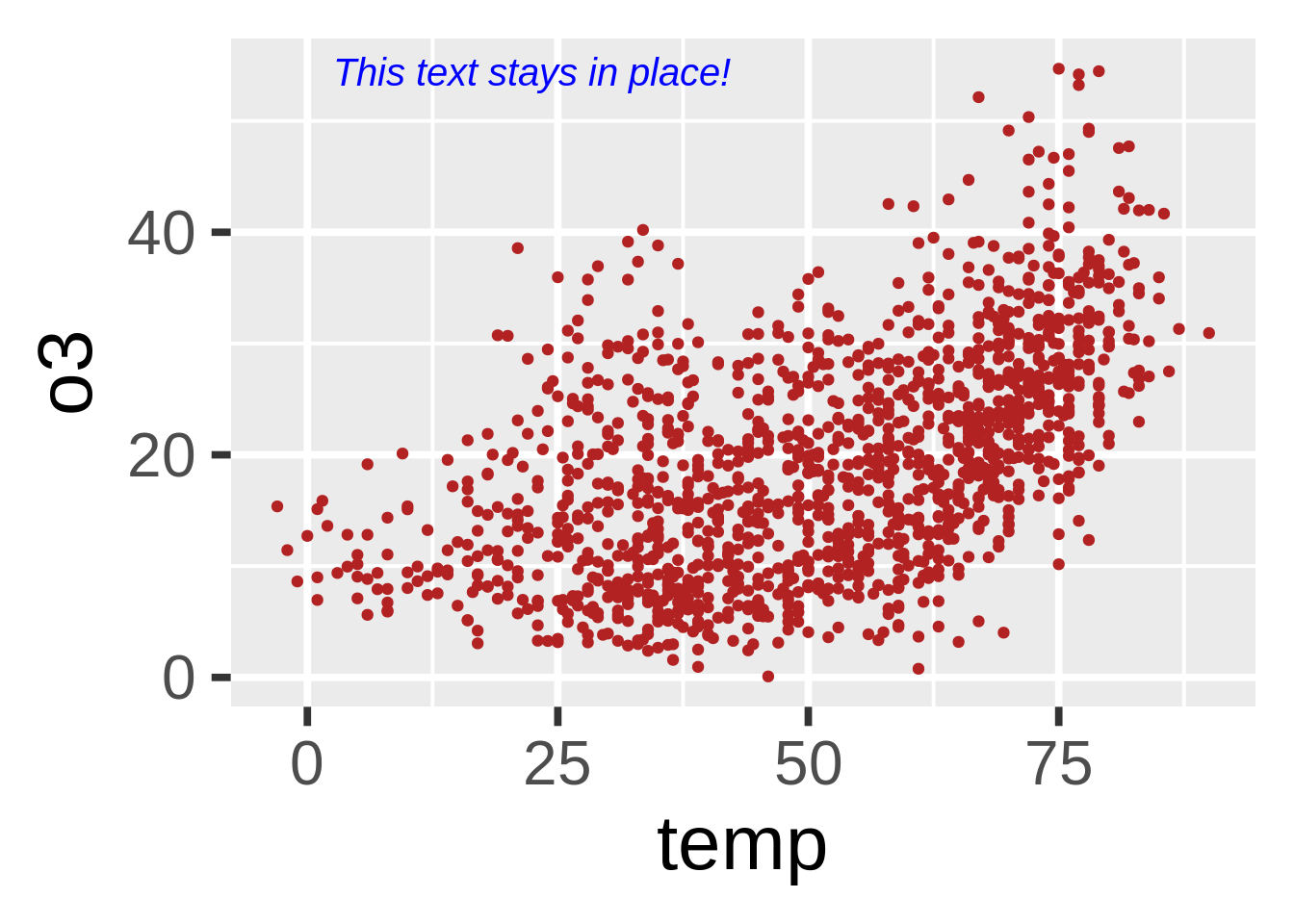
这是很重要的事情吗?答案是肯定的。当你有复数的图像并且标尺并不相同时,这样的设置便极为有价值。在接下来的图表中你可以看到虽然坐标的标尺在变化,但是上述的代码可以让注解出现在每一幅图表的同一位置:
my_grob = grobTree(textGrob("This text stays in place!", x=0.1,  y=0.95, hjust=0,
  gp=gpar(col="blue", fontsize=12, fontface="italic")))

ggplot(nmmaps, aes(temp, o3))+geom_point(color="firebrick")+facet_wrap(~season, scales="free")+
  annotation_custom(my_grob)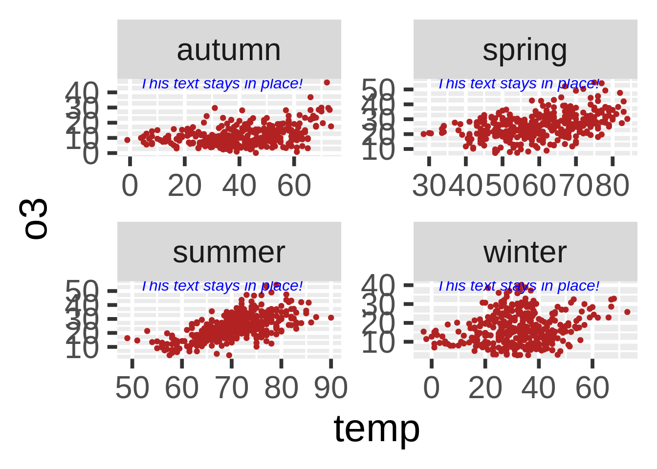
坐标的使用
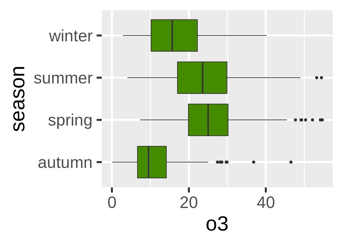
翻转图像(coord_flip())
其实翻转图像非常容易。这里我使用了coord_flip(),你只需要它就可以翻转你的图像。
不同图像种类的使用
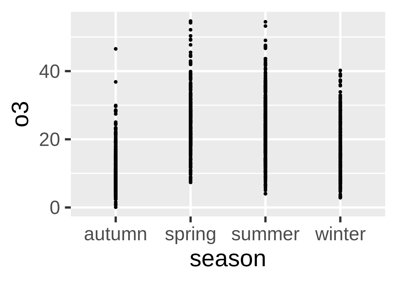
箱型图的替代品(geom_jitter()和geom_violin())
从箱型图开始
箱型图没什么不对的,但是他们有时候会显得枯燥。这里有一些替代品,但是我们先来看看箱型图怎么画:
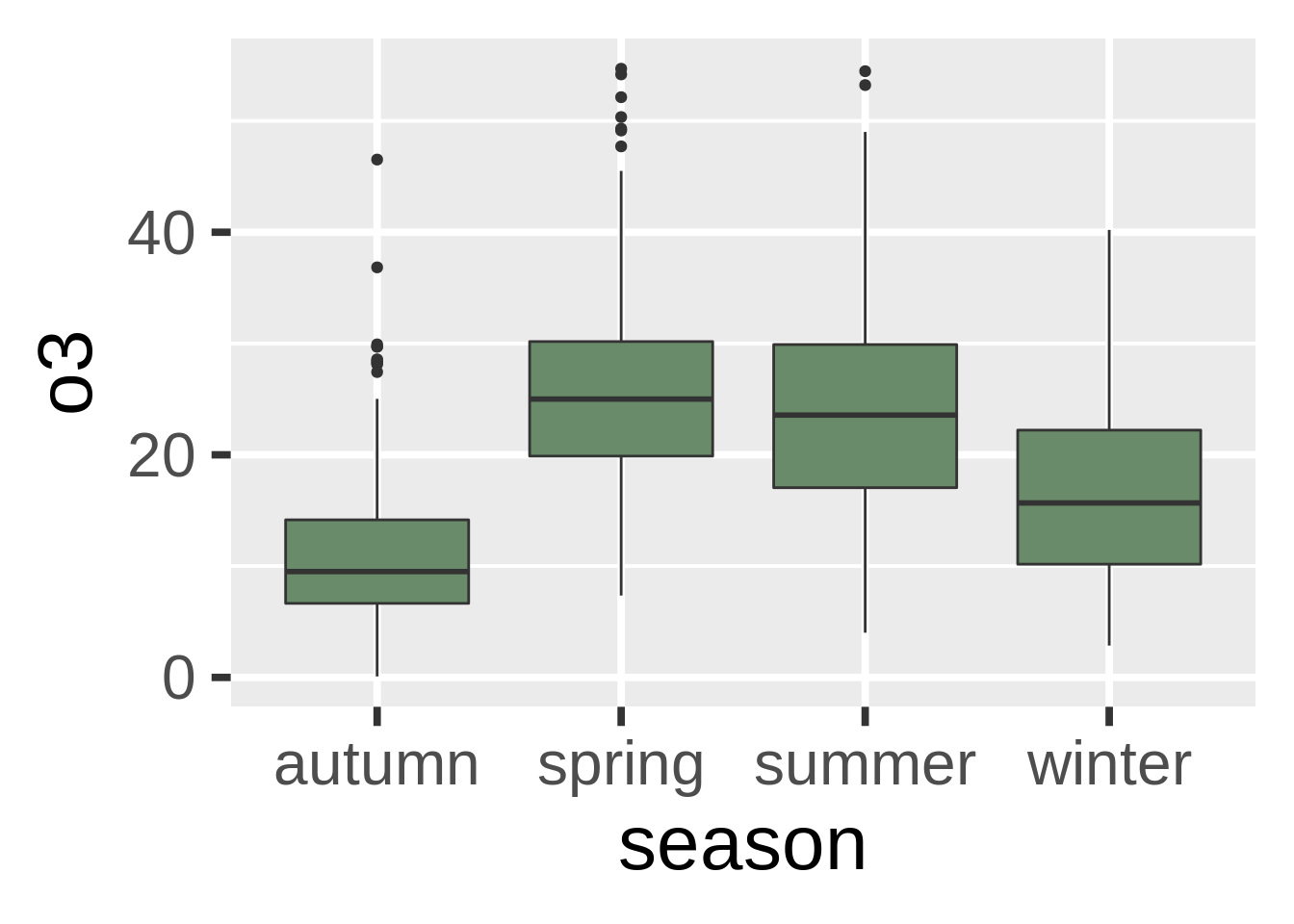
有效吗?是的。有趣吗?难说。
点图:
如果我们只�画点呢?
不仅枯燥,并且并没有传达出什么信息。我们可以尝试调整透明度,但是于事无补。我们可以试试别的:
发散点图:
我们可以把原本的数据点发散一些。我很喜欢这类图,但是需要注意你正在人工添加噪音,这可能会造成对于原本数据的误解。
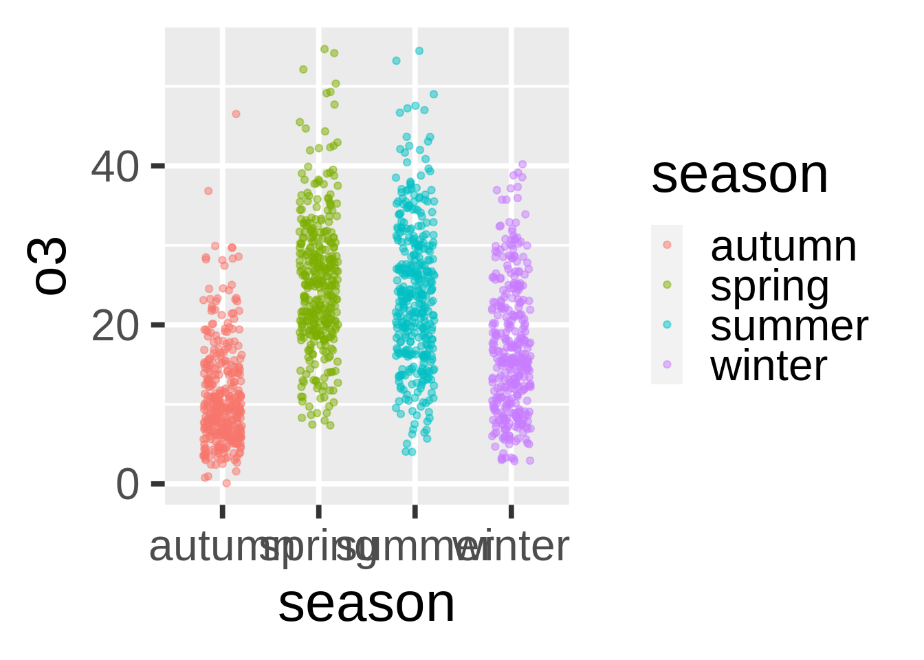
这看上去好些了。因为我们在用季节性数据,所以一些噪音不会影响对数据的认知。
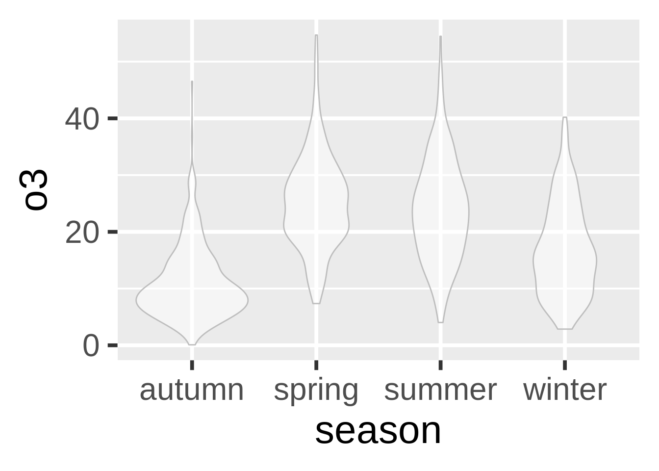
小提琴式图:
小提琴式图和箱型图类似,只不过我们利用内部密度来显示哪里的数据最多。这是非常实用的一种图。
如果我们翻转图表并且加入一些发散数据点的话…
g+geom_violin(alpha=0.5, color="gray")+geom_jitter(alpha=0.5, aes(color=season),
      position = position_jitter(width = 0.1))+coord_flip()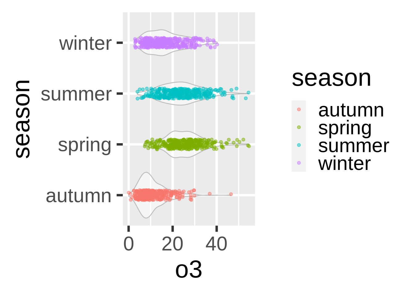
这已经非常不错了。在应用这类罕见的图表时,请注意读者会需要更多时间来理解内容。有些时候简单传统的图表才是你与他人分享数据时的最好选择。箱型图可能很无趣,但是人们一眼就能明白它的含义。
带状图(geom_ribbon())
我们并没有最适合带状图的数据,但是这类图非常有用。在这里的例子中,我们会用filter()来创建一个30天的动态平均,以便让我们的数据不太嘈杂。
# add a filter
nmmaps$o3run<-as.numeric(filter(nmmaps$o3, rep(1/30,30), sides=2))
ggplot(nmmaps, aes(date, o3run))+geom_line(color="lightpink4", lwd=1)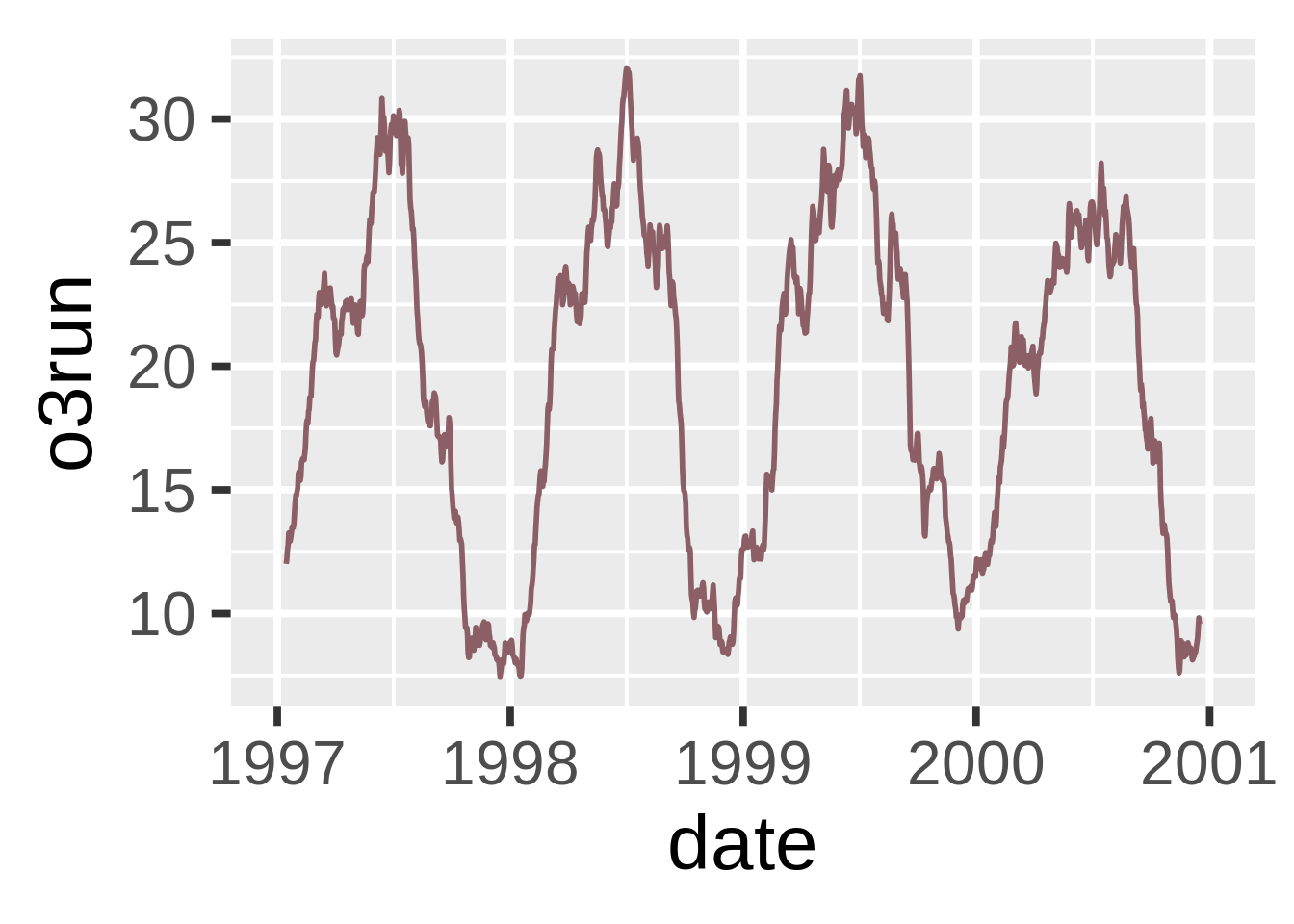
如果我们用geom_ribbon()来填充图像的话会如何呢?
ggplot(nmmaps, aes(date, o3run))+geom_ribbon(aes(ymin=0, ymax=o3run), fill="lightpink3", color="lightpink3")+
  geom_line(color="lightpink4", lwd=1)
这并不是最常见的使用geom_ribbon()的方式。我们可以尝试使用带状图来画出我们数据上下一标准差的区间:
nmmaps$mino3<-nmmaps$o3run-sd(nmmaps$o3run, na.rm=T)
nmmaps$maxo3<-nmmaps$o3run+sd(nmmaps$o3run, na.rm=T)

ggplot(nmmaps, aes(date, o3run))+geom_ribbon(aes(ymin=mino3, ymax=maxo3), fill="steelblue2", color="steelblue2")+
  geom_line(color="steelblue4", lwd=1)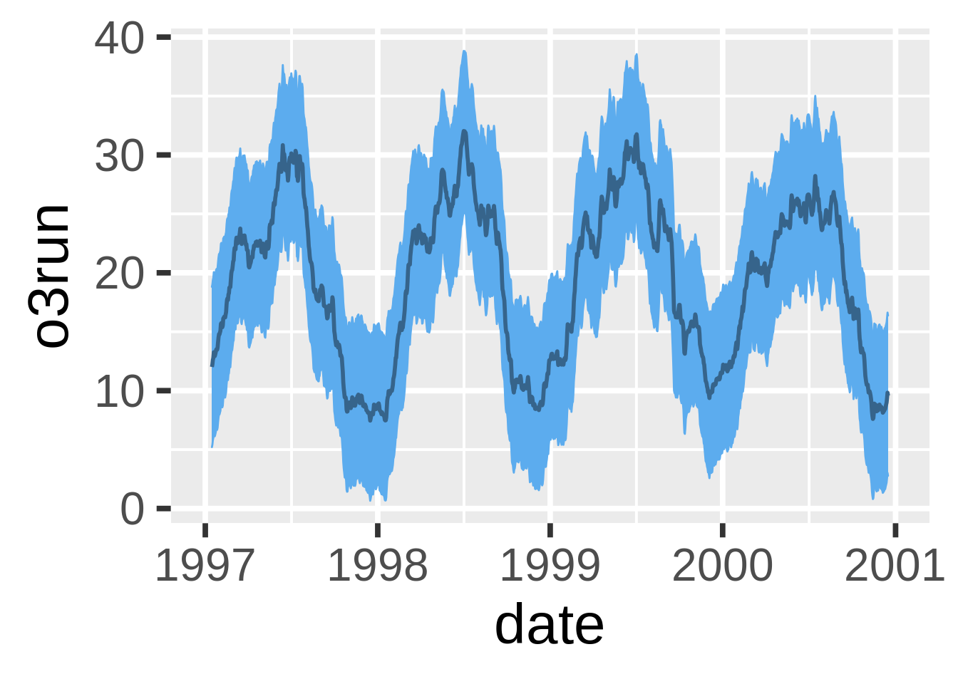
拼接式相关性图(geom_tile())
不得不说,拼接式相关性图画起来非常繁琐,我经常需要复制粘贴我之前写过的代码。但是它们非常有用,因此我在这里也附上这类图的代码。
第一步是创建一个关联系数的矩阵。我用了皮尔森式因为所有的变量都呈正态分布。如果你的数据看起来不是这样,那你可以考虑斯皮尔曼式。请注意我将一半设置成了NA因为他们是多余的。
#careful, I'm sorting the field names so that the ordering in the final plot is correct
thecor<-round(cor(nmmaps[,sort(c("death", "temp", "dewpoint", "pm10", "o3"))], method="pearson", use="pairwise.complete.obs"),2)
thecor[lower.tri(thecor)]<-NA
thecor
## death dewpoint o3 pm10 temp
## death 1 -0.47 -0.24 0.00 -0.49
## dewpoint NA 1.00 0.45 0.33 0.96
## o3 NA NA 1.00 0.21 0.53
## pm10 NA NA NA 1.00 0.37
## temp NA NA NA NA 1.00然后我要用reshape2中的melt功能将它转化为长格式,并且去除所有的NA。
thecor<-melt(thecor)
thecor$Var1<-as.character(thecor$Var1)
thecor$Var2<-as.character(thecor$Var2)
thecor<-na.omit(thecor)
head(thecor)
## Var1 Var2 value
## 1 death death 1.00
## 6 death dewpoint -0.47
## 7 dewpoint dewpoint 1.00
## 11 death o3 -0.24
## 12 dewpoint o3 0.45
## 13 o3 o3 1.00现在到了画图,我用了geom_tile(),但是如果你有很多数据,可以考虑使用更快的geom_raster()。
ggplot(thecor, aes(Var2, Var1))+
 geom_tile(data=thecor, aes(fill=value), color="white")+
 scale_fill_gradient2(low="blue", high="red", mid="white",
  midpoint=0, limit=c(-1,1),name="Correlation\n(Pearson)")+
 theme(axis.text.x = element_text(angle=45, vjust=1, size=11, hjust=1))+
 coord_equal()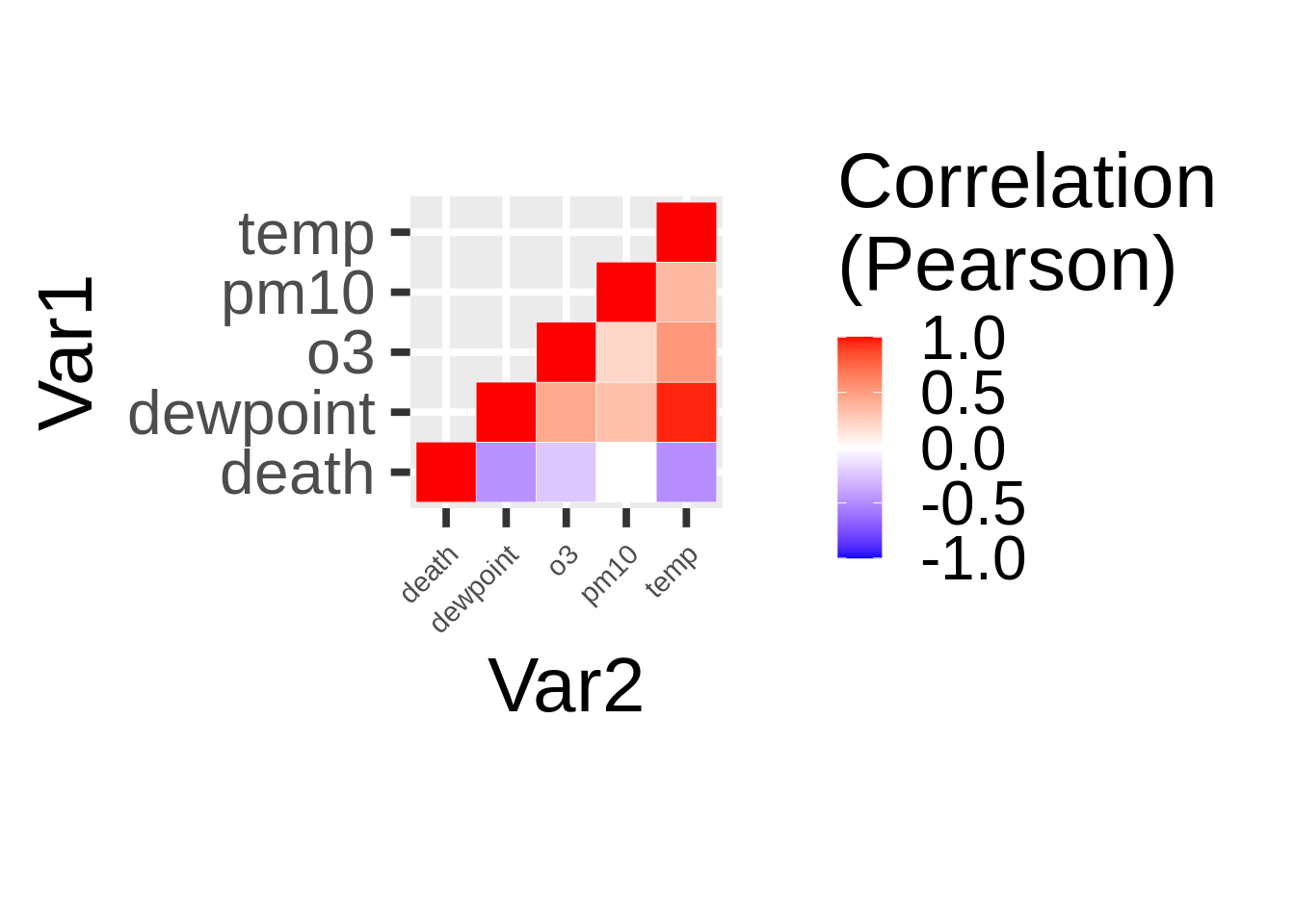
柔化的使用
你大概已经知道用ggplot2来柔化你的数据有多么容易。你只需要使用stat_smooth(),它就会加入LOESS(如果数据量小于1000)或者GAM。在这里我们的数据量大于1000,所以使用了GAM。
默认 - 使用LOESS或GAM(stat_smooth())
这是最简单的,不需要任何公式。
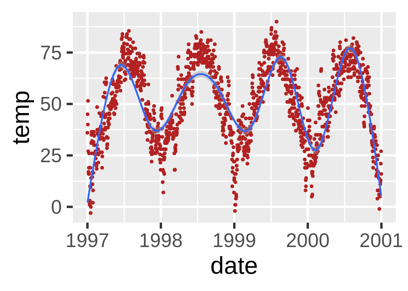
设置公式(stat_smooth(formula=))
但是ggplot2允许你使用你想用的公式。例如,如果你想添加GAM的维度(给你的柔化添加一些波纹):
ggplot(nmmaps, aes(date, temp))+
  geom_point(color="grey")+
  stat_smooth(method="gam", formula=y~s(x,k=10), col="darkolivegreen2", se=FALSE, size=1)+
  stat_smooth(method="gam", formula=y~s(x,k=30), col="red", se=FALSE, size=1)+
  stat_smooth(method="gam", formula=y~s(x,k=50), col="dodgerblue4", se=FALSE, size=1)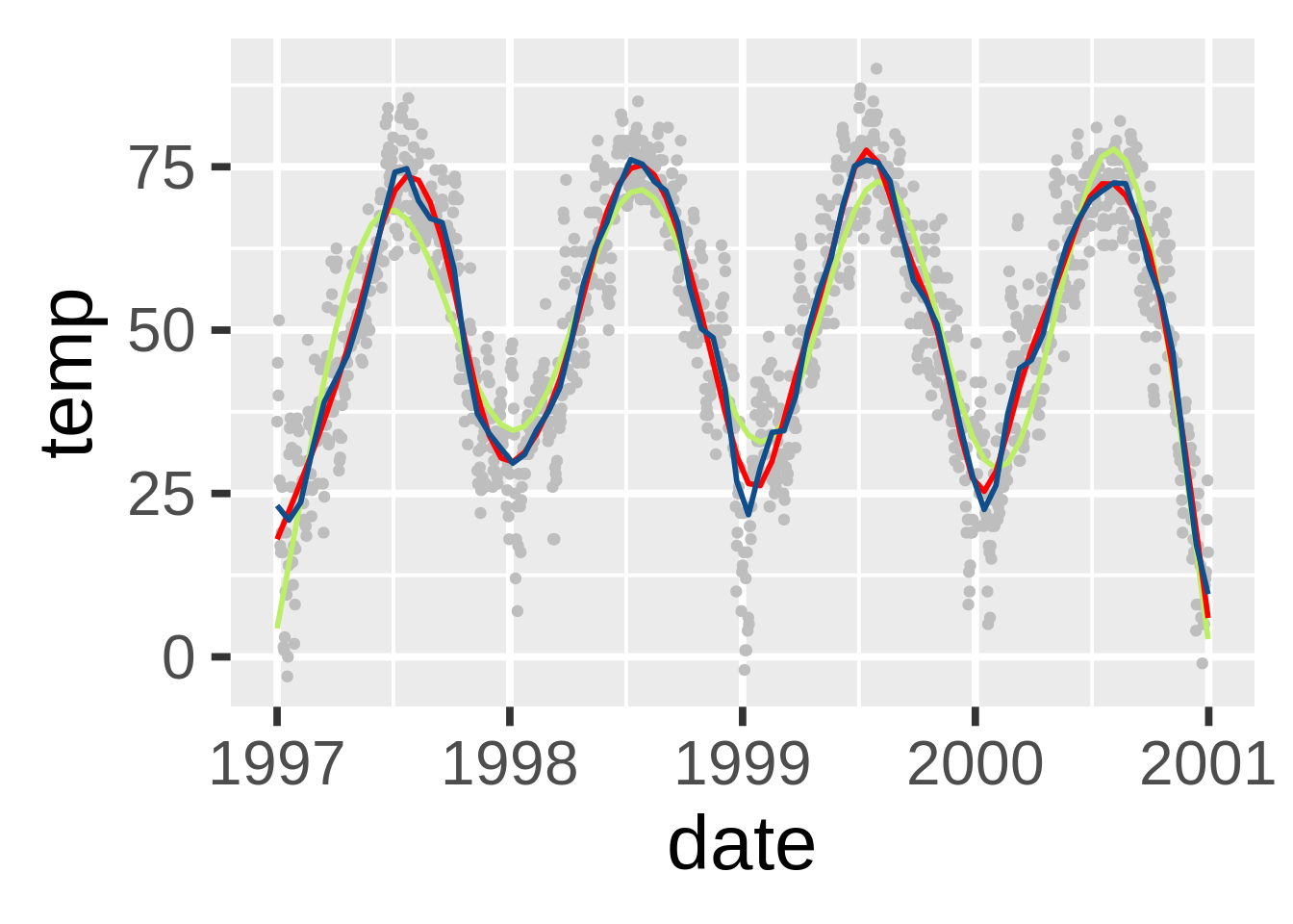
添加线性回归(stat_smooth(method=“lm”))
尽管默认下是柔化,但是加一个线性回归也很容易:

当然这也可以用一些更复杂的方式得到:
lmTemp<-lm(death~temp, data=nmmaps)
ggplot(nmmaps, aes(temp, death))+geom_point(col="firebrick")+
  geom_abline(intercept=lmTemp$coef[1], slope=lmTemp$coef[2])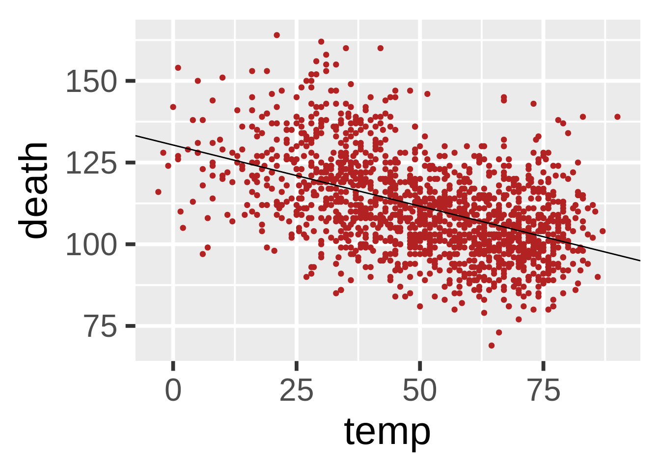
交互式线上图表
Plot.ly是一个非常不错的工具。它可以直接根据你的ggplot2图表中轻松地创建线上可交互图表。这个过程惊人地简单,并且可以在R中直接做到。我在另一篇帖子中有着详细的描述。
(本文基于RStudio (knitr. R version 3.0.2 (2013-09-25))和ggplot 0.9.3.1)