Chapter 37 Some techniques for label setting
Haonan Wen
library(gridExtra)
library(ggplot2)
library(ggrepel)
library("directlabels")
library(AER)
library(dplyr)
library(forcats)
library(stringr)
library("shadowtext")
37.1 1. Label placement
When adding labels to plots, sometimes we may find it tricky to adjust position of labels to cope with problems like text overlapping and text expanding over the boundary of grid. The hints and tips below worked for me and I believe they should work for most others in similar situations.
37.1.1 Tip 1: Adjusting parameters in geom_text like hjust, vjust, nudge_x and nudge_y
Let’s use mpg data set as an example. Sample 10 car models from the data frame and make a scatter plot of highway miles per gallon against engine displacement using model names as labels. Here is the scatter plot under the default setting.
set.seed(0)
df1 <- mpg[sample(nrow(mpg),10),]
ggplot(df1,aes(displ,hwy)) +
  geom_point() +
  geom_text(aes(label=model)) +
  labs(x = "Engine Displacement",
       y = "Highway Miles per Gallon")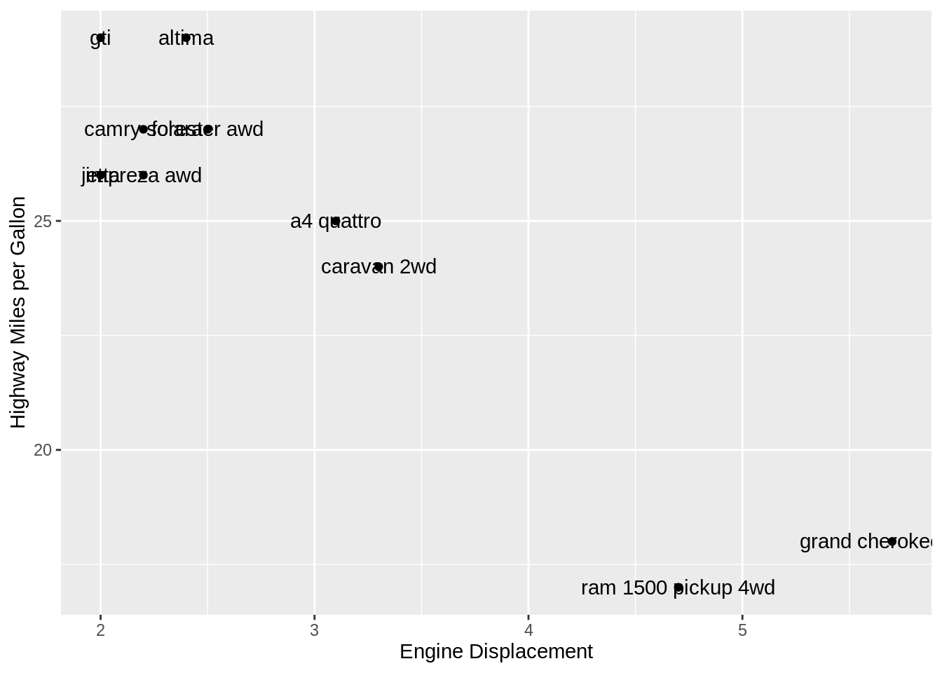
We see that the text string on the edge is expanding over the boundary. The problem can be addressed by adding hjust=“inward” to align texts to the left or right of the points.
ggplot(df1,aes(displ,hwy)) +
  geom_point() +
  geom_text(aes(label=model),hjust="inward") +
  labs(x = "Engine Displacement",
       y = "Highway Miles per Gallon")
All the text strings are inside the grid range now. But another problem is that the texts are overlapping with the points. We can try adjusting nudge_x and nudge_y to make horizontal and vertical adjustment to nudge labels and offset text from points.
ggplot(df1,aes(displ,hwy)) + geom_point() +
  geom_text(aes(label=model), hjust="inward", vjust="center", nudge_y = -.3) +
  labs(x = "Engine Displacement",
       y = "Highway Miles per Gallon")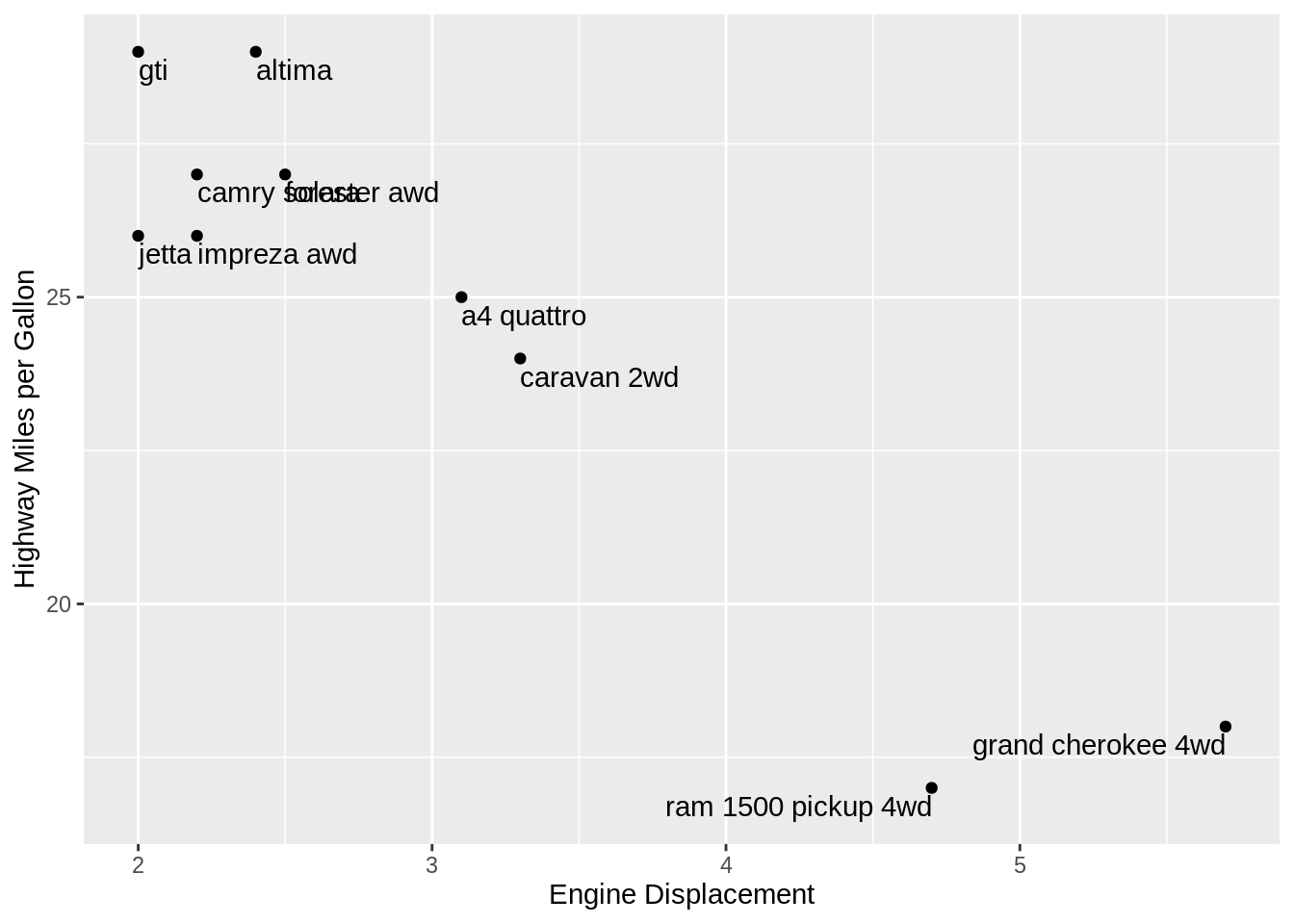
Now it looks better. But there are still some texts overlapped with each other, which makes it difficult to read them.
We can solve this problem using ggrepel which is a package developed to make adjustment on label positions.
37.1.2 Tip 2: ggrepel
In fact, geom_text_repel can solve all the problems mentioned in Method1 in one step.
ggplot(df1,aes(displ,hwy)) +
  geom_point()+
  geom_text_repel(aes(label=model)) +
  labs(x = "Engine Displacement",
       y = "Highway Miles per Gallon")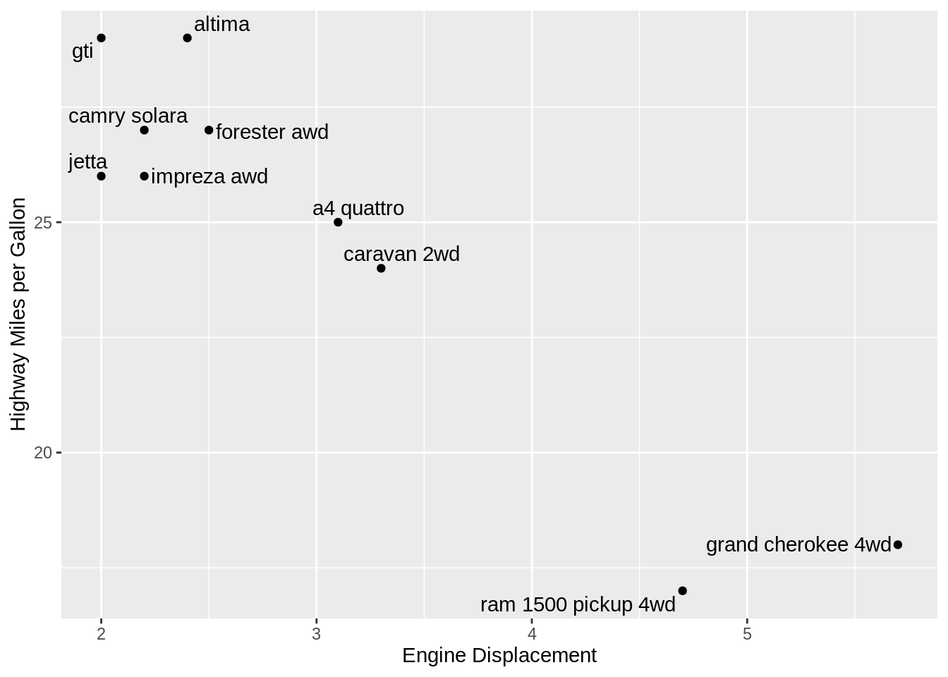
37.1.3 Tip 3: directlabels
set.seed(2)
df2 <- mpg[sample(nrow(mpg),10),]
ggplot(df2,aes(displ,hwy)) +
  geom_point() +
  geom_text(aes(label=model)) +
  labs(x = "Engine Displacement",
       y = "Highway Miles per Gallon")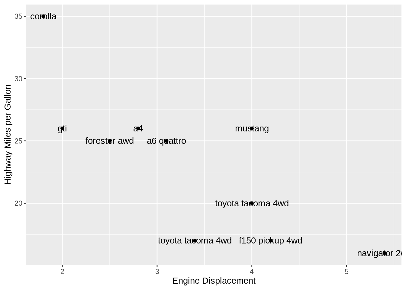
ggplot(df2,aes(displ,hwy)) +
  geom_point() +
  geom_dl(aes(label=model), method = "smart.grid") +
  labs(x = "Engine Displacement",
       y = "Highway Miles per Gallon")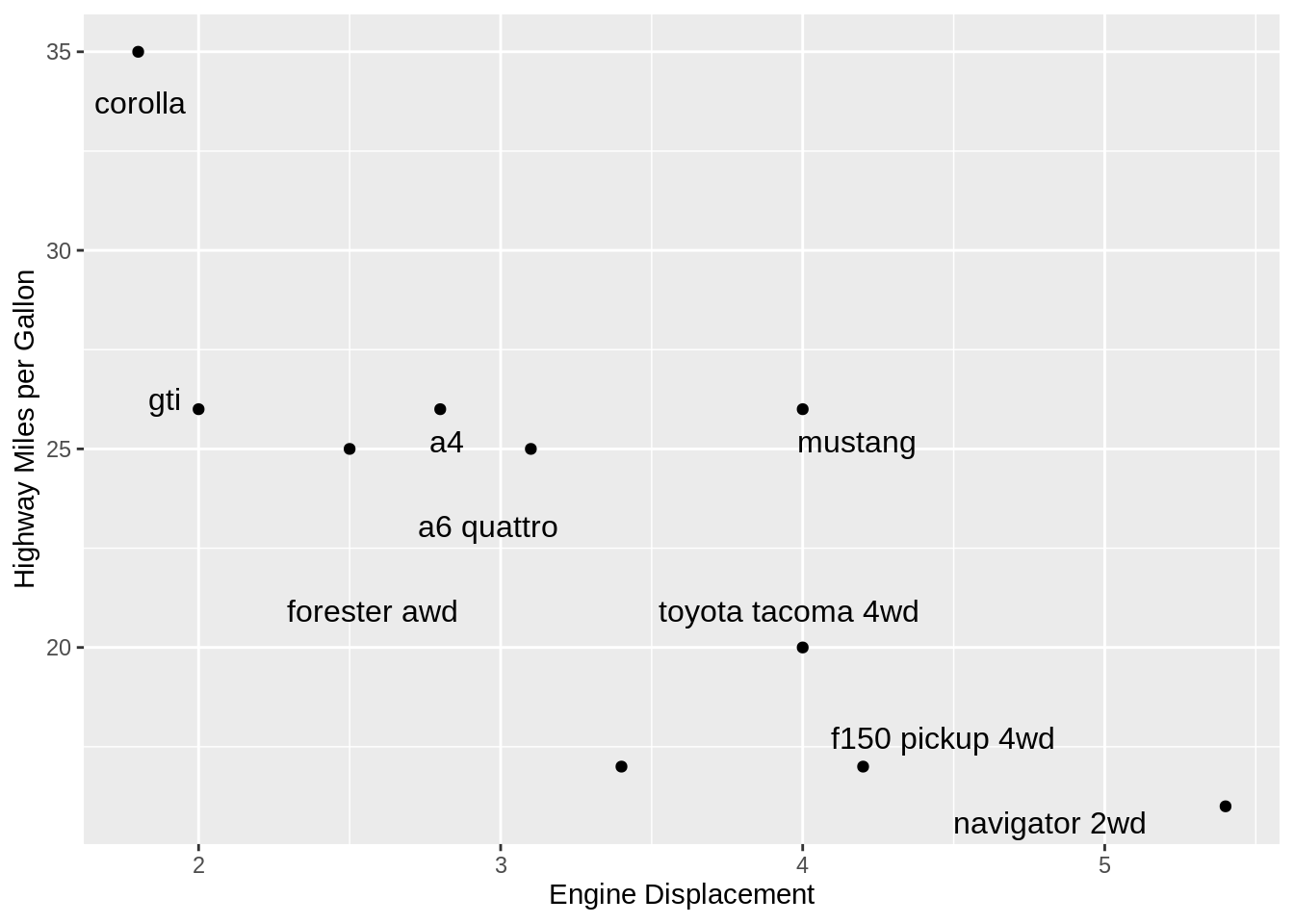
directlabels package implements the “smart.grid” method in geom_dl, which is able to sparate overlapped texts and points. But it seems that it works worse than geom_text_repel in that after the adjustment some texts are a little far from their corresponding points.
Actually, geom_dl fits better in plots with a lot more points. We can see from the above plot there are two “toyota tacoma 4wd” cars but geom_dl outputs only one label. So geom_dl is more suitable and useful for adding direct labels to replace color legend.
g3 <- ggplot(mpg,aes(displ,hwy,color=class)) +
  geom_point() +
  labs(x = "Engine Displacement",
       y = "Highway Miles per Gallon",
       title = "Use Legend and Color")
g4 <- ggplot(mpg,aes(displ,hwy,color=class)) +
geom_point(show.legend=F) +
geom_dl(aes(label=class),method="smart.grid") +
labs(x = "Engine Displacement",
y = "Highway Miles per Gallon",
title = "Use Label and Color")
grid.arrange(g3, g4, ncol = 2)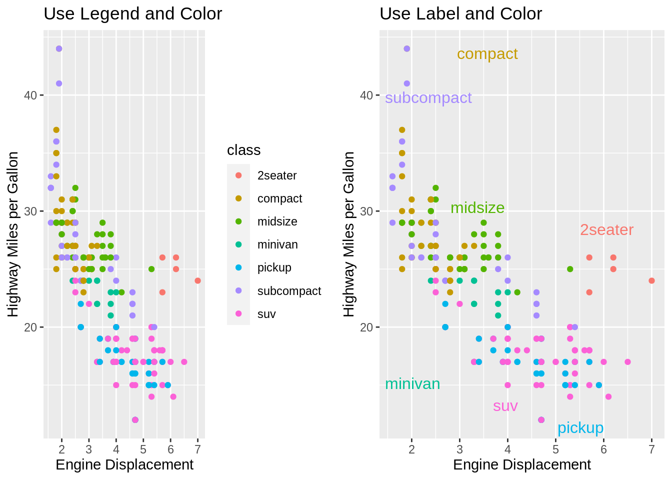
Clearly the figure on the right is more artistic and readable. geom_dl adds direct labels to a plot, and hide the color legend. ggplot2 shows automatic legends based on the variable specified for color, but these legends can be confusing if there are too many colors. Direct labels are a useful and clear alternative to a confusing legend in many common plots.
37.2 2. Auto wrapping of long labels on axis
We use DoctorVisits data set in AER package as an example. When labels are so long that they overlapped with each other and thus are not readable, we can wrap labels via str_wrap in stringr package.
data("DoctorVisits")
DoctorVisits <- DoctorVisits %>%
  mutate(numvisits = fct_collapse(factor(visits),
                                  "No doctor visit in past 2 weeks" = "0",
                                  "One doctor visit in past 2 weeks" = "1",
                                  group_other = TRUE))%>%
  mutate(numvisits = fct_collapse(numvisits,
                                  "No doctor visit in past 2 weeks" = "No doctor visit in past 2 weeks",
                                  "One doctor visit in past 2 weeks" = "One doctor visit in past 2 weeks",
                                  "Two or more doctor visits in past 2 weeks" = "Other"))

g1 <- DoctorVisits %>%
  group_by(numvisits) %>%
  summarise(count = n()) %>%
  ggplot(aes(x=numvisits, y=count)) +
  geom_bar(stat = "identity")

g2 <- DoctorVisits %>%
  group_by(numvisits) %>%
  summarise(count = n()) %>%
  ggplot(aes(x=numvisits, y=count)) +
  geom_bar(stat = "identity") +
  scale_x_discrete(labels=function(x) str_wrap(x, width=10))

grid.arrange(g1, g2, ncol = 2)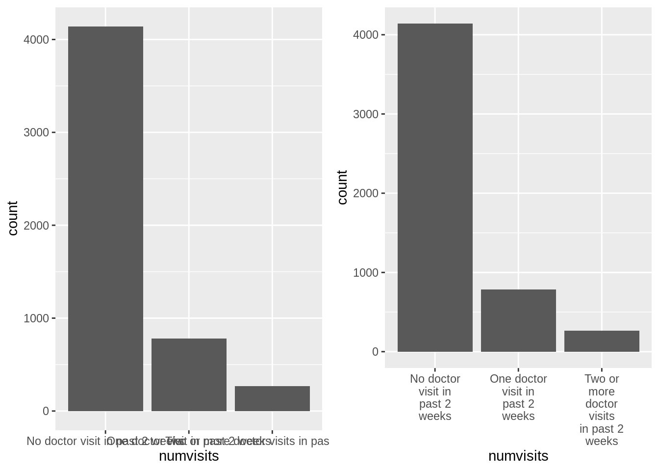
37.3 3. Add shadow effect to labels
We can create labels with background shadow by making use of shadowtext package.
Again, we take a look at mpg data set. The use of geom_shadowtext is just like geom_text. Besides there are additional parameters in geom_shadowtext like “bg.color” and “size”, which brings different background colors and shadow text size.
set.seed(0)
df3 <- mpg[sample(nrow(mpg),10),]
set.seed(3)
df3$angle = sample(0:-30, 10)
ggplot(df3,aes(displ,hwy)) +
  geom_point() +
  geom_shadowtext(aes(label=model,
                      color = model,
                      angle = angle),
                      hjust="inward", vjust="inward", nudge_y = -.1,
                      bg.color='firebrick3', size = 4) +
  theme(legend.position="none")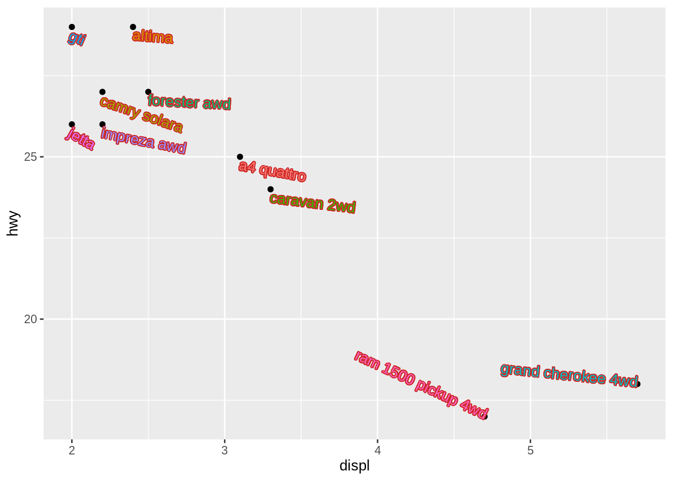
Together with parameter settings in Tips 1 in Label Placement, the shadow text effect and angle setting makes the labels more readable and beautiful.
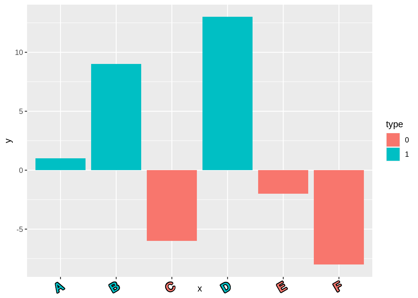
Also, this shadow effect can be applied to labels on axis. Just like the use of element_text in theme system, now we have element_shadowtext to add shadow effect to labels on axis.
x <- c("A","B","C","D","E","F")
y <- c(1, 9,-6,13,-2,-8)
df3 <- data.frame(x, y)

df3$type <- as.factor(ifelse(as.numeric(df3$y)<0, 0, 1))

g <- ggplot(df3, aes(x = x, y = y)) +
    geom_bar(stat = "identity", aes(fill = type)) +
    theme(axis.text.x = element_shadowtext(color = "white",
                                           size = 12,
                                           face = "bold"))
g
color <- ggplot_build(g)$data[[1]]$fill

g +
  theme(axis.text.x =
          element_shadowtext(color = color, angle=30, hjust=1,size = 15,face = "bold"))