26 A Summary of Interactive Chart
Yihan Chen
26.1 Introduction
This is a cheat sheet to help you find the proper interactive visualization with your purpose using R. In this document, I included several visualization examples about how to creating an interactive table, scatter plots, network, maps, etc.
26.2 Interactive Table
As shown below, we can create a interactive table with the help of package DT. In this interactive table, you can easily search certain data, sort data in one variable, show different number of rows.
26.3 Interactive Graph
26.3.1 Time Series
The dygraph package offers zooming, hovering, minimaps and much more. You can also pull down the timeline below to select and view the data for specified times.
26.3.2 Histograph
plotly can help us create interactive histogram. When hovering over the histogram, we can see information such as the category and quantity of that data. Similarly, we can also select parts of the graph to look deeper.
26.3.3 Scatter and Bubble Plots
plotly can also be used to create scatter and bubble plots. Here is an example. The same interaction can be realized here.
26.3.4 Interactive Network Graph
We can also create interactive network graph. For example, if you can’t see one node clearly, you can just move that node, and that node and the nodes who connect with it will change accordingly, just as you moved it in the physical world! networkD3 and visNetwork can both realize this function. The difference is that you can selected nodes by id in the network drawn by visNetwork.
26.3.5 Heatmaps
we can also draw an interactive heatmap using d3heatmap. Here is an example, when you hover over data, it will show the row and column it belongs to and also the value of it. You can also select a rectangle of data to dive deeper into the data set. Besides, when you click on one column/row name, it will highlight the corresponding column/name.
26.3.6 3D Scatterplots
threejs and rgl provides a way to show scatterplots in 3D. Typically, the input should be 3 vectors with same length representing x, y, z coordinate. You can drag the image to see the data from different angles.
26.3.7 Globe Plots
With the help of threejs, we can also create globe plots. It is an interesting way to view data on globe way.
26.3.8 Interactive Maps
We can create interactive maps to observe data related to geographic distribution. It also offers zooming, hovering, minimaps and much more.
26.3.9 Interactive Chord Diagram
Chord diagram can be interactive too! When hovering on specific part of the diagram, the detailed information of that part will pop up and also it will hight the related part for you to observe more clearly.
26.3.10 Interactive Collapsible Reingold-Tilford Tree Diagrams
Collapsible Reingold-Tilford Tree Diagram is another interesting interactive graph. When you click a node, its children will be expanded so you can get more detailed information. When you don’t want to see in detail, you can also collapse the lower level nodes.
26.3.11 Interactive Circle Packing
Circle packing is a kind of graph that help you learn more about the composition of the data. For example, how many of the students are taking math class, and among them, what is the distribution of sex.
Note that it may be no interactive graph shown in html file, but it should be fine when seen in rmd file.
So I add a static graph here for reference.
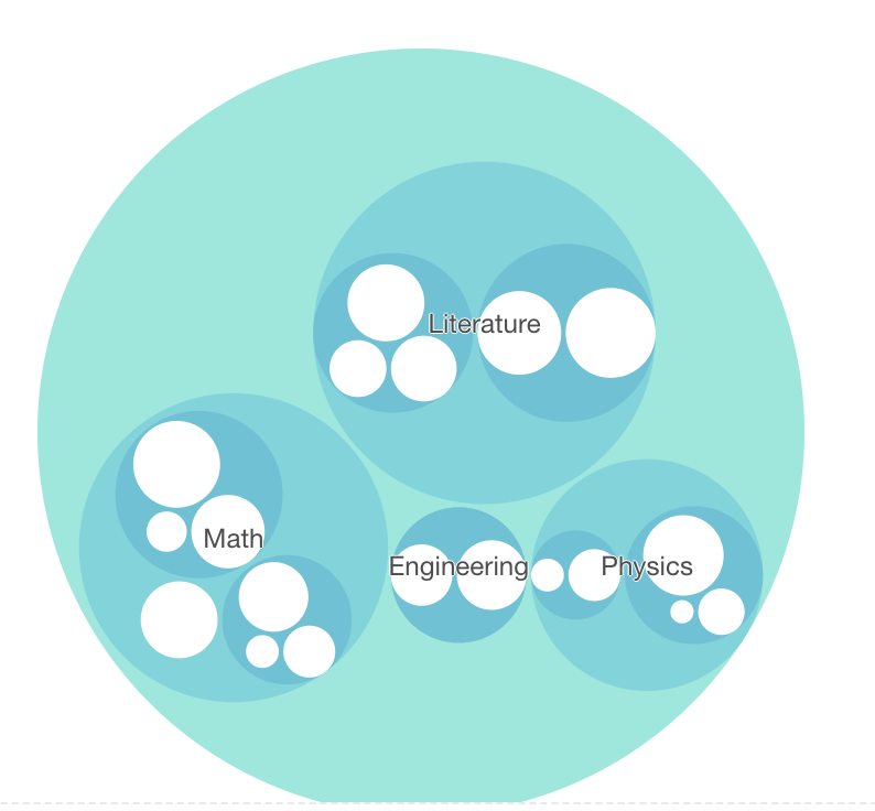
Interactive Circle Packing
26.3.12 Interactive Streamgraph
streamgraph is a great tool to create interactive streamgraph. You can select a specific class to ocserve. Zooming, hovering, minimaps and much more also effective here.
Note that it may be no interactive graph shown in html file, but it should be fine when seen in rmd file.
So I add a static graph here for reference.
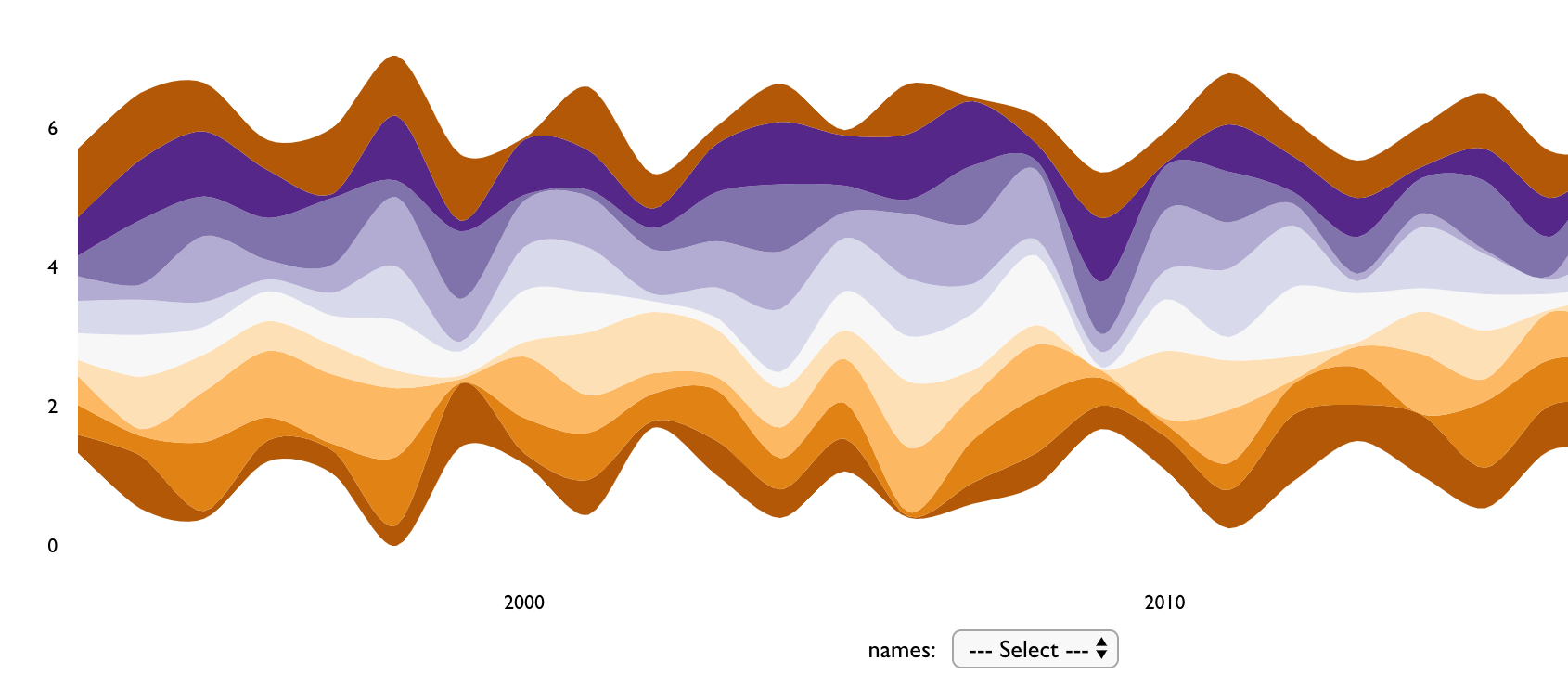
Interactive Streamgraph
26.4 Reference
- https://r-graph-gallery.com/bubble-map.html
- https://plotly.com/r/
- https://bwlewis.github.io/rthreejs/
- https://rstudio.github.io/leaflet/
- http://christophergandrud.github.io/networkD3/
- https://r-graph-gallery.com/3d_scatter_plot.html
- https://github.com/hrbrmstr/streamgraph
- https://r-graph-gallery.com/streamgraph.html
- https://cran.r-project.org/web/packages/rgl/vignettes/rgl.html
- https://r-graph-gallery.com/chord-diagram.html
- https://github.com/mattflor/chorddiag
- https://github.com/AdeelK93/collapsibleTree
- https://r-graph-gallery.com/network-interactive.html