31 3D Visualization in R
Tianyu Han and Shijia Huang
31.1 Motivation
As an important part of data visualization, 3D plotting makes the data exploration part easier for users and allow a visual display of datasets.By plotting data points on three axes, 3D plots describe the relationship between these three variables and are useful to identify underlying patterns and interactions that are not shown on 2D graphs.
In this tutorial, we will introduce different packages for 3D plots, including package Scatterplot3D, package plot3D, and also plotly. By the end of the tutorial, one will be able to choose the most suitable package for his/her project.
What we can learn from this project is that there are always different ways to tackle the same problem using different R libraries and packages. It will require extensive research and trials in order to determine which one works best in the given scenario.
31.2 Scatterplot3D
Scatterplot3d is an R package that displays multidimensional data in 3D space.There is only one function scatterplot3d() in this package.The usage of scatterplot3d() will be discussed with examples as below.
31.2.1 Load Data
We use the preloaded dataset USArrests as an example to show what information can be draw from 3D plot using scatterplot3d.
##            Murder Assault UrbanPop Rape
## Alabama      13.2     236       58 21.2
## Alaska       10.0     263       48 44.5
## Arizona       8.1     294       80 31.0
## Arkansas      8.8     190       50 19.5
## California    9.0     276       91 40.6
## Colorado      7.9     204       78 38.7
31.2.2 Create matrix
For Scatterplot3d, the dataframe provided must be converted into a matrix. Here we select Assault, Urban Population, and Rape as our three axes.
USArrestsMatrix <- as.matrix(USArrests)
x1 <- USArrestsMatrix[,2] ## Assault
y1 <- USArrestsMatrix[,3] ## Urban Population
z1 <- USArrestsMatrix[,4] ## Rape
31.2.3 Generate 3d scatter plot
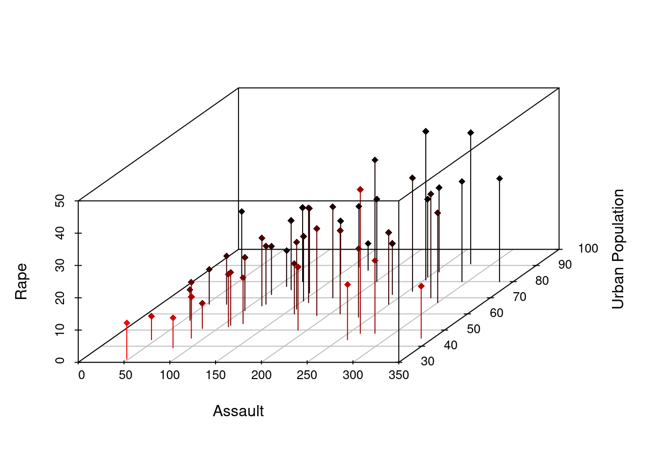
Creating a graph using scatterplot3d. “highlight” gives a color scale that enables users to understand the relative position of each data point. “pch” specifies a plotting shape, here we set pch = 16, which is a small dot.
sp1 <- scatterplot3d(x1,y1,z1, highlight.3d = TRUE, pch = 16, angle = 45,
                     xlab = "Assault",
                     ylab = "Urban Population",
                     zlab = "Rape")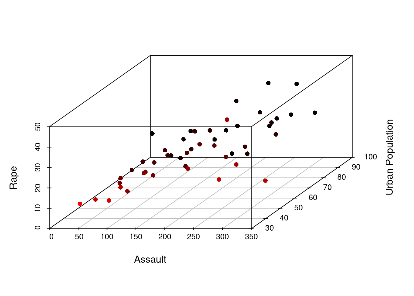
We can also remove the box (or grid) of the graph and change the color of the points. Note that when setting color, the “highlight.3d” argument should be specified as FALSE
sp2 <- scatterplot3d(x1,y1,z1,  pch = 16, angle = 45,highlight.3d = FALSE,
                     xlab = "Assault",
                     ylab = "Urban Population",
                     zlab = "Rape",
                     grid = TRUE,
                     box = FALSE,
color = c("pink")) 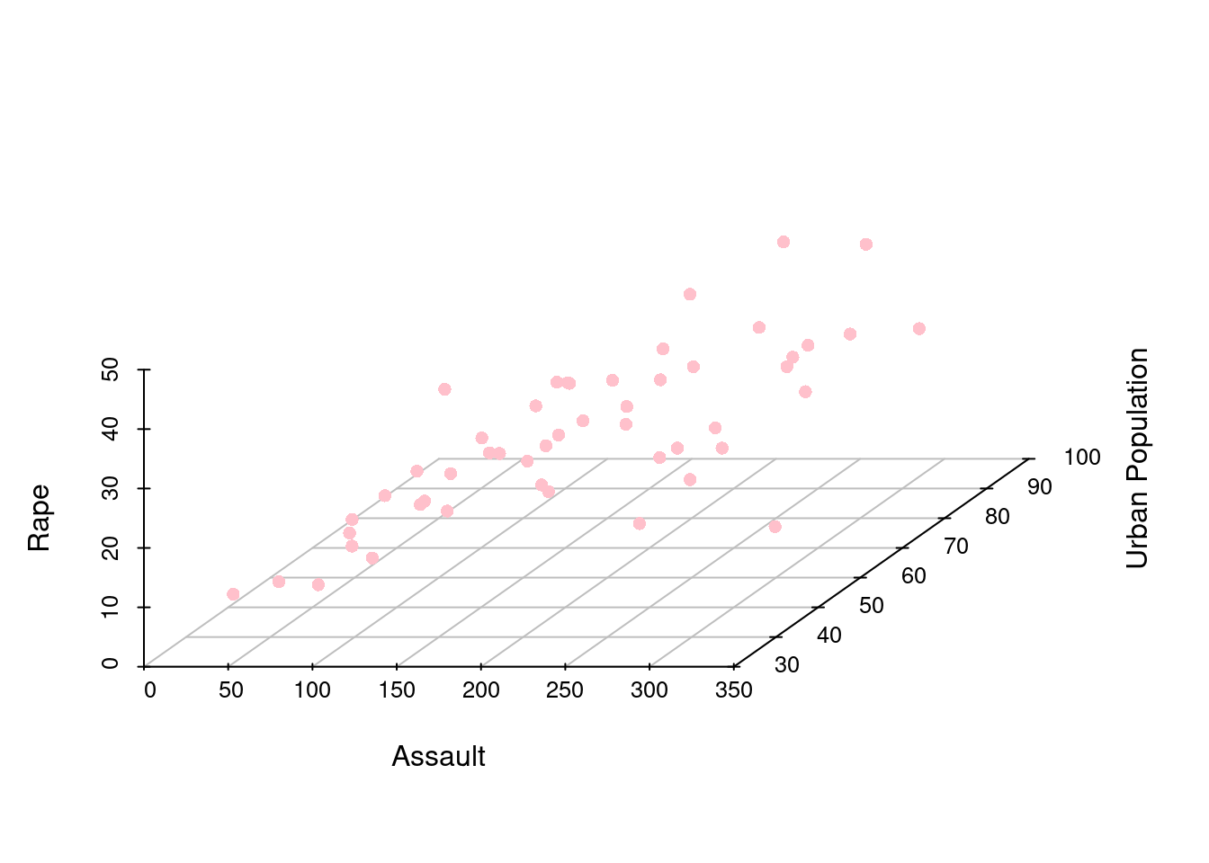
Adding labels to the graph, “cex” specifies the font size.
sp3 <- scatterplot3d(x1,y1,z1, highlight.3d = TRUE, pch = 18, angle = 45,
                     xlab = "Assault",
                     ylab = "Urban Population",
                     zlab = "Rape")
text(sp3$xyz.convert(USArrests[2:4]),labels = rownames(USArrests), cex = 0.5, color = 'pink')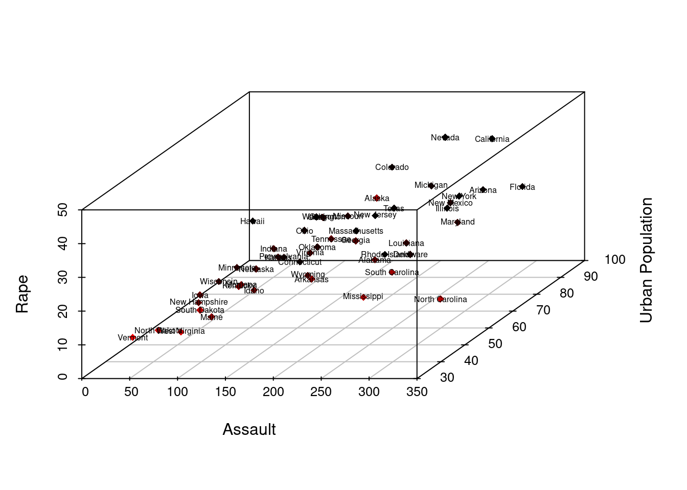
31.3 3D plot and PCA
In data science, 3D plot can also be used for machine learning steps. For example, by plotting principal components in a 3D space, we could efficiently observe the interaction between the important vectors of an input data.
We use the preloaded data “Glass” to perform the principal component analysis and 3D visualization of components.
31.3.1 Load Package “mlbench” and use the Glass dataset.
##        RI    Na   Mg   Al    Si    K   Ca Ba   Fe Type
## 1 1.52101 13.64 4.49 1.10 71.78 0.06 8.75  0 0.00    1
## 2 1.51761 13.89 3.60 1.36 72.73 0.48 7.83  0 0.00    1
## 3 1.51618 13.53 3.55 1.54 72.99 0.39 7.78  0 0.00    1
## 4 1.51766 13.21 3.69 1.29 72.61 0.57 8.22  0 0.00    1
## 5 1.51742 13.27 3.62 1.24 73.08 0.55 8.07  0 0.00    1
## 6 1.51596 12.79 3.61 1.62 72.97 0.64 8.07  0 0.26    1
31.3.2 Data Cleaning
Perform PCA on the dataset and convert the pca result into a dataframe. Here we plot three components of the PCA results.Specify three colors for them.”shape” specifies three different shapes for each component.
results <- prcomp(Glass[,2:4], scale = TRUE)
results$rotation <- -1*results$rotation
results$rotation
## PC1 PC2 PC3
## Na 0.4381565 -0.8763587 0.2000358
## Mg -0.6582364 -0.1612544 0.7353380
## Al 0.6121632 0.4538639 0.6475058
results$x <- -1*results$x
head(results$x)
## PC1 PC2 PC3
## 1 -1.1222507 -0.76451910 0.5299814
## 2 -0.2631728 -0.69696062 0.4746961
## 3 -0.2128159 -0.14139775 0.5944634
## 4 -0.7549327 -0.04089696 0.2632213
## 5 -0.7521008 -0.14291459 0.1773877
## 6 -0.5391614 0.71876865 0.5475329
pca.result <- results$x
pca.result <-data.frame(pca.result)
head(pca.result)
## PC1 PC2 PC3
## 1 -1.1222507 -0.76451910 0.5299814
## 2 -0.2631728 -0.69696062 0.4746961
## 3 -0.2128159 -0.14139775 0.5944634
## 4 -0.7549327 -0.04089696 0.2632213
## 5 -0.7521008 -0.14291459 0.1773877
## 6 -0.5391614 0.71876865 0.5475329
pca.result$Type <- (Glass$Type)31.3.3 Define color and shape parameter.
## choose 6 colors for 6 glass types
colors <- c("#E69F00", "#56B4E9","#B2182B","#D1E5F0","#92C5DE","#2166AC")
colors <- colors[as.numeric(pca.result$Type)]
## choose 6 shapes for 6 glass types
shape<-10:15
shape<-shape[as.numeric(pca.result$Type)]
31.3.4 Generate graph
Plot the result of our PCA analysis following the step in the previous part. Adjust angle for best visualization. Below is an example of how a 3D plot can help us see the contribution of each component in classifying types of glass.
PCA3D <- scatterplot3d(pca.result[,1:3],
                     color=colors,
                     pch = shape,
                     cex.symbols = 3,
                     angle = 100)
legend("top", legend = levels(pca.result$Type),
       col =   c("#E69F00", "#56B4E9","#B2182B","#D1E5F0","#92C5DE","#2166AC"),
       pch = c(10,11,12,13,14),
       inset = -0.1, xpd = TRUE, horiz = TRUE)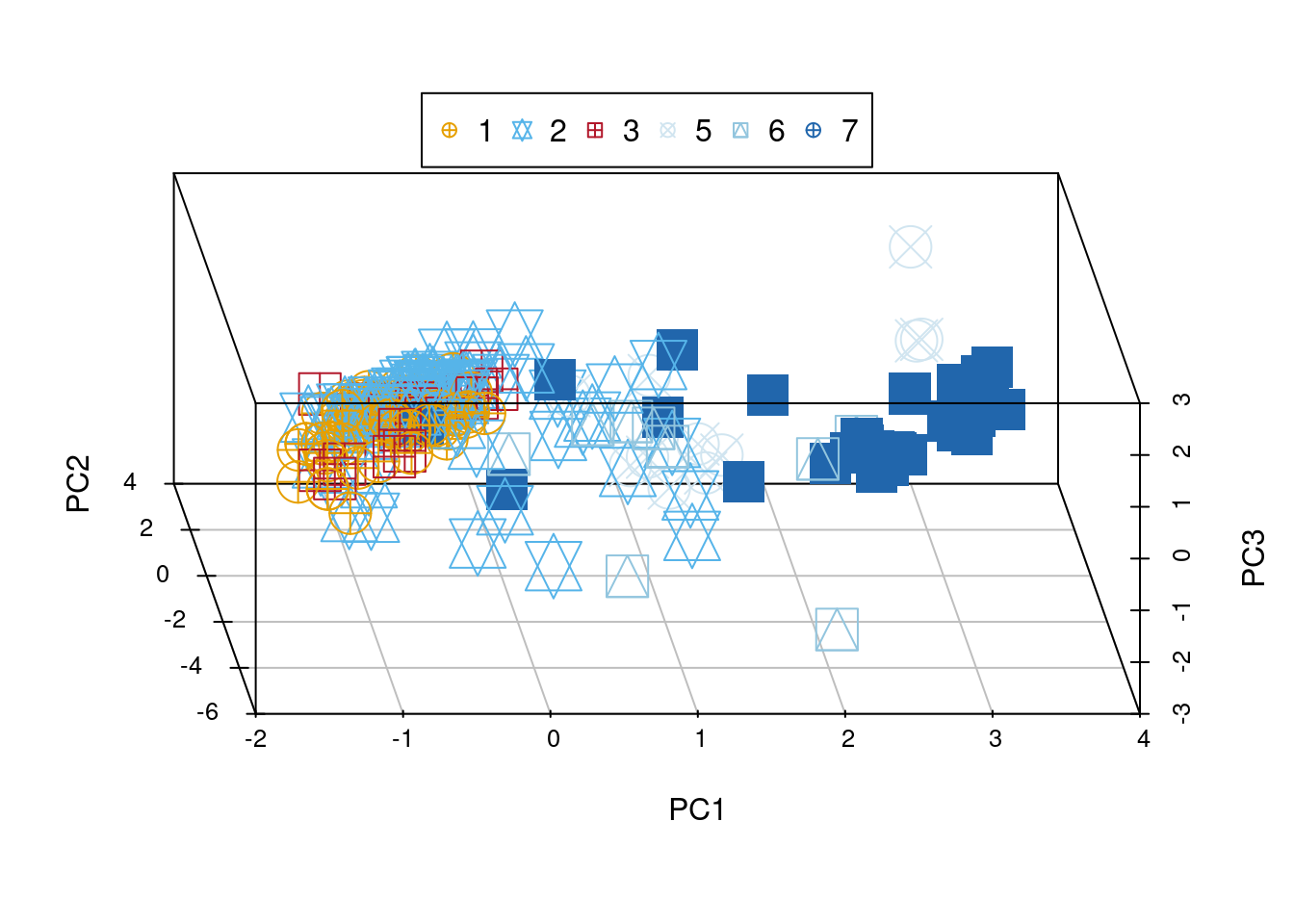
31.4 Other usage of the scatterplot3d function
Sometimes it is hard to imagine the relationship between two functions or graph, by plotting them on a 3D space, we could visualize the interaction on a dynamic environment.
Here is a simple example of how we could graph the interaction of cos and sin function.
z <- seq(-15, 15, 0.05)
x <- cos(z)
y <- sin(z)
scatterplot3d(x, y, z, highlight.3d=TRUE, col.axis ="blue",col.grid ="lightblue", main="an example of cosine and sine interaction", pch=20)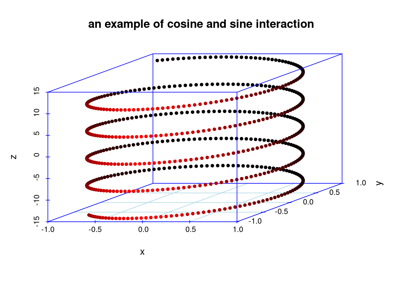
31.5 3D Histogram
If we were to generate a histogram in 3d, we can use the plot 3D package. We first initiate the x-axis and the y-axis. Then, we need to create z as matrix that has the dimension |x| * |y|. We can then use hist3D function in the package to help us generate the 3D histogram that we need.
x = c(1, 2)
y = c(1, 2)
z = c(1, 2, 2, 3)
mat1 <- matrix(z,nrow=2,ncol=2,byrow=TRUE)
hist3D(z=mat1, x = x, y= y)
31.6 3D scatter plot using plotly
31.6.1 Demo Data
In order to better demonstrate the different features of plotly 3D Scatterplot, we selected a sample data which includes 40 observations on household expenditure for single men and women. There are 5 variables for each observation:
Housing: money(usd) spent on housing
Food: money(usd) spent on food
Goods: money(usd) spent on goods
Service: money(usd) spent on service
Gender: female or male
household## housing food goods service gender
## 1 820 114 183 154 female
## 2 184 74 6 20 female
## 3 921 66 1686 455 female
## 4 488 80 103 115 female
## 5 721 83 176 104 female
## 6 614 55 441 193 female
## 7 801 56 357 214 female
## 8 396 59 61 80 female
## 9 864 65 1618 352 female
## 10 845 64 1935 414 female
## 11 404 97 33 47 female
## 12 781 47 1906 452 female
## 13 457 103 136 108 female
## 14 1029 71 244 189 female
## 15 1047 90 653 298 female
## 16 552 91 185 158 female
## 17 718 104 583 304 female
## 18 495 114 65 74 female
## 19 382 77 230 147 female
## 20 1090 59 313 177 female
## 21 497 591 153 291 male
## 22 839 942 302 365 male
## 23 798 1308 668 584 male
## 24 892 842 287 395 male
## 25 1585 781 2476 1740 male
## 26 755 764 428 438 male
## 27 388 655 153 233 male
## 28 617 879 757 719 male
## 29 248 438 22 65 male
## 30 1641 440 6471 2063 male
## 31 1180 1243 768 813 male
## 32 619 684 99 204 male
## 33 253 422 15 48 male
## 34 661 739 71 188 male
## 35 1981 869 1489 1032 male
## 36 1746 746 2662 1594 male
## 37 1865 915 5184 1767 male
## 38 238 522 29 75 male
## 39 1199 1095 261 344 male
## 40 1524 964 1739 1410 male31.6.3 Adding colors to 3D Scatterplot
In order differentiate the observations of opposite genders, we will need to add colors to our 3D scatter plot. It is done as followed:
31.6.4 Adding sizes to 3D Scatterplot
It is interesting to note that size is available as a fifth parameter if it helps us plot our findings. In our example, we used size to plot the overall expenditure of the household. It help us visualize the overall trend better.
fig <- plot_ly(household, x = ~housing, y = ~food, z = ~goods + service,
               color = ~gender, colors = c('#2ca02c', '#8c564b'), size = ~ housing + food + goods + service, sizes = c(500, 5000))
fig <- fig %>% add_markers()
fig <- fig %>% layout(scene = list(xaxis = list(title = 'housing'),
                                   yaxis = list(title = 'food'),
                                   zaxis = list(title = 'goods and services')))
fig
31.7 Conclusion
In our tutorial, we have introduced scatterplot3d, plot3d, and also plotly. They each have their respective advantages. If you need a more interactive graph that allows zooming in and rotating, plotly would be your better choice. However, if you were to perform principal component analysis and better visualize your results, it would be easier to use scatterplot3d.
31.8 Works Cited
Ligges, Uwe, and Martin Mächler. “Scatterplot3d - an R Package for Visualizing Multivariate Data.” Journal of Statistical Software, vol. 8, no. 11, Foundation for Open Access Statistic, 2003, https://doi.org/10.18637/jss.v008.i11.
http://www.sthda.com/english/wiki/scatterplot3d-3d-graphics-r-software-and-data-visualization
http://www.sthda.com/english/wiki/colors-in-r#:~:text=In%20R%2C%20colors%20can%20be,taken%20from%20the%20RColorBrewer%20package.
https://www.statology.org/principal-components-analysis-in-r/
https://plotly.com/r/3d-scatter-plots/
http://www.countbio.com/web_pages/left_object/R_for_biology/R_fundamentals/3D_histograms_R.html