32 Visualizing Time Series Data
Kate Lassiter
32.0.0.1 Starting Point
Same exploratory questions as with any new data set:
- Strongly correlated columns
- Variable means
- Sample variance, etc.
Use familiar techniques:
- Summary statistics
- Histograms
- Scatter plots, etc.
Be very careful of lookahead!
- Incorporating information from the future into past smoothing, prediction, etc. when you shouldn’t know it yet
- Can happen when time-shifting, smoothing, imputing data
- Can bias your model and make predictions worthless
32.0.0.2 Working with time series (ts) objects
Integration of ts() objects with ggplot2:
- ggfortify package
- autoplot()
- All the same customizations as ggplot2
- Don’t have to convert from ts to dataframe format
- gridExtra package
- Arrange the 4 ggplot plots as a 4-panel grid
- grid package
- Add title to the grid arrangement
dax=autoplot(EuStockMarkets[,"DAX"])+
  ylab("Price")+
  xlab("Time")

cac=autoplot(EuStockMarkets[,"CAC"])+
  ylab("Price")+
  xlab("Time")

smi=autoplot(EuStockMarkets[,"SMI"])+
  ylab("Price")+
  xlab("Time")

ftse=autoplot(EuStockMarkets[,"FTSE"])+
  ylab("Price")+
  xlab("Time")
grid.arrange(dax,cac,smi,ftse,top=textGrob("Stock market prices"))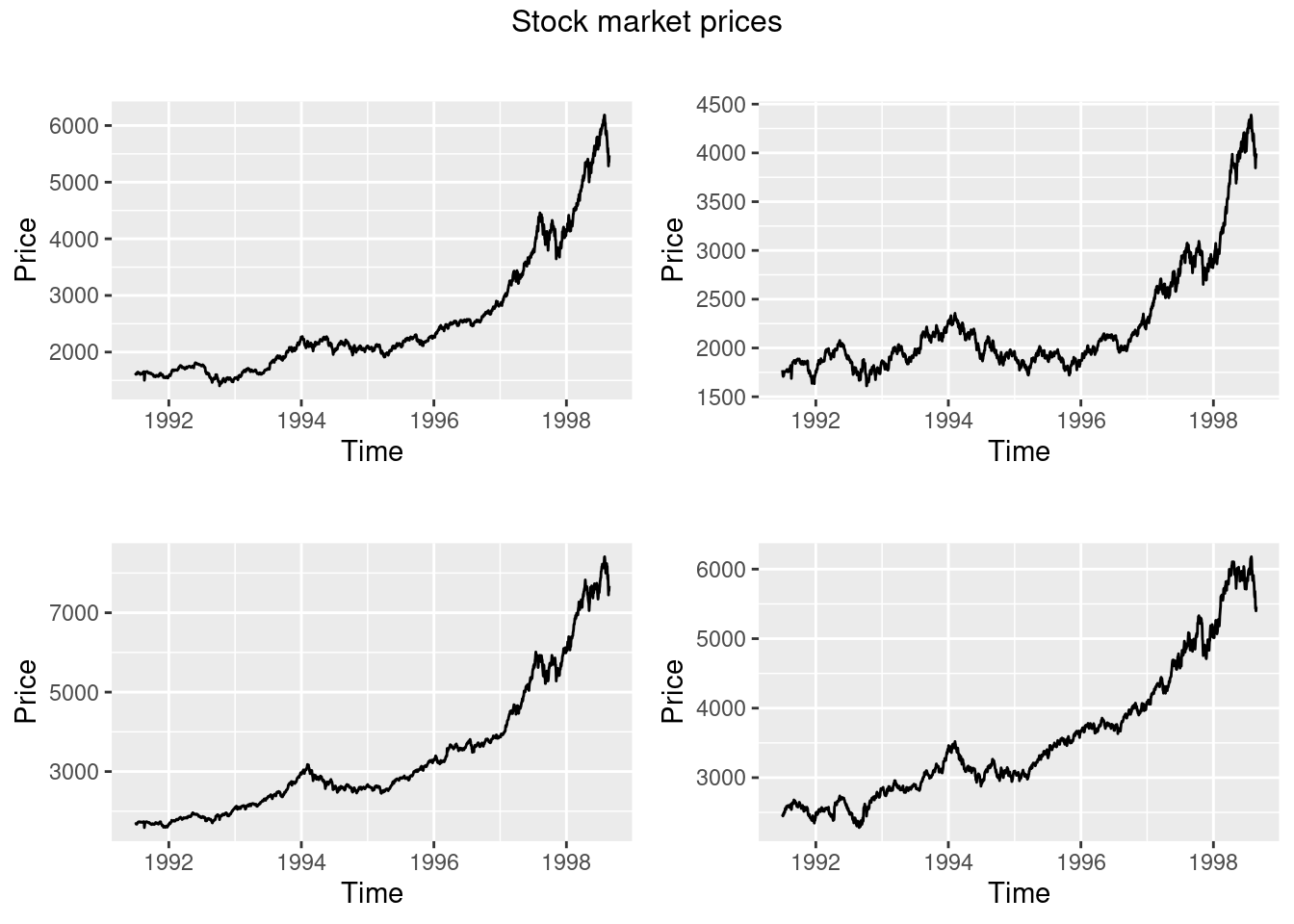
32.0.0.3 Time series relevant plotting:
Working with the data:
- Directly transforming ts() objects for use with ggplot2:
- complete.cases() to easily remove NA rows - prevent ggplot warning
- avoid irritations of working with ts objects
Looking at changes over time:
- Plot differenced values
- Histogram/scatter plot of the lagged data
- Shows change in values, how values change together
- Trend can hide true relationship, make two series appear highly predictive of one another when they move together
- Use base package diff(), calculates difference between point at time t and t+1
new=as.data.frame(EuStockMarkets)
new$SMI_diff=c(NA,diff(new$SMI))
new$DAX_diff=c(NA,diff(new$DAX))

p1 <- ggplot(new, aes(SMI,DAX))+
  geom_point(shape = 21, colour = "black", fill = "white")
p2 <- ggplot(new[complete.cases(new),], aes(SMI_diff,DAX_diff))+
  geom_point(shape = 21, colour = "black", fill = "white")

grid.arrange(p1,p2,top=textGrob("SMI vs DAX"))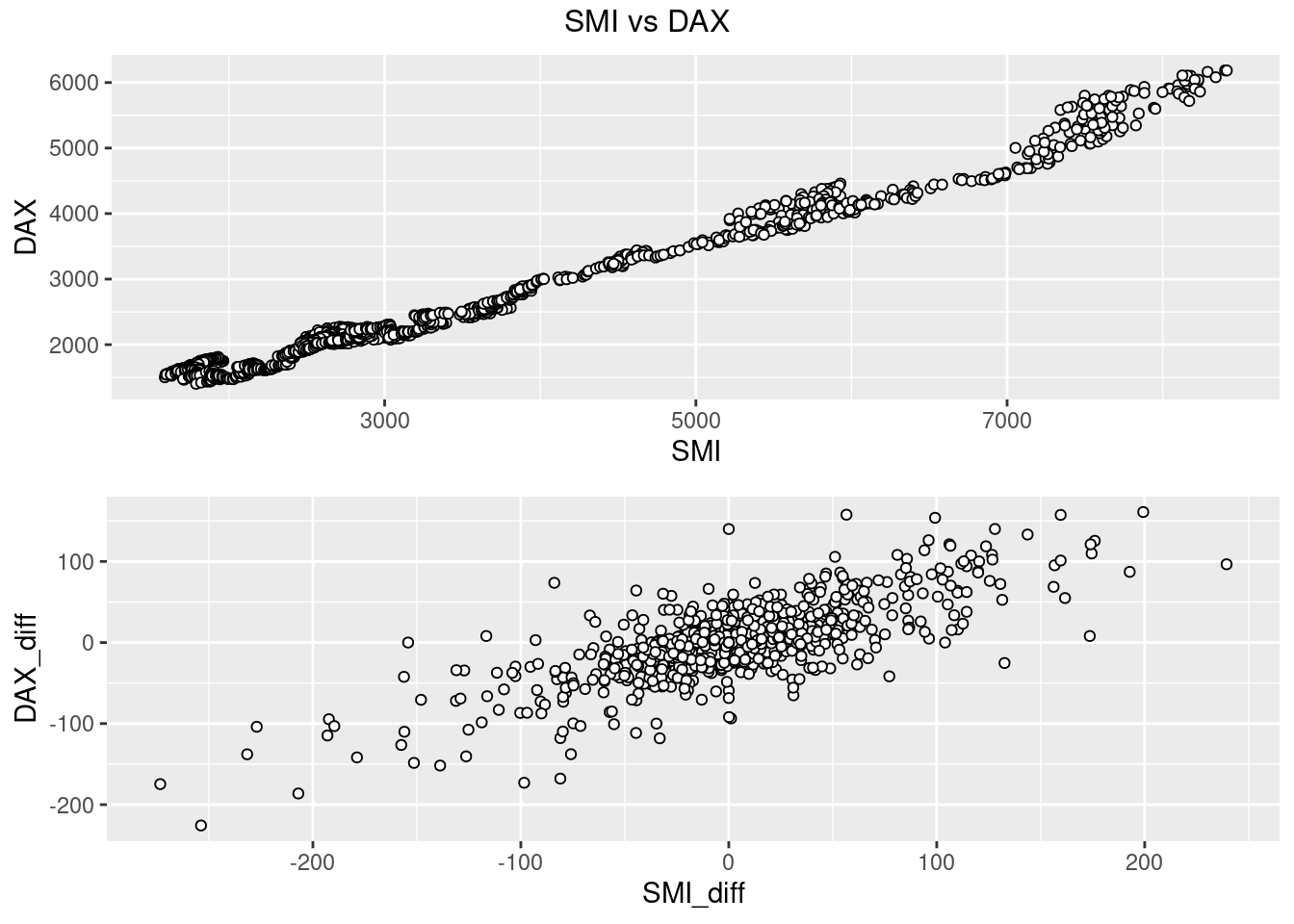
Exploring Time Lags:
- Lagged differences:
- Time series analysis: focused on predicting future values from past
- Concerned whether a change in one variable at time t predicts change in another variable at time t+1
- lag() to shift forward by one
- Showing density using alpha
new$SMI_lag_diff=c(NA,lag(diff(new$SMI),1))
ggplot(new[complete.cases(new),], aes(SMI_lag_diff,DAX_diff))+
  geom_point(shape = 21, colour = "black", fill = "white",alpha=0.4,size=2)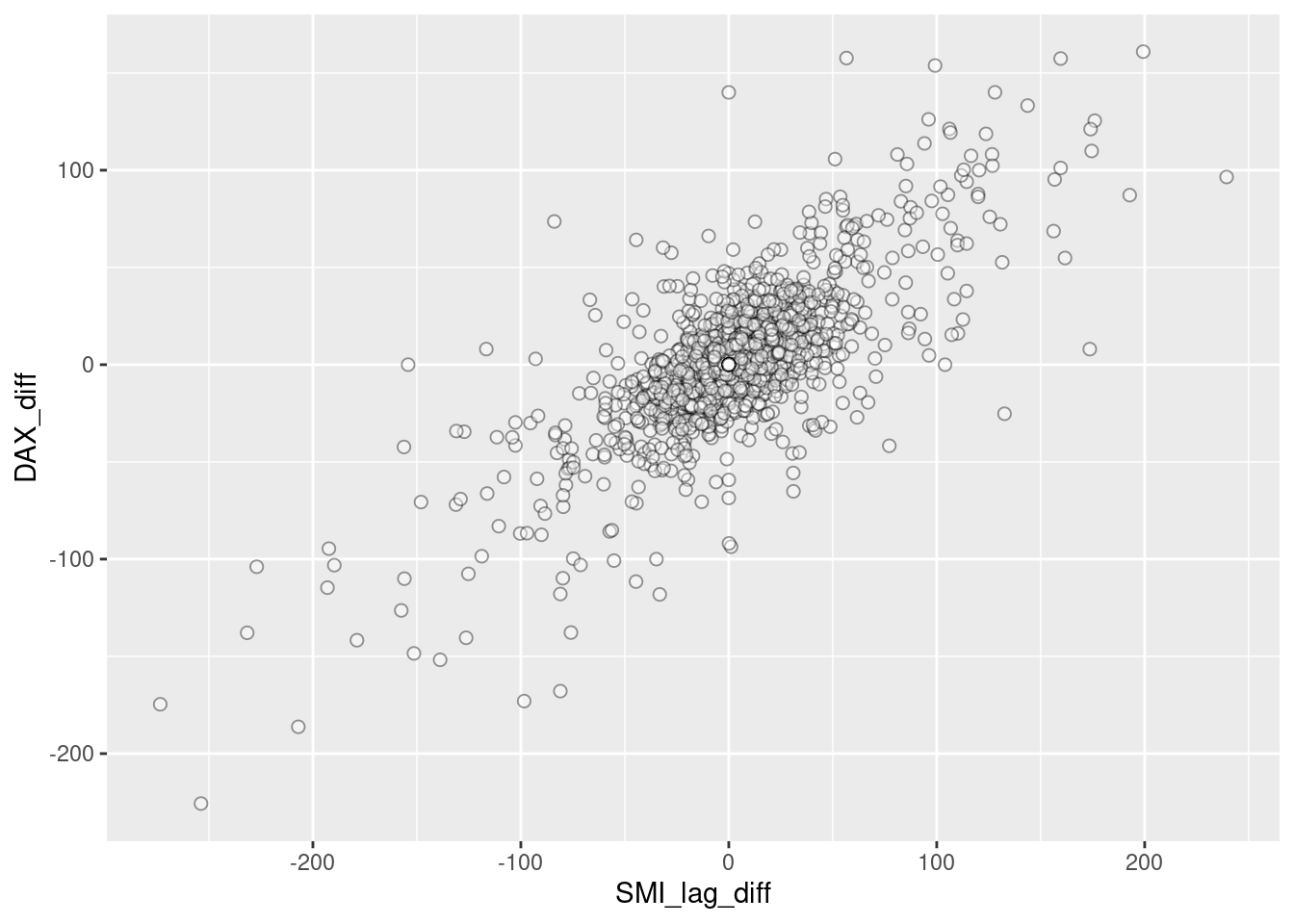
Now there is no apparent relationship: positive change in SMI today won’t predict positive change in DAX tomorrow. There is a positive trend over the long term, but this does little to predict in the short term
Observations:
- Be careful with time series data: use same techniques, but reshape data
- Change in values from one time to another is vital concept
32.0.0.4 Dynamics of Time Series Data
Three aspects of time series data:
- Seasonal:
- Recurs over a fixed period
- Cycle:
- Recurrent behaviors, variable time period
- Trend:
- Overall drift to higher/lower values over a long time period
- Overall drift to higher/lower values over a long time period
32.0.0.4.1 Line plots
Discover patterns through visual inspection:
- Observations:
- Clear trend
- Consider log transform or differencing
- Increasing variance
- Consider log or square root transform
- Multiplicative seasonality
- Seasonal swings grow along with overall values
- Clear trend
32.0.0.4.2 Time series decomposition:
- Break data into seasonal, trend, and remainder components
- Seasonal component:
- LOESS smoothing of all January values, February values, etc.
- Moving window estimate of smoothed value based on point’s neighbors
- stats package
- stl()
- stl()
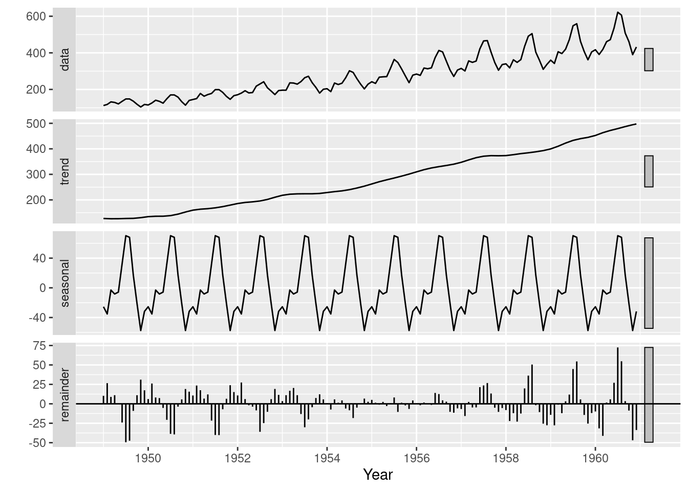
- Observations
- Clear rising trend
- Obvious seasonality
- Difference between the two methods:
- This particular decomposition shows additive, not multiplicative seasonality
- But start and end time series have highest residuals
- Settled on the average seasonal variance
- This particular decomposition shows additive, not multiplicative seasonality
- Both reveal information on patterns that need to be identified and potentially dealt with before forecasting can occur
32.0.0.5 Plotting: Exploiting the Temporal Axis
32.0.0.5.1 Gannt charts
- Shows overlapping time periods, duration of event relative to others
- timevis package timevis()
32.0.0.5.2 Using month and year creatively in line plots
- forecast package
- ggseasonplot()
- X axis is months
- Y axis is the variable of interest
- Each line represents a year.
- Shows if months exhibited similar/different seasonal patterns over the years
- ggmonthplot()
- X axis is months
- Y axis is the variable of interest
- Blue line is mean of each season
- Black line is the values for every year for a single month
- ggseasonplot()
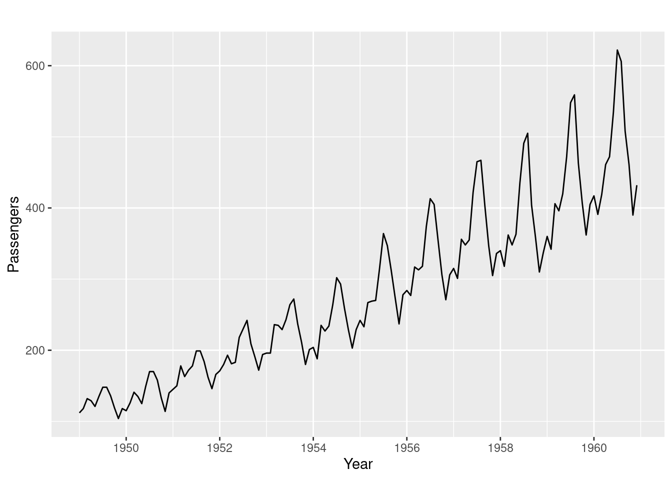
ggseasonplot(AirPassengers)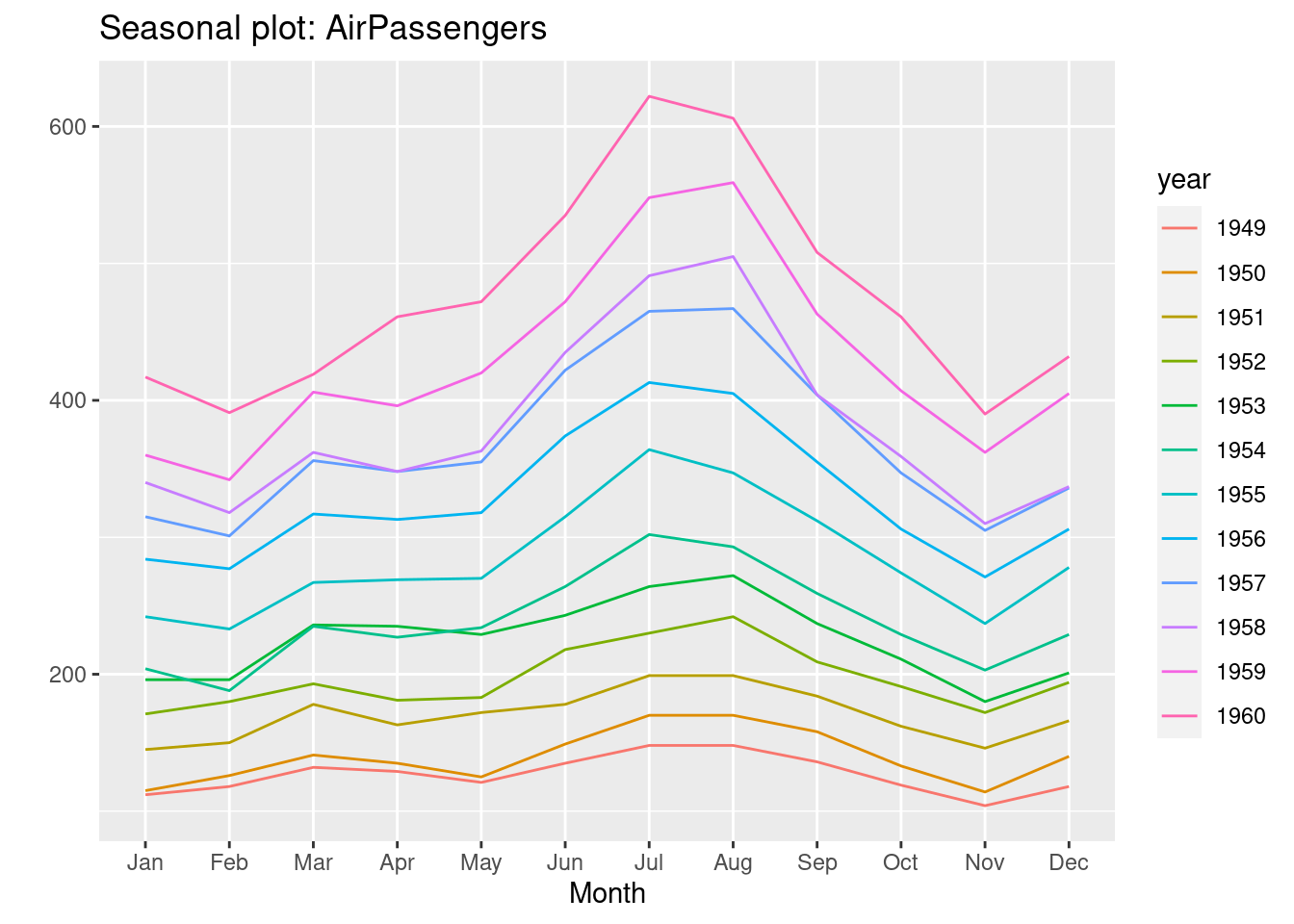
ggmonthplot(AirPassengers)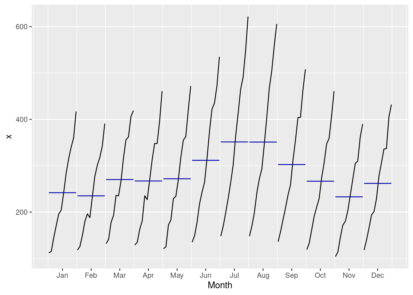
- Observations
- Some months increased more over time than others
- Passenger numbers peak in July or August
- Local peak in March most years
- Overall increase across months over the years
- Growth trend increasing (rate of increase increasing)
32.0.0.6 3-D Visualizations: plotly package
- Convert to a format plotly will understand
- Avoid using ts() object
- Dataframe with datetime, numeric columns
- lubridate package for date manipulation
- year()
- month()
new = data.frame(AirPassengers)
new$year=year(seq(as.Date("1949-01-01"),as.Date("1960-12-01"),by="month"))
new$month=lubridate::month(seq(as.Date("1949-01-01"),as.Date("1960-12-01"),by="month"),label=TRUE)
plot_ly(new, x = ~month, y = ~year, z = ~AirPassengers,
             color = ~as.factor(month)) %>%
    add_markers() %>%
    layout(scene = list(xaxis = list(title = 'Month'),
                        yaxis = list(title = 'Year'),
zaxis = list(title = 'Passenger Count')))- Allows a better view of the relationship between month, year, and number of passengers
32.0.0.7 Data Smoothing
- Usually need to smooth the data before starting analysis or visualization
- Allows better storytelling
- Irrelevant spikes dominate the narrative
- Methods:
- Moving average/median
- Good for noisy data
- Rolling mean reduces variance
- Keep in mind: affects accuracy, R² statistics, etc.
- Zoo package rollmean() and rollmedian()
- k = 7 is a 7 month rolling window
- Prevent lookahead, use past values as the window (align=“right”)
- gsub() substitute series names for a clearer legend
- tidyr package gather()
- Convert from wide to long, use this as color/group in ggplot2 geom_line()
- Convert from wide to long, use this as color/group in ggplot2 geom_line()
- Exponentially weighted moving average
- Weigh past values less than recent
- pracma package movavg() function
- Useful when more recent data is more or less informative than the past
- Geometric mean
- Combats strong serial correlation
- Good for series with data that compounds greatly as time goes on
- Base R exp(mean(log())) and zoo package rollapply()
- Moving average/median
new = data.frame(AirPassengers)
new$AirPassengers=as.numeric(new$AirPassengers)
new$year=seq(as.Date("1949-01-01"),as.Date("1960-12-01"),by="month")

new = new %>%
  mutate(roll_mean = rollmean(new$AirPassengers,k=7,align="right",fill = NA),
         roll_median = rollmedian(new$AirPassengers,k=7,align="right",fill = NA))

df <- gather(new, key = year, value = Rate,
                            c("roll_mean","roll_median", "AirPassengers"))
df$year=gsub("AirPassengers","series",df$year)
df$year=gsub("roll_mean","rolling mean",df$year)
df$year=gsub("roll_median","rolling median",df$year)
df$date = rep(new$year,3)

ggplot(df[complete.cases(df),], aes(x=date, y = Rate, group = year, colour = year)) +
  geom_line()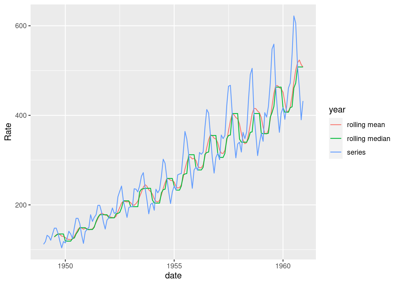
32.0.0.8 Checking Time Series Properties
32.0.0.8.1 Stationarity
- Many time series models rely on stationarity
- Stable mean/variance/autocorrelation over time
- Examine error term behavior
- Can do this visually:
- Look for seasonality, trend, increasing variance
- Statistically:
- Augmented Dickey–Fuller (ADF) test
- Null hypothesis = unit root
- Focuses on changing mean
- tseries package adf.test()
- Augmented Dickey–Fuller (ADF) test
- Visual can be better:
- ADF tests perform poorly on near unit roots, small sample size
- Use both approaches
- Remedies:
- Difference the data to correct trend
- Logarithm or square root to correct variance
new = data.frame(AirPassengers)
new$AirPassengers=as.numeric(new$AirPassengers)
new$date=seq(as.Date("1949-01-01"),as.Date("1960-12-01"),by="month")
new$diff_data=c(NA,diff(new$AirPassengers, differences=1))
new$diff_data2=c(NA,NA,diff(new$AirPassengers, differences=2))

g=ggplot(new , aes(date,AirPassengers))+
  geom_line(colour = "black")

g_diff=ggplot(new , aes(date,diff_data))+
  geom_line(colour = "red")+
  ylab("Difference Data")

g_diff2=ggplot(new , aes(date,diff_data2))+
  geom_line(colour = "blue")+
  ylab("2nd Difference Data")

grid.arrange(g,g_diff,g_diff2,top=textGrob("Airline Passengers"))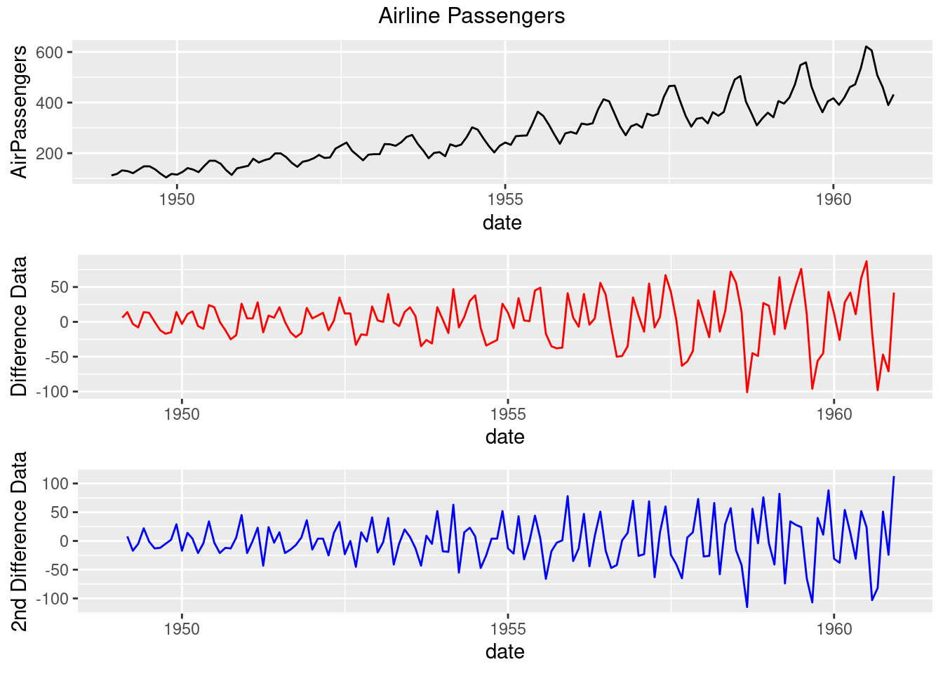
adf.test(new$AirPassengers,alternative='stationary')##
## Augmented Dickey-Fuller Test
##
## data: new$AirPassengers
## Dickey-Fuller = -7.3186, Lag order = 5, p-value = 0.01
## alternative hypothesis: stationary
adf.test(new[complete.cases(new$diff_data),3],alternative='stationary')##
## Augmented Dickey-Fuller Test
##
## data: new[complete.cases(new$diff_data), 3]
## Dickey-Fuller = -7.0177, Lag order = 5, p-value = 0.01
## alternative hypothesis: stationary
adf.test(new[complete.cases(new$diff_data2),4],alternative='stationary')##
## Augmented Dickey-Fuller Test
##
## data: new[complete.cases(new$diff_data2), 4]
## Dickey-Fuller = -8.0516, Lag order = 5, p-value = 0.01
## alternative hypothesis: stationary- Observations:
- The data has clear trend and increasing variance
- By using differencing, the trend is dampened
- There’s still some increasing variance, so log transform might be the right choice
- Things start getting muddied at second difference
- ADF says that the original series is stationary based on small p-value
- Visual inspection says otherwise
32.0.0.8.2 Normality:
- Many time series models assume normality
- This can be observed through a histogram or QQ plot
- ggplot2 package geom_histogram()
- stats package qqnorm() and qqline()
- If it is not normal:
- Box Cox transformation
- MASS package boxcox()
- Be careful with transformations!
- Are you preserving the important information?
- Box Cox transformation
ggplot(new, aes(x=AirPassengers)) +
  geom_histogram(binwidth =20,fill = "mediumpurple") +
  xlab("Passengers")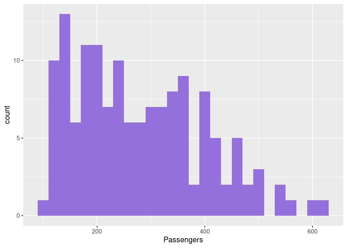
qqnorm(new$AirPassengers, main="Airline Passengers", xlab="", ylab="", pch=16)
qqline(new$AirPassengers)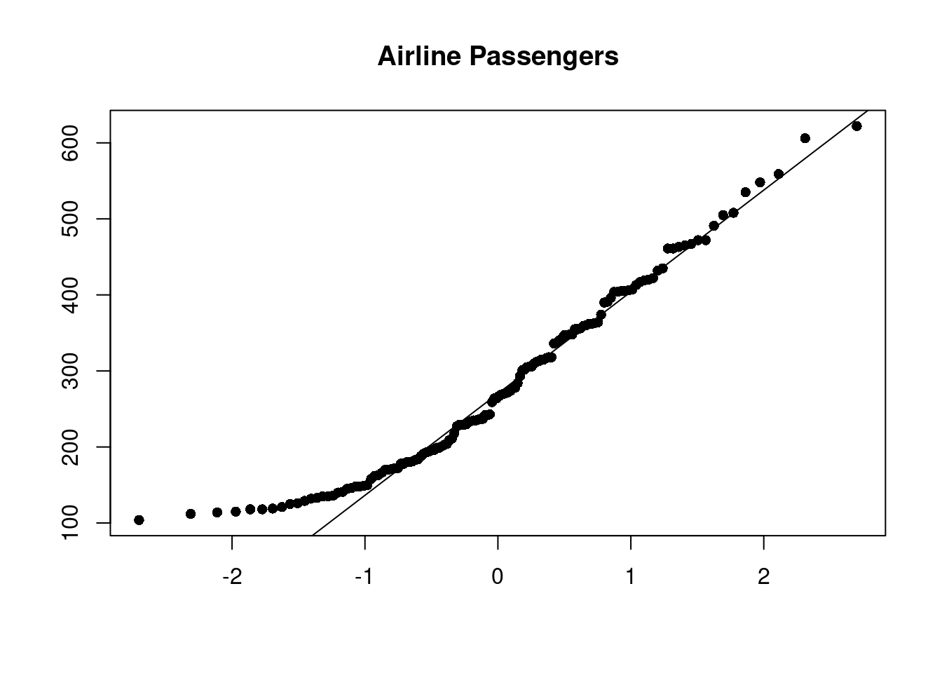
- Observations:
- Data does not look normal: it is skewed
- Even though this doesn’t capture the time aspect of the data, the input variable must be normal for many models
32.0.0.8.3 Lagged Correlations
- Autocorrelation Function
- Correlation between two points in a time series in a fixed interval
- Linear relationship between points as a function of their time difference
- Common behaviors:
- ACF of stationary series drops to zero quickly
- For nonstationary series, value at lag 1 is large and positive
- White noise will have 0 at all lags but 0
- Significance of ACF estimate determined by “critical region” with bounds at +/–1.96 × sqrt(n)
- forecast package Acf()
- Y axis is the correlation
- X axis is the time lag
Acf(new$AirPassengers,main='Passengers Autcorrelation Function')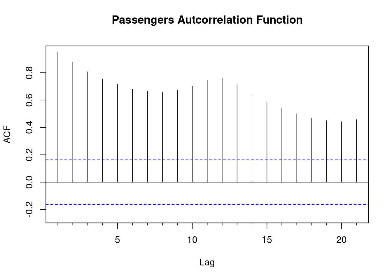
- Partial Autocorrelation Function:
- The partial correlation of the series at time t with the series at time t-k given all the information between t-k….t
- Same critical regions as ACF
- ACF vs PACF:
- Redundant correlations appear in ACF
- PACF correlations show exactly how the kth lagged value is related to the current point
- PACF helps you know how long a time series needs to be to capture dynamics you want to model
- forecast package Pacf()
Pacf(new$AirPassengers,main='Passengers Partial Autcorrelation Function')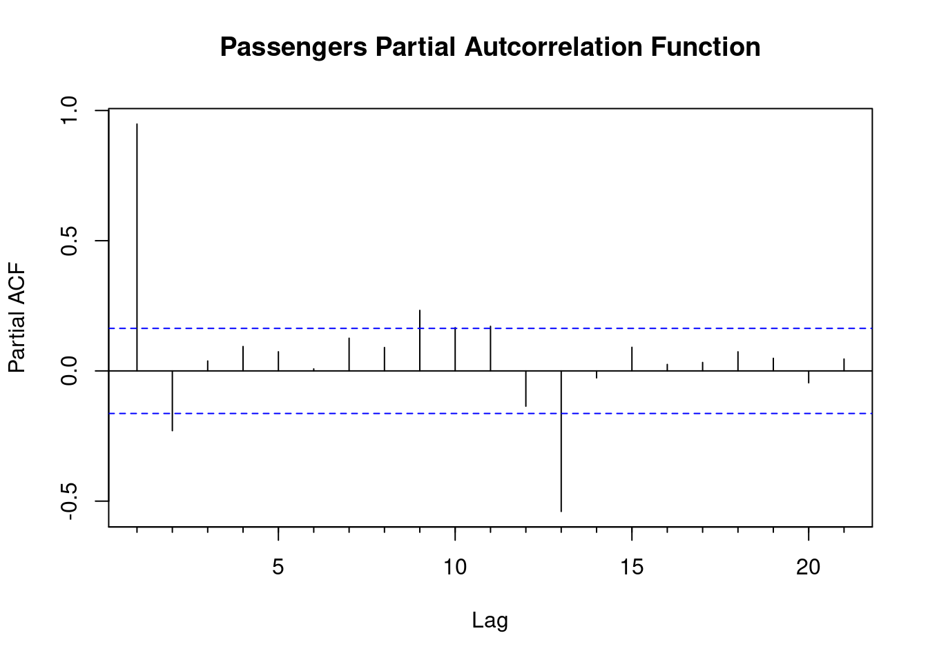
- Observations:
- The ACF fails to trail off after a certain lag, indicating clear trend
- PACF shows strong significance at around lag 12, coinciding with Christmas, a seasonal peak that is to be expected.
- Behavior of the PACF and ACF vital in determining parameters for time series ARIMA models and many others.
Now you are ready to get started with time series data!
References