45 Time series visualization with R
Runnan Jiang
library(tidyverse)
#library(ggplot2)
#library(dplyr)
library(openintro)
library(plotrix)
library(zoo)
library(gcookbook)
library(xts)
library(dygraphs)
45.0.1 1. Introduction
A time series is a sequence of data points that occur in successive order over some period of time. Time series is very important in many industries. In this tutorial, we collect and organize useful methods to create and customize time series visualizations from R. We hope this tutorial could help us visualize time series data effectively and efficiently in the future. The main packages used are tidyverse and dygraphs. ggplot2 has already offered great features when it comes to visualize time series: date can be recognized automatically and result in neat X axis labels; scale_x_data() makes it easy to customize those labels. Besides, there are packages including dygraphs,plotly that can create interactive plots of time series.
45.0.2 2 Line Plots
For this section, we use economics dataset from ggplot2 package. This dataset was produced from US economic time series data available from the Federal Reserve Bank of St. Louis. It contains information on personal consumption expenditures, total population, personal savings rate and unemployment with respect to the year and month.
## Rows: 574
## Columns: 6
## $ date     <date> 1967-07-01, 1967-08-01, 1967-09-01, 1967-10-01, 1967-11-01, …
## $ pce      <dbl> 506.7, 509.8, 515.6, 512.2, 517.4, 525.1, 530.9, 533.6, 544.3…
## $ pop      <dbl> 198712, 198911, 199113, 199311, 199498, 199657, 199808, 19992…
## $ psavert  <dbl> 12.6, 12.6, 11.9, 12.9, 12.8, 11.8, 11.7, 12.3, 11.7, 12.3, 1…
## $ uempmed  <dbl> 4.5, 4.7, 4.6, 4.9, 4.7, 4.8, 5.1, 4.5, 4.1, 4.6, 4.4, 4.4, 4…
## $ unemploy <dbl> 2944, 2945, 2958, 3143, 3066, 3018, 2878, 3001, 2877, 2709, 2…
Line plots are commonly used to plot time series data.
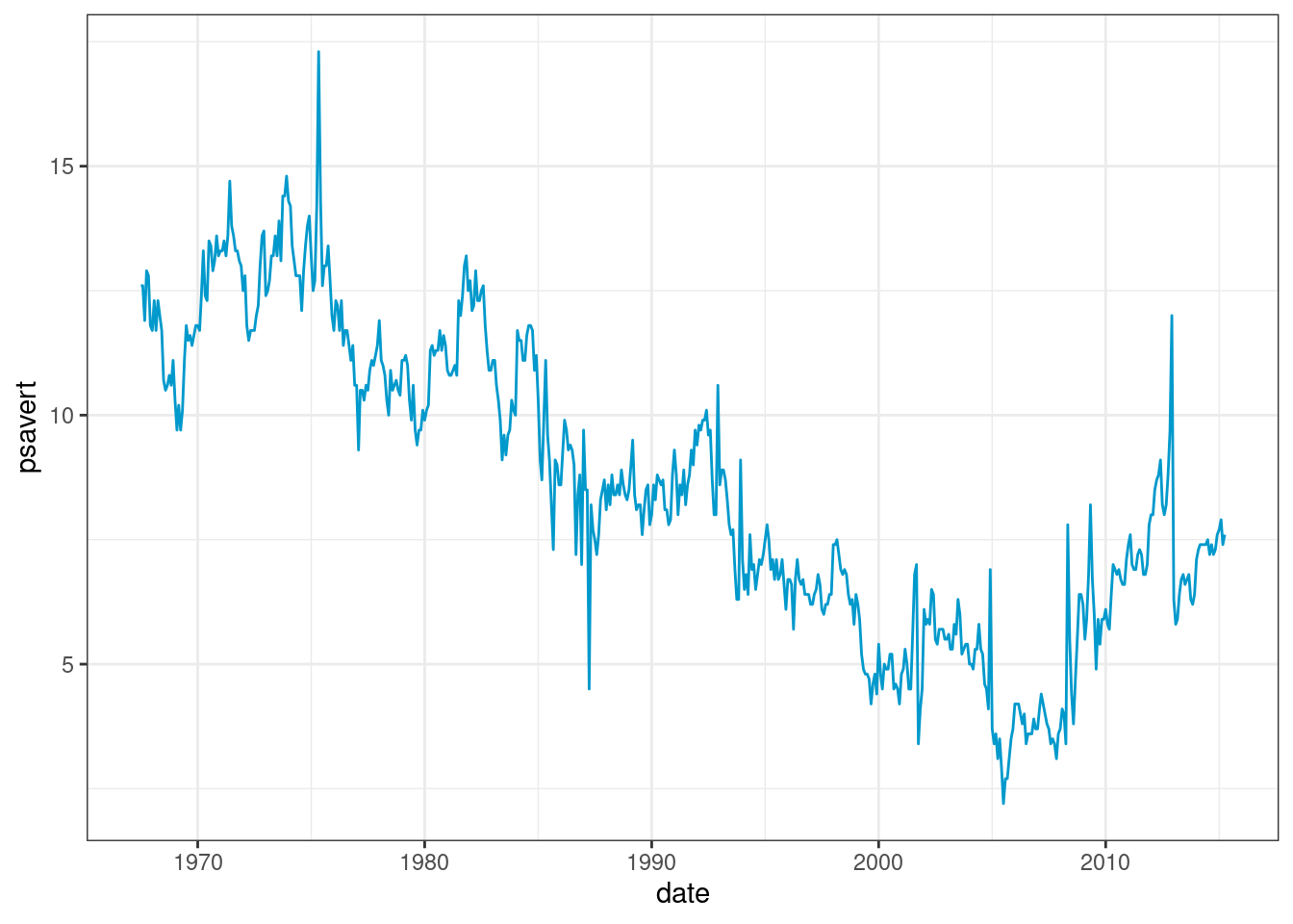
We can use scale_x_date() to control the x-axis breaks, limits, and labels; use scale_y_continuous() to control the y-axis breaks, limits, and labels; use geom_vline() with annotate() to mark specific events in a time series.
economics %>%
  ggplot(aes(x=date,y=psavert)) +
  geom_line(color="#0099CC") +
  scale_x_date(date_breaks = "5 years", date_labels = "%Y-%m") +
  scale_y_continuous(breaks = seq(2,20,2)) +
  geom_vline(xintercept=as.Date("2007-12-01"), color="#FF6666") +
  annotate("text", x=as.Date("2009-01-01"), y=12, label="Global Recession", angle=90, size=3, color="#FF6666") +
  ggtitle("Personal Savings Rate Time Series") +
  theme_bw()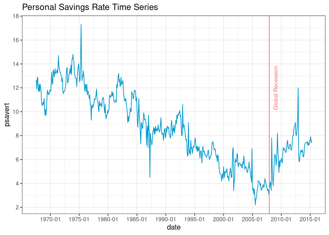
Sometimes multiple indicators that change along time are incomparable. At this time, the data should not be drawn in the same coordinate system. Generally, multiple slices can be drawn and aligned up and down according to the time axis. facet_wrap() can be used for faceting.
economics_facet <- economics %>%
  pivot_longer(c(pce, psavert),
               names_to = "index",
               values_to = "value")
economics_facet %>%
  ggplot(aes(date,value)) +
  geom_line(color="#0099CC") +
  facet_wrap(~index, ncol = 1, scales = "free_y") +
  theme_bw()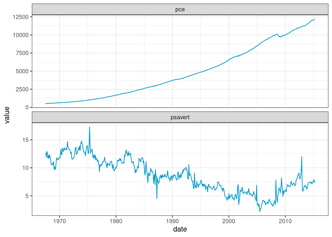
We can use rollmean() in Zoo package to compute rolling means.
economics_rolling <- economics %>%
  mutate(roll_mean = rollmean(economics$psavert,k=12,align="right",fill = NA))

economics_rolling <- gather(economics_rolling, key=Metric, value = psavert,
                            c("psavert","roll_mean"))

ggplot(economics_rolling) +
  geom_line(aes(x=date,y=psavert,group=Metric,color=Metric)) +
  theme_bw()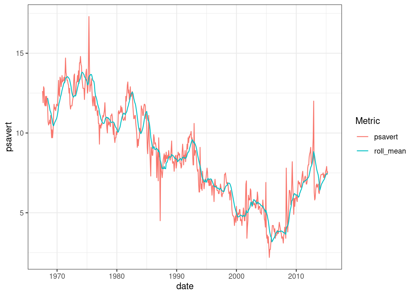
45.0.2.1 3 Bar Plots
We can also use barplot to visualize time series data.
ggplot(economics) +
  geom_bar(aes(x = date, y = psavert, fill = pop), stat = 'identity') +
  labs(title = "Personal Savings Rate and Total Population Time Series") +
  theme_bw()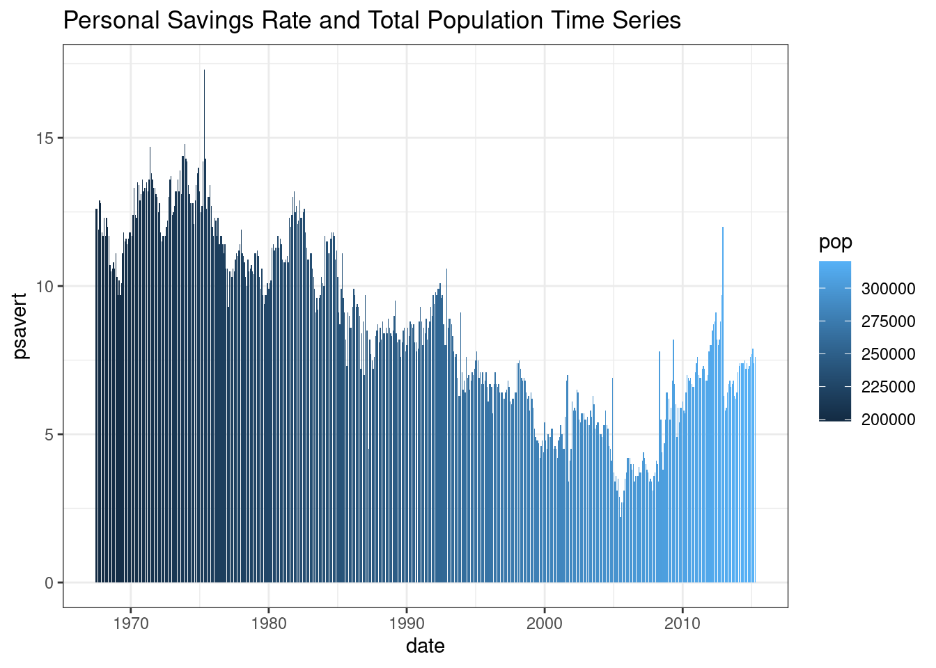
economics.grouped <-
  economics %>%
  mutate(year=format(date,"%Y")) %>%
  group_by(year) %>%
  summarise(mean_pop_by_year=mean(pce))

economics.grouped <-
  economics.grouped %>%
  filter(year > '2000')

ggplot(economics.grouped) +
  geom_bar(aes(x = year, y = mean_pop_by_year), stat = 'identity', fill="#0099CC",color='black',alpha=0.6) +
  labs(title = "Total Population Yearly Average") +
  theme_bw()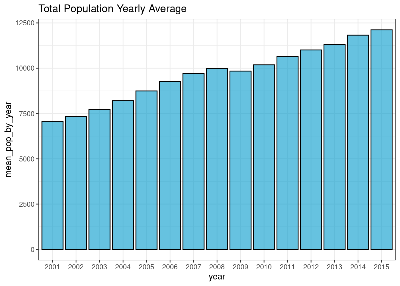
45.0.3 4. Area Plots
45.0.3.1 4.1 Areas Under a Single Time Series
ggplot(economics, aes(x = date, y = psavert)) +
  geom_area(fill="#0099CC",color='black',alpha=0.6) +
  labs(title = "Personal Savings Rate",
       x = "Date",
       y = "Personal Savings Rate") +
  scale_x_date(expand = c(0,0)) +
  scale_y_continuous(expand = c(0,0)) +
  theme_bw()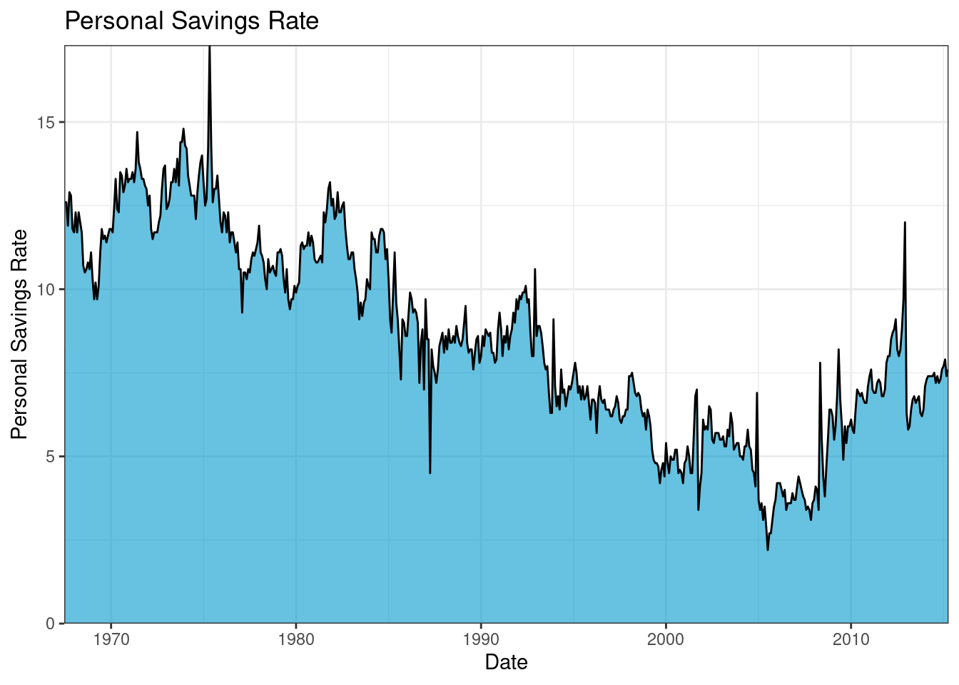
45.0.3.2 4.2 Stacked Polygons
A stacked area chart can be used to show differences between groups over time. In this section, we use uspopage dataset from gcookbook package. We will plot the age distribution of the US population from 1900 to 2002.
## Rows: 824
## Columns: 3
## $ Year      <int> 1900, 1900, 1900, 1900, 1900, 1900, 1900, 1900, 1901, 1901, …
## $ AgeGroup  <fct> <5, 5-14, 15-24, 25-34, 35-44, 45-54, 55-64, >64, <5, 5-14, …
## $ Thousands <int> 9181, 16966, 14951, 12161, 9273, 6437, 4026, 3099, 9336, 171…
To create stacked polygons (area plots), we use function stackpoly() from plotrix package.
ggplot(uspopage, aes(x = Year,
                     y = Thousands,
                     fill = AgeGroup)) +
  geom_area(alpha=0.6 , size=.5, colour="white") +
  ggtitle("US Population by age") +
  theme_bw()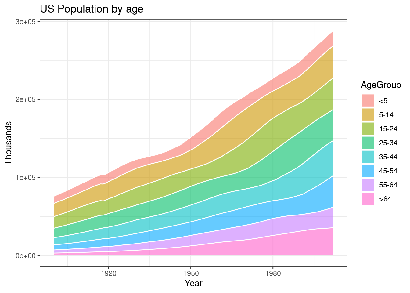
We could define a appropriate order of stack by ourselves.
# Give a specific order
uspopage$AgeGroup <- factor(uspopage$AgeGroup,
                   levels=c(">64","55-64","45-54","35-44","25-34","15-24","5-14","<5"))

ggplot(uspopage, aes(x=Year,y=Thousands,fill=AgeGroup)) +
    geom_area(alpha=0.6 , size=.5, colour="white") +
    ggtitle("US Population by age") +
    theme_bw()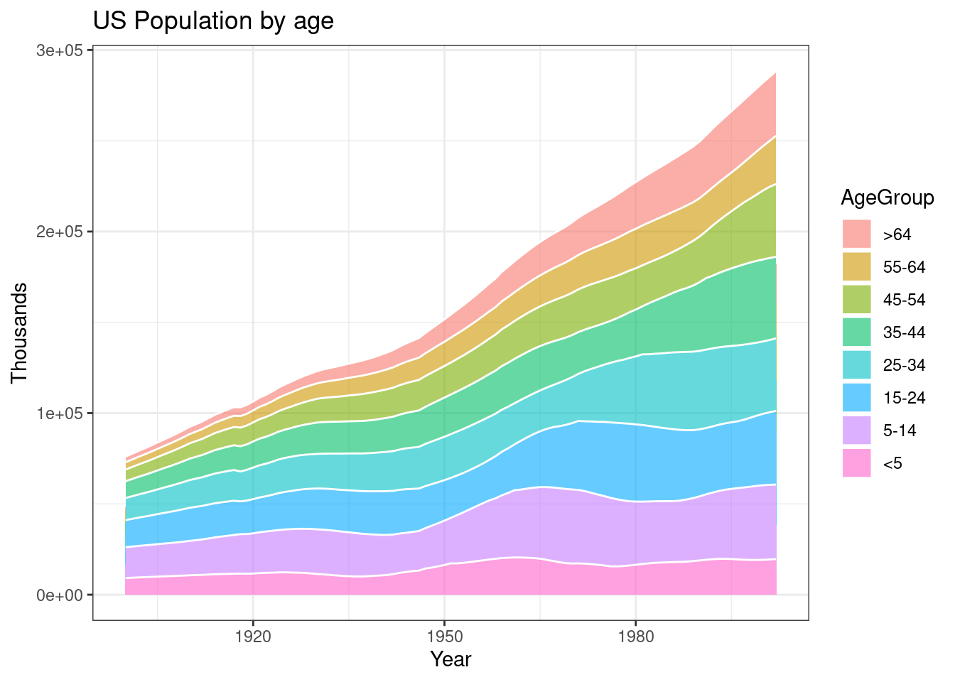
When the variable is a percentage and the sum of each year is always equal to a hundred, we could use a proportional stacked area graph to visualize the data.
uspopage_percentage <- uspopage  %>%
  group_by(Year, AgeGroup) %>%
  summarise(n = sum(Thousands)) %>%
  mutate(percentage = n / sum(n))

ggplot(uspopage_percentage, aes(x=Year, y=percentage, fill=AgeGroup)) +
    geom_area(alpha=0.6 , size=1, colour="white") +
    ggtitle("US Population Proportion by age") +
    theme_bw()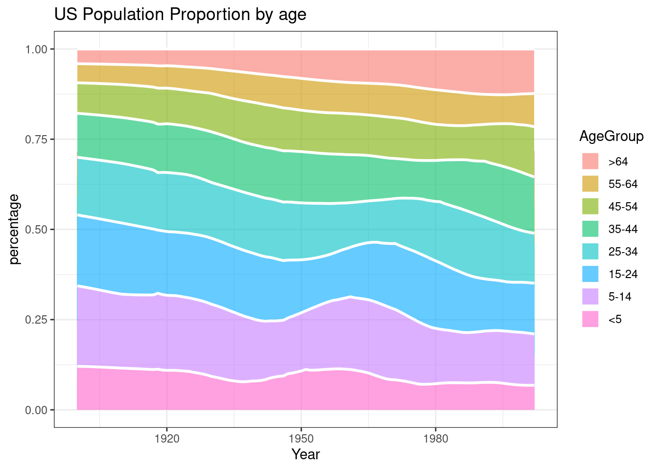
45.0.4 5. Interactive Time Series
dygraphs is a package for visualizing time series data. With dygraphs, we can easily implement zooming, hovering, minimaps and much more visualizations.
str(economics)## spc_tbl_ [574 × 6] (S3: spec_tbl_df/tbl_df/tbl/data.frame)
## $ date : Date[1:574], format: "1967-07-01" "1967-08-01" ...
## $ pce : num [1:574] 507 510 516 512 517 ...
## $ pop : num [1:574] 198712 198911 199113 199311 199498 ...
## $ psavert : num [1:574] 12.6 12.6 11.9 12.9 12.8 11.8 11.7 12.3 11.7 12.3 ...
## $ uempmed : num [1:574] 4.5 4.7 4.6 4.9 4.7 4.8 5.1 4.5 4.1 4.6 ...
## $ unemploy: num [1:574] 2944 2945 2958 3143 3066 ...
don <- xts(x = economics$psavert, order.by = economics$date)
p <- dygraphs::dygraph(don) %>%
  dyOptions(colors="#0099CC")
p
p <- dygraph(don) %>%
  dyOptions(labelsUTC = TRUE, fillGraph=TRUE, fillAlpha=0.1, drawGrid = FALSE,colors = "#0099CC") %>%
  dyRangeSelector() %>%
  dyCrosshair(direction = "vertical") %>%
  dyHighlight(highlightCircleSize = 5, highlightSeriesBackgroundAlpha = 0.2, hideOnMouseOut = FALSE)  %>%
  dyRoller(rollPeriod = 1)
p
45.0.5 6. Conclusion
In this tutorial, we collect and organize useful methods to create and customize time series visualizations from R. We hope this tutorial could help us visualize time series data effectively and efficiently in the future. The main packages used are tidyverse and dygraphs. ggplot2 has already offered great features when it comes to visualize time series: date can be recognized automatically and result in neat X axis labels; scale_x_data() makes it easy to customize those labels. Besides, there are packages including dygraphs,plotly that can create interactive plots of time series.
45.0.6 7. Reference
- R documentation: R documentation
- dygraphs package: dygraphs for R
- searching for useful R packages: R Graph Gallery