46 Twitter textual data: scraping and analyzing
Renato Russo
46.0.1 Loading all the required packages
library(googlesheets4)
library(academictwitteR)
library(widyr)
library(tidytext)
library(dplyr)
library(corpus)
library(tidyr) # used for sentiment analysis plot
library(forcats)
library(tm)
library(topicmodels) # visualization of topics in the NLP section
library(ggplot2) # chart of co-occurring terms
library(tidytext) # chart of co-occurring terms and get sentiment in seniment analysis
library(wordcloud) #for wordcloud
library(igraph) # for the network plot of co-occurring words
library(ggraph) # for the network plot of co-occurring words
library(syuzhet) # for sentiment analysis
library(textdata) # for sentiment analysis
library(gridExtra) # for sentiment analysis grid charts
library(tidyr) # for sentiment analysis
In this community contribution, we will be looking at three broader tasks of data analysis and visualization applied to textual data. More specifically, we will look at Twitter datas, and see methods for collecting (scraping), preparing, and analyzing Twitter data.
46.0.2 1. Scrape data
The first thing you should do is obtaining data. Fortunately, Twitter makes it relatively easy to scrape data, all you need to start is a Twitter Developer Account so you can get access to Twitter API. Actually, there are a few different types of Developer Account. For the purpose of this project, I am using my Academic Research account. You may want to check out Twitter’s Developer Portal for more information. From this point on, I will assume that you have your Twitter API credentials at hand ;-)
46.0.2.1 Packages needed/recommended
There are a few packages that help us retrieve data from Twitter. For this project, I am using academictwitteR, but you may also want to check out twitteR and rtweet. I have already experienced a few glitches with the former, which seems to be updated less frequently than rtweet. Another reason why I am using academictwitteR now is because it has a more straight forward connection with Twitter API V2, which we can use to retrieve “historical data” (the previous API allowed retrieval of data from the past 8-10 days only, among other limitations). So, let’s get on with the search:
46.0.2.2 Set up credentials
For this step, you will have to look at your profile on Twitter’s developer portal.
Now, go ahead and get your credentials.
With academictwitteR, I can use the Bearer Token only. The API documentation
and the package repository have
more information on that. For now, you have to call the function set_bearer() to
store that information for future use.
# set_bearer()Once you follow the instructions above, you are ready to go ahead and run your query!
46.0.2.3 Perform the search
Now, you’re finally able to run the search. For that, you will use the
get_all_tweets() function. In my case, I am interested in investigating how
sectors of the alt-right have “hijacked” narratives related to the Capitol attack
in January 2021, to assess what type of vocabulary people were using to refer to
different narratives related to that event.
For the purpose of this example, I will limit the number of tweets retrieved to 5000.
# capitol <- get_all_tweets(query = "capitol", # search query
#                                    start_tweets = "2021-01-06T00:00:00Z", # search start date
#                                    end_tweets = "2021-01-06T19:00:00Z", # search end date
#                                    bearer_token = get_bearer(), # pulling stored bearer toke
#                                    data_path = "data", #where data is stored as series of JSON files
#                                    n = 5000, # total number of tweets retrieved
#                                    is_retweet = FALSE) # excluding retweets

# save(capitol, file = "capitol.Rda")

# load("capitol.Rda")
# Originally, I had saved the data as a Rda file, but for
# submission purposes, I'm (1) saving the text content as a dataframe; (2) uploading
# the data to a Google Spreadsheet, then (3) reading it again here. I set the
# sharing to "Anyone with the link."

# capitol_df <- as.data.frame(capitol$text, capitol$id)
# capitol_df_ids <- as.data.frame(capitol$id)
# write_sheet(capitol_df)
# write_sheet(capitol_df_ids)
gs4_deauth()
capitol <- as.data.frame(read_sheet("https://docs.google.com/spreadsheets/d/198TOYrrXLtUWA3WpRHrch1CBjml0a-pTEdGPXNxqr3U/edit#gid=890543988"))
46.0.3 2. Prepare data
For this analysis, we will predominantly use the “text” column, that is, the content of the actual tweet. We could use other data, for example number of likes, or the timeline of a user, but let’s focus on the content for now.
46.0.3.1 Removing capitalization, numbers, and punctuation.
The custom function below is used to remove capitalization, and to remove numbers and punctuation:
# First, we define the function
clean_text <- function(text) {
  text <- tolower(text)
  text <- gsub("[[:digit:]]+", "", text)
  text <- gsub("[[:punct:]]+", "", text)
  return(text)
}
# Then, apply it to the text content:
capitol$text <- clean_text(capitol$text)
We also want to remove stop words, that is, those that do not add meaning to textual analysis. Before doing that, we will tokenize the words, which is a process that will be useful in other steps further ahead: #### Tokenize words
capitol_tokens <- capitol %>%
  tidytext::unnest_tokens(word, text) %>%
  count(id, word)
Below, I am using tidytext’s standard set of stop words:
capitol_tokens <- capitol_tokens %>%
  dplyr::anti_join(tidytext::get_stopwords())
However, preliminary plotting showed that the word “capitol” was causing noise in the charts because it obviously appears in every tweet, so I decided to remove it from the corpus. I understand that this does not harm the analysis, because we are not interested in the connections with the word, but in the general meaning of tweets containing that word.
my_stopwords <- tibble(word = c(as.character(1:10),
                                    "capitol", "just", "now",
                                "right now", "get", "like"))
capitol_tokens <- capitol_tokens %>%
  anti_join(my_stopwords)
I will also “stem” words, that is, combine words that share the same “root.” This is important because preliminary analysis showed the existence of words that have similar seemantic value like “storm” and “storming”
capitol_tokens$word <- text_tokens(capitol_tokens$word, stemmer = "en") # english stemmer46.0.3.2 Document-term matrix
The document-term matrix (dtm) is “a mathematical matrix that describes the frequency of terms that occur in a collection of documents” [3]. In this case, each tweet is stored as a document, and each word in the tweets is a term. In other words, the matrix shows which words appear in each tweet.
## <<DocumentTermMatrix (documents: 4999, terms: 10402)>>
## Non-/sparse entries: 61329/51938269
## Sparsity           : 100%
## Maximal term length: 30
## Weighting          : term frequency (tf)
Looking at the structure of the document-term matrix, we see that this specific dtm has 17,635 documents (tweets) and 36,273 terms (unique words). The dtm will be used for exploratory analysis in the next section.
46.0.4 3. Analyze data
46.0.4.1 Exploratory analysis
First, let’s look at the frequency of words. For that, we apply group_by()
and summarize() to the tokens dataset to find out the frequency:
## # A tibble: 10,402 × 2
##    word      occurrence
##    <list>         <int>
##  1 <chr [1]>       1397
##  2 <chr [1]>       1333
##  3 <chr [1]>       1214
##  4 <chr [1]>       1181
##  5 <chr [1]>        824
##  6 <chr [1]>        603
##  7 <chr [1]>        575
##  8 <chr [1]>        528
##  9 <chr [1]>        506
## 10 <chr [1]>        446
## # … with 10,392 more rows
As seen above, the resulting tibble shows only the description of the words as
list objects <chr [1]>, but not the words themselves, so I create a new tibble
that “reveals the words:”
tokens_words <- capitol_tokens %>% # creating a data frame with the frequencies
  group_by(word) %>%
  summarise(N = n())
class(tokens_words)
## [1] "tbl_df" "tbl" "data.frame"
tokens_words$word <- as.character(tokens_words$word) # turning the tokens into character objectsBelow, we can see the list of words by frequency. We notice that there is a “first tier” of frequency containing the words “storm,”“build,” “trump,” and “polic” are the 3 most frequent ones. “Storm,” “build,” and “polic” represent word stems, so words like “building” are within the “build” term, for example.
## # A tibble: 10,402 × 2
## # Groups:   word [10,402]
##    word        N
##    <chr>   <int>
##  1 storm    1389
##  2 build    1276
##  3 trump    1124
##  4 polic    1092
##  5 support   790
##  6 tri       587
##  7 protest   521
##  8 peopl     514
##  9 us        483
## 10 hill      431
## # … with 10,392 more rows
And we can plot the word frequency in a bar chart:
tokens_words %>%
  group_by(word) %>%
  filter(N > 300) %>%
  ggplot(aes(x = fct_reorder(word, N, .desc = TRUE), y = N, fill = N)) +
  geom_bar(stat = "identity") +
  ylab("Count") +
  xlab("Term (stemmed)") +
  theme_classic()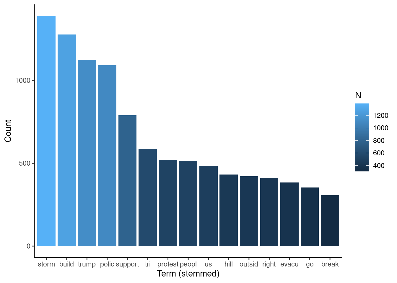
Another way to visualize the frequency of words is with a wordcloud. Although not always a good choice, in this case a wordcloud allows for visualizations of other terms that don’t fit in the bar chart.
set.seed(1234) # for reproducibility

pal <- brewer.pal(9, "BuGn") # setting the color palette
pal <- pal[-(1:5)] # this improves readability by narrowing the range of shades of the palette showing in the chart

wordcloud(words = tokens_words$word,
          freq = tokens_words$N,
          min.freq = 50,
          max.words=200,
          random.order=FALSE,
          rot.per=0.35,
          colors=pal)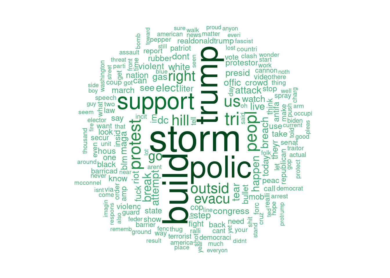
46.0.4.2 Natural language processing
46.0.4.2.1 Visualize topics with Latent Dirichlet Allocation (LDA)
Latent Dirichlet Allocation is an approach to statistical topic modeling in which documents are represented as a set of topics and a topic is a set of words. The topics are situated in a “latent layer.” Put in a very simple way, this type of modeling compares the presence of a term in a document and in a topic, and uses that comparison to establish the probability that the document is part of the topic [4]. This type of modeling is used here to identify the topics and the co-occurring terms, that is, terms that appear together in the tweets. The code below performs the topic allocation. Initial runs of this and the following parts revealed that the topics were too similar, so I proceeded with the creation of only 2, which seemed to capture the meaning in tweets satisfactorily.
46.0.4.2.2 Visualize co-occurring terms
The code below creates a tibble containing topics of 5 terms each.
topTerms <- LDA_td %>%
  group_by(topic) %>%
  top_n(5, beta) %>% # 5 main terms that will later be plotted
  arrange(topic, -beta) # arranging topics in descending order of beta coefficient
Then, we plot the topics.
topTerms %>%
  mutate(term = reorder_within(term, beta, topic)) %>%
  ggplot(aes(term, beta, fill = factor(topic))) +
  geom_col(show.legend = FALSE) +
  facet_wrap(~ topic, scales = "free_x") +
  coord_flip() +
  scale_x_reordered() +
  labs(title = "Topics in tweets containing the term 'capitol' in January 6, 2021")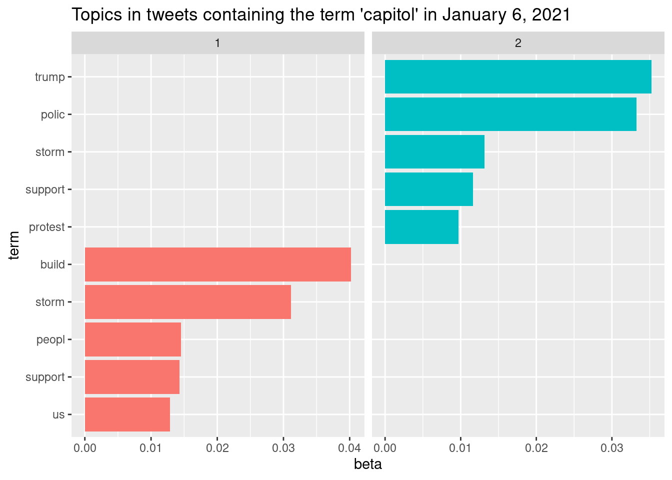
The process of identifying the number of topics and terms in each topic was iterative in this case. Preliminary plotting showed that there was strong intersection between topics, so I kept reducing the number until I found two that seemed relevant. Apparently, topic #2 refers to the process of protesters (stem “protest”) storming the capitol building (stem “build”); conversely, topic #1 seems to refer to police reaction to the attacks by the supporters.
Another way to visualize the relationships in the corpus is by identifying the frequency of word pairs present in the corpus. The code below generates a data
word_pairs_capitol <- capitol_tokens %>%
  pairwise_count(word, id, sort = TRUE, upper = FALSE)
46.0.4.2.3 Network plot of co-occurring words
word_pairs_capitol %>%
  filter(n >= 80) %>%
  graph_from_data_frame() %>%
  ggraph(layout = "fr") +
  geom_edge_link(aes(edge_alpha = n, edge_width = n), edge_colour = "cyan4") +
  geom_node_point(size = 5) +
  geom_node_text(aes(label = name), repel = TRUE,
                 point.padding = unit(0.5, "lines")) +
  theme_void() +
  labs(title = "Co-occurring terms in tweets containing the term 'capitol' in January 6, 2021")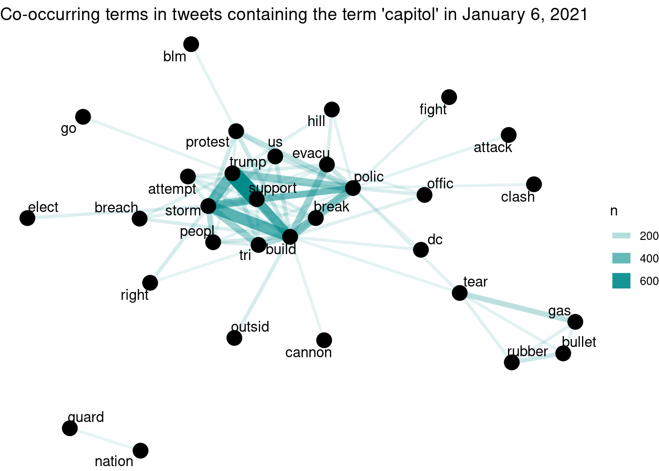
The plot above shows a few potentially interesting aspects of this corpus, among which we highlight two. First, there is a cluster of words related to non-lethal police weapons (“tear gas” and “rubber bullet”); that cluster is connected to “police” and and “people.” Another aspect is the proximity of “trump” to the center of the graph, strongly connected with “support” (possibly stemmed from “supporter/s”). “Support” is also strongly connected with “build” and “storm.” This is compatible with the pairwise chart, in which one of the topics is possibly associated with the police reaction to the attacks.
46.0.4.2.4 Sentiment analysis
tweets <- iconv(capitol$text) # creating a tibble containing the text

sentiment <- get_nrc_sentiment(tweets) # this uses the nrc dictionary to assign sentiment scores for each tweet
Now that we have a tibble with the sentiment score for each tweet, we can print the first results for sentiment and for tweets, if we want to compare:
head(sentiment)## anger anticipation disgust fear joy sadness surprise trust negative positive
## 1 1 0 0 0 0 0 0 1 1 1
## 2 2 1 2 2 0 1 1 2 2 2
## 3 1 0 1 1 0 1 0 0 1 0
## 4 0 0 0 0 0 0 0 0 0 0
## 5 1 0 1 1 0 2 0 0 3 0
## 6 2 0 1 2 0 1 1 0 3 1
head(tweets)## [1] "these are donald trumps supporters attempting to storm the united states capitol at his direction httpstcokcnjxmwvj"
## [2] "ok live coverage\ntrump gave his rabid base an order to march and marching waddling they are toward the capitol\ndamn\ndc is on lockdown natl guard amp cops some buildings evacuated\ntrumps crowd is a creepy lot amp things are getting tense"
## [3] "greekpale tvietor not like this not at the capitol this is terrorism"
## [4] "kenhagen quill would you look at that\n\nit only took the capitol to be overrun"
## [5] "one of the things that gets me is the sheer dishonesty and delusion of racists the claim that blm would get treated better if they stormed the capitol like the world wouldnt be treated to images of dead black people in the streets for weeks"
## [6] "murderous rhetoric trifecta on display here civil war no bag limits and day of the rope a phrase taken straight from accelerationist neonazis like atomwaffen these are the folks attempting to storm the capitol at the moment httpstcoviatsxujv"We can also see the frequency of each sentiment:
sentiment_sums <- sentiment %>%
  summarise_all(sum)

sentiment_sums = gather(sentiment, key = "S_sum") %>%
    group_by(S_sum) %>%
    summarize(number = sum(value, na.rm = TRUE))
sentiment_sums
## # A tibble: 10 × 2
## S_sum number
## <chr> <dbl>
## 1 anger 4466
## 2 anticipation 1872
## 3 disgust 1526
## 4 fear 4463
## 5 joy 1186
## 6 negative 5694
## 7 positive 5612
## 8 sadness 1951
## 9 surprise 2403
## 10 trust 3741And create a bar plot with that frequency:
ggplot(data = sentiment_sums,
       aes(x = fct_reorder(S_sum,
                           number,
                           .desc = TRUE),
           y = number,
           fill = number)) +
  geom_bar(stat = "identity") +
  ylab("Count") +
  xlab("Sentiment") +
  theme_classic()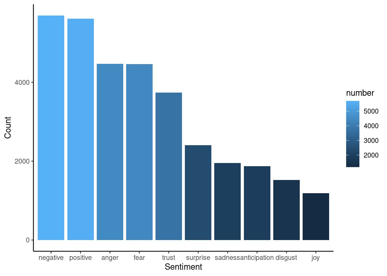
One other nlp task we can implement is identifying words associated with each “polarity” (positive and negative). Originally, the code chunk below contains a line that gets sentiments from the NRC dictionary [7]. For the compiled book, I’m reading a Google spreadsheet that contains the dictionary.
# nrc_positive <- get_sentiments("nrc") %>%
#   filter(sentiment == "positive")
#
# sheet_write(nrc_positive, ss = "https://docs.google.com/spreadsheets/d/198TOYrrXLtUWA3WpRHrch1CBjml0a-pTEdGPXNxqr3U/edit#gid=890543988", sheet = "nrc_positive")

nrc_positive <- read_sheet("https://docs.google.com/spreadsheets/d/198TOYrrXLtUWA3WpRHrch1CBjml0a-pTEdGPXNxqr3U/edit#gid=890543988", sheet = "nrc_positive")

tokens_words %>%
  inner_join(nrc_positive) %>%
  arrange(desc(N))
## # A tibble: 318 × 3
## word N sentiment
## <chr> <int> <chr>
## 1 build 1276 positive
## 2 elect 264 positive
## 3 march 158 positive
## 4 vote 118 positive
## 5 guard 102 positive
## 6 speech 81 positive
## 7 hope 80 positive
## 8 actual 79 positive
## 9 good 70 positive
## 10 protect 68 positive
## # … with 308 more rowsOk, now we see that “build” is classified as a positive term, and this adds an unintended bias to the analysis. “Building” is classified as positive by the NRC dictionary (possibly because of its verb form), and this may not be true in this case. In this corpus, “building” is a rather descriptive word, and apparently is mostly used as a noun.
So, let’s build a chart that shows the frequency of positive terms, excluding the term “biuld.”
plot_positive <- tokens_words %>%
inner_join(nrc_positive) %>%
arrange(desc(N)) %>%
filter(N > 50 & N < 500) %>%
ggplot(aes(x = fct_reorder(word, N, .desc = TRUE), y = N, fill = N)) +
geom_bar(stat = "identity") +
ylab("Count") +
xlab("Positive terms (stemmed)")
plot_positive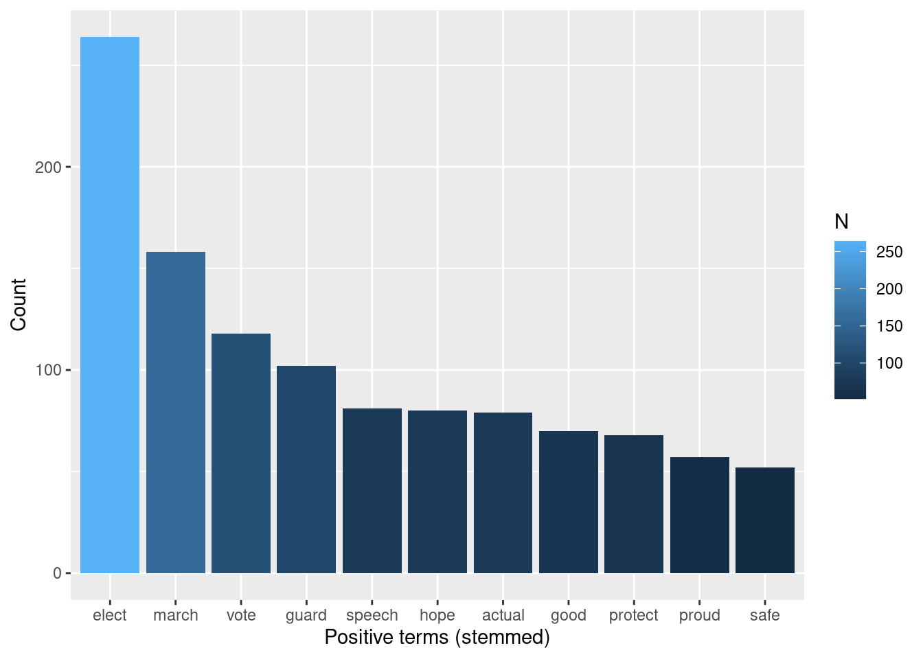 And we can do the same for negative:
# nrc_negative <- get_sentiments("nrc") %>%
#   filter(sentiment == "negative")
#
# sheet_write(nrc_negative, ss = "https://docs.google.com/spreadsheets/d/198TOYrrXLtUWA3WpRHrch1CBjml0a-pTEdGPXNxqr3U/edit#gid=890543988", sheet = "nrc_negative")
#
nrc_negative <- read_sheet("https://docs.google.com/spreadsheets/d/198TOYrrXLtUWA3WpRHrch1CBjml0a-pTEdGPXNxqr3U/edit#gid=890543988", sheet = "nrc_negative")

tokens_words %>%
  inner_join(nrc_negative) %>%
  arrange(desc(N))
## # A tibble: 470 × 3
## word N sentiment
## <chr> <int> <chr>
## 1 storm 1389 negative
## 2 breach 248 negative
## 3 attack 226 negative
## 4 riot 206 negative
## 5 violent 171 negative
## 6 mob 145 negative
## 7 fight 142 negative
## 8 vote 118 negative
## 9 barrier 100 negative
## 10 terrorist 99 negative
## # … with 460 more rows
tokens_words %>%
inner_join(nrc_negative) %>%
arrange(desc(N)) %>%
filter(N > 90) %>%
ggplot(aes(x = fct_reorder(word, N, .desc = TRUE), y = N, fill = N)) +
geom_bar(stat = "identity") +
ylab("Count") +
xlab("Negative terms (stemmed)")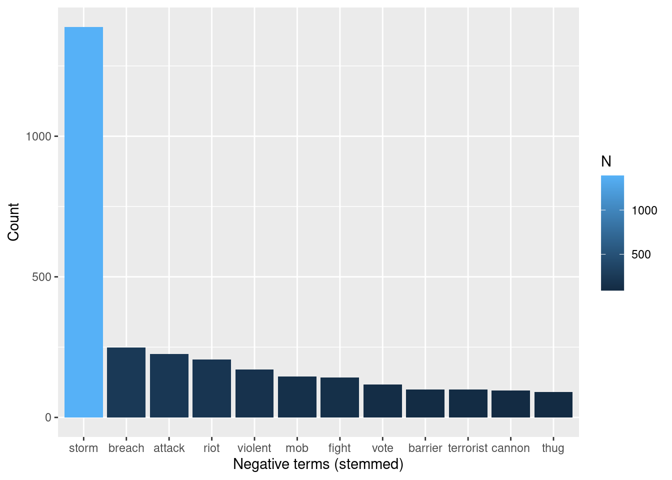 Something slightly similar happens to “storm” among the negative terms: It happens
with strikingly higher frequency than the rest of the terms, so, for this exercise,
I’ll remove set the range so that the chart includes most frequent words except for
“storm:”
Something slightly similar happens to “storm” among the negative terms: It happens
with strikingly higher frequency than the rest of the terms, so, for this exercise,
I’ll remove set the range so that the chart includes most frequent words except for
“storm:”
plot_negative <- tokens_words %>%
  inner_join(nrc_negative) %>%
  arrange(desc(N)) %>%
  filter(N  > 90& N < 500) %>%
  ggplot(aes(x = fct_reorder(word, N, .desc = TRUE), y = N, fill = N)) +
           geom_bar(stat = "identity") +
  ylab("Count") +
  xlab("Negative terms (stemmed)")
plot_negative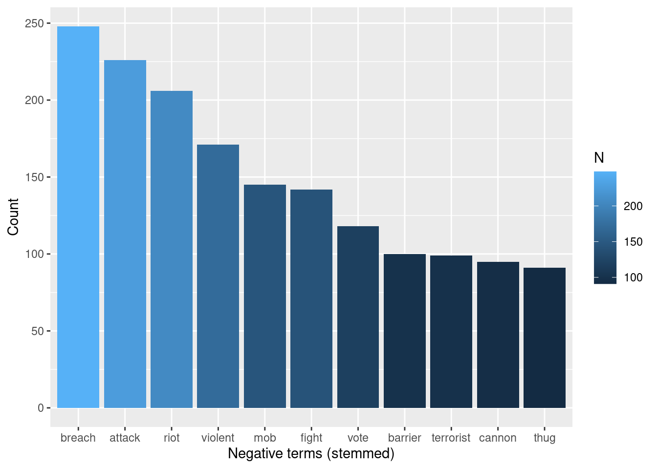
As we see, the list of negative terms include words that are possibly related to criticism towards the “methods” of the crowd invading the capitol: they are possibly described as a mob that was violently attacking. Of course, more precise conclusions would require deeper analysis, but these words give a sense of the negative vocabulary used to describe the event.
We can present both negative and positive together using grid.arrange():
plot_negative <- tokens_words %>%
  inner_join(nrc_negative) %>%
  arrange(desc(N)) %>%
  filter(N  > 90 & N < 500) %>%
  ggplot(aes(x = fct_reorder(word, N, .desc = TRUE), y = N, fill = N)) +
           geom_bar(stat = "identity") +
  ylab("Count") +
  xlab("Negative terms (stemmed)") +
  ylim(0, 300)

plot_negative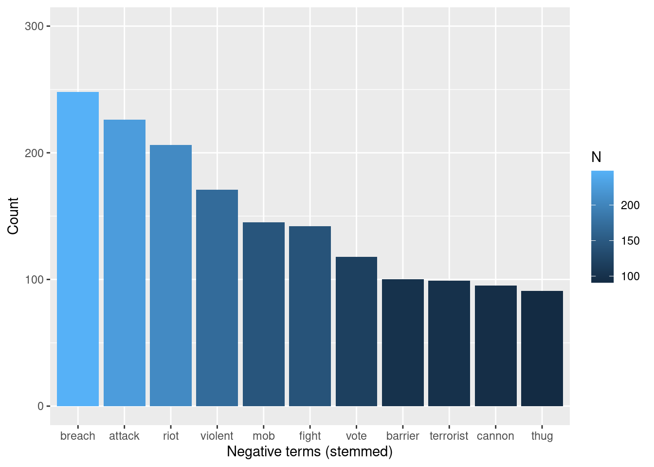
plot_positive <- tokens_words %>%
  inner_join(nrc_positive) %>%
  arrange(desc(N)) %>%
  filter(N  > 50 & N < 500) %>%
  ggplot(aes(x = fct_reorder(word, N, .desc = TRUE), y = N, fill = N)) +
           geom_bar(stat = "identity") +
  ylab("Count") +
  xlab("Positive terms (stemmed)") +
  ylim(0, 300)

grid.arrange(plot_negative, plot_positive)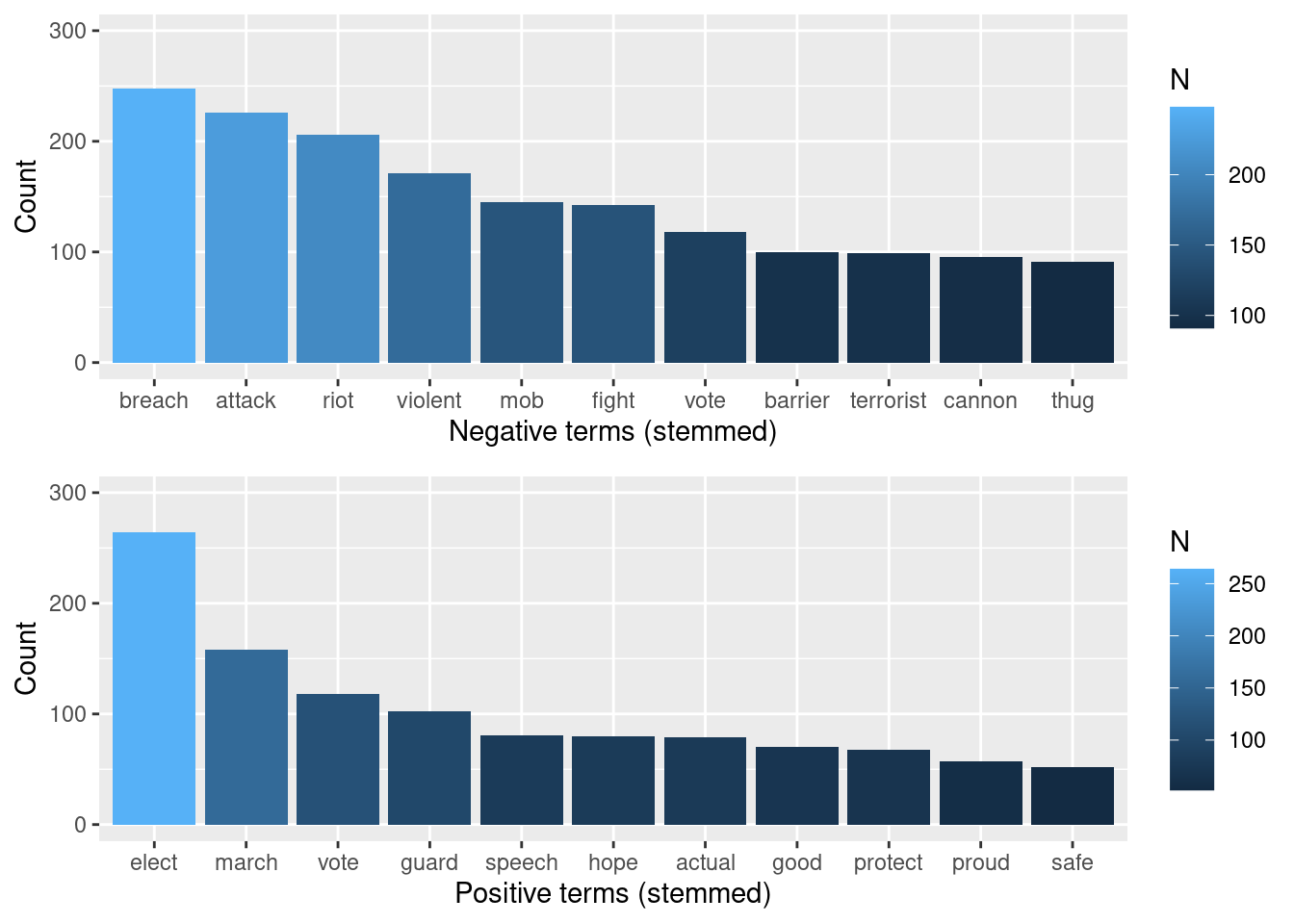
46.0.5 4. Conclusion
With this project, we covered three main steps in textual analysis of twitter data.
First, we used Twitter API V2 to scrape tweets of a topic of interest within a
time range. Second, we prepared the data by removing punctuation, stemming, and
stop words – both standard ones and those which preliminary analysis had shown
to cause overplotting in later stages. Finally, I conduct some tasks in textual
analysis. At that last stage, I first conducted an exploratory analysis by
identifying most frequent terms in the corpus. I also used a wordcloud to offer
an alternative visualization to word frequency. Then, I undertook natural
language processing tasks. Through Latent Dirichlet Allocation, I showed two of
the most salient topics in the data. Additionally, I plotted bi-grams, which
demonstrate strength of relationship between words, and “clusters” where words
concentrate. Finally, I implemented sentiment analysis to identify terms and
frequencies across sentiments described by the ncr dictionary.
The most challenging part of carrying out this project was the handling data objects, and this is mainly because the object returned by the search is a dataframe with other dataframes nested. Because of that, saving a csv file was not as straightforward as I was used to. Therefore, it was a little confusing to define a strategy to deal with files: should I use a Rda file or save only the columns I needed as csv files? With saved files, I was not sure how they would behave when someone opened the .rmd file in another computer. I ended up sticking with the .rda file, because it seemed the most natural choice as a format in which files “carry” all the information needed for analysis.
46.0.5.0.1 References:
[1] https://jtr13.github.io/cc21/twitter-sentiment-analysis-in-r.html#word-frequency-plot
[2] https://towardsdatascience.com/create-a-word-cloud-with-r-bde3e7422e8a
[3] DTM: https://bookdown.org/Maxine/tidy-text-mining/tidying-a-document-term-matrix.html
[4] LDA: https://blog.marketmuse.com/glossary/latent-dirichlet-allocation-definition/
[5] Sentiment analysis: https://finnstats.com/index.php/2021/05/16/sentiment-analysis-in-r/
[6] Sentiment analysis: https://www.tidytextmining.com/sentiment.html