Chapter 39 Mapping in R
Hanjun Li and Chengchao Jin
39.1 Overview
This section covers how to draw maps using R. The packages we will be using are ggplot2 and maps.
39.2 What is maps?
The package maps, which contains a lot of outlines of continents, countries, states, and counties, is used to visualize geographical map. Some notable features and functions of maps are:
county: counties of the United States mainland generated from US Department of the Census data. we can usecounty.fipsto check the all counties listed.map: main function used to draw lines and polygons as specified by a map database.state: states of the United States mainland generated from US Department of the Census datausa: this database produces a map of the United States
39.3 Installing maps
You can install maps from CRAN:
install.packages("maps")Load the required packages
39.4 Simple Demonstration (using maps)
maps::map("usa", col = "#9FF781", fill = TRUE)
map.axes(cex.axis=0.8)
maps::map("state", lty = 2, add = TRUE, col = "#0B3B39") # map the state borderline to the US map
title(main = "United States Mainland by States", xlab = "Longitude", ylab = "Latitude",
      cex.lab = 0.8)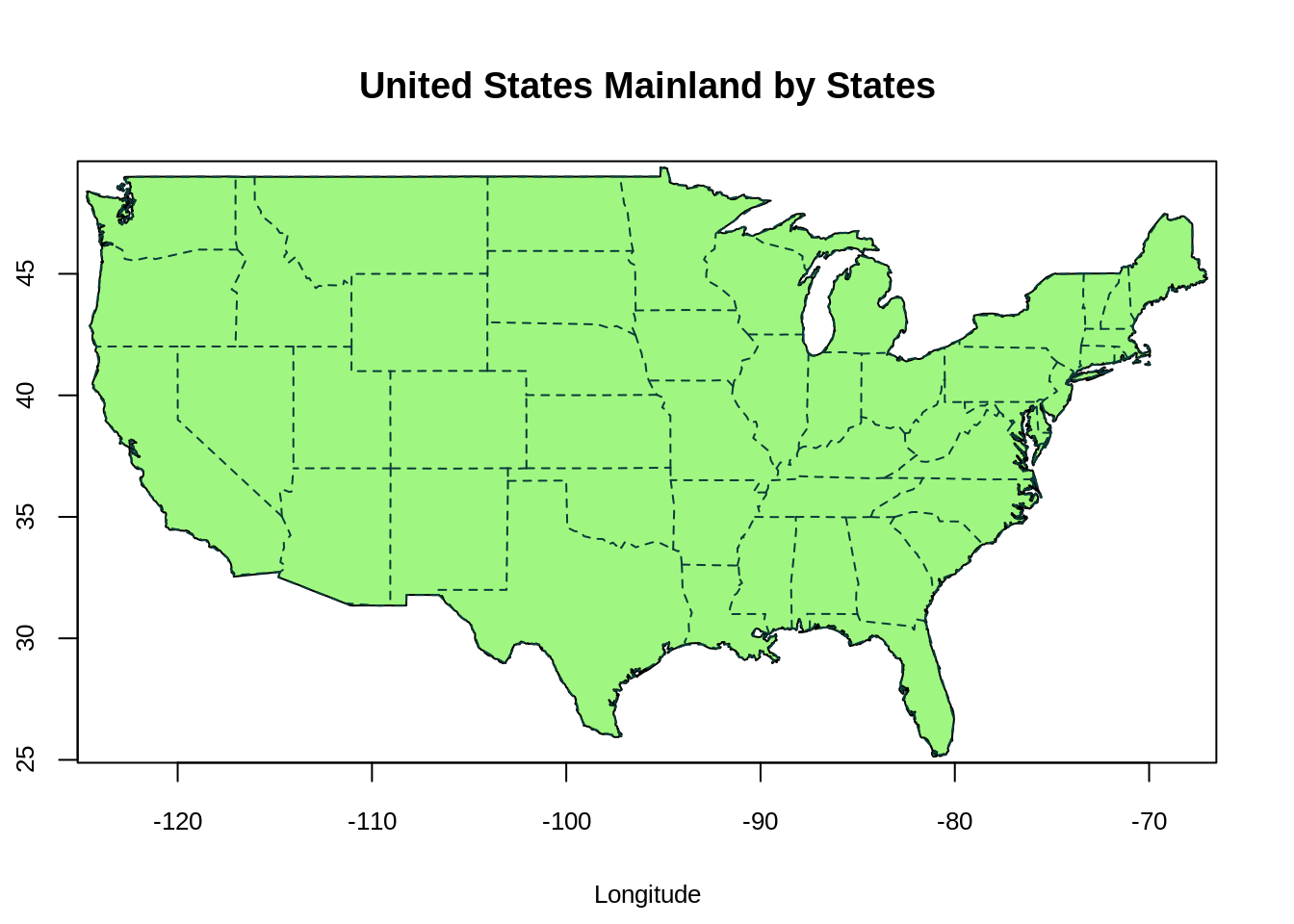
- The function
map("usa")plots a map of the United States Mainland. The x-axis and y-axis represent longtitude and latitude respectively. Positive latitude is above the equator (N), and negative latitude is below the equator (S). Positive longitude is east of the prime meridian, while negative longitude is west of the prime meridian (a north-south line that runs through a point in England). - The function
map("state",add=True)adds the state borderline to the US map.
maps::map('county', region = 'new york', col = "#5E610B")
map.cities(us.cities, country="NY", col = "#642EFE", cex = 0.6) # map cities recorded in us.cities to NY State
map.axes(cex.axis=0.8)
title(main = "New York State by Counties", xlab = "Longitude", ylab = "Latitude",
      cex.lab = 0.8)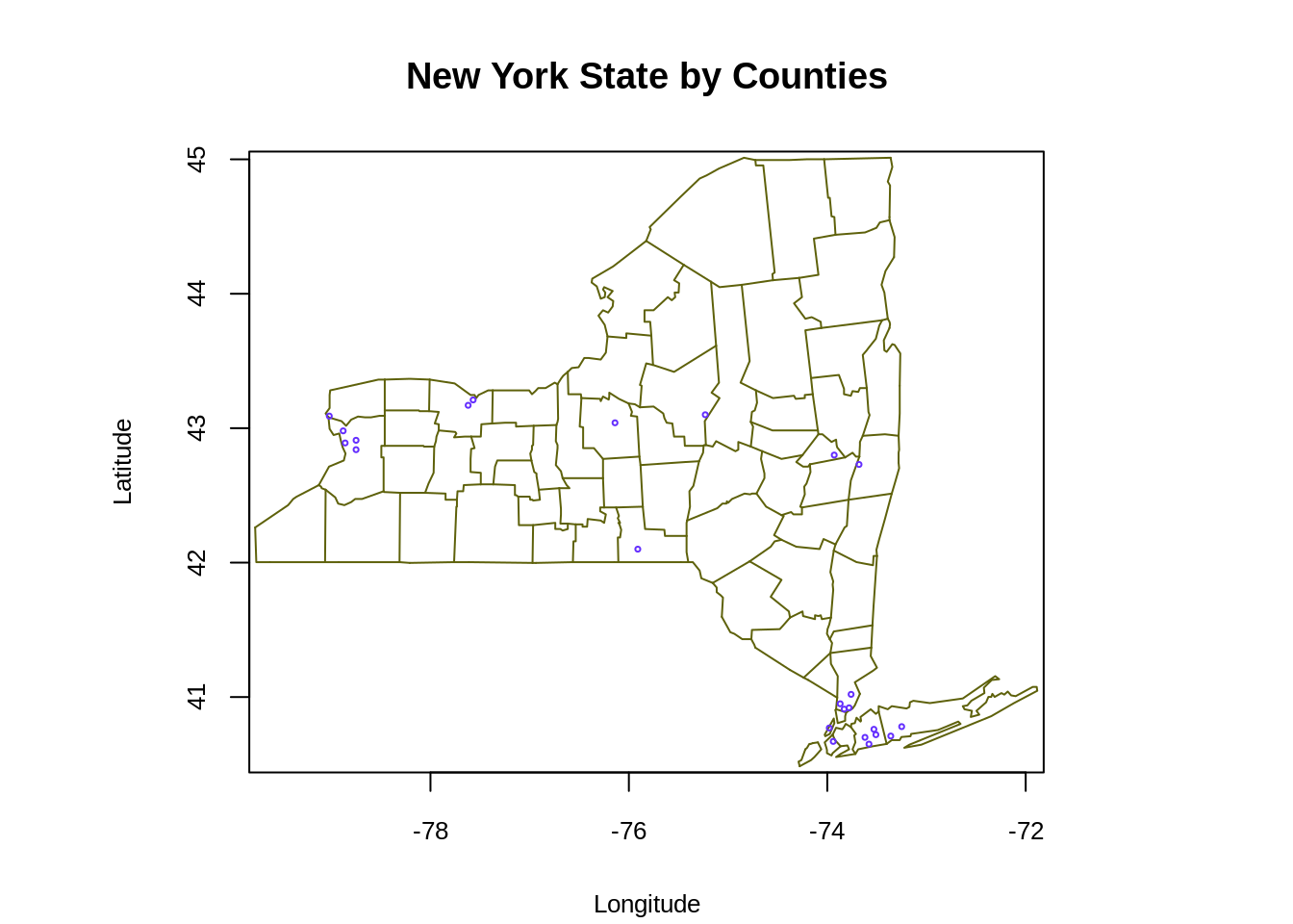
- The graph above plots the state map of New York. The function
map.citiespoints out the recorded cities in us.cities in New York State map (blue dots).
39.5 Simple Demonstration (using ggplot2)
We would first introduce the function map_data from ggplot2, which converts the map to a data frame. The most important variable we need to pass to map_data is the name of map provided by the maps package. These include: maps::usa, maps::france, maps::italy and etc.
## [1] "data.frame"## long lat group order region subregion
## 1 -101.4078 29.74224 1 1 main <NA>
## 2 -101.3906 29.74224 1 2 main <NA>
## 3 -101.3620 29.65056 1 3 main <NA>
## 4 -101.3505 29.63911 1 4 main <NA>
## 5 -101.3219 29.63338 1 5 main <NA>
## 6 -101.3047 29.64484 1 6 main <NA>ggplot() + geom_polygon(data = usa, aes(x=long, y = lat), fill = "#9F81F7") +
labs(title = "Map of the United States Mainland", x = "longitude", y = "latitude") +
coord_fixed(1.3) +
theme(panel.background = element_blank())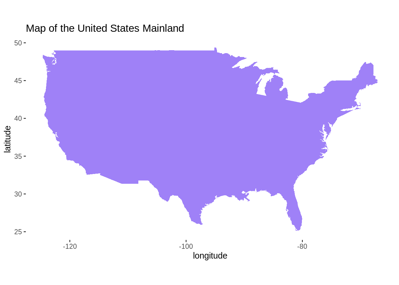
- We could plot the map of the United States Mainland using
ggplot2as well. First, we require a data which contains information of longitude and latitude. The functionmap_datacan easily turn data from the maps package into a data frame suitable for plotting with ggplot2. Then we pass the suitable data frame togeom_polygonfunction. Again, the two axis represent longitude and latitude.
states <- map_data("state")
counties <- map_data("county")
NewYork <- subset(states, region == "new york")
head(NewYork)
## long lat group order region subregion
## 9050 -73.92874 40.80605 34 9050 new york manhattan
## 9051 -73.93448 40.78886 34 9051 new york manhattan
## 9052 -73.95166 40.77741 34 9052 new york manhattan
## 9053 -73.96312 40.75449 34 9053 new york manhattan
## 9054 -73.96885 40.73730 34 9054 new york manhattan
## 9055 -73.97458 40.72584 34 9055 new york manhattan## long lat group order region subregion
## 52932 -73.78550 42.46763 1795 52932 new york albany
## 52933 -74.25533 42.41034 1795 52933 new york albany
## 52934 -74.27252 42.41607 1795 52934 new york albany
## 52935 -74.24960 42.46763 1795 52935 new york albany
## 52936 -74.22668 42.50774 1795 52936 new york albany
## 52937 -74.23241 42.56504 1795 52937 new york albanyggplot() + geom_polygon(data = NewYork, aes(x=long, y = lat, fill = subregion)) +
geom_polygon(data = ny_county, aes(x=long, y = lat, group = group), color = "white", fill = NA) +
labs(title = "New York State by Counties", x = "longitude", y = "latitude") +
coord_fixed(1.3) +
theme(panel.background = element_blank())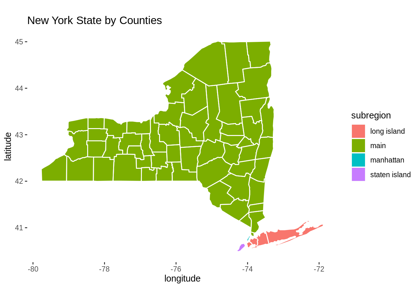
- To plot the map of New York State, we need to preprocess the data frame using
map_dataandsubset. We first fill the map by subregions, and then we add the borderlines to the map.
39.6 Mapping with geom_map
we will use the built-in state.x77 dataset. This 50 by 8 dataset contains some US State facts and figures. For instance, the variable Population indicates the population estimate as of July 1, 1975 in each states. For our example, we choose to investigate Income and Murder
##            Population Income Illiteracy Life Exp Murder HS Grad Frost   Area
## Alabama          3615   3624        2.1    69.05   15.1    41.3    20  50708
## Alaska            365   6315        1.5    69.31   11.3    66.7   152 566432
## Arizona          2212   4530        1.8    70.55    7.8    58.1    15 113417
## Arkansas         2110   3378        1.9    70.66   10.1    39.9    65  51945
## California      21198   5114        1.1    71.71   10.3    62.6    20 156361
## Colorado 2541 4884 0.7 72.06 6.8 63.9 166 103766library(tidyverse)
df <- state.x77 %>% as.data.frame() %>% rownames_to_column("state")
df$state <- tolower(df$state)
ggplot(df, aes(map_id = state)) + geom_map(aes(fill = Income), map = states) +
expand_limits(x = states$long, y = states$lat) +
scale_fill_gradient(low = "white", high = "#FE2EC8") +
labs(title = "US Per Capita Income by States, 1974", x = "longitude", y = "latitude",
caption = "source: https://www.rdocumentation.org/packages/
datasets/versions/3.6.1/topics/state") +
coord_fixed(1.3) +
theme(panel.background = element_blank())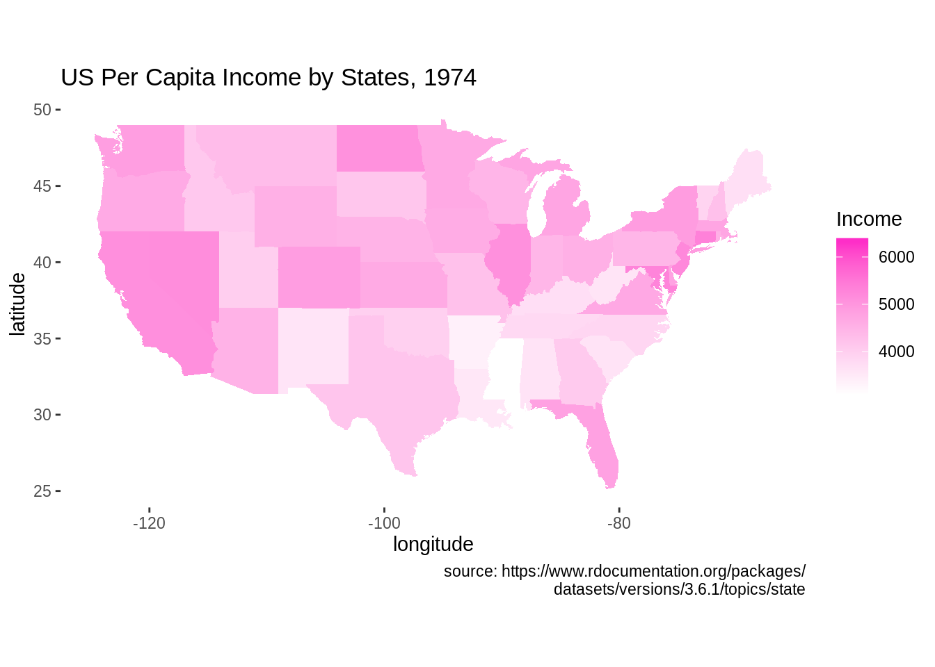
- The graph above plots the heatmap of US per Capita income by state in 1974. To plot the state map, we need to preprocess data to make sure the state names are all in lowercase. Then, we use
map_idto plot the states. We set thefillingeom_mapfunction to the variable of interest to plot the heatmap.
ggplot(df, aes(map_id = state)) + geom_map(aes(fill = Murder), map = states, col = "white") +
  expand_limits(x = states$long, y = states$lat) +
  scale_fill_distiller(name = "murder rate", palette = "Spectral") +
  labs(title = "US Murder Rate per 100,000 Population, 1976", x = "longitude", y = "latitude",
       caption = "source: https://www.rdocumentation.org/packages/
       datasets/versions/3.6.1/topics/state") +
  coord_fixed(1.3) +
  theme_minimal()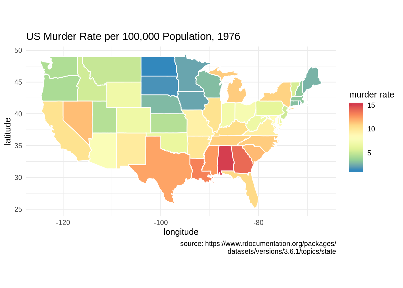
- This is another example of plotting with
geom_map. The graph shows US murder rate in 1976.
39.7 Considerations
- When we visualize the map using
ggplot2andgeom_ploygon, it is necessary to addcoord_fixed()to ggplot as it fixes the ratio between x and y direction. The value 1.3 we used incoord_fixed()is an arbitrary value that makes the plot look good
39.8 External Resources
https://cran.r-project.org/web/packages/maps/maps.pdf is an R documentation on the package
maps.https://www.rdocumentation.org/packages/maps/versions/3.3.0/topics/map talks specifically about the function map in the package
maps.https://eriqande.github.io/rep-res-web/lectures/making-maps-with-R.html demonstrates some examples of mapping in R
The package
ggmapis also used to draw maps. It uses the Google map platform and users need to register for an API key prior to accessing the database. More details on https://cran.r-project.org/web/packages/ggmap/ggmap.pdf and https://rdrr.io/cran/ggmap/man/register_google.html