Chapter 40 Plotting Maps with R: An Example-Based Tutorial
Jonathan Santoso and Kevin Wibisono
In this short tutorial, we would like to introduce several different ways of plotting choropleth maps, i.e. maps which use differences in shading, colouring, or the placing of symbols within areas to indicate a particular quantity associated with each area, using R. The data set used throughout this tutorial is the 2015 to 2019 crime data from the city of Milwaukee, Wisconsin (obtained from https://data.milwaukee.gov/dataset/wibr). The variables of interest are as follows:
- ReportedYear, which takes integer values from 2015 to 2019.
- ALD (Aldermanic District), which takes integer values from 1 to 15. Each of these districts will be represented with an area in our choropleth maps. The data set contains some observations whose ALD equal 0 or NA, and we decided not to include these observations in our exploratory data analysis and visualisation.
- Arson, which takes binary values. It has a value of 1 if and only if the crime can be categorised as an arson.
- AssaultOffense, which takes binary values. It has a value of 1 if and only if the crime can be categorised as an assault offence.
- CriminalDamage, which takes binary value. It has a value of 1 if and only if the crime can be categorised as a criminal damage to property.
- LockedVehicle, which takes binary value. It has a value of 1 if and only if the crime can be categorised as a locked vehicle entry.
- VehicleTheft, which takes binary value. It has a value of 1 if and only if the crime can be categorised as a vehicle theft.
We note that a crime can be categorised as more than one categories. For example, the 27th row of the data set refers to a crime categorised as both an assault offence and a criminal damage to property.
As a first step, we load all the necessary libraries.
library(rgdal) # R wrapper around GDAL/OGR
library(tidyverse)
library(RColorBrewer)
library(ggplot2)
library(leaflet)
library(tmap)
In order to plot custom map boundaries, we will need a .shp file for the boundaries, which can be obtained from https://data.milwaukee.gov/dataset/aldermanic-districts. This file contains coordinates, labels and shapes, and can be read (and automatically parsed) using the ‘rgdal’ package. In order to access the data in the .shp file, we use the command shapefile@data. Also, we use the fortify method to convert the .shp file into a dataframe.
The chunk of code below converts the .shp file into a dataframe
# reads in the SHP file
shapefile <- readOGR("./resources/plotting_maps_tutorial/alderman_coord.shp")
## OGR data source with driver: ESRI Shapefile
## Source: "/home/travis/build/jtr13/cc19/resources/plotting_maps_tutorial/alderman_coord.shp", layer: "alderman_coord"
## with 15 features
## It has 6 fields
## Integer64 fields read as strings: ALD COLORCATNow, we load the crime data, focussing on the seven columns mentioned above. Note that we delete rows whose ALD values are 0 or NA.
# load the data
crimes <- read_csv('./resources/plotting_maps_tutorial/wibr.csv')
crimes_df <- crimes %>%
  select(ReportedYear, ALD, LockedVehicle, VehicleTheft) %>%
  filter(!(ALD %in% c(0, NA)))
In order to label the plots nicely, we will need to plot the legends at the centroid of each polygon, whence centroid calculations must be performed. Also, we will need to map the ID column in the .shp file to our desired labelling, which is ALD. The mapping can be found in the .shp data file, where the row names corresponds to ID and the ALD column corresponds to our labels.
Reference: https://stackoverflow.com/questions/28962453/how-can-i-add-labels-to-a-choropleth-map-created-using-ggplot2.
# labels
lab <- data.frame(shapefile$ALD, shapefile$ALDERMAN)
lab <- mutate(lab, id = strtoi(rownames(lab)) - 1)

# centroid calculations
centroids <- setNames(do.call("rbind.data.frame", by(shapefile_df, shapefile_df$id, function(x) {Polygon(x[c('long', 'lat')])@labpt})), c('long', 'lat'))
centroids$factors <- levels(shapefile_df$id)
centroids <- merge(centroids, lab, by.x = "factors", by.y = "id", all.x = TRUE)

#remove lab
rm(lab)
40.1 Plotting using base R
Now, let’s use base R to visualise the number of vehicle-related crimes in each of the fifteen districts in 2018.
#create the veh_2018 dataframe
veh_2018 <- crimes_df %>%
  filter(ReportedYear == 2018) %>%
  group_by(ALD, ReportedYear) %>%
  summarise(sum(LockedVehicle),sum(VehicleTheft)) %>%
  mutate(Vehicle = `sum(LockedVehicle)` + `sum(VehicleTheft)`) %>%
  select(ALD, Vehicle, ReportedYear) %>%
  as.data.frame()

# first, we create a copy temp of the .shp file since we do not want to modify the original fie.
# next, we add a column called identifier to temp@data in order to preserve the sorting order and not to mess up the labelling.
# after that, we can merge temp@data with the arson dataframe with a common key, i.e. ALD.
# we then reorder the data based on the original order by using the identifier column, and assign it back to the .shp file variable.
temp <- shapefile
a <- temp@data
a <- a %>% mutate(identifier = strtoi(rownames(a)) + 1)
b <- sp::merge(a, veh_2018, by = "ALD", all.x= TRUE)
b <- b[order(b$identifier),]
row.names(b) <- 0:14
temp@data <- b

# remove unnecessary variables
rm(a)
rm(b)

# plotting in base R requires us to define the colour schemes. In this tutorial, we will use the brewer.pal method to generate the colours.
# we also need to define our own intervals for cutting the target variable, and map our target to the interval.
my_colors <- brewer.pal(8, "YlGn")
mybreaks <- seq(0, 1400, 200)
cut(temp@data$Vehicle, mybreaks)
## [1] (400,600] (200,400] (400,600] (400,600] (0,200] (200,400]
## [7] (400,600] (600,800] (400,600] (200,400] (800,1e+03] (400,600]
## [13] (600,800] (400,600] (600,800]
## 7 Levels: (0,200] (200,400] (400,600] (600,800] ... (1.2e+03,1.4e+03]mycolourscheme <- my_colors[findInterval(temp@data$Vehicle, vec = mybreaks)]
# we can then generate our plot from the modified .shp file
# the labels are generated from the centroids
plot(temp, col = mycolourscheme,
main = "Vehicle-Related Crimes by Milwaukee Districts in 2018", cex = 5,
ylim = c(min(shapefile_df$lat) - 0.05, max(shapefile_df$lat)))
text(centroids$long, centroids$lat, labels = centroids$shapefile.ALD)
legend(min(shapefile_df$long) - 0.3, min(shapefile_df$lat) + 0.12,
legend = levels(cut(temp@data$Vehicle, mybreaks)),
fill = my_colors, cex = 0.8, title = "Vehicle-Related Crimes")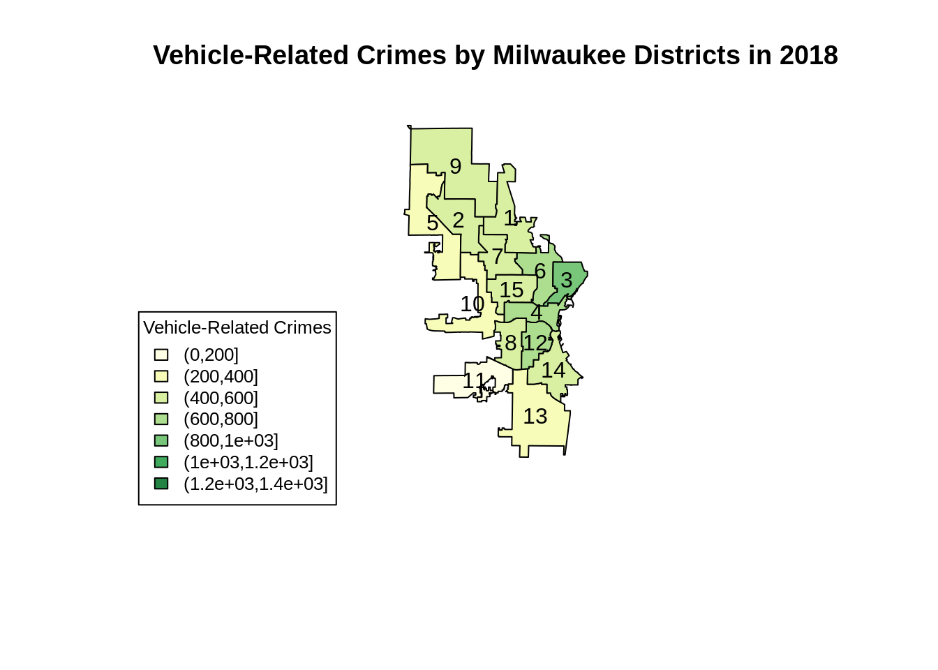
Plotting maps in base R can be frustrating sometimes. Even though we only need to write a relatively short code, we are required to manually define the colour schemes. Moreover, we will also need to modify the data in the .shp file since we can only plot from the S4 data type.
40.2 Plotting using ggplot2
Next, we will produce a similar chart using ggplot2. This time, we will use the same vehicle data frame as we used in the previous plot.
# first, we need to create a dataframe to map id to ALD
lab <- data.frame(shapefile$ALD, shapefile$ALDERMAN)
lab <- mutate(lab, id = strtoi(rownames(lab)) - 1)

# in order to use ggplot, we will need the fortified dataset and merge it with the external data set using the id
ggplotdf <- merge(shapefile_df, lab, by = "id", all.x = TRUE)
ggplotdf <- merge(ggplotdf, veh_2018, by.x = "shapefile.ALD", by.y = "ALD", all.x = TRUE)


# then, we can use the geom_polygon method to create the boundaries and use the external data set fill. This is similar to a normal ggplot2 syntax.
map <- ggplot(data = ggplotdf, aes(x = long, y = lat)) +
  geom_polygon(mapping = aes(group = group, fill = Vehicle),
               color = "white") +
  with(centroids, annotate(geom="text", x = long, y = lat,
                           label=shapefile.ALD, size=3)) +
  scale_fill_gradient(low="white", high="darkgreen") +
  ggtitle("Vehicle-Related Crimes by Milwaukee Districts in 2018") +
  theme(plot.title = element_text(hjust = 0.5))

map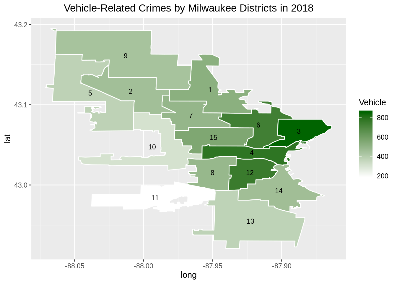
Plotting using ggplot2 is fairly straightforward since we only need to merge a fortified data set and an external data set. We could then proceed with the usual ggplot2 grammar of graphics syntax.
40.3 Plotting interactively using leaflet
Now, we will create our map using leaflet, which provides interactivity features. For this plot, we are using the same dataframe.
# first, we create a copy temp of the .shp file since we do not want to modify the original fie.
# next, we add a column called identifier to temp@data in order to preserve the sorting order and not to mess up the labelling.
# after that, we can merge temp@data with the arson dataframe with a common key, i.e. ALD.
# we then reorder the data based on the original order by using the identifier column, and assign it back to the .shp file variable.
temp <- shapefile
a <- temp@data
a <- a %>% mutate(identifier = strtoi(rownames(a)) + 1)
b <- sp::merge(a, veh_2018, by = "ALD", all.x= TRUE)
b <- b[order(b$identifier),]
row.names(b) <- 0:14
temp@data <- b

# remove unnecessary variables
rm(a)
rm(b)

# labels for interactivity
labels <- paste0(
  "<strong>Alderman District: </strong>",  temp$ALD,
  "<br/>Vehicle-related crimes in 2018: ", temp$Vehicle
)

# define a color scheme
pal <- colorQuantile("YlGn", NULL, n = 5)

# create leaflet plot
m <- leaflet() %>%
  setView(lng = -87.9065, lat = 43.0389, zoom = 11) %>%
  addTiles() %>%
  addPolygons(data = temp,
              fillColor = ~pal(Vehicle),
              fillOpacity = 0.8,
              color = "#BDBDC3",
              weight = 1,
              popup = labels)

m
40.4 Plotting using tmap
We will now use tmap to generate a faceted map of the sum of vehicle-related crimes in 2016 to 2019.
#create the veh dataframe
veh <- crimes_df %>%
  filter(ReportedYear %in% c(2016,2017,2018,2019)) %>%
  group_by(ALD, ReportedYear) %>%
  summarise(sum(LockedVehicle),sum(VehicleTheft)) %>%
  mutate(Vehicle = `sum(LockedVehicle)` + `sum(VehicleTheft)`) %>%
  select(ALD, Vehicle, ReportedYear) %>%
  as.data.frame()

#modify the .shp file
temp <- shapefile
a <- temp@data
a <- a %>% mutate(identifier = strtoi(rownames(a)) + 1)
b <- sp::merge(a, veh, by = "ALD", all.x= TRUE)
b <- b[order(b$identifier),]
b <- b[order(b$ReportedYear),]
row.names(b) <- 0:59
temp@data <- b

# remove unnecessary variables
rm(a)
rm(b)

#create maps
facetmaps <- tm_shape(temp) +
  tm_borders() +
  tm_facets(by = "ReportedYear", nrow = 2, free.coords = TRUE) +
  tm_fill(col='Vehicle', palette = 'YlGn') +
  tm_layout(title = "Number of Vehicle-Related Crimes in Milwaukee")

facetmaps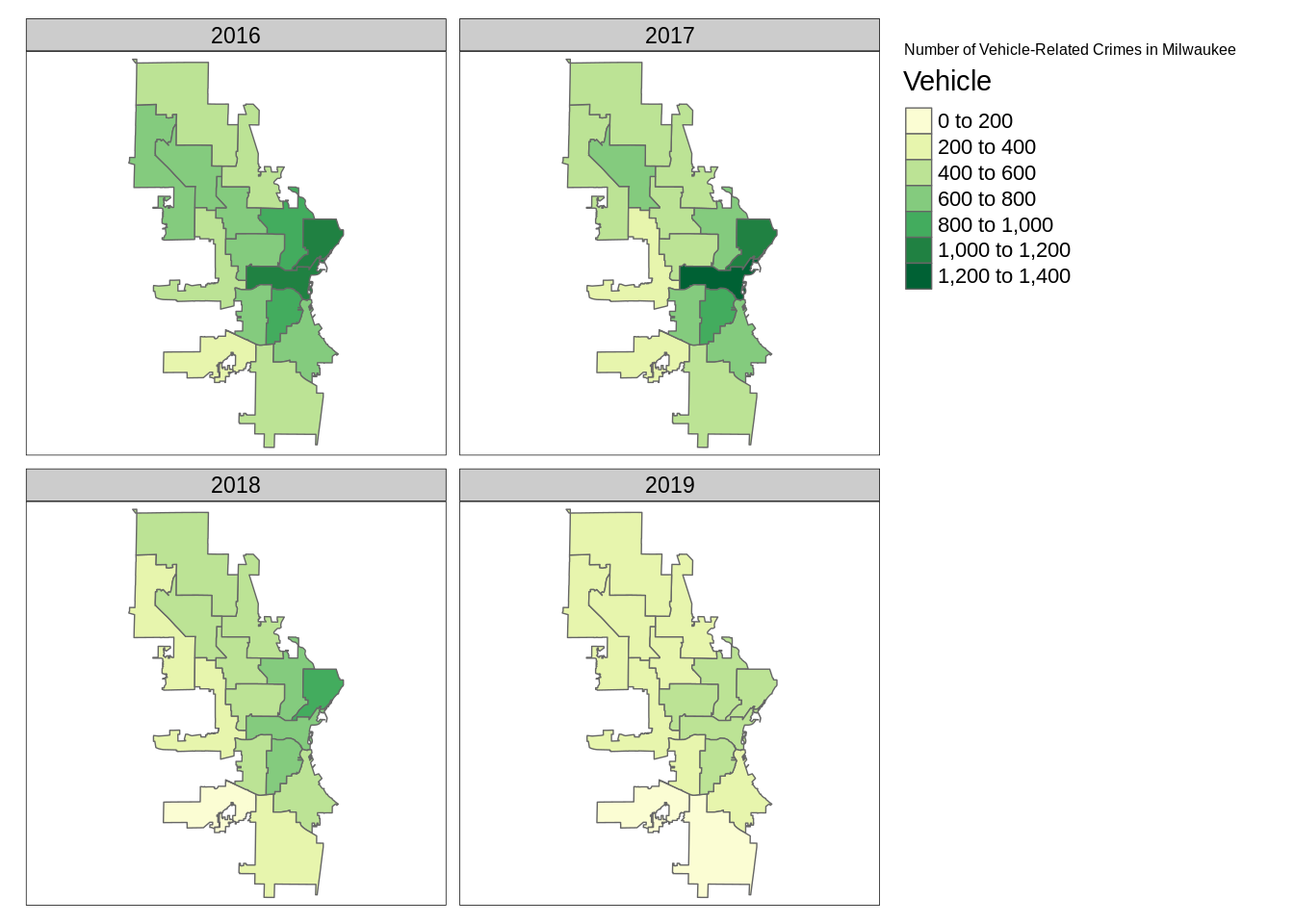
We can also generate an animated map based on the faceted map above.
#create animated map
animatedmaps <- tm_shape(temp) +
  tm_borders() +
  tm_facets(along = "ReportedYear", nrow = 2, free.coords = FALSE) +
  tm_fill(col='Vehicle', palette = 'YlGn')

# code to create tmap animation
#gif <- tmap_animation(animatedmaps, filename = 'edav.gif', width = 800, height = 1000, delay = 50)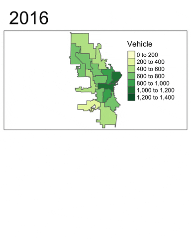
The tmap_animation method will automatically generate a .gif file named ‘edav.gif’ in the same working directory as this .Rmd file. In order to display the .gif file, one may need to upload the file to giphy, and insert the link in the plain text of the .Rmd file. The link for this .gif file is https://media.giphy.com/media/lp6S5QJA78fMFfnUAh/giphy.gif.
From these plots, at least two insights can be drawn:
- Vehicle-related crimes more often happened in downtown districts (e.g. 3, 4, 6 and 12). This trend is consistent across the years.
- Using the facet map or the animated map, we can clearly see that the number of vehicle-related crimes in most districts had decreased quite signiificantly throughout the year.
In conclusion, ggplot2 offers a practical yet powerful way to plot maps. The same holds for leaflet, which provides interactivity. One may also consider tmap, a “powerful and flexible map-making package” which allows for a broader range of spatial classes. As tmap is built on the basis of a grammar of graphics, users already familiar with ggplot2 should be able to learn to use this versatile package easily. In the future, this tutorial can be expanded to create interactive plots that display how crime varies across years and potentially selectors to visualise different crimes in a single plot.
Happy coding with R!