Chapter 72 Midsemester Review
Tiffany Zhu tz2196 and Olivia Wang yw3324
72.1 Lecuture 1: Introduction
- Exploratory Data Aanlysis (EDA)
- detecting patterns, finding outliers, making comparisons, identifying clusters
- Data science pipeline
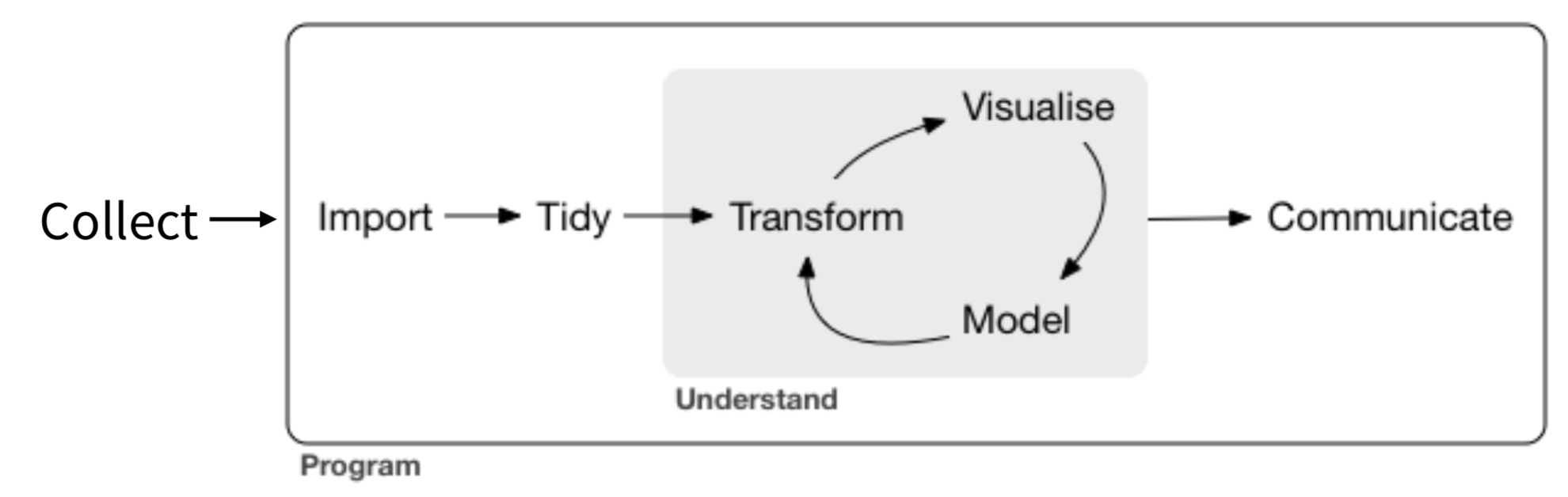
- Exploration vs visualization
- Exploratory vs explanatory
- Not mutually exclusive
72.2 Lecture 2: Histograms
x <- rnorm(N)
df <- data.frame(x)
ggplot(df, aes(x)) +
  geom_histogram() +
  ggtitle("Histogram of Random Data")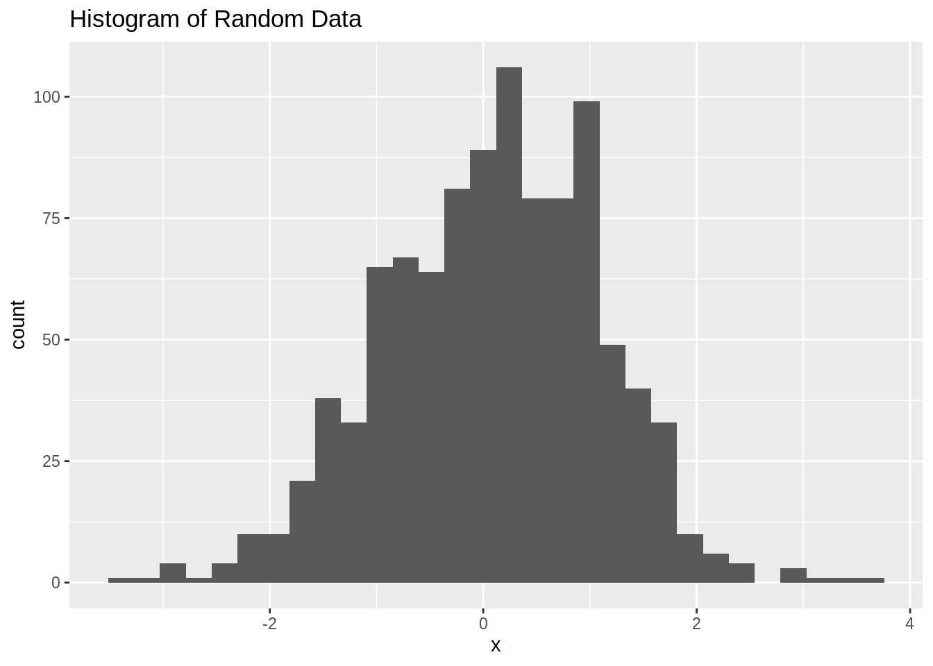
- Summary:
- Primary tool for continuous variables
- Different types: Count (frequency)/relative frequency/cumulative frequency/density
- Boundaries
- default in R: right closed (e.g. (55,60])
- Bin width
- Sometimes multimodality might disappear with change in binwidth
- using non-integer binwidth can conceal useful empirical info
- unequal bin width should be avoided
- Relative frequency histograms:
- Area under curve is 1
- \(Relative Frequency = \frac{count}{total}\)
- \(Density = \frac{Relative Frequency}{BinWidth}\)
- Uneven binwidth histogram:
- Density histogram should be used
- Uneven binwidth histogram:
- Density histogram should be used
- Cumulative frequency:
- e.g. how many ppl can have weight less than X
- Good for:
- emphasizing features of the raw data
- Bad for:
- density estimates
72.3 Lecture 3: Grammar of Graphics
- Why use a grammar? Becuase More flexible, more room for growth
- Building blocks
- Layers (many)
- geom → aesthetic mapping, stat, position
- coord (1)
- facet (1)
- scales (1 per mapping)
- x → scale_x_date(), y → scale_y_continuous(), color → scale_color_manual() +theme (1)
- Layers (many)
- Example mnemonic to remember order:
- Geometry Class Feels So Lame Today
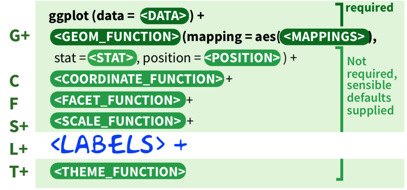
- Geometry Class Feels So Lame Today
72.4 Lecture 4: Common ggplot2 Problems
- aes() not needed for constant values
- correct example – color varies with z
- ggplot(df, aes(x, y, color = z)) + geom_point()
- if missing legend, data is not tidy (use gather())
72.5 Lecture 5: Boxplots & Continuous Variables
72.5.0.1 Boxplot Overview
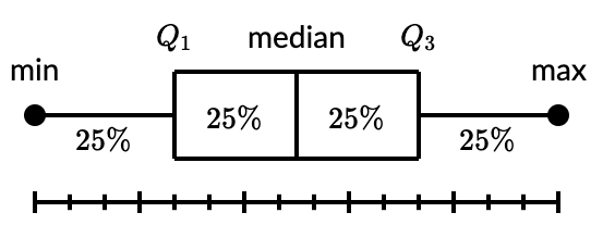 * Boxplot components
+ minimum
+ quartile 1 (lower hinge)
+ quartile 2 (median)
+ quartile 3 (upper hinge)
+ maximum
*
* Boxplot components
+ minimum
+ quartile 1 (lower hinge)
+ quartile 2 (median)
+ quartile 3 (upper hinge)
+ maximum
* interquartile range (hinge spread)
+ \(IQR = Q3 – Q1\)
* Can easily see outliers
+ Point is outlier if it falls outside of fences
+ Upper Fence: 1.5hinge + upper hinge (Q3)
+ 1.5IQR + Q3
+ Lower Fence: 1.5hinge - lower hinge (Q1)
+ 1.5IQR - Q1
* Best for comparing the distribution of a variable across the groups (textbook-ch 3)
* If multiple boxplots, should reorder by something (e.g. median, max value, standard deviation)
72.5.0.2 Comparing Histograms to Boxplots
par(mfrow=c(3,2))
hist(x, main="Histogram of Normal Data")
boxplot(x, horizontal=T, main='Boxplot of Normal Data')

x <- c(0, 0, 1, 1, 1, 2, 2, 3, 3, 4, 5, 7, 10)
hist(x, main="Histogram of Right Skewed Data")
boxplot(x, horizontal=T, main='Boxplot of Right Skewed Data')

x <- c(0, 0, 1, 1, 1, 2, 2, 3, 3, 4, 5, 7, 8, 9, 9, 9, 10, 10)
hist(x, main="Histogram of Bimodal Data")
boxplot(x, horizontal=T, main='Boxplot of Bimodal Data')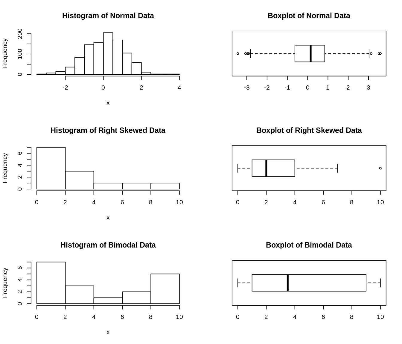
violin plots- density curves–> rotated
- bandwidth really matters
- box plot vs. violin:
- skinny quartile: lots of data
- fat one: little data
Ridgeline plots: density curve plots shifted - good for multimodality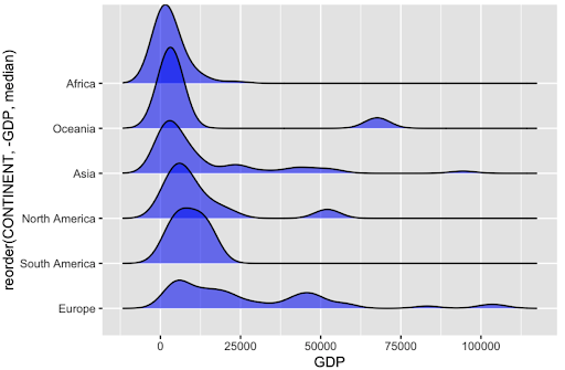
72.6 Lecture 6: Rounding Normal (Continuous Variables Wrap-up)
- You can tell if the data is rounded or not by:
- changing the bin width (to see gaps)
- Stem and leaf plot
- Q-Q plot (quantile-quantile)
- If distribution is normal, you will get a straight line
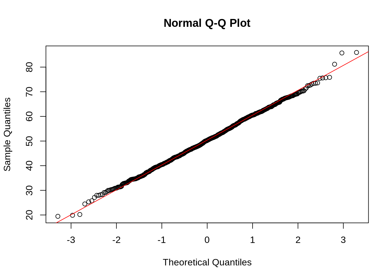
- Other ways to test normality is by:
- Putting density curve & normal curve on top of the histogram
- Shapiro-Wilk test
- Null Hypothesis: Data is normally distributed
- Alternative Hypothesis: Data is NOT normally distributed
- Check the p-value
72.7 Lecture 7: Graphical Perception
- Gets harder and harder to perceive:
- Position along a common scale
- Position along identical, nonaligned scales
- Length
- Angle / Slope
- Area
- Volume
- Color hue / Color saturation / Density
72.8 Lecture 8: Categorical Variables (Textbook: Chapter 04)
- Summary:
- https://github.com/jtr13/codehelp/blob/master/R/reorder.md
- Hard to work with
- Not a lot of options
- Choice about which categories to display
- Choice of the order of categories
- Data cleaning takes more time
- Types of data
- Nominal – no fixed category order -> order by frequency
- Bar charts
- Order by frequency: Sort from highest to lowest count (left to right or top to bottom)
- Natural order
- Bar charts
- Ordinal – fixed category order -> use natural order
- Bar chart
- Sort in logical order of categories
- can’t change binwidth
- Bar chart
- Discrete – small # of possibilities
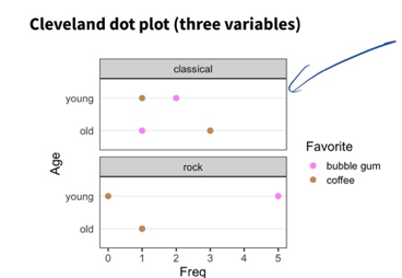
- Cleveland dot plot
- Not always clearcut: nominal vs ordinal, ordinal vs discrete,
- Sometimes numbers = nominal, not discrete
- Nominal – no fixed category order -> order by frequency
Bar charts- how to order:
- if ordinal: order by natural order
- If nominal: order by frequency count
- If data is binned, use geom_col, If data unbinned, use geom_bar
- unbinned, ordinal, correct level order
- geom_bar
- unbinned, ordinal, levels out of order
- geom_bar, fct_relevel
- binned, ordinal, correct level order
- geom_col
- binned, ordinal, levels out of order
- geom_col, fct_inorder
- unbinned, nominal
- geom_bar, fct_infreq
- binned, nominal
- geom_col, fct_reorder
- example:
- how to order:
library(dplyr)
colors <- as.data.frame(HairEyeColor)

# just female hair color, using dplyr
colors_female_hair <- colors %>%
  filter(Sex == "Female") %>%
  group_by(Hair) %>%
  summarise(Total = sum(Freq))

ggplot(colors_female_hair, aes(x = Hair, y = Total)) +
  geom_bar(stat = "identity") +
  ggtitle("Bar Graph Using ggplot2")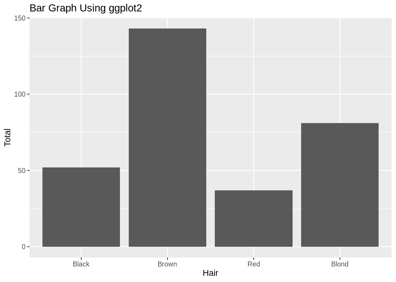
72.9 Lecture 9: Web Scraping & rvest package
Web scraping- Should be last resort
- Better to use an API (httr package) or R package
- Investigate legal issues, think about ethical questions, limit bandwidth use
72.10 Lecture 10: Scatterplots - 2 Continuous Variables (Textbook: Chapter 05)
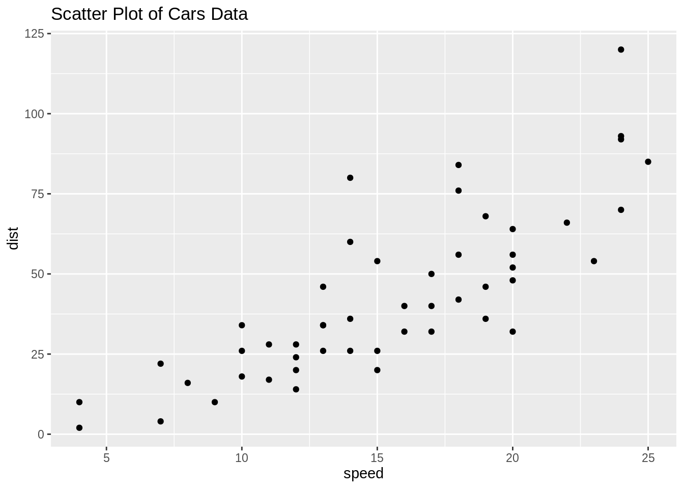
Featuresvisible in scatterplots- Correlation (Correlation != Causation) => dependent variable on the y-axis
- Associations
- Outliers
- Clusters
- Gaps (where particular combinations of values do not occur)
- Barriers (Boundaries) (where some combinations of values may not be possible. e.g. having more years of experience than their age)
- Conditional Relationships (different relationships for different intervals of x)
- Strategies
- Use techniques to deal with over plotting
- open circles
- Alpha blending
- Plotly (interactive)
- Don’t plot all points
- temporarily remove outliers, start off with sampling, subset data on the
- basis of some variable, such as “freshmen”
- Heatmaps
- bin counts or density estimates
- Density contour lines
- to see if there’s a clear cluster or not
- Combination of above
- Multiple variables: scatterplot matrices
72.11 Lecture 11: Parallel Coordinates
- Used for multiple (more than 2) continuous variables
- Where there are a lot of repeat data, splines make PC plots more useful
- Interpreting Parallel Coordinates
- Twisting means that the variables are negatively correlated
- Straigh parallel lines means that the variables are strongly positively correlated
- Otherwise, variables are not correlated
library(datasets)
library(GGally)

ggparcoord(iris, columns=1:4, title = "Parallel coordinate plot for Iris flowers")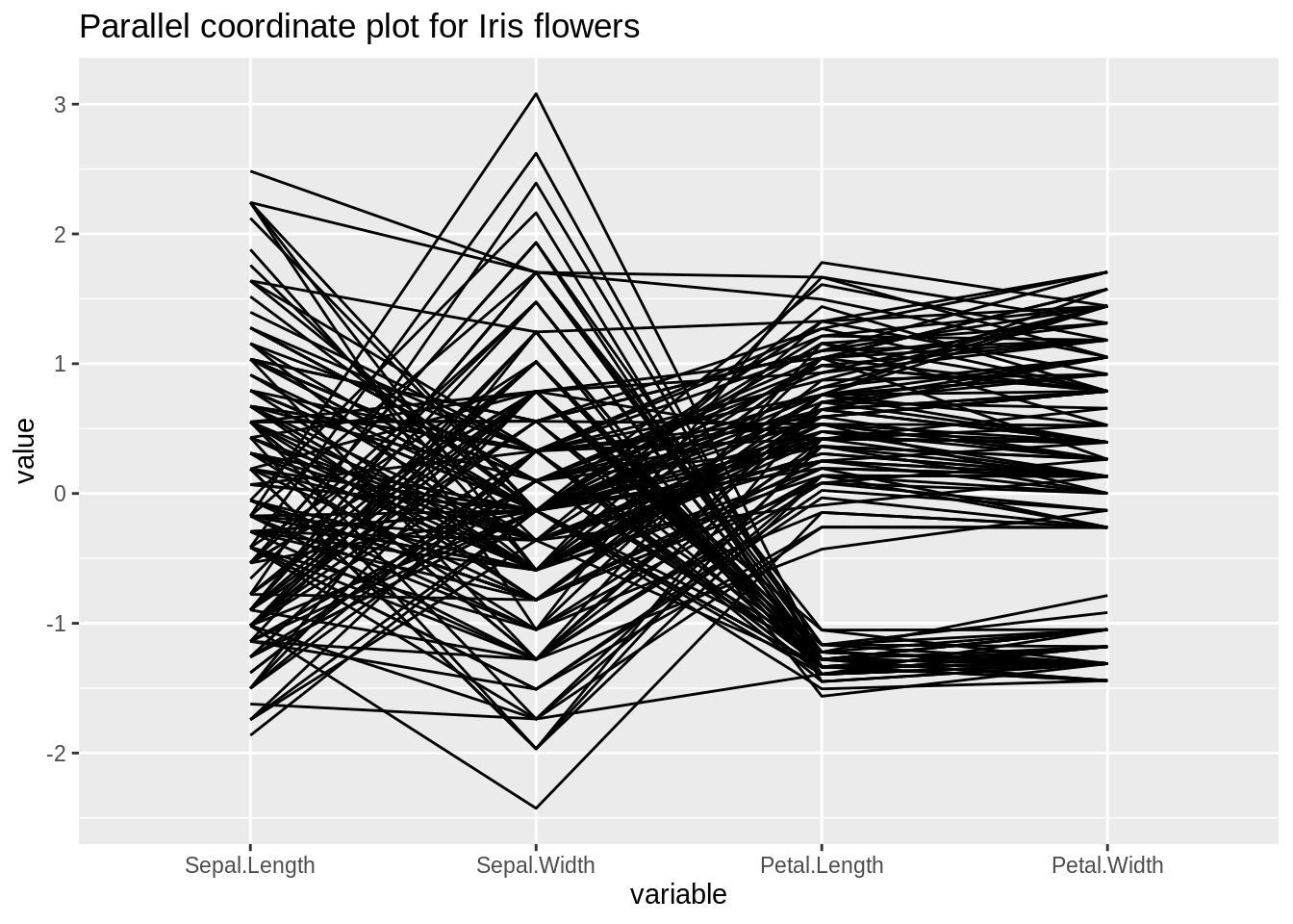
72.12 Lecture 12: Interactive Parallel Coordinates (Htmlwidget: parcoords)
- Interactive PC good for recognizing outliers
- Parallel coordinate plots need to be interactive to be fully effective
- Alpha blending, color, filter out (certain data)
72.13 Lecture 13: Git - Workflow
- Create local clone of your repository bc hard to write code on GitHub
- Simple workflow
- From local: 1. pull, 2. write code, 3. commit/push
72.14 Lecture 14: Multivariate Categorical Variables (e.g. Mosaic Plots)
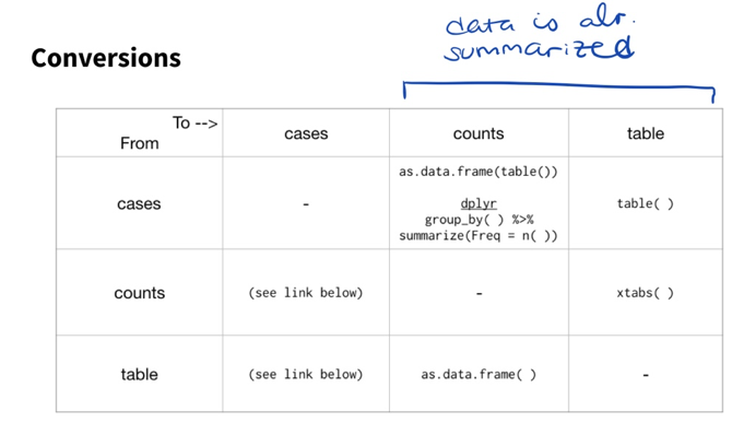
Categorical data- It has categories
- Data formats:
- Cases
- COUNTS (tidy data with Freq Column)
- Contingency or pivot table
Multivariate Categorical- FREQUENCY
- Bar charts
- Grouped vs. stacked
- Stacked: interested in overall total
- Grouped: the rest
- The closer things are, the easier to compare
- Grouped vs. stacked
- Cleveland dot plot
- Two dots on the same horizontal level: for simplicity of comparison
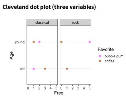
- Two dots on the same horizontal level: for simplicity of comparison
- Bar charts
- FREQUENCY
- PROPORTION/ASSOCIATION
- Mosaic Plots
- Any filled rectangular plot (no white space) with consistent numbers of rows and columns, in which the area of each small rectangle is PROPORTIONAL to the FREQUENCY count for a UNIQUE combination of levels of the categorical variable displayed
- Mosaic Plots
library(vcd)
library(ucidata)
mosaic(cp ~ exang,
       labeling = labeling_border(rot_labels = c(45, 0, 0, 0),
                                  abbreviate_labs = c(6)),
       main = 'Chest Pain vs Exercise Induced Angina',
       heart_disease_cl)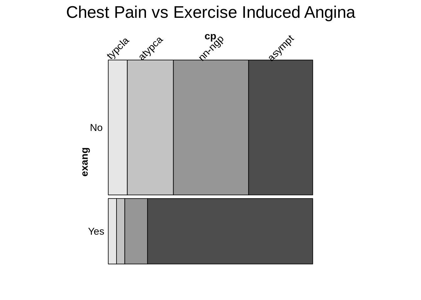
- Best practices
- Dependent variables is split LAST and split HORIZONTALLY
- Fill: set to dependent variable
- Other variables are split vertically
- Level of dependent variable is closest to the x-axis and darkest
Mosaic pairs plot- You are looking at 2 at a time
- Looking for strong linear relationships between variables
- Strongest: most staggered; we thus decide to zoom in on those variables
- Disadvantages:
- Labeling is a nightmare
Fluctation Diagrams- Shows same info as the mosaic plot
- Starts off with same sized squares
- Drawn in proportion to the one with the highest frequency count
- Everything thus is proportional
- All have the same aspect ratio
- Variables having no relationship to each other: boxes of varying shapes
- Useful for:
- When there are a lot of variables
Mosaic vs. tree map- Tree map: each box cannot be in more than one category (based on hierarchical data)
- Filled rectangular plot representing hierarchical data
- Tree map: each box cannot be in more than one category (based on hierarchical data)
Chi Square Test of Independence- Close to mosaic
- Tests how different variables are from one another
- We compare the observed to the expected (under the assumption of the null: assumes that the two variables are independent)
- Graph shows that there are no interactions
- Implementation (from textbook)
- Starts off with an empty rectangle that represents the whole dataset
- Taking the first variable and dividing the HORIZONTAL axis into sections PROPORTIONAL to the sizes of its categories.
- Each of the rectangles is then divided along its VERTICAL axis according to the sizes of the second variable categories
- In theory, you can continue to divide up the rectangles alternately horizontally and vertically for as many variables as you have. (however, having too many categories makes the plot messy)
- Works well with:
- Small number of categories
- Ordinal dependent variables
- As you can see cumulative patterns if they exist
- Alternative:
- Using the pairs function in vcd
- Produces a matrix display with the bar charts of the individual variables down the diagonal
- As well as 6 mosaic plots both above and below the diagonal
- Labeling is kept to a minimum
- While efficient, plot is hard to read
- Using the pairs function in vcd
72.15 Lecture 15: Transforming Data
- General naming conventions (e.g. for files) – should be machine readable, human readable
- Data frames – avoid spaces, punctuation, special characters
- Factor levels – descriptive but not too long
- when recoding factor levels: leave a papertrail, keep original columns if can
- Data visualization – human readability, brevity
- If possible, don’t use column names that have to be altered when plotting
- Transposing data frames
- t()
- will convert numerical to character if there are non numericals in the column
- works best if data frame has row names
- gather() then spread()
- t()
- transposing multiple columns
- mutate_all, mutate_if, mutate_at
72.16 Lecture 16: Likert
- Likert data is survey data with responses:
- strongly agree, agree, don’t know, dislike, strong dislike
- Plots to graph likert data:
- Stacked bar chart
- Diverging stacked bar chart - centered at the neutral data
- Can use
HH::likertpackage
72.17 Lecture 17: Git - Branching
- pull
- create new branch,
- write code,
- commit/push,
- submit pull request (so can merge branch into master),
- merge pull request,
- delete branch locally
72.18 Lecturee 18: Simpson’s Paradox
- Different ways of splitting the mosaic plot/faceting the data can show different and sometimes opposite trend– as a result, it is important to note the proportions when comparing groups of different sizes
- Wikipedia: “Where a trend appears in several different groups of data but disappears/reverses when these groups are combined”
- Video - https://www.youtube.com/watch?v=ebEkn-BiW5k
- when looking at just cats or just humans, can see that treatment helps.
- but when looking at total (cat + human), seems like treatment doesn’t help.
72.19 Lecture 19: Heatmaps (Textbook: Chapter 8)
- It can show FREQUENCY counts (2 D histogram- with just an x and an y-axis) or value of a third variable (which you will have to manually insert, it will not be generated automatically)
- When cleaning dataset to be used for Heat maps:
- We need 1 column that lists all the variables
- Can be used for continuous or categorical data (both for axes and fill color)
- However:
- It is overused
- Based off of color (hard to decipher) –> not our first choice
- However:
Categorical axes- Frequency count/ time
- Common use: gene expression
- Rows: genes
- Columns: samples
- COLOR: change in gene expression LEVEL
- Common use: gene expression
- Not a good option for
- Data with small numbers of categories (small n)
- Very hard to read (color makes it hard to see patterns)
- Data with small numbers of categories (small n)
- Frequency count/ time
Continuous axes- Location
- Eyetracking
- Geographic Data
Implementation- Geom_point()
- Geom_tile() –> makes rectangles instead of dots
- Geom_raster() –> similar to but faster than geom_tile()
- if one variable is categorical, use fill
- Heat map theme
- theme(axis.line = element_blank(), axis.ticks = element_blank())
- coord_fixed –> squares
- white borders with geom_tile
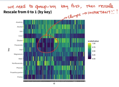
- rescale(value): transforms values to 0 to 1
- rescaling: group_by key first and then rescale
- small sample size and not rescaled?
- Meaningless unless we look at proportions
- Can be rescaled so that whole box/column adds to 1
- To test that your values are correct: add geom_text()
- Try changing color scheme to make things clearer
- Tips regarding heat maps (
from textbook)- Each case is represented by a row and each variable is represented by a column
- Individual cells are colored according to the case value relative to the other values in the COLUMN
- Either with a normal transformation to z score
- Or adjusted to a scale from min to max
- It is unwise to color according to all values in the dataset tas that highlights differences between different levels of variables instead of differences between individual cases.
- Clusters are very important
- Rather subjective tool
- Can be effective for particular structures in some datasets, but cannot be relied upon to produce good results in general.
- Additional related graphs
- Scatterplot Matrices
- Shows relationship and association
- Parallel coordinate plots
- Great for studying groups of cases
- Some of the features are already identified in the scatterplot matrix display, at least for those variables with adjacent axes.
- A lot of information on the distribution of individual variables
- Skewness
- Gaps
- Most effective if used interactively.
- Scatterplot Matrices
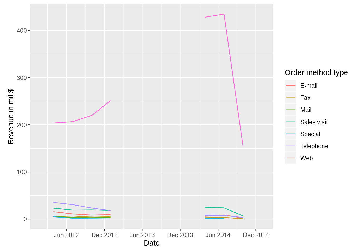
72.20 Lecture 20: Time Series (Textbook: Chapter 11)
- Definition: lines with time on the x axis
- usually for continuous variables, but could be for nominal (e.g. person’s state of health) or discrete variables
- main reasons for studying time series: understand patterns of the past to forecast the future
- dates and times have tricky properties => best to use package to deal with them
- Single time series (from textbook)
- Decisions to be made before plotting:
- Symbol – use point and/or lines?
- Scale – what scale should be used for x or y axis? What min to max level to use?
- Aspect ratio – the length of the y axis to the length of the horizontal time axis.
- Trend – should a trend estimate in form of a smoother be added to the display?
- Gaps – how should gaps be represented?
- Decisions to be made before plotting:
Multiple series(from textbook)- Related series for the same population
- Instead of drawing each series individually, can make a new dataset with 1. time values needed
- values of the different time series all in one variables
- a grouping variable of the time series labels
- Instead of drawing each series individually, can make a new dataset with 1. time values needed
- Same series for different subgroups
- E.g. time series of the same variable for several countries, so a time series that can be analyzed together on the same scale
- Series with different scales
- To deal with different scales could
- Set value of first time in series to 100. Each value is divided by the first value and multiplied by 100.
- standardize all series by their respective means and standard deviations
- To deal with different scales could
- Related series for the same population
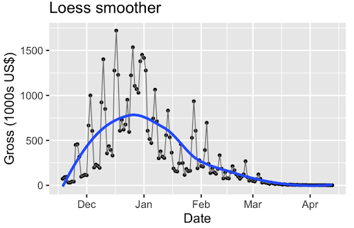
Loess smoother(non-parametric - does not assume anything about the underlying distribution)- Uses geom_smooth()
- Increasing smoothing parameter => smoother => under fitting
- Underfitting = over smoothing
- Overfitting = under smoothing
- Uses geom_smooth()
- Trends to describe time series graph
- Cyclical trends – repeated trends
- facet by variable to look at cyclic pattern more
- Secular trends – overall trends
- Cyclical trends – repeated trends
- Could use bars, they are better for individual values. But should ideally use lines.
- What if you want to observe the frequency of time series data? A simple answer: use geom_point() in addition to geom_line().
- Gaps
- Add points to lines to show the frequency of the data
- A straight line is suspicious in the real world, it is usually because there’s missing values.
- It’s very difficult to deal with NAs when using time series
- Could just leave gaps by setting missing values to NA
- If don’t want gaps, remove NAs
- If don’t want gaps, remove NAs
- Add points to lines to show the frequency of the data