57 Efficient dimension reduction with UMAP
Soham Joshi and Mehrab Singh Gill
57.1 Brief Introduction to UMAP
The dimensionality techniques that exist right now do not tend to work very efficiently when there are a lot of dimensions involved. In such cases these techniques tend to be very slow and inefficient. This is where UMAP (Uniform Manifold Approximation and Projection) comes into the picture as it works very well in cases where there are a lot of dimensions involved.
UMAP is a dimensionality reduction technique which uses Topological Data Analysis and Mapping to project higher dimensional data to lower dimensions. UMAP can be used for dimensionality reduction, unsupervised clustering and metric learning. UMAP tends to work much faster and efficiently compared to the other techniques. This can be very effective as it takes into consideration the local and global minima and maxima while projecting data into two dimensions. It does not find the principal components.
Unlike PCA (Principal Component Analysis), which is a linear approach, UMAP uses k nearest neighbours on an n-dimensional manifold to find out those points which are closest to a certain point based on the topology of the data. UMAP basically checks the relations in the higher dimensions and then helps to plot the same in lower dimensions.
UMAP can be used in R through the “umap” package which is an implementation of the python package in R. While working on this project, we gained hands on experience with the “umap” package and realized how efficient, fast and easy it can be to visualize data with higher dimensions with the help of UMAP. We aim to explore many more datasets on which we could define and demonstrate this technique as well as try to make a better and faster package for visualization of data in R.
As part of our project, we will now be demonstrating the use of the “umap” package, input tuning and its properties by working on two datasets, namely MNIST and IRIS.
57.2 Experiments on the MNIST dataset
Let’s start with a high dimensionality dataset which can be projected to 2 dimensions and then discerned with clusters. The MNIST hand written digits dataset is a collection of images of handwritten numbers, flattened and stored as a 784 dimension vectors.
df2<- read.csv("https://datahub.io/machine-learning/mnist_784/r/mnist_784.csv")Since, the MNIST dataset has the digits from 0-9 with 70,000 rows, this processing is computationally very expensive for R. Hence, we will consider only the first 4 digits, i.e {0,1,2,3} and all entries corresponding to them. We thus get a 784 dimensions x 28,911 rows data.
We also separate the labels and the actual input data to umap.
df2 <- df2[ !(df2$class >= 4),]
mnist_labels = df2[, "class"]
mnist_data = df2[1:784]
The function call to umap is very straightforward in the default case.
mnist.umap = umap(mnist_data)
mnist.umap
Here we get an object of the following summary:
It is an umap embedding of 28911 items, which refer to our data points and 2 dimensions. Thus, the umap algorithm has reduced our data from 784 to 2 dimensional data.
Layout: This is a numeric vector which gives us the values of the 2 dimensions that we have created. These values can be considered as X and Y coordinates and form the projection that UMAP has created.
Data: It is the input data we fed into the algorithm.
KNN: This is also an object which consists of two components, indexes and distances, which are stored from the smooth knn part of the UMAP algorithm.
config: These are the input parameters which are considered for UMAP. In this particular case we have not tweaked any, but we will be doing it shortly.
If you now plot the embedding created by UMAP, we get the following result:
df <- data.frame(mnist.umap$layout[,1], mnist.umap$layout[,2], mnist_labels)
colnames(df) <- c("X","Y", "Label")
ggplot(df, aes(x =X, y= Y))+ geom_point()
We can clearly see that there are 4 distinct clusters formed in the embedded data. We can visually assess the accuracy of this clustering by coloring the points according to their true labels:
df <- data.frame(mnist.umap$layout[,1], mnist.umap$layout[,2], mnist_labels)
colnames(df) <- c("X","Y", "Label")
ggplot(df, aes(x =X, y= Y, color= Label))+ geom_point()
With the exception of a few outliers, we see that UMAP accurately separates the clusters corresponding to the digits {0,1,2,3}.
For our base case, the default values of UMAP worked out well, but in some scenarios it may not be the case. Parameter tuning is thus very efficient for UMAP. We can change the input parameters to umap using the config object.
We can check the default values of UMAP as follows:
custom.config = umap.defaults
custom.config
57.3 Parameters and Additional Insights
We will be focusing on the 3 most important parameters in UMAP:
n_neighbors: This controls the number of neighbors in KNN. Since the number of neighbors changes our idea of what points are similar to any given point on the manifold, this value can have a visible effect in the output.
min_dist: This value ranges from 0.0 to 1.0. It refers to the packing of data in the final projection. If data is packed too tightly, then it is harder to split clusters, while very loose packing might lead to loss of shape and cluster formations. Thus, it is important we choose a good value for min_dist.
n_components: While n_components does not affect the projection in UMAP, it changes the target dimensionality for our reduction. By default n_components =2, i.e UMAP will always reduce data to 2 dimensions. But in many cases data can also be viewed better in 3 dimensions. This parameter can be utilized for such cases.
To demonstrate the effect of the first two parameters let us consider arbitrary values:
57.3.1 min_dist = 0.99 and n_neighbors = 4
custom.config = umap.defaults # Set of configurations
custom.config$min_dist = 0.99 # change min_dist and n_neighbors
custom.config$n_neighbors = 4

mnist.umap.config = umap(mnist_data, config=custom.config)
The resultant projection is shown below:
dfc <- data.frame(mnist.umap.config$layout[,1], mnist.umap.config$layout[,2], mnist_labels)
colnames(dfc) <- c("X","Y", "Label")

ggplot(dfc, aes(x =X, y= Y))+ geom_point(alpha =0.5)
As we can see, there are no separate clusters formed. This is evident, since we considered a lower number of neighbors and packed it loosely i.e we looked more from a local structure perspective and did not bind the points together.
If now, we change the n_neighbors to a higher number, say n_neighbors = 10
57.3.2 min_dist = 0.99 and n_neighbors = 10
custom.config = umap.defaults # Set of configurations
custom.config$min_dist = 0.99 # change min_dist and n_neighbors
custom.config$n_neighbors = 10

mnist.umap.config2 = umap(mnist_data, config=custom.config)

dfc <- data.frame(mnist.umap.config2$layout[,1], mnist.umap.config2$layout[,2], mnist_labels)
colnames(dfc) <- c("X","Y", "Label")


ggplot(dfc, aes(x =X, y= Y))+ geom_point(alpha =0.5)
This has a good effect, as we include more neighbors, more clusters are formed. However, the boundaries are very close to each other since our min_dist value is still high. UMAP still does a good job of separating the clusters:
dfc <- data.frame(mnist.umap.config2$layout[,1], mnist.umap.config2$layout[,2], mnist_labels)
colnames(dfc) <- c("X","Y", "Label")


ggplot(dfc, aes(x =X, y= Y, color =Label))+ geom_point(alpha =0.5)
Instead of varying n_neighbors, if we change the min_dist to a lower value, say min_dist = 0.5; the packing becomes loose, but the clusters are not discernable. Thus, a lower n_neighbors value is not a good idea if we have a large dataset.
57.3.3 min_dist = 0.5 and n_neighbors = 4
custom.config = umap.defaults # Set of configurations
custom.config$min_dist = 0.5 # change min_dist and n_neighbors
custom.config$n_neighbors = 4

mnist.umap.config3 = umap(mnist_data, config=custom.config)
dfc <- data.frame(mnist.umap.config3$layout[,1], mnist.umap.config3$layout[,2], mnist_labels)
colnames(dfc) <- c("X","Y", "Label")


ggplot(dfc, aes(x =X, y= Y))+ geom_point(alpha =0.5)
If we add color to Labels and check the output, we can notice that the groups are actually separate, but there is no clear boundary.
dfc <- data.frame(mnist.umap.config3$layout[,1], mnist.umap.config3$layout[,2], mnist_labels)
colnames(dfc) <- c("X","Y", "Label")


ggplot(dfc, aes(x =X, y= Y, color =Label))+ geom_point(alpha =0.5)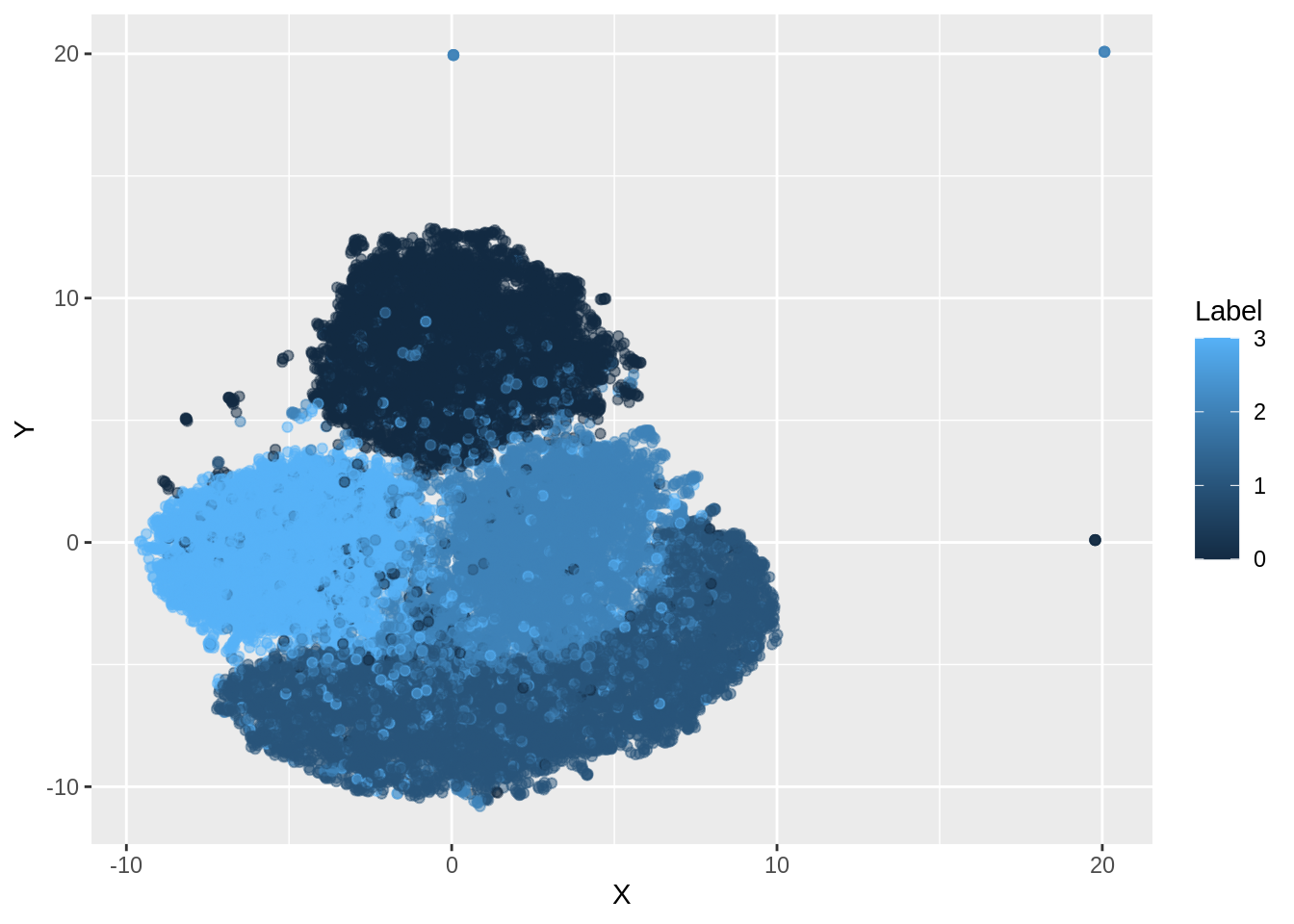
57.4 Iris Dataset
Function call to umap in the default case
iris.umap = umap(iris.data)
iris.umap
It is an umap embedding of 150 items, which refer to our data points and 2 dimensions. Thus, the umap algorithm has reduced our data from 4 to 2 dimensional data.
If you now plot the embedding created by UMAP, we get the following result:
df_iris <- data.frame(iris.umap$layout[,1], iris.umap$layout[,2], iris.labels)
colnames(df_iris) <- c("X","Y", "Label")

ggplot(df_iris, aes(x =X, y= Y))+ geom_point()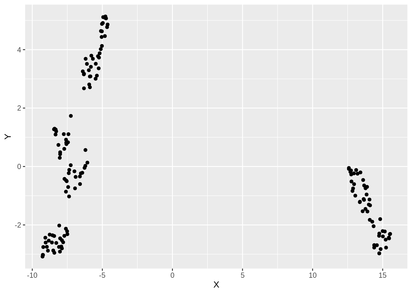
We see that there are 2 distinct clusters formed in the embedded data. We will now visually assess the accuracy of this clustering by coloring the points according to their true labels:
df_iris_1 <- data.frame(iris.umap$layout[,1], iris.umap$layout[,2], iris.labels)
colnames(df_iris_1) <- c("X","Y", "Label")

ggplot(df_iris_1, aes(x =X, y= Y, color= Label))+ geom_point()
On clustering by coloring the points, we infact realize that there are 3 clusters and not 2.
For our base case, the default values of UMAP didn’t work out well in this case. We thus go for parameter tuning.
As discussed before, we can check the default values of UMAP as follows:
custom.config = umap.defaults
custom.config
57.5 Analysis of Iris using UMAP
To demonstrate the effect of n_neighbors and min_dist, let us consider arbitrary values:
57.5.1 min_dist = 0.10 and n_neighbors = 20
custom.config = umap.defaults # Set of configurations
custom.config$min_dist = 0.10 # change min_dist and n_neighbors
custom.config$n_neighbors = 20

iris.umap.config = umap(iris.data, config=custom.config)
The resultant projection is shown below:
dfc_iris <- data.frame(iris.umap.config$layout[,1], iris.umap.config$layout[,2], iris.labels)
colnames(dfc_iris) <- c("X","Y", "Label")


ggplot(dfc_iris, aes(x =X, y= Y))+ geom_point(alpha =0.5)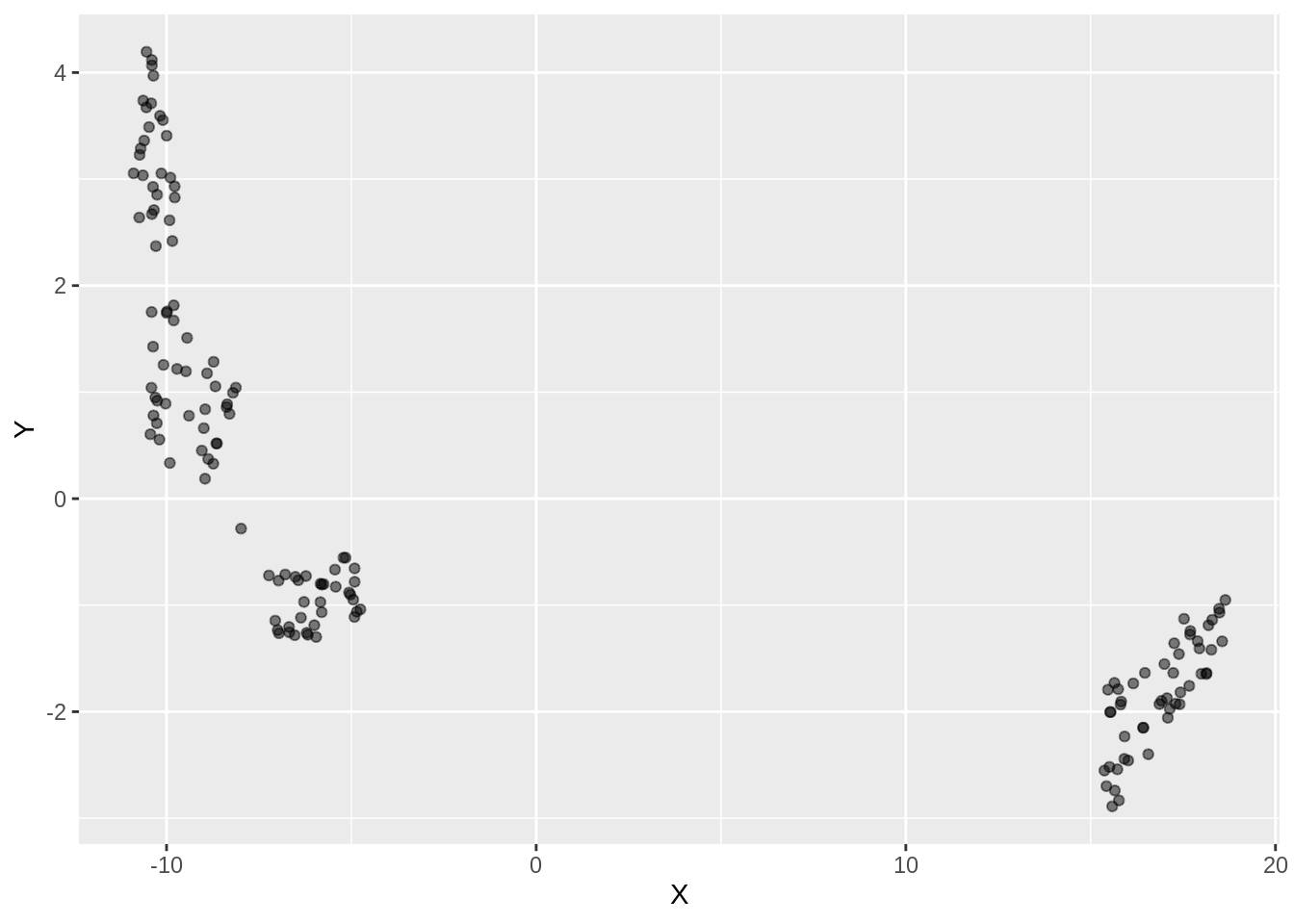
If we add color to the same,
dfc_iris <- data.frame(iris.umap.config$layout[,1], iris.umap.config$layout[,2], iris.labels)
colnames(dfc_iris) <- c("X","Y", "Label")


ggplot(dfc_iris, aes(x =X, y= Y, color = Label))+ geom_point(alpha =0.5)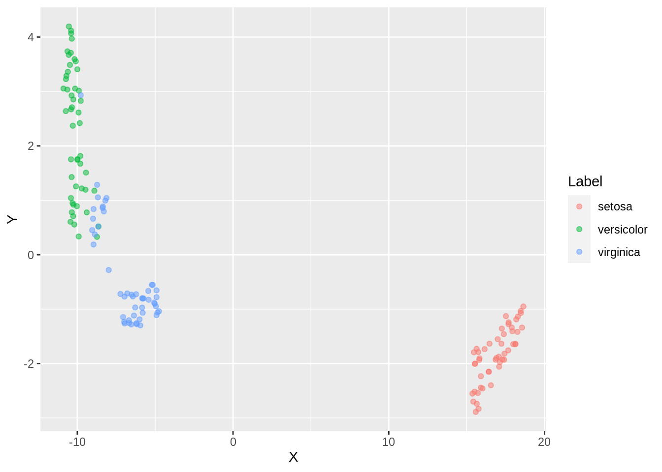
With an increase in the number of neighbors, we observe a close packing of similar clusters. More neighbors implies merging of clusters ( observe versicolor and verginica). Some clusters are still not well connected. For low number of neighbours, data is over-clustered.
Say, now we increase the min_dist parameter to 0.5
57.5.2 min_dist = 0.5 and n_neighbors = 20
custom.config = umap.defaults # Set of configurations
custom.config$min_dist = 0.5 # change min_dist
custom.config$n_neighbors = 20

iris.umap.config2 = umap(iris.data, config=custom.config)

dfc_iris <- data.frame(iris.umap.config2$layout[,1], iris.umap.config2$layout[,2], iris.labels)
colnames(dfc_iris) <- c("X","Y", "Label")


ggplot(dfc_iris, aes(x =X, y= Y))+ geom_point(alpha =0.5)
If we add color,
dfc_iris <- data.frame(iris.umap.config2$layout[,1], iris.umap.config2$layout[,2], iris.labels)
colnames(dfc_iris) <- c("X","Y", "Label")


ggplot(dfc_iris, aes(x =X, y= Y, color =Label))+ geom_point(alpha =0.5)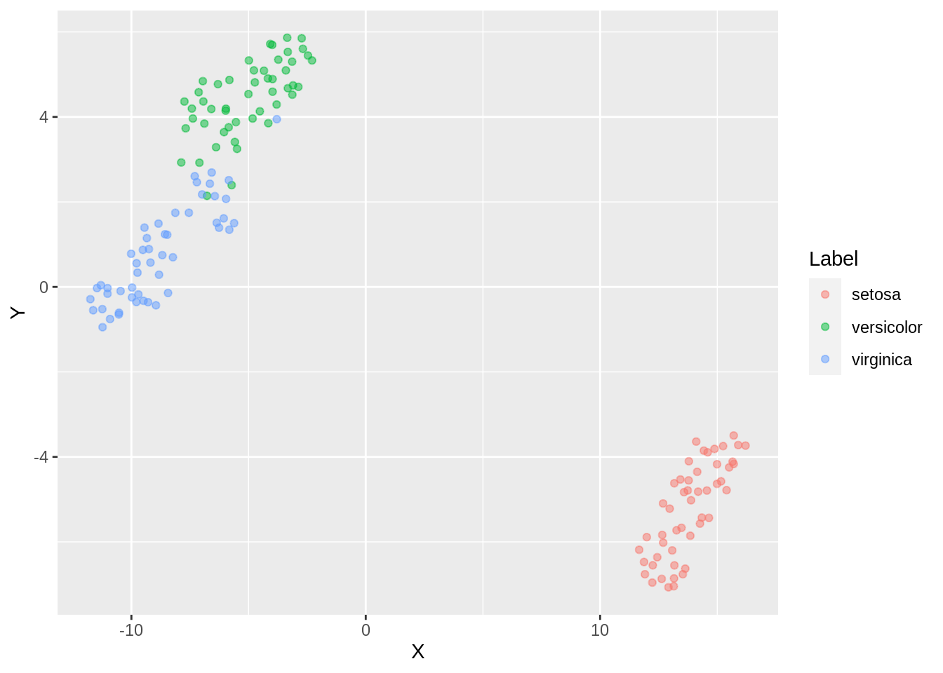
Finer separation of data has been achieved now (observe virginica and versicolor). By reducing the density of packing, the amount of points which can be wrongly classified can be reduced. However, the downside is that the weak inter cluster connection can be misrepresented as separate clusters which infact might even loosen up the third tightly classified cluster ( setosa).
57.5.3 High min_dist and low n_neighbors
custom.config = umap.defaults # Set of configurations
custom.config$min_dist = 0.9 # change min_dist and n_neighbors
custom.config$n_neighbors = 3

iris.umap.config3 = umap(iris.data, config=custom.config)

dfc_iris <- data.frame(iris.umap.config3$layout[,1], iris.umap.config3$layout[,2], iris.labels)
colnames(dfc_iris) <- c("X","Y", "Label")


ggplot(dfc_iris, aes(x =X, y= Y))+ geom_point(alpha =0.5)
If we add color,
dfc_iris <- data.frame(iris.umap.config3$layout[,1], iris.umap.config3$layout[,2], iris.labels)
colnames(dfc_iris) <- c("X","Y", "Label")


ggplot(dfc_iris, aes(x =X, y= Y, color =Label))+ geom_point(alpha =0.5)
Two different labels start merging. There are a few outliers with respect to setosa label here as well. We observe an overlap of clusters in this case.
57.5.4 Low min_dist and high n_neighbors
custom.config = umap.defaults # Set of configurations
custom.config$min_dist = 0.15 # change min_dist and n_neighbors
custom.config$n_neighbors = 35

iris.umap.config4 = umap(iris.data, config=custom.config)

dfc_iris <- data.frame(iris.umap.config4$layout[,1], iris.umap.config4$layout[,2], iris.labels)
colnames(dfc_iris) <- c("X","Y", "Label")


ggplot(dfc_iris, aes(x =X, y= Y))+ geom_point(alpha =0.5)
If we add color,
dfc_iris <- data.frame(iris.umap.config4$layout[,1], iris.umap.config4$layout[,2], iris.labels)
colnames(dfc_iris) <- c("X","Y", "Label")


ggplot(dfc_iris, aes(x =X, y= Y, color =Label))+ geom_point(alpha =0.5)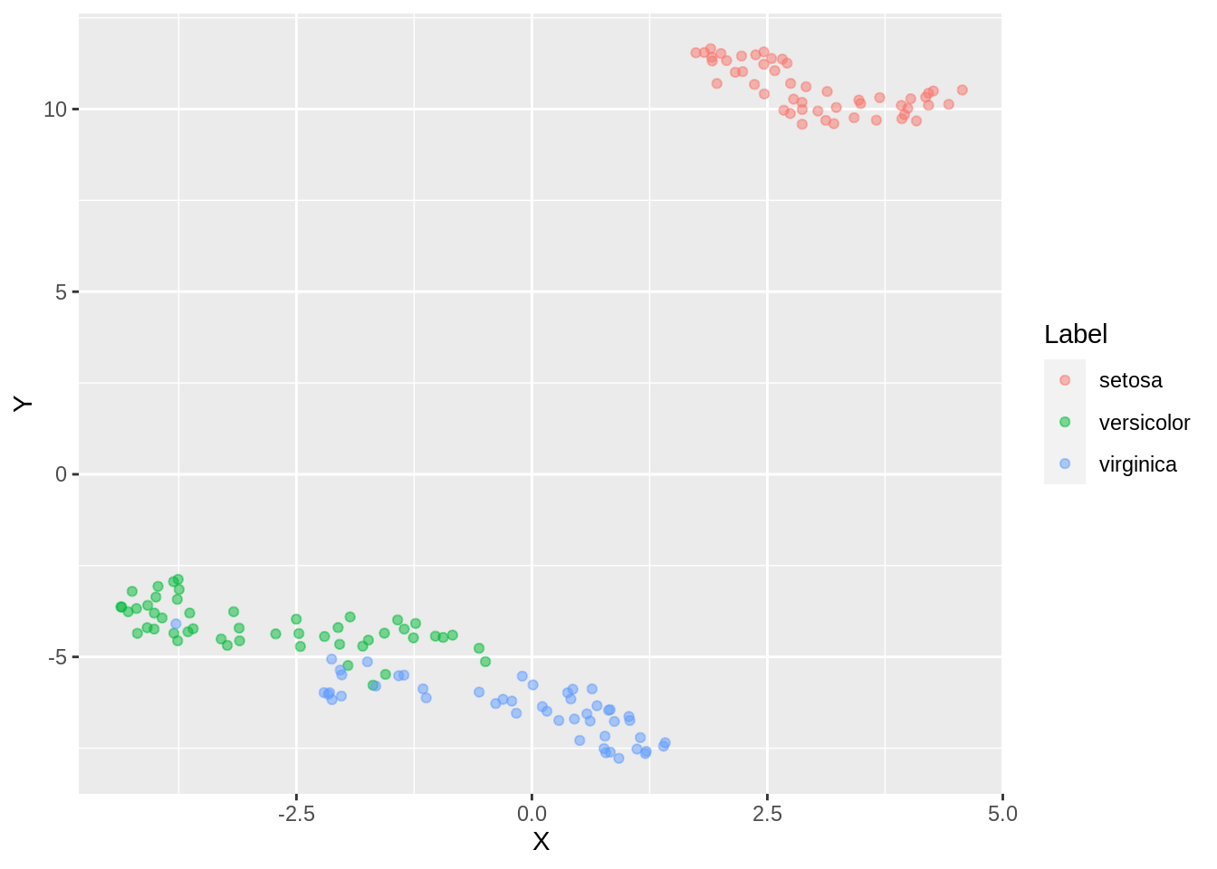
Here, too we observe an overlap of clusters
57.5.5 3D Visualisation using UMAP
We can always choose the number of dimensions we need for the projection. While we usually plot data on 2 dimensions to visualize it better on a plot, we can always create 3 dimensional visualization by projecting it on 3 components. This can be done by changing the n_components parameter to 3 and proceeding to plot it using plotly (for 3-D plot).
custom.config = umap.defaults # Set of configurations
custom.config$n_components = 3 # change min_dist and n_neighbors

iris.umap.config5 = umap(iris.data, config=custom.config)


df <- data.frame(iris.umap$layout[,1], iris.umap$layout[,2])
colnames(df) <- c("X","Y")

dfc <- data.frame(iris.umap.config5$layout[,1], iris.umap.config5$layout[,2], iris.umap.config5$layout[,3], iris.labels)
colnames(dfc) <- c("X","Y", "Z", "Label" )


plot_ly(dfc, x=dfc$X, y=dfc$Y, z=dfc$Z, color = ~Label, type="scatter3d", mode="markers")
57.6 References:
Uniform Manifold Approximation and Projection in R: https://umap-learn.readthedocs.io/en/latest/
Uniform Manifold Approximation and Projection for Dimension Reduction: https://umap-learn.readthedocs.io/en/latest/
MNIST dataset: https://datahub.io/machine-learning/mnist_784#resource-mnist_784