23 Introduction to the lattice package
Eubin Park
The lattice package is a data visualization package created by Deepayan Sarkar. It is an add-on package that improves the defaults on base R, with an emphasis on displaying multivariate data - supporting the creation of trellis graphs. The strength of the lattice package is mainly from its ability to manage dependent data.
The general format of plotting using lattice functions is: graph_type(formula, data). The main workhorse function in the lattice package is xyplot().
23.1 Producing a Plot in Lattice
We can begin by creating the most basic of all plots in Lattice - a scatterplot. In Lattice, this is done by using the xyplot. In this example, we will use the iris dataset.
data(iris)
xyplot(Sepal.Length ~ Sepal.Width, data = iris,
       xlab = "Sepal Width",
       ylab = "Sepal Length")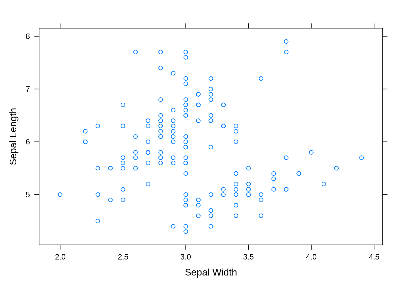
This type of scatterplot should be very familiar to many. As seen above, we can see that the basic method of plotting using xyplot() is through the symbolic formula y ~ x, where x is the independent variable and y is the dependent variable.
23.2 Plotting by Groups
There are 2 main ways of going about plotting multivariate data in lattice.
1. Superposition: All data is plotted in the same region of the graph, but distinct groups are able to be categorized by varying plot features such as color, shapes, etc. To use superposition in plots, the groups argument must be specified.
2. Juxtaposition:
Data is plotted in separate regions of a larger graph. To use juxtaposition in plots, one must specify a conditioning statement, such as: y ~ x | z, where z is the conditioning variable.
The difference between superposition and juxtaposition can be shown below:
Superposition:
xyplot(Sepal.Length ~ Sepal.Width, data=iris,
       groups=iris$Species, # use groups argument
       auto.key=list(text=c("setosa", "versicolor", "virginica")),
       xlab = "Sepal Width",
       ylab = "Sepal Length")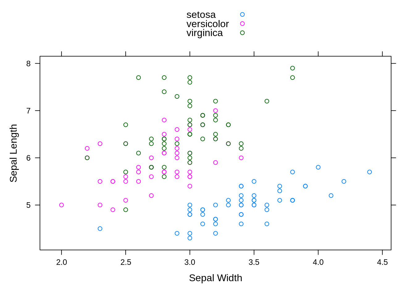
Juxtaposition:
xyplot(Sepal.Length ~ Sepal.Width | Species, data=iris, # add conditioning statement
       pch=1, col="black",
       xlab = "Sepal Width",
       ylab = "Sepal Length")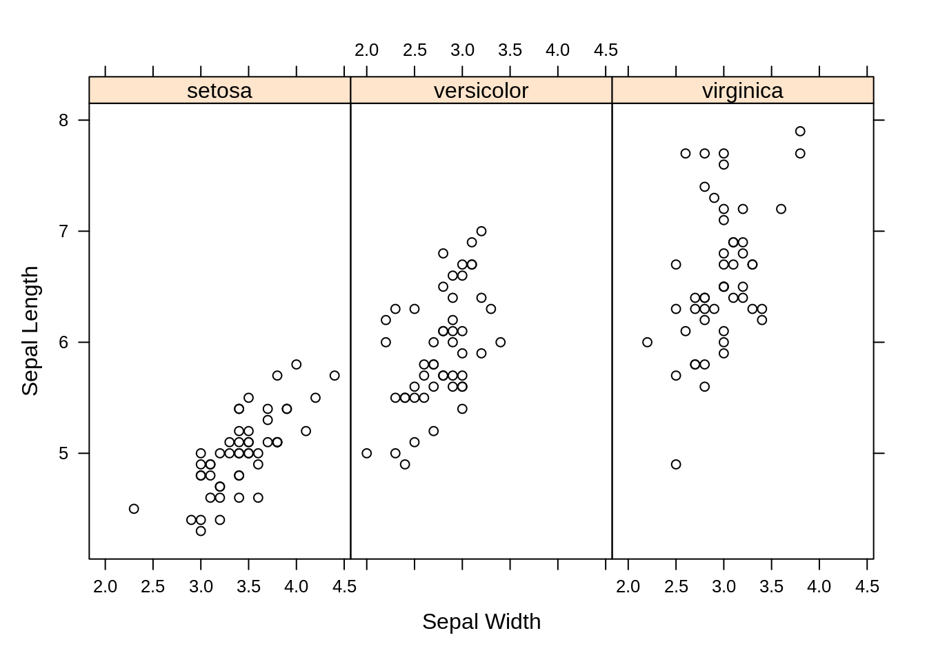
As seen above, the only real difference in plotting the two graphs is whether one uses the groups argument (Supposition) or conditioning statement (Juxtaposition), but Lattice is able to create two very different graphs with this small difference.
There are many problems with the supposition plot above that the juxtaposition plot overcomes. For example, there is a good deal of over-plotting in the first plot, and as a result it is difficult to distinguish clear trends within each species group. However, these problems are not seen in the juxtaposition plot.
This sort of advanrage becomes much more conspicuous when dealing with larger multivariate datasets. In this next example, we will use the quakes dataset.
data(quakes)
# Create shingles
Depth = equal.count(quakes$depth, number = 8, overlap = .1)

# Plot graph using supposition
xyplot(lat ~ long, data = quakes,
       groups = Depth,
       xlab = "Longitude",
       ylab = "Latitude")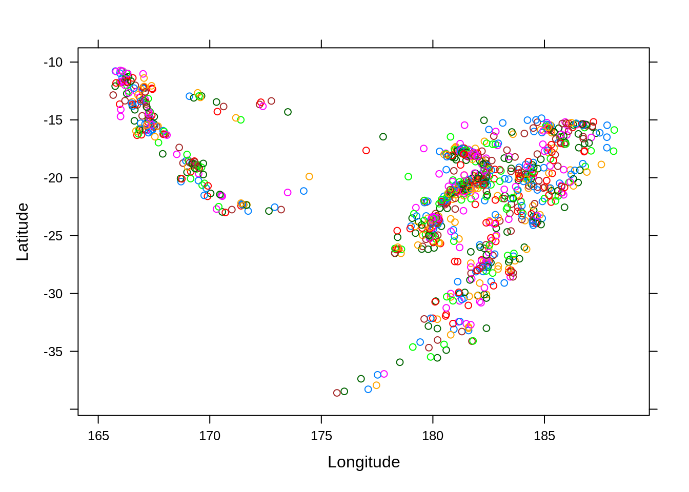
In the above example, we have created shingles in order to essentially bin the data. Each shingle contains the data from some subset of the variable it is being created from.
# Plot graph using juxtaposition
xyplot(lat ~ long | Depth, data = quakes,
       xlab = "Longtitude",
       ylab = "Latitude")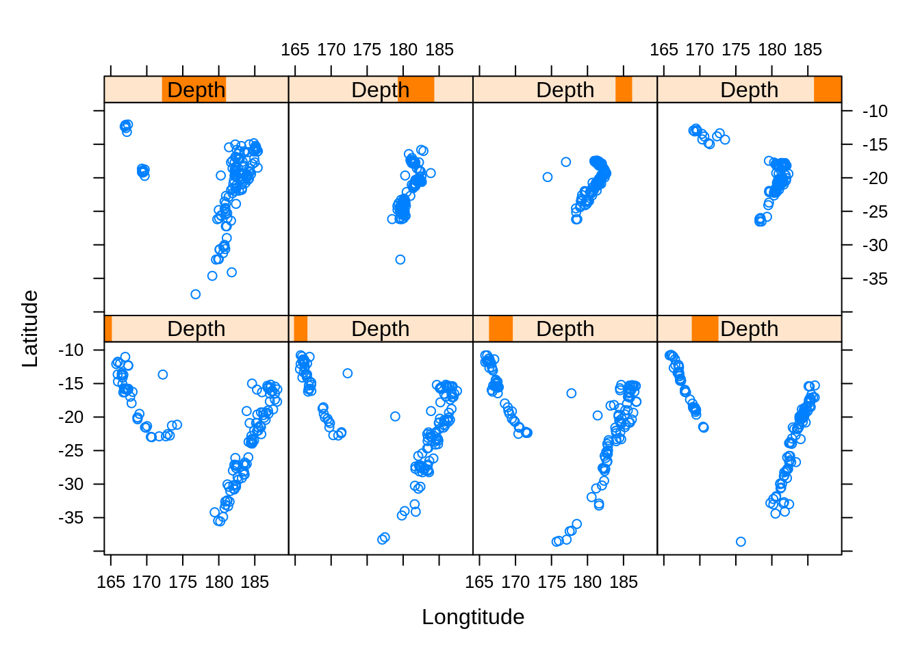
In this example, it is clear to see the advantages of using the juxtaposition method of plotting.
If we want to re-arrange the panels in the above plot, we can use the layout argument. This argument takes a vector of three values: number of rows, number of columns, and number of pages.
# Use layout argument
xyplot(lat ~ long | Depth, data = quakes,
       layout = c(3, 3, 1),
       xlab = "Longtitude",
       ylab = "Latitude")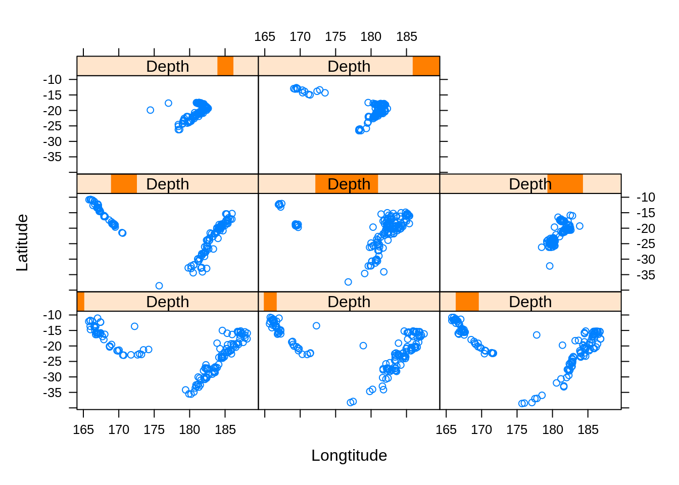
However, by using this argument, we have skewed the shapes of the plots. We can fix this using the aspect argument, which controls the ratio of the plots.
# Use aspect argument
xyplot(lat ~ long | Depth, data = quakes,
       aspect = 1,
       layout = c(3, 3, 1),
       xlab = "Longtitude",
       ylab = "Latitude")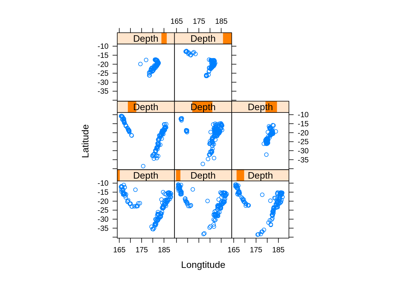
If we wanted to fit regression lines into each panel, we can use the panel function argument of the xyplot function.
# Use the panel function argument
xyplot(lat ~ long | Depth, data = quakes,
       panel = function(x,y,subscripts,...){
           panel.points(x,y,...)
           panel.lmline(x,y,...) })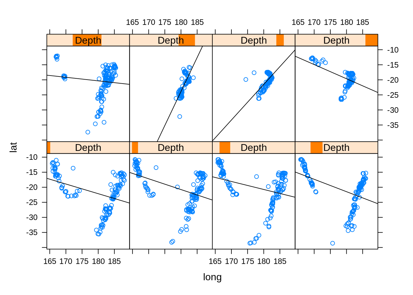
23.3 Histograms and Density Plots
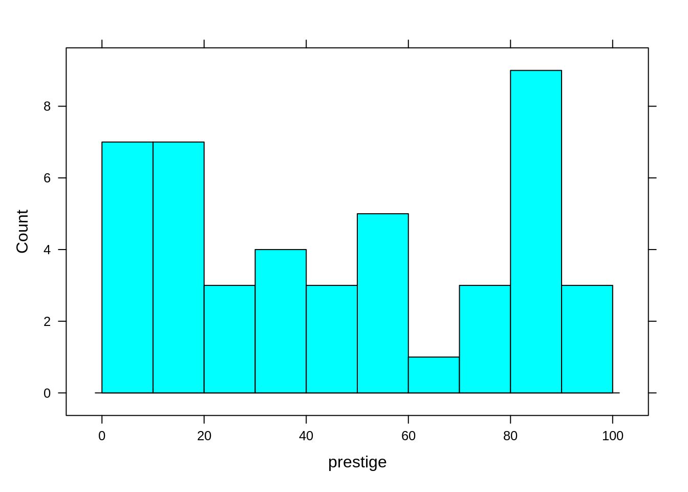
Lattice offers other options too, such as histograms and density plots. In this example, we will use the Duncan dataset from the car package.
data(Duncan)To make a histogram with the lattice package, use the histogram() function.
histogram(~ prestige, data=Duncan,
          type="count", # can take 'count', 'percent', or 'density'
          nint = 10, # number of bins
          endpoints = c(0, 100)
          )
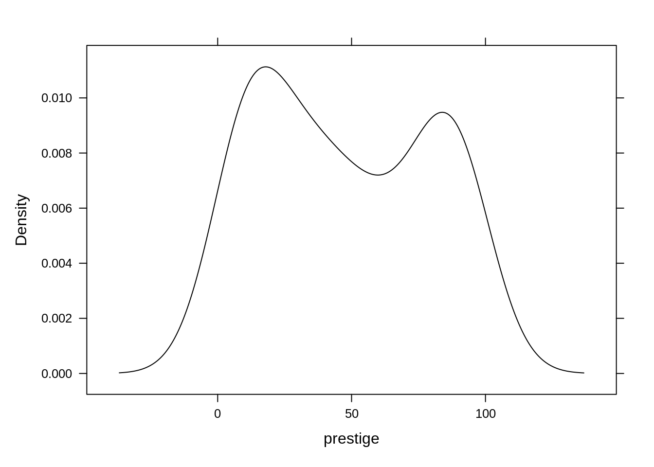
To make a density plot with lattice package, use the densityplot() function.
densityplot(~ prestige, data = Duncan,
            col = "black",
            plot.points = F # specify whether to have data points
            )
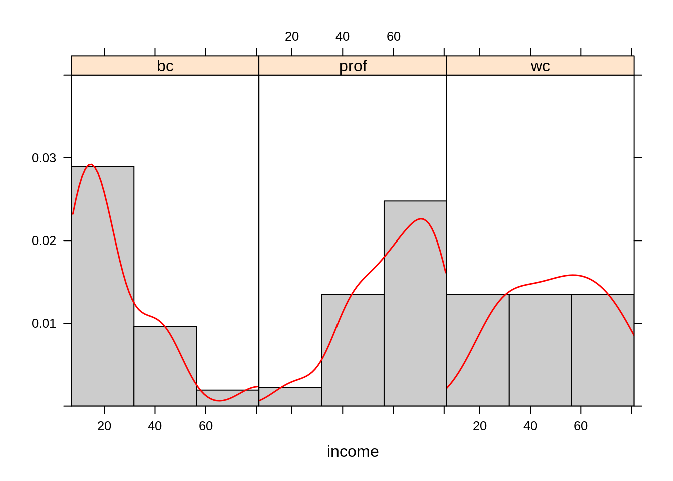
We can even combine histograms and density plots using the panel function argument. While doing so, we can split the data into separate panels, which is useful for multivariate data.
b <- with(Duncan, do.breaks(range(income), 3))

xyplot(~income | type, data=Duncan,
       xlim = range(b), ylim = c(0, 0.04),
       panel = function(x){
           panel.histogram(x,
                           breaks = b,
                           col="gray80")
           panel.densityplot(x,
                             darg =list(n=100),
                             col="red",
                             lwd=1.5,
                             plot.points=F)
       })
23.4 Boxplots, Violinplots, and Dotplots
Some other options offered by the Lattice package include boxplots and dotplots. In this example, we will use the ToothGrowth dataset.
To make a boxplot, use the bwplot() function. As always with the lattice package, you can use a conditioning statement to create juxtaposing panels.
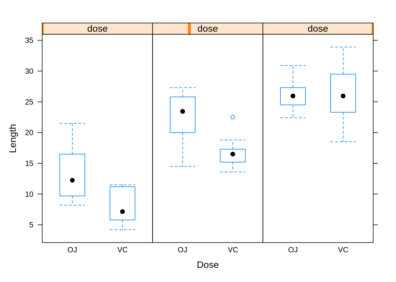
To make a violin plot, use the bwplot() function and specify the panel argument.
bwplot(len ~ supp | dose,  data = ToothGrowth,
       layout = c(3, 1),
       panel = panel.violin, # specify panel argument to make violin plot
        xlab = "Dose", ylab = "Length")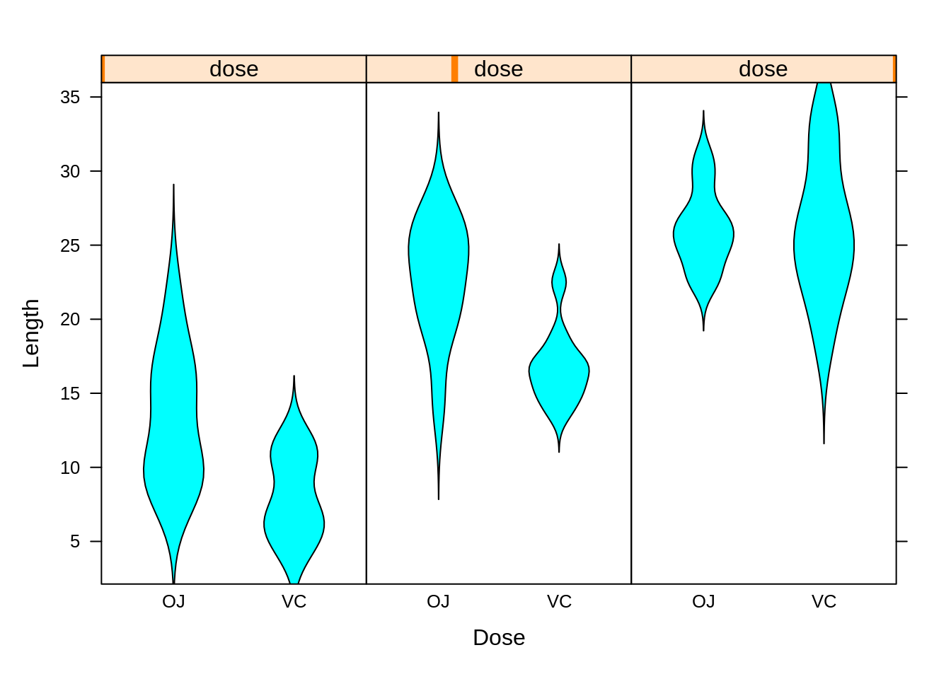
To make a dotplot, use the dotplot() function.

23.5 Trivariate Plots
One option when displaying trivariate continuous data is to utilize all 3 axes. This can be done with a three-dimensional scatterplot.
In the lattice package, one can create such a plot using the cloud() function. This function takes in a symbolic formula as its first argument, in the form: z ~ x * y, where x, z, and y are the three continuous variables.
In this example we will use the quakes dataset again.
cloud(depth ~ lat * long, data=quakes)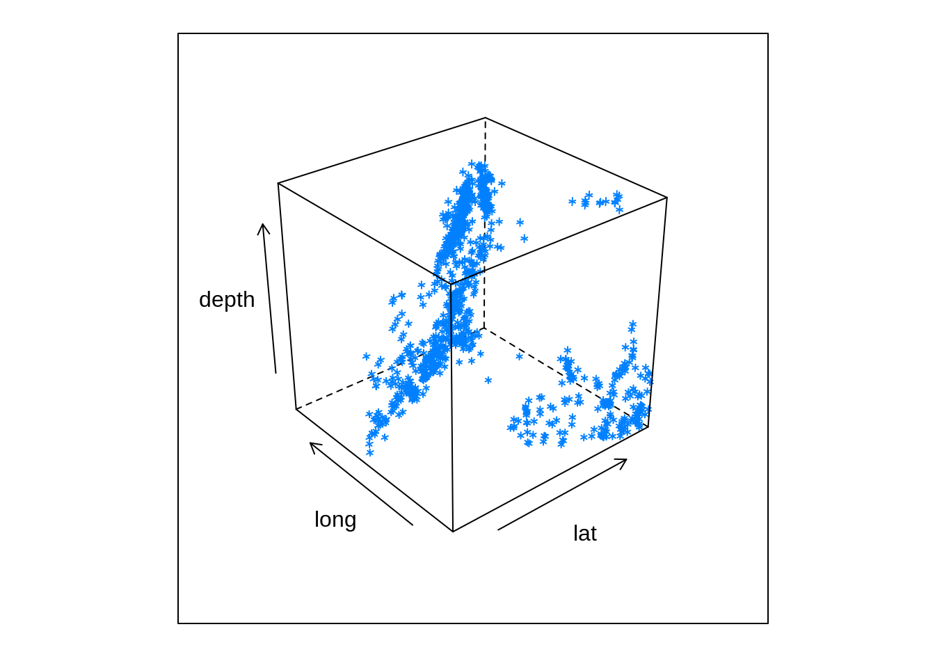
To view the data from a different perspective, you can rotate the plot using the screen argument. You can play with this feature until you find the best view of your data.
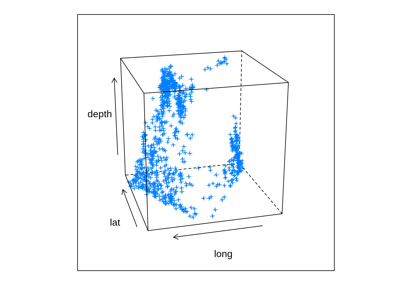
Unfortunately, interactive options are not available in the Lattice package.
23.6 Pros and Cons of Lattice
Now that we have a basic overview of the kinds of things the lattice package can do, let’s discuss some of the advantages and disadvantages of this data visualization package.
Pros:
- Very good at allowing one to visualize multivariate data, i.e. comparing how some variable y changes with some variable x across levels of some other variable z
- Many settings set automatically because the entire plot is created at once.
Cons:
- Can be difficult to flesh out an entire plot in one method call
- Cannot add more elements to a plot once it is created; it has to be modified.