33 Parallel Coordinate Plots in ggplot2
Amrutha Varshini Sundar
33.1 Introduction
A parallel coordinate plot is used for visualizing multivariate numerical data. The plots facilitate for comparing multiple numeric variables that have different scales and different units of measurement. It abets in finding out patterns and correlations in datasets which are high dimensional.
The plot itself consists of X-axis which represents the different variable and the corresponding point along the Y-axis represents the magnitude of the value for that variable. Each datapoint is connected as a series of line segments across all the variables.
The ubiquitous implementation of parallel coordinate plots is provided by the ggparcoord function within the GGally package. The document below gives a walkthrough for plotting the parallel coordinate plots and some functionalities associated with it by using the ggplot2 package.
33.2 Plotting a sample parallel coordinate plot using ggparcoord
The dataset we use for plotting parallel coordinate plots is the Wine Quality Data Set from the UCI ML Repository. We are specifically extracting 12 different attributes of white wine across 100 different wine samples and presenting the parallel coordinate plot for the same.
# read the dataset
winequality <- read.csv("http://archive.ics.uci.edu/ml/machine-learning-databases/wine-quality/winequality-white.csv", sep = ";")[0:100, ]

print(head(winequality))
## fixed.acidity volatile.acidity citric.acid residual.sugar chlorides
## 1 7.0 0.27 0.36 20.7 0.045
## 2 6.3 0.30 0.34 1.6 0.049
## 3 8.1 0.28 0.40 6.9 0.050
## 4 7.2 0.23 0.32 8.5 0.058
## 5 7.2 0.23 0.32 8.5 0.058
## 6 8.1 0.28 0.40 6.9 0.050
## free.sulfur.dioxide total.sulfur.dioxide density pH sulphates alcohol
## 1 45 170 1.0010 3.00 0.45 8.8
## 2 14 132 0.9940 3.30 0.49 9.5
## 3 30 97 0.9951 3.26 0.44 10.1
## 4 47 186 0.9956 3.19 0.40 9.9
## 5 47 186 0.9956 3.19 0.40 9.9
## 6 30 97 0.9951 3.26 0.44 10.1
## quality
## 1 6
## 2 6
## 3 6
## 4 6
## 5 6
## 6 6
# creating a dummy wine type category as the first column
winequality = winequality %>% add_column(WineType = c(sub("^","Class ", 1:100)), .before="fixed.acidity")

# plotting with basic ggparcoord from GGally
ggally_par_coord <- ggparcoord(winequality, columns = 2:13, scale = 'globalminmax') +
                      xlab("Wine Attributes") +
                      ylab("Value")

ggally_par_coord +
  ggtitle("Parallel coordinates plot showing the wine attributes for different wines") +
    theme(plot.title = element_text(size = 15, face = "bold"))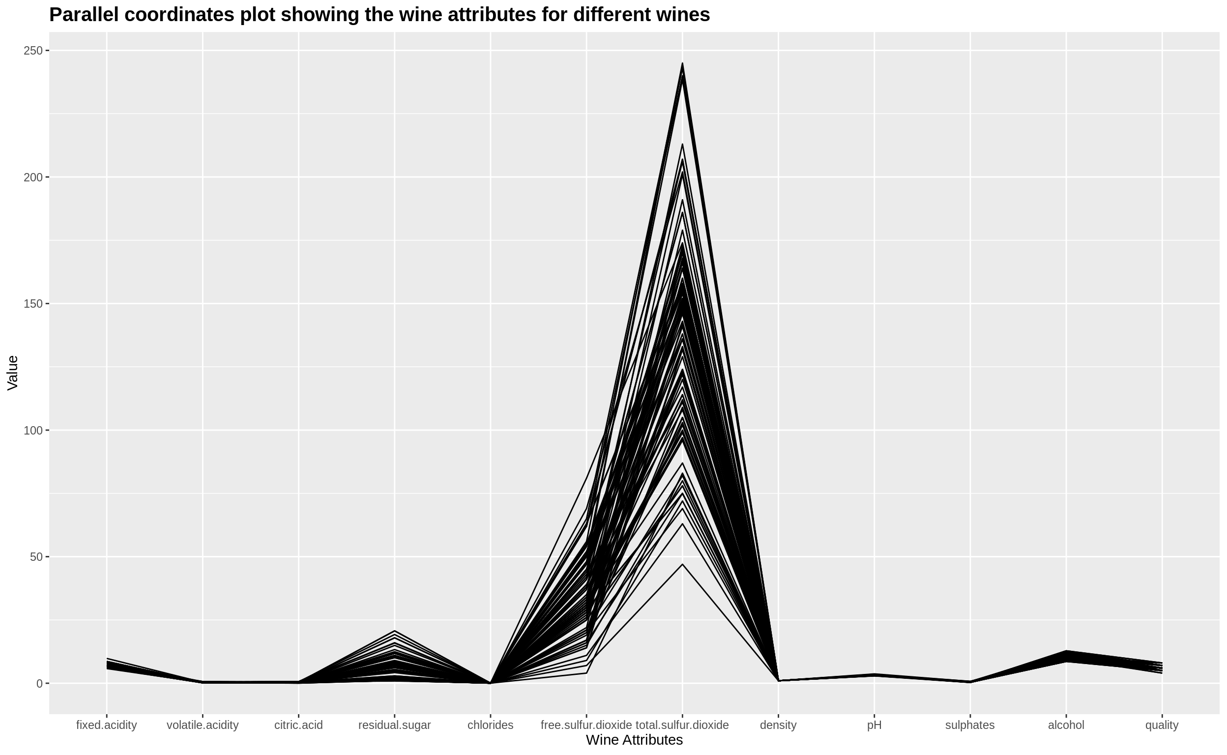
33.3 Custom function to implement a similar functionality for presenting parallel coordinate plots using ggplot2
The function geom_parcoord is an implementation to present parallel coordinate plots using ggplot2. The function accepts the following parameters,
df_wide - An unpivoted dataframe with the multidimensional variables present as separate columns of the dataframe
-
columns - Indicates the columns that are the variables in the dataframe.
Default behavior - NULL. Assumes that the first column is the group by column which represents the series of line segment for a single entity.
-
spline_factor - Controls the level of smoothness to the sequential line segments.
Default behavior - 1. This indicates no smoothing. Higher the value, higher is the smoothing.
-
standardize - Boolean to indicate whether the variables have to be scaled before plotting them. This is recommended as it helps in better analysis of the patterns when they are all plotted on comparable scales. This uses the scale function provided in base R.
Default behavior - T
smooth_df_group <- function(dt, spline_factor, groupvars){
  data.frame(spline(as.factor(dt$category), dt$values, n=12*groupvars))
}

# Custom function to plot
geom_parcoord <- function(df_wide, columns=NULL, spline_factor = 1, standardize = T) {

  # Assuming the first column is going to be the column to be grouped
  group_by_col = 1
  columns = NULL

  # normalize data
  if(standardize) {
    df = df_wide[(group_by_col+1):length(colnames(df_wide))] %>% mutate_all(scale)
    df = df %>% add_column(WineType = c(sub("^","Class ", 1:100)), .before="fixed.acidity")
    df_wide = df
  }

  # If columns are not provided, then set defaults
  if(is.null(columns)) {
    columns = (group_by_col+1):length(colnames(df_wide))
  }

  # pivot the dataframe to convert to the long format
  df_long <- pivot_longer(df_wide, cols = columns, names_to = "category", values_to = "values")

  # group by using the group_by column and apply appropriate level of smoothing
  final_df <- df_long %>%
   group_by_at(colnames(df_wide)[group_by_col]) %>%
   group_modify(smooth_df_group, spline_factor)

  # Plot using geom_line
  ggplot(filter(final_df)) +
    geom_line(aes_string(x = "x", y = "y", group=colnames(df_wide)[group_by_col])) +
    ylab('Values') +
    scale_x_continuous(name="Category", limits=c(1, length(columns)), labels=sort(colnames(df_wide)[columns]), breaks=c(1:length(columns)))
}
33.4 Plotting parallel coordinate plots using custom function - geom_parcoord
Below is a plot for a simple parcoord plot using the default behavior of geom_parcoord. There is no level of smoothing and the values are not scaled.
custom_parcoord = geom_parcoord(winequality, standardize = F)
custom_parcoord +
  ggtitle("Parallel coordinate plot of White Wine Quality Attributes using geom_parcoord") +
    theme(plot.title = element_text(size = 15, face = "bold"))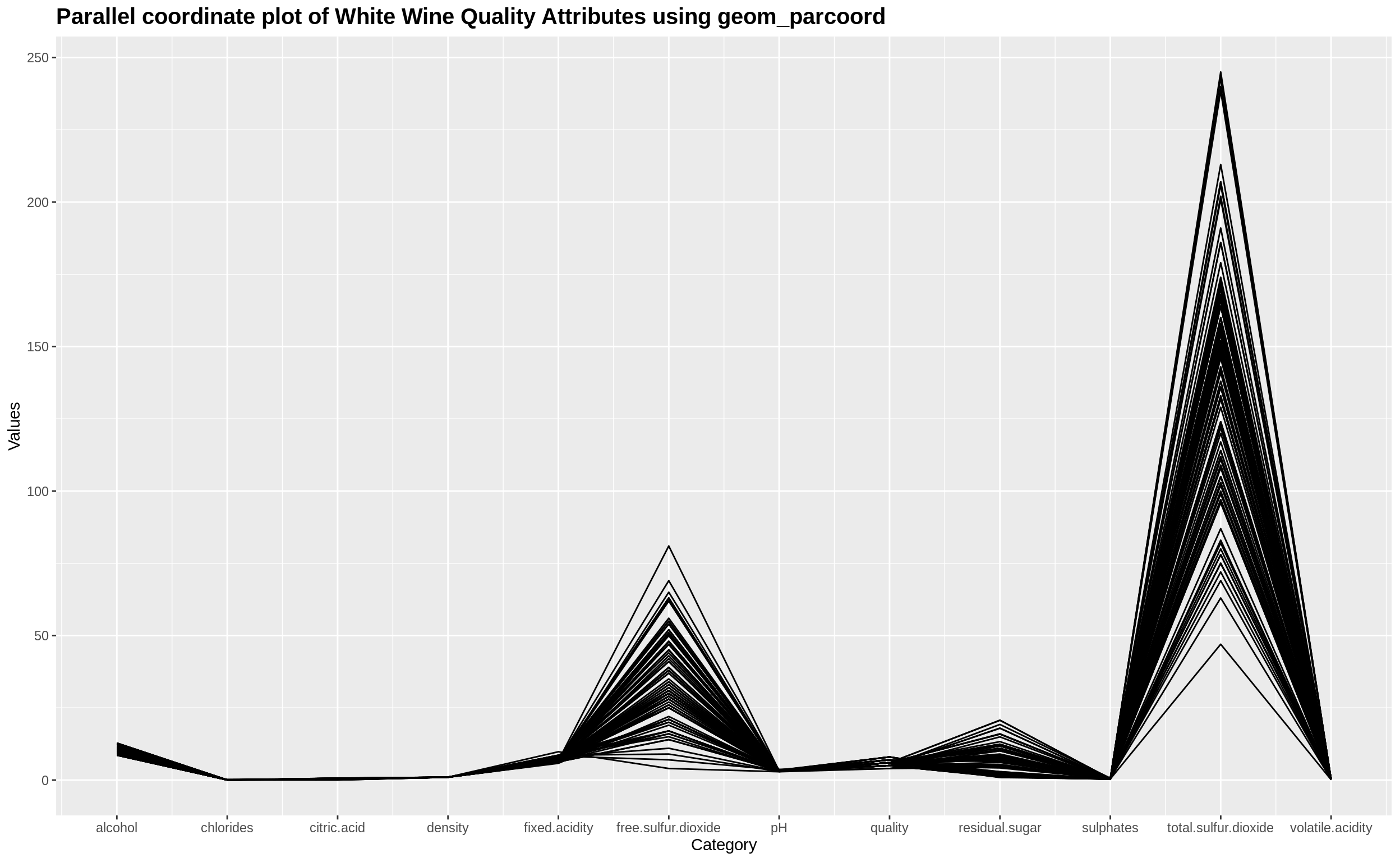
33.4.1 Playing around with some parameters of geom_parcoord
Tweaking some parameters such as smoothing factor and scaling the plot appropriately
geom_parcoord(winequality, spline_factor = 20, standardize = T) +
  ggtitle("Parallel coordinate plot of White Wine Quality Attributes using geom_parcoord(spline_factor=20, standardize=T)") +
    theme(plot.title = element_text(size = 15, face = "bold"))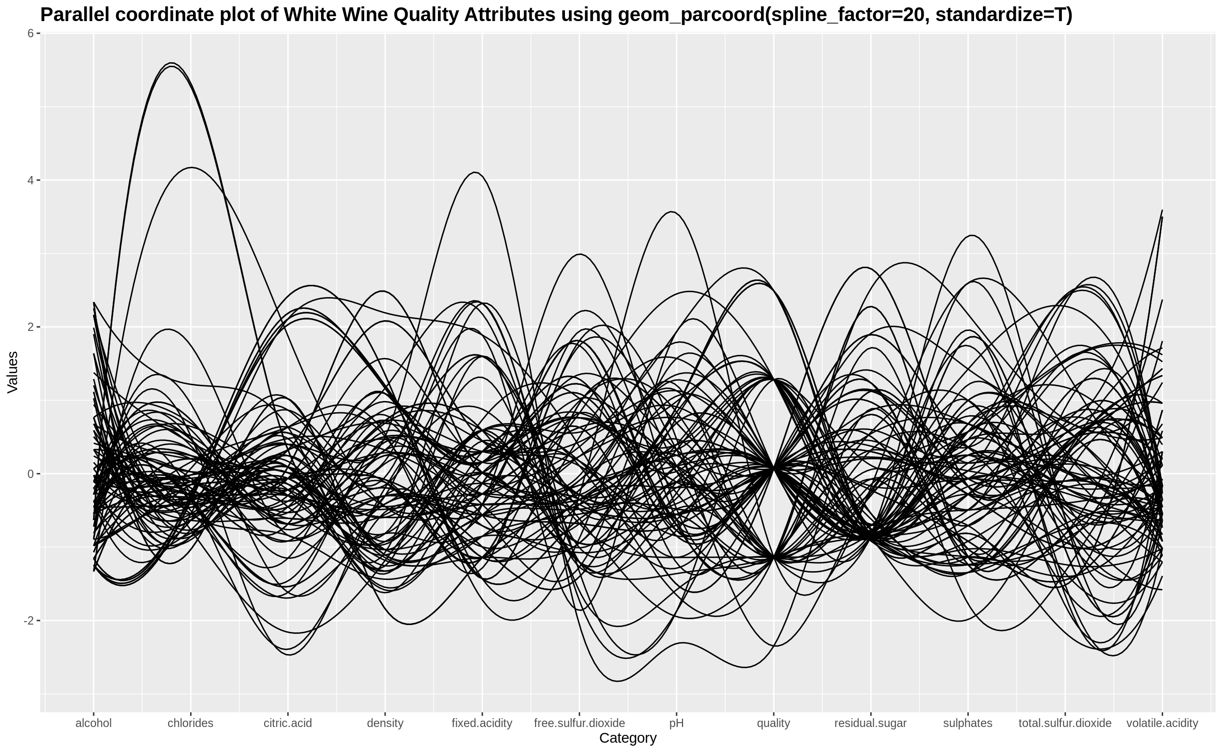
33.5 Summary and Comparisons
Below shows a side by side comparison of the plots obtained by the ggparcoord and the custom geom_parcoord functions.
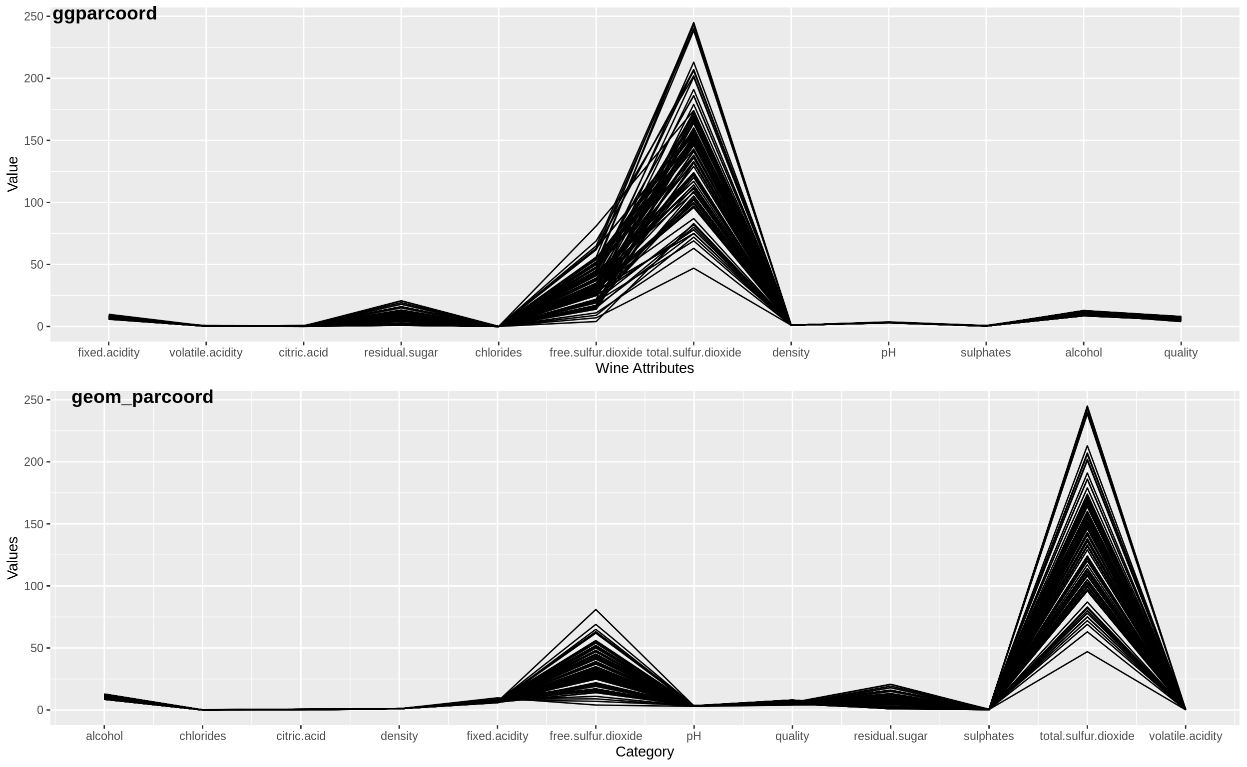
33.5.1 Observations
While on the outset the plots may look similar, these are some of the differences with respect to the visuals and implementation,
One main observation is the ordering of the dimensions along the X-axis. We can see that the ggparcoord retains the order of the variables as they were in the dataset, while the custom geom_parcoord has the variables plotted in alphabetical order.
ggparcoord has several functionalities such as different methods of scaling like ‘uniminmax’, ‘globalminmax’ and such while the custom function has implementations that are to the extent of the base R scale function implementation.
The spline functionality might differ in the two depending on which method has been used for splining in ggparcoord.
33.6 Improvements and future work
Adding a variation to the different methods of scaling to support much more than the normal base R scaling.
Giving an option to retain the order of the variables as given in the dataframe instead of ordering them alphabetically.
Adding to ggplot2 as a geom for parallel coordinate plots - geom_parcoord. This will avoid installing another package just for plotting parallel coordinate plots. This is the main motivation of the idea behind this project.
33.6.1 Sources
- Dataset - https://archive.ics.uci.edu/ml/datasets/Wine+Quality
- Learning more about parallel coordinate plots - https://towardsdatascience.com/parallel-coordinates-plots-6fcfa066dcb3
- Learning more about ggparcoord - https://www.r-graph-gallery.com/parallel-plot-ggally.html