26 Interactive Plots
Zhirui Yang
# Libraries
# Make sure these packages are installed before running code.
library(plotly)
library(ggplot2)
library(dygraphs)
library(xts)
library(dplyr)
library(igraph)
library(networkD3)
26.1 Why use interactive plots
In general, we will use ggplot2 to plot a static graph. In this way, we can only know the data from a macroscopic perspective. If we want to know some subtle contents, like the exact difference of two points, we still need to write code to find the values of these two points. However, this tedious step can be avoided in an interactive graph. Interactive graphs is very important for data analysis. We can check the value of every point on the graph, and also zoom on and out the graph to check some details.
In this tutorial, we will introduce some frequently used plot, and provide some examples. Moreover, we will introduce some important parameters, which can help you customize the plot.
At the beginning of the tutorial, these packages are what we will use below. If you have not installed these, you can use install.packages(‘package_name’) to install it.
26.2 Interactive Scatter plot
Plotly’s R graphing library makes interactive, publication-quality graphs. Examples of how to make line plots, scatter plots, area charts, bar charts, error bars, box plots, histograms, heatmaps, subplots, multiple-axes, and 3D (WebGL based) charts.
We will give some examples to show how to draw Scatterplot by Plotly.
26.2.1 Compare Plotly and ggplot2
We will use iris dataset, which is provided natively by R. Here is a part of dataset.
head(iris)## Sepal.Length Sepal.Width Petal.Length Petal.Width Species
## 1 5.1 3.5 1.4 0.2 setosa
## 2 4.9 3.0 1.4 0.2 setosa
## 3 4.7 3.2 1.3 0.2 setosa
## 4 4.6 3.1 1.5 0.2 setosa
## 5 5.0 3.6 1.4 0.2 setosa
## 6 5.4 3.9 1.7 0.4 setosaWe will draw a Scatterplot of Sepal.Length vs Sepal.Width.
# basic scatterplot
ggplot(iris, aes(x=Sepal.Length, y=Sepal.Width)) +
  geom_point()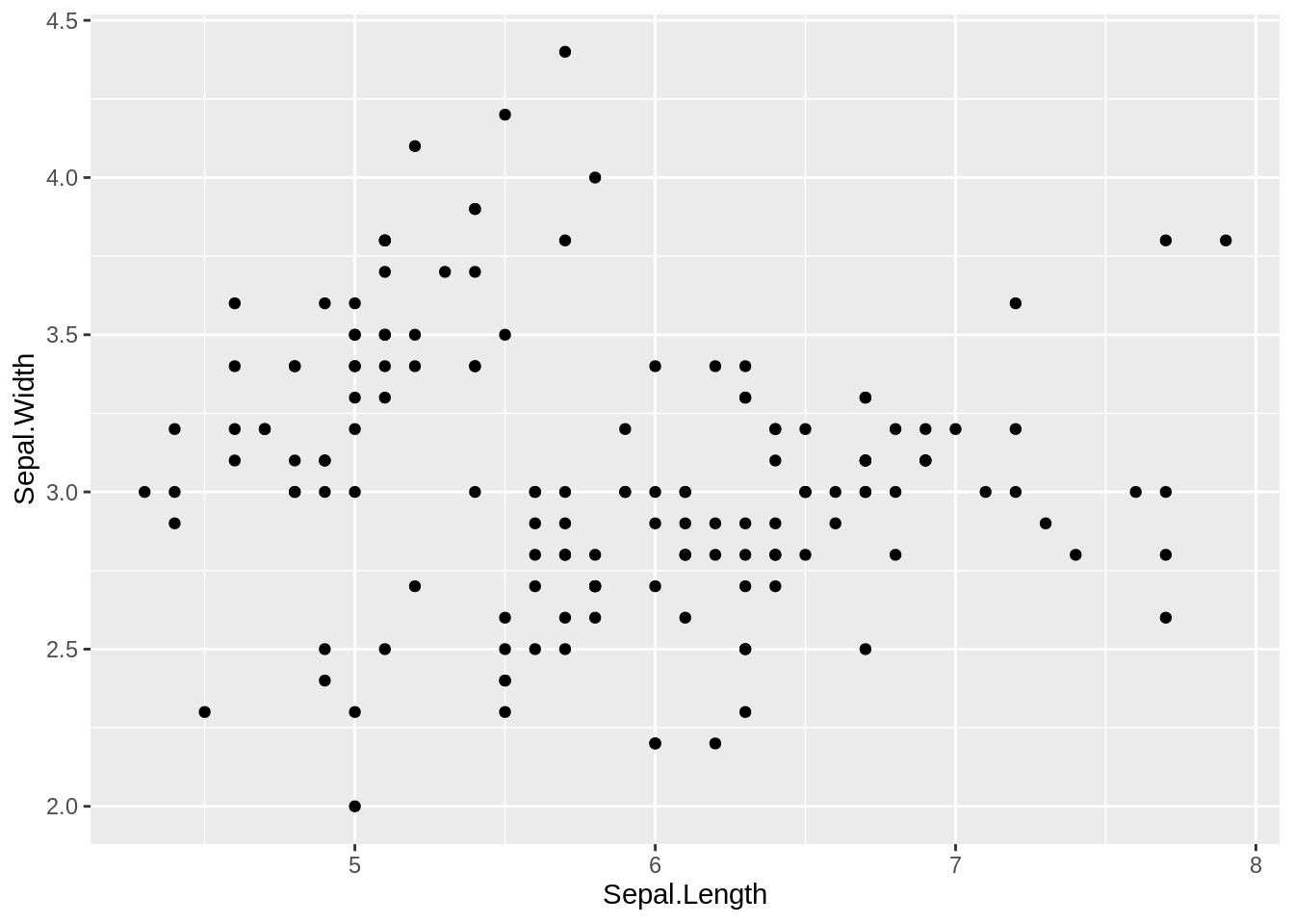
# interactive scatterplot
fig <- plot_ly(
  data = iris, x = ~Sepal.Length, y = ~Petal.Length)
fig
We can not check the value of each data point in basic scatterplot, but we can do it in interactive scatterplot.
26.2.2 Styled Scatter Plot
We can customize our Scatter Plot by using parameters of plot_ly. Plotly has three main attributions including plot_ly, add_trace and layout. Every aspect of a Plotly chart (the colors, the grid-lines, the data, and so on) has a corresponding key in these attributions.
26.2.2.1 plot_ly
plot_ly is what we used in 1.1. This function is basically draw the main content of the plot. The basic structure is below.
# plot_ly(
# data,
# type = "scatter", # all "scatter" attributes. We don't need to change it for scatter plot
# x = ~x, # x of scatter plot
# y = ~y, # y of scatter plot
# marker = list(
#   size = 5,
#   color="#264E86") # marker is used to change color, size and so on.
# ) 26.2.2.2 add_trace
Plotly’s graph is made up of two parts. One is trace, and we can regard it as the key component of a graph. For example, the trace of a scatter plot is all points of the graph, and the trace of a line plot is the line of the graph. We can regard the plot of plot_ly as a background. And sometimes we want to add multiple modes on the plot, then we will need add_trace. The basic structure is below, and it is very similar to the plot_ly.
# add_trace(x = ~x2, # x2 of new trace
#           y = ~y2, # y2 of new trace
#           mode = 'lines', # type of mode
#           line = list(
#             color = "#5E88FC",
#             dash = "dashed"
#             )
# )
We will use an example to understand how add_trace works.
fig <- plot_ly(data = iris, x = ~Sepal.Length)
fig <- fig %>% add_trace(x = ~Sepal.Length, y = ~Petal.Length, name = 'Petal.Length',mode = 'markers', color = "red")
fig <- fig %>% add_trace(x = ~Sepal.Length, y = ~Sepal.Width, name = 'Sepal.Width',mode = 'markers', color = "blue")
fig <- fig %>% add_trace(x = ~Sepal.Length, y = ~Petal.Width, name = 'Petal.Width',mode = 'markers', color = "green")
fig
26.2.2.3 layout
layout is used for the rest of the chart, like the title, xaxis, or annotations. The basic structure is below.
# layout(
#   title = "Unemployment", # add title
#   xaxis = list( # add xaxis
#     title = "Time",
#     showgrid = F),
#   yaxis = list( # add xaxis
#     title = "uidx")
# )
We will use an example to understand how layout works.
26.3 Interactive time series chart
26.3.1 ggplot2 and plotly
There are two ways to create an interactive time series chart. The first way is to creat a line plot by ggplot2, then use plotly to turn ggplot2 chart object interactive. An example is below.
# Load dataset from github
data <- read.table("https://raw.githubusercontent.com/holtzy/data_to_viz/master/Example_dataset/3_TwoNumOrdered.csv", header=T)
data$date <- as.Date(data$date)

# Usual area chart
p <- data %>%
  ggplot( aes(x=date, y=value)) +
    geom_area(fill="red", alpha=0.5) +
    geom_line(color="blue") +
    ylab("bitcoin price ($)")
p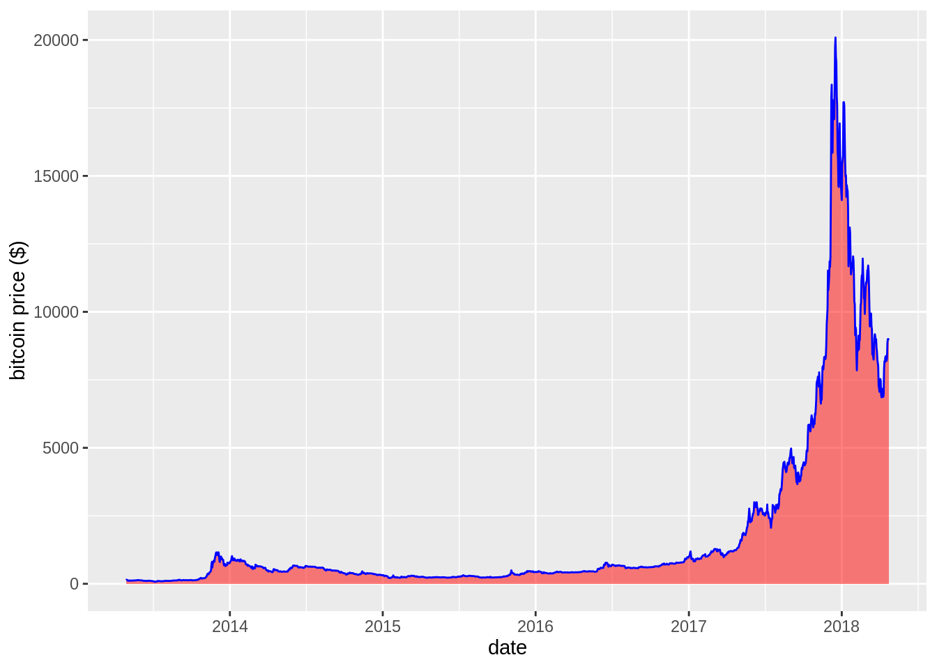
# Turn it interactive with ggplotly
p <- ggplotly(p)
p
We can also just use plotly. To make an area plot with interior filling set fill to “tozeroy” in the call for the second trace. For more informations and options about the fill option checkout https://plotly.com/r/reference/#scatter-fill.
plot_ly(data=data, x=~date, y=~value, type="scatter", mode="line", fill='tozeroy')26.3.2 dygraphs and xts
dygraphs is a very useful R package for creating interactive time series plot. The dygraphs package is an R interface to the dygraphs JavaScript charting library. It provides rich facilities for charting time-series data in R, including: rich interactive features including zoom/pan and series/point highlighting, automatically plots xts time series objects (or any object convertible to xts), highly configurable axis and series display (including optional second Y-axis) and so on. Here we only use some plot functions.
Before input data into dygraphs, we will transform the data frame to the xts format (xts=eXtensible Time Series).
We can select an interval to do data analysis, Here is an example.
26.4 Interactive network diagram
networkD3 is very useful for creating interactive network diagrams. Its input contains each edge, which specifies two nodes.
26.4.1 Simple Network
We can use simpleNetwork of networkD3.
# Create fake data
src <- c("A", "A", "A", "A",
        "B", "B", "C", "C", "D")
target <- c("B", "C", "D", "J",
            "E", "F", "G", "H", "I")
networkData <- data.frame(src, target)

# Plot
simpleNetwork(networkData)
26.4.2 Customized Network
Many option are available to customize the interactive diagram. Some options allow to customize the node, links and label feature, like nodeColour or fontSize. For example, linkDistance controls numeric distance between the links in pixels. charge controls numeric value indicating either the strength of the node repulsion (negative value) or attraction (positive value). fontSize and fontFamily can control the label. We can use help(simpleNetwork) to have a better understanding.
# create a dataset:
data <- data_frame(
  from=c("A", "A", "B", "B", "B", "B", "C", "C", "C", "D", "E", "K", "L", "M", "M"),
  to=c("C", "F", "D", "F", "G", "E", "L", "F", "E", "G", "Z", "J", "M", "L", "Z")
)

# Plot
p <- simpleNetwork(data, height="100px", width="100px",
        Source = 1,                 # column number of source
        Target = 2,                 # column number of target
        linkDistance = 20,          # distance between node. Increase this value to have more space between nodes
        charge = -900,                # numeric value indicating either the strength of the node repulsion (negative value) or attraction (positive value)
        fontSize = 14,               # size of the node names
        fontFamily = "serif",       # font og node names
        linkColour = "#666",        # colour of edges, MUST be a common colour for the whole graph
        nodeColour = "#69b3a2",     # colour of nodes, MUST be a common colour for the whole graph
        opacity = 0.9,              # opacity of nodes. 0=transparent. 1=no transparency
        zoom = T                    # Can you zoom on the figure?
        )
p
We can also customized a more complicated networks using forceNetwork. forceNetwork has different input from simpleNetwork. The two main input is Links and Nodes. Links should be a data frame object with the links between the nodes. It should include the Source and Target for each link. These should be numbered starting from 0. And Nodes should be a data frame containing the node id and properties of the nodes. If no ID is specified then the nodes must be in the same order as the Source variable column in the Links data frame. Currently only a grouping variable is allowed. Here is an examlpe of forceNetwork.
head(MisLinks)## source target value
## 1 1 0 1
## 2 2 0 8
## 3 3 0 10
## 4 3 2 6
## 5 4 0 1
## 6 5 0 1
head(MisNodes)## name group size
## 1 Myriel 1 15
## 2 Napoleon 1 20
## 3 Mlle.Baptistine 1 23
## 4 Mme.Magloire 1 30
## 5 CountessdeLo 1 11
## 6 Geborand 1 9
forceNetwork(Links = MisLinks, Nodes = MisNodes,
            Source = "source", Target = "target",
            Value = "value", NodeID = "name",
            Group = "group", opacity = 0.8)