34 Radial bar chart and other interesting graphs
Zhe Hou
34.1 Radial Bar Chart
34.1.1 Overview
Radial Bar Chart is a kind of graph that display bars redially, and all bars are standing on a circle.
34.1.2 full-fledged example
Here is a full-fledged example of Radial Bar Chart.
# generate data
df <- data.frame(name=rep(LETTERS[1:10], 5),
                 subject=rep(c("Chinese", "English", "History", "Biology", "Music"), each=10),
                 score=rep((1:5), each=10) + rnorm(50, 0, 0.5))
df$subject <- factor(df$subject, levels = c("Chinese", "English", "History", "Biology", "Music"))

# plot
ggplot(data=df,aes(name,score,fill=subject))+
  geom_bar(stat="identity", color="black", position=position_dodge(),width=0.65,size=0.3)+
  coord_polar(theta = "x",start=0) +
  ylim(c(-1,6))+
  scale_fill_brewer(palette="YlGnBu")+
  theme_light()+
  theme( axis.text.y = element_text(size = 12,colour="black"),
         axis.text.x=element_text(size = 10,colour="black"))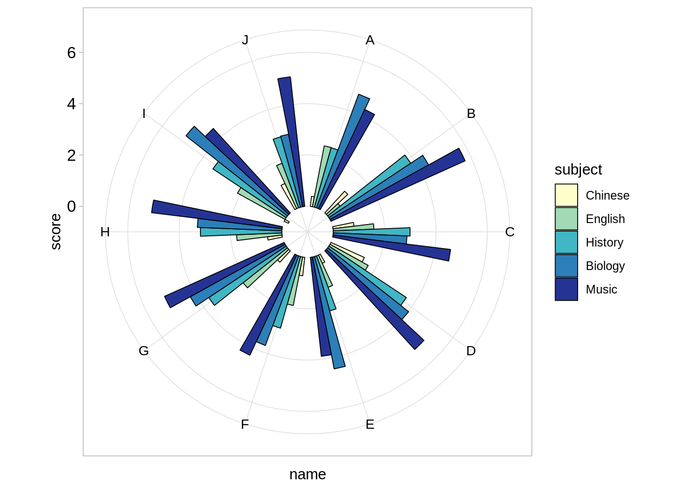
34.1.3 Simple Example
# generate a simpler dataset
sim_data <- data.frame( a=c("Monday","Tuesday","Wednesday","Thursday","Friday","Saturday","Sunday"),b=c(70, 50, 60, 30,100,90,40))
sim_data$a <- factor(sim_data$a, levels = c("Monday", "Tuesday", "Wednesday", "Thursday", "Friday", "Saturday", "Sunday"))

# plot
ggplot(sim_data) +
  geom_bar(aes(x=a, y=b), width = 1, stat="identity",
           colour = "black", fill="lightblue") +
coord_polar(theta = "x", start=0) 
This is a single variable radial bar chart, which displays temperature of every day in one week. “coord_polar()” is key to let the ordinary bar chart become radial bar chart.
# generate data
df <- data.frame(name=rep(LETTERS[1:10], 5),
                 subject=rep(c("Chinese", "English", "History", "Biology", "Music"), each=10),
                 score=rep((1:5), each=10) + rnorm(50, 0, 0.5))
df$subject <- factor(df$subject, levels = c("Chinese", "English", "History", "Biology", "Music"))

# plot
ggplot(data=df,aes(name,score,fill=subject))+
  geom_bar(stat="identity", position=position_dodge())+
coord_polar(theta = "x",start=0) 
When we have two variables, we should set the parameter “positon”. But now we can see that all bars are start from a point, which is not easy to observe small bars.
# plot
ggplot(data=df,aes(name,score,fill=subject))+
  geom_bar(stat="identity", position=position_dodge())+
  coord_polar(theta = "x",start=0) +
  ylim(c(-2,6))+
  theme_light()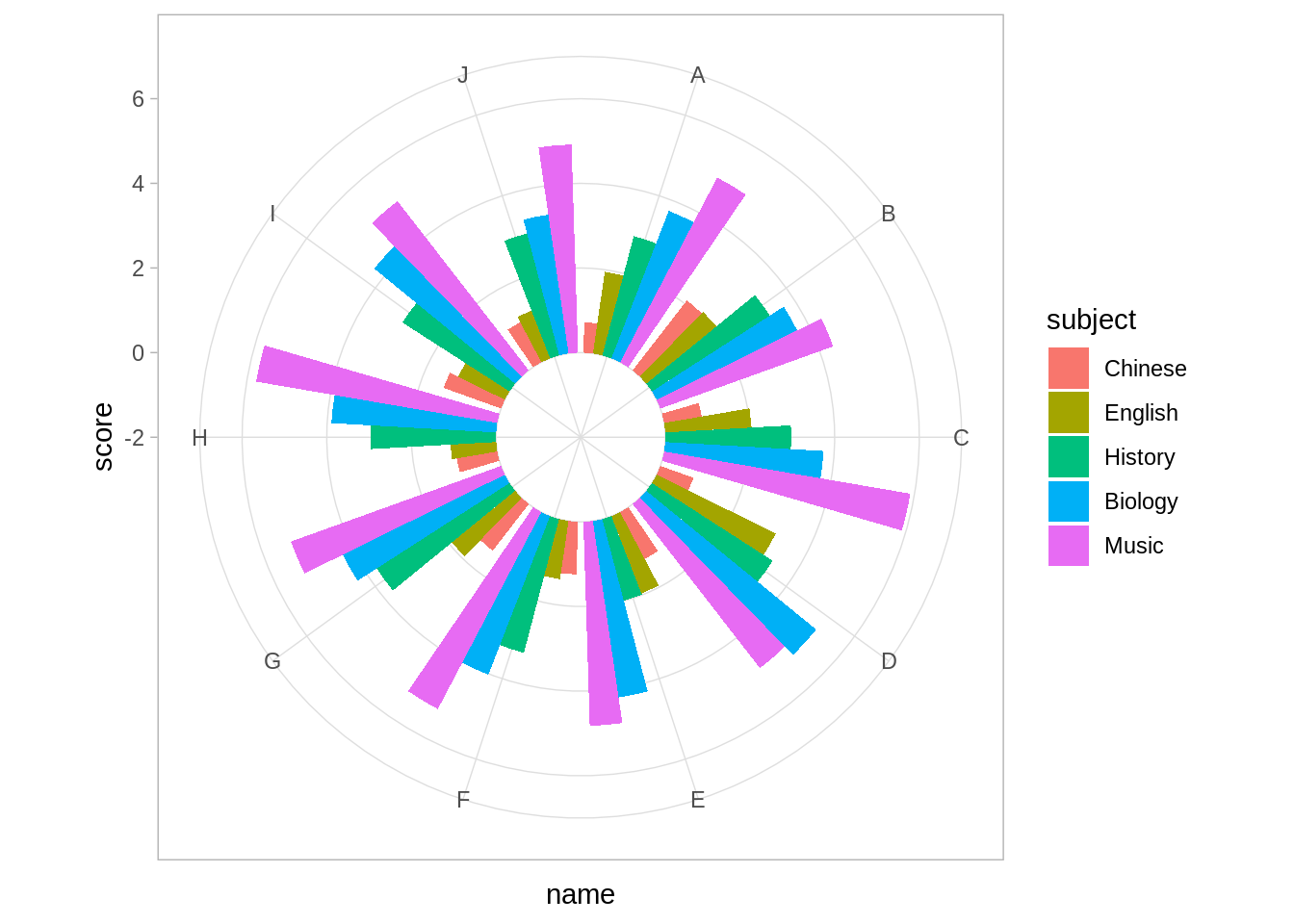
We can set the y-axis start from -2 (so -2 is the center point of circles), and now we can clearly observe bars.
34.2 Other interesting graphs
34.2.1 Waffle Chart
# prepare data
table <- round(table(mpg$class ) * (100/(length(mpg$class))))
sorted_table<-sort(table,index.return=TRUE,decreasing = FALSE)
Order<-sort(as.data.frame(table)$Freq,index.return=TRUE,decreasing = FALSE)
df <- expand.grid(y = 1:10, x = 1:10)
df$category<-factor(rep(names(sorted_table),sorted_table), levels=names(sorted_table))

# plot
ggplot(df, aes(x = y, y = x, fill = category)) +
  geom_tile(color = "white", size = 0.25) +
  coord_fixed(ratio = 1)+
  scale_y_continuous(trans = 'reverse') +
  theme( panel.background  = element_blank(),
    plot.title = element_text(size = rel(1.2)),
    legend.position = "right")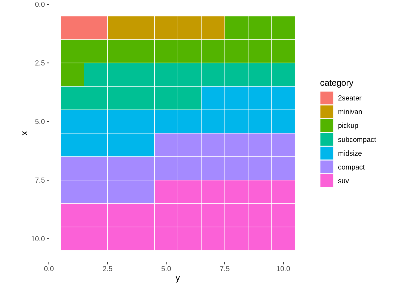
This is a Waffle chart, which shows the percentage of each category of cars.
34.2.2 Redar Graph
# prepare data
a <- matrix(runif(10, 30, 100)/100, 2, 5)
colnames(a) <- c("Chinese", "English", "History", "Biology", "Music")
df <- data.frame(a)
name <- c("John", "Lily")
df <- data.frame(name, df)

# plot
ggradar(df)
This is a redar graph which displays scores of some subjects of two students.