11 Chart: Cleveland Dot Plot

This page is a work in progress. We appreciate any input you may have. If you would like to help improve this page, consider contributing to our repo.
11.1 Overview
This section covers how to make Cleveland dot plots. Cleveland dot plots are a great alternative to a simple bar chart, particularly if you have more than a few items. It doesn’t take much for a bar chart to look cluttered. In the same amount of space, many more values can be included in a dot plot, and it’s easier to read as well. R has a built-in base function, dotchart(), but since it’s such an easy graph to draw, doing it “from scratch” in ggplot2 or base allows for more customization.
The code:
library(tidyverse)
# create a theme for dot plots, which can be reused
theme_dotplot <- theme_bw(14) +
theme(axis.text.y = element_text(size = rel(.75)),
axis.ticks.y = element_blank(),
axis.title.x = element_text(size = rel(.75)),
panel.grid.major.x = element_blank(),
panel.grid.major.y = element_line(size = 0.5),
panel.grid.minor.x = element_blank())
# move row names to a dataframe column
df <- swiss %>% tibble::rownames_to_column("Province")
# create the plot
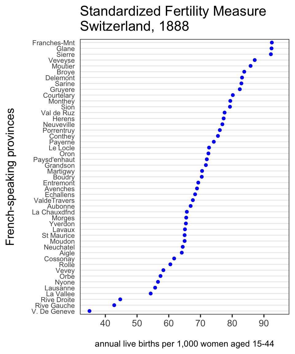
ggplot(df, aes(x = Fertility, y = reorder(Province, Fertility))) +
geom_point(color = "blue") +
scale_x_continuous(limits = c(35, 95),
breaks = seq(40, 90, 10)) +
theme_dotplot +
xlab("\nannual live births per 1,000 women aged 15-44") +
ylab("French-speaking provinces\n") +
ggtitle("Standardized Fertility Measure\nSwitzerland, 1888")11.2 Multiple dots
For this example we’ll use 2010 data on SAT mean scores for a sample of New York City public schools:
df <- read_csv("data/SAT2010.csv", na = "s")

set.seed(5293)
tidydf <- df %>%
  filter(!is.na(`Critical Reading Mean`)) %>%
  sample_n(20) %>%
  rename(Reading = "Critical Reading Mean", Math = "Mathematics Mean",
         Writing = "Writing Mean") %>%
  gather(key = "Test", value = "Mean", "Reading", "Math", "Writing")

ggplot(tidydf, aes(Mean, `School Name`, color = Test)) +
  geom_point() +
  ggtitle("Schools are sorted alphabetically", sub = "not the best option") + ylab("") +
  theme_dotplot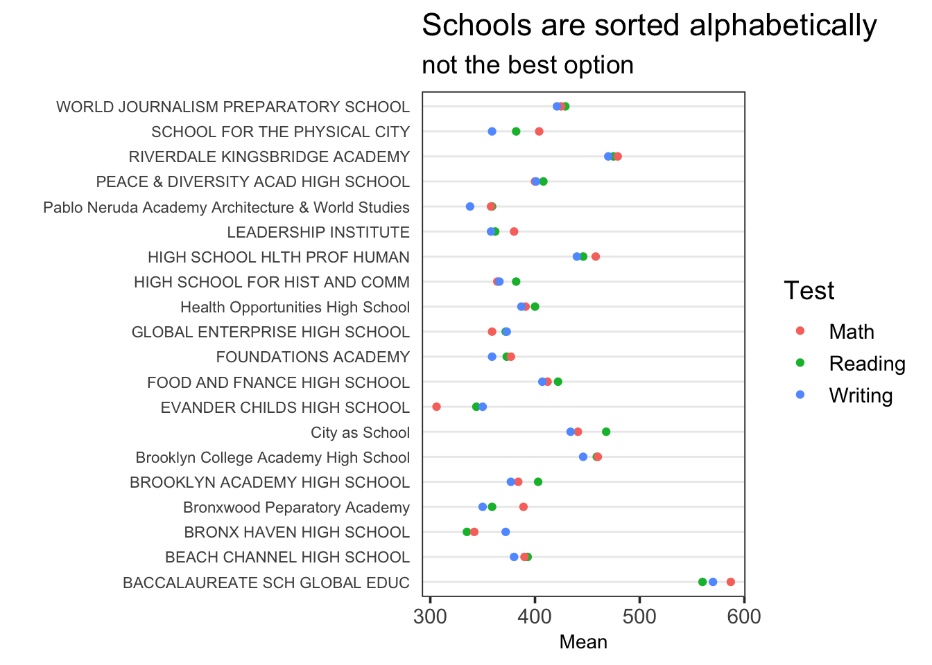
Note that School Name is sorted by factor level, which by default is alphabetical. A better choice is to sort by one of the levels of Test. It’s usually best to try sorting on different factor levels and observe the patterns that appear.
To perform the double sort, that is, sorting School Name by Test and then Mean, we use forcats::fct_reorder2(). This function sorts .f (a factor or character vector) by two sorting vectors, .x and .y. For this type of plot, .x is the variable represented by the colored dots and .y is the continuous variable mapped to the y-axis.
Suppose we wish to sort the schools by mean reading score. We can do this by limiting the Test variable to “Reading” when sorting on Mean:
ggplot(tidydf,
       aes(Mean, fct_reorder2(`School Name`, Test=="Reading", Mean, .desc = FALSE),
           color = Test)) +
  geom_point() + ggtitle("Schools sorted by Reading mean") + ylab("") +
theme_dotplot 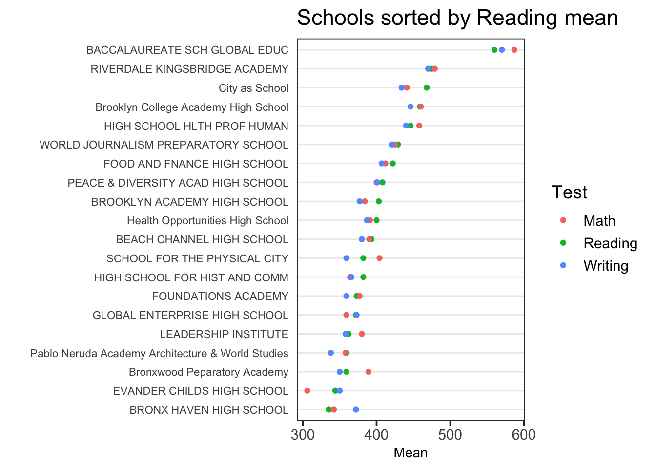
(Many thanks to Zeyu Qiu for the tip on setting .x directly to the factor level, a much better approach than reordering factor levels to conform with fct_reorder2() defaults, as discussed below.)
While this is the go-to method, there may be cases in which it’s easier to specify that you wish to sort by the first or the last factor level of the first sorting variable (Test), without spelling it out.
If a factor level is not specified, fct_reorder2() by default will sort on the last factor level of .x. In this case, “Writing” is the last factor level of Test:
ggplot(tidydf,
       aes(Mean, fct_reorder2(`School Name`, Test, Mean, .desc = FALSE),
           color = Test)) +
  geom_point() + ggtitle("Schools sorted by Writing mean") + ylab("") +
  theme_dotplot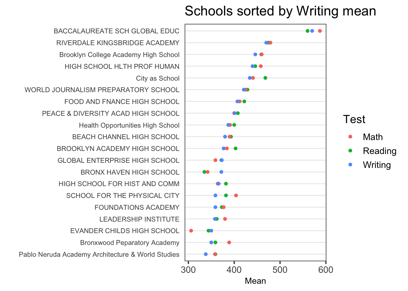
If you desire to sort by the first factor level of .x, “Math” in this case, you’ll need the development version of forcats, which you can install with:
devtools::install_github("tidyverse/forcats")
Change the default sorting function, last2(), to first2():
ggplot(tidydf,
       aes(Mean, fct_reorder2(`School Name`, Test, Mean, .fun = first2, .desc = FALSE),
           color = Test)) +
  geom_point() + ggtitle("Schools sorted by Math mean") + ylab("") +
  theme_dotplot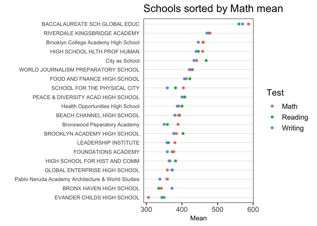
with