5 Chart: Histogram

5.1 Overview
This section covers how to make histograms.
5.2 tl;dr
Gimme a full-fledged example!
Here’s an application of histograms that looks at how the beaks of Galapagos finches changed due to external factors:
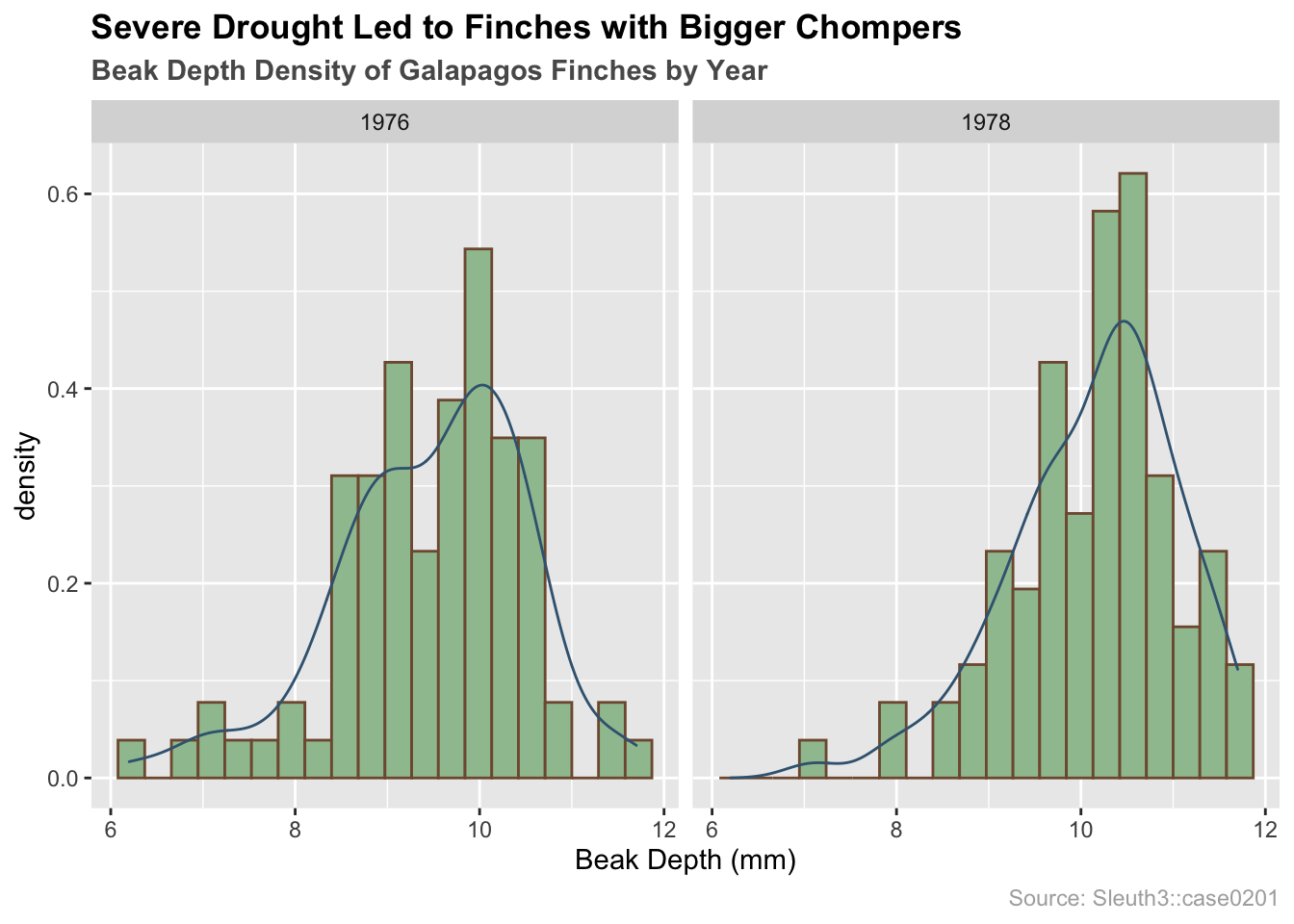
And here’s the code:
library(Sleuth3) # data
library(ggplot2) # plotting

# load data
finches <- Sleuth3::case0201
# finch histograms by year with overlayed density curves
ggplot(finches, aes(x = Depth, y = ..density..)) +
  # plotting
  geom_histogram(bins = 20, colour = "#80593D", fill = "#9FC29F", boundary = 0) +
  geom_density(color = "#3D6480") +
  facet_wrap(~Year) +
  # formatting
  ggtitle("Severe Drought Led to Finches with Bigger Chompers",
          subtitle = "Beak Depth Density of Galapagos Finches by Year") +
  labs(x = "Beak Depth (mm)", caption = "Source: Sleuth3::case0201") +
  theme(plot.title = element_text(face = "bold")) +
  theme(plot.subtitle = element_text(face = "bold", color = "grey35")) +
  theme(plot.caption = element_text(color = "grey68"))
For more info on this dataset, type ?Sleuth3::case0201 into the console.
5.3 Simple examples
Whoa whoa whoa! Much simpler please!
Let’s use a very simple dataset:
# store data
x <- c(50, 51, 53, 55, 56, 60, 65, 65, 68)
5.3.1 Histogram using base R
# plot data
hist(x, col = "lightblue", main = "Base R Histogram of x")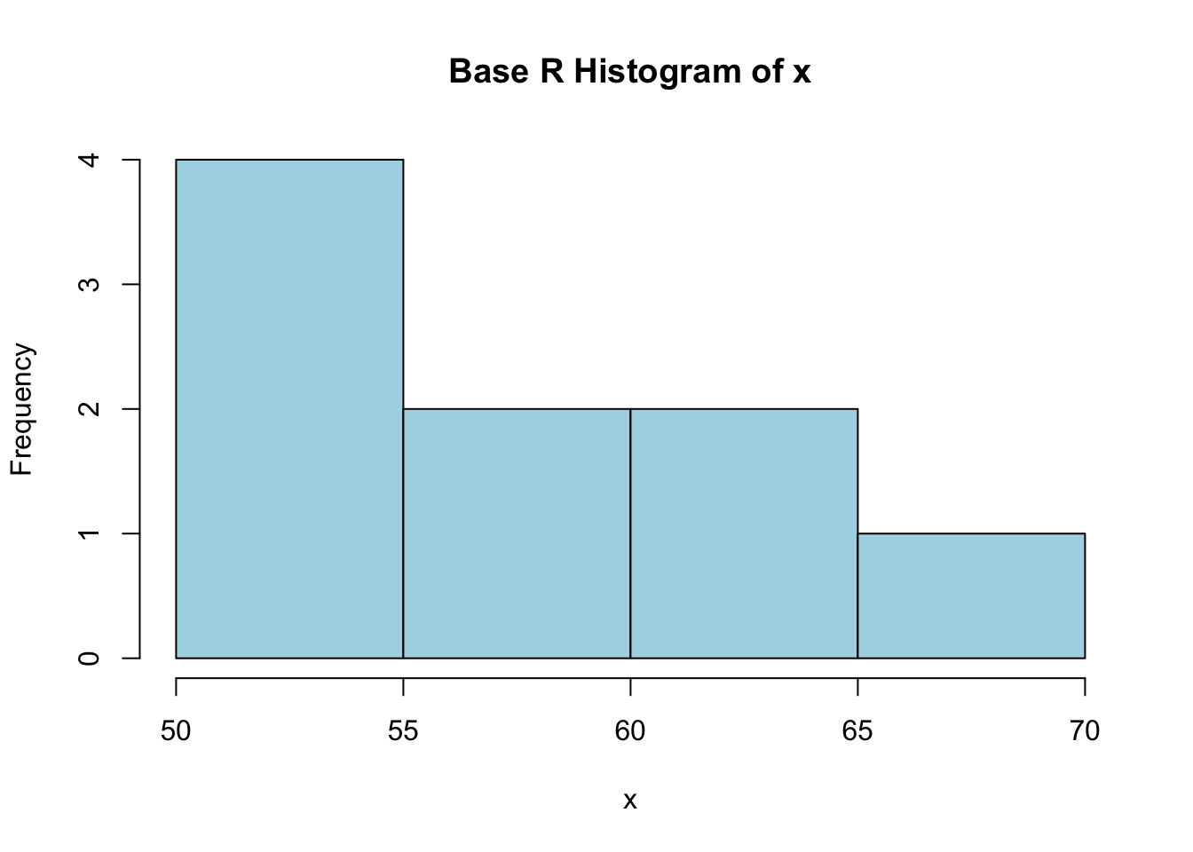
For the Base R histogram, it’s advantages are in it’s ease to setup. In truth, all you need to plot the data x in question is hist(x), but we included a little color and a title to make it more presentable.
Full documentation on hist() can be found here
5.3.2 Histogram using ggplot2
# import ggplot
library(ggplot2)
# must store data as dataframe
df <- data.frame(x)

# plot data
ggplot(df, aes(x)) +
  geom_histogram(color = "grey", fill = "lightBlue",
                 binwidth = 5, center = 52.5) +
  ggtitle("ggplot2 histogram of x")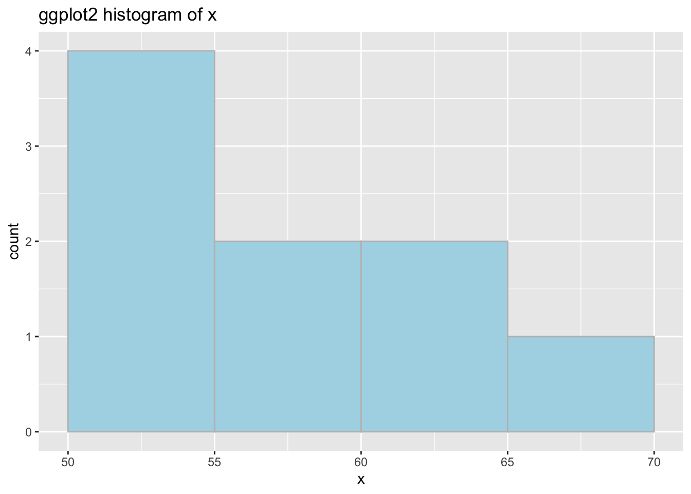
The ggplot version is a little more complicated on the surface, but you get more power and control as a result. Note: as shown above, ggplot expects a dataframe, so if you are getting an error where “R doesn’t know what to do” like this:

ggplot dataframe error
make sure you are using a dataframe.
5.4 Theory
Generally speaking, the histogram is one of many options for displaying continuous data.
The histogram is clear and quick to make. Histograms are relatively self-explanatory: they show your data’s empirical distribution within a set of intervals. Histograms can be employed on raw data to quickly show the distribution without much manipulation. Use a histogram to get a basic sense of the distribution with minimal processing necessary.
- For more info about histograms and continuous variables, check out Chapter 3 of the textbook.
5.5 Types of histograms
Use a histogram to show the distribution of one continuous variable. The y-scale can be represented in a variety of ways to express different results:
5.5.1 Frequency or count
y = number of values that fall in each bin
5.5.2 Relative frequency historgram
y = number of values that fall in each bin / total number of values
5.5.3 Cumulative frequency histogram
y = total number of values <= (or <) right boundary of bin
5.5.4 Density
y = relative frequency / binwidth
5.6 Parameters
5.6.1 Bin boundaries
Be mindful of the boundaries of the bins and whether a point will fall into the left or right bin if it is on a boundary.
# format layout
op <- par(mfrow = c(1, 2), las = 1)

# right closed
hist(x, col = "lightblue", ylim = c(0, 4),
     xlab = "right closed ex. (55, 60]", font.lab = 2)
# right open
hist(x, col = "lightblue", right = FALSE, ylim = c(0, 4),
     xlab = "right open ex. [55, 60)", font.lab = 2)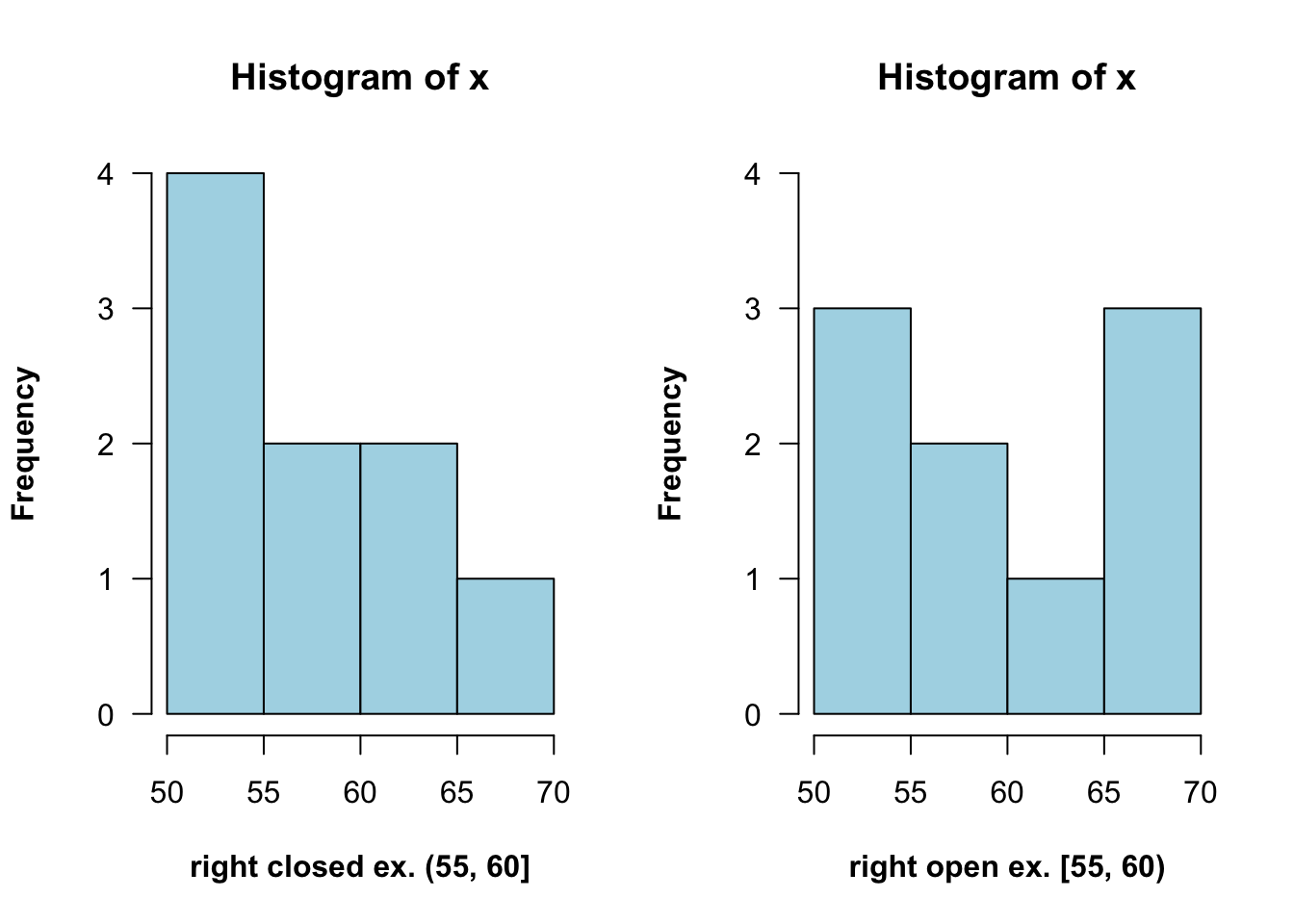
5.6.2 Bin number
The default bin number of 30 in ggplot2 is not always ideal, so consider altering it if things are looking strange. You can specify the width explicitly with binwidth or provide the desired number of bins with bins.
# default...note the pop-up about default bin number
ggplot(finches, aes(x = Depth)) +
  geom_histogram() +
  ggtitle("Default with pop-up about bin number")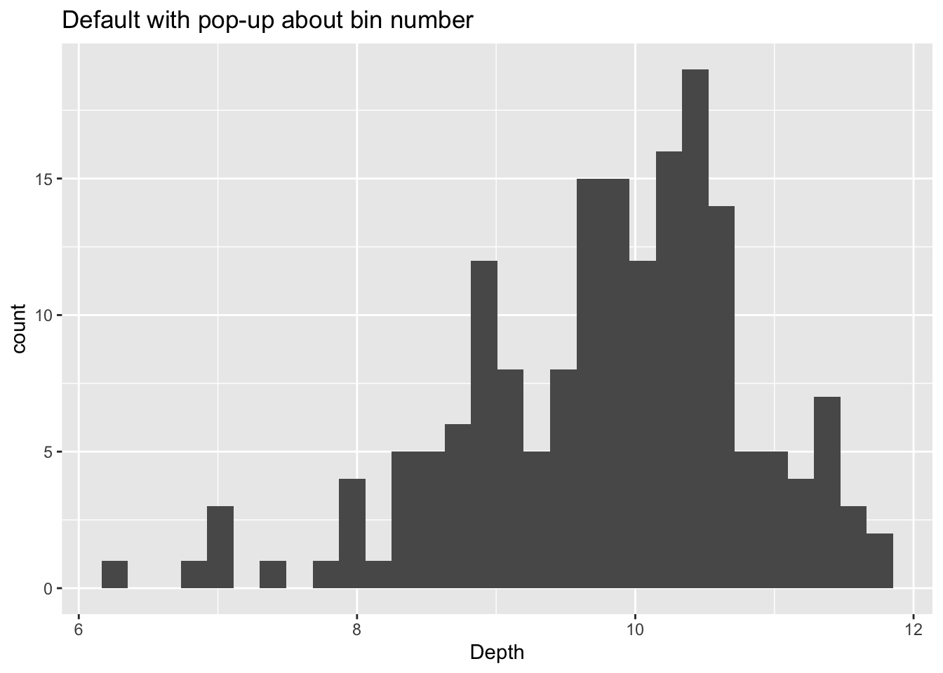
Here are examples of changing the bins using the two ways described above:
# using binwidth
p1 <- ggplot(finches, aes(x = Depth)) +
  geom_histogram(binwidth = 0.5, boundary = 6) +
  ggtitle("Changed binwidth value")
# using bins
p2 <- ggplot(finches, aes(x = Depth)) +
  geom_histogram(bins = 48, boundary = 6) +
  ggtitle("Changed bins value")

# format plot layout
library(gridExtra)
grid.arrange(p1, p2, ncol = 2)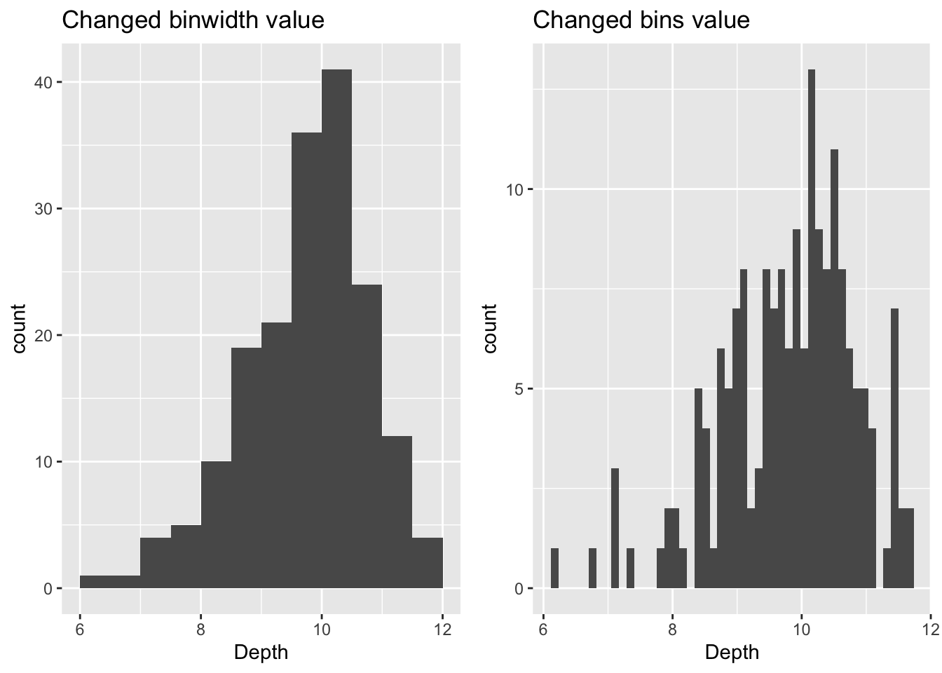
5.6.3 Bin alignment
Make sure the axes reflect the true boundaries of the histogram. You can use boundary to specify the endpoint of any bin or center to specify the center of any bin. ggplot2 will be able to calculate where to place the rest of the bins (Also, notice that when the boundary was changed, the number of bins got smaller by one. This is because by default the bins are centered and go over/under the range of the data.)
df <- data.frame(x)

# default alignment
ggplot(df, aes(x)) +
  geom_histogram(binwidth = 5,
                 fill = "lightBlue", col = "black") +
  ggtitle("Default Bin Alignment")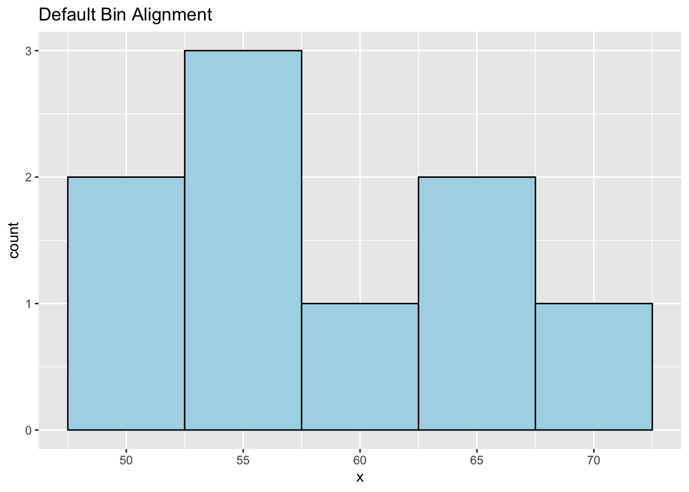
# specify alignment with boundary
p3 <- ggplot(df, aes(x)) +
  geom_histogram(binwidth = 5, boundary = 60,
                 fill = "lightBlue", col = "black") +
  ggtitle("Bin Alignment Using boundary")

# specify alignment with center
p4 <- ggplot(df, aes(x)) +
  geom_histogram(binwidth = 5, center = 67.5,
                 fill = "lightBlue", col = "black") +
  ggtitle("Bin Alignment Using center")

# format layout
library(gridExtra)
grid.arrange(p3, p4, ncol = 2)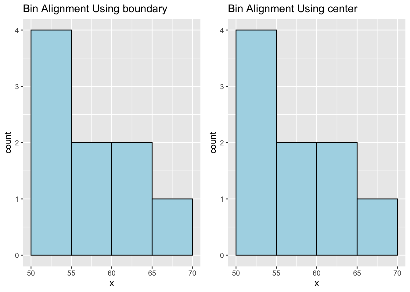
Note: Don’t use both boundary and center for bin alignment. Just pick one.
5.7 Interactive histograms with ggvis
The ggvis package is not currently in development, but does certain things very well, such as adjusting parameters of a histogram interactively while coding.
Since images cannot be shared by knitting (as with other packages, such as plotly), we present the code here, but not the output. To try them out, copy and paste into an R session.
5.7.1 Change binwidth interactively
library(tidyverse)
library(ggvis)
faithful %>% ggvis(~eruptions) %>%
    layer_histograms(fill := "lightblue",
        width = input_slider(0.1, 2, value = .1,
                             step = .1, label = "width"))
5.7.2 GDP example
df <-read.csv("countries2012.csv")
df %>% ggvis(~GDP) %>%
    layer_histograms(fill := "green",
        width = input_slider(500, 10000, value = 5000,
        step = 500, label = "width"))
5.7.3 Change center interactively
df <- data.frame(x = c(50, 51, 53, 55, 56, 60, 65, 65, 68))
df %>% ggvis(~x) %>%
    layer_histograms(fill := "red",
        width = input_slider(1, 10, value = 5, step = 1, label = "width"),
        center = input_slider(50, 55, value = 52.5, step = .5, label = "center"))
5.7.4 Change center (with data values shown)
df <- data.frame(x = c(50, 51, 53, 55, 56, 60, 65, 65, 68),
                 y = c(.5, .5, .5, .5, .5, .5, .5, 1.5, .5))
df %>% ggvis(~x, ~y) %>%
    layer_histograms(fill := "lightcyan", width = 5,
                     center = input_slider(45, 55, value = 45,
                                           step = 1, label = "center")) %>%
  layer_points(fill := "blue", size := 200) %>%
  add_axis("x", properties = axis_props(labels = list(fontSize = 20))) %>%
  scale_numeric("x", domain = c(46, 72)) %>%
  add_axis("y", values = 0:3,
           properties = axis_props(labels = list(fontSize = 20)))
5.7.5 Change boundary interactively
df %>% ggvis(~x) %>%
    layer_histograms(fill := "red",
        width = input_slider(1, 10, value = 5,
                             step = 1, label = "width"),
        boundary = input_slider(47.5, 50, value = 50,
                                step = .5, label = "boundary"))
5.8 External resources
- hist documentation: base R histogram documentation page.
- ggplot2 cheatsheet: Always good to have close by.
with