7 Chart: Violin Plot
 This chapter originated as a community contribution created by AshwinJay101
This page is a work in progress. We appreciate any input you may have. If you would like to help improve this page, consider contributing to our repo.
7.1 Overview
This section covers how to make violin plots.
7.2 Some Examples in R
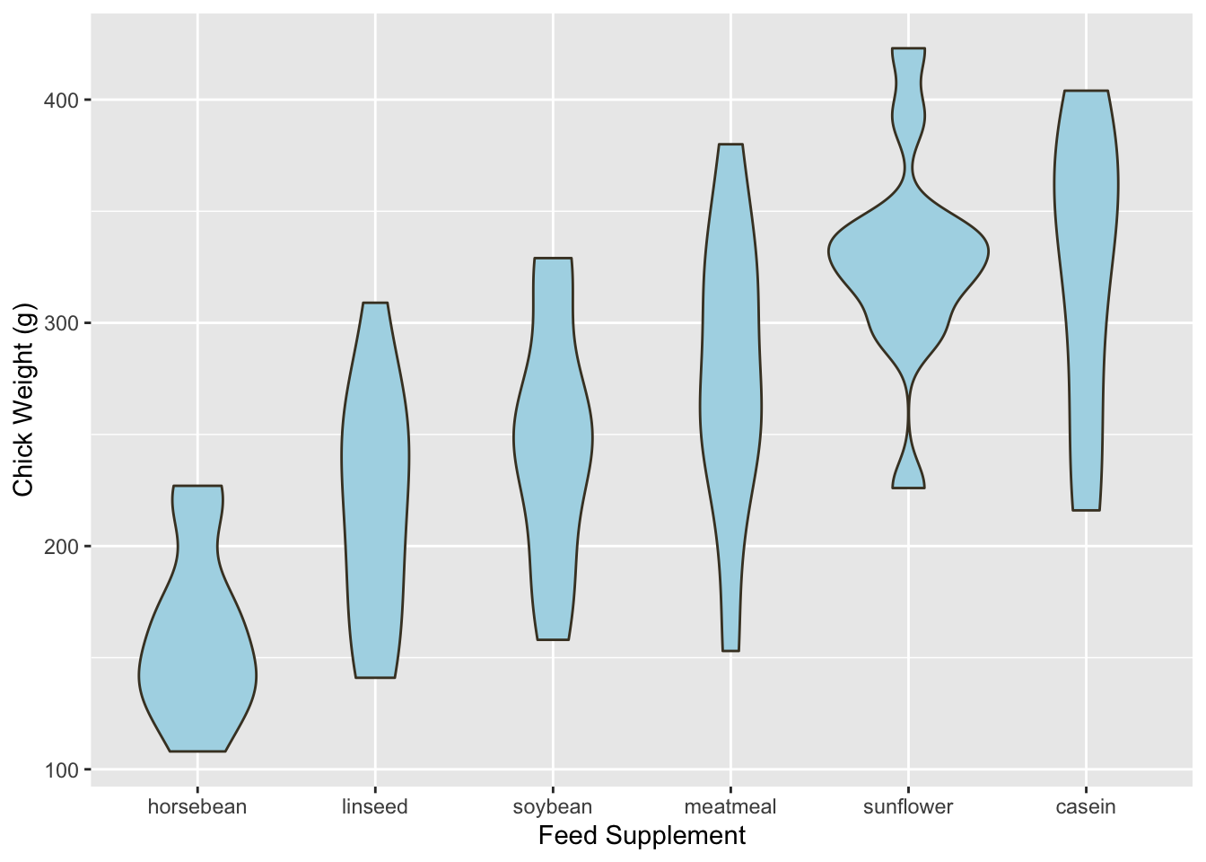
Let’s use the chickwts dataset from the datasets package to plot a violin plot using ggplot2.
Here’s the code for that:
# import ggplot and the Datasets Package
library(datasets)
library(ggplot2)

supps <- c("horsebean", "linseed", "soybean", "meatmeal", "sunflower", "casein")

# plot data

ggplot(chickwts, aes(x = factor(feed, levels = supps),
                     y = weight)) +
  # plotting
  geom_violin(fill = "lightBlue", color = "#473e2c") +
  labs(x = "Feed Supplement", y = "Chick Weight (g)")
7.3 Adding Statistics to the Violin Plot
7.3.1 Adding the median and the interquartile range
We can add the median and the interquartile range to the violin plot
ggplot(chickwts, aes(x = factor(feed, levels = supps),
                     y = weight)) +
  # plotting
  geom_violin(fill = "lightBlue", color = "#473e2c") +
  labs(x = "Feed Supplement", y = "Chick Weight (g)") +
   geom_boxplot(width=0.1)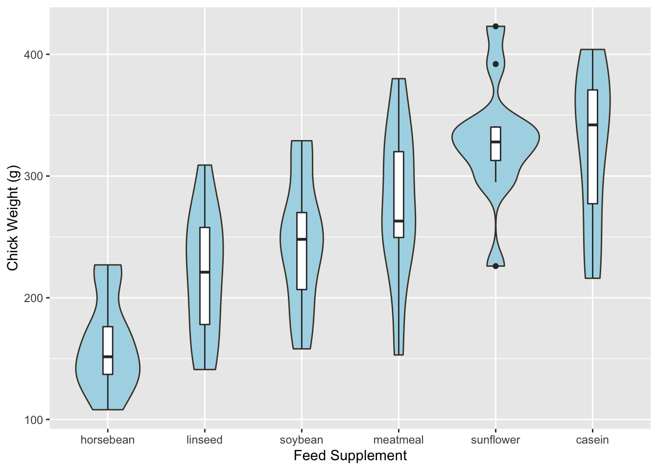
To get the result, we just add a boxplot geom.
7.3.2 Displaying data as dots
ggplot(chickwts, aes(x = factor(feed, levels = supps),
                     y = weight)) +
  # plotting
  geom_violin(fill = "lightBlue", color = "#473e2c") +
  labs(x = "Feed Supplement", y = "Chick Weight (g)") +
  geom_dotplot(binaxis='y', dotsize=0.5, stackdir='center')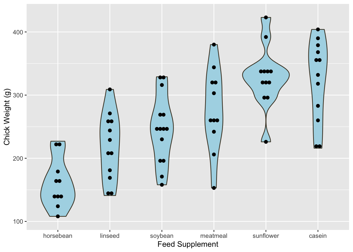
7.4 Description
Violin plots are similar to box plots. The advantage they have over box plots is that they allow us to visualize the distribution of the data and the probability density. We can think of violin plots as a combination of boxplots and density plots.
This plot type allows us to see whether the data is unimodal, bimodal or multimodal. These simple details will be hidden in the boxplot. The distribution can be seen through the width of the violin plot.
7.5 When to use
Violin plots should be used to display continuous variables only.
7.6 External Resources
- ggplot2 Violin Plot: Excellent resource for showing the various customizations that can be added to the violin plot.
with