8 Chart: Ridgeline Plots
 This chapter originated as a community contribution created by nehasaraf1994
This page is a work in progress. We appreciate any input you may have. If you would like to help improve this page, consider contributing to our repo.
8.1 Overview
This section covers how to make ridgeline plots.
8.2 tl;dr
I want a nice example and I want it NOW!
Here’s a look at the dose of theophylline administered orally to the subject on which the concentration of theophylline is observed:
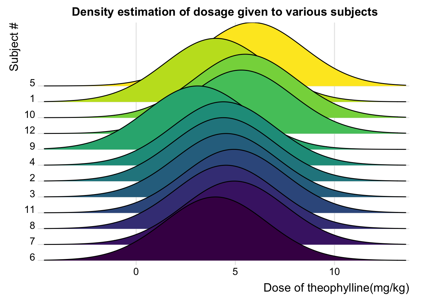
Here is the code:
library("ggridges")
library("tidyverse")
Theoph_data <- Theoph
ggplot(Theoph_data, aes(x=Dose,y=Subject,fill=Subject))+
  geom_density_ridges_gradient(scale = 4, show.legend = FALSE) + theme_ridges() +
  scale_y_discrete(expand = c(0.01, 0)) +
  scale_x_continuous(expand = c(0.01, 0)) +
  labs(x = "Dose of theophylline(mg/kg)",y = "Subject #") +
  ggtitle("Density estimation of dosage given to various subjects") +
  theme(plot.title = element_text(hjust = 0.5))
For more info on this dataset, type ?datasets::Theoph into the console.
8.3 Simple examples
Okay…much simpler please.
Let’s use the Orange dataset from the datasets package:
library("datasets")
head(Orange, n=5)
## Grouped Data: circumference ~ age | Tree
## Tree age circumference
## 1 1 118 30
## 2 1 484 58
## 3 1 664 87
## 4 1 1004 115
## 5 1 1231 1208.4 Ridgeline Plots using ggridge
library("ggridges")
library("tidyverse")
ggplot(Orange, aes(x=circumference,y=Tree,fill = Tree))+
  geom_density_ridges(scale = 2, alpha=0.5) + theme_ridges()+
  scale_fill_brewer(palette = 4)+
  scale_y_discrete(expand = c(0.8, 0)) +
  scale_x_continuous(expand = c(0.01, 0))+
  labs(x="Circumference at Breast Height", y="Tree with ordering of max diameter")+
  ggtitle("Density estimation of circumference of different types of Trees")+
  theme(plot.title = element_text(hjust = 0.5))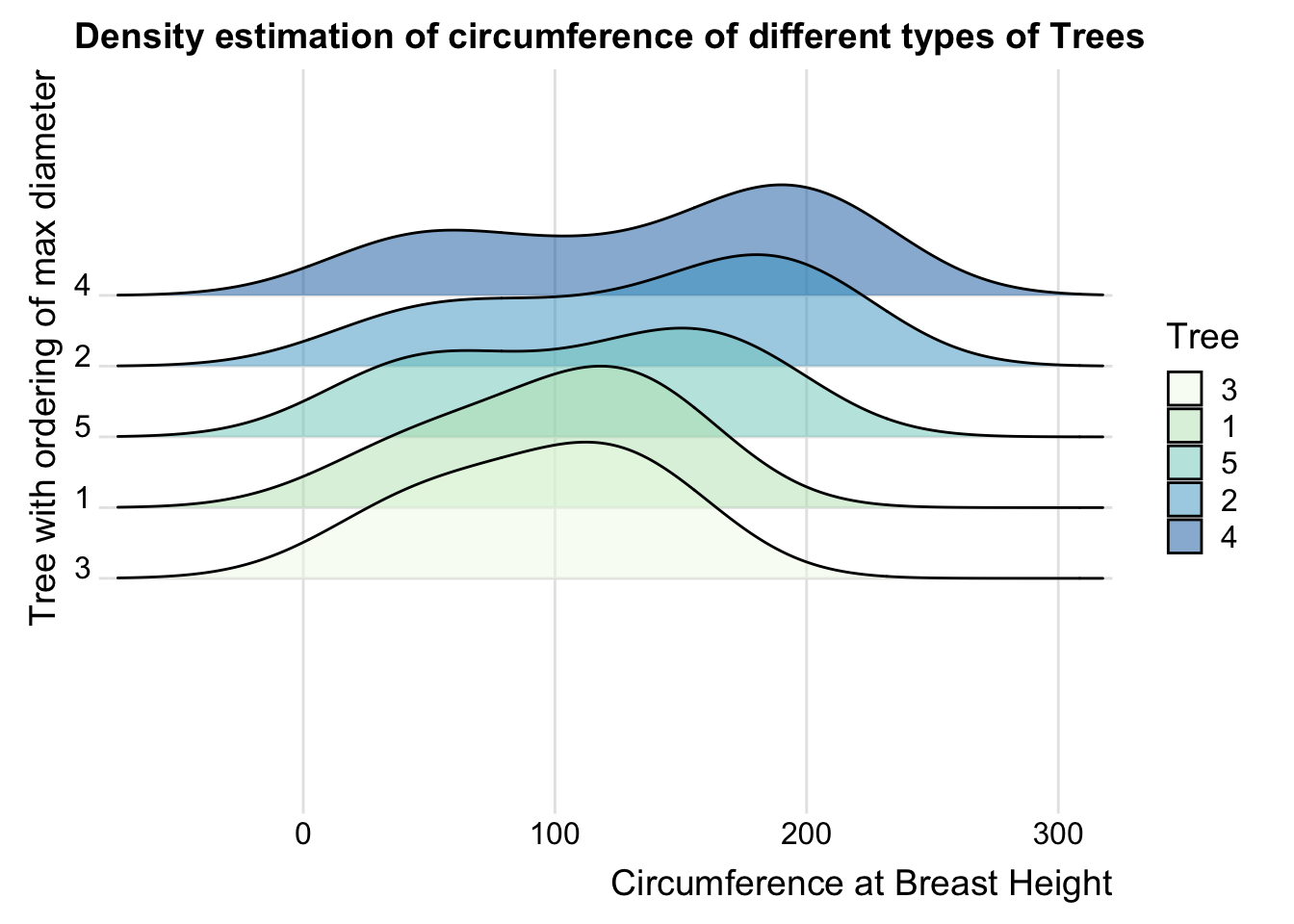
ggridge uses two main geoms to plot the ridgeline density plots: “geom_density_ridges” and “geom_ridgeline”. They are used to plot the densities of categorical variable factors and see their distribution over a continuous scale.
8.5 When to Use
Ridgeline plots can be used when a number of data segments have to be plotted on the same horizontal scale. It is presented with slight overlap. Ridgeline plots are very useful to visualize the distribution of a categorical variable over time or space.
A good example using ridgeline plots will be a great example is visualizing the distribution of salary over different departments in a company.
8.6 Considerations
The overlapping of the density plot can be controlled by adjusting the value of scale. Scale defines how much the peak of the lower curve touches the curve above.
library("ggridges")
library("tidyverse")
OrchardSprays_data <- OrchardSprays
ggplot(OrchardSprays_data, aes(x=decrease,y=treatment,fill=treatment))+
  geom_density_ridges_gradient(scale=3) + theme_ridges()+
  scale_y_discrete(expand = c(0.3, 0)) +
  scale_x_continuous(expand = c(0.01, 0))+
  labs(x="Response in repelling honeybees",y="Treatment")+
  ggtitle("Density estimation of response by honeybees to a treatment for scale=3")+
  theme(plot.title = element_text(hjust = 0.5))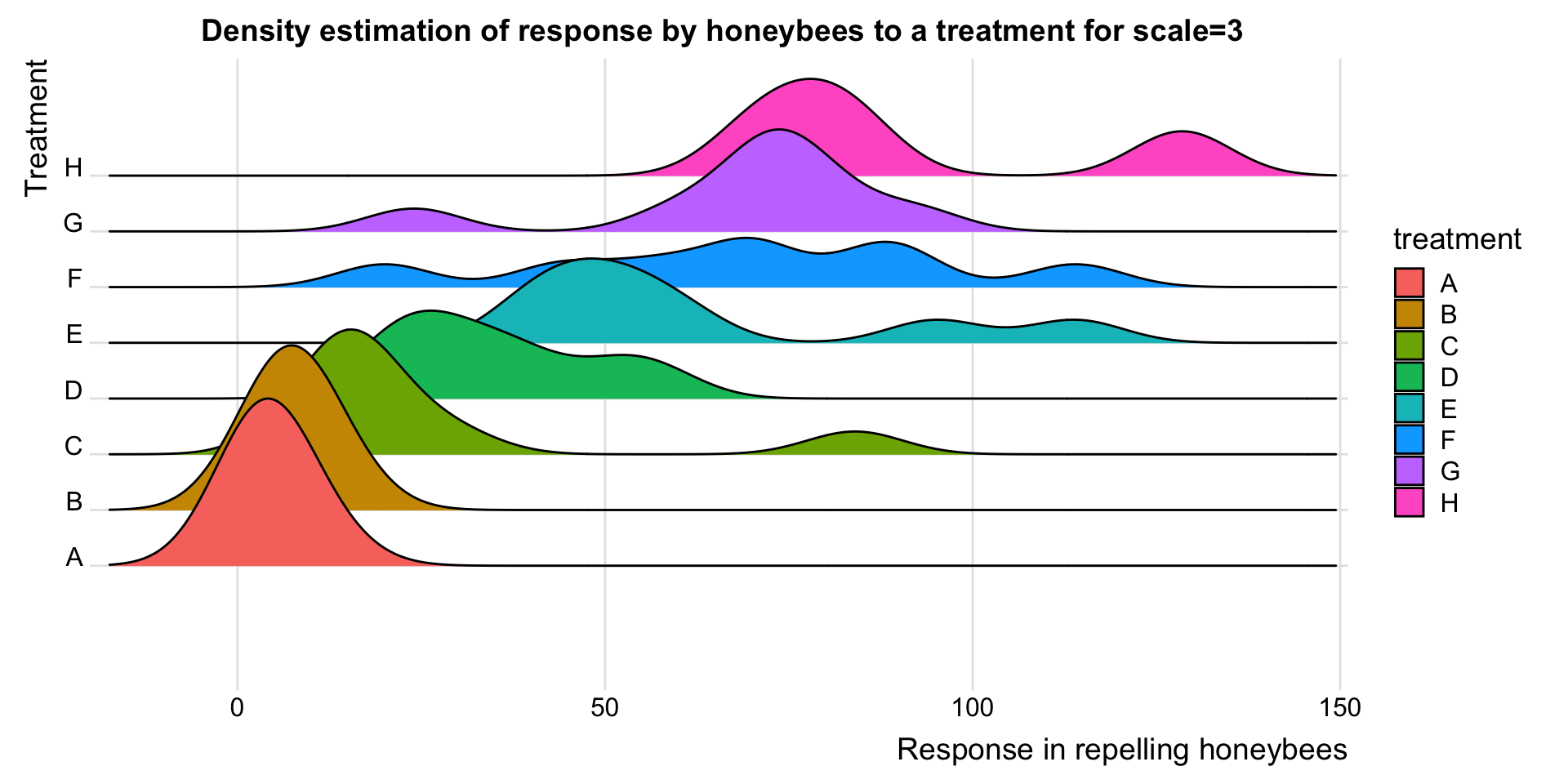
ggplot(OrchardSprays_data, aes(x=decrease,y=treatment,fill=treatment))+
  geom_density_ridges_gradient(scale=5) + theme_ridges()+
  scale_y_discrete(expand = c(0.3, 0)) +
  scale_x_continuous(expand = c(0.01, 0))+
  labs(x="Response in repelling honeybees",y="Treatment")+
  ggtitle("Density estimation of response by honeybees to a treatment for scale=5")+
  theme(plot.title = element_text(hjust = 0.5))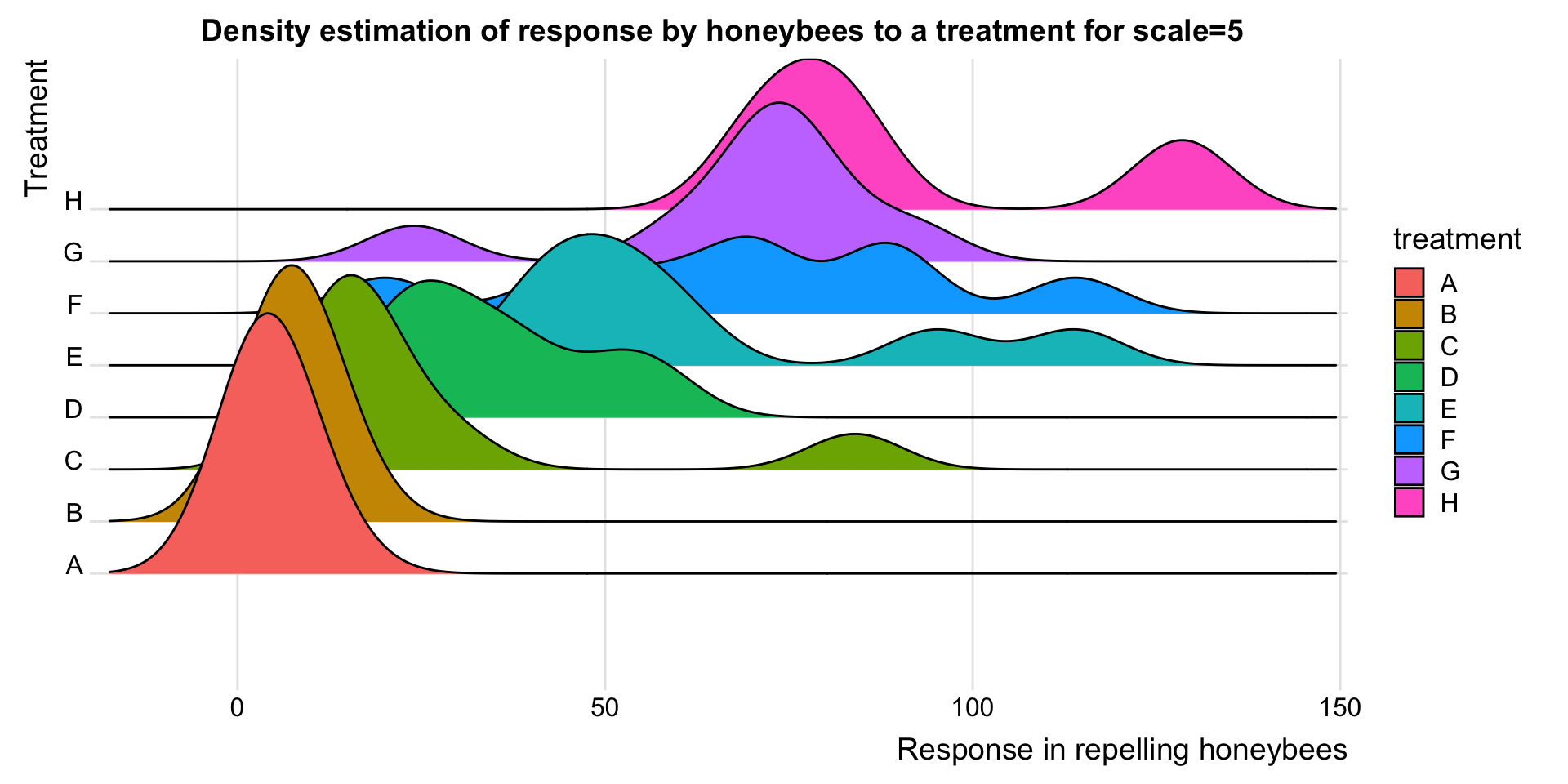
Ridgeline plots can also be used to plot histograms on the common horizontal axis rather than density plots. But doing that may not give us any valuable results.
library("ggridges")
library("tidyverse")
ggplot(InsectSprays, aes(x = count, y = spray, height = ..density.., fill = spray)) +
  geom_density_ridges(stat = "binline", bins = 20, scale = 0.7, draw_baseline = FALSE)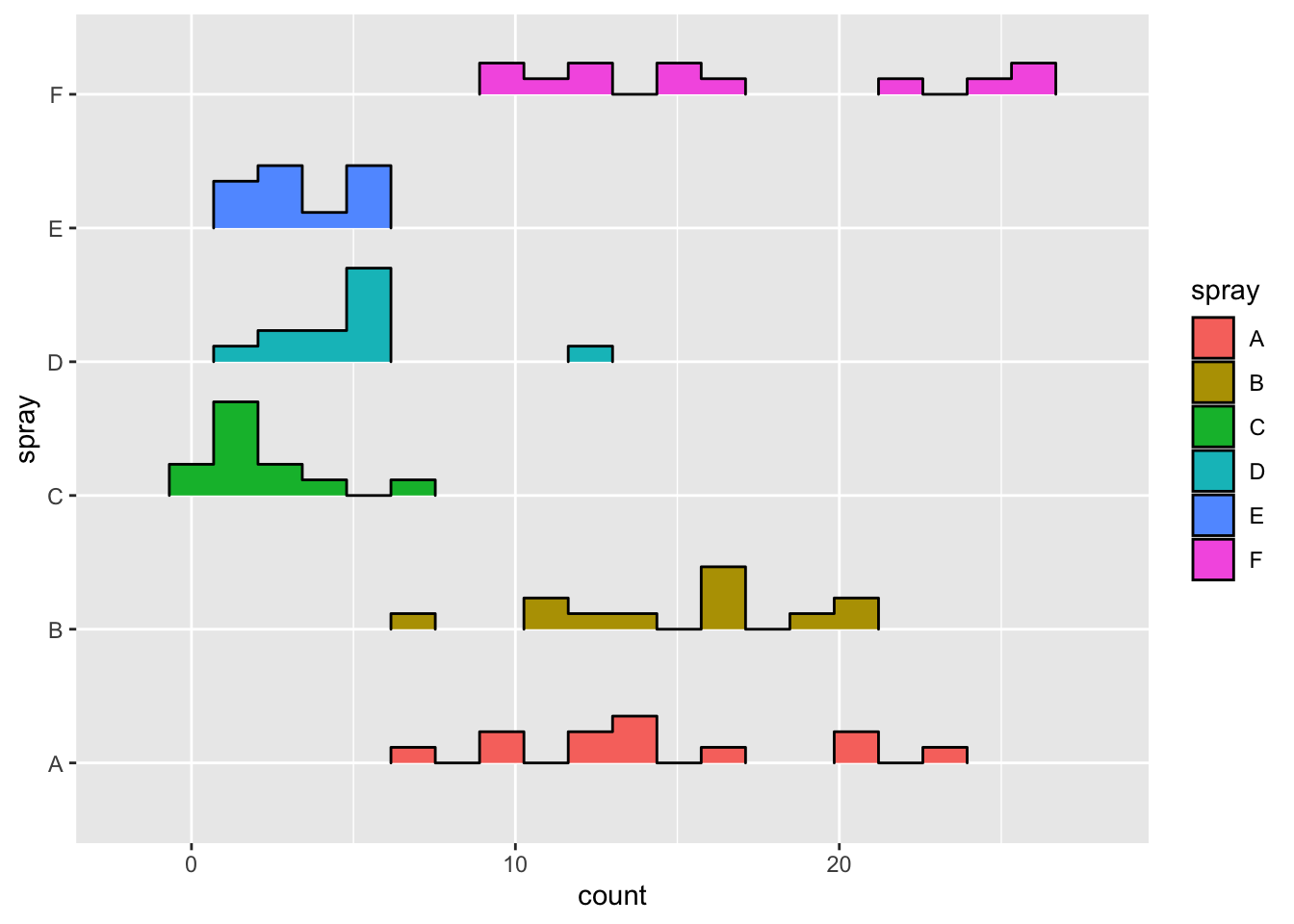
If the same thing is done in ridgeline plots, it gives better results.
library("ggridges")
library("tidyverse")
ggplot(InsectSprays, aes(x=count,y=spray,fill=spray))+
  geom_density_ridges_gradient() + theme_ridges()+
  labs(x="Count of Insects",y="Types of Spray")+
  ggtitle("The counts of insects treated with different insecticides.")+
  theme(plot.title = element_text(hjust = 0.5))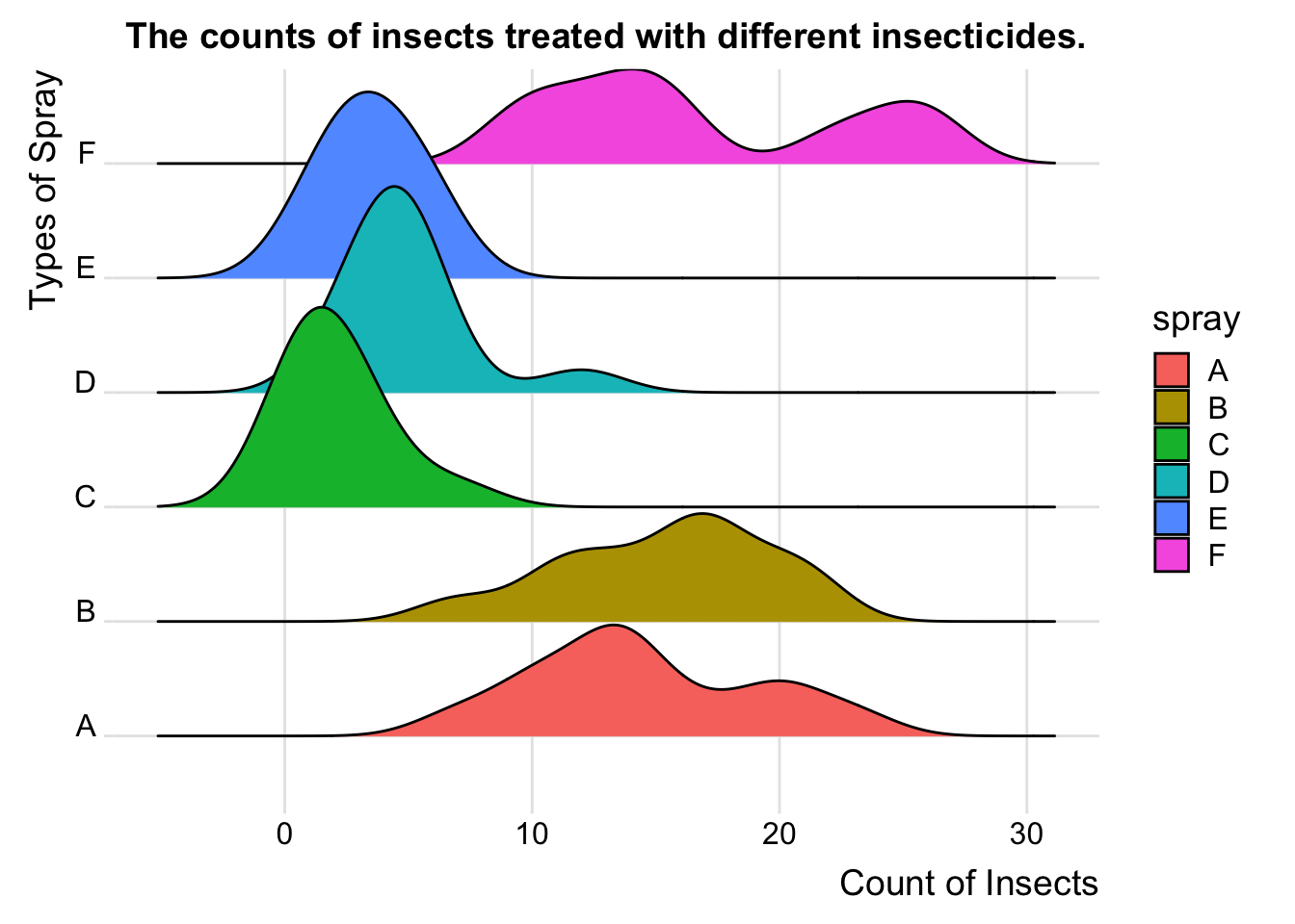
8.7 External Resources
Introduction to ggridges: An excellent collection of code examples on how to make ridgeline plots with
ggplot2. Covers every parameter of ggridges and how to modify them for better visualization. If you want a ridgeline plot to look a certain way, this article will help.Article on ridgeline plots with ggplot2: Few examples using different examples. Great for starting with ridgeline plots.
History of Ridgeline plots: To refer to the theory of ridgeline plots.
with