15 Chart: Mosaic
 This chapter originated as a community contribution created by harin
This page is a work in progress. We appreciate any input you may have. If you would like to help improve this page, consider contributing to our repo.
df = read_csv("data/MusicIcecream.csv")15.1 Overview
Mosaic plots take some investment to learn to read and draw properly. Particularly when starting out, we recommend drawing them incrementally: start with splitting on one variable and then add additional variables one at a time. The full mosaic plot will have one split per variable.
Important: if your data has a frequency column, as in the example below, the count column must be called Freq. (Tables and matrices also work, see ?vcd::structable for more details.)
Also note that all of these plots are drawn with vcd::mosaic() not the base R function, mosaicplot().
The data:
df## # A tibble: 8 × 4
## Age Music Favorite Freq
## <chr> <chr> <chr> <dbl>
## 1 old classical bubble gum 1
## 2 old rock bubble gum 1
## 3 old classical coffee 3
## 4 old rock coffee 1
## 5 young classical bubble gum 2
## 6 young rock bubble gum 5
## 7 young classical coffee 1
## 8 young rock coffee 0Split on Age only:
vcd::mosaic(~Age, df)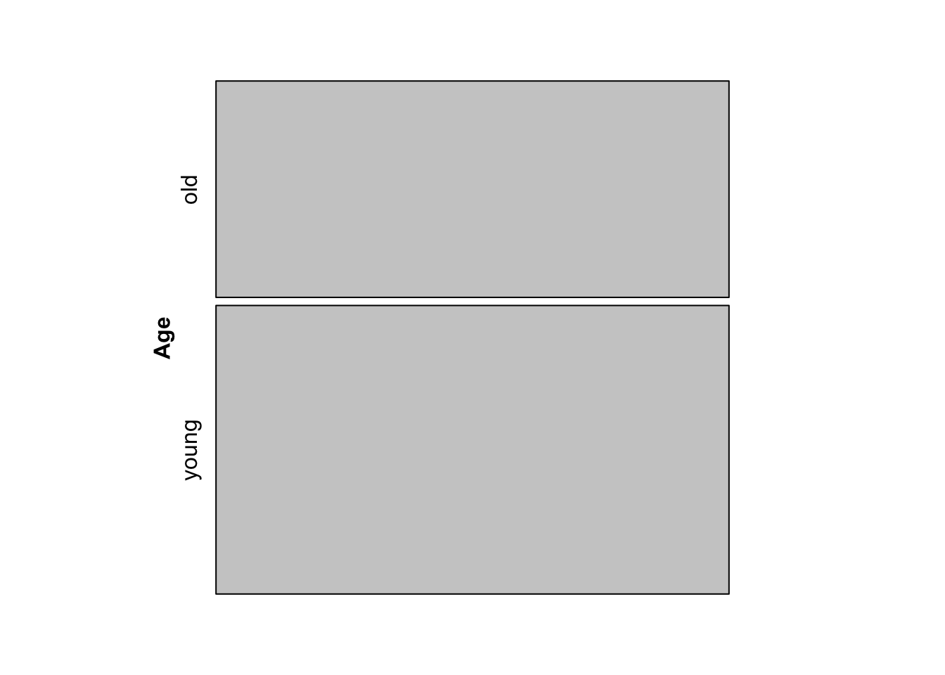
Split on Age, then Music:
vcd::mosaic(Music ~ Age, df)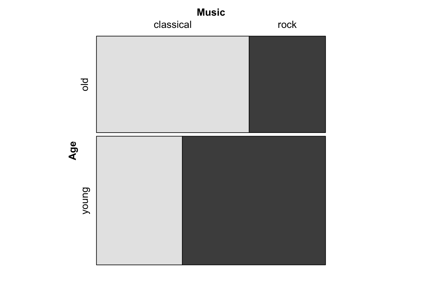
Note that the first split is between “young” and “old”, while the second set of splits divides each age group into “classical” and “rock”.
Split on Age, then Music, then Favorite:
vcd::mosaic(Favorite ~ Age + Music, df)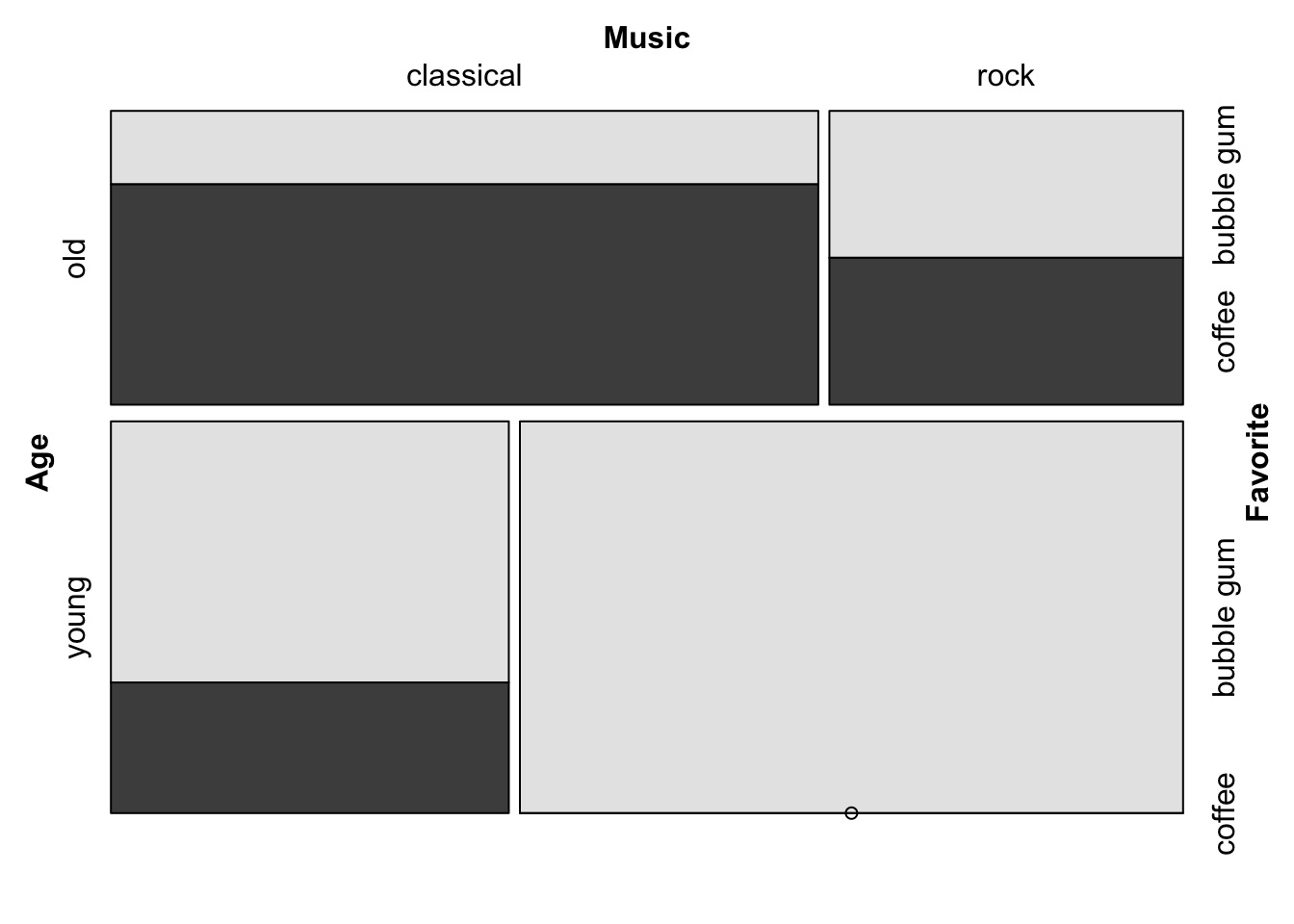
15.2 Direction of splits
Note that in the previous example, the direction of the splits is as follows:
Age– horizontal splitMusic– vertical splitFavorite– horizontal split
This is the default direction pattern: alternating directions beginning with horizontal. Therefore we get the same plot with the following:
vcd::mosaic(Favorite ~ Age + Music,
       direction = c("h", "v", "h"), df)
The directions can be altered as desired. For example, to create a doubledecker plot, make all splits vertical except the last one:
vcd::mosaic(Favorite ~ Age + Music,
       direction = c("v", "v", "h"), df)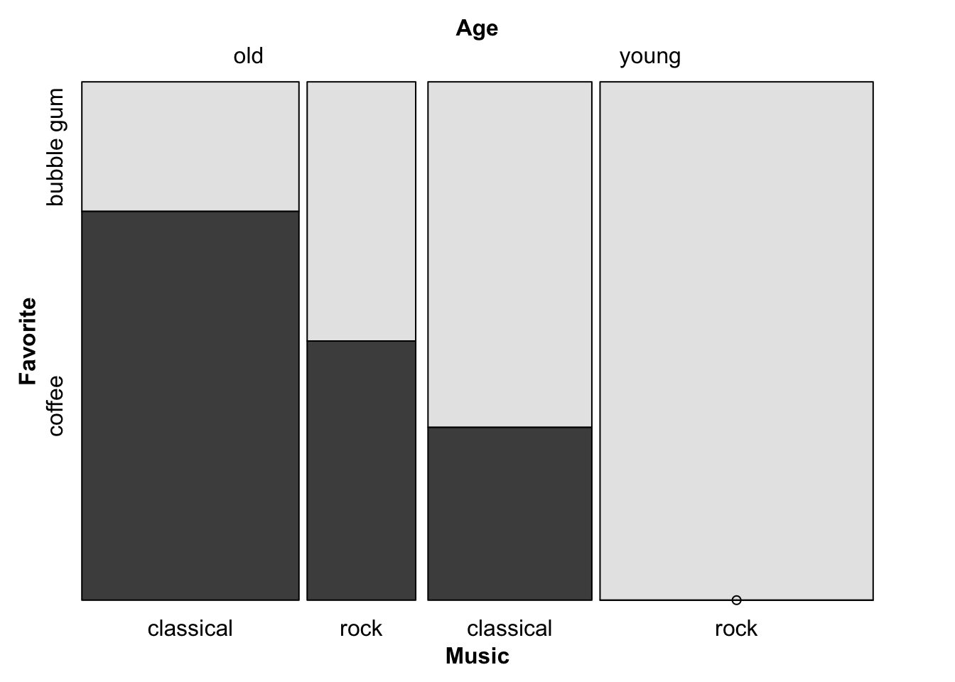
Note that the direction vector is in order of splits (Age, Music, Favorite), not in the order in which the variables appear in the formula, where the last variable to be split is listed first, before the “~”.
15.3 Fill color
Fill colors are applied and recycled according to the last cut dimension, i.e. the dependent variable–in this case favorite flavor ice cream. (If this is not working properly, update to the latest version of vcd.
vcd::mosaic(Favorite ~ Age + Music,
       highlighting_fill = c("grey90", "cornflowerblue"),
       df)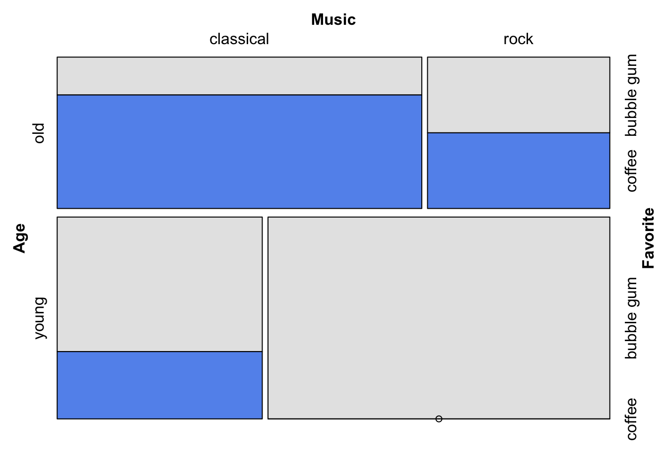
15.4 Labels
For official documentation on labeling options, see Labeling in the Strucplot Framework
15.4.1 Rotate labels
The rot_labels = vector sets the rotation in degrees on the four sides of the plot–not on variable split order–in this order: top, right, bottom, left. (Different from the typical base graphics order!) The default is rot_labels = c(0, 90, 0, 90).
vcd::mosaic(Favorite ~ Age + Music,
       labeling = vcd::labeling_border(rot_labels = c(45, -45, 0, 0)),
       df)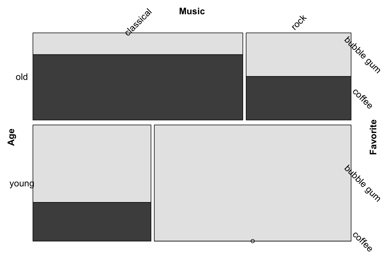
15.4.2 Abbreviate labels
Labels are abbreviated in the order of the splits (as for direction =). The abbreviation algorithm appears to return the specified number of characters after vowels are eliminated (if necessary).
For more formatting options, see >?vcd::labeling_border.
vcd::mosaic(Favorite ~ Age + Music,
       labeling = vcd::labeling_border(abbreviate_labs = c(3, 1, 6)),
       df)
15.5 Cell spacing
vcd::mosaic(Favorite ~ Age + Music,
       spacing = vcd::spacing_equal(sp = unit(0, "lines")),
       df)
For more details, see >?vcd::spacings
15.5.1 Mosaic using vcd::doubledecker
data(Arthritis, package = "vcd")
vcd::doubledecker(Improved ~ Treatment + Sex, data=Arthritis)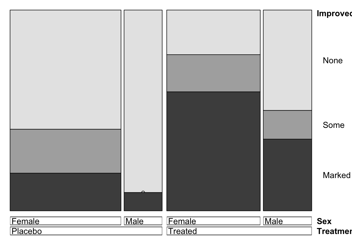
vcd::doubledecker(Music ~ Favorite + Age,
                  xtabs(Freq ~ Age + Music + Favorite, df))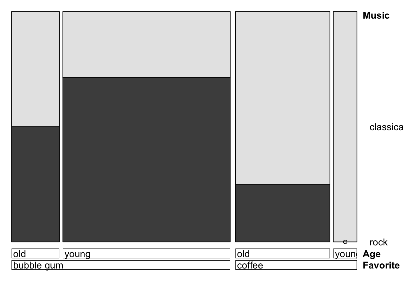
15.6 Mosaic using ggplot
To create mosaic plots in the ggplot2 framework, use geom_mosaic() which is available in the ggmosaic package:
https://cran.r-project.org/web/packages/ggmosaic/vignettes/ggmosaic.html
15.7 Theory
15.8 When to use
When you want to see the relationships in Multivariate Categorical Data
15.9 Considerations
15.9.1 Labels
Legibility of the labels is problematic in mosaic plot especially when there are a lot of dimensions. This can be alleviated by - Abbreviate names - Rotating the labels
15.9.2 Aspect Ratio
- lengths are easier to judge than area, so try to use rectangles with same width or height
- Taller thinner rectangles are better (we are better at distinguishing length than area)
15.9.3 Gaps between rectangles
- No gap = most efficient
However, a gap can help improve legibility, so try out different combinations
- Can have a gap at splits
- Can Vary gap size down the hierarchy
15.9.4 Color
- good for rates in the subgroup
- displaying residual
- emphasizing particular subgroup
15.10 External resources
Chapter 7 of Graphical data analysis with R by Anthony Unwin
Link: A comprehensive overview of mosaic plot in ggplot check out the link below.
with