19 Time Series
 This chapter originated as a community contribution created by HaiqingXu
This page is a work in progress. We appreciate any input you may have. If you would like to help improve this page, consider contributing to our repo.
19.1 Overview
This section discusses drawing graphics for time series data.
19.2 Single/Multiple Time Series
We can draw time series using geom_line() with time on the x-axis. X-axis should be an object in the Date class, assuming there is no hour/minute/second data.
library(tidyverse)

ggplot(data = economics, aes(x = date, y = pop))+
  geom_line(color = "blue") +
  ggtitle("US Population, in Thousands") +
  labs(x = "year", y = "population")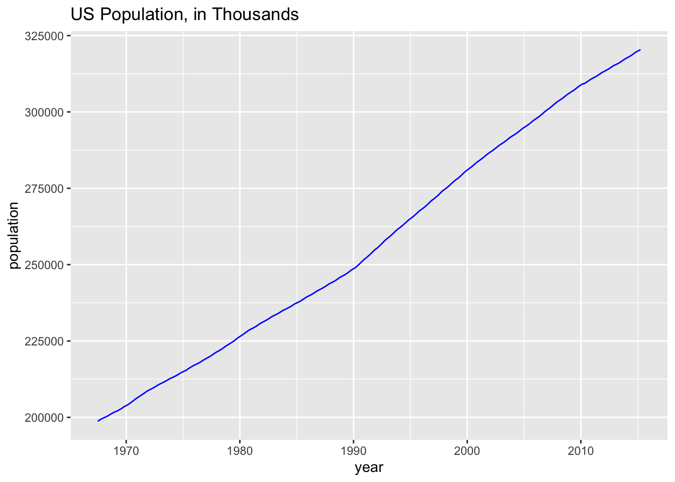
We can also draw multiple time series on one plot for comparison purpose:
df <- read_csv("data/mortgage.csv")
df <- df %>% gather(key = TYPE, value = RATE, -DATE) %>%
  mutate(TYPE = forcats::fct_reorder2(TYPE, DATE, RATE)) # puts legend in correct order


g <- ggplot(df, aes(DATE, RATE, color = TYPE)) + geom_line() +
    ggtitle("U.S. Mortgage Rates") +
    labs (x = "", y = "percent") +
    theme_grey(16) +
    theme(legend.title = element_blank())
g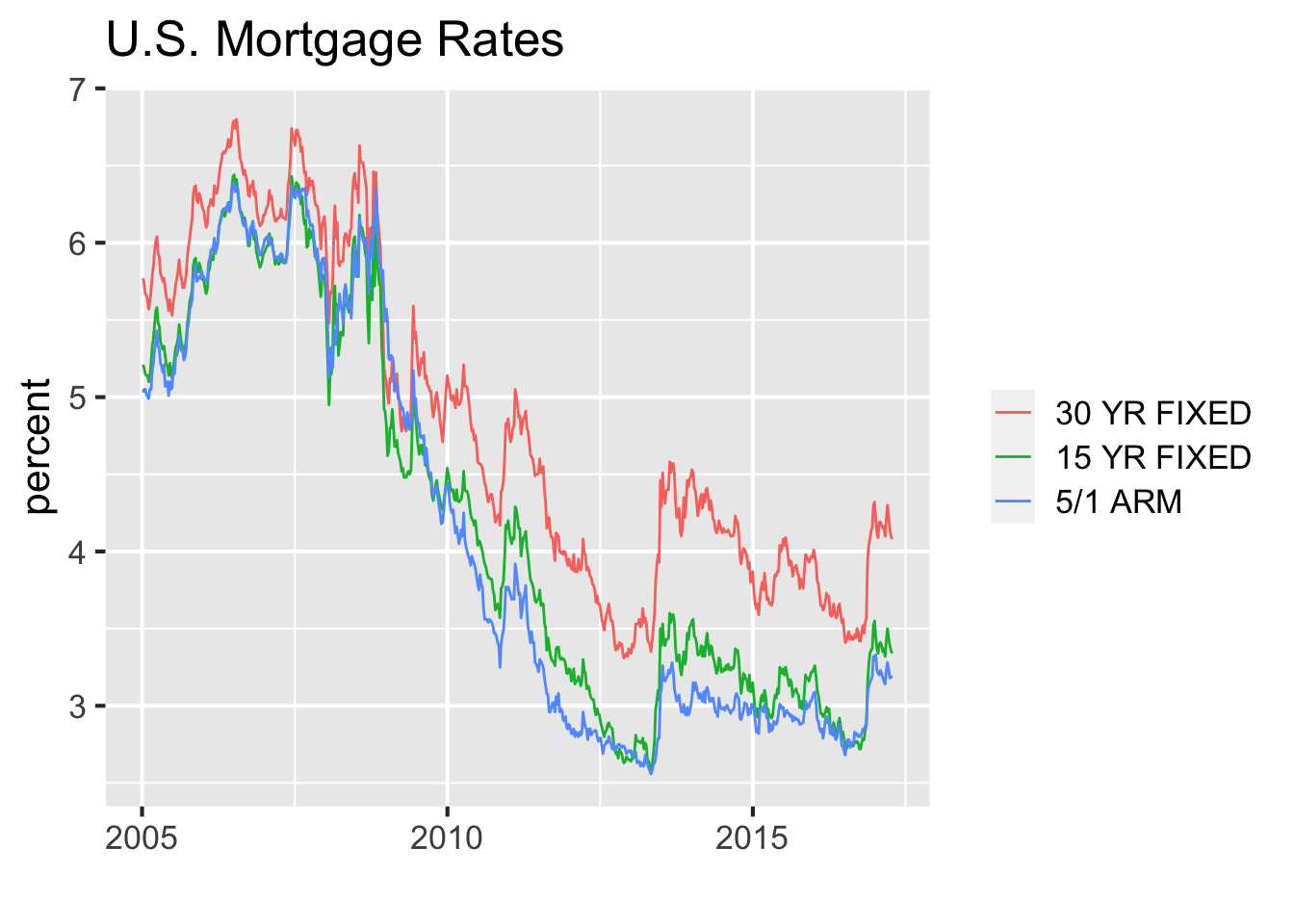
The following exmaple shows the closing price for four big technology companies in the US. When analyzing GDP, salary level and stock prices, it is often difficult to compare trends since the scales are so different. For example, since AAPL and MSFT prices per share are so much lower than GOOG’s price per share, it’s hard to discern the trends:
library(tidyquant)
stocks <- c("AAPL", "GOOG", "IBM", "MSFT")
df <- tq_get(stocks, from = as.Date("2013-01-01"),
             to = as.Date("2013-12-31"))

ggplot(df, aes(date, y = close,
               color = fct_reorder2(symbol, date, close))) +
  geom_line() + xlab("") + ylab("") +
  theme(legend.title = element_blank())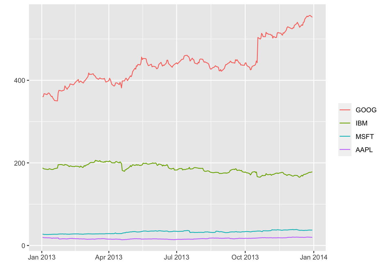
In such a case, it can be helpful to rescale the data. We rescaled the data to make sure these four stocks have a price of 100 on Jan 2013:
df <- df %>% group_by(symbol) %>%
  mutate(rescaled_close = 100*close / close[1])

ggplot(df, aes(date, y = rescaled_close,
               color = fct_reorder2(symbol, date, rescaled_close))) +
  geom_line() + xlab("") + ylab("") +
  theme(legend.title = element_blank())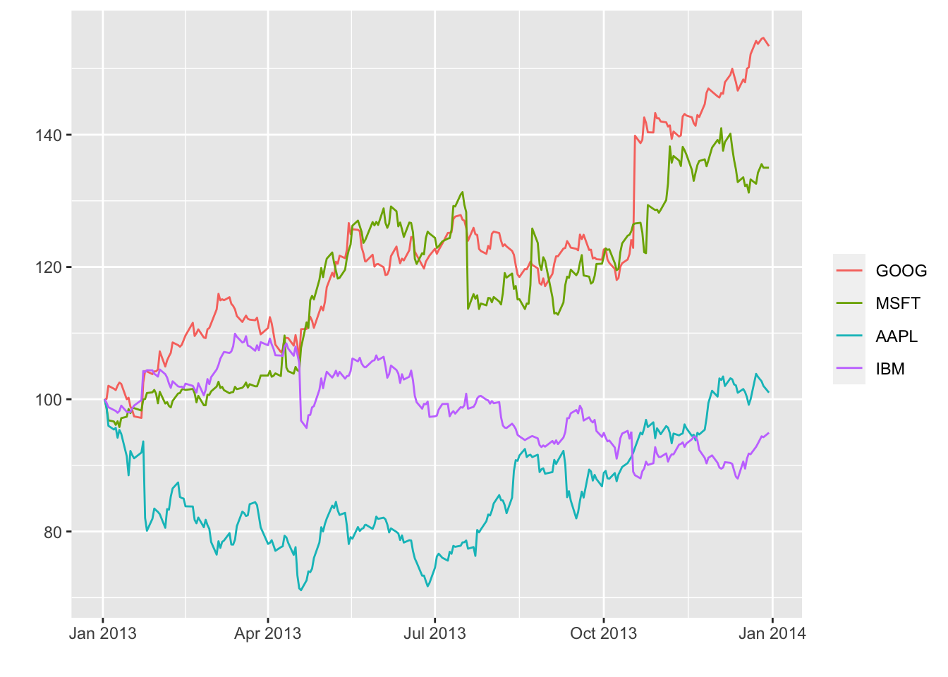
19.3 Secular Trend
Instead of looking at observations over time, we often want to ovserve overall long-term trend in our time series data. In this case, we can use geom_smooth(). Here we will show secular trend using the Loess Smoother.
AAPL <- df %>% filter(symbol == "AAPL")

g <- ggplot(AAPL, aes(date, close)) + geom_point()

g + geom_line(color = "grey50") +
    geom_smooth(method = "loess", se = FALSE, lwd = 1.5) +
    ggtitle("Loess Smoother for Apple Stock Price") +
    labs(x = "Date", y = "Price")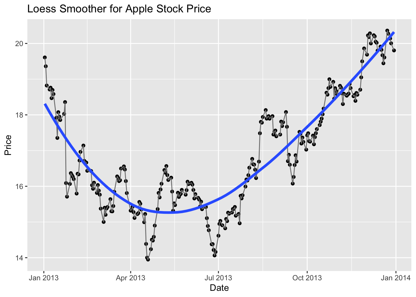
Experiment with different smoothing parameters.
g + geom_smooth(method = "loess", span = .5, se = FALSE)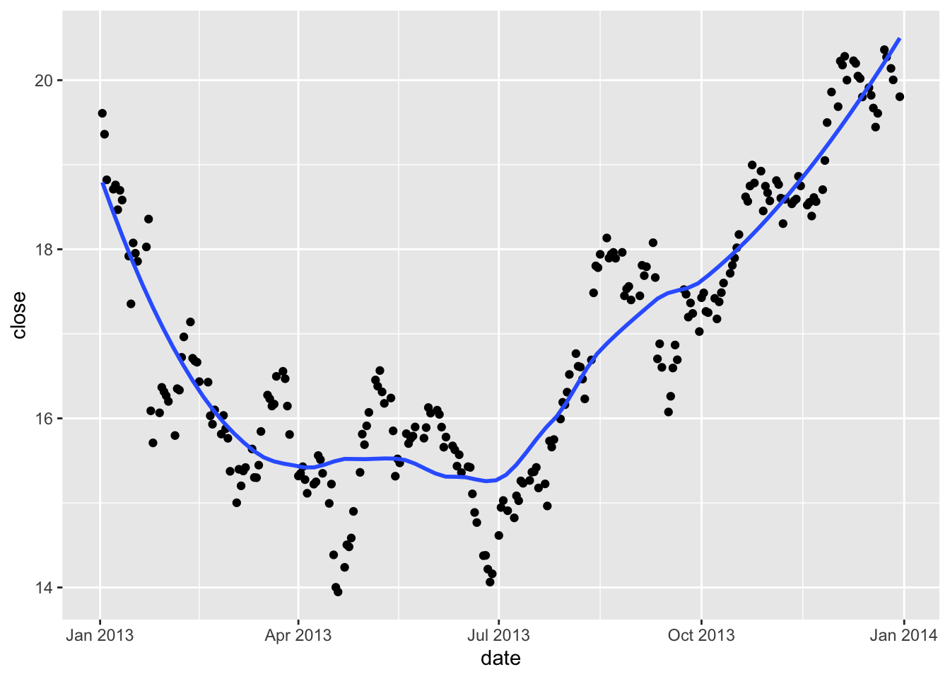
19.4 Seasonal Trends
In addition to secular trends, there are also seasonal trends in time series data. One way is to visualize seasonal trends is to use fact on season(day of month, day of week etc.).
library(lubridate)
dfman <- read_csv("data/ManchesterByTheSea.csv")
ggplot(dfman, aes(Date, Gross)) +
  geom_line() +
  facet_wrap(~wday(Date, label = TRUE), ncol = 1, strip.position="right")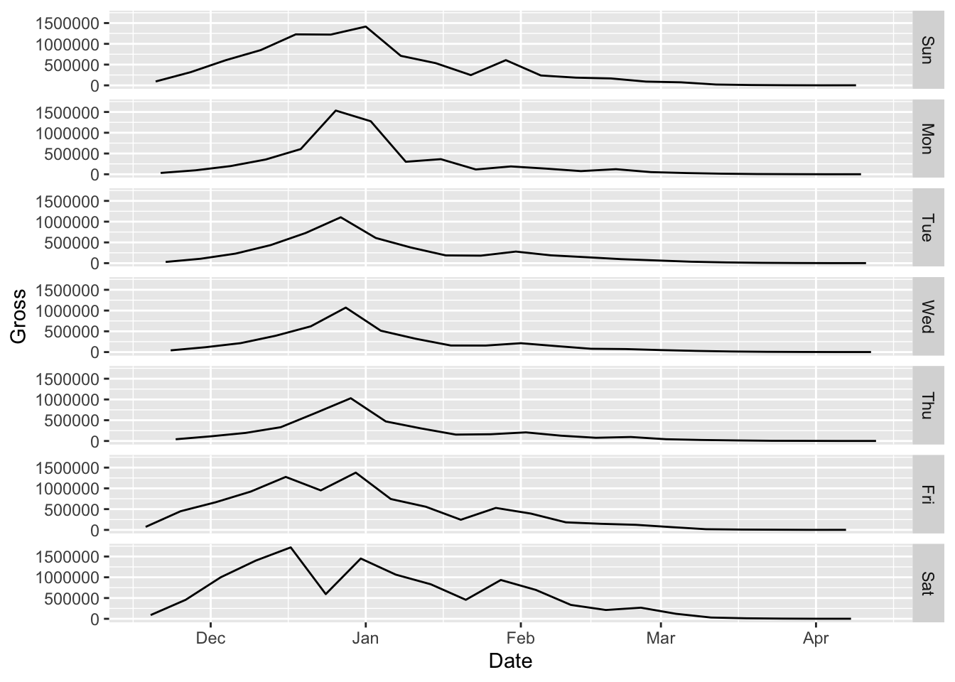
Or, let us create a monthly plot.
monthplot(AirPassengers)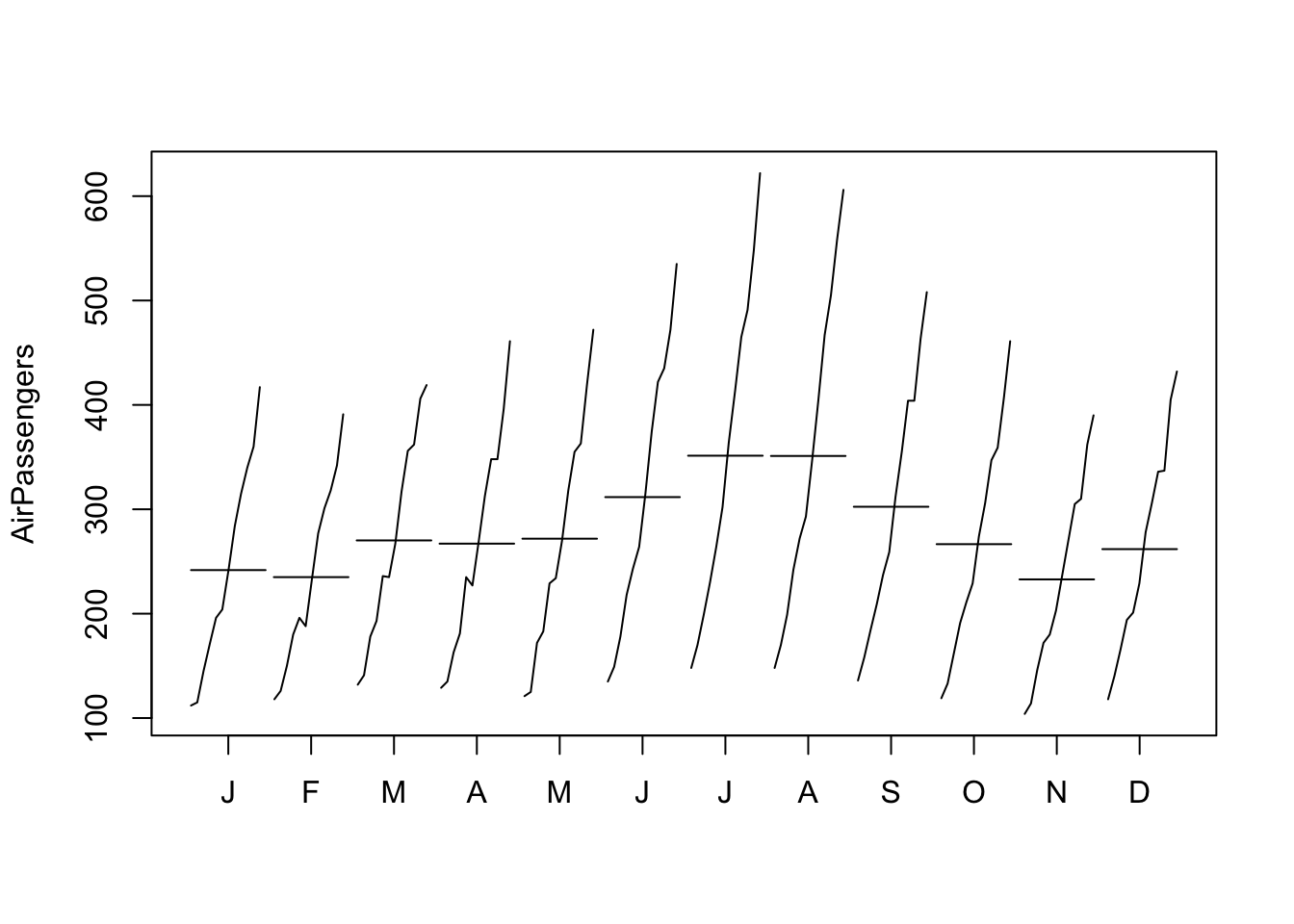
19.5 Frequency of Data
What if you want to observe the frequency of time series data? A simple answer: use geom_point() in addition to geom_line().
# read file
mydat <- read_csv("data/WA_Sales_Products_2012-14.csv") %>%
  mutate(Revenue = Revenue/1000000)

# convert Quarter to a single numeric value Q
mydat$Q <- as.numeric(substr(mydat$Quarter, 2, 2))

# convert Q to end-of-quarter date
mydat$Date <- as.Date(paste0(mydat$Year, "-",
                             as.character(mydat$Q*3),
                             "-30"))

Methoddata <- mydat %>% group_by(Date, `Order method type`) %>%
    summarize(Revenue = sum(Revenue))

g <- ggplot(Methoddata, aes(Date, Revenue,
                            color = `Order method type`)) +
    geom_line(aes(group = `Order method type`)) +
    scale_x_date(limits = c(as.Date("2012-02-01"), as.Date("2014-12-31")),
        date_breaks = "6 months", date_labels = "%b %Y") +
  ylab("Revenue in mil $")
g + geom_point()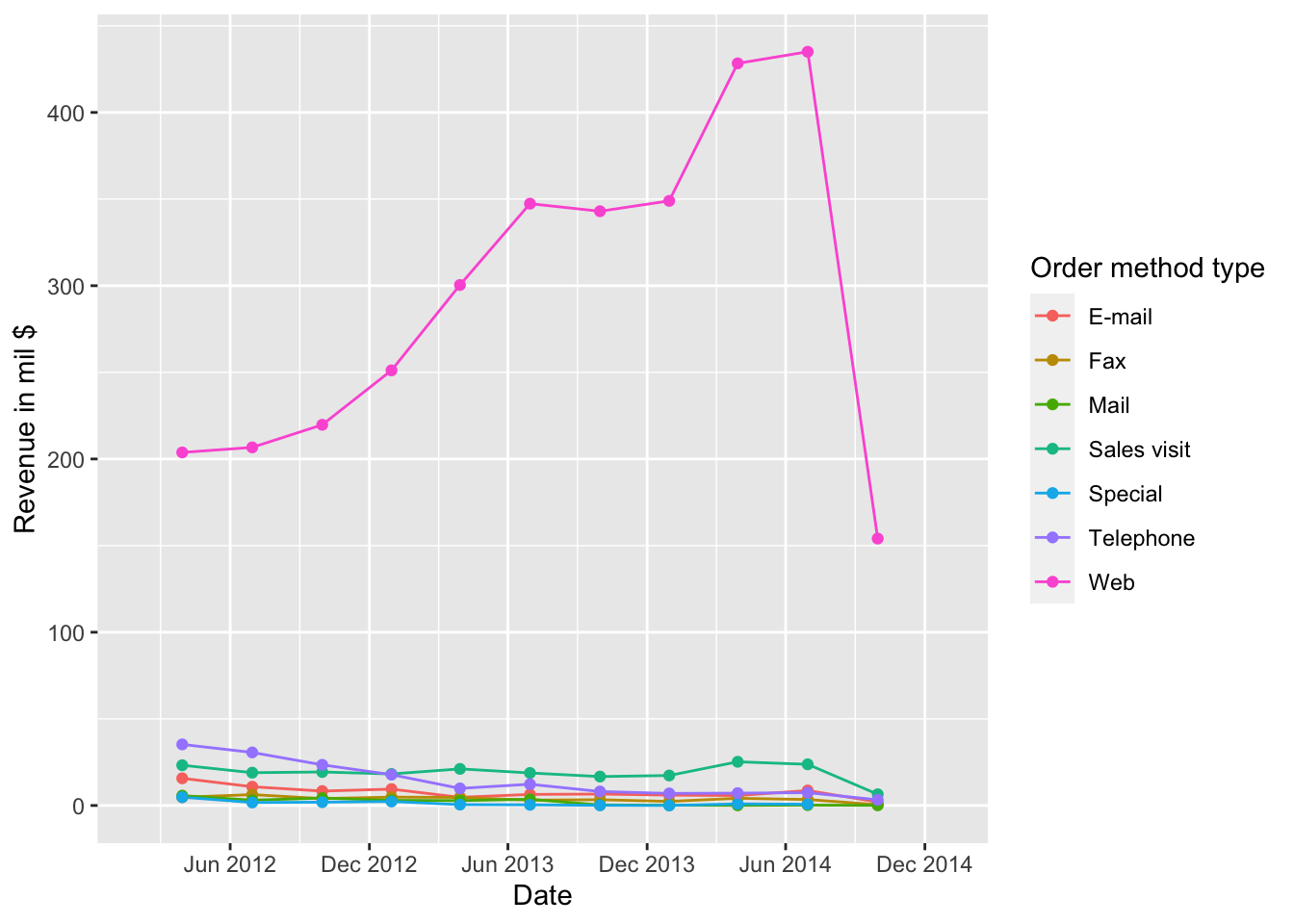
There could be NA values in time series data. Using geom_point() with geom_line() is one way to detect missing values. Here we introduce another option: leave gaps.
Methoddata$Date[year(Methoddata$Date)==2013] <- NA
g <- ggplot(Methoddata, aes(Date, Revenue,
                            color = `Order method type`)) +
    geom_path(aes(group = `Order method type`)) +
    scale_x_date(limits = c(as.Date("2012-02-01"), as.Date("2014-12-31")),
        date_breaks = "6 months", date_labels = "%b %Y") +
  ylab("Revenue in mil $")
g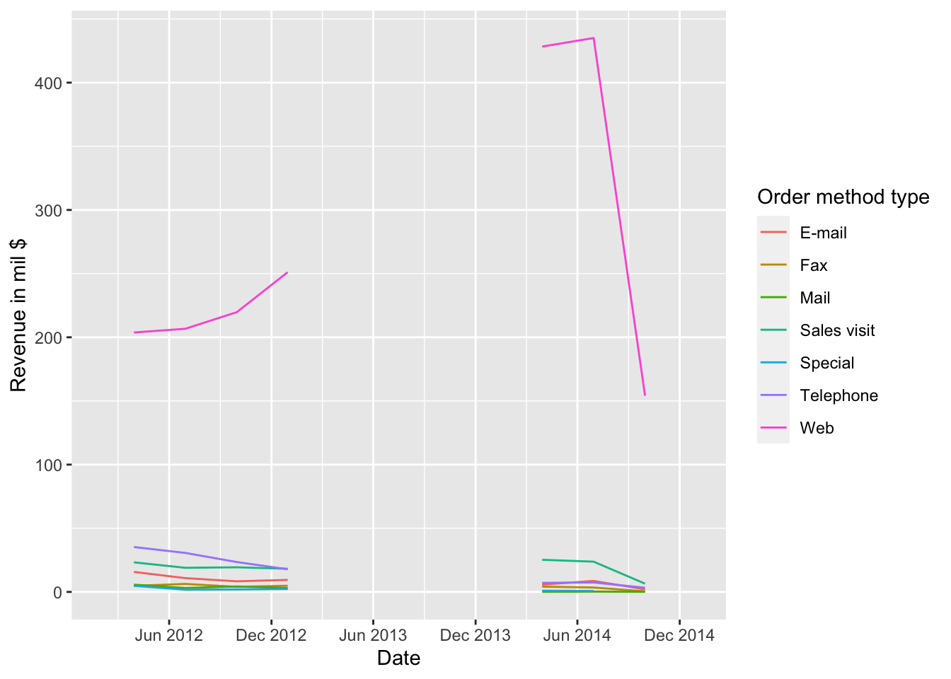
with