9 Chart: QQ-Plot
 This chapter originated as a community contribution created by hao871563506
This page is a work in progress. We appreciate any input you may have. If you would like to help improve this page, consider contributing to our repo.
9.1 Introduction
In statistics, a Q-Q (quantile-quantile) plot is a probability plot, which is a graphical method for comparing two probability distributions by plotting their quantiles against each other. A point (x, y) on the plot corresponds to one of the quantiles of the second distribution (y-coordinate) plotted against the same quantile of the first distribution (x-coordinate). Thus the line is a parametric curve with the parameter which is the number of the interval for the quantile.
9.2 Interpreting qqplots
9.3 Normal or not (examples using qqnorm)
9.3.1 Normal qqplot
x <- rnorm(1000, 50, 10)
qqnorm(x)
qqline(x, col = "red")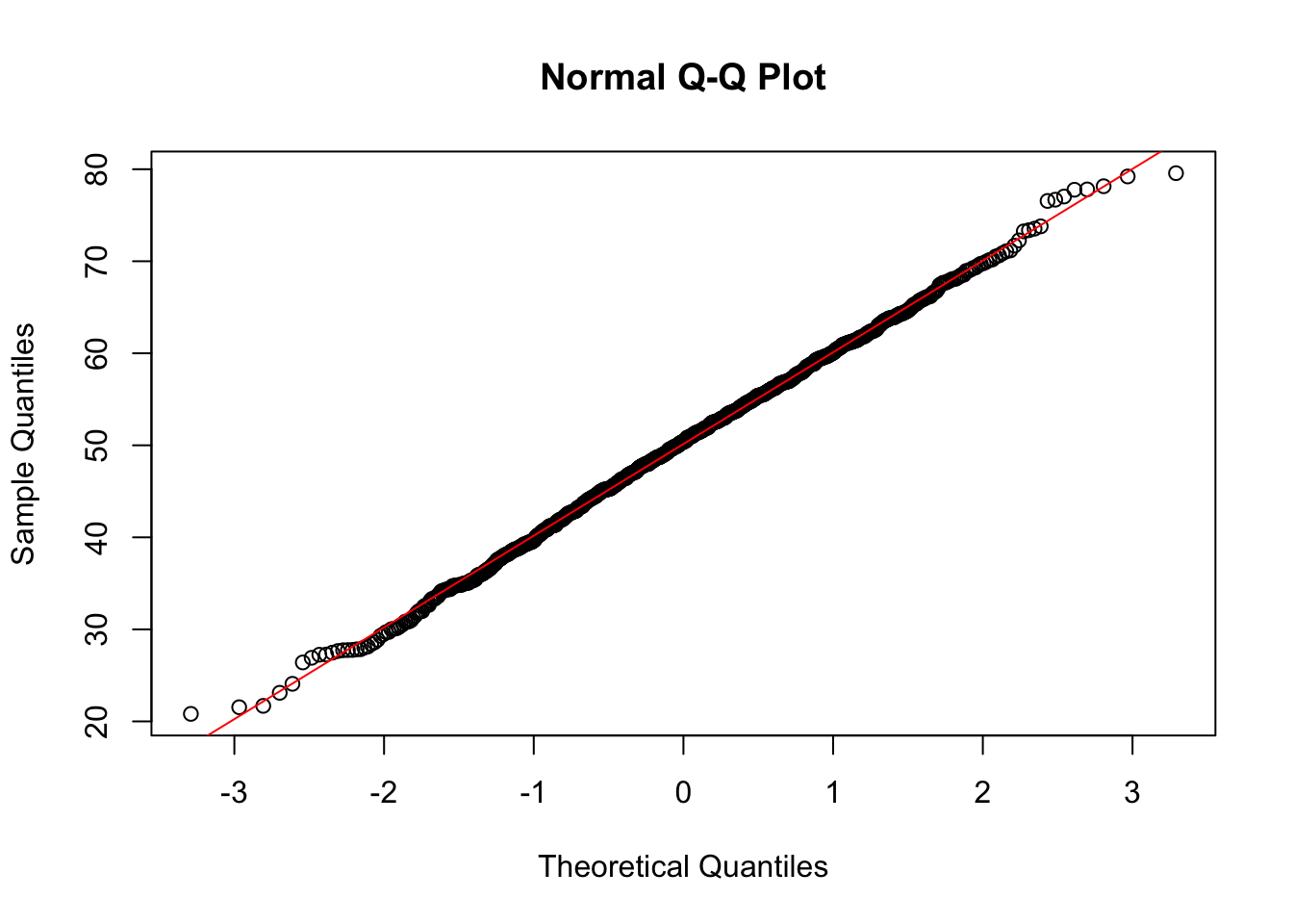
The points seem to fall along a straight line. Notice the x-axis plots the theoretical quantiles. Those are the quantiles from the standard Normal distribution with mean 0 and standard deviation 1.
9.3.2 Non-normal qqplot
x <- rexp(1000, 5)
qqnorm(x)
qqline(x, col = "red")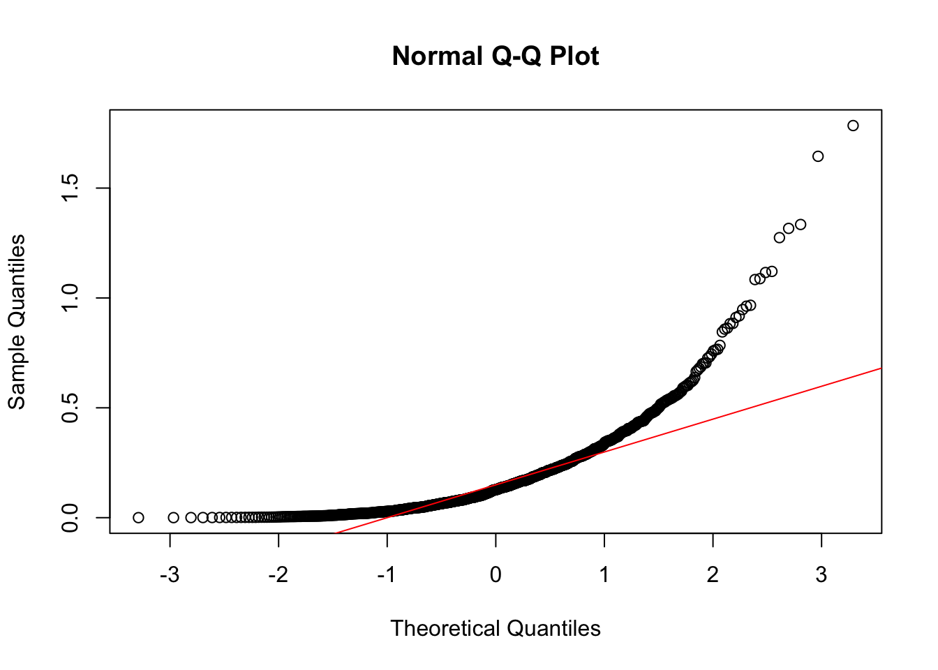
Notice the points form a curve instead of a straight line. Normal Q-Q plots that look like this usually mean your sample data are skewed.
9.4 Different kinds of qqplots
The following graph is a conclusion of all the kinds of qqplot:
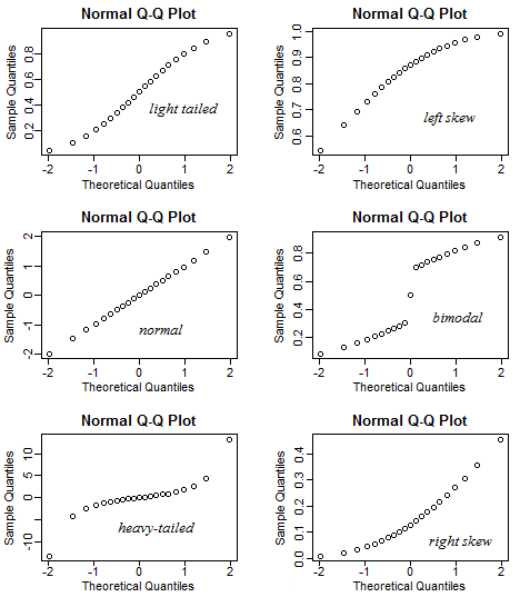 via Stack Exchange
Normal qqplot: The normal distribution is symmetric, so it has no skew (the mean is equal to the median).
Right skewed qqplot: Right-skew is also known as positive skew.
Left skewed qqplot: Left-skew is also known as negative skew.
Light tailed qqplot: meaning that compared to the normal distribution there is little more data located at the extremes of the distribution and less data in the center of the distribution.
Heavy tailed qqplot: meaning that compared to the normal distribution there is much more data located at the extremes of the distribution and less data in the center of the distribution.
Biomodel qqplot: illustrate a bimodal distribution.
9.5 qqplot using ggplot
In order to use ggplot2 to plot a qqplot, we must use a dataframe, so here we convert it to one. We can see that using ggplot to plot a qqplot has a similar outcome as using qqnorm
library(ggplot2)
x <- rnorm(1000, 50, 10)
x <- data.frame(x)
ggplot(x, aes(sample = x)) +
  stat_qq() +
  stat_qq_line()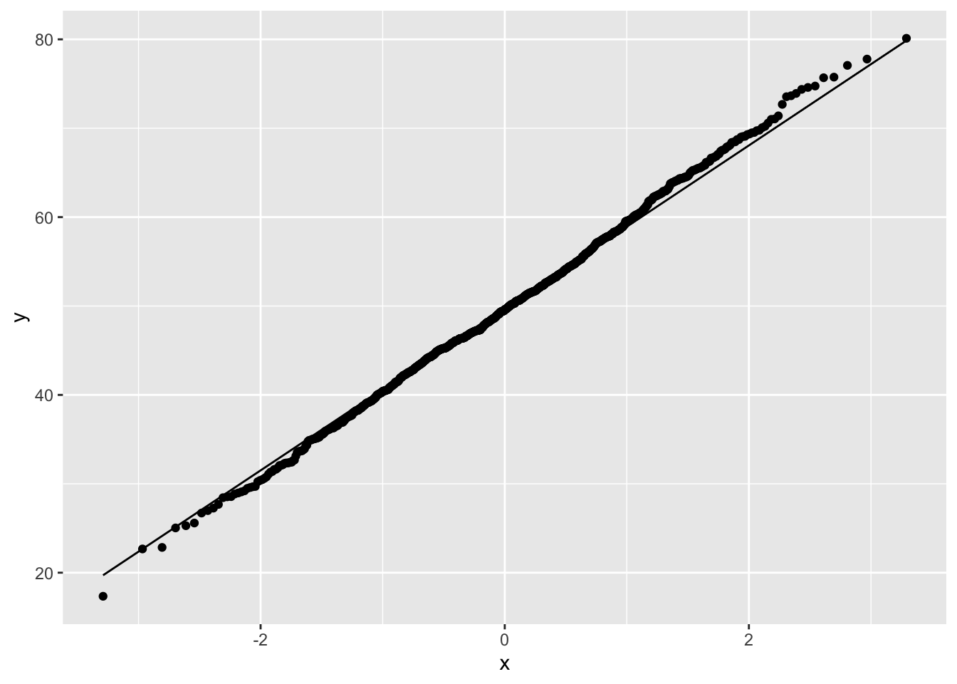
However, when we need to plot different groups, ggplot will be very helpful with its coloring by factor.
library(ggplot2)
ggplot(mtcars, aes(sample = mpg, colour = factor(cyl))) +
  stat_qq() +
  stat_qq_line()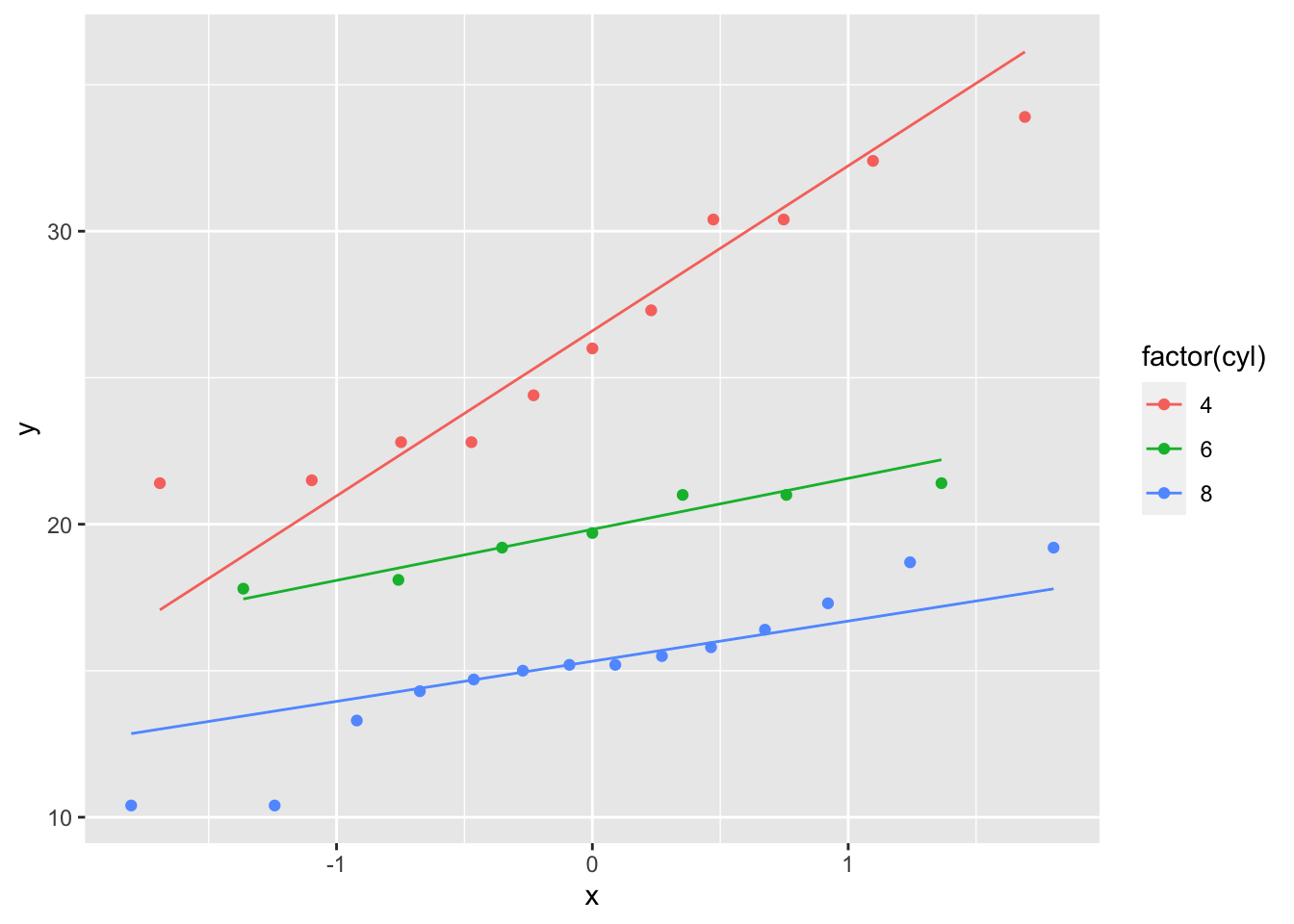
9.6 References
- Understanding Q-Q Plots: A discussion from the University of Virginia Library on qqplots.
- How to interpret a QQ plot: Another resource for interpreting qqplots.
- A QQ Plot Dissection Kit: An excellent walkthrough on qqplots by Sean Kross.
- Probability plotting methods for the analysis of data: Paper on plotting techniques, which discusses qqplots. (Wilk, M.B.; Gnanadesikan, R. (1968))
- QQ-Plot Wiki: Wikipedia entry on qqplots
with