12 Chart: Scatterplot

12.1 Overview
This section covers how to make scatterplots
12.2 tl;dr
Fancy Example NOW! Gimme Gimme GIMME!
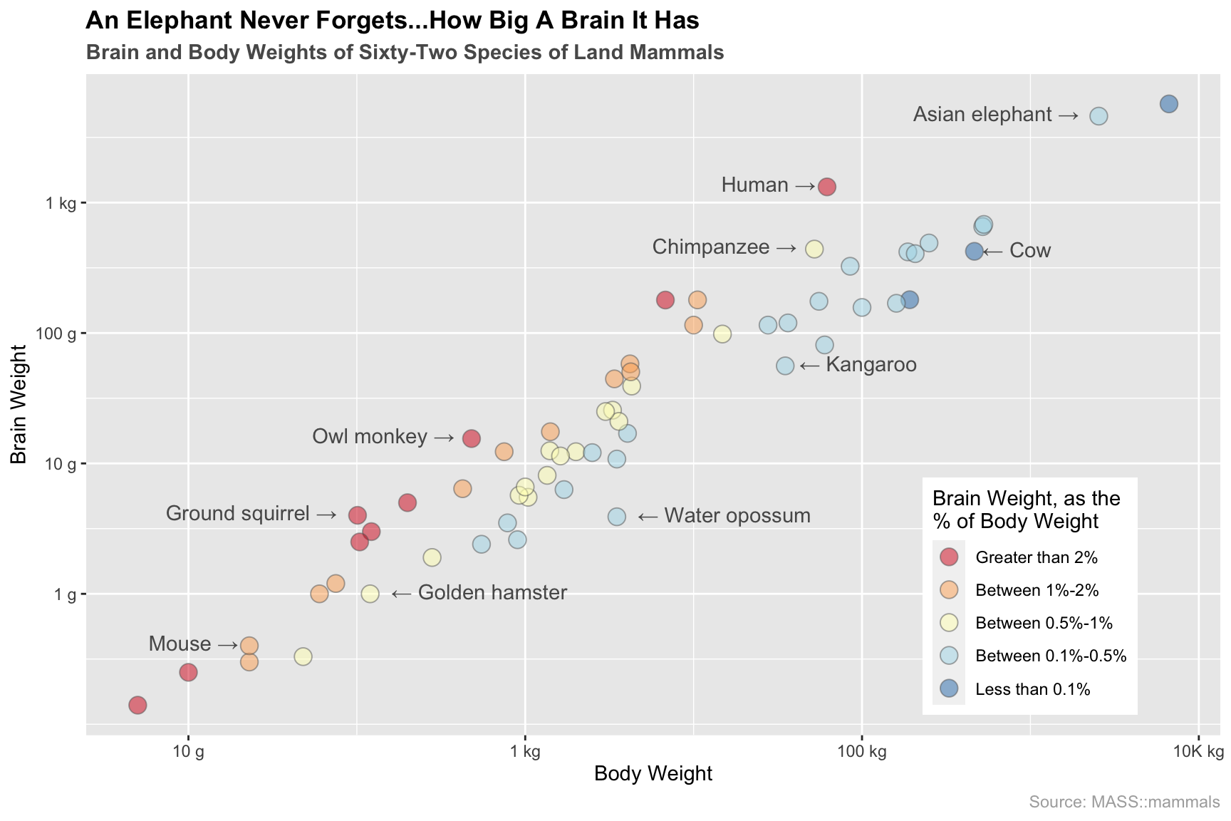
Here’s a look at the relationship between brain weight vs. body weight for 62 species of land mammals:
And here’s the code:
library(ggplot2) # plotting
mammals <- MASS::mammals

# ratio for color choices
ratio <- mammals$brain / (mammals$body*1000)

ggplot(mammals, aes(x = body, y = brain)) +
  # plot points, group by color
  geom_point(aes(fill = ifelse(ratio >= 0.02, "#0000ff",
                   ifelse(ratio >= 0.01 & ratio < 0.02, "#00ff00",
                   ifelse(ratio >= 0.005 & ratio < 0.01, "#00ffff",
                   ifelse(ratio >= 0.001 & ratio < 0.005, "#ffff00", "#ffffff"))))),
             col = "#656565", alpha = 0.5, size = 4, shape = 21) +
  # add chosen text annotations
  geom_text(aes(label = ifelse(row.names(mammals) %in% c("Mouse", "Human", "Asian elephant", "Chimpanzee", "Owl monkey", "Ground squirrel"),
                               paste(as.character(row.names(mammals)), "→", sep = " "),'')),
            hjust = 1.12, vjust = 0.3, col = "grey35") +
  geom_text(aes(label = ifelse(row.names(mammals) %in% c("Golden hamster", "Kangaroo", "Water opossum", "Cow"),
                               paste("←", as.character(row.names(mammals)), sep = " "),'')),
            hjust = -0.12, vjust = 0.35, col = "grey35") +
  # customize legend/color palette
  scale_fill_manual(name = "Brain Weight, as the\n% of Body Weight",
                    # values = c('#e66101','#fdb863','#b2abd2','#5e3c99'),
                    values = c('#d7191c','#fdae61','#ffffbf','#abd9e9','#2c7bb6'),
                    breaks = c("#0000ff", "#00ff00", "#00ffff", "#ffff00", "#ffffff"),
                    labels = c("Greater than 2%", "Between 1%-2%", "Between 0.5%-1%", "Between 0.1%-0.5%", "Less than 0.1%")) +
  # formatting
  scale_x_log10(name = "Body Weight", breaks = c(0.01, 1, 100, 10000),
                labels = c("10 g", "1 kg", "100 kg", "10K kg")) +
  scale_y_log10(name = "Brain Weight", breaks = c(1, 10, 100, 1000),
                labels = c("1 g", "10 g", "100 g", "1 kg")) +
  ggtitle("An Elephant Never Forgets...How Big A Brain It Has",
          subtitle = "Brain and Body Weights of Sixty-Two Species of Land Mammals") +
  labs(caption = "Source: MASS::mammals") +
  theme(plot.title = element_text(face = "bold")) +
  theme(plot.subtitle = element_text(face = "bold", color = "grey35")) +
  theme(plot.caption = element_text(color = "grey68")) +
  theme(legend.position = c(0.832, 0.21))
For more info on this dataset, type ?MASS::mammals into the console.
And if you are going crazy not knowing what species is in the top right corner, it’s another elephant. Specifically, it’s the African elephant. It also never forgets how big a brain it has.
12.3 Simple examples
That was too fancy! Much simpler please!
Let’s use the SpeedSki dataset from GDAdata to look at how the speed achieved by the participants related to their birth year:
library(GDAdata)

head(SpeedSki, n = 7)
## Rank Bib FIS.Code Name Year Nation Speed Sex Event
## 1 1 61 7039 ORIGONE Simone 1979 ITA 211.67 Male Speed One
## 2 2 59 7078 ORIGONE Ivan 1987 ITA 209.70 Male Speed One
## 3 3 66 190130 MONTES Bastien 1985 FRA 209.69 Male Speed One
## 4 4 57 7178 SCHROTTSHAMMER Klaus 1979 AUT 209.67 Male Speed One
## 5 5 69 510089 MAY Philippe 1970 SUI 209.19 Male Speed One
## 6 6 75 7204 BILLY Louis 1993 FRA 208.33 Male Speed One
## 7 7 67 7053 PERSSON Daniel 1975 SWE 208.03 Male Speed One
## no.of.runs
## 1 4
## 2 4
## 3 4
## 4 4
## 5 4
## 6 4
## 7 412.3.1 Scatterplot using base R
x <- SpeedSki$Year
y <- SpeedSki$Speed
# plot data
plot(x, y, main = "Scatterplot of Speed vs. Birth Year")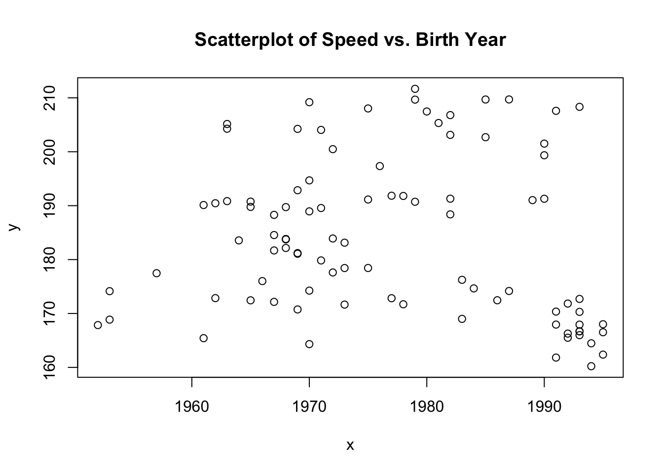
Base R scatterplots are easy to make. All you need are the two variables you want to plot. Although scatterplots can be made with categorical data, the variables you are plotting will usually be continuous.
12.3.2 Scatterplot using ggplot2
library(GDAdata) # data
library(ggplot2) # plotting

# main plot
scatter <- ggplot(SpeedSki, aes(Year, Speed)) + geom_point()

# show with trimmings
scatter +
  labs(x = "Birth Year", y = "Speed Achieved (km/hr)") +
  ggtitle("Ninety-One Skiers by Birth Year and Speed Achieved")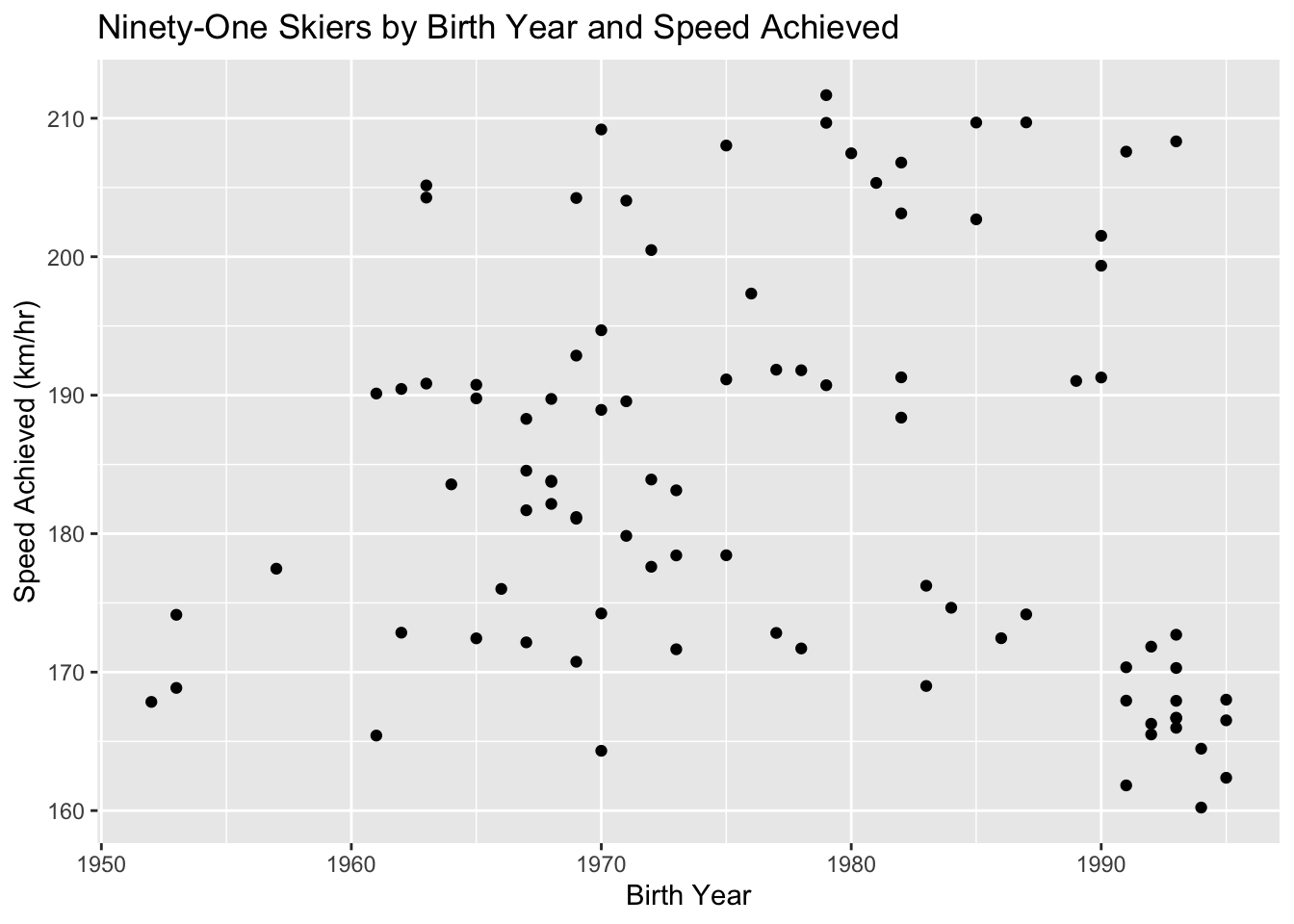
ggplot2 makes it very easy to create scatterplots. Using geom_point(), you can easily plot two different aesthetics in one graph. It also is simple to add on extra formatting to make your plots look nice (All that is really necessary is the data, the aesthetics, and the geom).
12.4 Theory
Scatterplots are very useful in understanding the correlation (or lack thereof) between variables. For example, in section 13.2 notice the positive relationship between brain and body weight in species of land mammals. The scatterplot gives a good idea of whether that relationship is positive or negative and if there’s a correlation. However, don’t mistake correlation in a scatterplot for causation!
Below we show variations on the scatterplot which can be used to enhance interpretability.
- For more info about adding lines/contours, comparing groups, and plotting continuous variables check out Chapter 5 of the textbook.
12.5 When to use
Scatterplots are great for exploring relationships between variables. Basically, if you are interested in how variables relate to each other, the scatterplot is a great place to start.
12.6 Considerations
12.6.1 Overlapping data
Data with similar values will overlap in a scatterplot and may lead to problems. Consider exploring alpha blending or jittering as remedies (links from Overlapping Data section of Iris Walkthrough).
12.6.2 Scaling
Consider how scaling can modify how your data will be perceived:
library(ggplot2)
num_points <- 100
wide_x <- c(rnorm(n = 50, mean = 100, sd = 2),
            rnorm(n = 50, mean = 10, sd = 2))
wide_y <- rnorm(n = num_points, mean = 5, sd = 2)
df <- data.frame(wide_x, wide_y)

ggplot(df, aes(wide_x, wide_y)) +
  geom_point() +
  ggtitle("Linear X-Axis")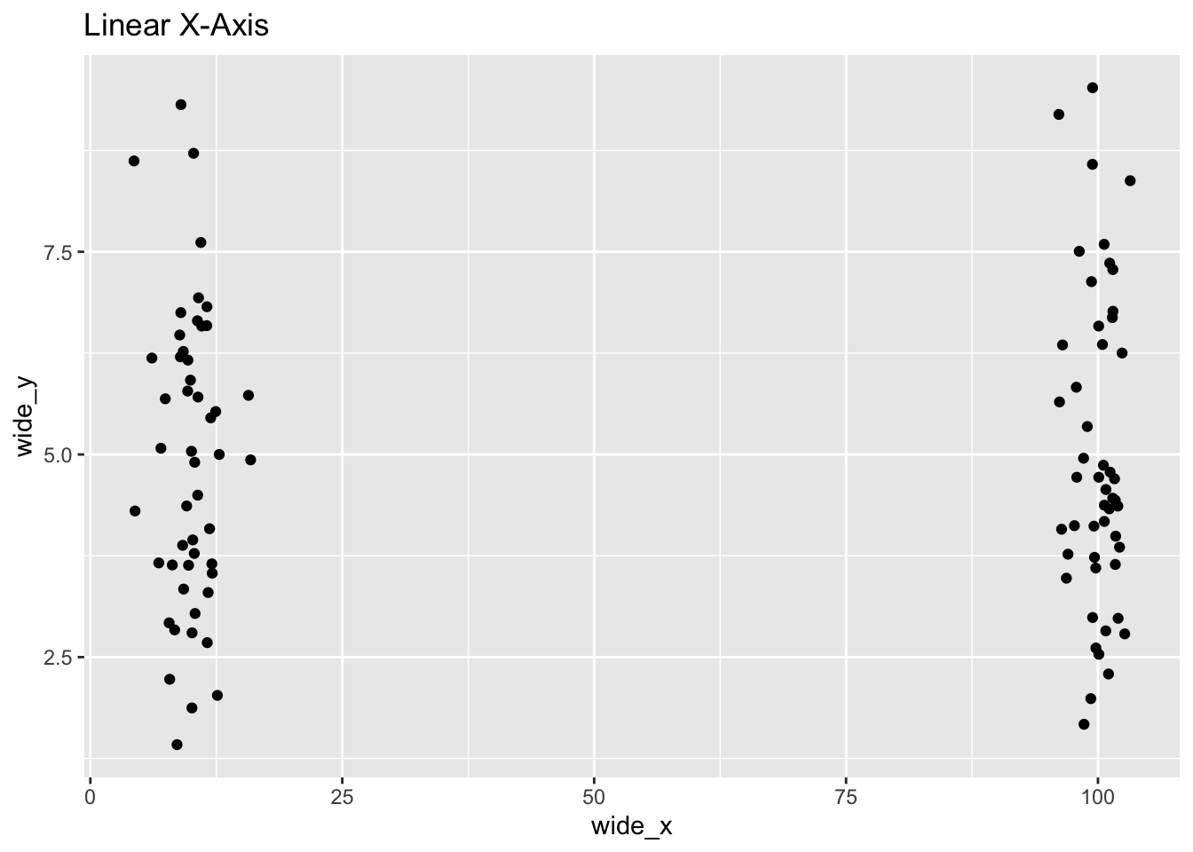
ggplot(df, aes(wide_x, wide_y)) +
  geom_point() +
  ggtitle("Log-10 X-Axis") +
  scale_x_log10()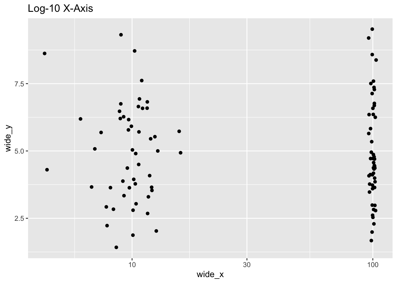
12.7 Modifications
12.7.1 Contour lines
Contour lines give a sense of the density of the data at a glance.
For these contour maps, we will use the SpeedSki dataset.
Contour lines can be added to the plot call using geom_density_2d():
ggplot(SpeedSki, aes(Year, Speed)) +
geom_density_2d() 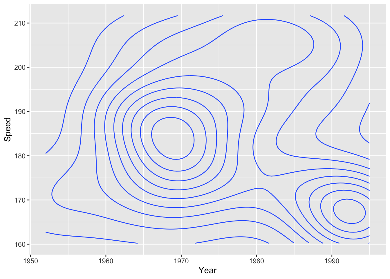
Contour lines work best when combined with other layers:
ggplot(SpeedSki, aes(Year, Speed)) +
  geom_point() +
  geom_density_2d(bins = 5)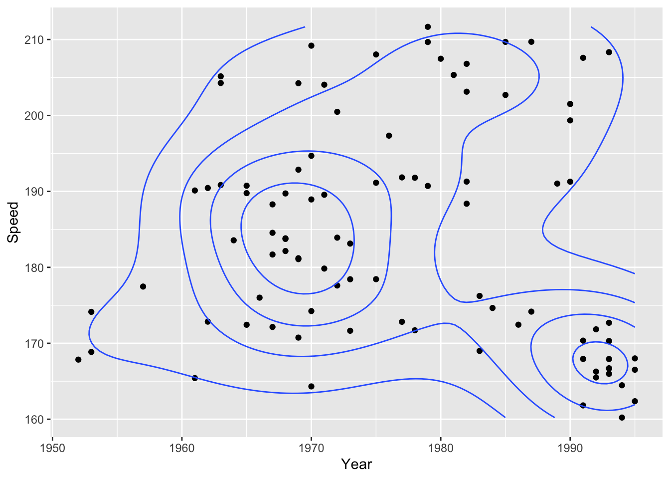
12.7.2 Scatterplot matrices
If you want to compare multiple parameters to each other, consider using a scatterplot matrix. This will allow you to show many comparisons in a compact and efficient manner.
For these scatterplot matrices, we will use the movies dataset from the ggplot2movies package.
As a default, the base R plot() function will create a scatterplot matrix when given multiple variables:
library(ggplot2movies) # data
library(dplyr) # manipulation

index <- sample(nrow(movies), 500) #sample data
moviedf <- movies[index,] # data frame

splomvar <- moviedf %>%
  dplyr::select(length, budget, votes, rating, year)

plot(splomvar)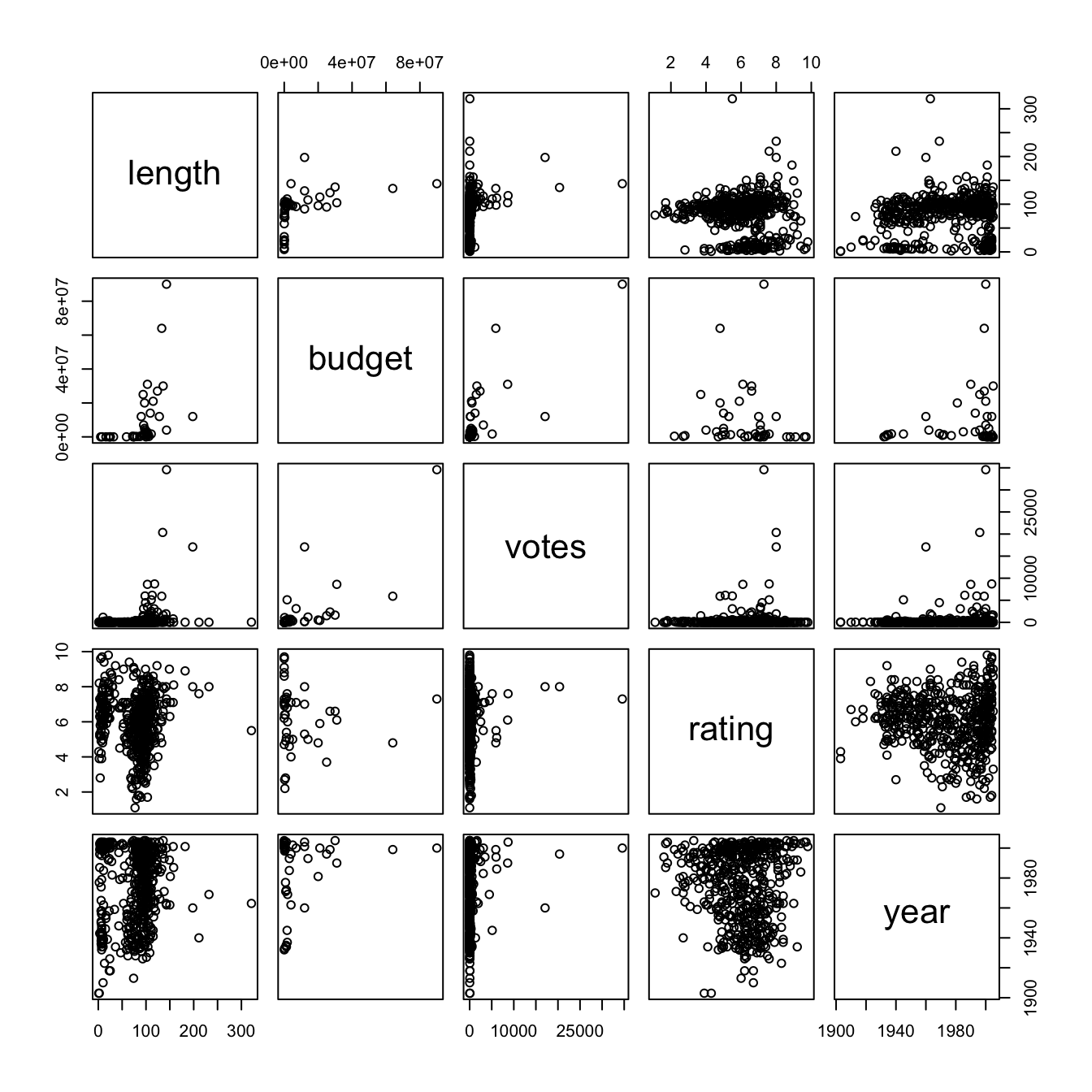
While this is quite useful for personal exploration of a datset, it is not recommended for presentation purposes. Something called the Hermann grid illusion makes this plot very difficult to examine.
To remove this problem, consider using the splom() function from the lattice package:
library(lattice) #sploms

splom(splomvar)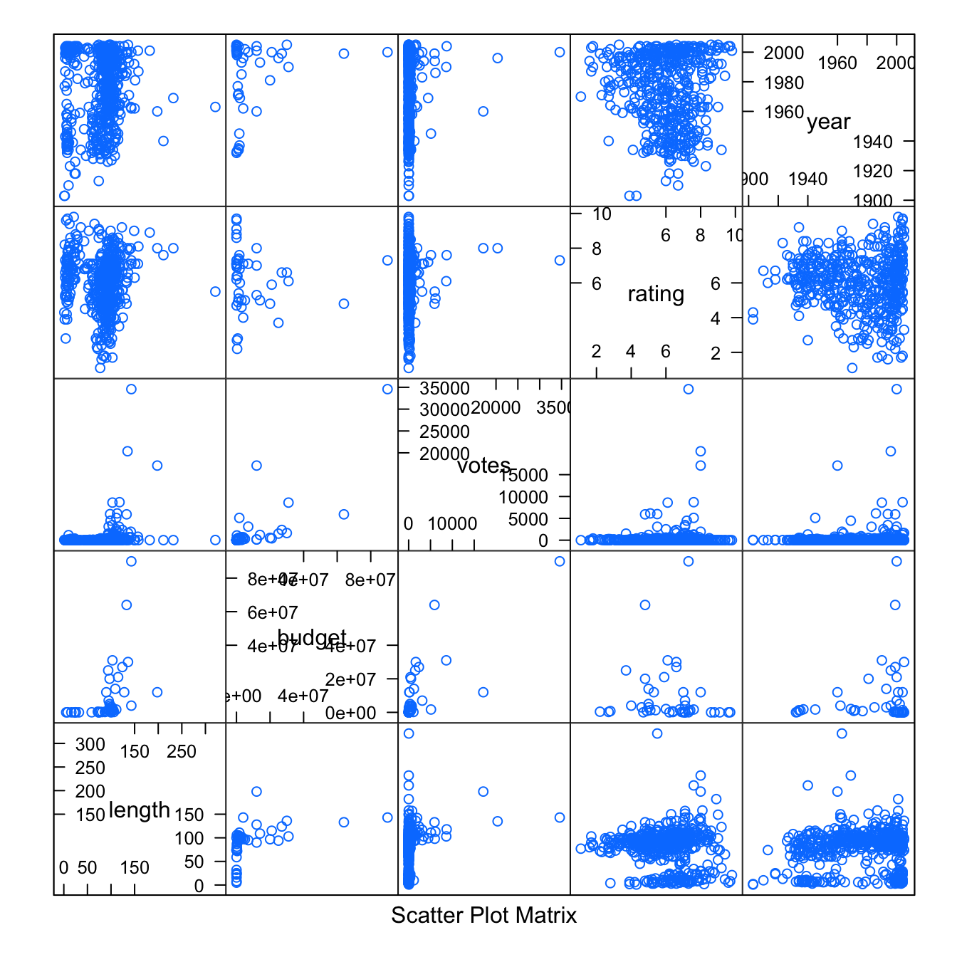
12.8 External resources
- Quick-R article about scatterplots using Base R. Goes from the simple into the very fancy, with Matrices, High Density, and 3D versions.
- STHDA Base R: article on scatterplots in Base R. More examples of how to enhance the humble graph.
- STHDA ggplot2: article on scatterplots in
ggplot2. Heavy on the formatting options available and facet warps. - Stack Overflow on adding labels to points from
geom_point() - ggplot2 cheatsheet: Always good to have close by.
with