24 A Brief Guide Through ggplot via Examples
Andrew Ward
24.1 Introduction
This community contribution is an outline of the key concepts in data visualization. I find that, to remind myself how a particular plot is created, I like to look for an example. From that example, I can see the key parameters that are used, as well as how the code is formatted. To that end, I decided to create a cheat sheet of sorts, with a rundown of all the major plots that I’ve been using recently. Each chapter contains a type of plot, with a few examples of that plot based on different common uses for it. Essentially, I just wanted a place where I could quickly access relevant examples for common plots that I may be using. I also added comments after most of the parameters to explain in words what that parameter is doing. That can make knowing which lines to alter easier to create the precise plot you are looking to create.
Creating this cheat sheet was really helpful for me personally. Not only does it now serve as a resource that I will reference myself, but even just writing the examples helped me get a more innate understanding of how the functions operate, including the type of data they require. Often times, I tried to use data in the examples that would not need to be downloaded. That meant either manually writing in a data frame, or using a very common data set in R, such as mtcars. Then, I would alter the data frame to fit a format that would be needed to suit the plot I was making. Understanding the type of data that needs to be used ended up making it much easier for me to understand how the plot worked.
Many of the examples are taken from lecture slides. That gave me a baseline to build upon. I then tried to comment on each line of the code. Additionally, I would sometimes use different data or slightly different syntax to try to make the plot more reproducible for someone who might not understand what certain parameters are doing. This is not meant to provide solutions to highly complex plots with really messy data. Instead, it is meant to serve as a baseline to understanding how some of these major plots work through examples, which is the way that I personally like to learn things.
In future iterations of this cheat sheet, I plan to add more types of plots, just to grow the database that this file will have. Additionally, I may look to have a more cohesive and thorough way to have different examples. Maybe I’ll need to create more examples in each chapter to illustrate differences, or maybe I don’t need as many, as simply listing the parameters and what they do is sufficient.
24.2 Histograms
24.2.1 Histogram by Frequency (Count)
Data from lecture slides
df1a <- data.frame(x = c(35, 59, 61, 64, 66, 66, 70, 72, 73, 74, 75, 76, 76, 78, 79, 80, 80, 81, 81, 82, 82, 82, 84, 86, 86, 88, 88, 88, 88, 89, 89, 90, 91,91, 92, 92, 92, 92, 94, 94, 94, 94, 96, 98, 102))
g1a <- ggplot(df1a, aes(x = x)) +
    geom_histogram(color = "blue", #color the border of the bars
                   fill = "lightblue", #color the bars
                   breaks = seq(30, 110, 10)) + #set the bins
        scale_x_continuous(breaks = seq(30, 110, 10)) #set the x axis
g1a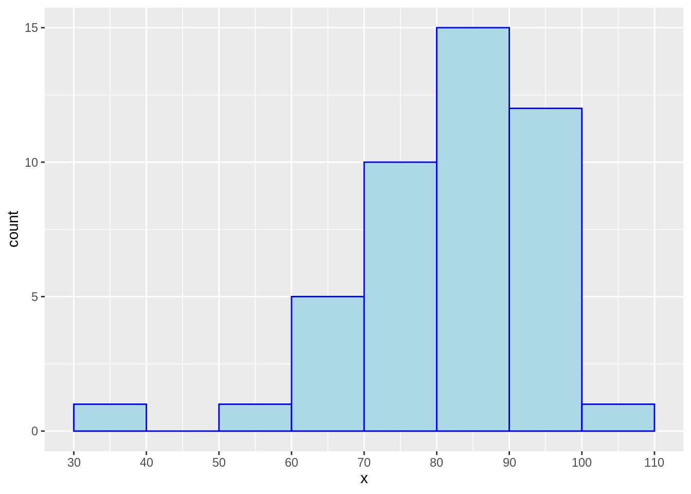
24.2.2 Histogram by Density
df1b <- data.frame(x = rnorm(1000, 100, 10))

g1b <- ggplot(data= df1b, aes(x=x)) +
  geom_histogram(aes(y = ..density..), #set to density
                 color = "blue", fill = "lightblue") +
  geom_density(color = "red") + #add density curve of the data
  stat_function(fun = dnorm, args = list(mean = mean(df1b$x), sd = sd(df1b$x))) + #add normal curve based on mean and sd of data to see how it compares to the density curve
  ggtitle("Density")

g1b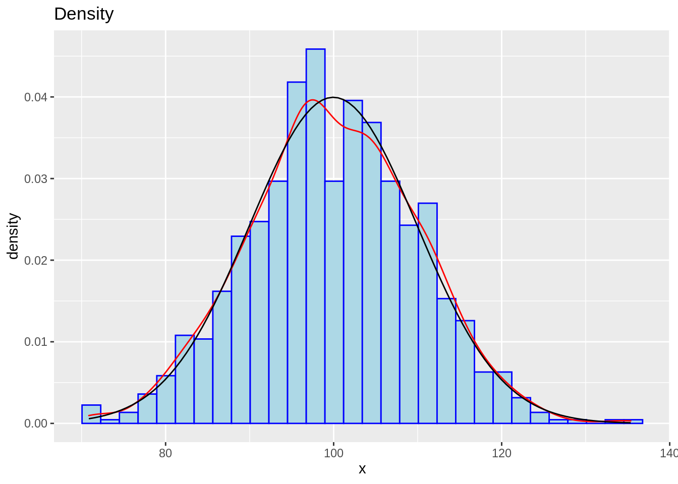
24.3 Boxplots
24.3.1 Standard Box Plot
df2a <- mtcars
df2a <- df2a %>%
  mutate(group = c(1,1,1,1,1,1,1,1, 2,2,2,2,2,2,2,2, 3,3,3,3,3,3,3,3, 4,4,4,4,4,4,4,4)) %>%
  mutate(group = as.factor(group))

g2a <- ggplot(df2a, aes(x= reorder(group, -mpg, median), #order the boxes in eitehr increasing or decreasing order
                        y = mpg)) +
  geom_boxplot(varwidth= TRUE) + #change width of each box
  coord_flip() + #switch x and y axes
  theme_grey(14)

g2a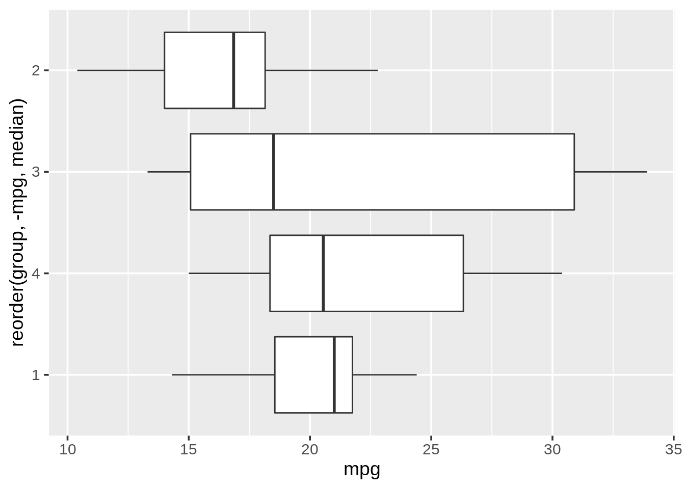
24.3.2 Ridgeline Plot
df2b <- mtcars
df2b <- df2b %>%
  mutate(group = c(1,1,1,1,1,1,1,1, 2,2,2,2,2,2,2,2, 3,3,3,3,3,3,3,3, 4,4,4,4,4,4,4,4)) %>%
  mutate(group = as.factor(group))

g2b <- ggplot(df2b, aes(x= mpg,y= reorder(group,-mpg, median))) +
  geom_density_ridges(fill = "blue", alpha = .5, #alpha changes how opaque or vague the ridges are
                      scale= 1) + #scale changes how close together the groups are
  theme_grey(14)
g2b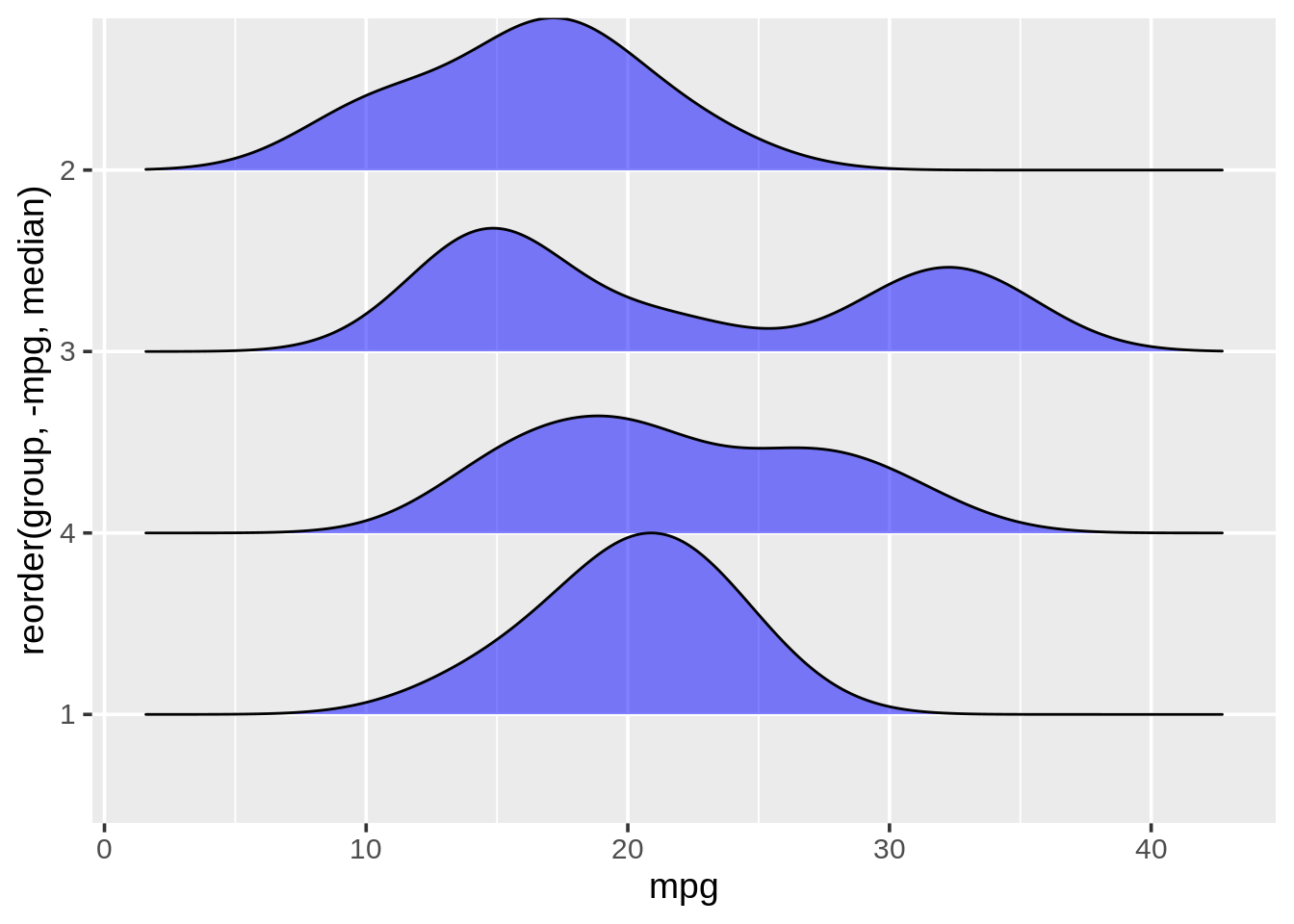
24.4 Bar Plots
24.4.1 Standard Bar Plot
Data from lecture slides
df3a <- food_world_cup

g3a <- ggplot(data = df3a, aes(x = knowledge)) + #y is the count of x instances
    geom_bar(fill = "cornflowerblue") + #color
    coord_flip() + #switch x and y axes
    ggtitle("Knowledge level of respondents") +
    theme_bw(16)

g3a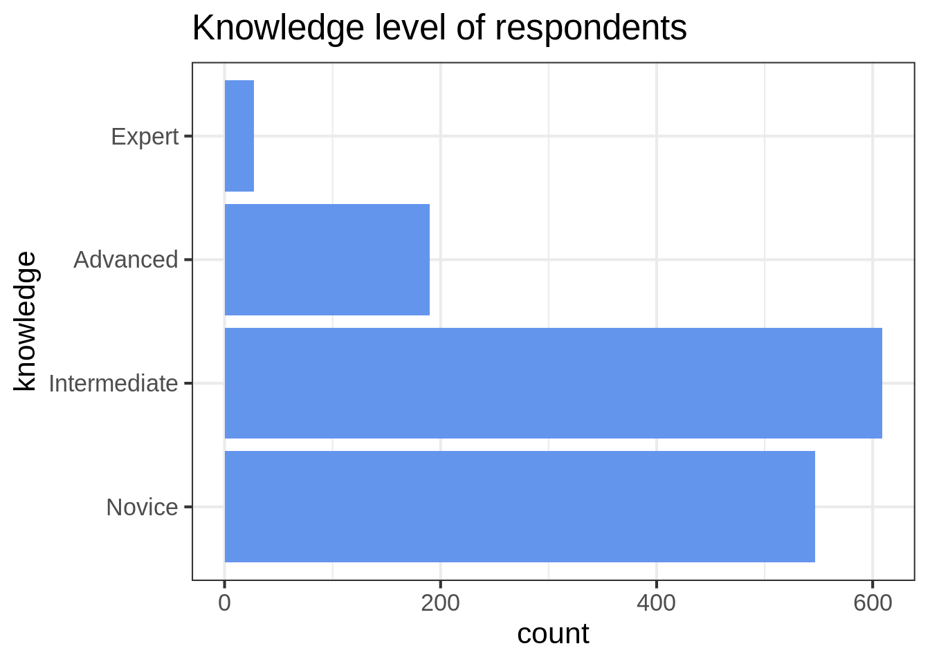
24.4.2 Stacked Bar Plot with Multiple Variables
data from https://r-charts.com/part-whole/stacked-bar-chart-ggplot2/
set.seed(1)

age3b <- factor(sample(c("Child", "Adult", "Retired"),
              size = 50, replace = TRUE),
              levels = c("Child", "Adult", "Retired"))
hours3b <- sample(1:4, size = 50, replace = TRUE)
city3b <- sample(c("A", "B", "C"),
               size = 50, replace = TRUE)

df3b <- data.frame(x = age3b, y = hours3b, group = city3b)

g3b <- ggplot(df3b, aes(x = x, y = y,
                      fill = group)) + #fill by the group you want to compare between
  geom_bar(stat = "identity") #stat= identity for multiple variables

g3b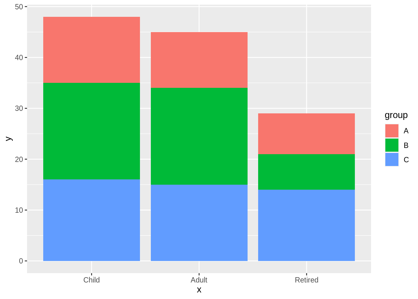
24.4.3 Grouped Bar Plot
data from https://r-charts.com/part-whole/stacked-bar-chart-ggplot2/
age3c <- factor(sample(c("Child", "Adult", "Retired"),
              size = 50, replace = TRUE),
              levels = c("Child", "Adult", "Retired"))
hours3c <- sample(1:4, size = 50, replace = TRUE)
city3c <- sample(c("A", "B", "C"),
               size = 50, replace = TRUE)

df3c <- data.frame(x = age3c, y = hours3c, group = city3c)

g3c <- ggplot(df3c, aes(x = x, y = y, fill = group)) + #same aesthetics
  geom_bar(position= "dodge", stat = "identity") #position = dodge makes them grouped

g3c
24.4.4 Grouped Bar Plot with Facets
data from https://r-charts.com/part-whole/stacked-bar-chart-ggplot2/
age3d <- factor(sample(c("Child", "Adult", "Retired"),
              size = 50, replace = TRUE),
              levels = c("Child", "Adult", "Retired"))
hours3d <- sample(1:4, size = 50, replace = TRUE)
city3d <- sample(c("A", "B", "C"),
               size = 50, replace = TRUE)

df3d <- data.frame(x = age3d, y = hours3d, group = city3d)

g3d <- ggplot(df3d, aes(x = x, fill = group)) +
  geom_bar(position= "dodge") + #position = dodge makes them grouped
  facet_wrap(~y) #add the facets around the variable of your choice

g3d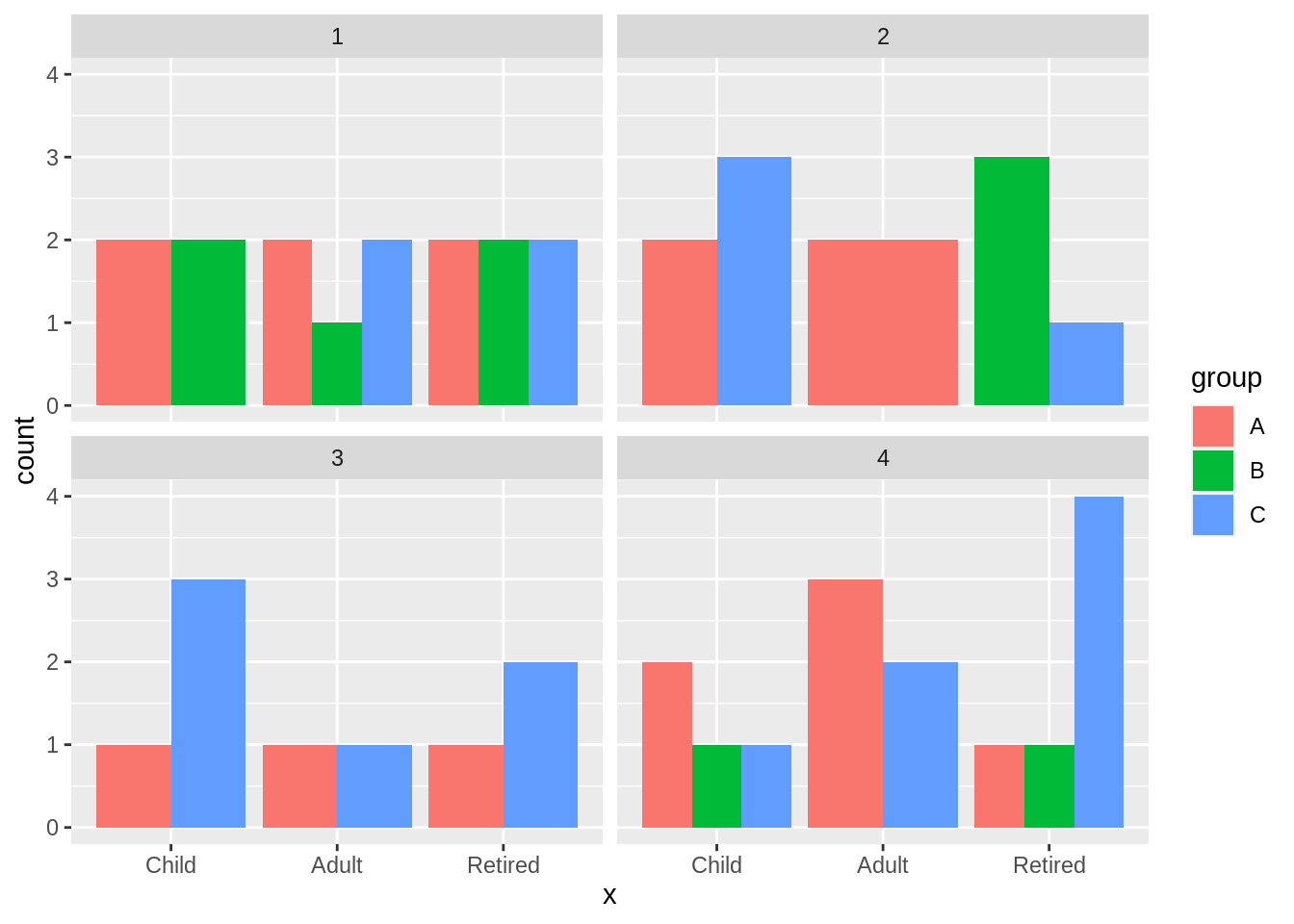
24.5 Cleveland Dot Plots
24.5.1 Standard Cleveland Dot Plot
df4a <- mtcars %>%
  mutate(number = c(1:32)) %>%
  mutate(number = as.factor(number)) %>%
  mutate(group = c(1,1,1,1,1,1,1,1,1,1,1,1,1,1,1,1,2,2,2,2,2,2,2,2,2,2,2,2,2,2,2,2)) %>%
  mutate(group = as.factor(group))


g4a <- ggplot(data = df4a, aes(x= mpg, y= fct_reorder(number, mpg))) + #order the factor to make the dots be increasing or decreaing
  geom_point(color = "blue") +
  ggtitle("Cleveland Dot Plot for Car MPG") +
  ylab("")

g4a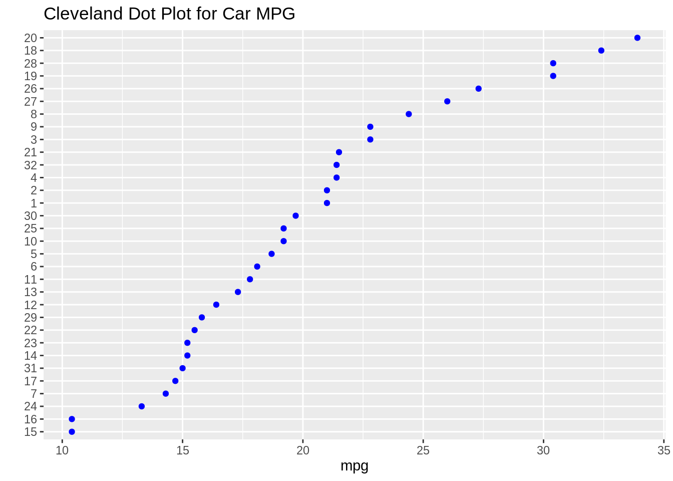
24.5.2 Cleveland Dot Plot with Multiple Dots
df4b <- mtcars %>%
  mutate(number = c(1:32)) %>%
  mutate(number = as.factor(number)) %>%
  mutate(group = c(1,1,1,1,1,1,1,1,1,1,1,1,1,1,1,1,2,2,2,2,2,2,2,2,2,2,2,2,2,2,2,2)) %>%
  mutate(group = as.factor(group))


g4b <- ggplot(data = df4b, aes(x= mpg, y= fct_reorder2(number, group == 2, mpg, .desc= FALSE), color= group)) + #color parameter differentiates the points by group
  geom_point() +
  ggtitle("With Multiple Groups") +
  ylab("")

g4b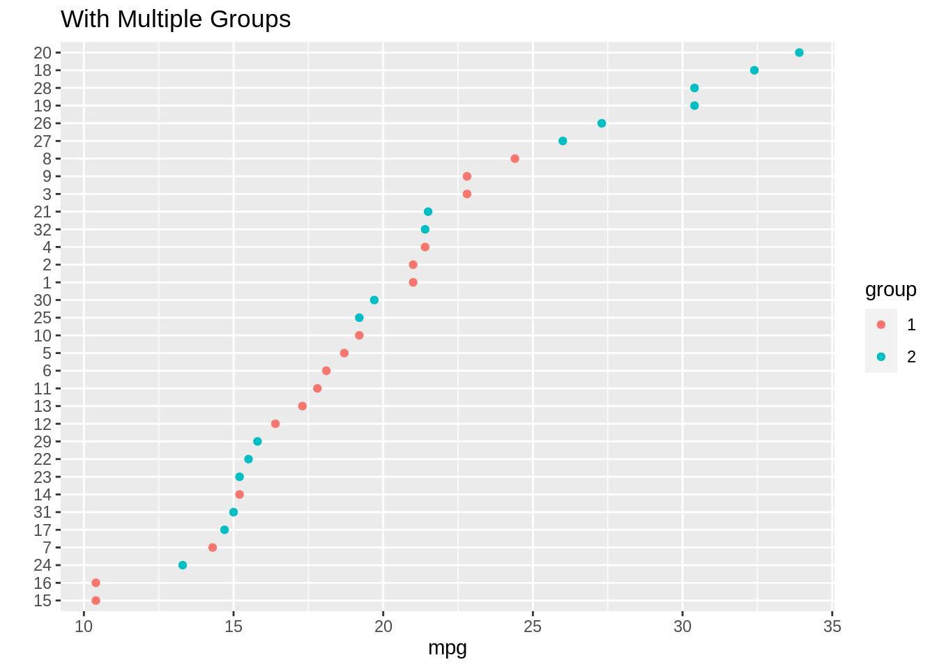
24.5.3 Cleveland Dot Plots with Facets
df4c <- mtcars %>%
  mutate(number = c(1:32)) %>%
  mutate(number = as.factor(number)) %>%
  mutate(group = c(1,1,1,1,1,1,1,1,1,1,1,1,1,1,1,1,2,2,2,2,2,2,2,2,2,2,2,2,2,2,2,2)) %>%
  mutate(group = as.factor(group))


g4c <- ggplot(data= df4c, aes(x= mpg, y= reorder(number, mpg))) +
  geom_point(color = "blue") +
  facet_grid(.~reorder(group, -mpg, median)) + #facet by the group
  ggtitle("Facet Cleveland Dot Plot for Car MPG") +
  ylab("")

g4c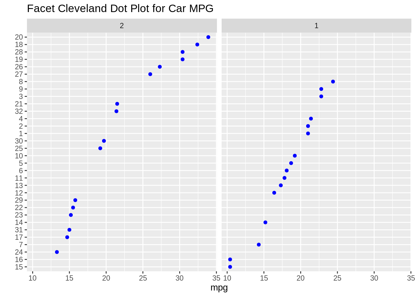
24.6 Heatmaps
24.6.1 Square Heatmap
Data from lecture slides
df5a <- SpeedSki

g5a <- ggplot(df5a, aes(x=Year, y=Speed)) +
  scale_fill_viridis_c() + #color scheme
  geom_bin2d(binwidth = c(5,5), #binwidth sets how big the bins are
             alpha = .4) + #alpha changes transparency
  geom_point(size= 2) #add points to see that the heatmap looks correct

g5a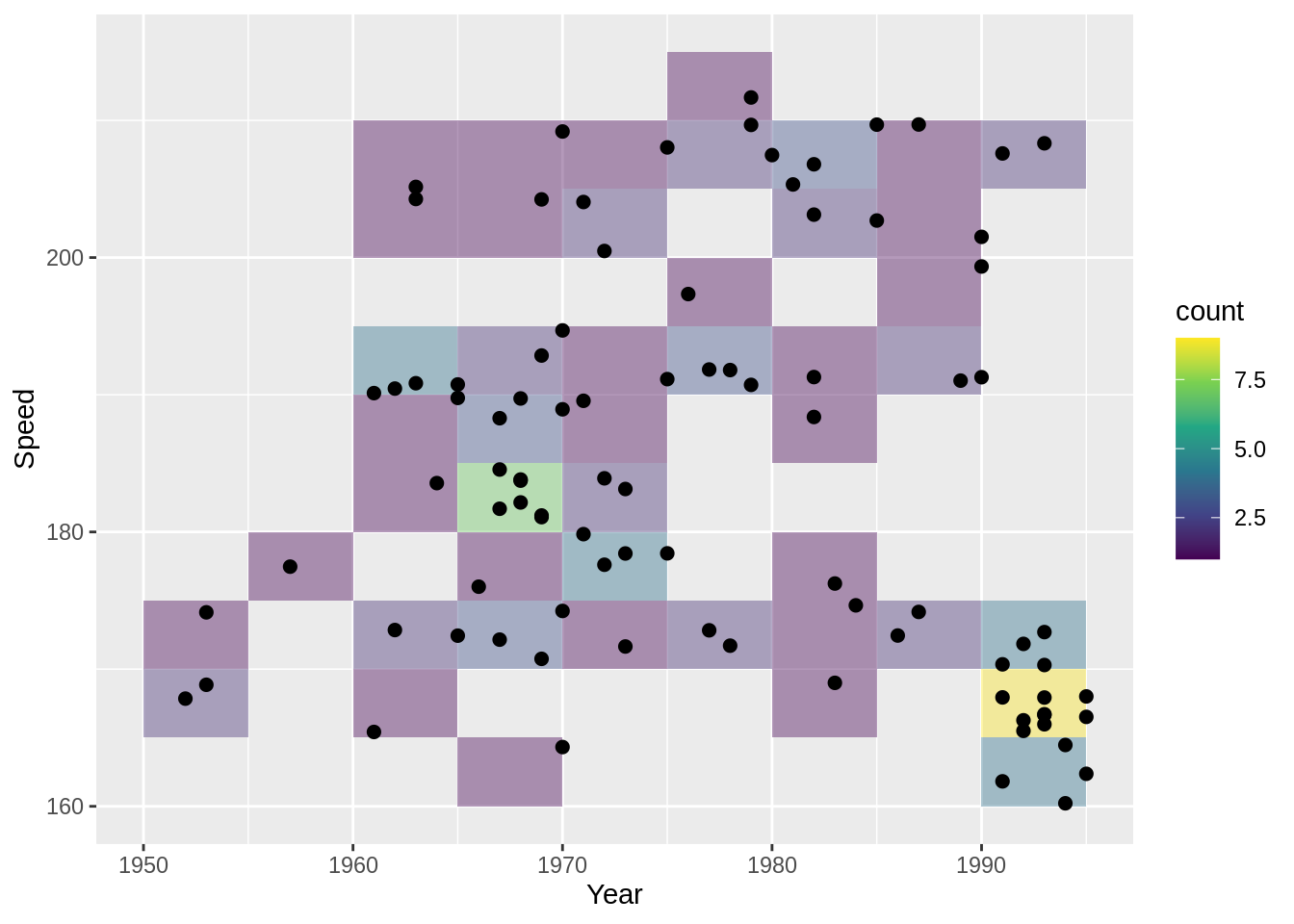
24.6.2 Hex Heatmap
Data from lecture slides
df5b <- SpeedSki

g5b <- ggplot(df5b, aes(x=Year, y=Speed)) +
  scale_fill_gradient(low = "grey", high= "purple") + #color scheme
  geom_hex(binwidth = c(5,5), alpha = .8) + #use geom_hex instead
  geom_point(size= 2)

g5b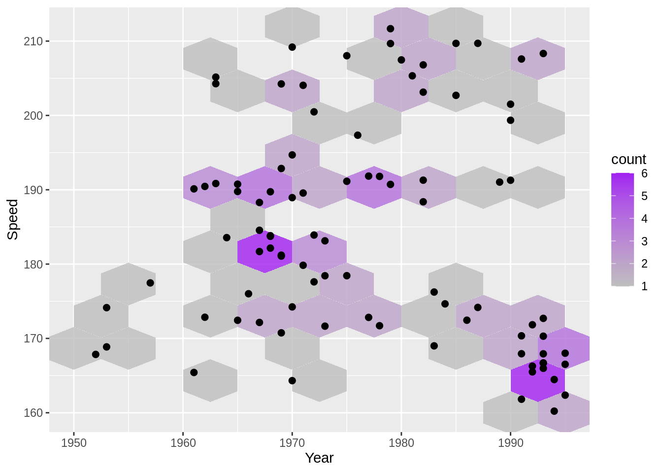
24.6.3 Density lines
Data from lecture slides
df5c <- SpeedSki

g5c <- ggplot(df5c, aes(x=Year, y=Speed)) +
  geom_point() +
  geom_density2d(bins = 10) + #bins number changes how many density lines there are
  theme_grey(18)

g5c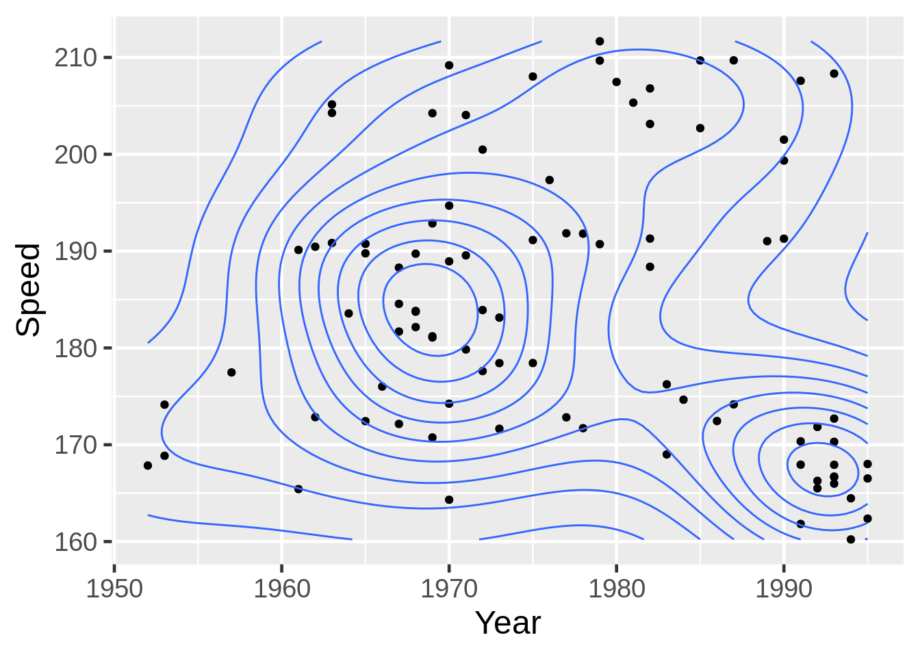
24.7 Parallel Coordinate Plots
24.7.1 Rescaled Slope Graph
Data from lecture slides
theme_set(theme_grey(18))
x6a <- rnorm(50, 20, 5)
y6a <- runif(50, 8, 12) - x6a
df6a <- data.frame(x6a, y6a)

tidydf6a <- df6a %>%
  mutate(z = rexp(50, .1) + x6a) %>%
  dplyr::select(x6a, y6a) %>%
  rownames_to_column("ID") %>%
  gather(var, value, -ID)

# Rescale the data here
rescaled6a <- tidydf6a %>%
  group_by(var) %>%
  mutate(value= scales::rescale(value)) %>%
  ungroup()

g6a <- ggplot(rescaled6a, aes(x = var, #2 variables, x and y
                            y = value, #using the rescaled value
                            group = ID)) +  #use this so ggplot knows where to map points in x to points in y
  geom_line()

g6a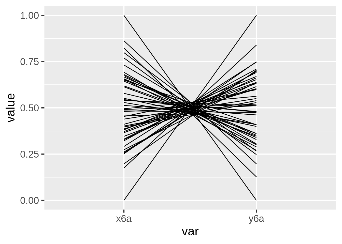
24.7.2 Parallel Coordinate Plot
Data from lecture slides
mystates6b <- data.frame(state.x77) %>%
    rownames_to_column("State") %>%
    mutate(Region = factor(state.region))

mystates6b$Region <- factor(mystates6b$Region,
                          levels = c("Northeast", "North Central","South","West"))

g6b <- ggparcoord(mystates6b,
                  columns= c(2,4,6,8,3,5,7,9), #reorder the columns
                  alphaLines = .3, #transparency of lines
                  scale= "uniminmax") #rescale

g6b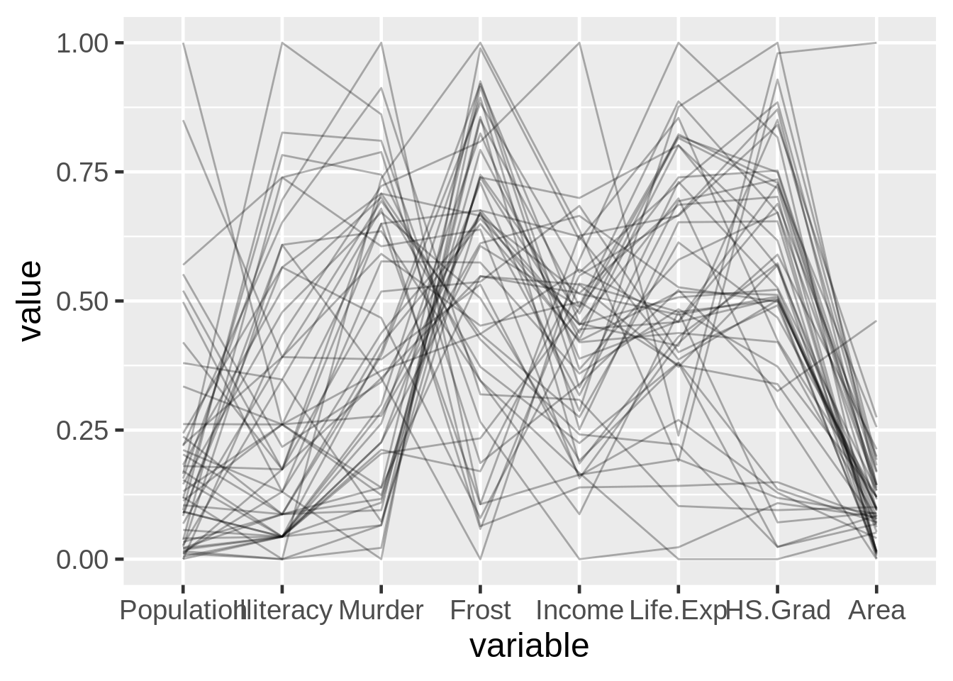
24.7.3 Splines
Data from lecture slides
x6c <- 1:10
y6c <- c(2,2,4,4,5,5,5,10,10,10)
z6c <- c(3,3,2,3,3,7,7,5,7,7)
w6c <- c(1, 1, 1, 7, 7, 7, 8, 8, 8, 8)
df6c <- data.frame(x6c,y6c,z6c, w6c)

g6c <- ggparcoord(df6c, columns= 1:4, scale= "globalminmax", #scale
                  splineFactor = 10, #how curvy the lines are
                  alphaLines = .5) + #how transparent the lines are
  geom_vline(xintercept = 1:4, color= "blue") # vertical lines

g6c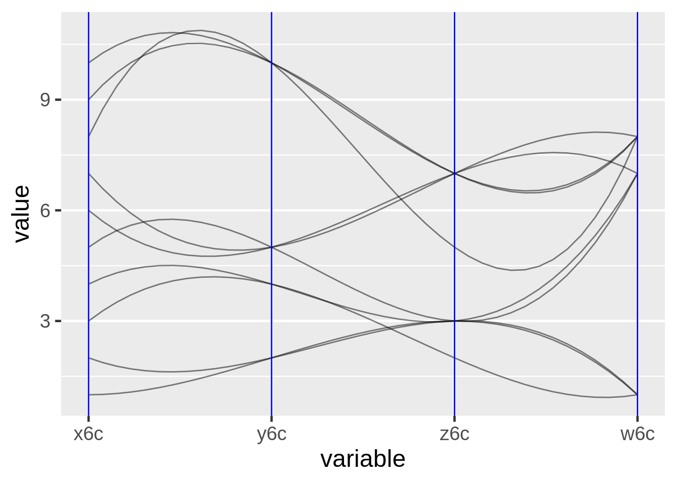
24.7.4 Parallel Coordinate Plot with Highlighted Trend
Data from lecture slides
mystates6d <- data.frame(state.x77) %>%
    rownames_to_column("State") %>%
    mutate(Region = factor(state.region))

mystates6d$Region <- factor(mystates6d$Region,
                          levels = c("Northeast", "North Central","South","West"))

mystates6d <- mystates6d %>%
    mutate(color = factor(ifelse(Murder > 11, 1, 0))) %>%
    arrange(color)

g6d <- ggparcoord(mystates6d,columns= 2:9, #set the columns to use
                  groupColumn= "color") + #group the columns by the parameter you want to highlight
  scale_color_manual(values = c("grey70", "red")) + #Choose colors
  coord_flip() + #flip the coordinates
  guides(color = FALSE) #remove this to get the legend

g6d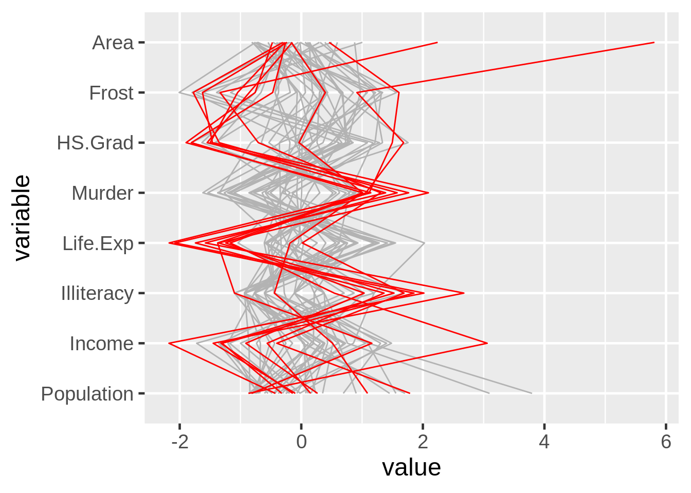
24.8 Biplots
24.8.1 Principal Component Analysis
Data from lecture slides
df7a <- data.frame(country = c(1,2,3,4,5,6,7,8,9,10,11,12,13),
                   living = c(7,7,5,5,6,8,5,4,5,2,8,2,4),
                   climate = c(8,9,6,8,2,3,8,7,6,4,4,5,4),
                   food = c(9,9,6,7,2,2,9,8,6,4,7,5,5),
                   security = c(5,5,6,3,3,8,3,2,3,2,7,2,3),
                   hospitality = c(3,2,5,2,7,7,1,1,4,3,9,3,3),
                   infrastructure = c(7,8,6,3,6,9,3,2,4,2,8,3,3))
df7a <- df7a %>%
  mutate(country = as.factor(country))

pca <- prcomp(df7a[,2:7], scale = TRUE) #do the pca here

biplot(pca) #plot the pca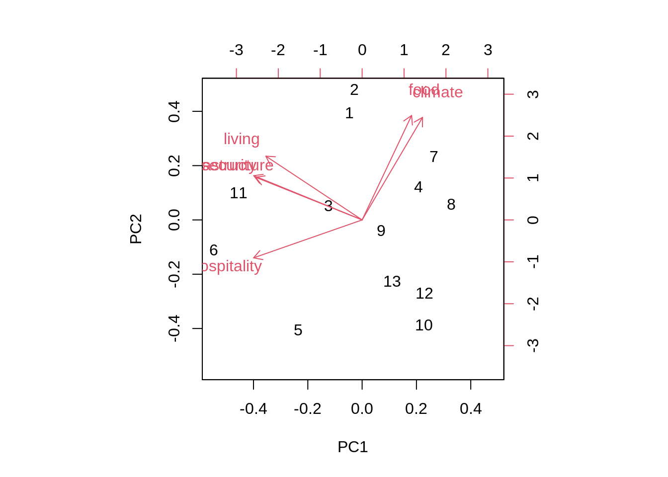
24.8.2 Biplot By Hand
Data from lecture slides
df7b <- data.frame(country = c(1,2,3,4,5,6,7,8,9,10,11,12,13),
                   living = c(7,7,5,5,6,8,5,4,5,2,8,2,4),
                   climate = c(8,9,6,8,2,3,8,7,6,4,4,5,4),
                   food = c(9,9,6,7,2,2,9,8,6,4,7,5,5),
                   security = c(5,5,6,3,3,8,3,2,3,2,7,2,3),
                   hospitality = c(3,2,5,2,7,7,1,1,4,3,9,3,3),
                   infrastructure = c(7,8,6,3,6,9,3,2,4,2,8,3,3))
df7b <- df7b %>%
  mutate(country = as.factor(country))

draw_biplot(df7b,
            "climate", # calibrate an axis
            project = TRUE) + #set to false to remove the projection
  scale_x_continuous(limits = c(-4, 3)) +
  scale_y_continuous(limits = c(-3, 3)) #can use these to rotate the biplot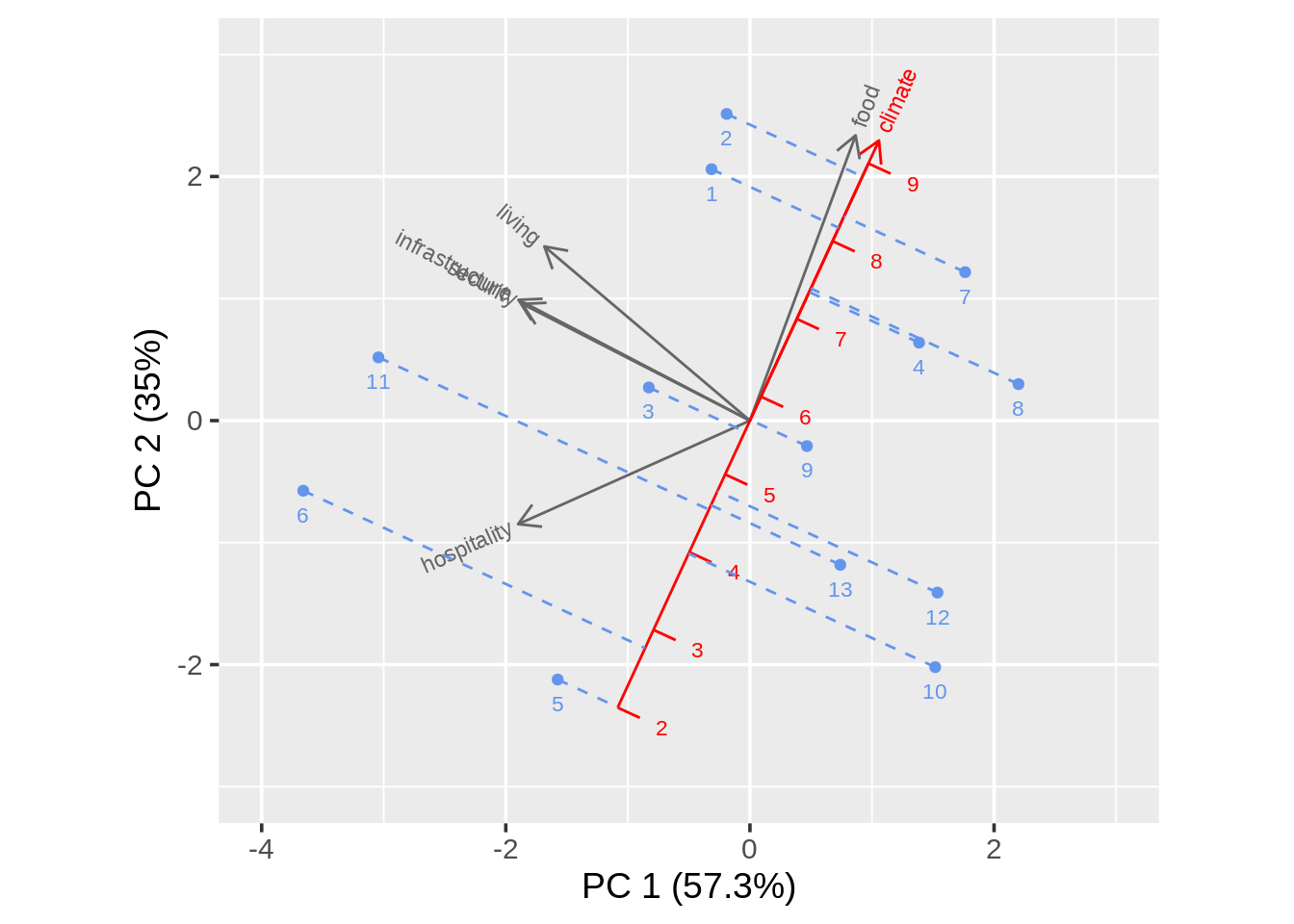
24.9 Mosaic Plots
24.9.1 Using ggplot
Data from lecture slides
localnews8a <- data.frame(Age = c("18-29", "30-49", "50-64", "65+"),
                        Freq = c(2851, 9967, 11163, 10911)) %>%
  mutate(Followers = round(Freq*c(.15, .28, .38, .42)),
         Nonfollowers = Freq - Followers)

local8a <- localnews8a %>%
  dplyr::select(-Freq)

tidylocal8a <- local8a %>%
  gather(key = "Group", value = "Freq", -Age)

g8a <- ggplot(tidylocal8a) +
  geom_mosaic(aes(weight = Freq, #count
                  x = product(Age),
                  fill = Group)) + #color by differing group
  xlab("") +
  ylab("") +
  guides(fill = FALSE) +
  theme_classic()
g8a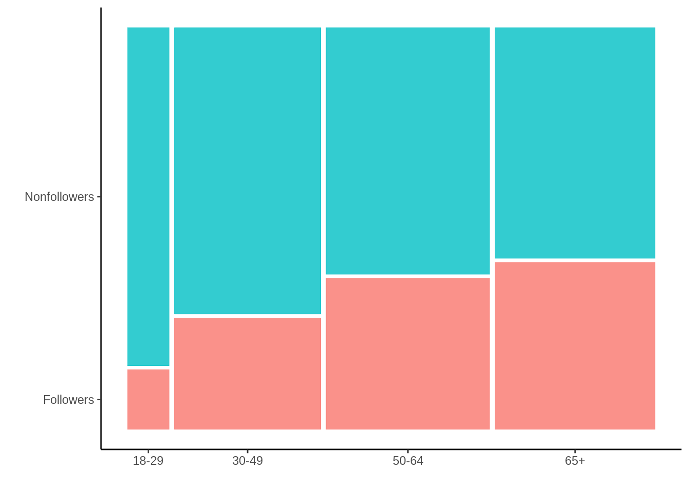
24.9.2 Using vcd::mosaic
Data from lecture slides
localnews8b <- data.frame(Age = c("18-29", "30-49", "50-64", "65+"),
                        Freq = c(2851, 9967, 11163, 10911)) %>%
  mutate(Followers = round(Freq*c(.15, .28, .38, .42)),
         Nonfollowers = Freq - Followers)

local8b <- localnews8b %>%
  dplyr::select(-Freq)

tidylocal8b <- local8b %>%
  gather(key = "Group", value = "Freq", -Age)

tidylocal8b$Group <- fct_rev(tidylocal8b$Group)

tidylocal8b$Age <- factor(tidylocal8b$Age, levels= c("65+", "50-64", "30-49", "18-29")) # reorder the factors here for either upward or downward mobility

vcd::mosaic(Group ~ Age, direction= c("v","h"), #direction sets order of vertical and horizontal graphing
            tidylocal8b, #data
            tl_labels = c(FALSE, TRUE), #move labels to bottom
            rot_labels = c(0,0,90,0), #rotate labels
            highlighting_fill= c("grey80", "blue")) #color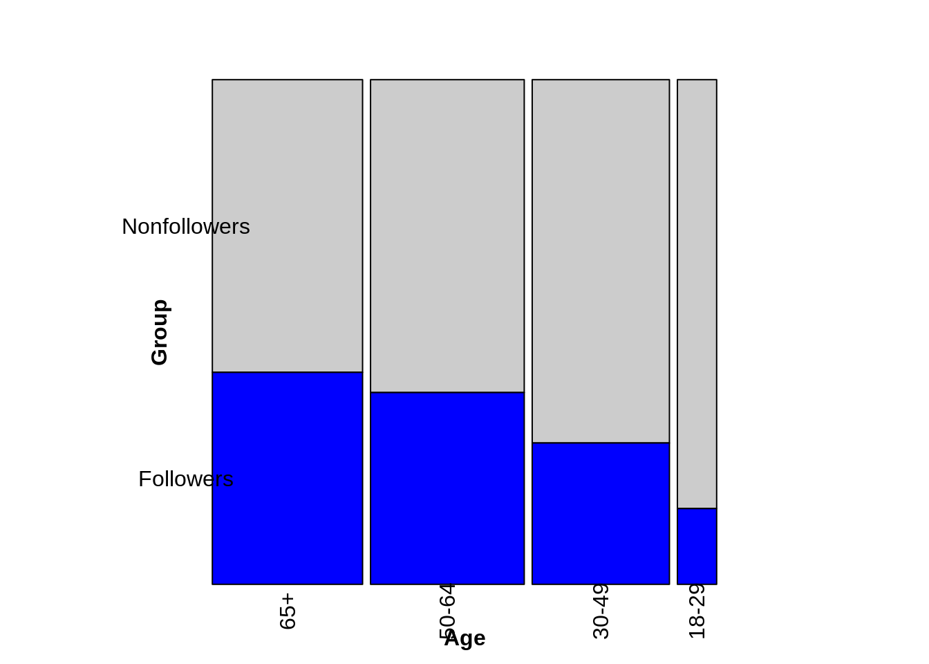
24.9.3 Many Variables
Data from lecture slides
foodorder8c <- Alligator %>% group_by(food) %>% summarize(Freq = sum(count)) %>%
  arrange(Freq) %>% pull(food)

ally8c <- Alligator %>%
  rename(Freq = count) %>%
  mutate(size = fct_relevel(size, "small"),
         food = factor(food, levels = foodorder8c),
         food = fct_relevel(food, "other"))

vcd::mosaic(food ~ sex + size,
            ally8c, #data
       direction = c("v", "v", "h"), #changing order of v and h changes the image of the plot, but still gives accurate data
       rot_labels = c(0,0,90,0),
       highlighting_fill= RColorBrewer::brewer.pal(5, "Set1")) #set the color scheme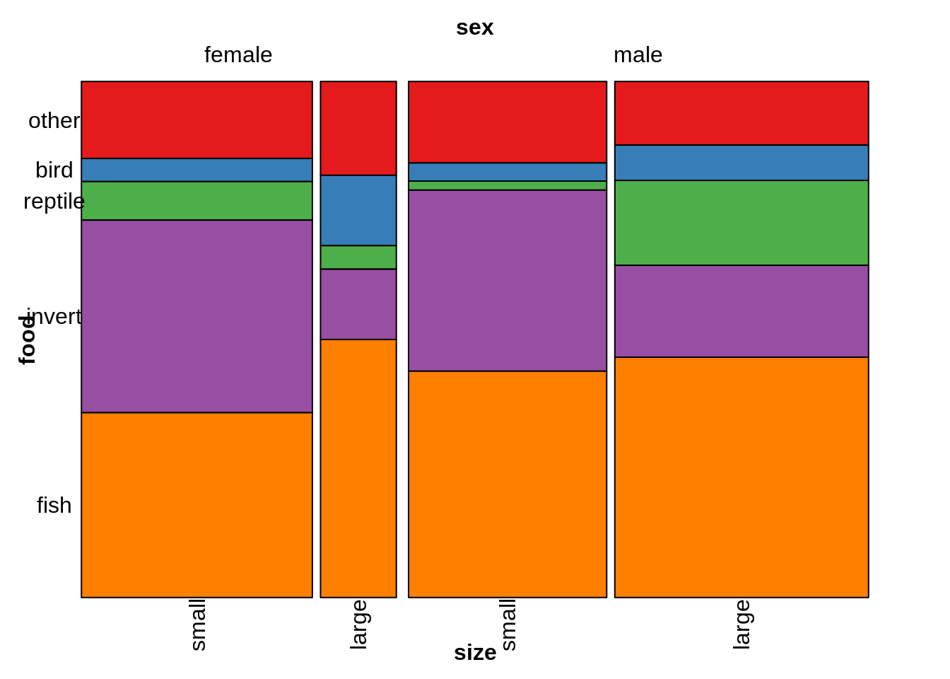
24.10 Alluvial
24.10.1 Simple Alluvial
Data from lecture slides
df9a <- data.frame(Class1 = c("Stats", "Math", "Stats", "Math", "Stats", "Math", "Stats", "Math"),
                 Class2 = c("French", "French", "Art", "Art", "French", "French", "Art", "Art"),
                 Class3 = c("Gym", "Gym", "Gym", "Gym", "Lunch", "Lunch", "Lunch", "Lunch"),
                 Freq = c(20, 3, 40, 5, 10, 2, 5, 15))

g9a <- ggplot(df9a, aes(axis1= Class1,
                      axis2= Class2,
                      axis3= Class3, #add as many axes as needed
                      y = Freq)) + #y axis must be Freq
  geom_alluvium(color = "black") + #add the flow
  geom_stratum() + #add the bars
  geom_text(stat = "stratum",
            aes(label = paste(after_stat(stratum), "\n", after_stat(count)))) + #add the labels
  scale_x_discrete(limits = c("Class1", "Class2", "Class3")) #set x axis

g9a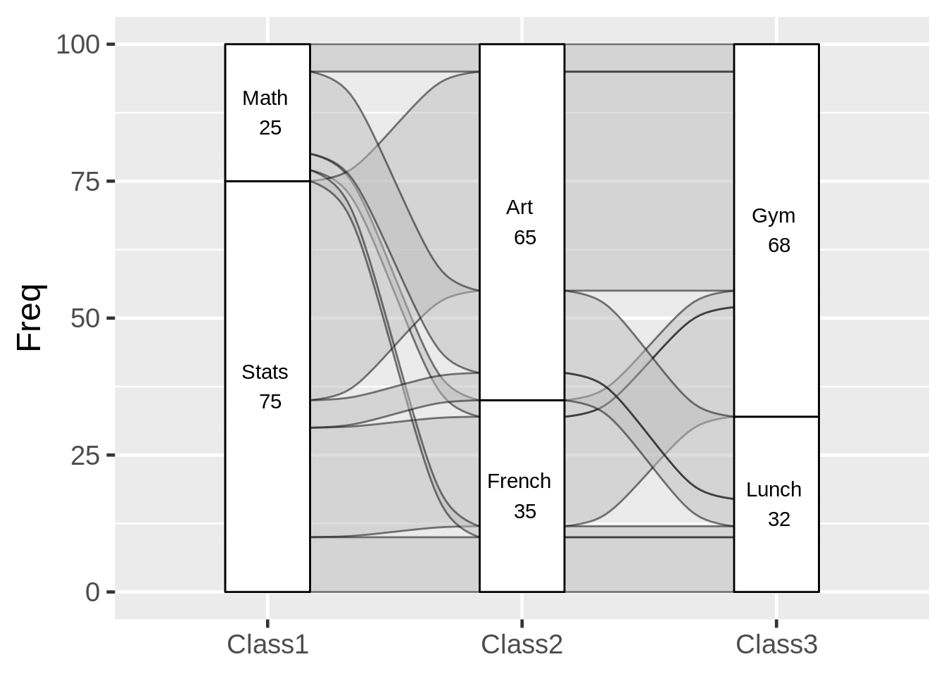
24.10.2 Use geom_flow instead?
Data from lecture slides
df9b <- data.frame(Class1 = c("Stats", "Math", "Stats", "Math", "Stats", "Math", "Stats", "Math"),
                 Class2 = c("French", "French", "Art", "Art", "French", "French", "Art", "Art"),
                 Class3 = c("Gym", "Gym", "Gym", "Gym", "Lunch", "Lunch", "Lunch", "Lunch"),
                 Freq = c(20, 3, 40, 5, 10, 2, 5, 15))

g9b <- ggplot(df9b, aes(axis1 = Class1, axis2 = Class2, axis3 = Class3, y = Freq)) +
  geom_flow(color = "black") + #essentially resets at each stratum
  geom_stratum() +
  geom_text(stat = "stratum", aes(label = paste(after_stat(stratum), "\n", after_stat(count)))) +
  scale_x_discrete(limits = c("Class1", "Class2", "Class3"))

g9b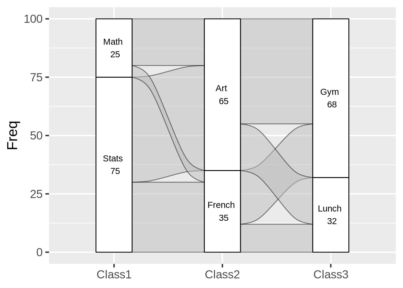
24.11 Time Series
24.11.1 Multiple Time Series
data from https://r-graph-gallery.com/279-plotting-time-series-with-ggplot2.html
df10a <- data.frame(
  day = as.Date("2017-06-14") - 0:364,
  value1 = runif(365) + seq(-140, 224)^2 / 10000,
  value2 = runif(365) - seq(-140, 224)^2 / 10000
) #create data

df10a <- df10a %>%
  gather(key = TYPE, value = Number, -day) #create only 2 columns: date and value


g10a <- ggplot(data= df10a, aes(x=day, #x axis must be date
                               y=Number, #value you're tracking over time
                               color= TYPE)) + #can track multiple time series by color
  geom_line()

g10a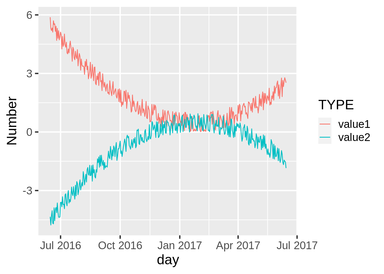
24.11.2 Add a Loess Smoother
data from https://r-graph-gallery.com/279-plotting-time-series-with-ggplot2.html
df10b <- data.frame(
  day = as.Date("2017-06-14") - 0:364,
  value1 = runif(365) + seq(-140, 224)^2 / 10000,
  value2 = runif(365) - seq(-140, 224)^2 / 10000
) #create data

g10b <- ggplot(df10b, aes(x= day, y= value1)) +
  geom_point() + #add the points
  geom_line(color = "grey") + #add the line connecting the points
  geom_smooth(method= "loess",
              se= FALSE, #turn off the error area around the line
              lwd = .75, #set the line width
              span = .75) #determine how closely the line follows individual points

g10b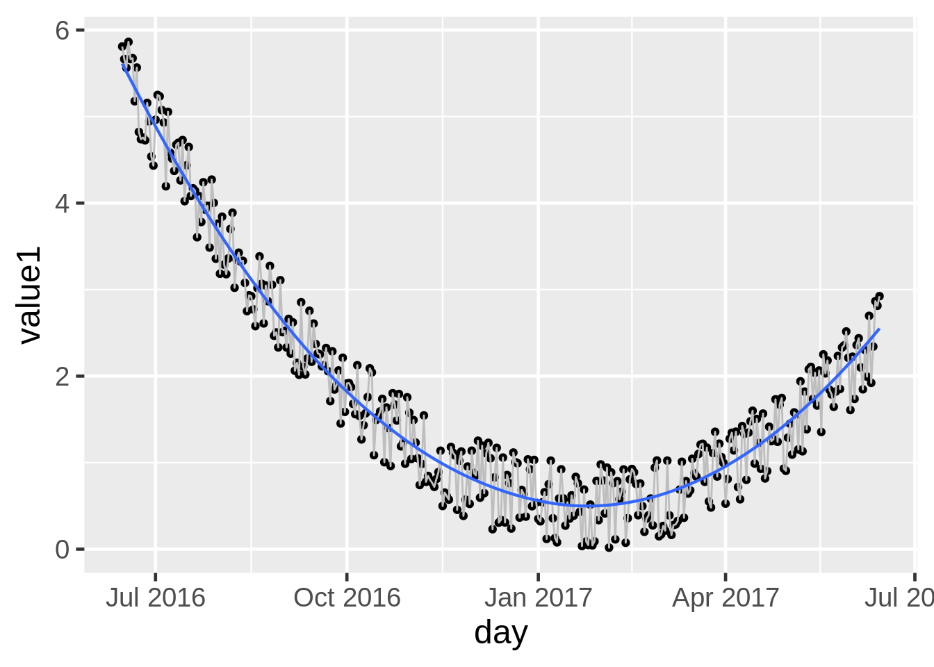
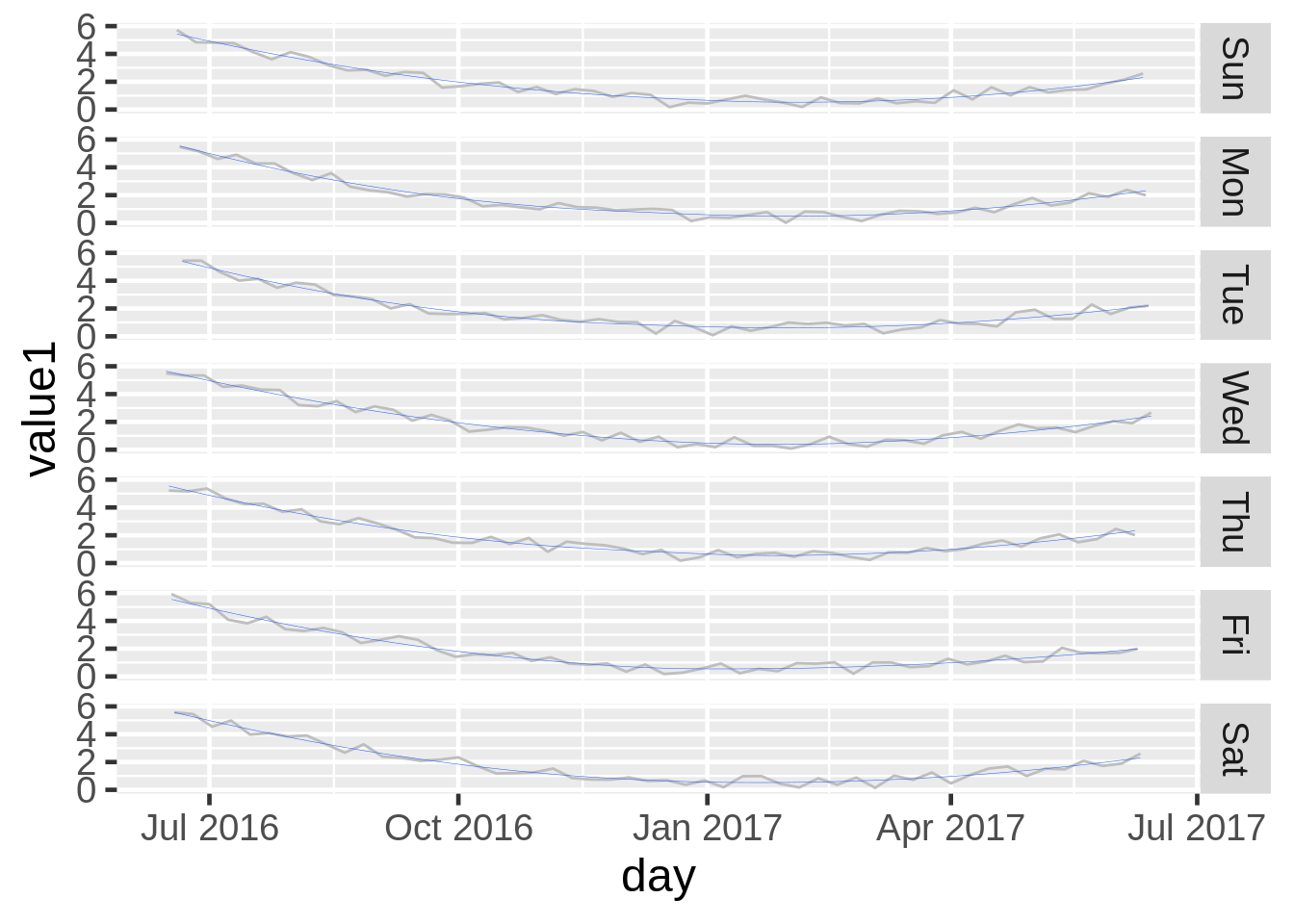
24.11.3 Facet by Day of the Week
data from https://r-graph-gallery.com/279-plotting-time-series-with-ggplot2.html
df10c <- data.frame(
  day = as.Date("2017-06-14") - 0:364,
  value1 = runif(365) + seq(-140, 224)^2 / 10000,
  value2 = runif(365) - seq(-140, 224)^2 / 10000
) #create data

g10c <- ggplot(df10c, aes(x= day, y= value1)) +
  geom_line(color = "grey") + #add the line connecting the points
  facet_grid(wday(day, label = TRUE)~.) + #facet the data by day of the week using wday() function
  geom_smooth(se = FALSE, lwd = 0.1) #can add the line to each facet

g10c