6 Graphics cheatsheet in ggplot2
Yuwei Hu
Motivation: My main purpose to create this cheat sheet is organizing statistical graphics (contains graphics mentioned in this class and in other websites(1)) by ggplot2. At the same time, I want to show the usage of ggplot2 functions in this cheat sheet. It means some graphics mentioned in this document can be created more easily by base R or other packages. This cheat sheet is divided into ‘Distribution’, ‘Correlation’, ‘Ranking’, ‘Evolution’ and ‘Flow’, five types of graphic. To find the code, you can firstly consider the type of graphic you want to draw and then choose the code for certain chart. I think that it is organized to create most graphics by ggplot2 because we can control elements in different graphs by similar methods. However, due to the existing of other graphic packages, we can draw some graphs by simpler code than several lines of ggplot2 code. Next time, I may create a cheat sheet of simpler code for the graphics mentioned in the document.
(1)https://r-graph-gallery.com/index.html
library(ggplot2)
library(gridExtra)
library(d3r)
library(dplyr)
library(forcats)
library(Lock5withR)
library(ggridges)
library(broom)
library(plotly)
library(MASS)
library(gcookbook)
library(GGally)
library(parcoords)
library(ggmosaic)
library(ggalluvial)
6.1 Distribution
6.1.1 histogram
data=data.frame(x=sample(0:20,100,replace = T))
# basic histogram
gh<-ggplot(data, aes(x)) +
  geom_histogram()+
  ggtitle("basic histogram")+
  theme_grey(8)

# add color, bin width and bin center
g1<-ggplot(data, aes(x)) +
  geom_histogram(color = "blue", fill = "lightblue", binwidth = 5, center = 0)+
  ggtitle("binwidth=5 and centered at 0")+
  theme_grey(8)

# unequal bin widths
g2<-ggplot(data, aes(x)) +
  geom_histogram(color = "blue", fill = "lightblue", breaks=c(0,2,5,10, 20))+
  ggtitle("unequal bin widths")+
  theme_grey(8)


# density histogram
gd<-ggplot(data, aes(x)) +
  geom_histogram(aes(y = ..density..),color = "blue", fill = "lightblue")+
  geom_density(color = "red") +
  ggtitle("density histogram")+
  theme_grey(8)

# Cumulative frequency histogram
gc<-ggplot(data, aes(x)) +
  geom_histogram(aes(y = cumsum(..count..)), color = "blue", fill = "lightblue") +
  ggtitle("Cumulative Frequency")+
  theme_grey(8)


# Bin boundaries: right closed/left closed
gr<-ggplot(data, aes(x)) +
  geom_histogram(color = "blue", fill = "lightblue", binwidth = 1, center = 0.5, closed = "right") +
  ggtitle("right closed")+
  theme_grey(8)

gl<-ggplot(data, aes(x)) +
  geom_histogram(color = "blue", fill = "lightblue", binwidth = 1, center = 0.5, closed = "left") +
  ggtitle("left closed")+
  theme_grey(8)

# histogram with several groups
# source: https://r-graph-gallery.com/histogram_several_group.html
gmulti<-ggplot(iris, aes(x=Sepal.Length, fill=Species)) +
    geom_histogram( color="#e9ecef", alpha=0.6, position = 'identity')+
  ggtitle("histogram with several groups")+
  theme_grey(8)

grid.arrange(gh,g1, g2,gd, gc,gr, gl,gmulti,ncol=3, nrow =3)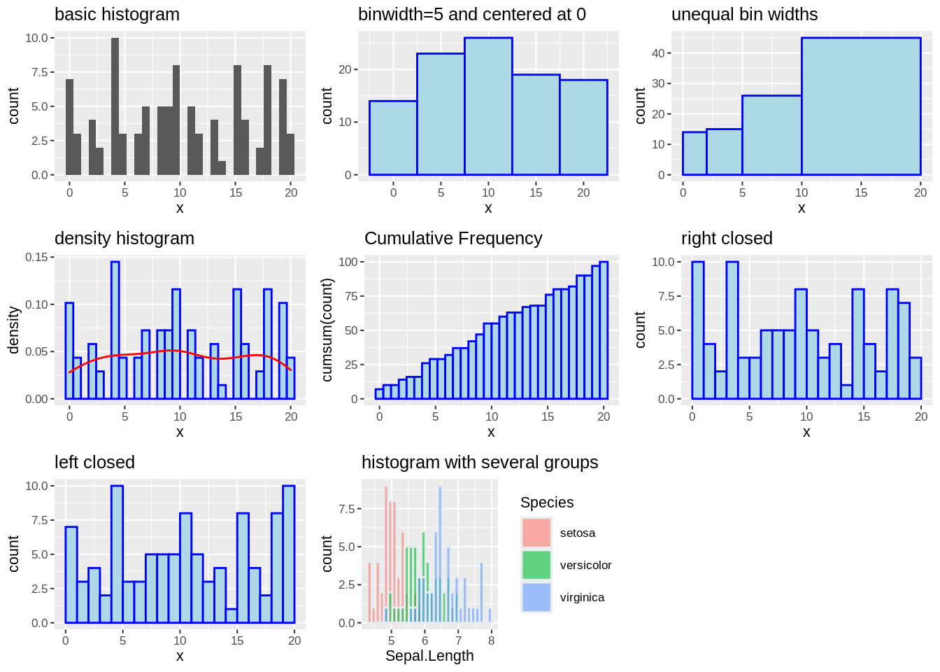
6.1.2 boxplot
# resource: https://r-graph-gallery.com/89-box-and-scatter-plot-with-ggplot2.html
data2 <- data.frame(
  group=c( rep("A",500), rep("B",500), rep("B",500), rep("C",20), rep('D', 100)  ),
  value=c( rnorm(500, 10, 5), rnorm(500, 13, 1), rnorm(500, 18, 1), rnorm(20, 25, 4), rnorm(100, 12, 1) )
)
# basic
gs<-ggplot(data, aes(x)) +
  geom_boxplot()+
  ggtitle("basic boxplot")+
  theme_grey(10)

gm<-ggplot(data2, aes(group, value)) +
  geom_boxplot()+
  ggtitle("basic boxplot by group")+
  theme_grey(10)


# reorder by median
gorder<-ggplot(data2) +
  geom_boxplot(aes(x = reorder(group, -value, median),y = value)) +
  ggtitle("order by median with variable width boxplots")+
  theme_grey(10)

# variable width boxplots
gwidth<-ggplot(data2) +
  geom_boxplot(aes(group,value),varwidth = TRUE) +
  ggtitle("variable width boxplots")+
  theme_grey(10)

# horizontal boxplots
ghorizontal<-ggplot(data2) +
  geom_boxplot(aes(group,value)) +
  coord_flip()+
  ggtitle("horizontal boxplots")+
  theme_grey(10)

grid.arrange(gs, gm,gorder, gwidth,ghorizontal,ncol=3, nrow =2)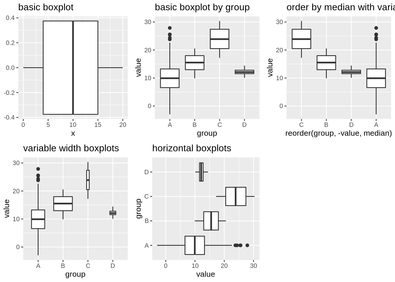
6.1.3 Violin plots, ridgeline plot vs boxplot
# basic violin plots with color
gv<-ggplot(data2) +
geom_violin(aes(group,value, fill=group),adjust = 6)+
ggtitle("violin plots")
# basic ridgeline plot
gr<-ggplot(data2) +
geom_density_ridges(aes(value,group, fill=group), alpha = .5, scale = 1)+
ggtitle("ridgeline plot")
grid.arrange(gv, gr,gm,ncol=2, nrow =2)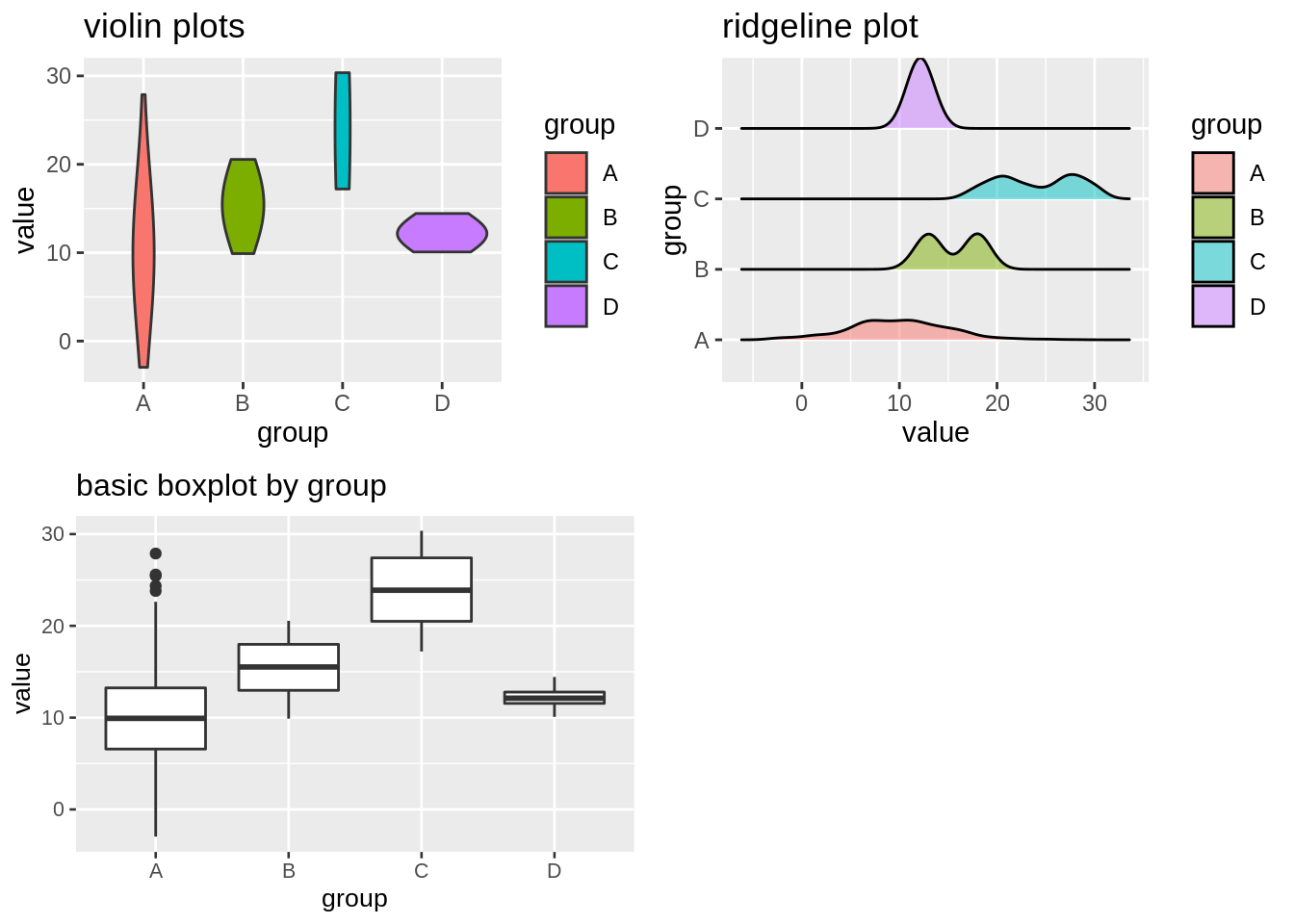 ## Correlation
### Scatterplot
## Correlation
### Scatterplot
gsca<-ggplot(iris, aes(x=Sepal.Length, y=Sepal.Width,color = Species)) +
  geom_point()+
  ggtitle("colored Scatterplot")+
  theme_grey(8)

gscaadj<-ggplot(iris, aes(x=Sepal.Length, y=Sepal.Width)) +
  geom_point(alpha = 0.4, size = 0.8,pch = 21,stroke = 0)+
  ggtitle("Scatterplot with adjusted alpha, size, pch, stroke")+
  theme_grey(8)

glm<-ggplot(iris, aes(x=Sepal.Length, y=Sepal.Width)) +
  geom_point()+
  geom_smooth(method = 'lm', se = FALSE) +
  ggtitle("basic Scatterplot with linear model")+
  theme_grey(8)


mod <- lm(Sepal.Width~Sepal.Length,iris)
r2 <- summary(mod)$r.squared

df <- mod %>% augment()
grp<-ggplot(df, aes(.fitted, .std.resid)) +
  geom_point()+
  geom_hline(yintercept = 0, col = "blue")+
  ggtitle("Residual plot")+
  theme_grey(8)

# basic Scatterplot with facets
gsf<-ggplot(iris, aes(x=Sepal.Length, y=Sepal.Width)) +
  geom_point()+
  facet_wrap(~Species, ncol=3,scales = "free_x")+
  ggtitle("basic Scatterplot with facets")+
  theme_grey(8)

grid.arrange(gsca,gscaadj,glm,grp,gsf,ncol=3, nrow =2)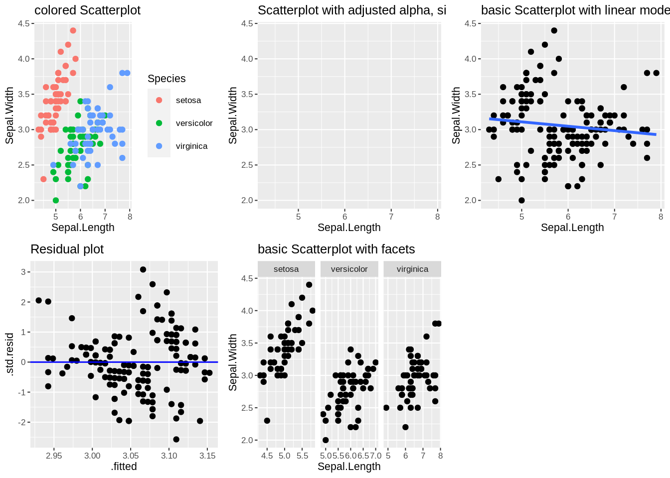
# Interactive

ggplotly(gsca)
# scatterplot with heatmap and contour lines
ghh<-ggplot(iris, aes(x=Sepal.Length, y=Sepal.Width)) +
  scale_fill_viridis_c()+
  geom_hex(binwidth = c(0.5, 0.5), alpha = .4)+
  geom_point(size = 1)+
  ggtitle("Scatterplot with Hex heatmap")+
  theme_grey(8)

gsh<-ggplot(iris, aes(x=Sepal.Length, y=Sepal.Width)) +
  scale_fill_viridis_c()+
  geom_bin2d(binwidth = c(0.5, 0.5), alpha = .4)+
  geom_point(size = 1)+
  ggtitle("Scatterplot with Square heatmap")+
  theme_grey(8)

gcl<-ggplot(iris, aes(x=Sepal.Length, y=Sepal.Width)) +
  scale_fill_viridis_c()+
  geom_density2d(colour="red",bins = 5)+
  geom_point(size = 1)+
  ggtitle("Scatterplot with contour lines")+
  theme_grey(8)

data3<-data.frame(time = c(1,2,3,4,5,6,7,8,9,10),
                  value = sample(1:50,10))
# basic connected scatterplot
ggcs<-ggplot(data3, aes(x=time, y=value)) +
    geom_line() +
    geom_point()+
  ggtitle("basic connected scatterplot")+
  theme_grey(8)

grid.arrange(ghh,gsh,gcl,ggcs,ncol=2, nrow =2)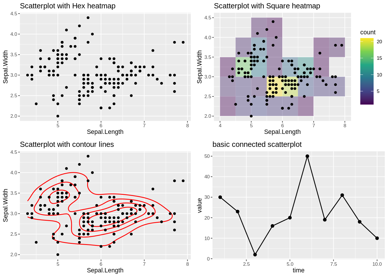
# 2D kernel

f1 <- kde2d(iris$Sepal.Length, iris$Sepal.Width)
image(f1)
contour(f1, add = T)
points(iris$Sepal.Length, iris$Sepal.Width, pch = 16)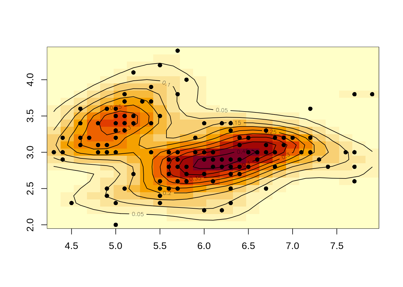
6.1.4 Heatmap
# data from course notes
grade <- rep(c("first", "second", "third", "fourth"), 3)
subject <- rep(c("math", "reading", "gym"), each = 4)
statescore <- sample(50, 12) + 50
df <- data.frame(grade, subject, statescore)

# basic heatmap
ghp<-ggplot(df, aes(grade, subject, fill = statescore))+
  geom_tile()+
  ggtitle("basic heatmap")+
  theme_grey(8)

# control color
ghpc<-ggplot(df, aes(grade, subject, fill = statescore)) +
  geom_tile() +
  scale_fill_gradient(low="white", high="blue")+
  ggtitle("control color")+
  theme_grey(8)

grid.arrange(ghp,ghpc,ncol=2, nrow =1)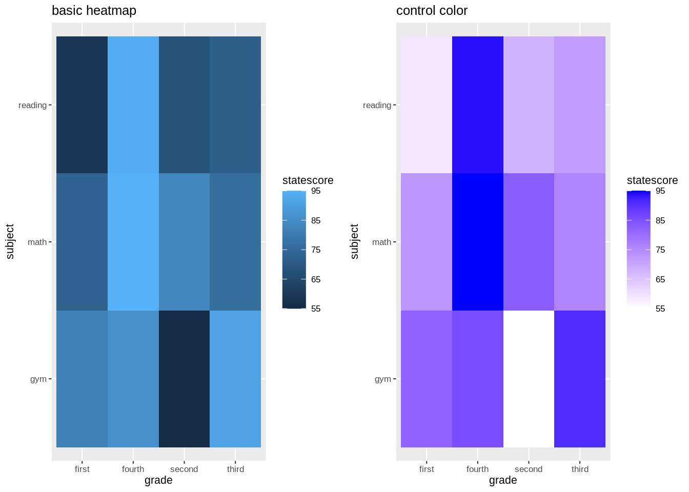
# interactive
ggplotly(ghp)
6.1.5 Bubble plot
# source: https://r-graph-gallery.com/320-the-basis-of-bubble-plot.html
head(StudentSurvey)
## Year Gender Smoke Award HigherSAT Exercise TV Height Weight Siblings
## 1 Senior M No Olympic Math 10 1 71 180 4
## 2 Sophomore F Yes Academy Math 4 7 66 120 2
## 3 FirstYear M No Nobel Math 14 5 72 208 2
## 4 Junior M No Nobel Math 3 1 63 110 1
## 5 Sophomore F No Nobel Verbal 3 3 65 150 1
## 6 Sophomore F No Nobel Verbal 5 4 65 114 2
## BirthOrder VerbalSAT MathSAT SAT GPA Pulse Piercings Sex
## 1 4 540 670 1210 3.13 54 0 Male
## 2 2 520 630 1150 2.50 66 3 Female
## 3 1 550 560 1110 2.55 130 0 Male
## 4 1 490 630 1120 3.10 78 0 Male
## 5 1 720 450 1170 2.70 40 6 Female
## 6 2 600 550 1150 3.20 80 4 Female
# basic bubble plot
gbp<-ggplot(StudentSurvey, aes(x=VerbalSAT, y=MathSAT, size = Exercise)) +
  geom_point(alpha=0.5)+
  ggtitle("basic bubble plot")+
  theme_grey(8)

# Control circle size
gbps<-ggplot(StudentSurvey, aes(x=VerbalSAT, y=MathSAT, size = Exercise)) +
  geom_point(alpha=0.1)+
  scale_size(range = c(.1, 10))+
  ggtitle("control circle size")+
  theme_grey(8)

# add the fourth dimension
gbpd<-ggplot(StudentSurvey, aes(x=VerbalSAT, y=MathSAT, size = Exercise,color = Gender)) +
  geom_point(alpha=0.5)+
  ggtitle("add the fourth dimension")+
  theme_grey(8)

grid.arrange(gbp,gbps,gbpd,ncol=2, nrow =2)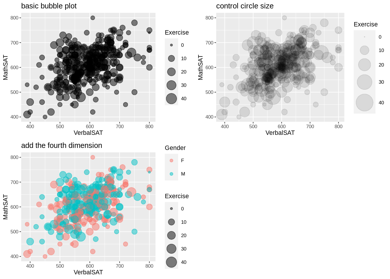
6.2 Ranking
6.2.1 bar chart
# with/without stat="identity"
gb1<-ggplot(data2,aes(x=group, y=value)) +
  geom_bar(stat = "identity")+
  ggtitle("with stat")

gb2<-ggplot(data2,aes(group)) +
  geom_bar()+
  ggtitle("without stat")

# order bar chart
data2$group<-factor(data2$group)

gborder1<-ggplot(data2) +
  geom_bar(aes(fct_infreq(group))) +
  ggtitle("order the levels of x by decreasing frequency")+
  theme_grey(6)

gborder2<-data2 %>%
  group_by(group) %>%
  summarize(sum = sum(value)) %>%
  ggplot(aes(fct_reorder(group, sum, .desc = TRUE), sum))+
  geom_bar(stat = "identity")+
  ggtitle("reorder x by y")+
  theme_grey(6)

gborder<-ggplot(data2, aes(x = fct_inorder(group), y = value)) +
  geom_bar(stat = "identity")+
  ggtitle("set level order of x to row order")+
  theme_grey(6)

gborderm1<-ggplot(data2, aes(x = fct_relevel(group, "C"), y = value)) +
  geom_bar(stat = "identity")+
  ggtitle("manually set group C to the first") +
  theme_grey(6)

gborderm2<-ggplot(data2, aes(x = fct_relevel(group, "C",after = 2), y = value)) +
  geom_bar(stat = "identity")+
  ggtitle("manually set group C after the second group") +
  theme_grey(6)

gborderm3<-ggplot(data2, aes(x = fct_relevel(group, "C",after = Inf), y = value)) +
  geom_bar(stat = "identity")+
  ggtitle("manually set group C to the last") +
  theme_grey(6)

gbrev<-ggplot(data2, aes(fct_rev(group))) +
  geom_bar() +
  coord_flip() +
  ggtitle("reverse the order of factor levels of x") +
  theme_grey(6)

grid.arrange(gb1, gb2,gborder1, gborder2,gborder,gborderm1,gborderm2,gborderm3,gbrev,ncol=4, nrow =3)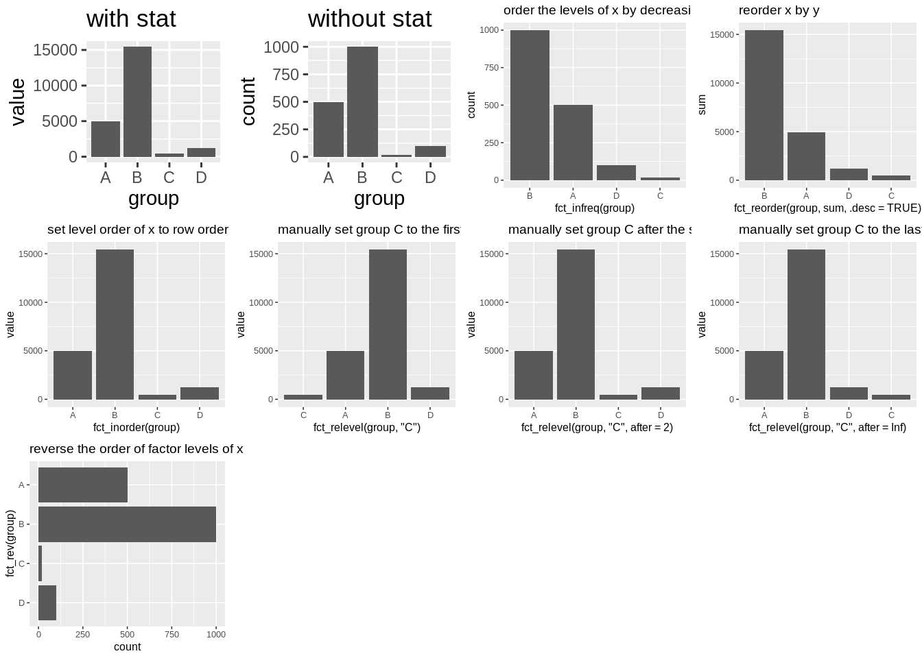
6.2.2 Cleveland dot plot
# resourse: https://r-graphics.org/recipe-bar-graph-dot-plot

tophit <- tophitters2001[1:25, ]

gc1<-ggplot(tophit, aes(x = avg, y = name)) +
  geom_point()+
  ggtitle("basic Cleveland dot plot") +
  theme_grey(8)

gc2<-ggplot(tophit, aes(x = avg, y = fct_reorder(name, avg))) +
  geom_point() +
  ggtitle("ordered Cleveland dot plot") +
  theme_grey(8)

gc3<-ggplot(tophit, aes(x = avg, y = fct_reorder(name, avg), color = lg)) +
  geom_point() +
  ggtitle("ordered Cleveland dot plot by color") +
  theme_grey(8)

gc4<-ggplot(tophit, aes(x = avg, y = fct_reorder(name, avg))) +
  geom_point() +
  facet_grid(lg~.,scales = "free_y", space = "free_y") +
  ggtitle("ordered Cleveland dot plot with facets") +
  theme_grey(8)

grid.arrange(gc1,gc2,gc3,gc4,ncol=2, nrow =2)
6.2.3 Parallel coordinates plot
# rescale + group
gstd<-ggparcoord(iris, columns = 1:4,groupColumn = 5)+
  ggtitle("substract mean & divide by sd")+
  theme_grey(8)
gglo<-ggparcoord(iris, columns = 1:4,groupColumn = 5,scale = "globalminmax")+
  ggtitle("No scaling")+
  theme_grey(8)
guni<-ggparcoord(iris, columns = 1:4,groupColumn = 5,scale = "uniminmax")+
  ggtitle("Standardize to Min = 0 and Max = 1")+
  theme_grey(8)
gcenter<-ggparcoord(iris, columns = 1:4,groupColumn = 5,scale = "center")+
  ggtitle("Standardize and center variables")+
  theme_grey(8)

# change alpha
gpcalpha<-ggparcoord(iris, columns = 1:4,alphaLines = .3)+
  ggtitle("change alpha")+
  theme_grey(8)
# Splines
gpcspline<-ggparcoord(iris, columns = 1:4, splineFactor = 10) +
  ggtitle("splines")+
  theme_grey(8)

# Highlight a group
iriscolor <- iris %>%
mutate(color = factor(ifelse(Species == "setosa",1,0))) %>%
arrange(color)
gpchl<-ggparcoord(iriscolor, columns = 1:4, groupColumn = "color") +
  scale_color_manual(values = c("grey70", "red")) +
  guides(color = FALSE) +
  ggtitle("highlight setosa")+
  theme_grey(8)

grid.arrange(gstd,gglo,guni,gcenter,gpcalpha,gpcspline,gpchl,ncol=3, nrow =3)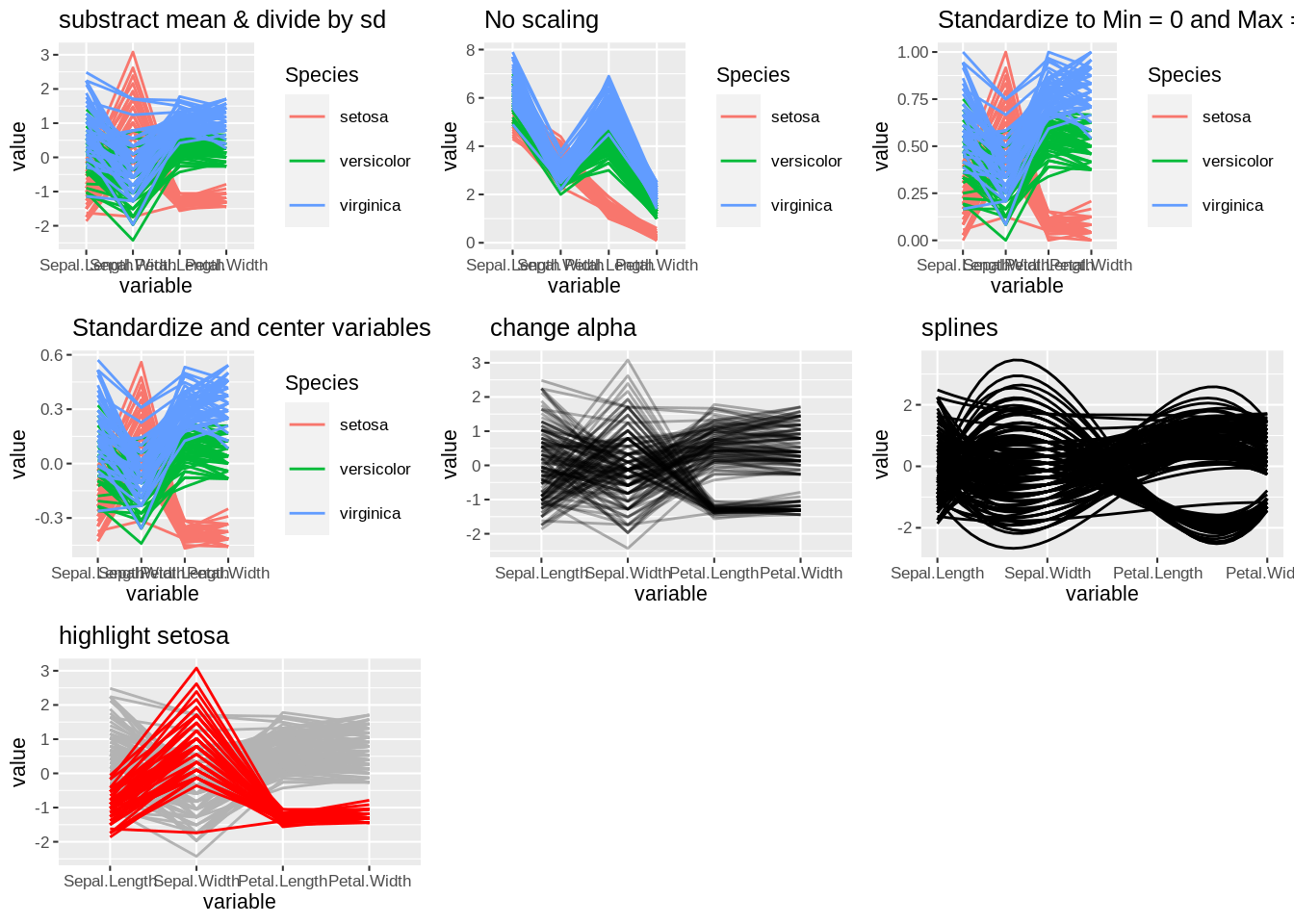
# interactive Parallel coordinates with arrangement by groups

iris %>% arrange(Species) %>%
parcoords(
rownames = F
, brushMode = "1D-axes"
, reorderable = T
, queue = T
, color = list(
colorBy = "Region"
,colorScale = "scaleOrdinal"
,colorScheme = "schemeCategory10"
)
, withD3 = TRUE
, width = 1000
, height = 400
)
6.2.4 Mosaic plot
# Stacked bar chart
gsbc<-ggplot(StudentSurvey, aes(x = Year, fill = Award)) +
  geom_bar()+
  ggtitle("Stacked bar chart")+
  theme_grey(8)

# Mosaic plot (2 var)

gmp2<-ggplot(StudentSurvey) +
  geom_mosaic(aes(x = product(Year), fill = Award))+
  ggtitle("Mosaic plot (2 var)")+
  theme_grey(8)

# Mosaic plot (3 var)
gmp3<-ggplot(StudentSurvey) +
  geom_mosaic(aes(x = product(Year,Gender), fill = Award))+
  ggtitle("Mosaic plot (3 var)")+
  theme_grey(8)

grid.arrange(gsbc,gmp2,gmp3,ncol=2, nrow =2)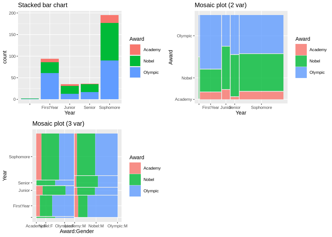
6.2.5 lollipop plot
# source: https://r-graph-gallery.com/301-custom-lollipop-chart.html
# basic lollipop plot
glp<-ggplot(data3, aes(x=time, y=value)) +
  geom_point() +
  geom_segment( aes(x=time, xend=time, y=0, yend=value))+
  ggtitle("basic lollipop plot")+
  theme_grey(8)

# control marker
glpm<-ggplot(data3, aes(x=time, y=value)) +
  geom_point() +
  geom_segment( aes(x=time, xend=time, y=0, yend=value))+
  geom_point( size=5, color="red", fill=alpha("orange", 0.3), alpha=0.7, shape=21, stroke=2) +
  ggtitle("control marker")+
  theme_grey(8)

# control stem
glps<-ggplot(data3, aes(x=time, y=value)) +
  geom_point() +
  geom_segment( aes(x=time, xend=time, y=0, yend=value),size=1, color="blue",linetype="dotdash" )+
  ggtitle("control stem")+
  theme_grey(8)

# control baseline
glpb<-ggplot(data3, aes(x=time, y=value)) +
  geom_point() +
  geom_segment( aes(x=time, xend=time, y=20, yend=value))+
  ggtitle("control baseline")+
  theme_grey(8)

grid.arrange(glp,glpm,glps,glpb,ncol=2, nrow =2)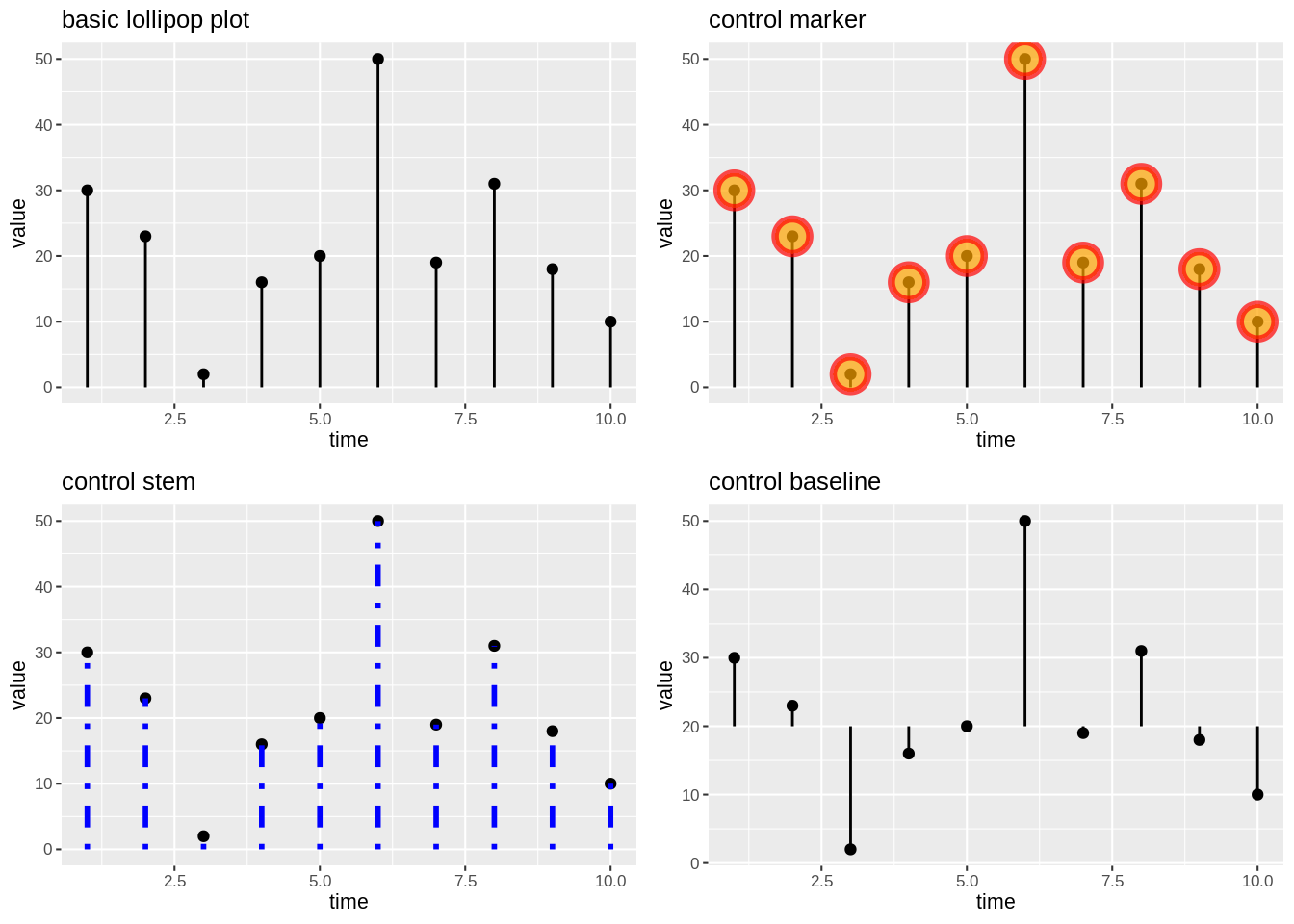
6.2.6 Donut chart, pie chart
# source: https://r-graph-gallery.com/128-ring-or-donut-plot.html
data2$fraction = data2$value / sum(data2$value)
data2$ymax = cumsum(data2$fraction)
data2$ymin = c(0, head(data2$ymax, n=-1))

gdc<-ggplot(data2, aes(ymax=ymax, ymin=ymin, xmax=4, xmin=2, fill=group)) +
  geom_rect() +
  coord_polar(theta="y")+
  xlim(c(-1, 4))+
  ggtitle("Donut chart")+
  theme_grey(8)

gpc<-ggplot(data2, aes(ymax=ymax, ymin=ymin, xmax=4, xmin=2, fill=group)) +
  geom_rect() +
  coord_polar(theta="y")+
  ggtitle("Pie chart")+
  theme_grey(8)

grid.arrange(gdc,gpc,ncol=2, nrow =1)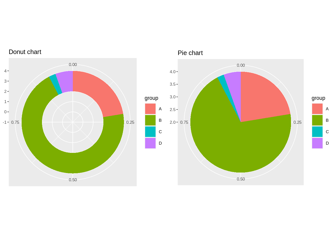
6.3 Evolution
6.3.1 line plot/area chart
# source: https://r-graph-gallery.com/line-chart-ggplot2.html
# basic line plot
glp<-ggplot(data3, aes(x=time, y=value)) +
  geom_line()+
  ggtitle("basic line plot")+
  theme_grey(8)

# Customize
glpc<-ggplot(data3, aes(x=time, y=value)) +
  geom_line( color="#69b3a2", size=2, alpha=0.9, linetype=2)+
  ggtitle("customize line plot")+
  theme_grey(8)

# basic area chart
gac<-ggplot(data3, aes(x=time, y=value)) +
  geom_area()+
  ggtitle("basic area chart")+
  theme_grey(8)

data4<-data.frame(time = as.numeric(rep(seq(1,7),each=7)),
value = runif(49, 10, 100) ,
group = rep(LETTERS[1:7],times=7)
)

# basic stacked area chart
gsac<-ggplot(data4, aes(x=time, y=value, fill=group)) +
  geom_area()+
  ggtitle("basic stacked area chart")+
  theme_grey(8)

# proportional stacked area chart
data4 <- data4  %>%
  group_by(time, group) %>%
  summarise(n = sum(value)) %>%
  mutate(percentage = n / sum(n))
gpsac<-ggplot(data4, aes(x=time, y=percentage, fill=group)) +
  geom_area(alpha=0.6 , size=1, colour="black")

grid.arrange(glp,glpc,gac,gsac,gpsac,ncol=3, nrow =2)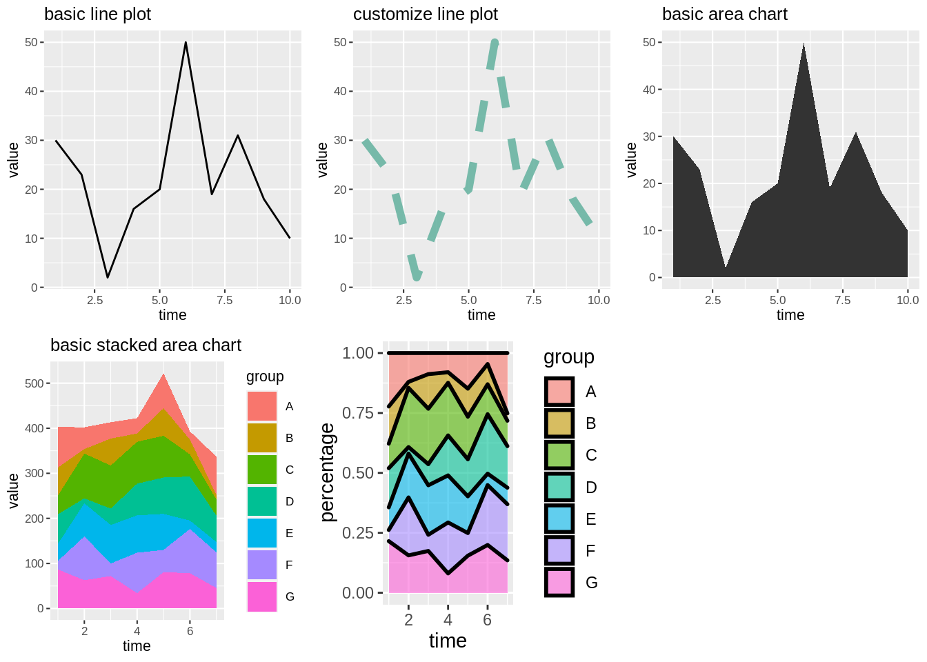
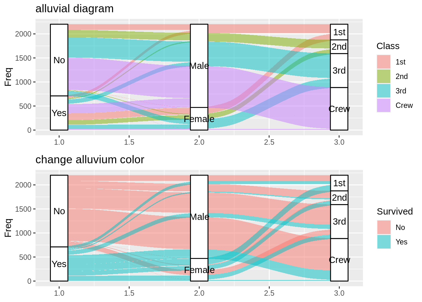
6.4 flow
6.4.1 alluvial diagram
# source: https://cran.r-project.org/web/packages/ggalluvial/vignettes/ggalluvial.html#:~:text=The%20ggalluvial%20package%20is%20a,the%20feedback%20of%20many%20users.

# alluvial diagram example

gad<-ggplot(as.data.frame(Titanic),aes(y = Freq, axis1 = Survived, axis2 = Sex, axis3 = Class)) +
  geom_alluvium(aes(fill = Class),width = 0)+
  geom_stratum(width = 1/8) +
  geom_text(stat = "stratum", aes(label = after_stat(stratum)))+
  ggtitle("alluvial diagram")

# change alluvium color
gadc<-ggplot(as.data.frame(Titanic),aes(y = Freq, axis1 = Survived, axis2 = Sex, axis3 = Class)) +
  geom_alluvium(aes(fill = Survived),width = 0)+
  geom_stratum(width = 1/8) +
  geom_text(stat = "stratum", aes(label = after_stat(stratum)))+
  ggtitle("change alluvium color")

grid.arrange(gad,gadc,ncol=1, nrow =2)