36 Differences between some packages of visualizaiton
Yudong Zhou and Yanbo Wang
library(ggplot2)
library(plotly)
library(tidyverse)
library(dygraphs)
library(leaflet)
library(ggfortify)
library(corrplot)
# require(devtools)
# install_github('recharts', 'taiyun')
library(recharts) # must be installed from source
36.1 – Surface
Visualization is a very important part in R language. In order to facilitate users to complete visualization operations, many developers have concentrated themselves on the visualization research and developed a variety of practical packages.
In this .html file, Yudong Zhou and Yanbo Wang will complete descriptions and summaries of several visualization packages. Hope this file may contribute a lot to other students’ data-visualization learning process.
Another purpose of this work proves to be early preparation for our final project. Yudong and Yanbo believe that these kinds of summaries and examples will help us quite a lot for the final project, in which we are planning to analyze and visualize multivariate variables and time series data.
36.2 – ggplot2
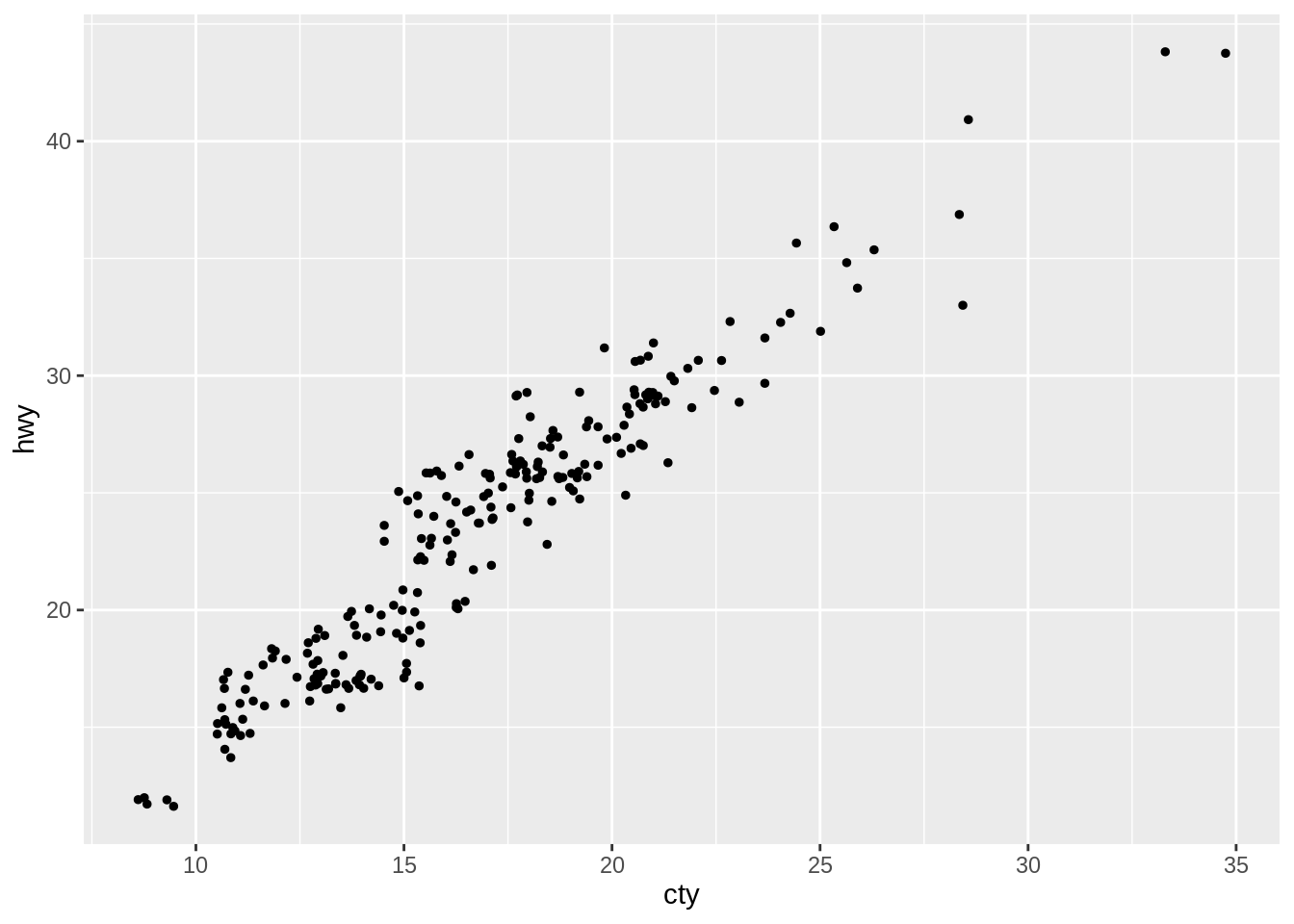
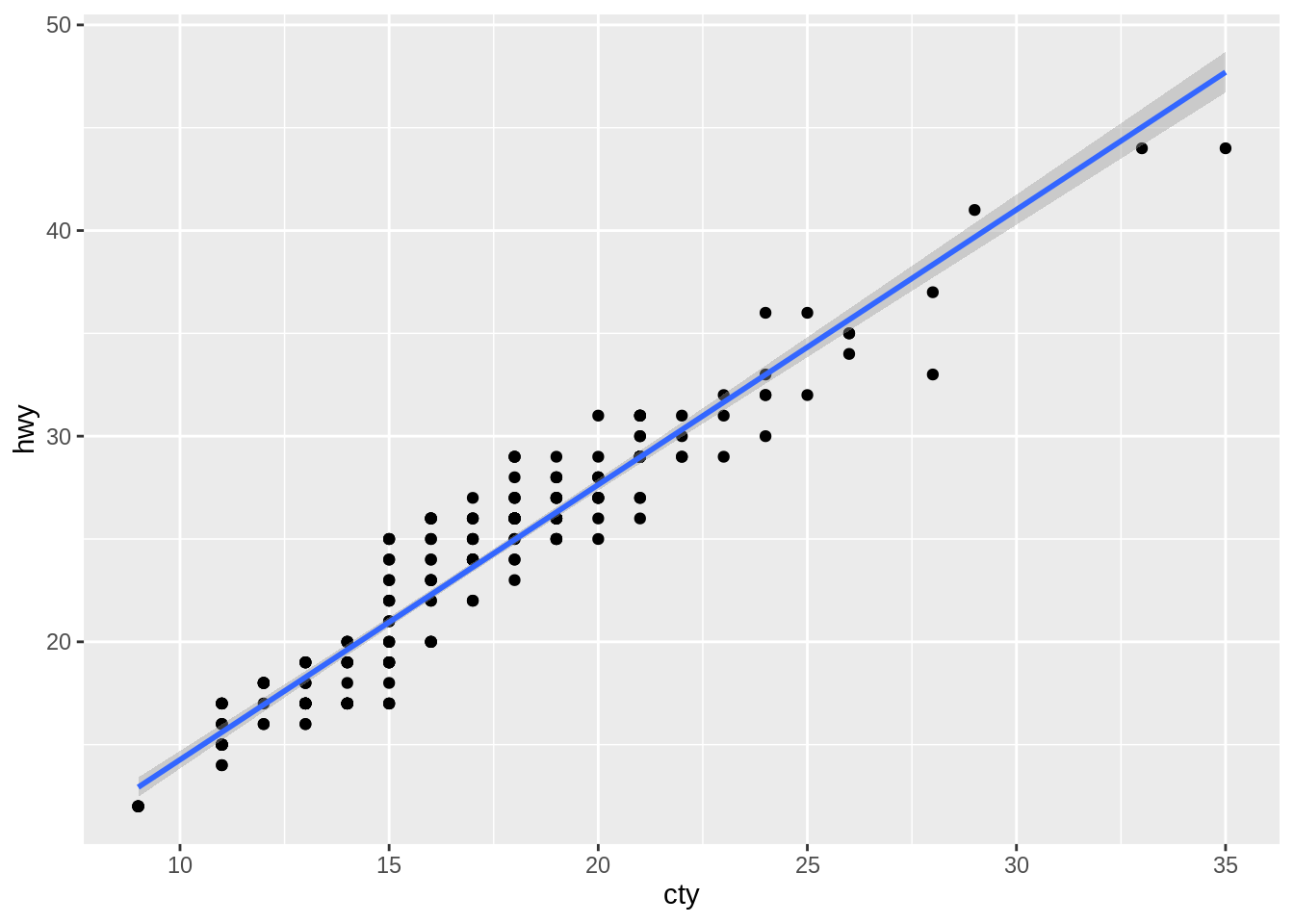
This package, ggplot2, is supposed to be the most famous and the most commonly used visualization tool in R language. Up to now, we believe that students, who are enjoying going through the data visualization learning process, must have been quite familiar with the basic grammar and have completed several graphs with this useful package. Therefore, we will not go into too much detail here, instead, we will provide some typical examples of the ggplot2 package.
In our final project, ggplot2 is going to be our main tool to demonstrate basic values of variables and the relationships among them.
36.2.1 Basic template that can be used for different types of plots: ggplot(data = , mapping = aes()) + ()
36.2.3 Box Plot
ggplot(mpg, aes(class, cty)) +
 geom_boxplot()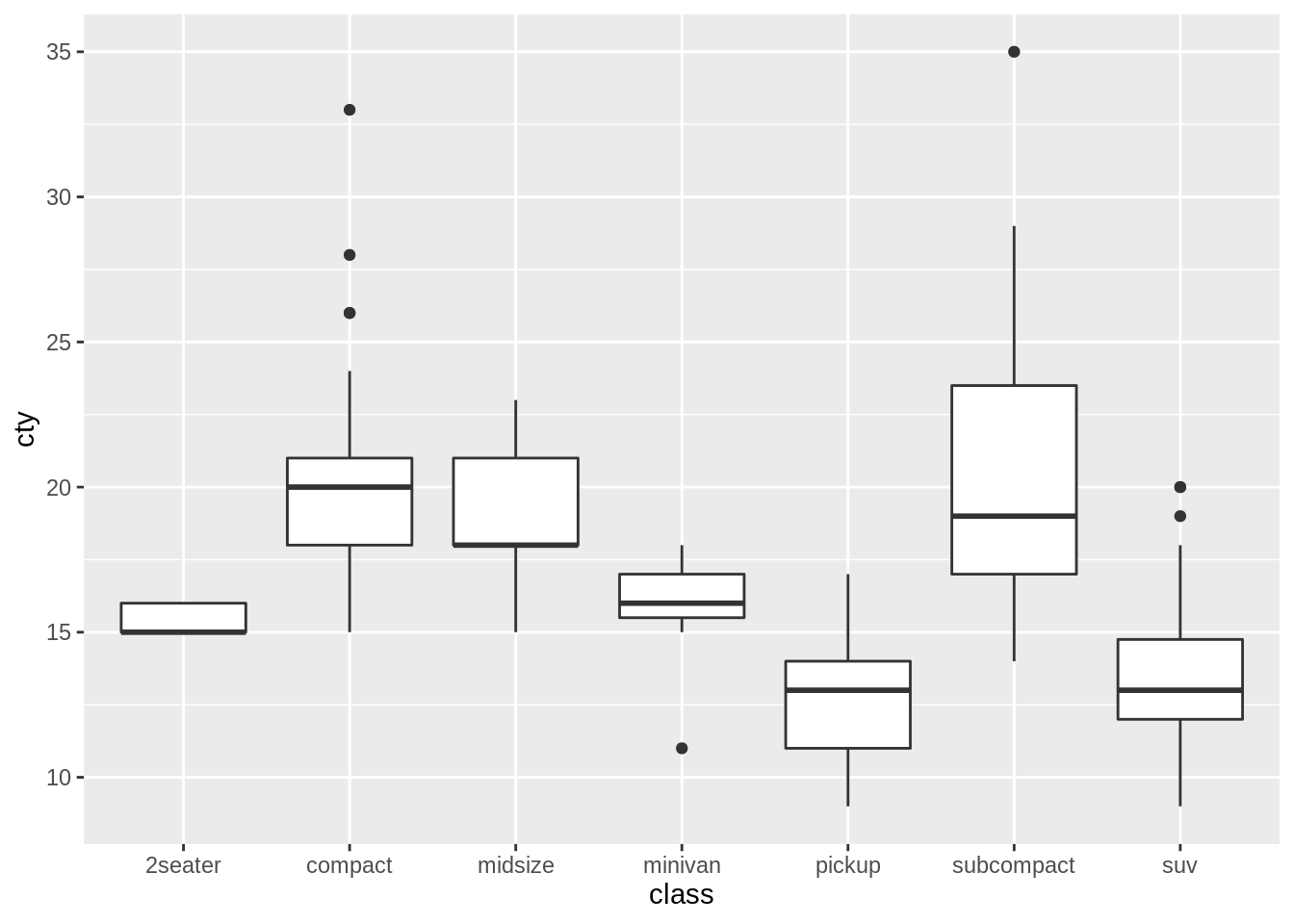
36.2.3.1 Pie Chart
ggplot(mpg, aes(x = "", fill = factor(class))) +
  geom_bar(width = 1) +
  theme(axis.line = element_blank(),
        plot.title = element_text(hjust=0.5)) +
  coord_polar(theta = "y", start=0)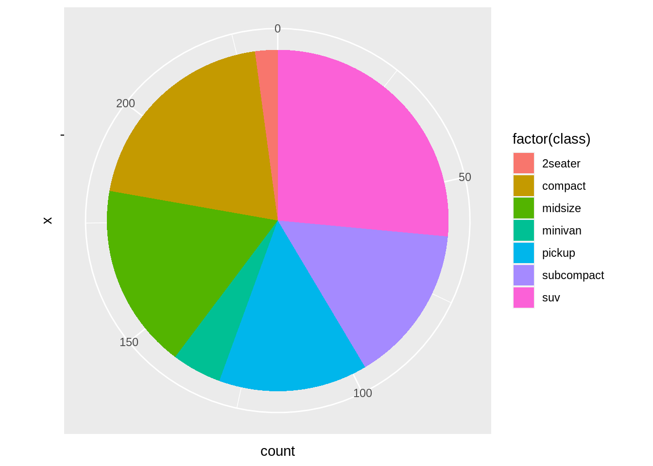
36.2.4 Histogram
ggplot(mpg, aes(displ)) +
  geom_histogram(aes(fill=class), bins = 10, col = "grey")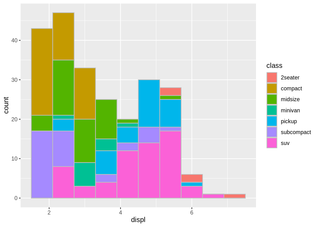
For more details about ggplot2, you can go to check the cheatsheets of it — https://github.com/rstudio/cheatsheets/blob/main/data-visualization-2.1.pdf
36.3 – plotly
This package, Plotly, is pretty similar with the aforementioned ggplot2. However, compared to ggplot2, plotly is more able to generate interactive and high-quality plots.
In our final project, we may use plotly to produce interactive plots to make our outcomes much more readable and illustrative.
The next following two examples - interactive bar chart and boxplot - are the two useful plots we are going to include in our final project.
36.3.2 Interactive boxplot
plot_ly(diamonds, y = ~price) %>% add_boxplot(x = ~cut)For more information about plotly of R, you can check the Plotly R Open Source Graphing Library — https://plotly.com/r/
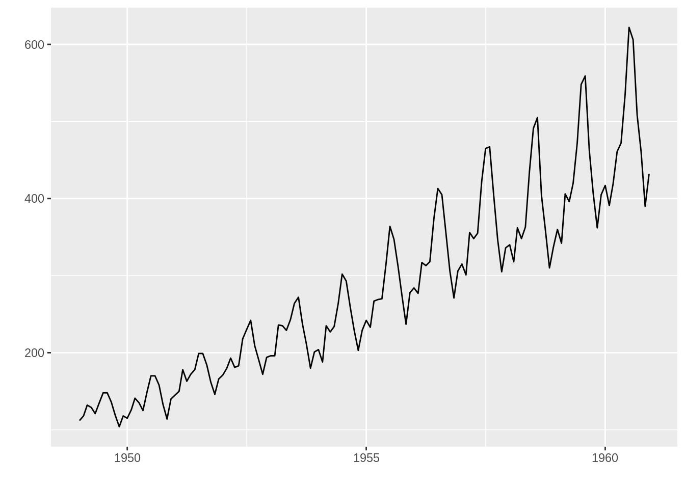
36.4 – dygraphs
Like plotly, dygraphs is also able to draw out interactive plots using its dygraphs Javascripts charting library. One thing that makes this package stand out is dygraphs profoundly facilitates us to complete time series data visualization analysis.
In our final project, the data we are going to analyze are closely related with imports and exports. This special attribute natually makes the data become time series data. There is no doubt that dygraphs will be definitely helpful for us to complete time series analysis.
36.5 – leaflet
Once again, leaflet is also a practical package that can gives birth to interactive graph. But in this case, leaflet is specially designed for interactive maps.
This leaflet package seems special because of its unique property and function. We may use it to geographically analyze import and export data.
leaflet() %>%
  addTiles() %>%
  addMarkers(lat=40.8075, lng=-73.9626, popup="The location of Columbia University")
36.6 – ggfortify
ggfortify extends ggplot2 for plotting some popular R packages using a standardized approach.
Moreover, this package gives us some practical methods to specifically complete variable relationship analysis by building up models.
36.6.1 Heatmap
df <- mtcars[, c("mpg", "disp", "hp", "drat", "wt")]
df <- as.matrix(df)

# Heatmap
autoplot(scale(df))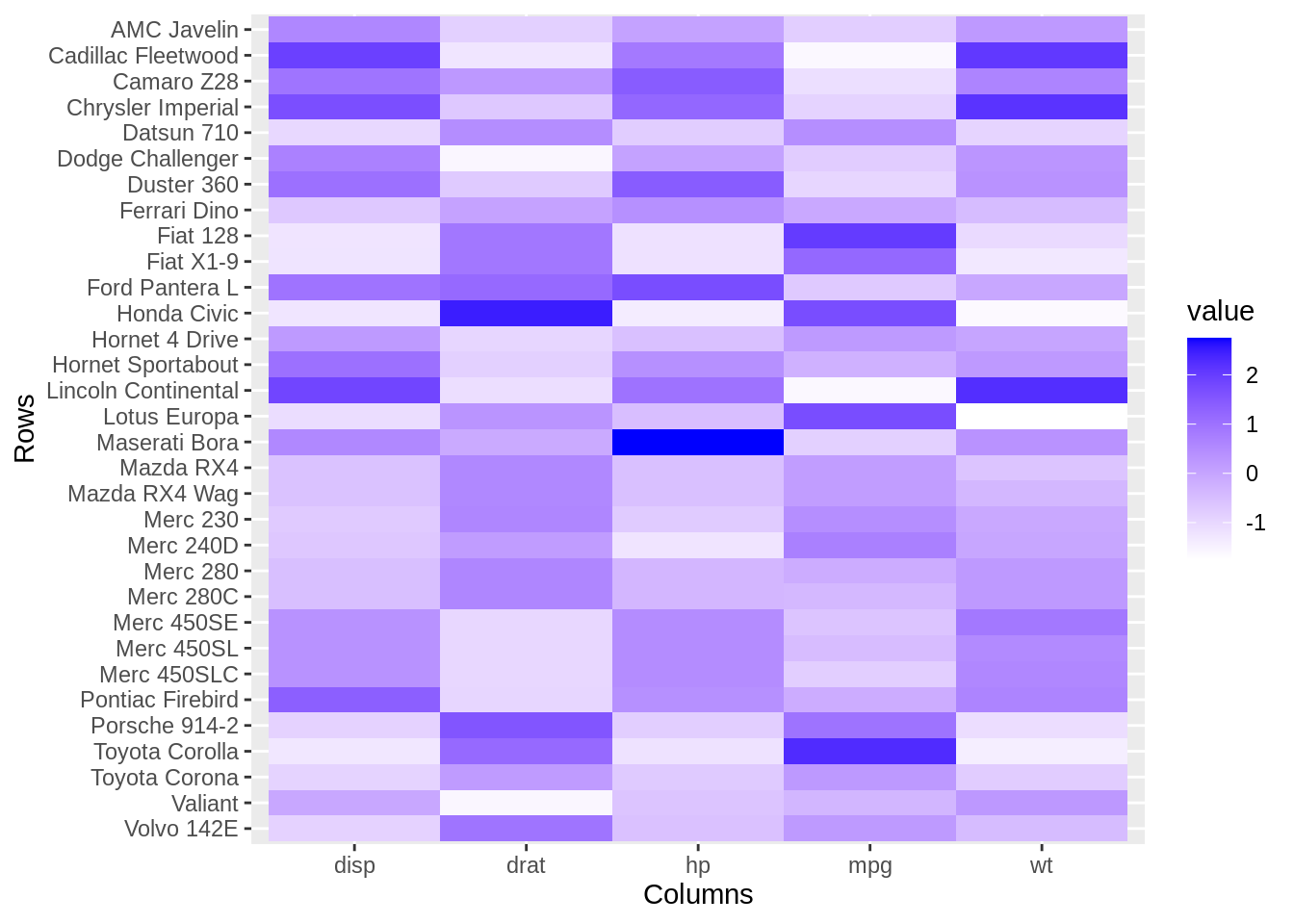
36.6.2 Scatterplot
# Extract the data
df2 <- df[, c("wt", "mpg")]
colnames(df2) <- c("V1", "V2")
# Scatter plot
autoplot(df2, geom = 'point') +
  labs(x = "mpg", y = "wt")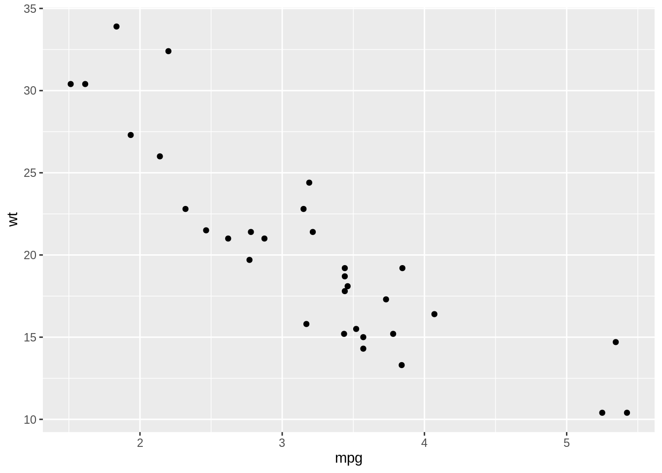
36.6.3 Diagnostic plots for Linear Models (LM)
# Compute a linear model
m <- lm(Petal.Width ~ Petal.Length, data = iris)
# Create the plot
autoplot(m, which = 1:6, ncol = 2, label.size = 3)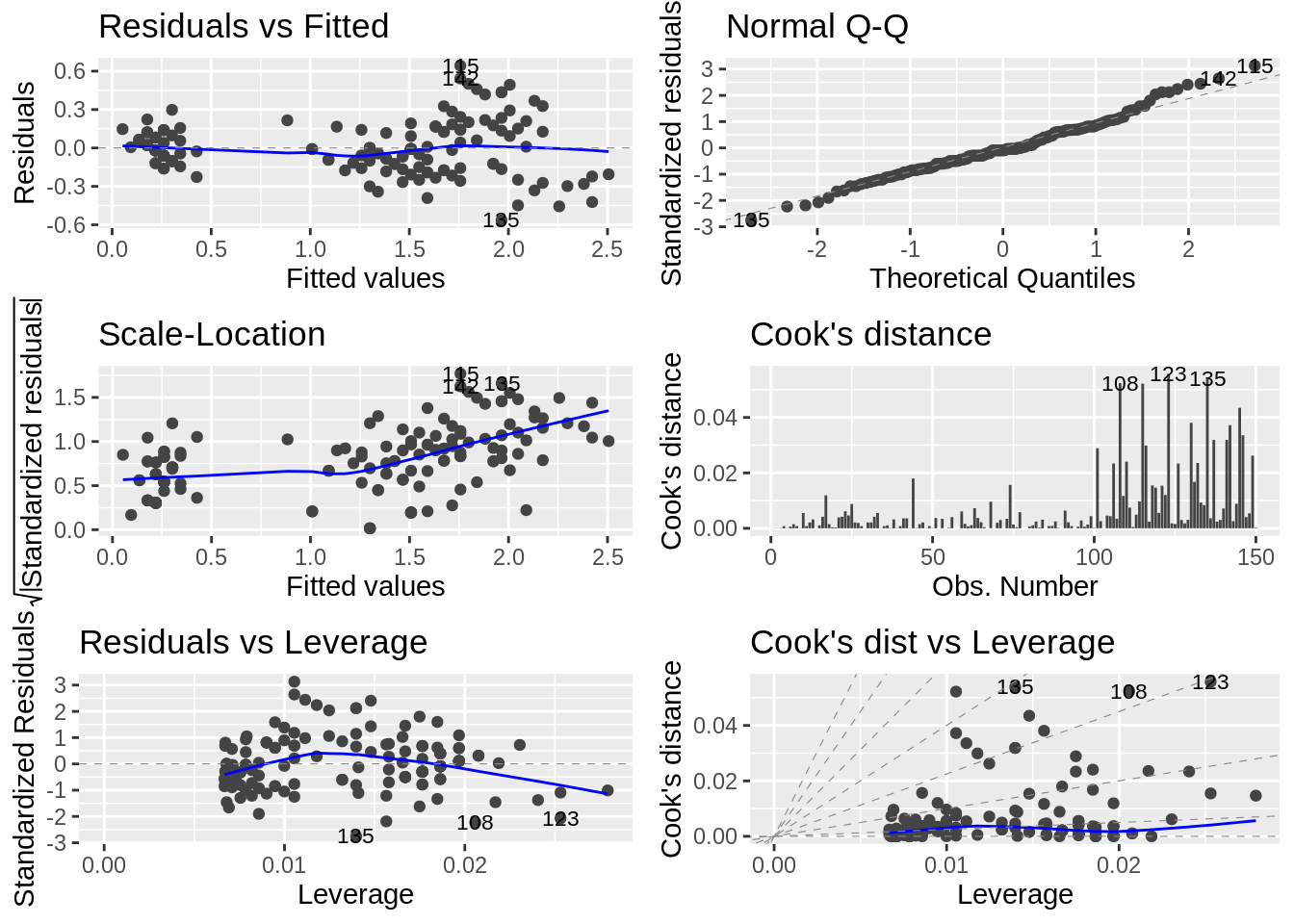
36.6.4 Diagnostic plots with Generalized Linear Models (GLM)
# Compute a generalized linear model
m <- glm(Murder ~ Assault + UrbanPop + Rape,
         family = gaussian, data = USArrests)
# Create the plot
# Change the theme and colour
autoplot(m, which = 1:6, ncol = 2, label.size = 3,
         colour = "steelblue") + theme_bw()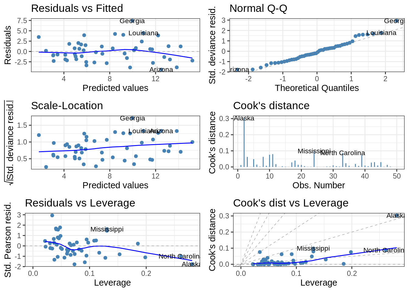
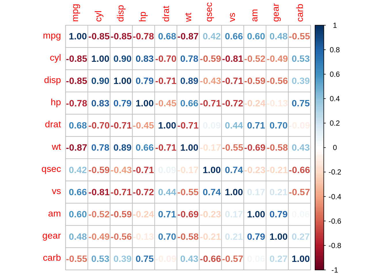
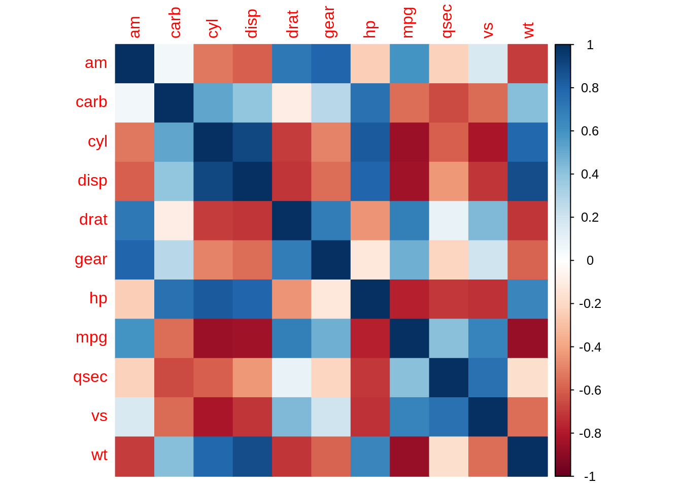
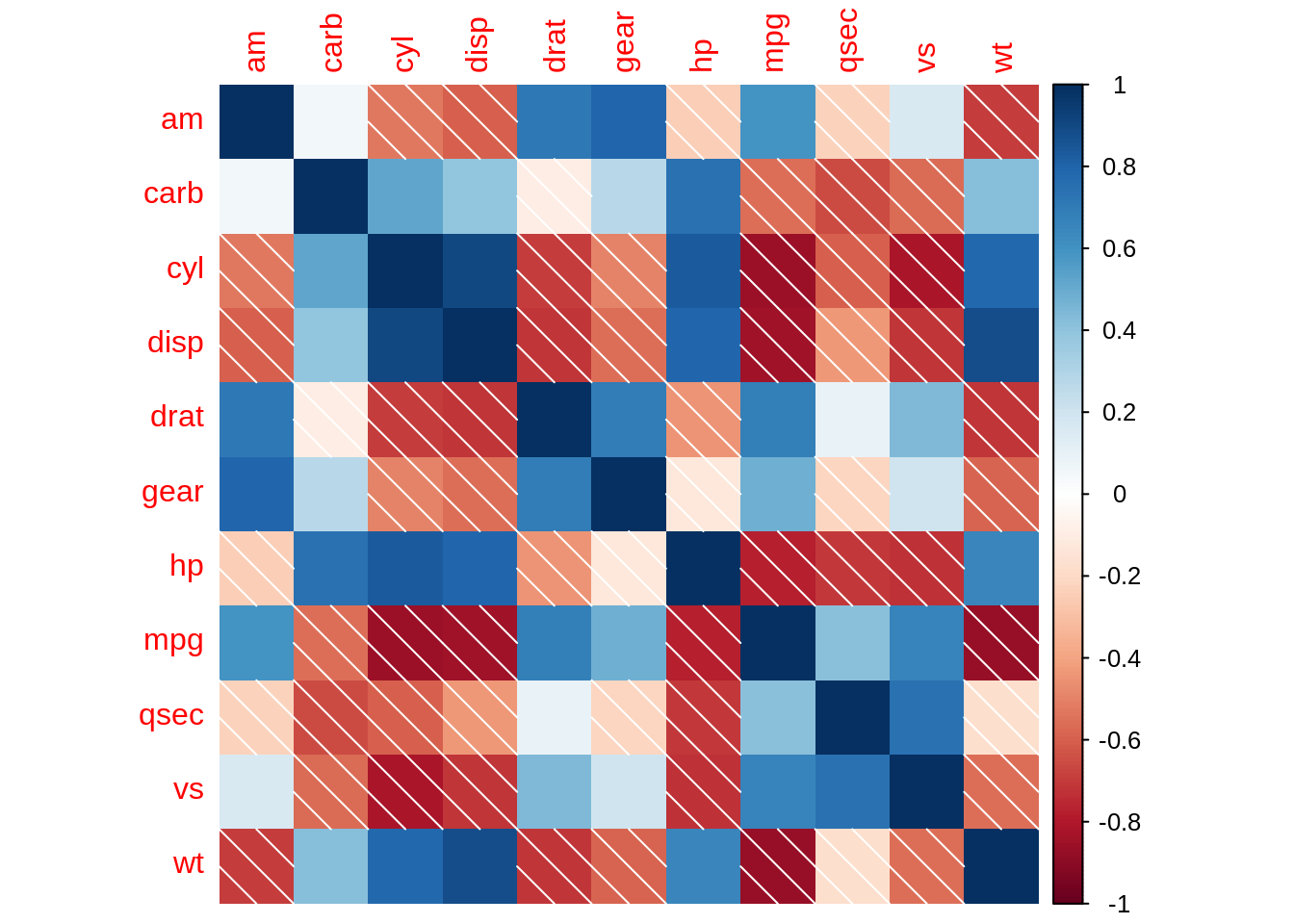
36.7 – corrplot
R package corrplot provides a visual exploratory tool on correlation matrix that supports automatic variable reordering to help detect hidden patterns among variables.
36.8 – recharts
The R package recharts provides an interface to the JavaScript library ECharts for data visualization. The goal of this package is to make it easy to create charts with only a few lines of R code.
iris$Species <- as.character(iris$Species)
ePoints(iris, ~Sepal.Length, ~Sepal.Width, series = ~Species)
36.9 – Summary
In this file, considering the nature of the final project data, Yudong Zhou and Yanbo Wang have mainly completed the enumeration and simple examples of the visualization tools that may be involved. We will use them fully and reasonably in the final project to complete import and export data relationship analysis and visualization.