7 ggplot2 cheatsheet
Haoyuan Sun, Zhongtian Qiao
7.1 Overview
ggplot2 is a system for declaratively creating graphics. You provide the data, tell ggplot2 how to map variables to aesthetics, what graphical primitives to use, and it takes care of the details. This cheatsheet shows code options for commonly used graphs by using ggplot2.
7.2 scatter plot
ggplot(data = mpg) +
  geom_point(aes(x = displ, y = hwy))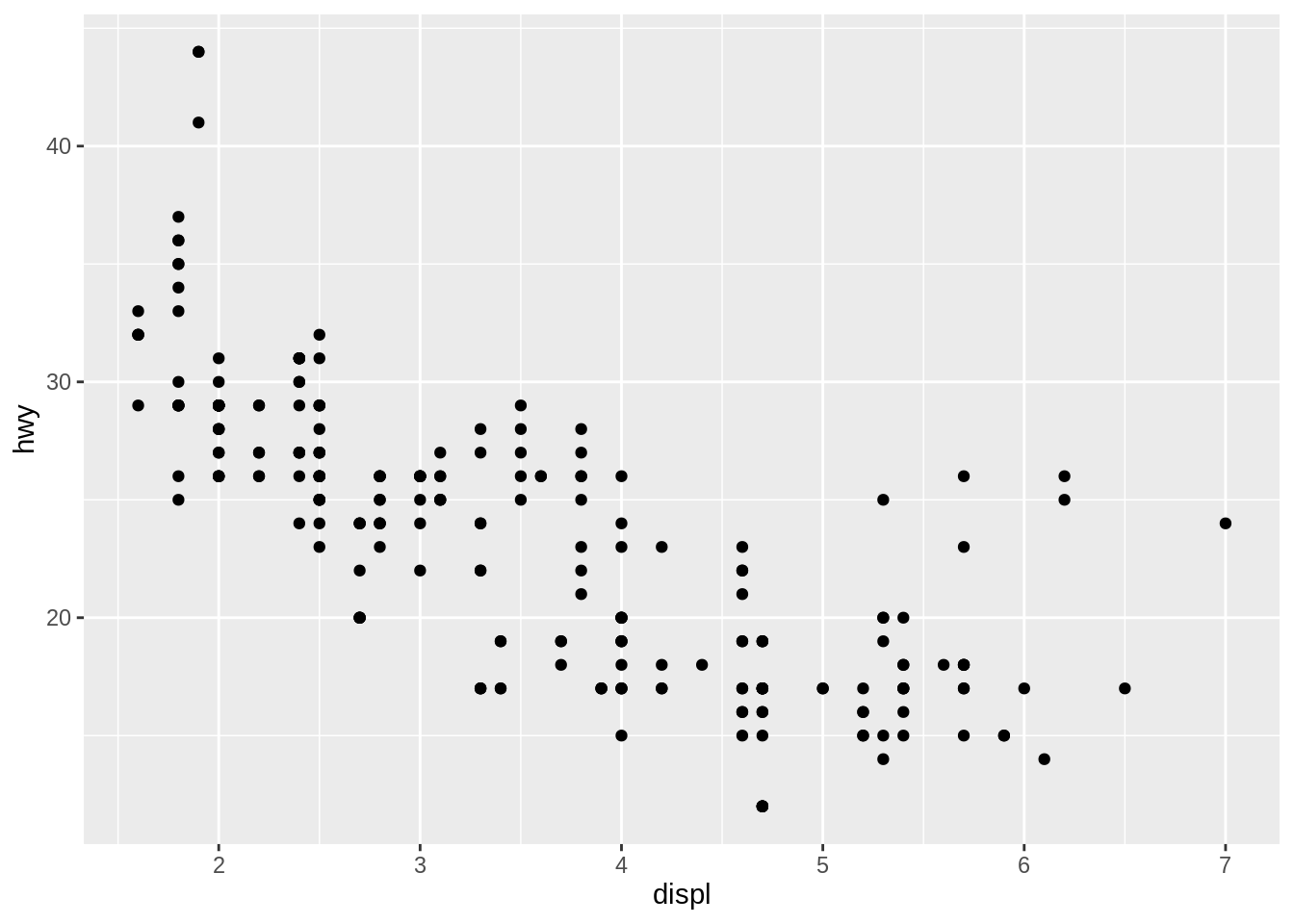
We can get a scatter plot by using geom_point().
7.2.1 Setting color
ggplot(data = mpg) +
  geom_point(aes(x = displ, y = hwy), color = "blue")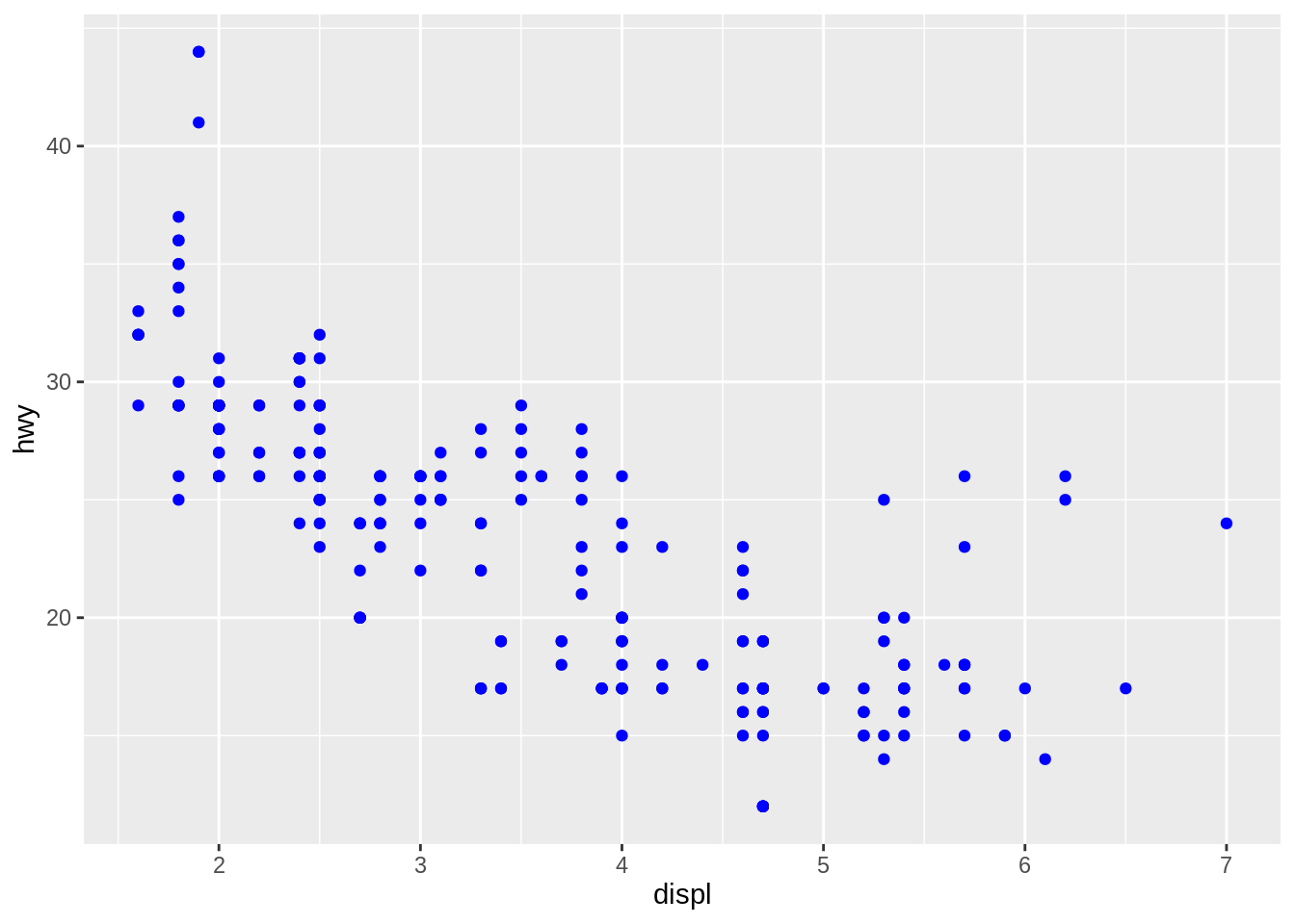
We can change the color of the poionts by using color =.
7.2.2 Color by groups
ggplot(data = mpg) +
  geom_point(aes(x = displ, y = hwy, color = class))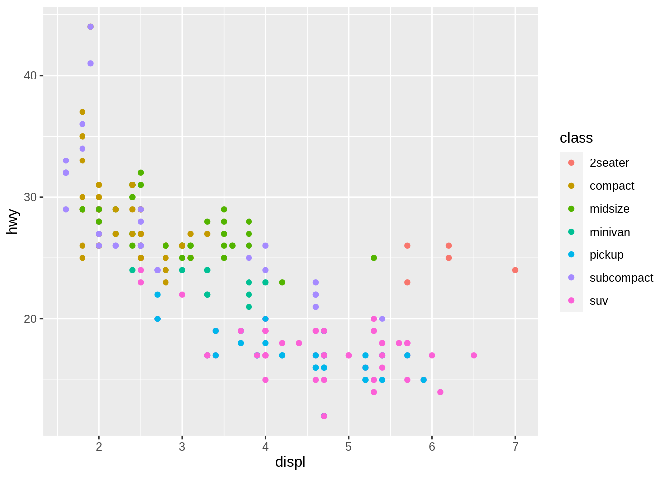
If X-variable is a categorical variable, such as variable “class”, we can set points of different classes to have different colors.
7.2.3 Identify overlapping points
ggplot(data = mpg) +
  geom_count(aes(x = displ, y = hwy))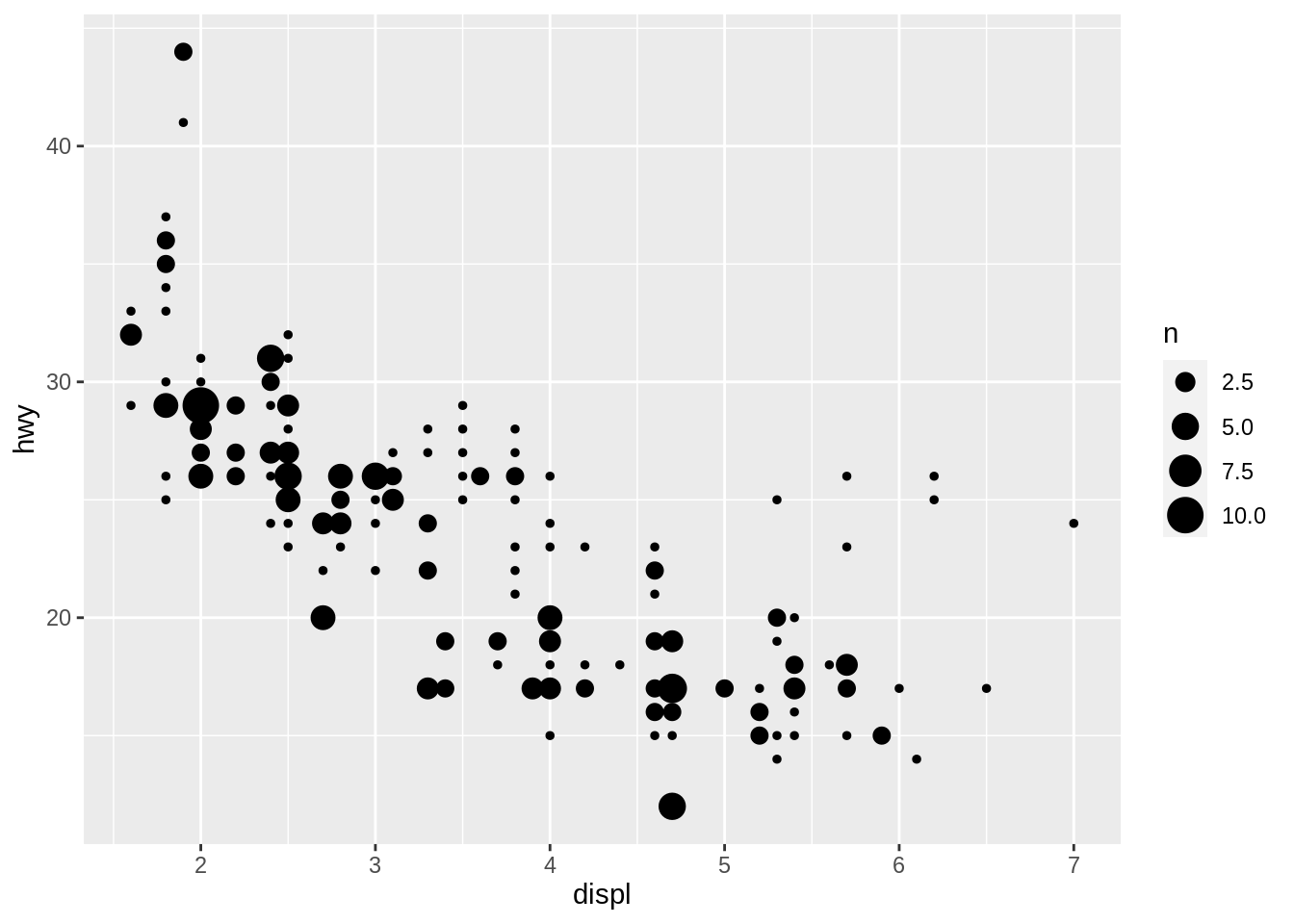
We can get a scatter plot by using geom_count. The size of the points shows if the point is overlap.
7.3 Line plot
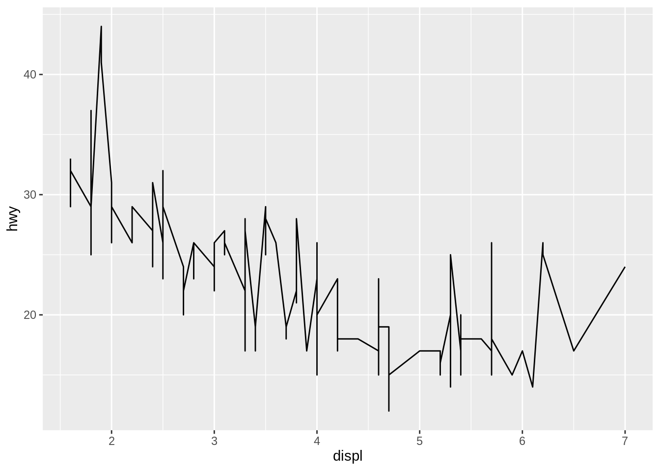
- We can get a line plot by using
geom_line(). -
Use
lty =to change the type of line. - Use
size =to change the size of line. - Use
col =to change the color of line.
7.3.1 Adding an arbitrary line
ggplot(data = mpg) +
  geom_point(aes(x = displ, y = hwy)) +
  geom_abline(slope = 1, intercept = 20)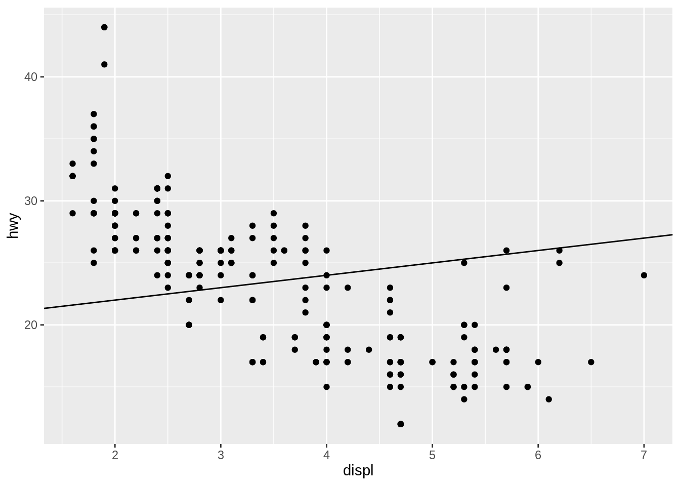
We can add arbitrary lines by using geom_abline().
7.4 Box plot
ggplot(data = mpg) +
  geom_boxplot(aes(x = class, y = hwy))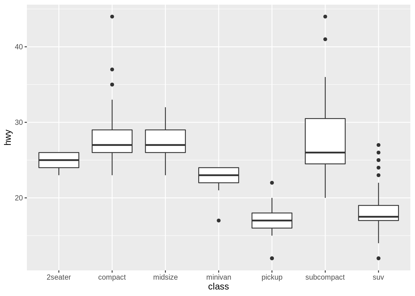
We can get a box plot by using geom_boxplot().
7.4.1 Horizontal box plot
ggplot(data = mpg) +
  geom_boxplot(aes(x = class, y = hwy)) +
  coord_flip()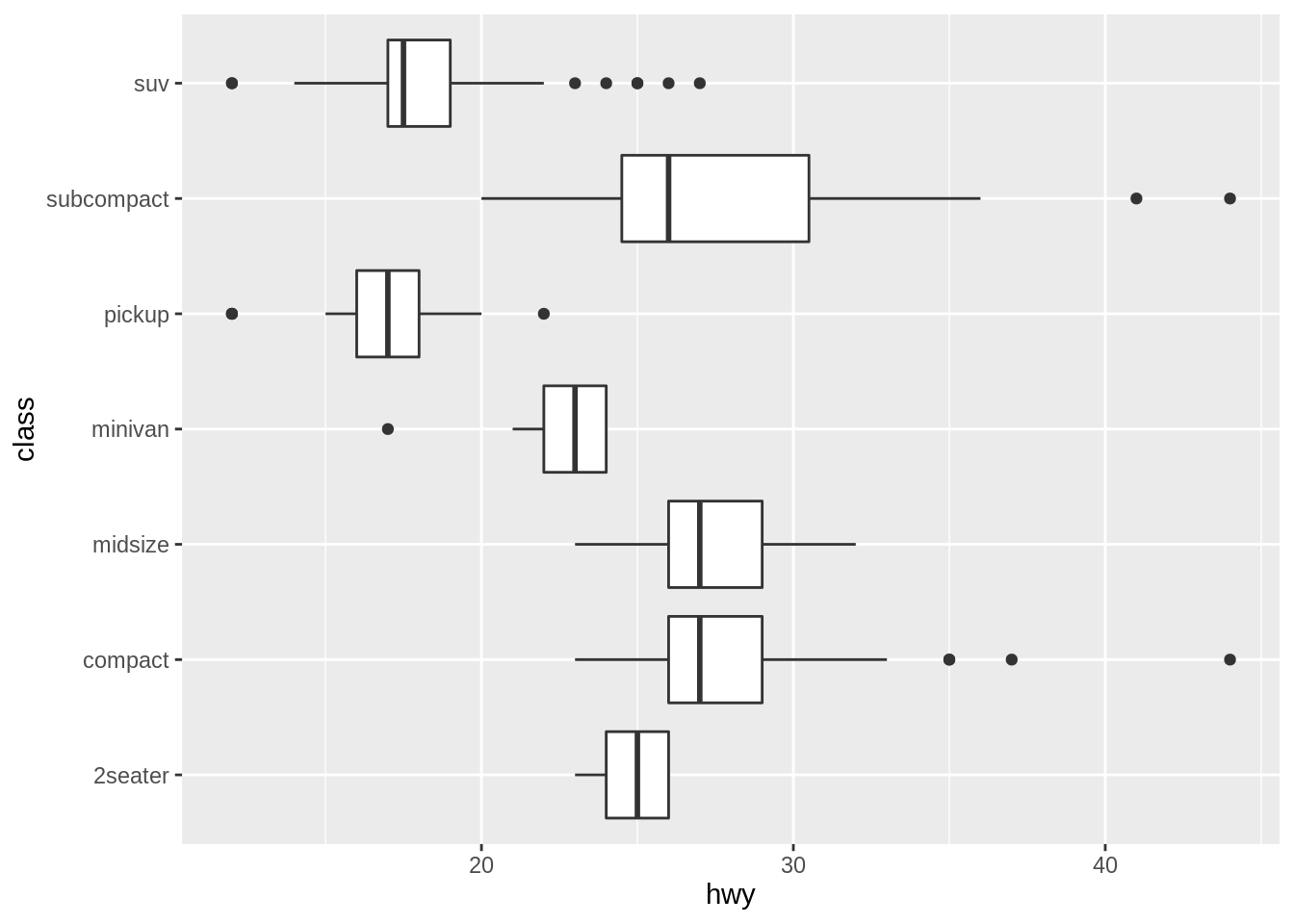
By using coord_flip(), we will get a horizontal box plot.
7.5 Histogram
ggplot(data = mpg) +
  geom_histogram(aes(x = hwy))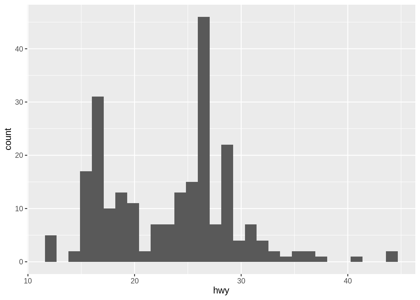
We can get a histogram by using geom_histogram().
7.5.1 Bins
ggplot(data = mpg) +
  geom_histogram(aes(x = hwy), bins = 10)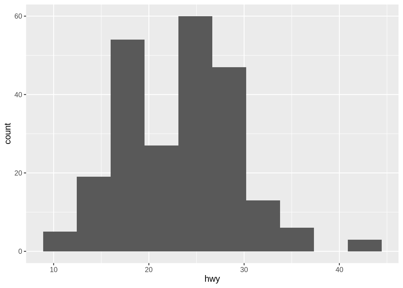
The default value of bin is 30. By changing the value of bins =, we can get different width of bin.
7.6 Bar plot
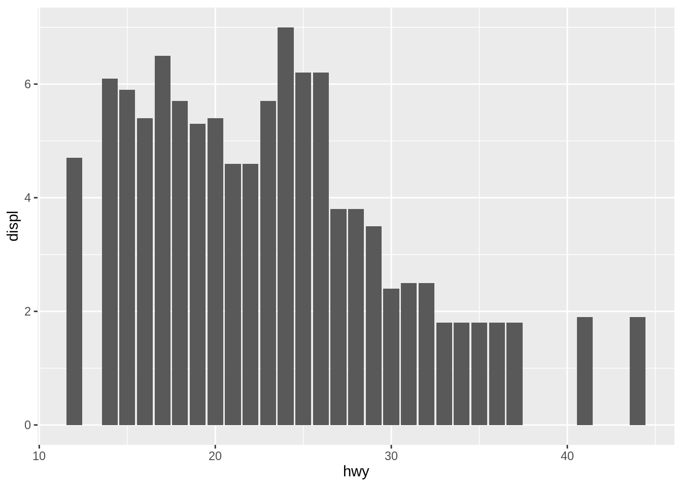
We can get a barplot which shows the relationship between of hwy and displ by using geom_bar with arguments position="dodge" and stat = "identity".
7.7 Heatmap
x <- c(1, 1, 1, 2, 2, 2, 3, 3, 3)
y <- c(1, 2, 3, 1, 2, 3, 1, 2, 3)
df <- data.frame(x, y)
set.seed(2017)
df$z <- sample(9)
ggplot(df, aes(x, y)) +
  geom_raster(aes(fill = z))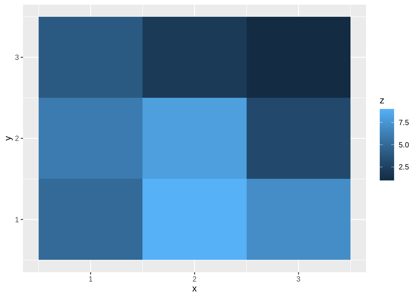

7.8 Countour plot
ggplot(data = mpg, aes(x = displ, y = hwy)) +
  geom_density2d() +
  geom_point(size = 1, alpha = 0.3)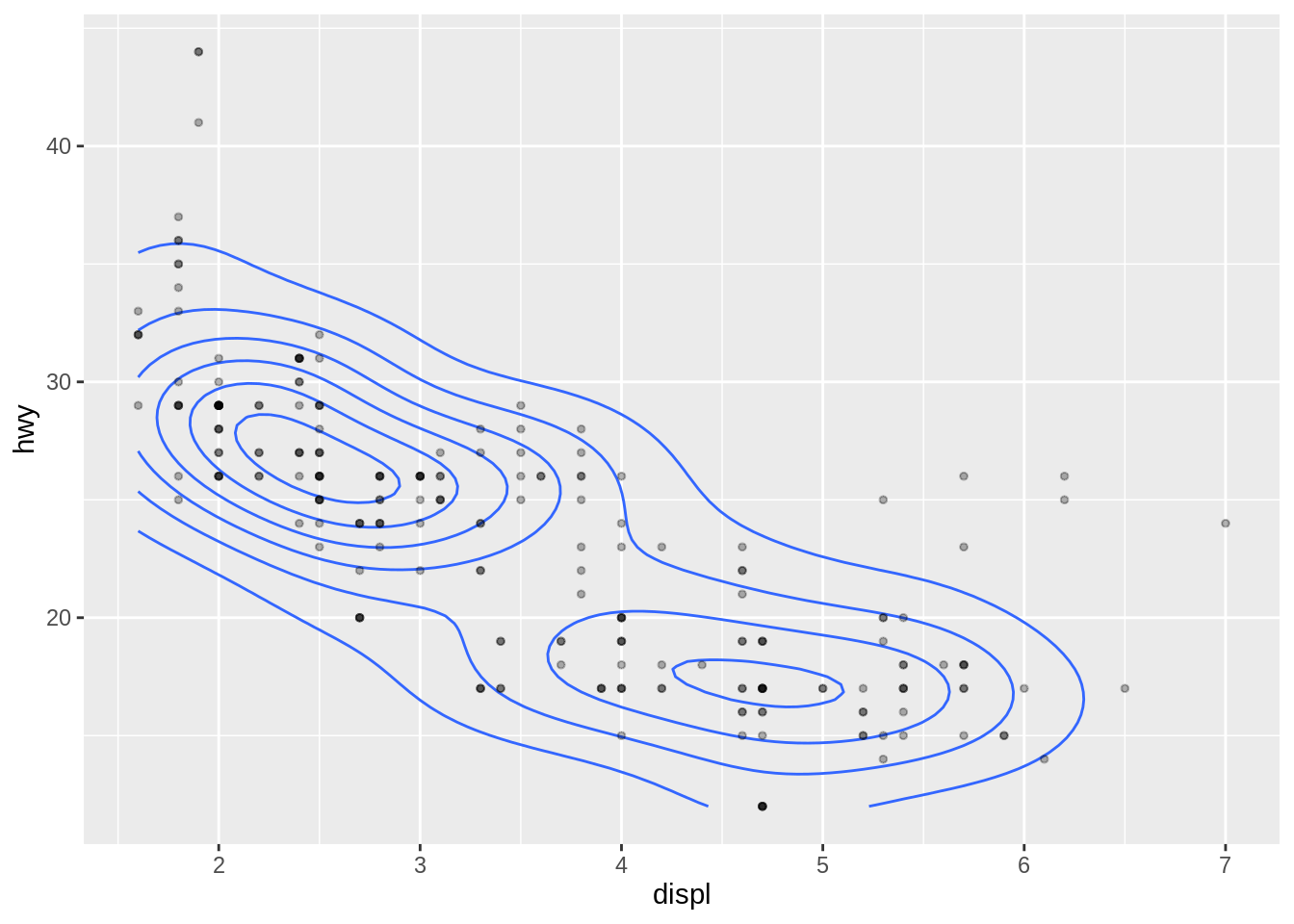
We can get a contour plot by using geom_density2d().
7.9 Area plot
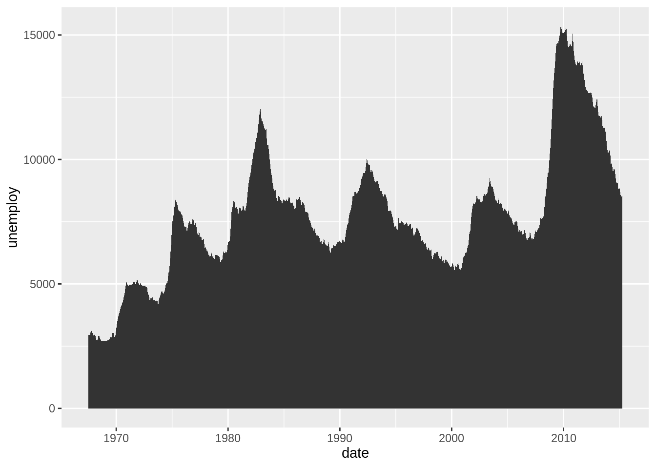
If we want to analyse 2 continuous variables, we can plot an area plot by using geom_area.
7.10 Adding Text
7.10.1 title and xy-corrdinate
ggplot(data = mpg) +
  geom_point(aes(x = displ, y = hwy, color = class)) +
  labs(title = "displ v.s. hwy",
       subtitle = "group by different class",
       x = "Displ",
       y = "Hwy",
       color = "Class")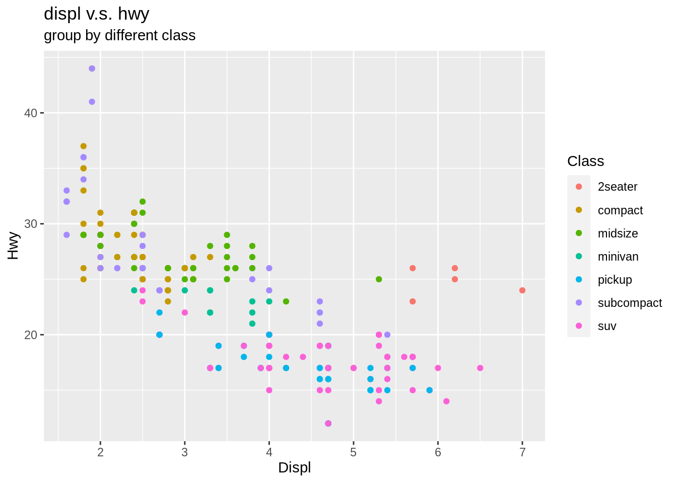
By using labs(), we can add more information for the plot, such as the title, subtitle, x-coordinate, y-coordinate, the class of color, the class of fill, etc.
7.10.2 Label
data <- data.frame(name = c("a", "b", "c"), count = c(20, 10, 30))

ggplot(data, aes(name, count)) +
  geom_bar(stat = "identity") +
  geom_text(aes(label = count))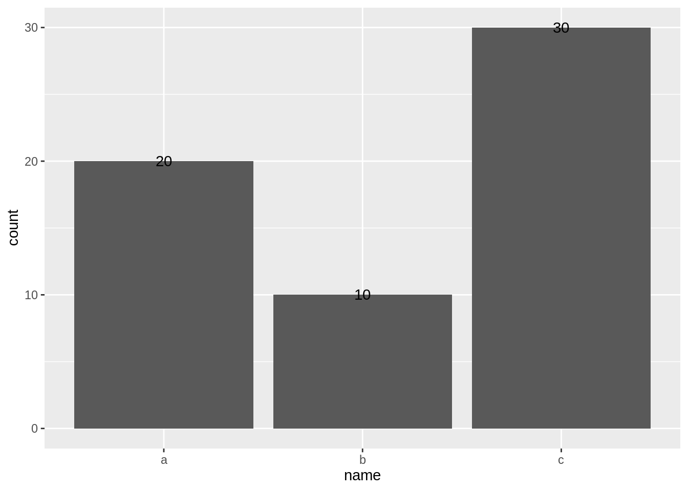
- We can get the label for the plot of data by
geom_text(), -
The content of label is controlled by
aes(label = ). - Use
hjustandvjustto adjust the vertical and horizontal position of the label. - Use
col =to adjust the color of the label. - Use
size =to adjust the size of the label.
ggplot(data, aes(name, count)) +
  geom_bar(stat = "identity") +
  geom_text(aes(label = count), col = "blue", vjust = -0.3, size = 5)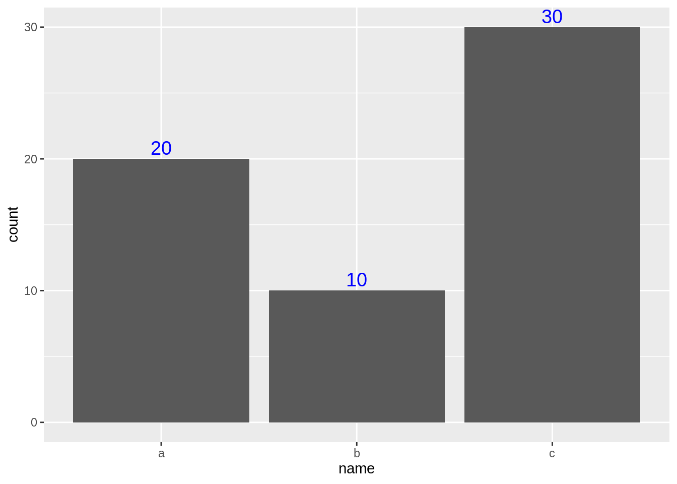
7.11 Facet
7.11.1 facet_wrap
ggplot(data = mpg) +
  geom_point(aes(x = displ, y = hwy)) +
  facet_wrap(~class,nrow=2)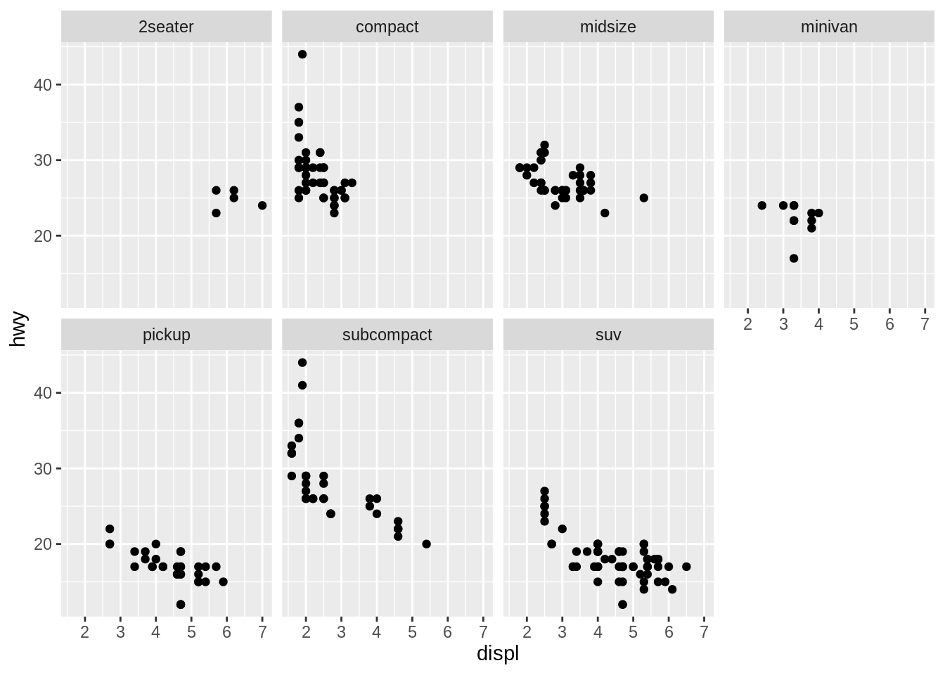
We can get multiple plots group by class by using facet_wrap.
7.11.2 facet_grid
ggplot(data = mpg) +
  geom_point(aes(x = displ, y = hwy)) +
  facet_grid(drv~cyl)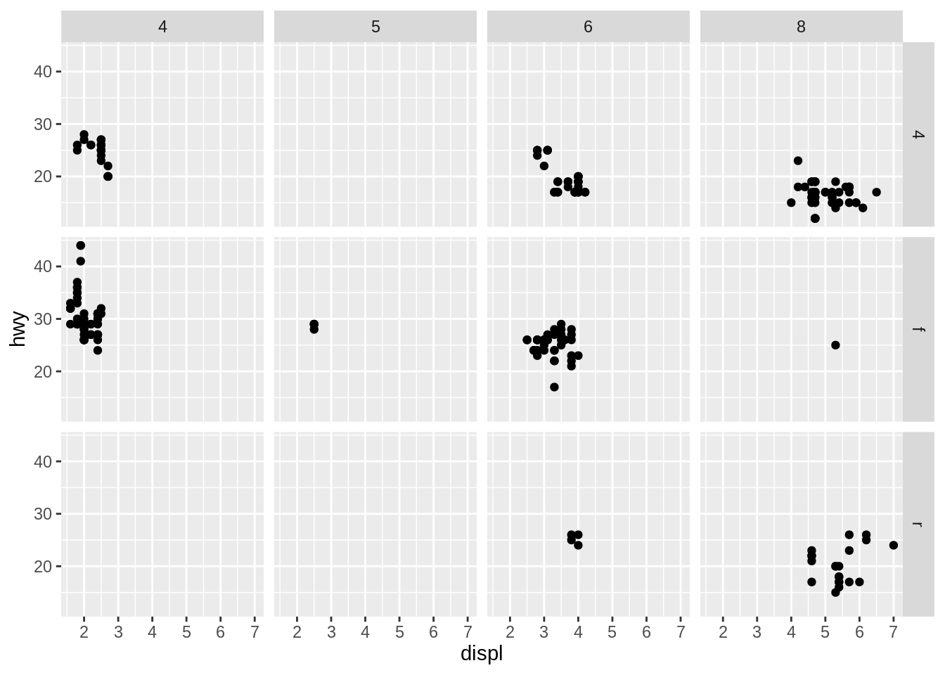
We can get multiple plots which are group by drv and cyl by using facet_grid.