35 Forest Plots
Shreya Rao
35.1 Introduction
- Forest Plots provide tabular and graphical information about estimates of comparisons or associations, corresponding precision, and statistical significance.
- A forest plot arrays point estimates (e.g., mean) and confidence intervals (e.g., 95% CI) represented by whiskers for multiple studies and/or multiple findings within a study in a horizontal orientation.
- Explanatory text displayed next to these points and whisker diagrams provide details regarding the data being presented.
- A vertical reference line is typically plotted at the null hypothesis, with the statistical significance of an individual point and whiskers compared to that reference line.
- In cases where the data being compared are difference between means, the null is zero (0) and the x scales are normal. When a ratio (e.g., odds ratio) is being compared, the null has a value of 1 and the scales are logarithmic.
Example 1:

Example 2:

35.2 Data
Assume a study conducted over a year from May 2020 to June 2021 collected the mortality rates of people along with socio-demographic and medical information. Researchers want to see if factors such as Sex, Socioeconomic condition, Period of the pandemic and Preexisting conditions influenced the mortality rate. To do so, they calculated the odds ratio of mortality rates of the factors with respect of a base factor within the four different categories.
After this analysis, the data looks like this:
or.df <- data.frame(
  factors = c("Female (ref)", "Male",
              "High (ref)", "Low",
              "Period 1 (05/17/2020-09/30/2020) (ref)", "Period 2 (10/01/2020-01/31/2021)",
         "Period 3 (02/01/2021-05/14/2021)", "Period 4 (05/14/2021-06/14/2021)",
         "No comorbidity (ref)", "Diabetes", "Hypertension", "Chronic respiratory illness",   "Chronic renal disease", "Chronic liver disease", "Other"),
  groups = c("Sex", "Sex",
             "Socio-demographic factors", "Socio-demographic factors",
             "Period of the pandemic", "Period of the pandemic",
         "Period of the pandemic", "Period of the pandemic",
         "Preexisting conditions", "Preexisting conditions", "Preexisting conditions",
         "Preexisting conditions", "Preexisting conditions", "Preexisting conditions", "Preexisting conditions"),
  or =  c(NA, 1.15, NA, 1.76, NA, 0.90, 0.84, 6.09, NA, 1.05, 1.13, 1.05, 2.33, 2.08, 1.44),
  ll = c(NA, 1.09, NA, 1.56, NA, 0.85, 0.77, 4.23, NA, 0.97, 1.04, 0.92, 2.04, 1.57, 1.29),
  ul = c(NA, 1.22, NA, 1.98, NA, 0.95, 0.91, 8.23, NA, 1.15, 1.23, 1.20, 2.67, 2.74, 1.61))

or.df
## factors groups or ll
## 1 Female (ref) Sex NA NA
## 2 Male Sex 1.15 1.09
## 3 High (ref) Socio-demographic factors NA NA
## 4 Low Socio-demographic factors 1.76 1.56
## 5 Period 1 (05/17/2020-09/30/2020) (ref) Period of the pandemic NA NA
## 6 Period 2 (10/01/2020-01/31/2021) Period of the pandemic 0.90 0.85
## 7 Period 3 (02/01/2021-05/14/2021) Period of the pandemic 0.84 0.77
## 8 Period 4 (05/14/2021-06/14/2021) Period of the pandemic 6.09 4.23
## 9 No comorbidity (ref) Preexisting conditions NA NA
## 10 Diabetes Preexisting conditions 1.05 0.97
## 11 Hypertension Preexisting conditions 1.13 1.04
## 12 Chronic respiratory illness Preexisting conditions 1.05 0.92
## 13 Chronic renal disease Preexisting conditions 2.33 2.04
## 14 Chronic liver disease Preexisting conditions 2.08 1.57
## 15 Other Preexisting conditions 1.44 1.29
## ul
## 1 NA
## 2 1.22
## 3 NA
## 4 1.98
## 5 NA
## 6 0.95
## 7 0.91
## 8 8.23
## 9 NA
## 10 1.15
## 11 1.23
## 12 1.20
## 13 2.67
## 14 2.74
## 15 1.61Note that this dataset has the columns - factors, groups/categoies to which the factors belong to, odds ratio, lower limits of confidence interval and upper limits of confidence intervals of the odds ratio. The factors columns also indicates the reference factor of every group. The reference groups within each category has NA values for the odds ratio, lower and upper confidence level limits.
Just looking at the values in the table, we can not fully understand the nuances. To better understand this analysis, we need to make a forest plot. We will use the library forestplot to plot it.
35.3 Formatting
The variables need to be formatted in a specific way to utilize the forestplot() function. Since we want to display the confidence intervals and or values, they can also be formatted appropriately.
#formating confidence intervals as (ll, ul) and adding to dataset
or.df$ci <- ifelse(!is.na(or.df$or), paste("(", as.character(or.df$ll), ", ", as.character(or.df$ul), ")", sep = ""), "")

ci <- c("95% CI",
        "", or.df$ci[1:2], "", #sex
        "", or.df$ci[3:4], "", #socio-demographic
        "", or.df$ci[5:8], "", #period
        "", or.df$ci[9:15]     #pre-existing condition
        )
To make the plot more presentable, we want to separates the factor categories from each other by adding a blank line after each category. To do so in forestplot(), we add an empty string to character vectors and NA values to numeric vectors.
#adding NA values and factor categories to or, upper limit and lower limit vectors

#formatting OR values that are displayed on graph
or.char <- c("OR",
        "", as.character(or.df$or[1:2]), "", #sex
        "", as.character(or.df$or[3:4]), "", #socio-demographic
        "", as.character(or.df$or[5:8]), "", #period
        "", as.character(or.df$or[9:15])     #pre-existing condition
        )

#formatting OR values forestplot uses
or <- c(NA,
        NA, or.df$or[1:2], NA,#sex
        NA, or.df$or[3:4], NA, #socio-demographic
        NA, or.df$or[5:8], NA, #period
        NA, or.df$or[9:15]     #pre-existing condition
        )

#formatting lower limit values forestplot uses
ll <- c(NA,
        NA, or.df$ll[1:2], NA, #sex
        NA, or.df$ll[3:4], NA, #socio-demographic
        NA, or.df$ll[5:8], NA, #period
        NA, or.df$ll[9:15]     #pre-existing condition
        )

#formatting upper limit values forestplot uses
ul <- c(NA,
        NA, or.df$ul[1:2], NA, #sex
        NA, or.df$ul[3:4], NA, #socio-economic
        NA, or.df$ul[5:8], NA, #period
        NA, or.df$ul[9:15] #pre-existing condition
        )

#formatting the categories and factor names
factors <- c("",
        "Sex", or.df$factors[1:2], "", #sex
        "Socioeconomic condition", or.df$factors[3:4], "", #socio-demographic
        "Period of pandemic", or.df$factors[5:8], "", #period
        "Preexisting conditions", or.df$factors[9:15] #pre-existing condition
        )
Again, to make the plot more readable, we can specify which rows of the forest plot are bolded. We do so by creating a summary vector, which specifies the rows of the plot we want to highlight. In this case, we want to make the text on the headings and category titles stand out, so we create a vector of TRUE/FALSE that has value TRUE when we want bold text and FALSE otherwise.
35.4 Forest Plot
forestplot() takes a specific type of dataframe. We need to specify the mean (OR values), lower (lower limits of confidence intervals), upper (upper limits of confidence intervals), study (the factors), confint (the formatted confidence intervals forestplot() displays) and OR (the OR values forestplot() displays).
plot.data <- data.frame(mean = or,
               lower = ll,
               upper = ul,
               study = factors,
               confint = ci,
               or = or.char)
forestplot(plot.data, labeltext = c(study, or, confint),
             is.summary = summary,
             new_page = T,
             col = fpColors(box = "royalblue",
                            line = "darkblue"),
             txt_gp = fpTxtGp(cex = 0.8, label = gpar(fontfamily = "serif"),
                              ticks=gpar(fontsize=5, cex=1.4)),
             graph.pos = 2,
             boxsize = 0.2,
             graphwidth = unit(45, 'mm'),
             title = "Forest Plot of Mortality Rates")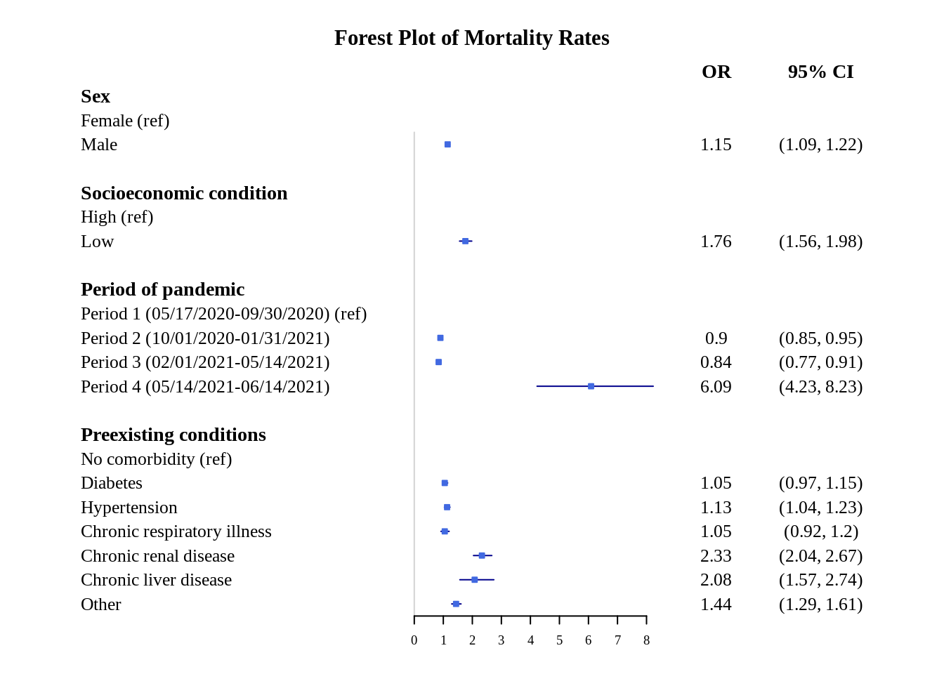
This plot looks fine, but the x-axis scale can be better because the confidence intervals range is not fully apparent. This can be fixed by changing the scale to logarithmic.
forestplot(plot.data, labeltext = c(study, or, confint),
             xlog = TRUE,
             is.summary = summary,
             new_page = T,
             col = fpColors(box = "royalblue",
                            line = "darkblue"),
             txt_gp = fpTxtGp(cex = 0.8, label = gpar(fontfamily = "serif"),
                              ticks=gpar(fontsize=5, cex=1.4)),
             graph.pos = 2,
             boxsize = 0.2,
             graphwidth = unit(45, 'mm'),
             title = "Forest Plot of Mortality Rates")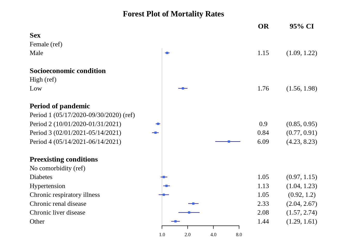
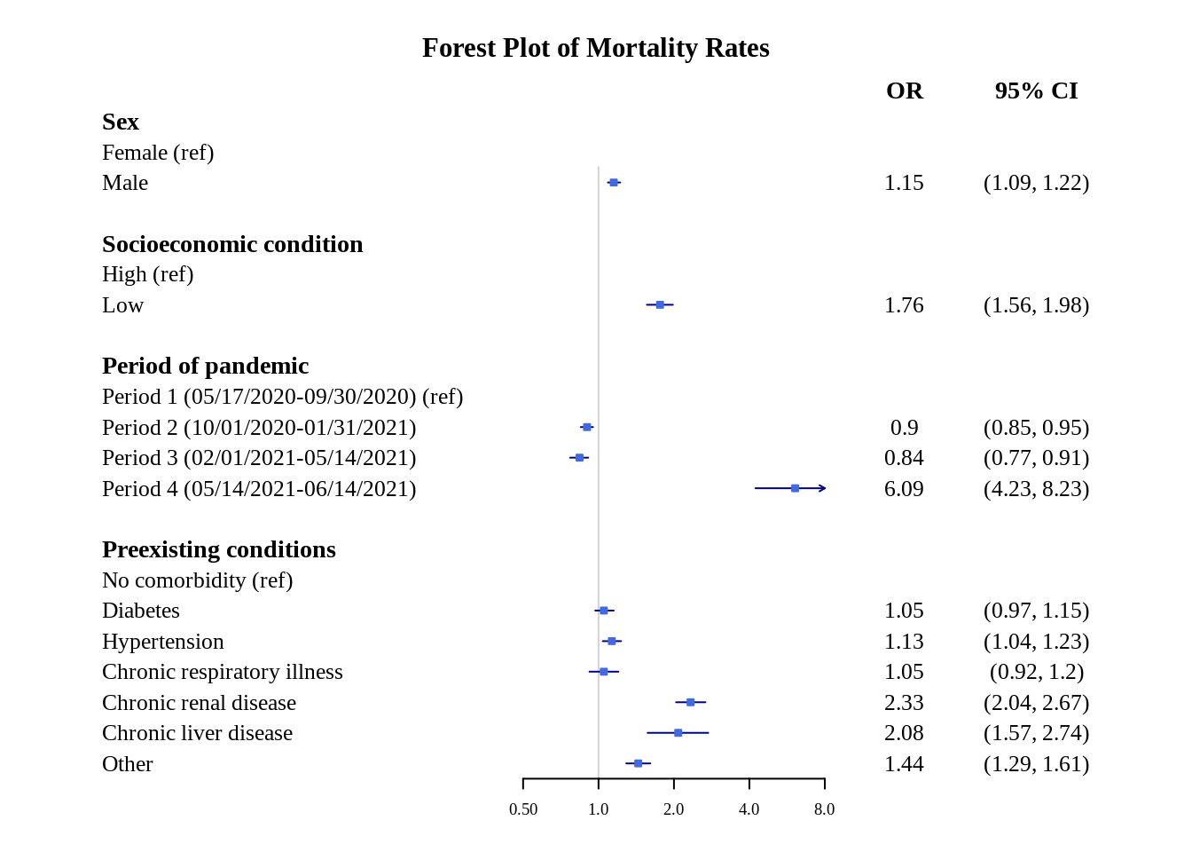
This is better, but to make it even more clear, we can specify the x-axis ticks (using xticks) and clip the conidence interval range (using clip).
forestplot(plot.data, labeltext = c(study, or, confint),
             clip = c(0.5, 5),
             xticks = c(0.5, 1, 2, 4, 8),
             xlog = TRUE,
             is.summary = summary,
             new_page = T,
             col = fpColors(box = "royalblue",
                            line = "darkblue"),
             txt_gp = fpTxtGp(cex = 0.8, label = gpar(fontfamily = "serif"),
                              ticks=gpar(fontsize=5, cex=1.4)),
             graph.pos = 2,
             boxsize = 0.2,
             graphwidth = unit(45, 'mm'),
             title = "Forest Plot of Mortality Rates")