25 Drawing Five Common Plots by ggplot2
Xirui Guo
library(ggplot2)
library(tidyverse)
library(ggpubr)
library(gridExtra)
library(reshape2)
library(Lock5withR)
library(fivethirtyeight)
library(RColorBrewer)
library(plotly)
25.1 Motivation
The ggplot2 is a powerful and effective package for drawing plots. It has a lot of syntaxes to support people get the graphs they want. A good plot needs to clearly represent the information. Scatter plots, line plots, histograms, boxplots, and heatmaps are frequently used in daily life. This Markdown hopes to be a guide about how to quickly and suitably draw the above five plots by ggplot2.
25.2 Graph1 scatter plot: geom_point
Using data mtcars
The main code for drawing scatter plot is geom_point; however, we usually don’t use it single because we need the plot shows more information and here are some syntaxes people use together with geom_point:aes(size , color): sometimes it is effective, but people need to avoid showing too much information and making the graph hard to read..alpha: change the transparency of point.geom_text: add labels of each point.geom_smooth: show the regression line and correspond standard error boundary.
mtcars$vs <- as.factor(mtcars$vs)

ggplot(mtcars, aes(x=wt, y=mpg, size=cyl, color=vs)) +
  geom_point(alpha = .4) +
  geom_text(label=rownames(mtcars),
            nudge_x = 0.25, nudge_y = 0.25,
            check_overlap = T)+
  geom_smooth(method=lm , color="red", fill="lightblue", se=TRUE)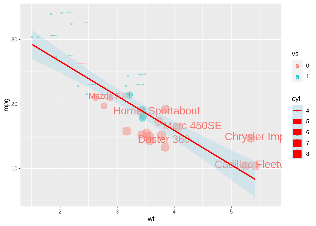
25.3 Graph2 line chart: geom_line
People need to clarify the x-axis and y-axis and can use group to draw the line with different colors.
# library(reshape2)
x <- -10:10
var1 <- dnorm(x,-2,1)
var2 <- dnorm(x,2,1)
var3 <- dt(x,2,2)
data <- data.frame(x,var1,var2,var3)
data_n <- melt(data, id="x")

ggplot(data_n,aes(x=x, y=value, group=variable, color=variable))+
  geom_line()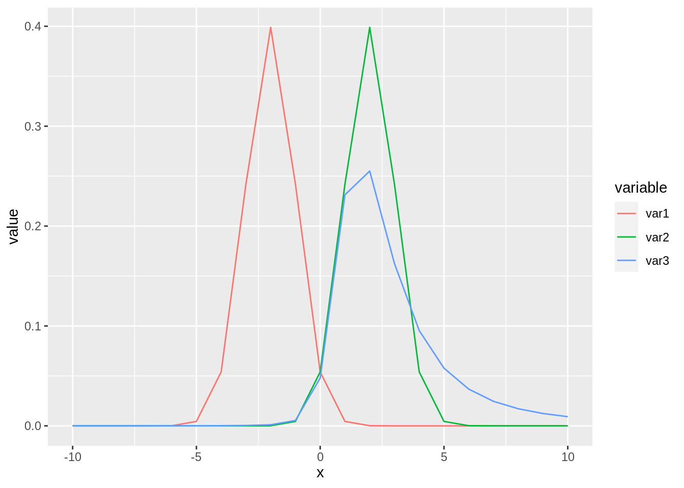
Using geom_line twice: a way for representing line from different groups without legend.
data_n <- data_n %>%
  mutate(variable2=variable)

ggplot(data_n, aes(x=x, y=value))+
  geom_line(data=data_n %>% select(-variable), aes(group=variable2), color="grey", size=0.5, alpha=0.8) +
  geom_line(aes(color=variable), color="blue", size=1)+
  facet_wrap(~variable)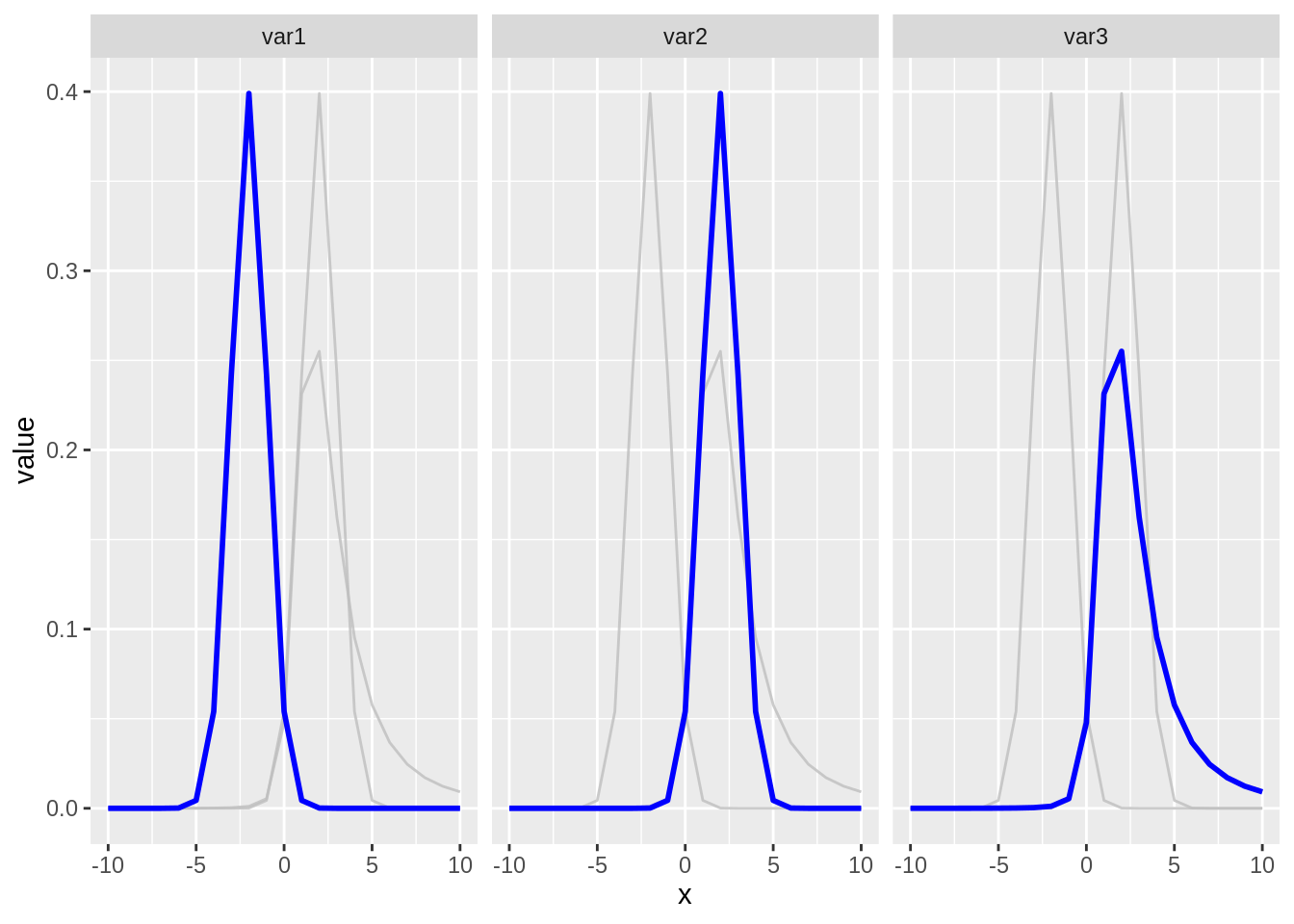
25.4 Graph3 box plot: geom_boxplot
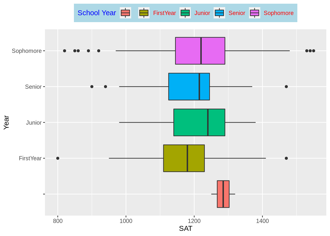
Using the Data: StudentSurvey in Lock5withR package(PSet1). Drawing a “simple” box-plot first:labs(): simultaneously add the main title and axis labels
# library(Lock5withR)
p3<-ggplot(StudentSurvey, aes(x = SAT, y = Year)) +
  geom_boxplot()+
  labs(title="Plot of SAT score and Year", x="SAT score", y="Year")
p3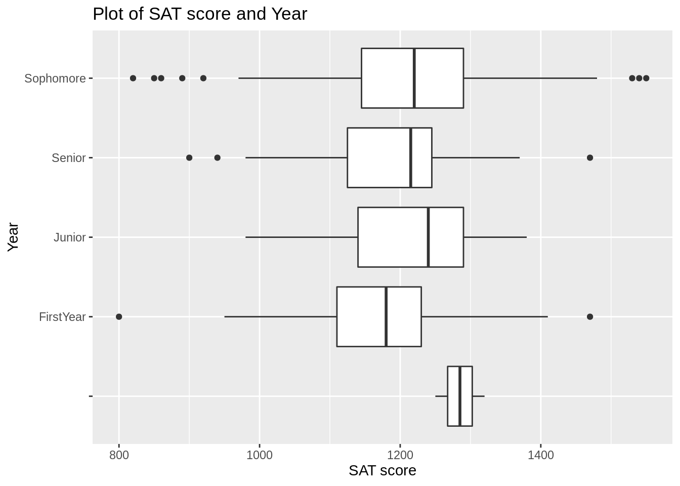
How to make boxplot shows more information:
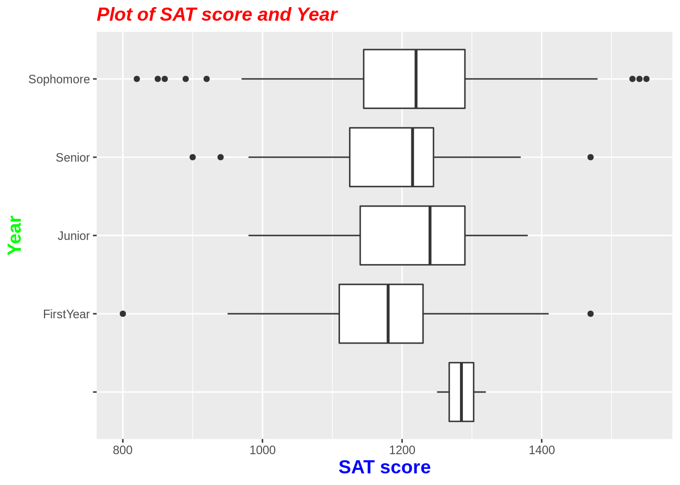
1. Using theme() + element_text() to modify the color, font, size of text.
p3+theme(
  plot.title = element_text(color = "red", size = 14, face = "bold.italic"),
  axis.title.x = element_text(color="blue", size = 14, face = "bold"),
  axis.title.y = element_text(color="green", size = 14, face = "bold")
)
- Adding legend and modifying the legend tittle
p3<-ggplot(StudentSurvey, aes(x = SAT, y = Year, fill=Year)) +
  geom_boxplot()+
  labs(fill="School Year")
p3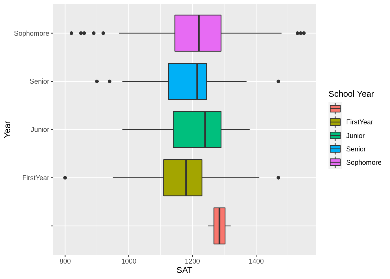
3.Changing the position of legend: five choices “left”,“top”, “right”, “bottom”, “none”
p3<- p3+
  theme(legend.position = "top")
p3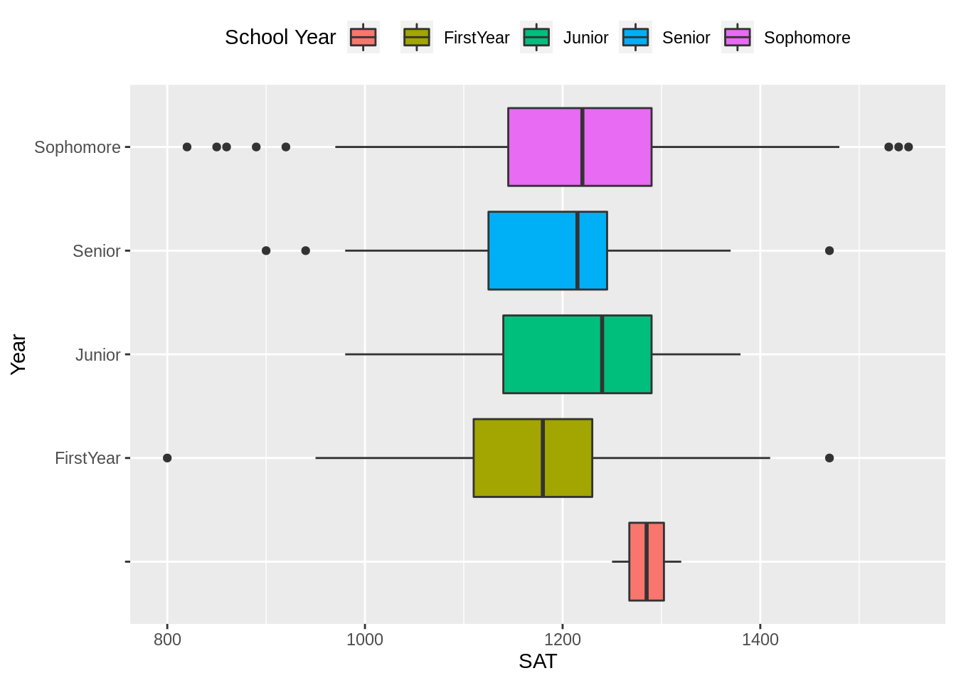
- Modifying the title, label and background of legend
p3+
  theme(
    legend.title = element_text(color="blue"),
    legend.text = element_text(color="red"),
    legend.background = element_rect(fill="lightblue")
    )
- Changing the name and order of factor’s level
Y <- fct_recode(StudentSurvey$Year, "NA" = "", "1st" = "FirstYear",
                "2nd" = "Sophomore", "3rd" = "Junior", "4th" = "Senior")
Y <- fct_relevel(Y,"1st","2nd","3rd","4th")

p3<-ggplot(StudentSurvey, aes(x = SAT, y = Y, fill=Y)) +
  geom_boxplot()+
  labs(fill="School Year")
p3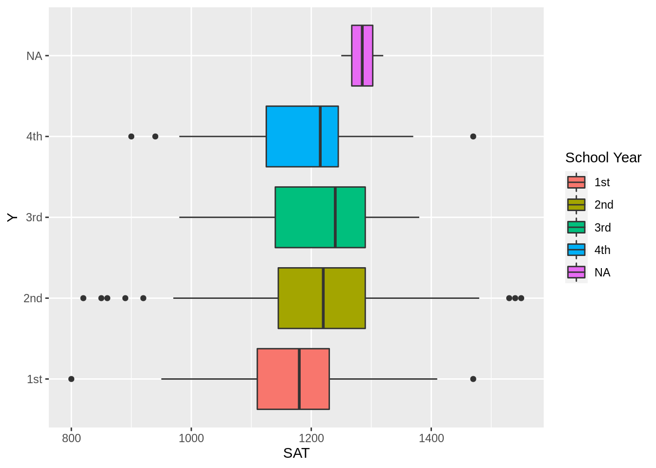
- 6 ways to change the background of whole plots
p3_1<-p3+theme_gray()
p3_2<-p3+theme_bw()
p3_3<-p3+theme_linedraw()
p3_4<-p3+theme_light()
p3_5<-p3+theme_minimal()
p3_6<-p3+theme_classic()

ggarrange(p3_1,p3_2,p3_3,p3_4,p3_5,p3_6,nrow=3,ncol=2)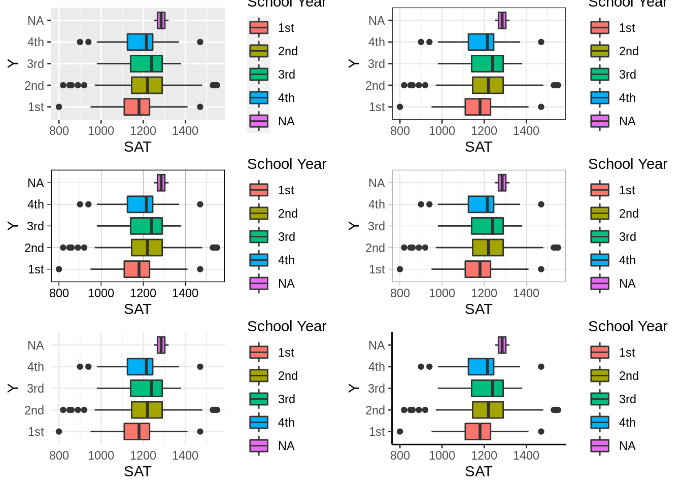
25.5 Graph4 histogram: geom_histogram
Using Data: bad_drivers in fivethirtyeight package. Common syntaxes with geom_histogram:binwidth: control the width of each bin.fill: the color of bin.color: the frame color of bin.alpha: control the transparency of the bin color.
# library(fivethirtyeight)
p4 <- ggplot(bad_drivers,aes(x=perc_alcohol,y=..count..)) +
  geom_histogram(binwidth=3, fill="lightblue", color="black", alpha=0.7)
p4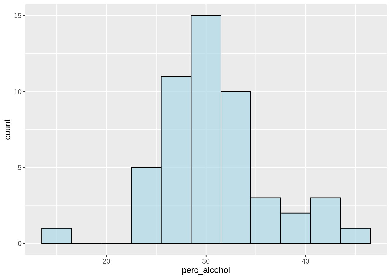
coord_flip():make the histogram bar become horizontal
p4<- p4 +
  coord_flip()
p4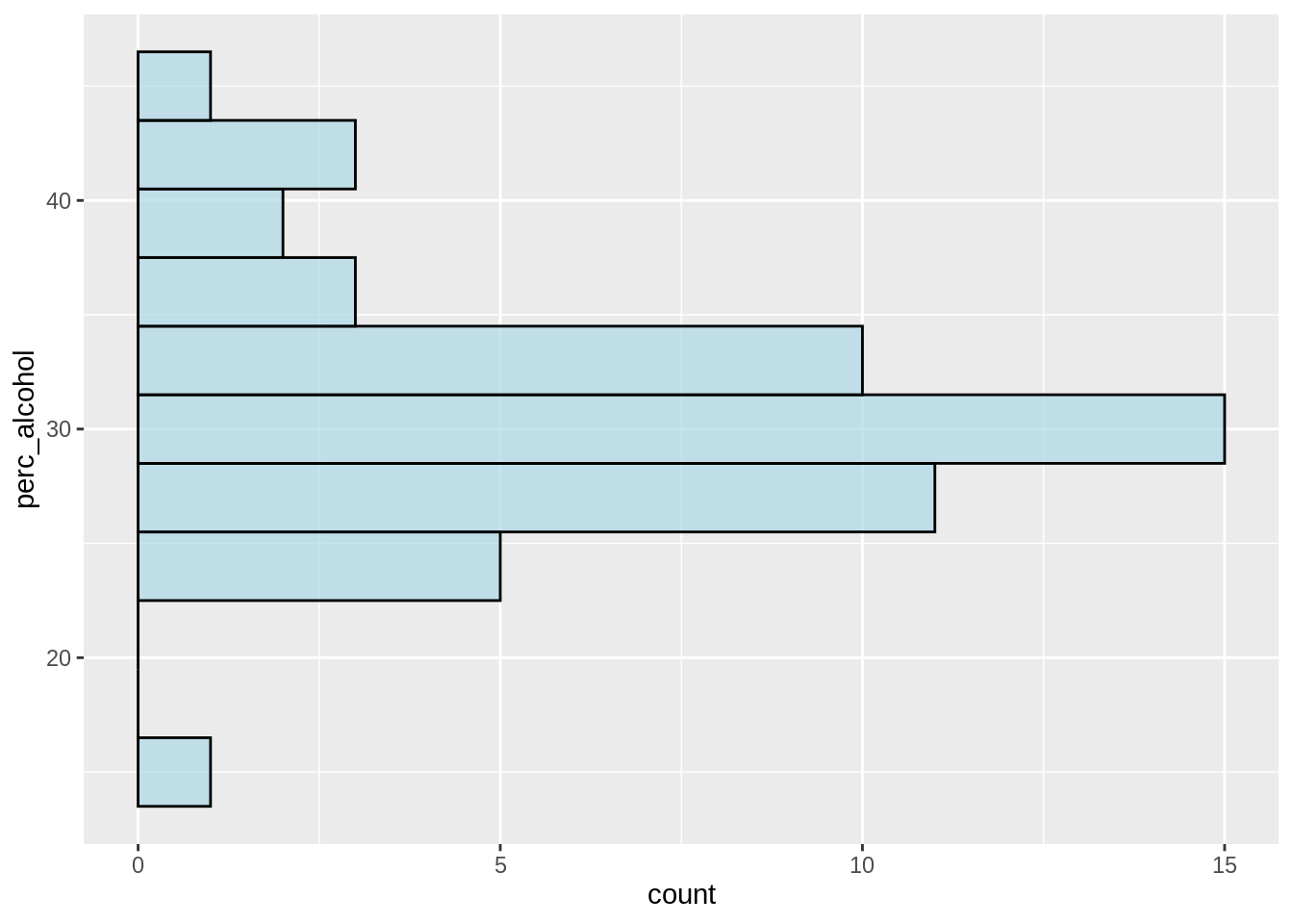
scale_x_reverse() and scale_y_reverse():reverse the x-axis and y-axis
p4+
  scale_y_reverse()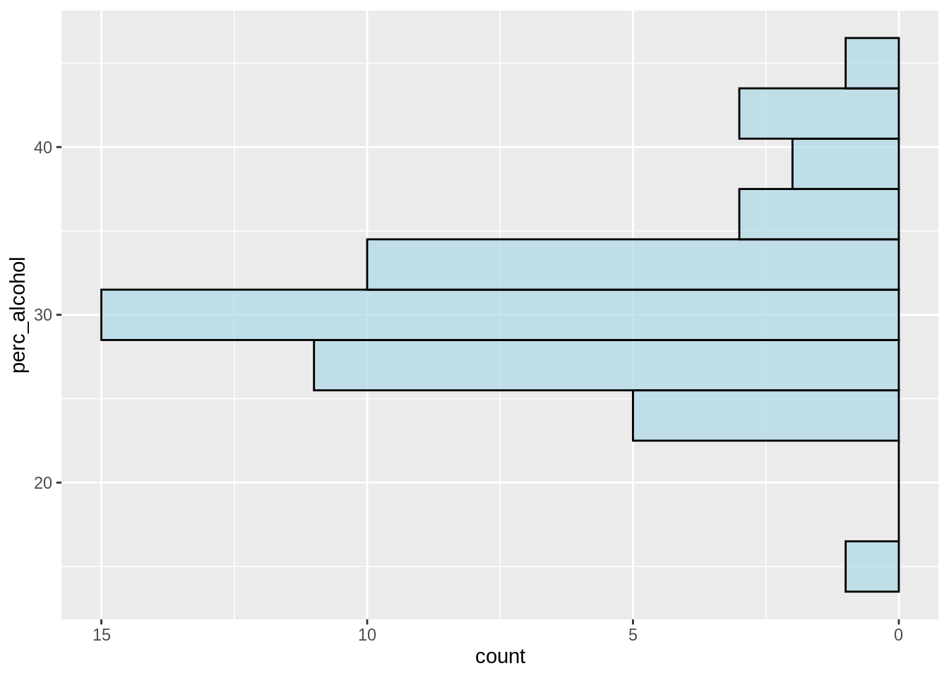
25.6 Graph5 heatmap: geom_tile
The data is from the class notes
grade <- rep(c("first", "second", "third", "fourth"), 3)
subject <- rep(c("math", "reading", "gym"), each = 4)
statescore <- sample(50, 12) + 50
df <- data.frame(grade, subject, statescore)

p5 <- ggplot(df, aes(grade, subject, fill = statescore)) +
  geom_tile()
p5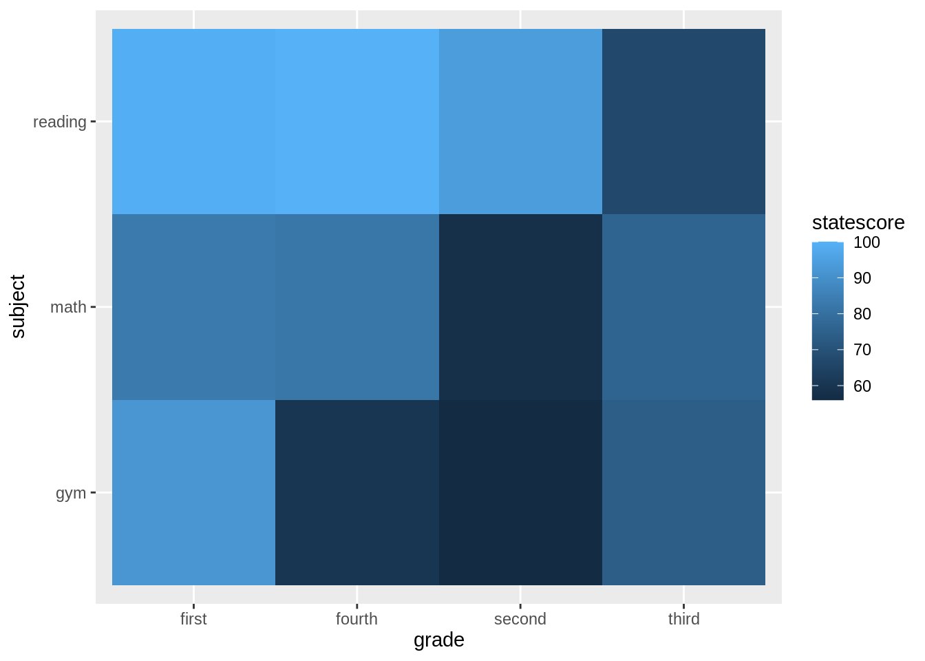
- Changing the color
scale_fill_gradient(),scale_fill_distiller()andscale_fill_viridis()scale_fill_gradient()can customize the colorscale_fill_distiller()usually need palette = RColorBrewerscale_fill_viridis()need to let discrete=False when the variable is continuous
# library(RColorBrewer)
display.brewer.all()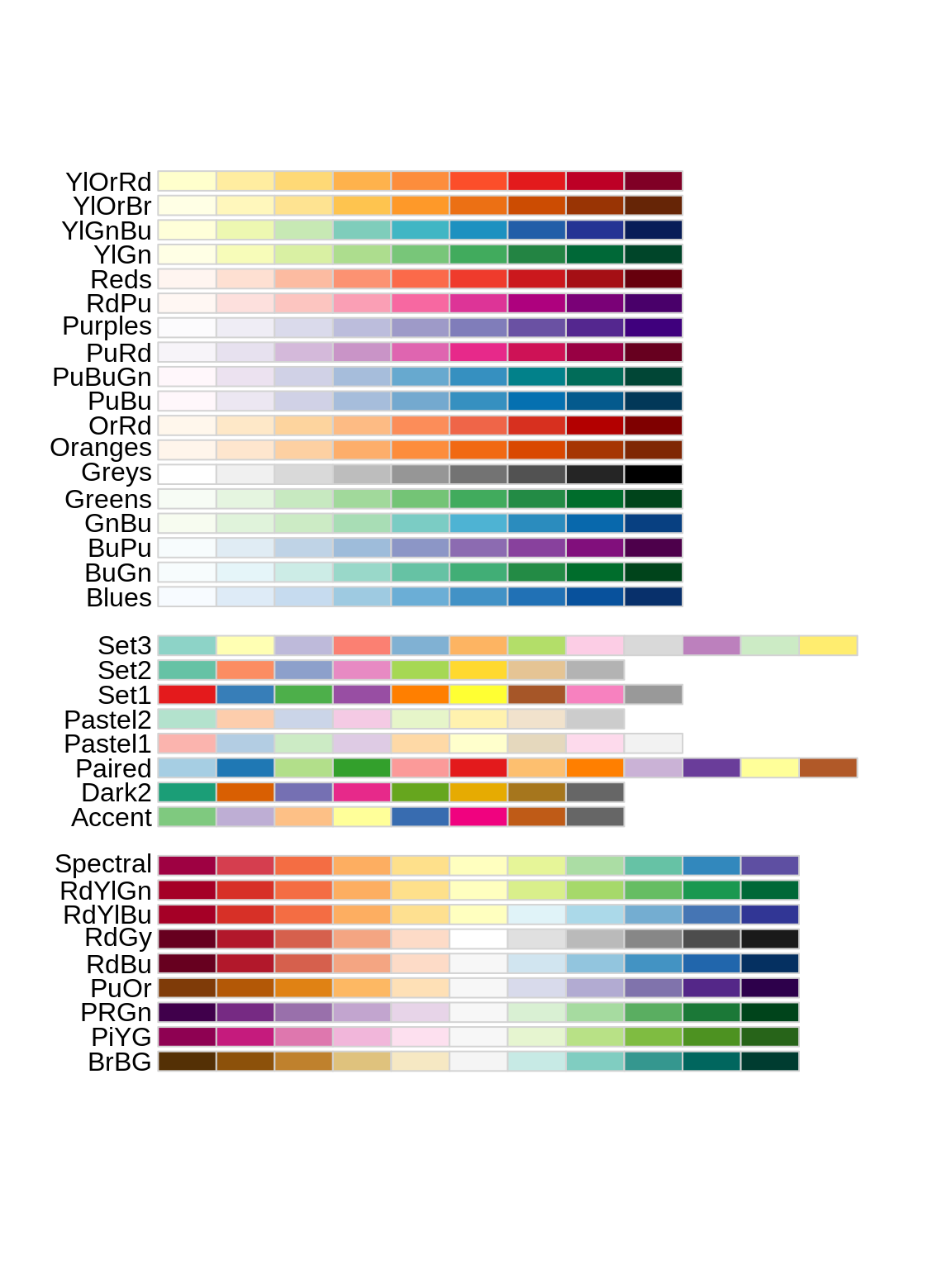
p5_1<-p5 + scale_fill_gradient(low="white", high="purple") + theme(legend.position="top")
p5_2<-p5 + scale_fill_distiller(palette = "RdBu")+ theme(legend.position="top")
p5_3<-p5 + scale_fill_viridis_c()+ theme(legend.position="top")
ggarrange(p5_1,p5_2,p5_3,nrow=1,ncol=3)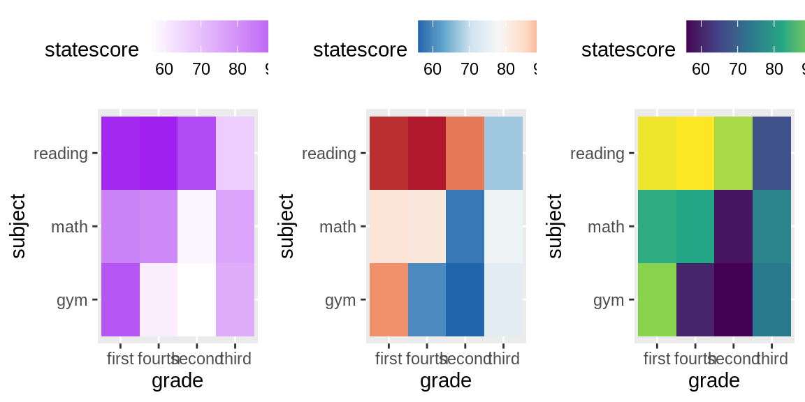
- adding text in each square and interact
25.7 Effective ways for showing more information
25.7.1 Way1: Faceting
- faceting by single discrete variable:
# vertical faceting
p3 +
  facet_grid(Award~.)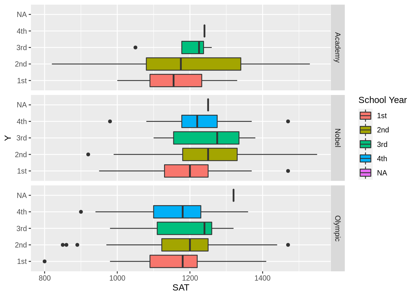
# horizontal faceting
p3 +
  facet_grid(.~Award)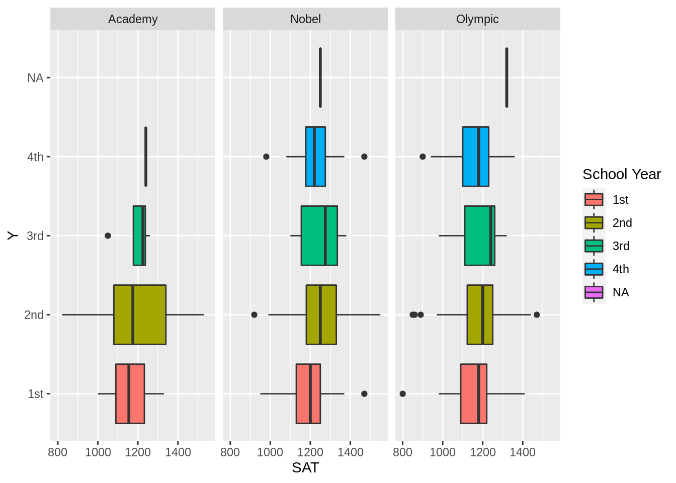
- faceting by two discrete variables:
# column facet by Year and row facet by Award
p3+
  facet_grid(Year~Award, scales='free')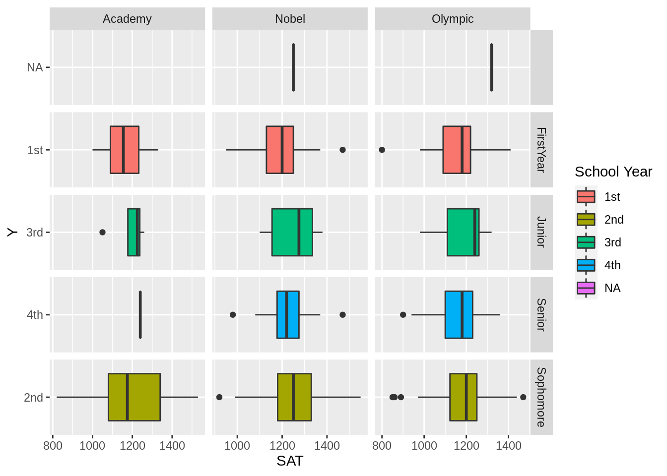
25.7.2 Way2: Representing multiple charts on a single page
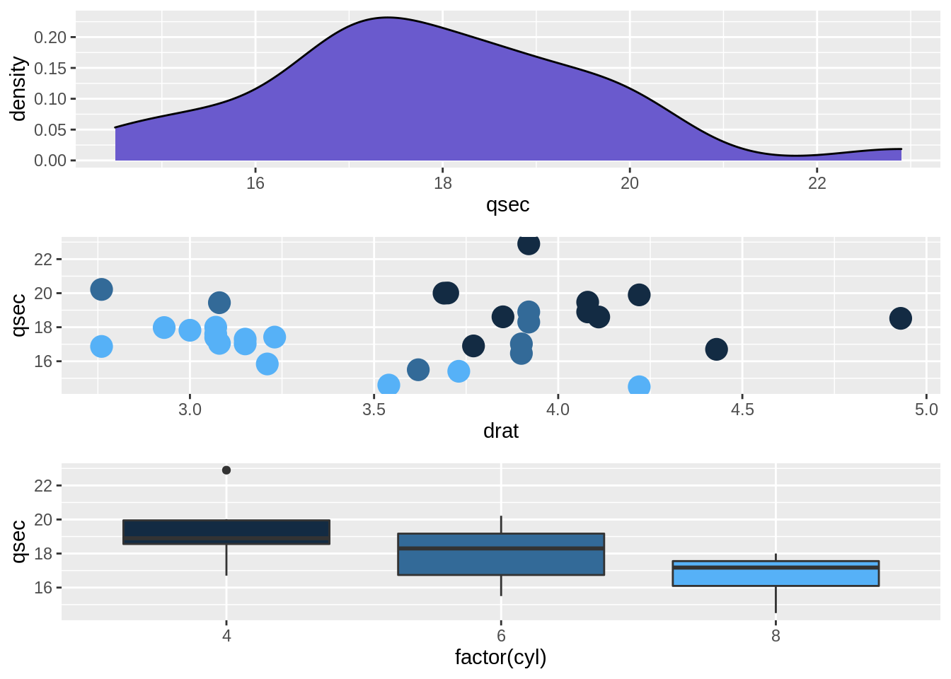
Using Data: bad_drivers with syntaxes grid.arrange()
# Make 3 simple graphics:
g6_1 <- ggplot(mtcars, aes(x=qsec)) +
  geom_density(fill="slateblue")

g6_2 <- ggplot(mtcars, aes(x=drat, y=qsec, color=cyl)) +
  geom_point(size=5) + theme(legend.position="none")

g6_3 <- ggplot(mtcars, aes(x=factor(cyl), y=qsec, fill=cyl)) +
  geom_boxplot() +
  theme(legend.position="none")

# Plots
grid.arrange(g6_1, arrangeGrob(g6_2, g6_3, ncol=2), nrow = 2)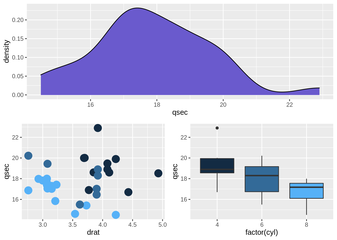
grid.arrange(g6_1, g6_2, g6_3, nrow = 3)