38 Basic introduction to tidyverse
Xiaoyuan Ge and Hui Li
38.1 Motivation
In data science, good visualizations should give and provide more information than you can just see in the data itself. Good visualizations should give us a more direct and clear sense of what is going on. However, bad data sometimes even worsen the situation and make us more confused on the data that on our hand.
We have an additional cheatsheet on the separate file. The link is: https://github.com/xiaoyuan1129/cc22spring/blob/main/resources/basic_introduction_to_%20tidyverse_cheatsheet.pdf
And the following is mainly about the use of “Tidyverse” in R. We focus on the data visualization with ggplot2 and data transformation with dplyr. Since there are many included inside Tidyverse package, this package could help people to transform data and plot data. And these are also 2 main goals that we want to showed on our cheat sheet. And firstly, because our class is named as data visualization and the mostly we learned on how to plotting different dataset with different properties. Also, under different situation and needs, we sometimes need to plot varies plots combined with accordingly explanation. Thus plotting accordingly based on the data set that we have would help us better see and explain and understanding the data.
R has several packages faciliate us making different plots and graphs, “ggplot2” is one of the most widely-used and flexible one that people use a lot in practice. Let’s starting by using mtcars
38.2 Data visualization
38.2.1 Scatterplot
dim(mpg)## [1] 234 11
head(mpg,3)## # A tibble: 3 × 11
## manufacturer model displ year cyl trans drv cty hwy fl class
## <chr> <chr> <dbl> <int> <int> <chr> <chr> <int> <int> <chr> <chr>
## 1 audi a4 1.8 1999 4 auto(l5) f 18 29 p compa…
## 2 audi a4 1.8 1999 4 manual(m5) f 21 29 p compa…
## 3 audi a4 2 2008 4 manual(m6) f 20 31 p compa…
ggplot(data = mpg) +
  geom_point(mapping = aes(x = displ, y = hwy))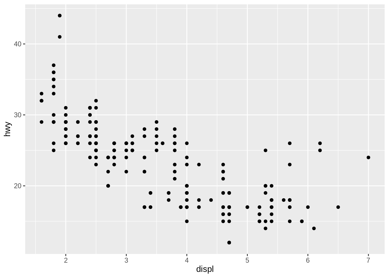
By plotting scatter plot, we do see a relationship between hwy and cyl, however, no more additional information provided to us based on this graph. There are only 2 variables included in, we can then add a third one and use color to classify them.
ggplot(data = mpg) +
  geom_point(mapping = aes(x=displ, y=hwy, color=class))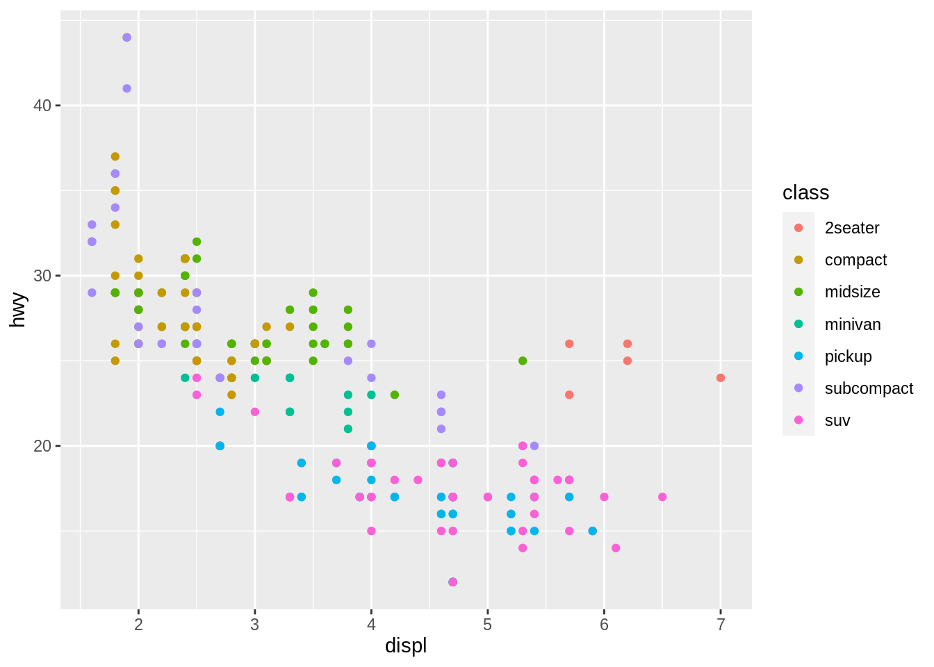
Colors of different dots help us to form a more comprehensive acknowledge as of the first graph on above. We could have a clear insight of knowing of different classes. However, this could be used as letting we know the constitution of class under this negative relationship. This could be used for discrete variables. When it comes to continuous variables, there is another way.
ggplot(data = mpg) +
  geom_point(mapping = aes(x = displ, y = hwy)) +
  facet_wrap(~ class, nrow = 2)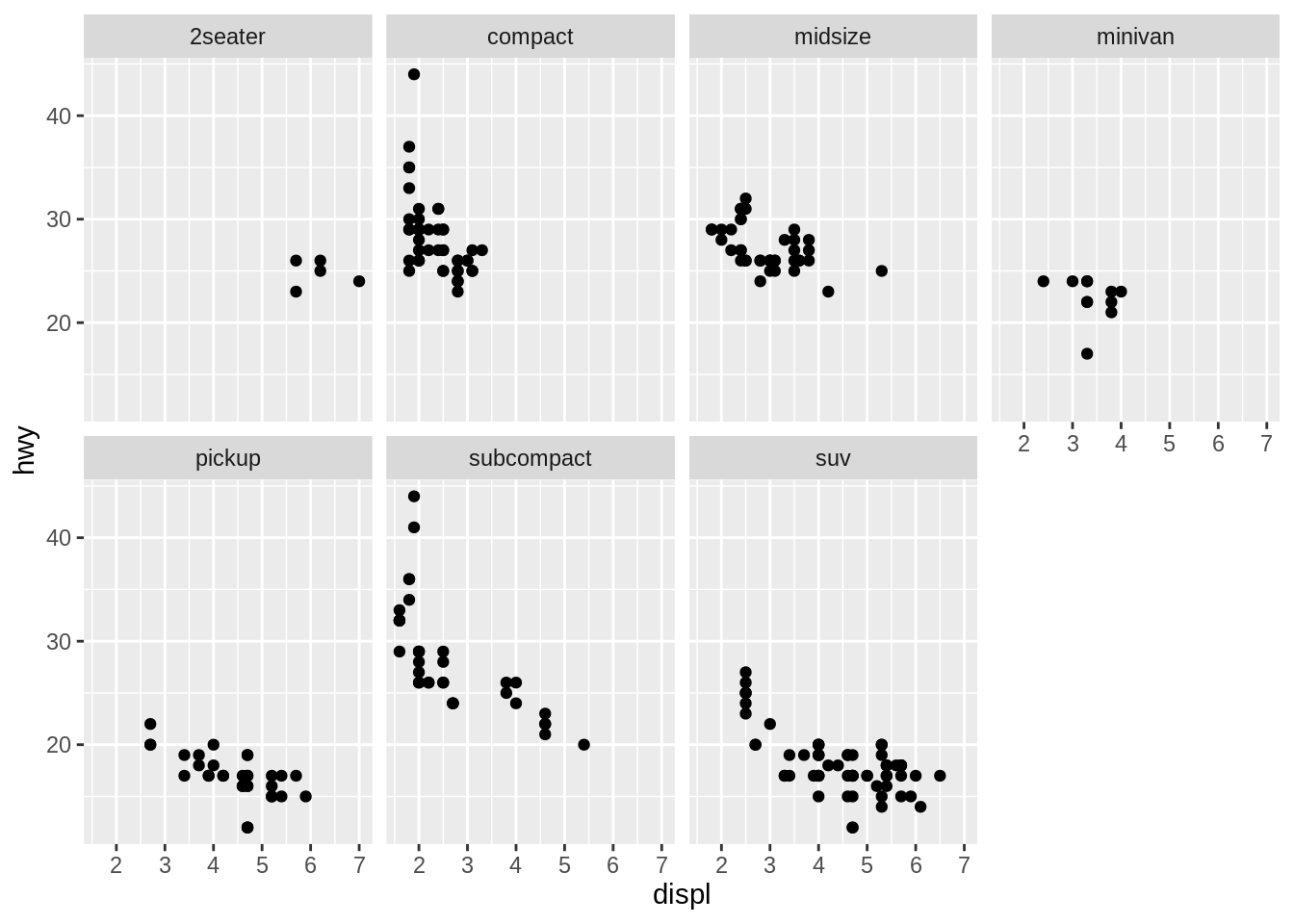
We could map a continuous variable in the mpg dataset, like cty, to the alpha,shape, and size aesthetics. we could add categorical variables to plots and split them into facets.
38.2.2 Bar plot
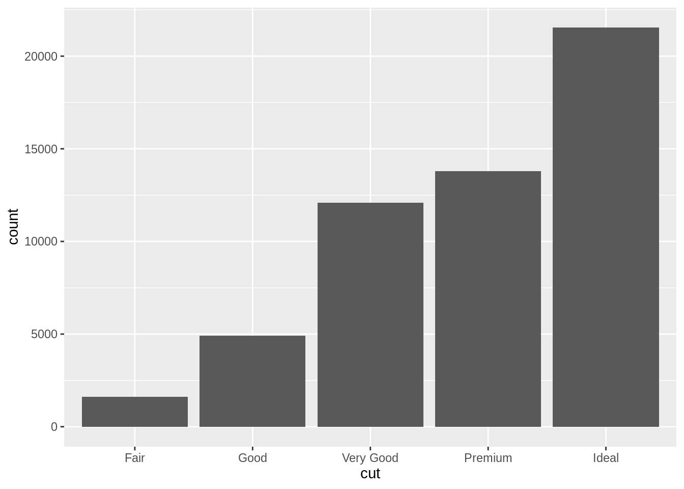
 upper <- diamonds$price > quantile(diamonds$price,probs = .7)
 diamonds$Expensive <- ifelse(upper,"high","not-high")
 theme_update(plot.title = element_text(hjust = 0.5))
 ggplot(data=diamonds) +
   geom_bar(aes(x=cut,fill=factor(Expensive)))+
   theme_gray()+
   labs(title = "Bar chart",fill="Price",x="")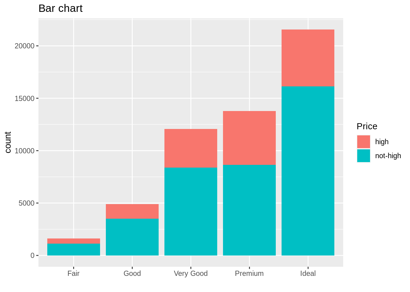
We use bar plot for categorical data, I plotted 2 kinds of bar plot above. Stacked Bar chart could help us to observe the count values across to two categorical variables.The advantage of bar plot is Show each data category in a frequency distribution,Display relative numbers/proportions of multiple categories,Summarize a large amount of data in a visual, easily intepretable form,and Make trends easier to highlight than tables do . However, the main disadvantages of bar chart are: It cannot show sufficient detail to enable timely detection of schedule slippages. The bar chart does not show the dependency relationships among activities.
38.2.3 Histogram
x <- seq(-5,5,by=.01)
 hist_data <- data.frame(x.var=rnorm(1000))
plot_data <- data.frame(x=x,f=dnorm(x))
 ggplot(hist_data)+
geom_histogram(mapping=aes(x=x.var,y=..density..),
               col="blue",fill="white",binwidth=.2)+
geom_line(plot_data,mapping = aes(x = x, y = f),
          col="black")+
labs(title = "Nomal Example",x="x",y="Density")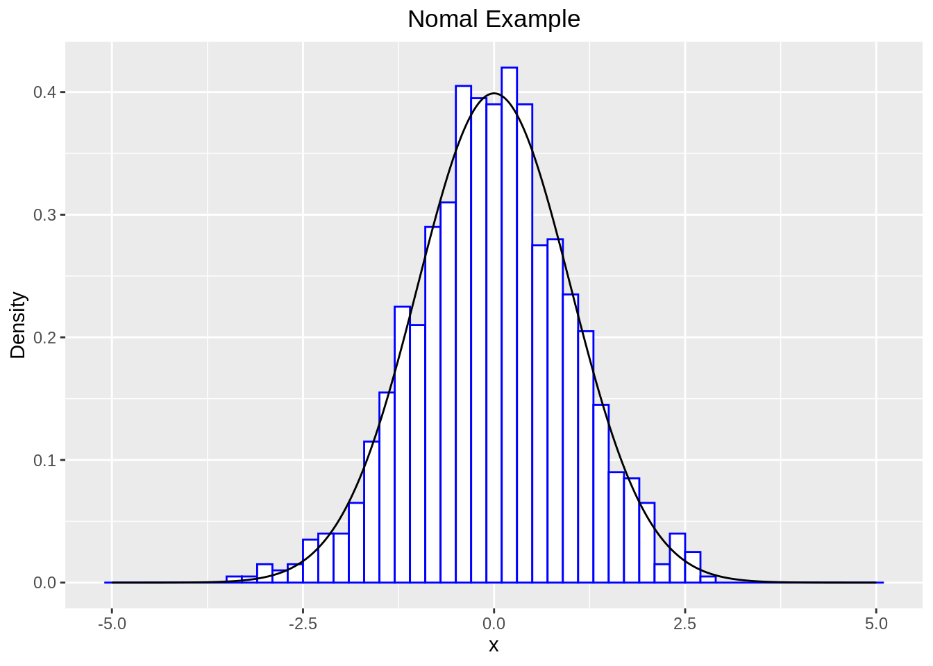
A histogram is a bar graph-like representation of data that buckets a range of outcomes into columns along the x-axis. The y-axis represents the number count or percentage of occurrences in the data for each column and can be used to visualize data distributions.And the purpose of a histogram (Chambers) is to graphically summarize the distribution of a univariate data set.The main advantages of a histogram are its simplicity and versatility. It can be used in many different situations to offer an insightful look at frequency distribution。
38.3 Data transformation
38.3.1 Installation
# The easiest way to get dplyr is to install the whole tidyverse:
#install.packages("tidyverse") - library(tidyverse)

# Alternatively, install just dplyr:
# install.packages("dplyr")
38.3.2 Usage
head(mpg,6)## # A tibble: 6 × 11
## manufacturer model displ year cyl trans drv cty hwy fl class
## <chr> <chr> <dbl> <int> <int> <chr> <chr> <int> <int> <chr> <chr>
## 1 audi a4 1.8 1999 4 auto(l5) f 18 29 p compa…
## 2 audi a4 1.8 1999 4 manual(m5) f 21 29 p compa…
## 3 audi a4 2 2008 4 manual(m6) f 20 31 p compa…
## 4 audi a4 2 2008 4 auto(av) f 21 30 p compa…
## 5 audi a4 2.8 1999 6 auto(l5) f 16 26 p compa…
## 6 audi a4 2.8 1999 6 manual(m5) f 18 26 p compa…
#Filter rows with filter(). filter() allows you to subset observations based on their values. The first argument is the name of the data frame. The second and subsequent arguments are the expressions that filter the data frame. For example, we can select all manufacturer in 2008 year with 4 cyl, 21 cty:
filter(mpg, year == 2008, cyl == 4, cty == 21)
## # A tibble: 10 × 11
## manufacturer model displ year cyl trans drv cty hwy fl class
## <chr> <chr> <dbl> <int> <int> <chr> <chr> <int> <int> <chr> <chr>
## 1 audi a4 2 2008 4 auto… f 21 30 p comp…
## 2 honda civic 2 2008 4 manu… f 21 29 p subc…
## 3 hyundai sonata 2.4 2008 4 auto… f 21 30 r mids…
## 4 hyundai sonata 2.4 2008 4 manu… f 21 31 r mids…
## 5 toyota camry 2.4 2008 4 manu… f 21 31 r mids…
## 6 toyota camry 2.4 2008 4 auto… f 21 31 r mids…
## 7 toyota camry sol… 2.4 2008 4 manu… f 21 31 r comp…
## 8 volkswagen gti 2 2008 4 manu… f 21 29 p comp…
## 9 volkswagen jetta 2 2008 4 manu… f 21 29 p comp…
## 10 volkswagen passat 2 2008 4 manu… f 21 29 p mids…
#Arrange rows with arrange().arrange() works similarly to filter() except that instead of selecting rows, it changes their order. It takes a data frame and a set of column names (or more complicated expressions) to order by. If you provide more than one column name, each additional column will be used to break ties in the values of preceding columns:
data1 <- arrange(mpg, year, cyl, cty)
head(data1, 6)
## # A tibble: 6 × 11
## manufacturer model displ year cyl trans drv cty hwy fl class
## <chr> <chr> <dbl> <int> <int> <chr> <chr> <int> <int> <chr> <chr>
## 1 toyota 4runner 4wd 2.7 1999 4 manu… 4 15 20 r suv
## 2 toyota toyota tac… 2.7 1999 4 manu… 4 15 20 r pick…
## 3 audi a4 quattro 1.8 1999 4 auto… 4 16 25 p comp…
## 4 toyota 4runner 4wd 2.7 1999 4 auto… 4 16 20 r suv
## 5 toyota toyota tac… 2.7 1999 4 auto… 4 16 20 r pick…
## 6 audi a4 1.8 1999 4 auto… f 18 29 p comp…## # A tibble: 6 × 11
## manufacturer model displ year cyl trans drv cty hwy fl class
## <chr> <chr> <dbl> <int> <int> <chr> <chr> <int> <int> <chr> <chr>
## 1 audi a4 2 2008 4 manua… f 20 31 p comp…
## 2 audi a4 2 2008 4 auto(… f 21 30 p comp…
## 3 audi a4 3.1 2008 6 auto(… f 18 27 p comp…
## 4 audi a4 quattro 2 2008 4 manua… 4 20 28 p comp…
## 5 audi a4 quattro 2 2008 4 auto(… 4 19 27 p comp…
## 6 audi a4 quattro 3.1 2008 6 auto(… 4 17 25 p comp…
#Select columns with select(). It’s not uncommon to get datasets with hundreds or even thousands of variables. In this case, the first challenge is often narrowing in on the variables you’re actually interested in. select() allows you to rapidly zoom in on a useful subset using operations based on the names of the variables.
data3 <- select(mpg, drv, cty, hwy)
head(data3, 6)
## # A tibble: 6 × 3
## drv cty hwy
## <chr> <int> <int>
## 1 f 18 29
## 2 f 21 29
## 3 f 20 31
## 4 f 21 30
## 5 f 16 26
## 6 f 18 26## # A tibble: 6 × 3
## drv cty hwy
## <chr> <int> <int>
## 1 f 18 29
## 2 f 21 29
## 3 f 20 31
## 4 f 21 30
## 5 f 16 26
## 6 f 18 26
## Select all columns except those from drv to hwy (inclusive)
data5 <- select(mpg,-(drv:hwy))
head(data5,6)
## # A tibble: 6 × 8
## manufacturer model displ year cyl trans fl class
## <chr> <chr> <dbl> <int> <int> <chr> <chr> <chr>
## 1 audi a4 1.8 1999 4 auto(l5) p compact
## 2 audi a4 1.8 1999 4 manual(m5) p compact
## 3 audi a4 2 2008 4 manual(m6) p compact
## 4 audi a4 2 2008 4 auto(av) p compact
## 5 audi a4 2.8 1999 6 auto(l5) p compact
## 6 audi a4 2.8 1999 6 manual(m5) p compact
#Add new variables with mutate(). Besides selecting sets of existing columns, it’s often useful to add new columns that are functions of existing columns. That’s the job of mutate(). mutate() always adds new columns at the end of your dataset so we’ll start by creating a narrower dataset so we can see the new variables.
mpg_sml <- select(mpg,
                  manufacturer,
                  model:year,
                  cyl,
                  drv:hwy)
data6 <- mutate(mpg_sml, net = hwy-cty)
head(data6, 6)
## # A tibble: 6 × 9
## manufacturer model displ year cyl drv cty hwy net
## <chr> <chr> <dbl> <int> <int> <chr> <int> <int> <int>
## 1 audi a4 1.8 1999 4 f 18 29 11
## 2 audi a4 1.8 1999 4 f 21 29 8
## 3 audi a4 2 2008 4 f 20 31 11
## 4 audi a4 2 2008 4 f 21 30 9
## 5 audi a4 2.8 1999 6 f 16 26 10
## 6 audi a4 2.8 1999 6 f 18 26 8
#Grouped summaries with summarise(). summarise() is not terribly useful unless we pair it with group_by(). This changes the unit of analysis from the complete dataset to individual groups. Then, when you use the dplyr verbs on a grouped data frame they’ll be automatically applied “by group”.
summarise(mpg, avg_year = mean(year, na.rm = TRUE))
## # A tibble: 1 × 1
## avg_year
## <dbl>
## 1 2004.
amount <- group_by(mpg, cty, hwy)
data7 <- summarise(amount, avg_year = mean(year, na.rm = TRUE))
head(data7, 6)
## # A tibble: 6 × 3
## # Groups: cty [3]
## cty hwy avg_year
## <int> <int> <dbl>
## 1 9 12 2008
## 2 11 14 2008
## 3 11 15 2000.
## 4 11 16 1999
## 5 11 17 2001.
## 6 12 16 2008
#Ungrouping. If you need to remove grouping, and return to operations on ungrouped data, use ungroup().
ye <- group_by(mpg, year)
ye %>%
  ungroup() %>%
  summarise(mpg = n())
## # A tibble: 1 × 1
## mpg
## <int>
## 1 234