13 Cheatsheet for multiple graphics
Guo Pei
13.1 Description
The cheatsheet includes a single formula sheet and a more detailed tutorial of implementing different plot types on several data sets. To be specific, it contains Histogram, Boxplot, Violin plot, Ridgeline plot, Q-Q plot, Bar chart, Cleveland dot plot, Scatterplot, Parallel coordinates plot, Biplot, Mosaic plot, Alluvial diagram and Heatmap.
For the formula sheet part, it contains nearly all formulas professor introduced in class and we used and met in the previous problem sets.
Link: https://github.com/gloria6661/5293_CC/blob/main/cheatsheet.pdf
For the implementation part, each figure is attached with code on how to draw it. For some types of plots, it lists more than one methods to draw.
library(ggplot2)
library(gridExtra)
library(ggridges)
library(carData)
library(forcats)
library(dplyr)
library(tidyr)
library(tibble)
library(openintro)
library(plotly)
library(GGally)
library(scales)
library(parcoords) # devtools::install_github("timelyportfolio/parcoords")
library(d3r)
library(redav)
library(grid)
library(vcd)
library(vcdExtra)
library(ggalluvial)
13.2 Histogram
Data: iris
head(iris)## Sepal.Length Sepal.Width Petal.Length Petal.Width Species
## 1 5.1 3.5 1.4 0.2 setosa
## 2 4.9 3.0 1.4 0.2 setosa
## 3 4.7 3.2 1.3 0.2 setosa
## 4 4.6 3.1 1.5 0.2 setosa
## 5 5.0 3.6 1.4 0.2 setosa
## 6 5.4 3.9 1.7 0.4 setosa13.2.1 Frequency (count) histogram (ggplot2)
ggplot(iris, aes(Sepal.Length)) +
  geom_histogram(color = "blue", fill = "lightblue", binwidth = .3) +
  theme_grey(14) +
  labs(title = "Histogram of Sepal Length", x = "Sepal Length")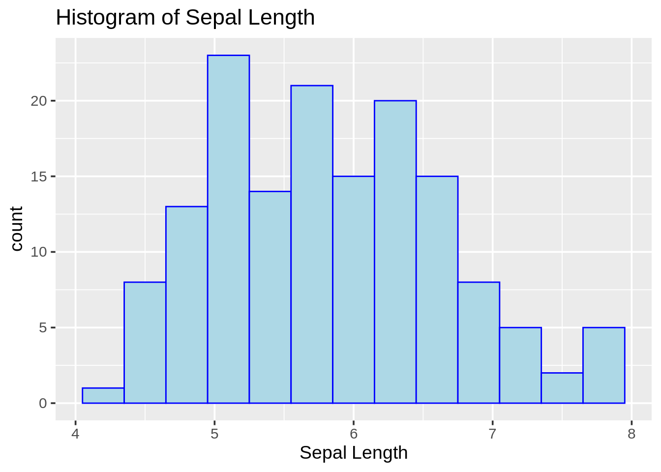
13.2.2 Histograms with right closed / right open (base R)
par(mfrow = c(1, 2))
# histogram with right closed
hist(iris$Sepal.Length, col = "lightblue", right = TRUE,
     breaks = 4, ylim = c(0, 60),
     main = "Histogram with right closed", xlab = "Sepal Length")
# histogram with right open
hist(iris$Sepal.Length, col = "lightblue", right = FALSE,
     breaks = 4, ylim = c(0, 60),
     main = "Histogram with right open", xlab = "Sepal Length")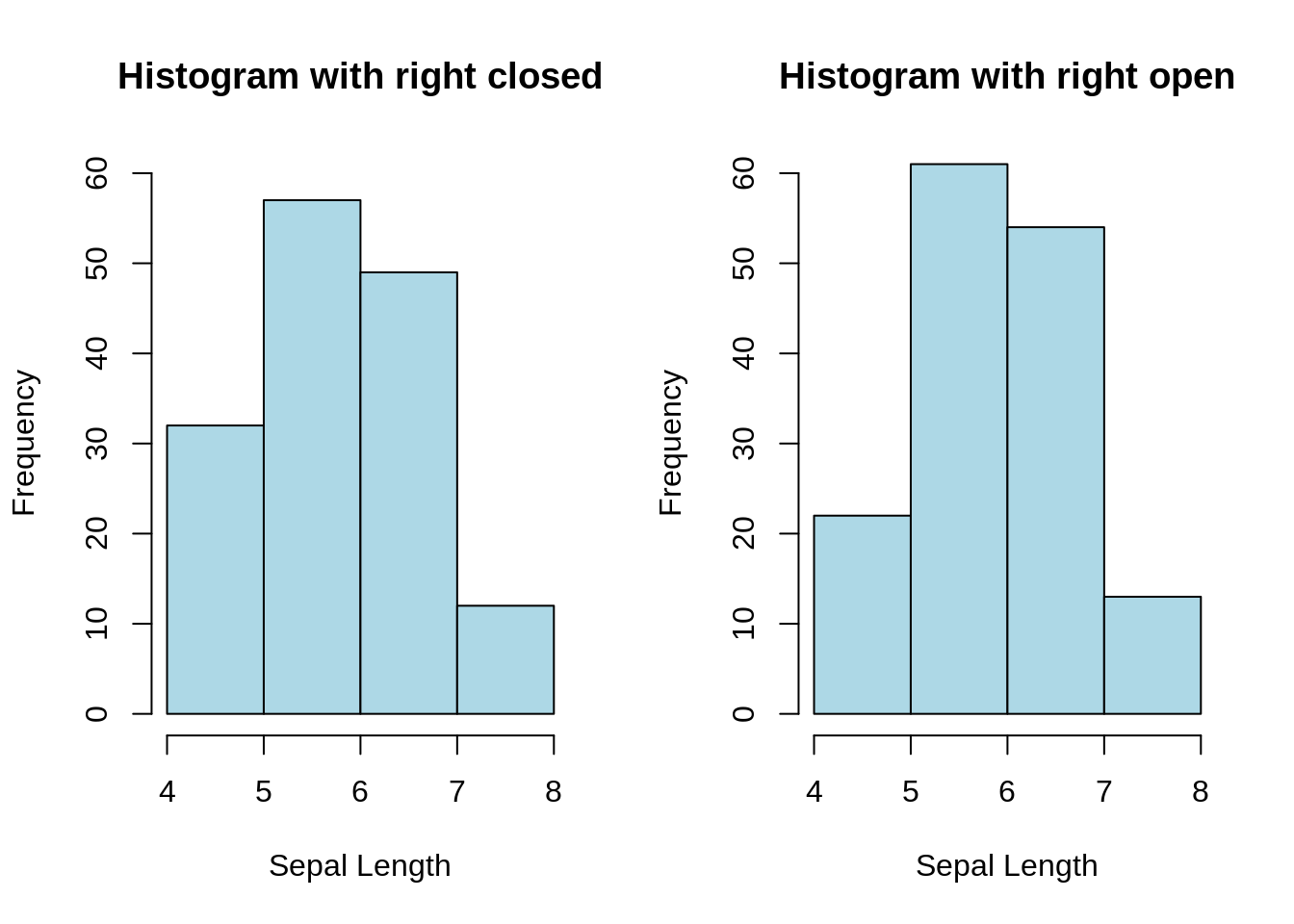
13.2.3 Density histogram with density curve overlaid (ggplot2)
ggplot(iris, aes(x = Sepal.Length, y = ..density..)) +
  geom_histogram(binwidth = .5, color = "blue", fill = "lightblue", boundary = 0) +
  geom_density(color = "red") +
  labs(title = "Density Histogram", x = "Sepal Length")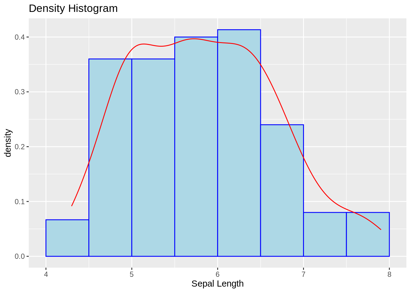
13.2.4 Density histogram with density curve and theoretical normal curve overlaid (base R)
# draw the density histogram
hist(iris$Sepal.Length, freq = FALSE, ylim = c(0, 0.5),
     main = "Density Histogram", xlab = "Sepal Length")
# add density curve
lines(density(iris$Sepal.Length), col = 2)
# add normal curve
x <- seq(3, 9, length = 100) # x-axis grid
nc <- dnorm(x, mean = mean(iris$Sepal.Length), sd = sd(iris$Sepal.Length)) #normal curve
lines(x, nc, col = 3)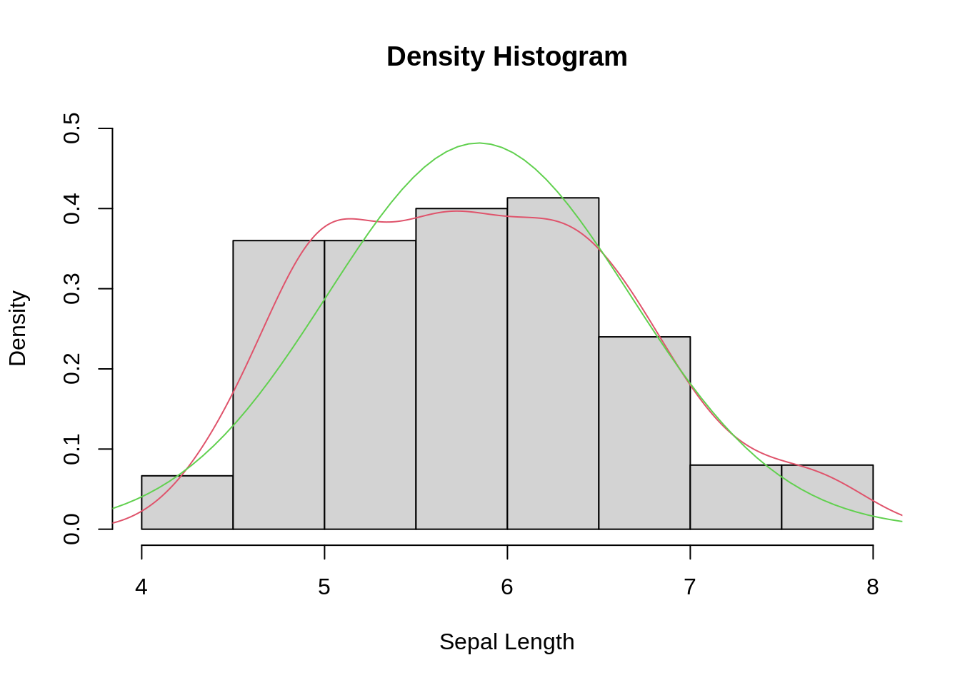
13.2.5 Cumulative frequency histogram
g1 <- ggplot(iris, aes(x = Sepal.Length)) +
  geom_histogram(color = "blue", fill = "lightblue") +
  labs(title = "Frequency", x = "Sepal Length")
g2 <- ggplot(iris, aes(x = Sepal.Length)) +
  geom_histogram(aes(y = cumsum(..count..)),
                 color = "blue", fill = "lightblue") +
  labs(title = "Cumulative Frequency", x = "Sepal Length")
grid.arrange(g1, g2, nrow = 1)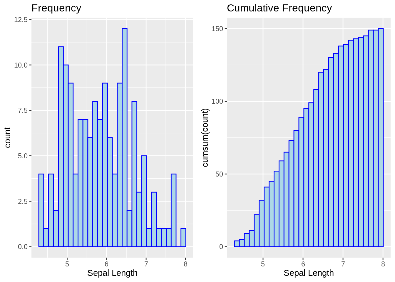
13.3 Boxplot
13.3.1 Boxplot (base R)
boxplot(Sepal.Length ~ Species, data = iris, horizontal = TRUE,
        main = "Sepal Length vs Species", ylab = "Sepal Length")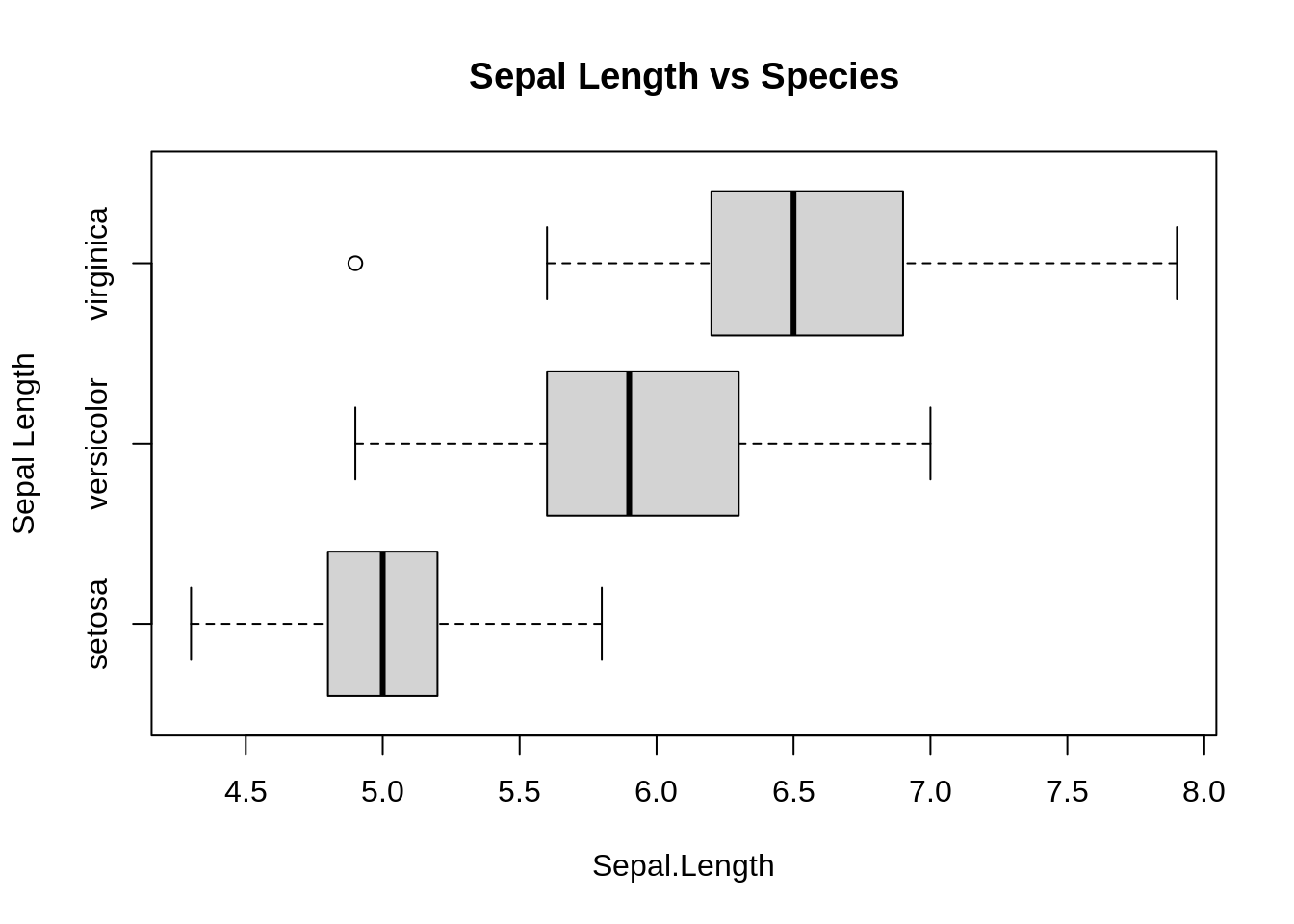
13.3.2 Boxplot (ggplot2)
ggplot(iris, aes(x = Species, y = Sepal.Length)) +
  geom_boxplot(varwidth = TRUE) +
  coord_flip() +
  labs(title = "Sepal Length vs Species", y = "Sepal Length")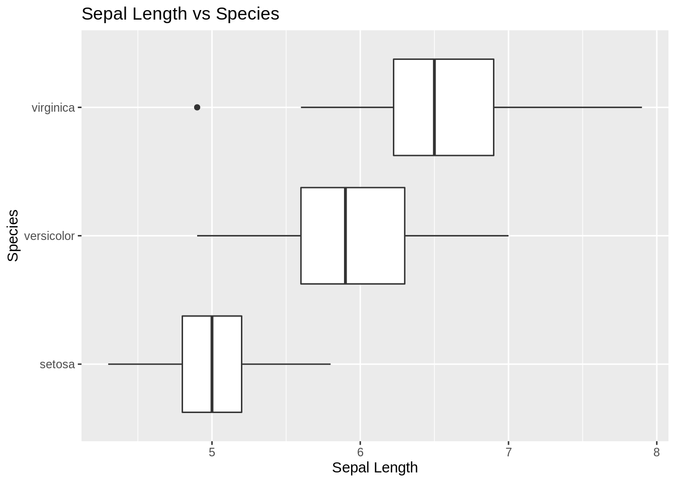
13.4 Violin plot
ggplot(iris, aes(x = Species,
                  y = Sepal.Length)) +
  geom_violin(adjust = 1.5) +
  coord_flip() +
  labs(title = "Violin Plot", y = "Sepal Length")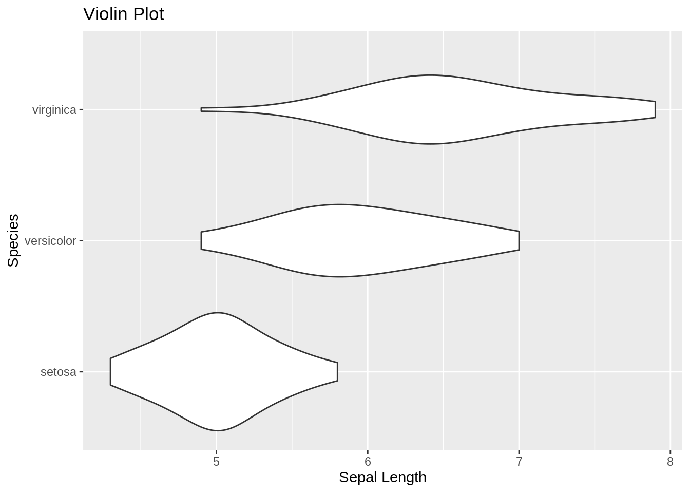
13.5 Ridgeline plot
ggplot(iris, aes(x = Sepal.Length, y = reorder(Species, Sepal.Length, median))) +
  geom_density_ridges(fill = "blue", alpha = .5, scale = .95) +
  labs(title = "Ridgeline Plot", x = "Sepal Length", y = "Species")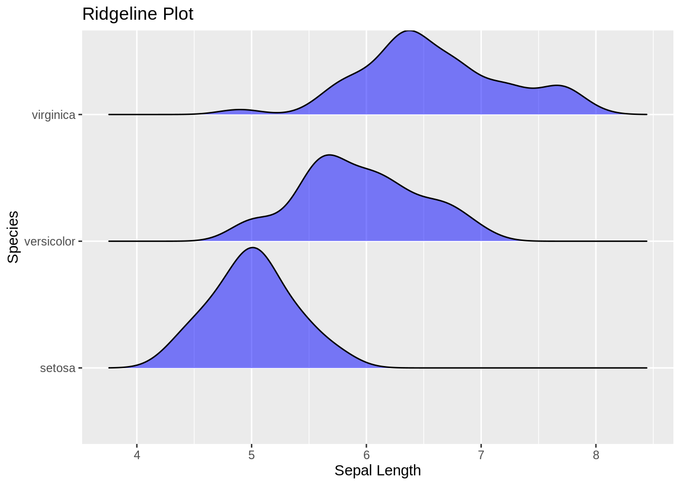
13.7 Bar chart
Data: TitanicSurvival
head(TitanicSurvival)## survived sex age passengerClass
## Allen, Miss. Elisabeth Walton yes female 29.0000 1st
## Allison, Master. Hudson Trevor yes male 0.9167 1st
## Allison, Miss. Helen Loraine no female 2.0000 1st
## Allison, Mr. Hudson Joshua Crei no male 30.0000 1st
## Allison, Mrs. Hudson J C (Bessi no female 25.0000 1st
## Anderson, Mr. Harry yes male 48.0000 1st13.7.1 Ordinal data (sort in logical order of the categories)
ggplot(TitanicSurvival, aes(passengerClass)) +
  geom_bar(fill = "cornflowerblue") +
  ggtitle("Passenger Class") +
  labs(title = "Passenger Class", x = "")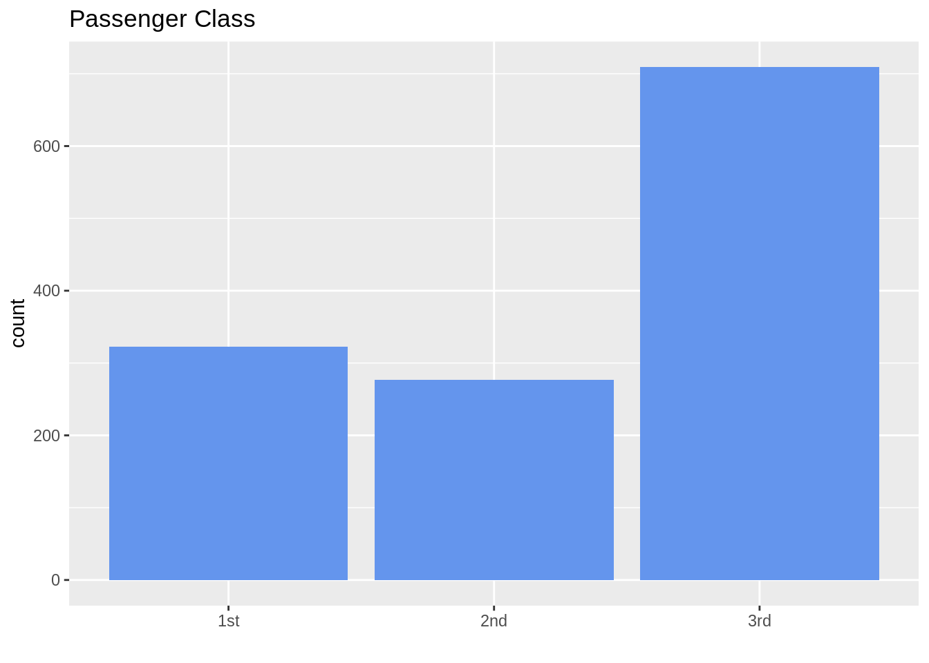
13.7.2 Nominal data (sort from highest to lowest count)
ggplot(TitanicSurvival, aes(fct_infreq(passengerClass))) +
  geom_bar(fill = "cornflowerblue") +
  ggtitle("Passenger Class") +
  labs(title = "Passenger Class", x = "")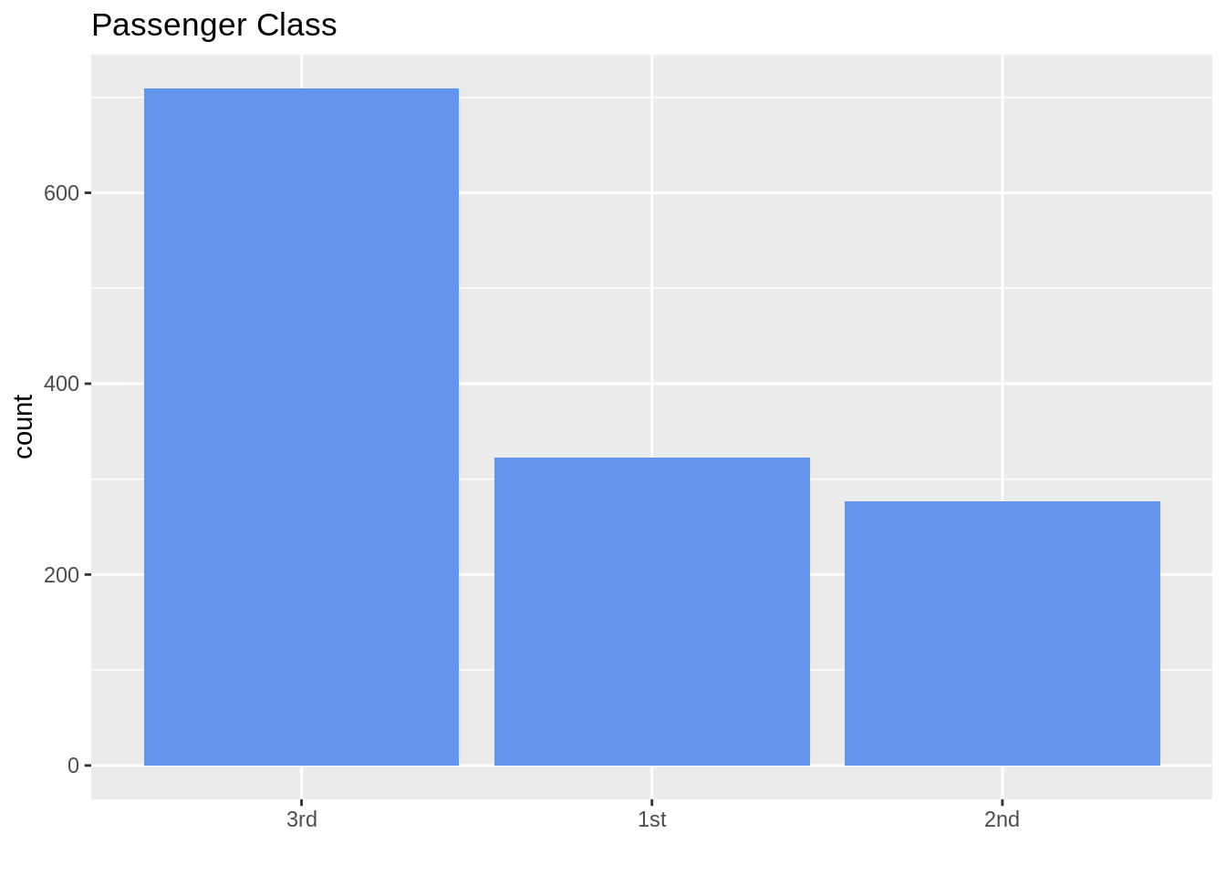
13.7.3 Bar chart with facets
ggplot(data = TitanicSurvival, aes(x = passengerClass)) +
  geom_bar() +
  facet_wrap(~survived, ncol = 1, scales = "free_y") +
  labs(title = "Bar chart faceted by Survival Status",
       x = "Passenger Class", y = "")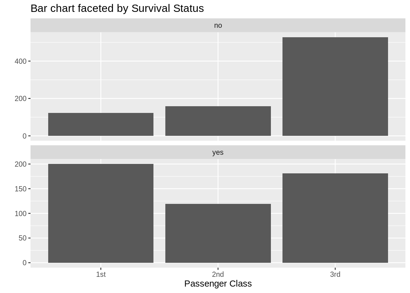
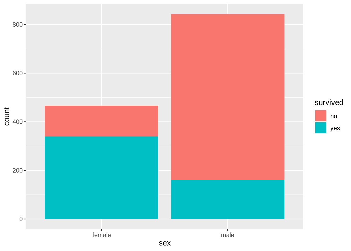
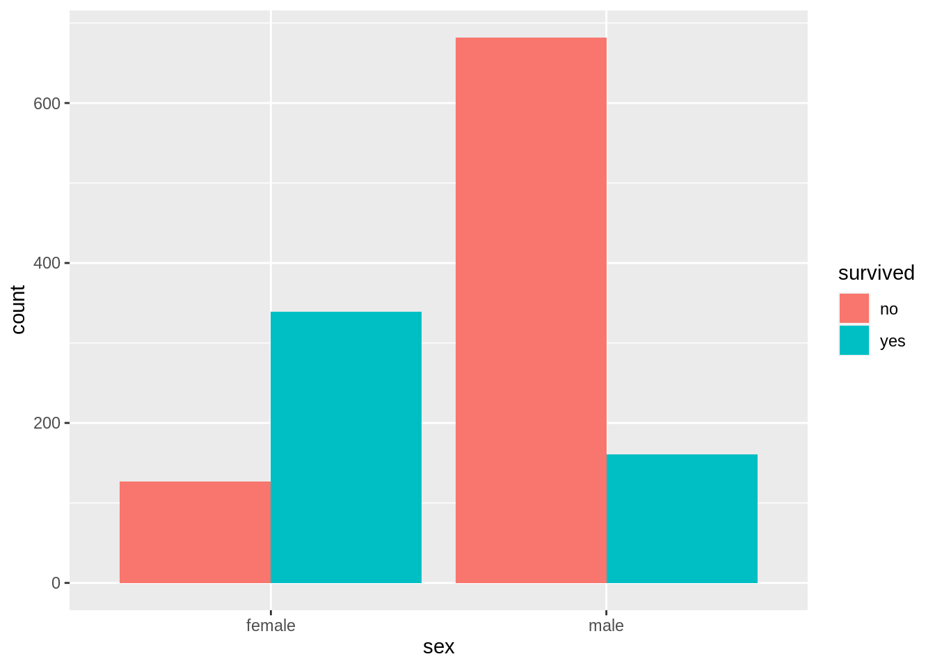
13.7.6 Grouped bar chart with facets
counts <- TitanicSurvival %>%
  group_by(sex, survived, passengerClass) %>%
  summarize(Freq = n()) %>%
  ungroup() %>%
  complete(sex, survived, passengerClass, fill = list(Freq = 0))
# draw the grouped bar chart
ggplot(counts, aes(x = sex, y = Freq, fill = survived)) +
  geom_col(position = "dodge") +
  facet_wrap(~passengerClass)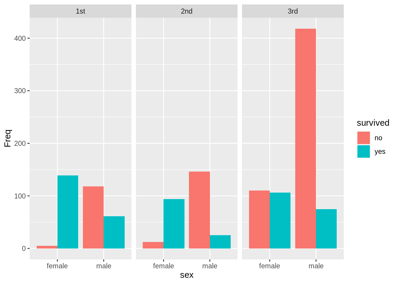
13.8 Cleveland dot plot
TitanicSurvival1 <- TitanicSurvival %>%
  rownames_to_column(var = "name")
head(TitanicSurvival1)
## name survived sex age passengerClass
## 1 Allen, Miss. Elisabeth Walton yes female 29.0000 1st
## 2 Allison, Master. Hudson Trevor yes male 0.9167 1st
## 3 Allison, Miss. Helen Loraine no female 2.0000 1st
## 4 Allison, Mr. Hudson Joshua Crei no male 30.0000 1st
## 5 Allison, Mrs. Hudson J C (Bessi no female 25.0000 1st
## 6 Anderson, Mr. Harry yes male 48.0000 1st13.8.1 Cleveland dot plot
ts1 <- TitanicSurvival1 %>%
  filter(!is.na(age) & passengerClass == "1st" & survived == "yes" & sex == "female" &
           age >= 30 & age <= 40)

ggplot(ts1,aes(x = age, y = fct_reorder(name, age))) +
  geom_point(color = "blue") +
  ylab("")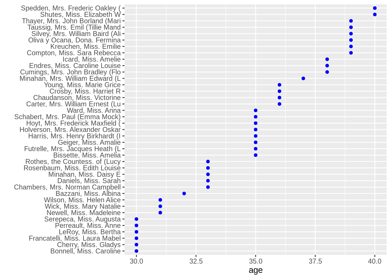
13.8.2 Cleveland dot plot with facets
ts2 <- TitanicSurvival1 %>%
  filter(!is.na(age) & survived == "yes" & sex == "female" & age >= 30 & age <= 40)

ggplot(ts2, aes(x = age, y = reorder(name, age))) +
  geom_point(color = "blue") +
  facet_grid(.~reorder(passengerClass, -age, median)) +
  ylab("")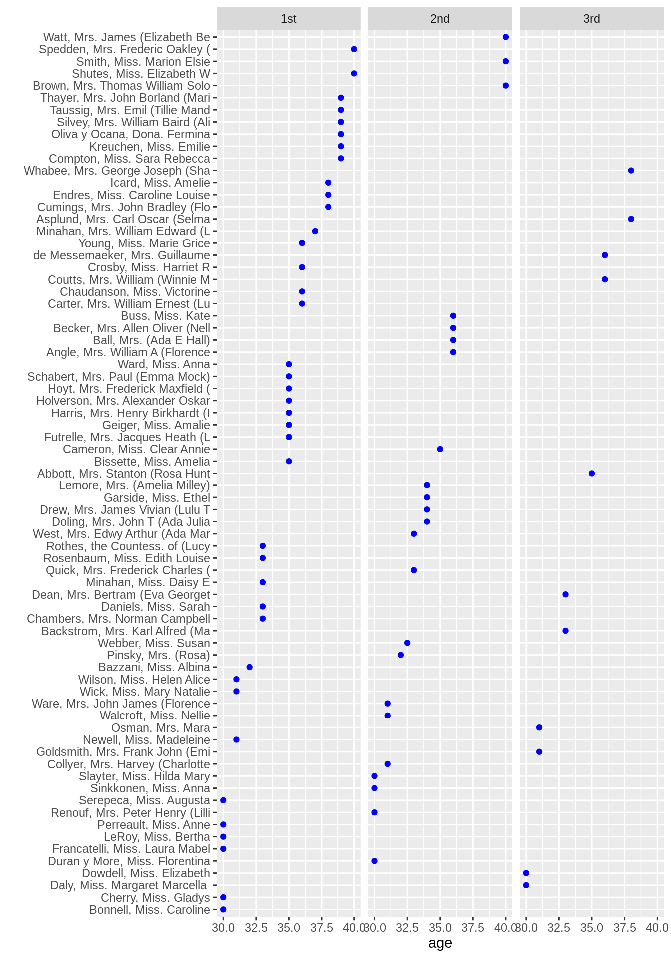
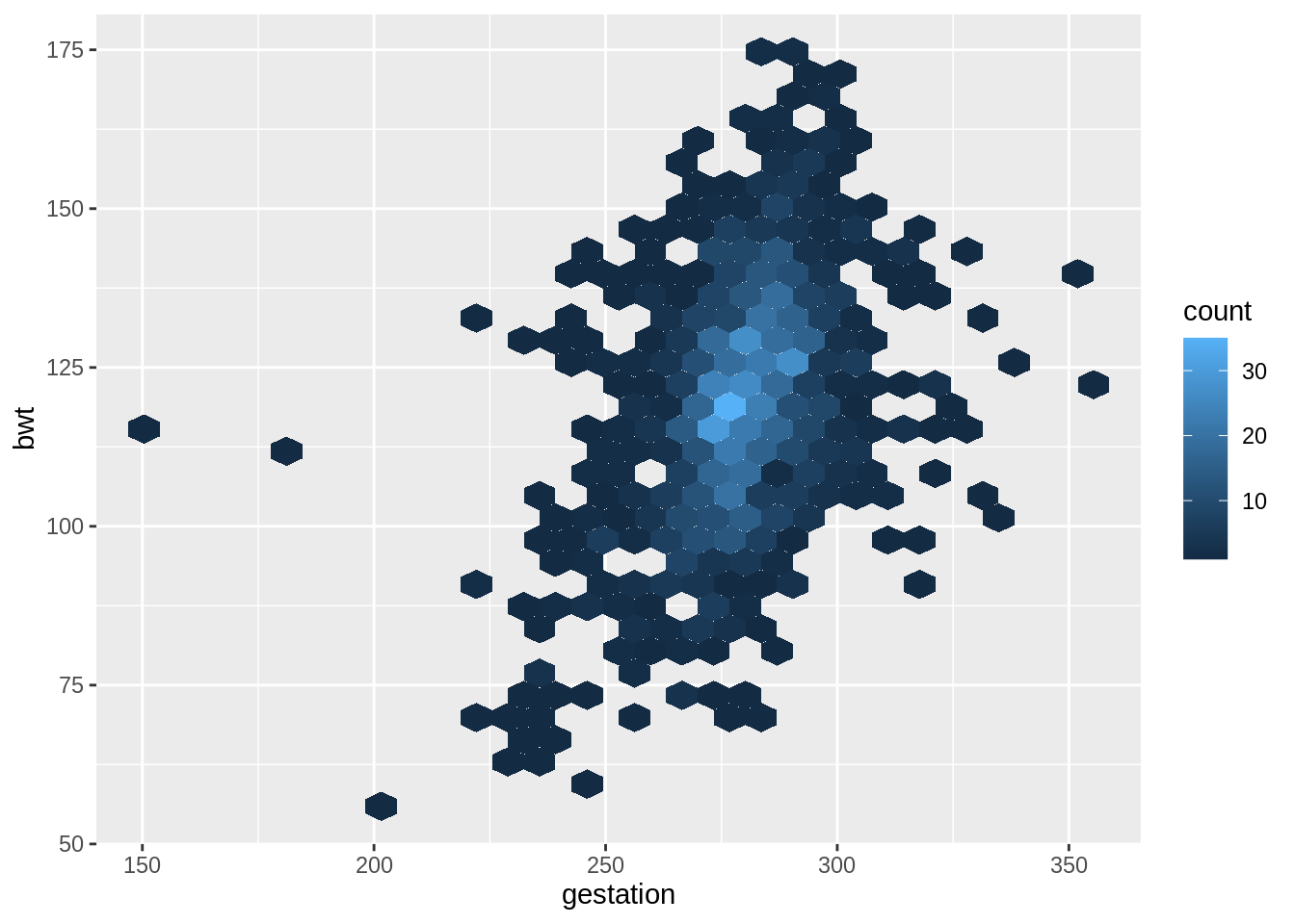
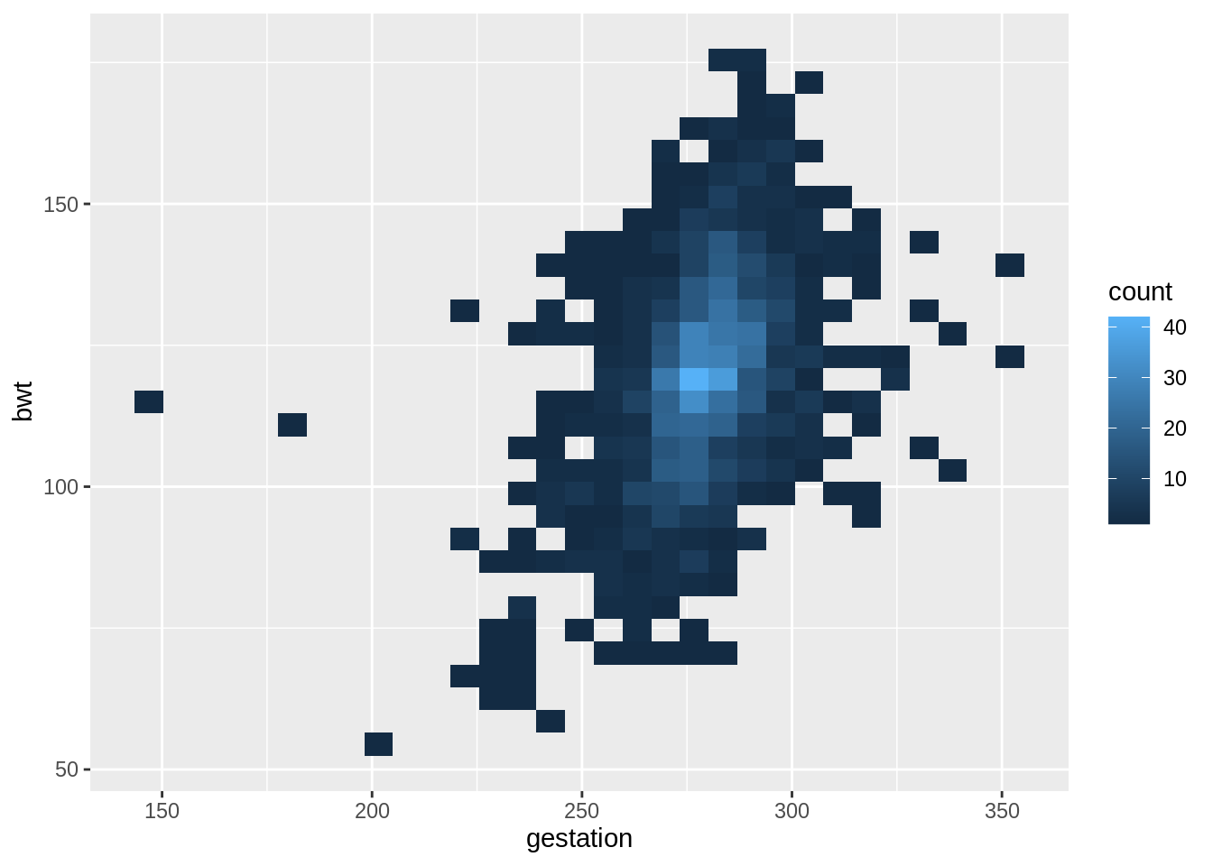
13.9 Scatterplot
Data: babies in the openintro package
head(babies)## # A tibble: 6 × 8
## case bwt gestation parity age height weight smoke
## <int> <int> <int> <int> <int> <int> <int> <int>
## 1 1 120 284 0 27 62 100 0
## 2 2 113 282 0 33 64 135 0
## 3 3 128 279 0 28 64 115 1
## 4 4 123 NA 0 36 69 190 0
## 5 5 108 282 0 23 67 125 1
## 6 6 136 286 0 25 62 93 013.9.1 Scatterplot
# draw the scatterplot
g <- ggplot(babies, aes(x = gestation, y = bwt)) +
  # adjust point size and add alpha blending
  geom_point(size = 1, alpha = .5)
g +
  # add the density contour lines
  geom_density_2d() +
  # add the linear model
  geom_smooth(method = 'lm', se = FALSE, col = 2)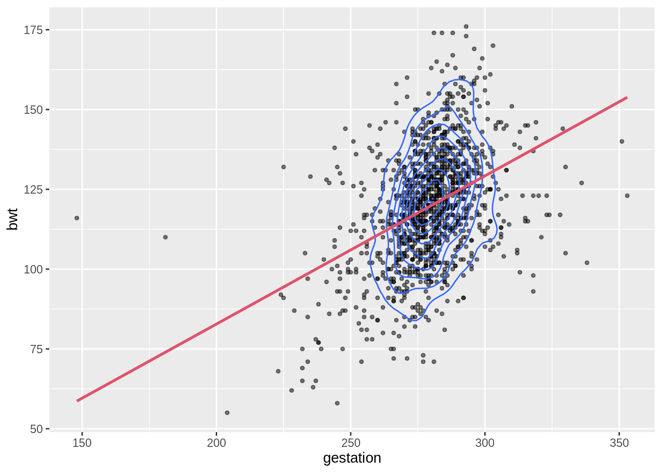
13.9.2 Interactive scatterplot
g1 <- ggplot(iris, aes(x = Sepal.Width, y = Sepal.Length, color = Species)) +
  geom_point()
ggplotly(g1)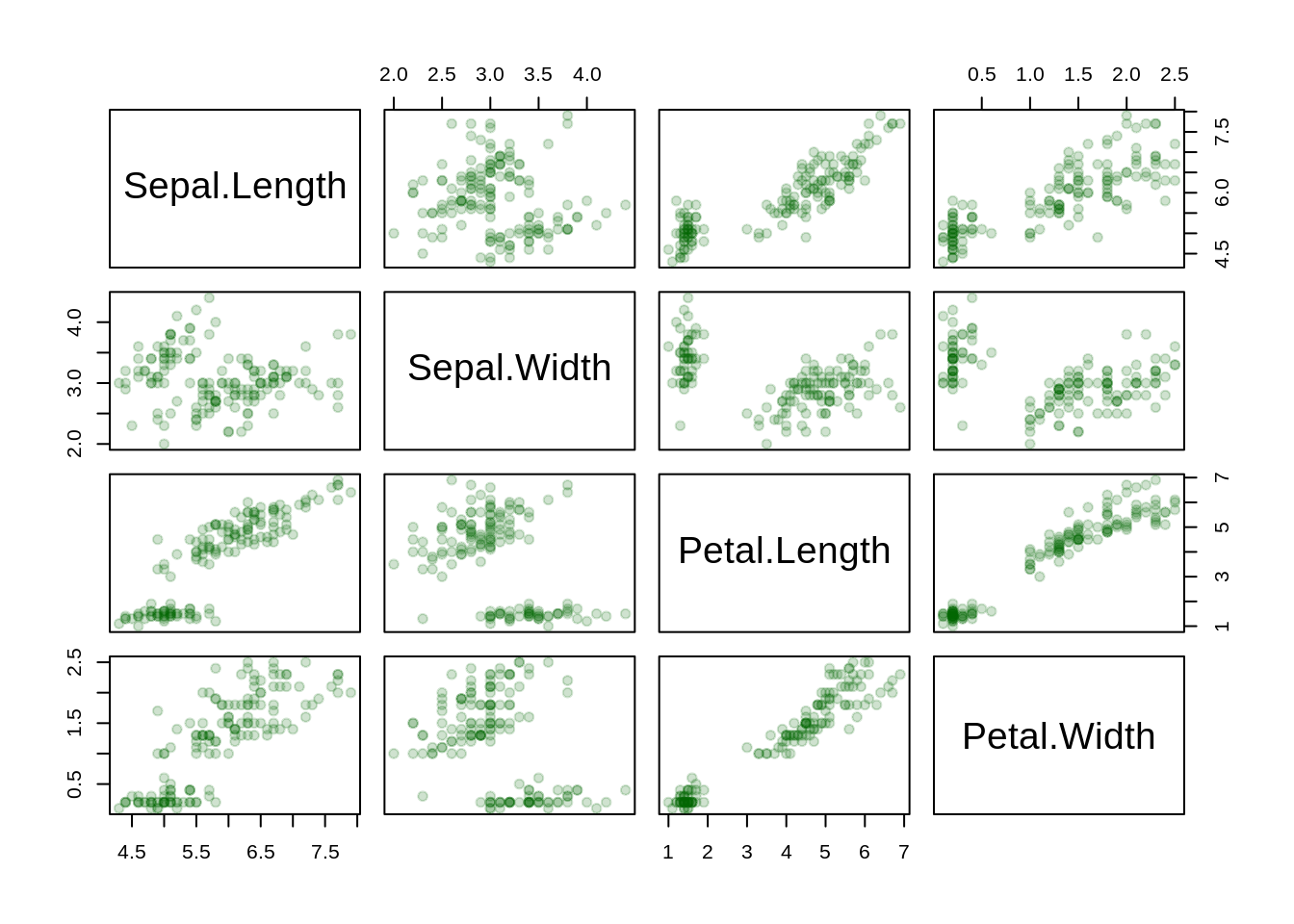
13.10 Parallel coordinates plot
Data: state.x77
mystates <- data.frame(state.x77) %>%
  rownames_to_column("State") %>%
  mutate(Region = factor(state.region))
head(mystates)
## State Population Income Illiteracy Life.Exp Murder HS.Grad Frost Area
## 1 Alabama 3615 3624 2.1 69.05 15.1 41.3 20 50708
## 2 Alaska 365 6315 1.5 69.31 11.3 66.7 152 566432
## 3 Arizona 2212 4530 1.8 70.55 7.8 58.1 15 113417
## 4 Arkansas 2110 3378 1.9 70.66 10.1 39.9 65 51945
## 5 California 21198 5114 1.1 71.71 10.3 62.6 20 156361
## 6 Colorado 2541 4884 0.7 72.06 6.8 63.9 166 103766
## Region
## 1 South
## 2 West
## 3 West
## 4 South
## 5 West
## 6 West13.10.1 Static parallel coordinates plot
ggparcoord(mystates, columns = 2:9, alphaLines = .5,
           scale = "uniminmax", splineFactor = 10, groupColumn = 10) +
  geom_vline(xintercept = 2:8, color = "lightblue")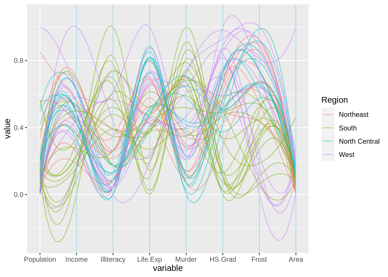
13.11 Biplot
Data: attributes.xls
(http://www.econ.upf.edu/~michael/attributes.xls)
ratings <- data.frame(country = c("Italy","Spain","Croatia","Brazil","Russia",
                                  "Germany","Turkey","Morocco","Peru","Nigeria",
                                  "France","Mexico","SouthAfrica"),
                      living_standard = c(7,7,5,5,6,8,5,4,5,2,8,2,4),
                      climate = c(8,9,6,8,2,3,8,7,6,4,4,5,4),
                      food = c(9,9,6,7,2,2,9,8,6,4,7,5,5),
                      security = c(5,5,6,3,3,8,3,2,3,2,7,2,3),
                      hospitality = c(3,2,5,2,7,7,1,1,4,3,9,3,3),
                      infrastructure = c(7,8,6,3,6,9,3,2,4,2,8,3,3))
head(ratings)
## country living_standard climate food security hospitality infrastructure
## 1 Italy 7 8 9 5 3 7
## 2 Spain 7 9 9 5 2 8
## 3 Croatia 5 6 6 6 5 6
## 4 Brazil 5 8 7 3 2 3
## 5 Russia 6 2 2 3 7 6
## 6 Germany 8 3 2 8 7 913.11.1 Principal components analysis (PCA)
## Importance of components:
##                          PC1    PC2     PC3     PC4     PC5     PC6
## Standard deviation     1.854 1.4497 0.43959 0.39052 0.27517 0.19778
## Proportion of Variance 0.573 0.3503 0.03221 0.02542 0.01262 0.00652
## Cumulative Proportion  0.573 0.9232 0.95544 0.98086 0.99348 1.00000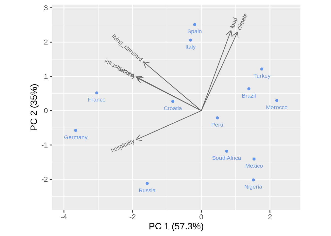
13.11.3 Biplot with calibrated axis and projection lines
draw_biplot(ratings, "climate", project = TRUE)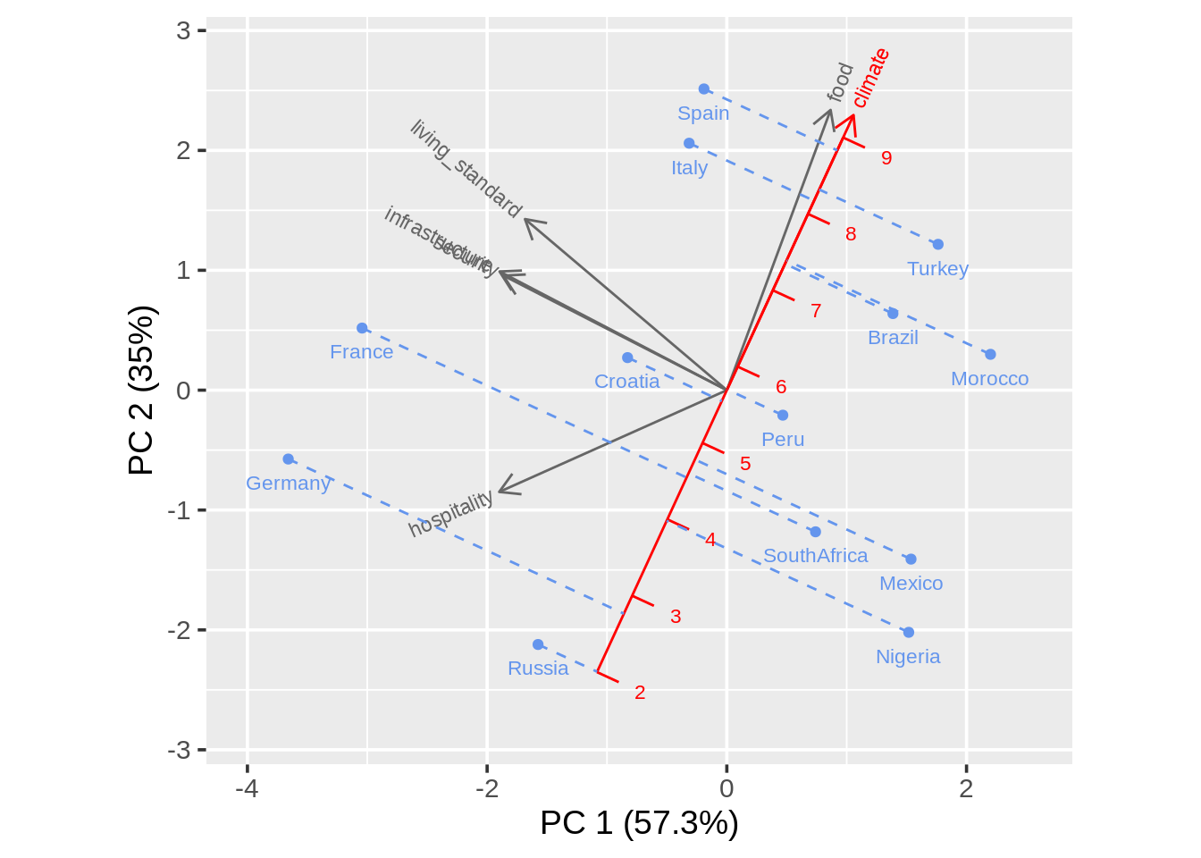
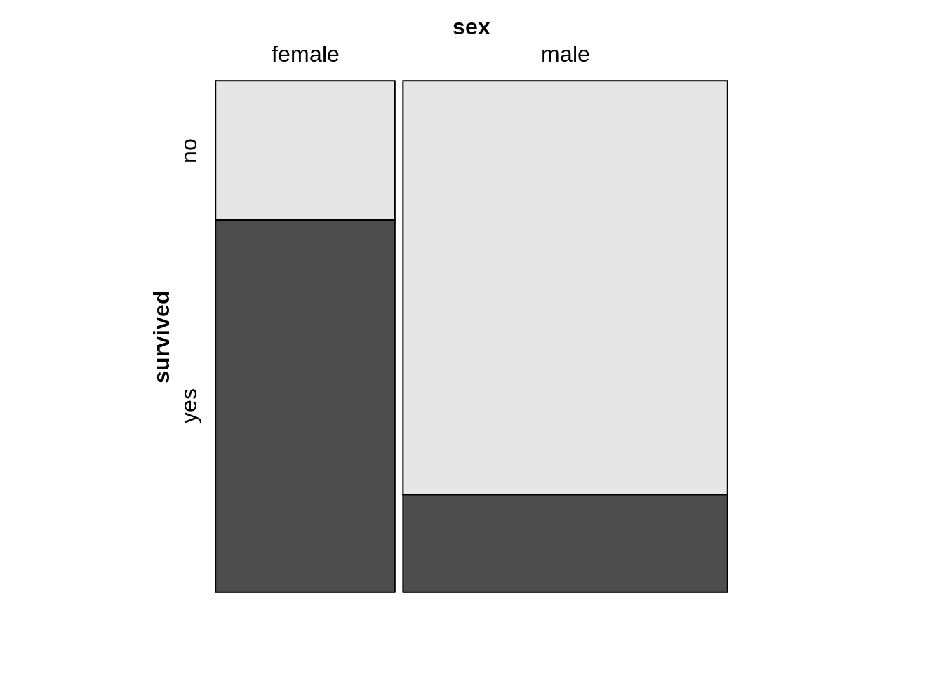
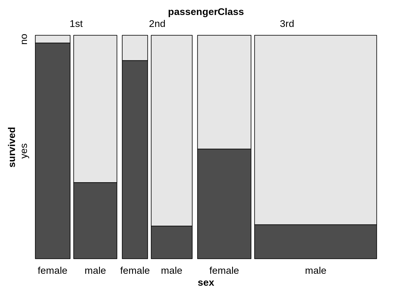
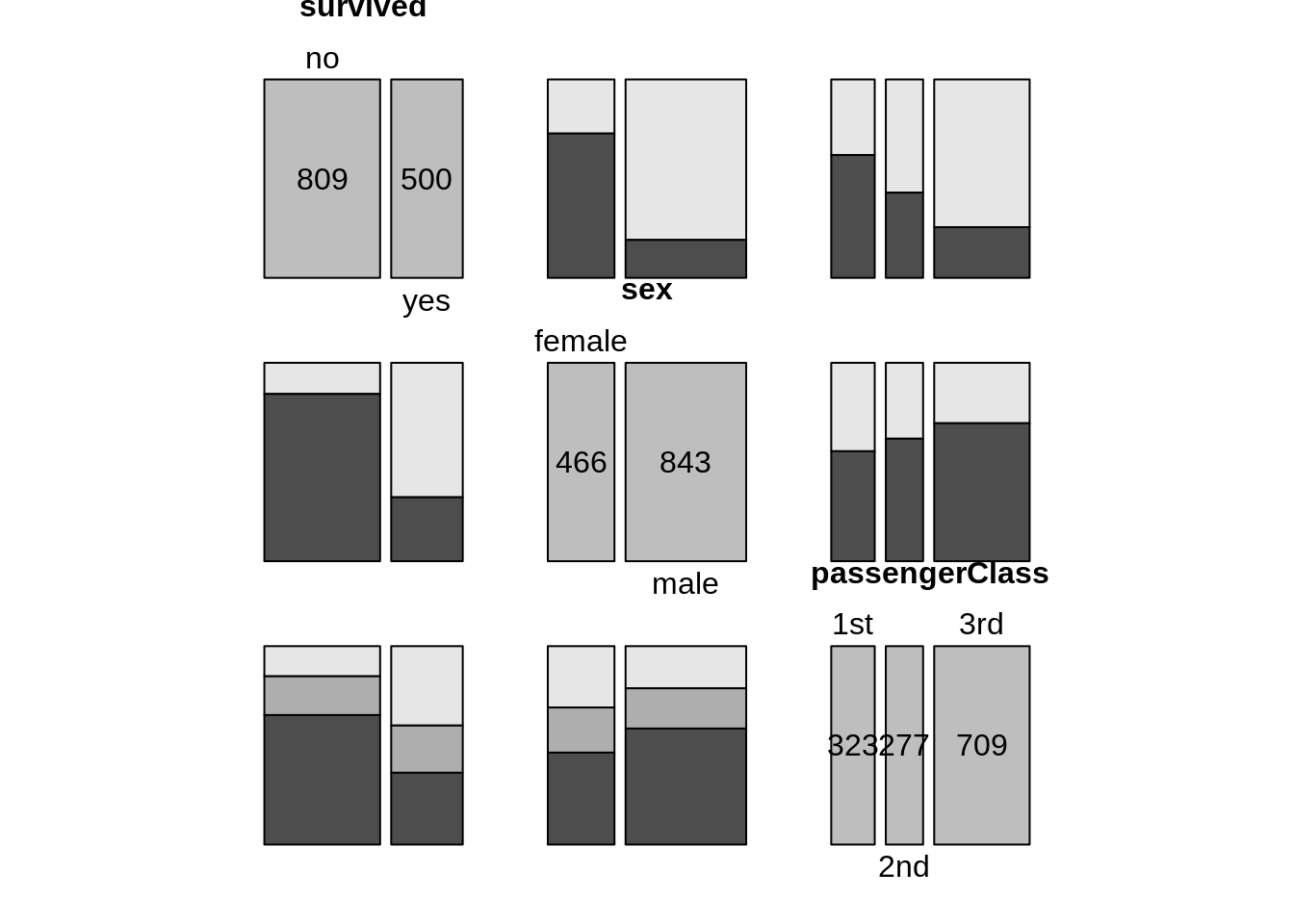
13.12 Mosaic plot
13.12.1 Mosaic plot with one variable
counts1 <- TitanicSurvival %>%
  group_by(sex, survived) %>%
  summarize(Freq = n())
mosaic(~sex, direction = "v", counts1)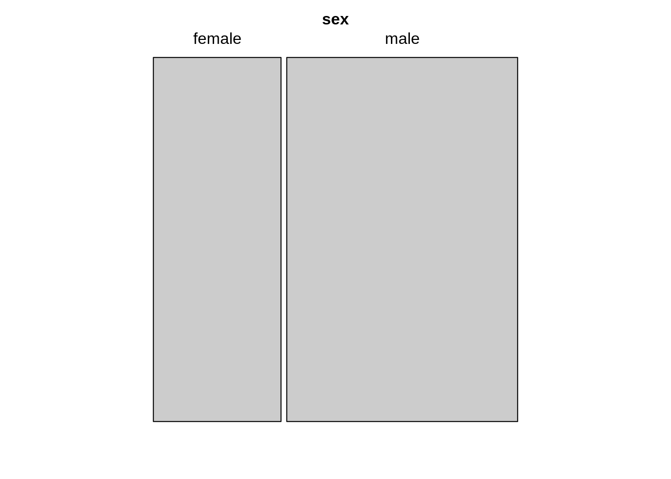
13.13 Alluvial diagram
Data: Yamaguchi87 in the vcdExtra package
head(Yamaguchi87)## Son Father Country Freq
## 1 UpNM UpNM US 1275
## 2 LoNM UpNM US 364
## 3 UpM UpNM US 274
## 4 LoM UpNM US 272
## 5 Farm UpNM US 17
## 6 UpNM LoNM US 1055
ggplot(Yamaguchi87, aes(y = Freq, axis1 = Father, axis2 = Son)) +
  geom_flow(aes(fill = Father), width = 1/12) +
  geom_stratum(width = 1/12, fill = "grey80", color = "black") +
  geom_label(stat = "stratum", aes(label = after_stat(stratum))) +
  scale_x_discrete(limit = c("Father", "Son"), expand = c(.05, .05)) +
  scale_y_continuous(expand = c(.01, 0)) +
  guides(fill = FALSE)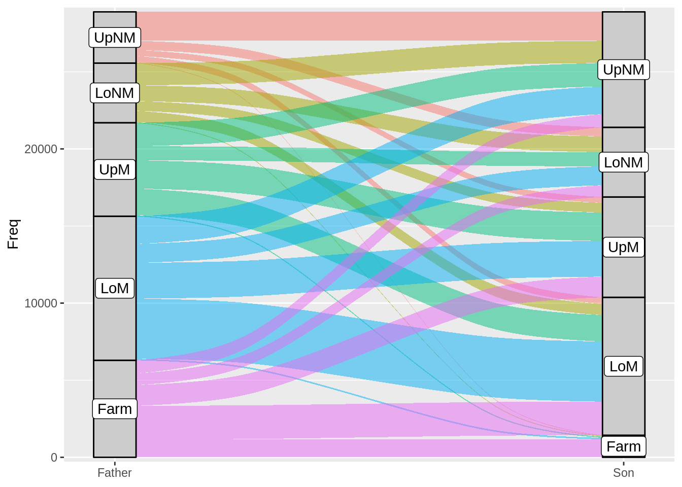
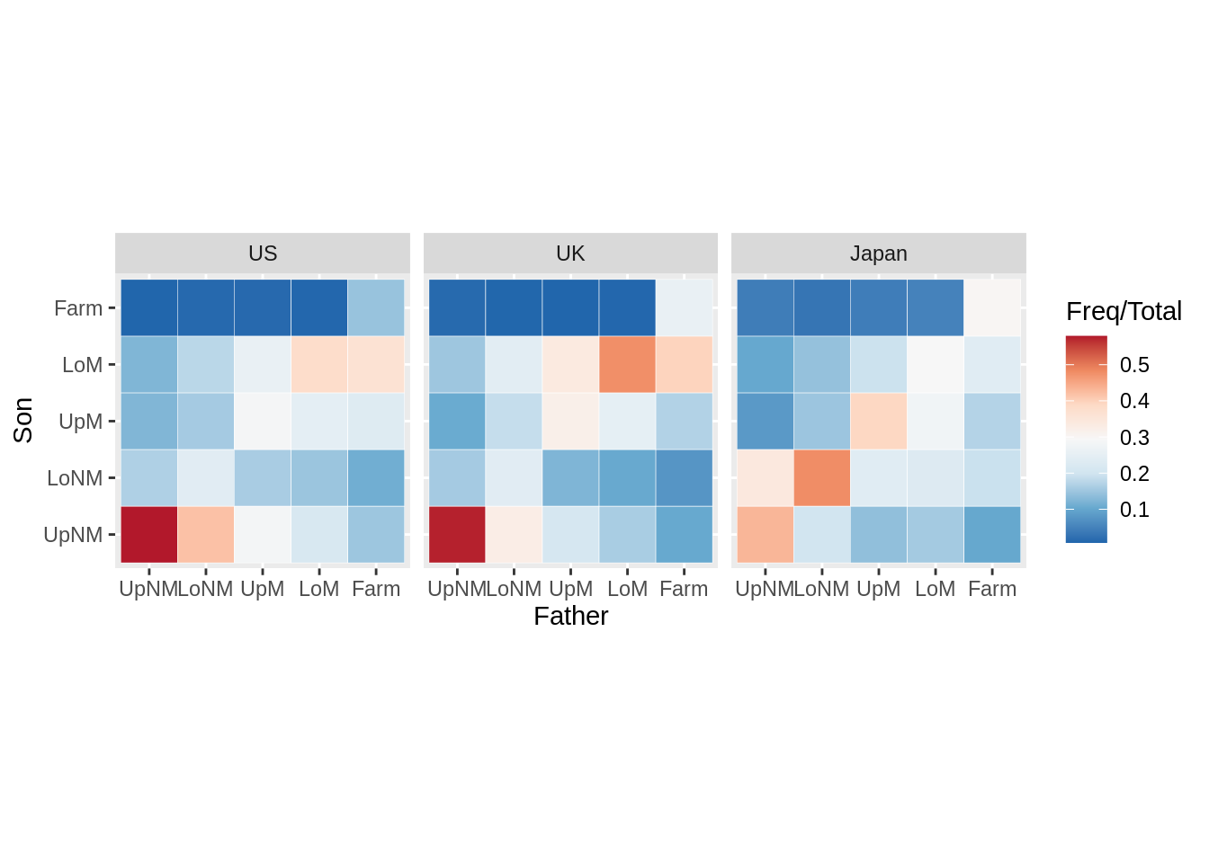
13.14 Heatmap
13.14.3 Heatmap with facets
mydata <- Yamaguchi87 %>%
  group_by(Country, Father) %>%
  mutate(Total = sum(Freq)) %>%
  ungroup()
ggplot(mydata, aes(x = Father, y = Son)) +
  geom_tile(aes(fill = Freq/Total), color = "white") +
  coord_fixed() +
  facet_wrap(~Country) +
  scale_fill_distiller(palette = "RdBu")