46 Data visualization with base r and ggplot
Qingyang He
library(datasets)
library(ggplot2)
library(dplyr)
library(sm)
library(vioplot)
library(ggridges)
library(plotly)
library(MSG)
library(KernSmooth)
library(RColorBrewer)
library(gcookbook)
library(survival)
library(GGally)
library(TeachingDemos)
Data visualization is the practice of translating information into a visual context, such as a map or graph, to make data easier for the human brain to understand and pull insights from. The main goal of data visualization is to make it easier to identify patterns, trends and outliers in large data sets. In R, there are a lot of ways to do the same thing, especially with visualization. R comes with built-in functionality for charts and graphs, typically referred to as base graphics. Then there are R packages that extend functionality, and ggplot2 is by far the most popular.
46.0.1 Overview
In this document, I will introduce 20 types of statistics graphs for Data visualization. I will describe in detail the purpose of the graph, the different function it used with base R and ggplot2, and an example code to represent the graph. In the 20 types of statistics graphs, 15 of them we have learned in class, and 5 of them are not. Here is a quick view of the 20 graphs I will discuess.
- Histogram
- Box Plot
- Violin Plot
- Ridgeline Plot
- Q-Q Plot
- Scatter Plot
- Interactive Plot
- Heatmaps
- Contour Plot and Contour Line
- Cleveland dot plot
- Scatter plot matrix
- Bar Plot
- Parallel Coordinate Plot
- Biplot
- Mosaic Plot
- Chernoff face 17.Rug Plot
- Survival Plot
- Sunflower Scatter Plot
- Interaction Plot
46.1 Histogram
A histogram is an approximate representation of the distribution of numerical data.
Base R function: hist()
hist(iris$Sepal.Width)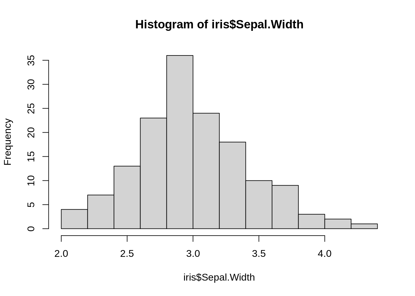
ggplot2 function: geom_histogram()
ggplot(iris, aes(x=iris$Sepal.Width)) +
  geom_histogram()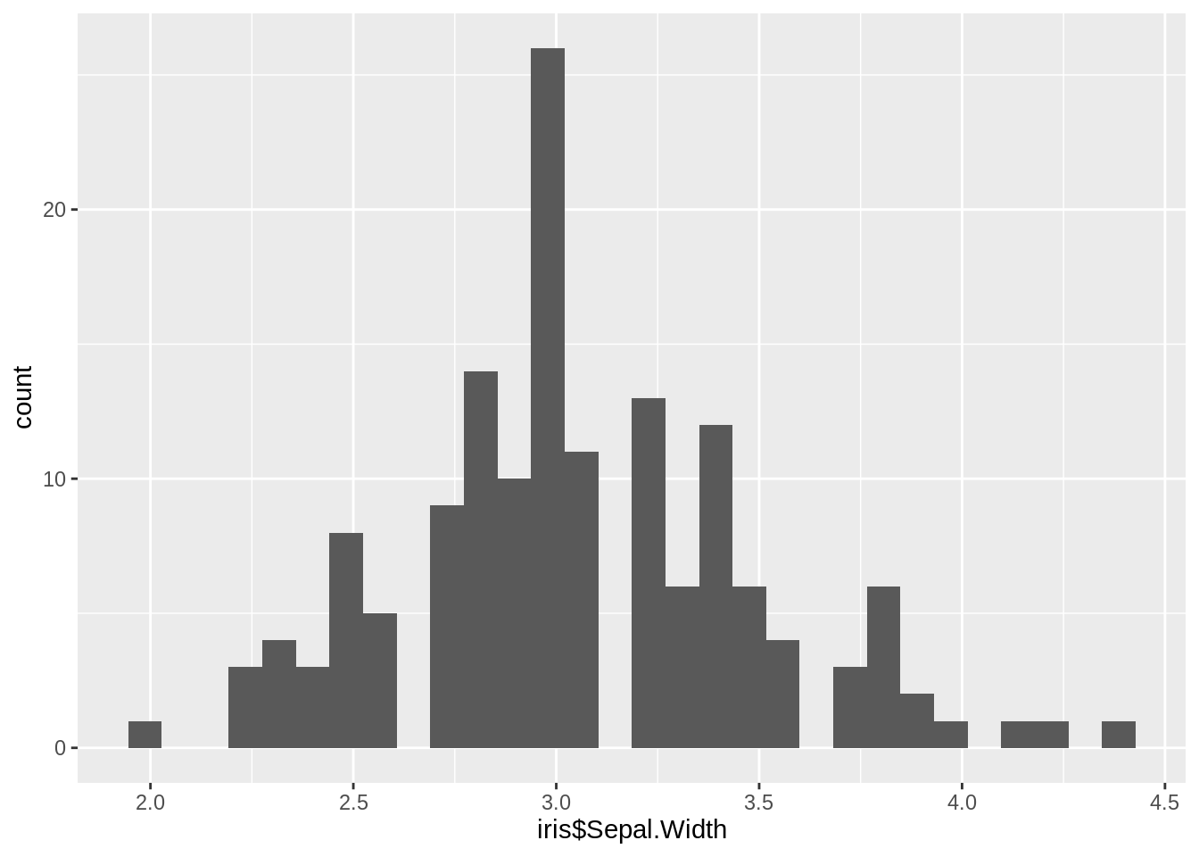
46.2 Box Plot
A box and whisker plot—also called a box plot—displays the five-number summary of a set of data. The five-number summary is the minimum, first quartile, median, third quartile, and maximum. In a box plot, we draw a box from the first quartile to the third quartile. A vertical line goes through the box at the median. The whiskers go from each quartile to the minimum or maximum.
Base R function: boxplot()
boxplot(mpg~cyl,data=mtcars, main="Car Milage Data",
xlab="Number of Cylinders", ylab="Miles Per Gallon")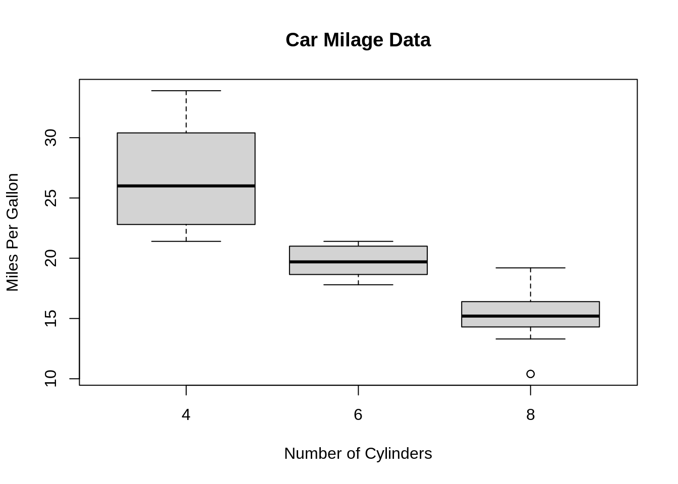 ggplot2 function:geom_boxplot()
ggplot(iris, aes(iris$Species, iris$Sepal.Length)) +
  geom_boxplot()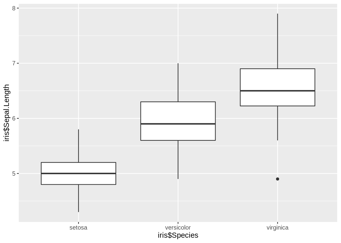
46.3 Violin Plots
violin plots are similar to box plots, except that they also show the kernel probability density of the data at different values. Typically, violin plots will include a marker for the median of the data and a box indicating the interquartile range, as in standard box plots.
Base R function: vioplot()
f <- function(mu1, mu2)
  c(rnorm(300, mu1, 0.5), rnorm(200, mu2, 0.5))
x1 <- f(0, 2)
x2 <- f(2, 3.5)
x3 <- f(0.5, 2)
vioplot(x1, x2, x3,
  horizontal = TRUE,
  names = c("A", "B", "C"))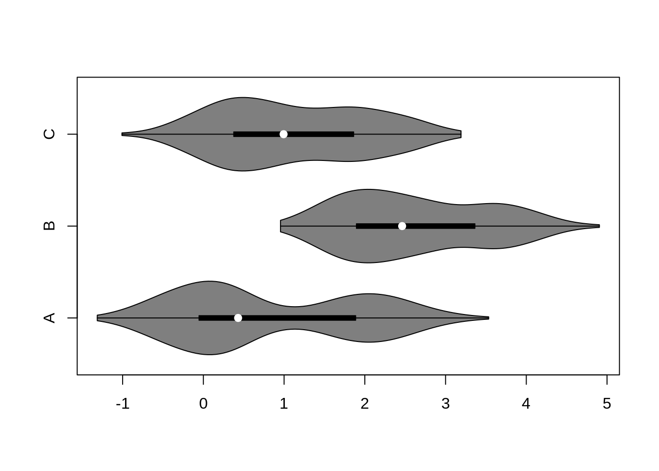
ggplot2 function: geom_violin()
ggplot(iris, aes(iris$Species, iris$Sepal.Length)) +
geom_violin()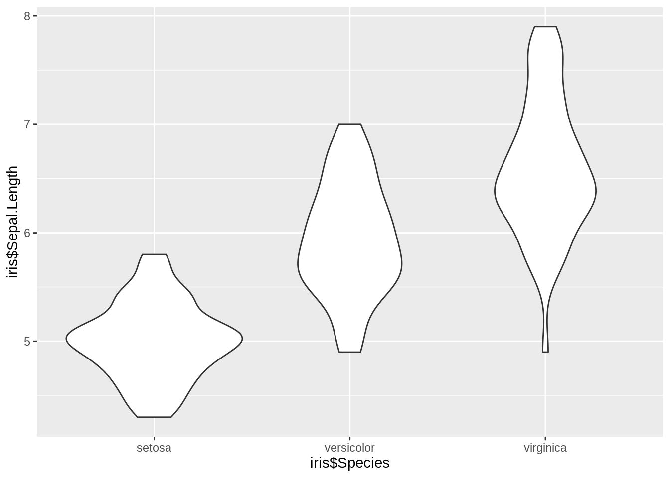 source :
46.4 Ridgeline Plot
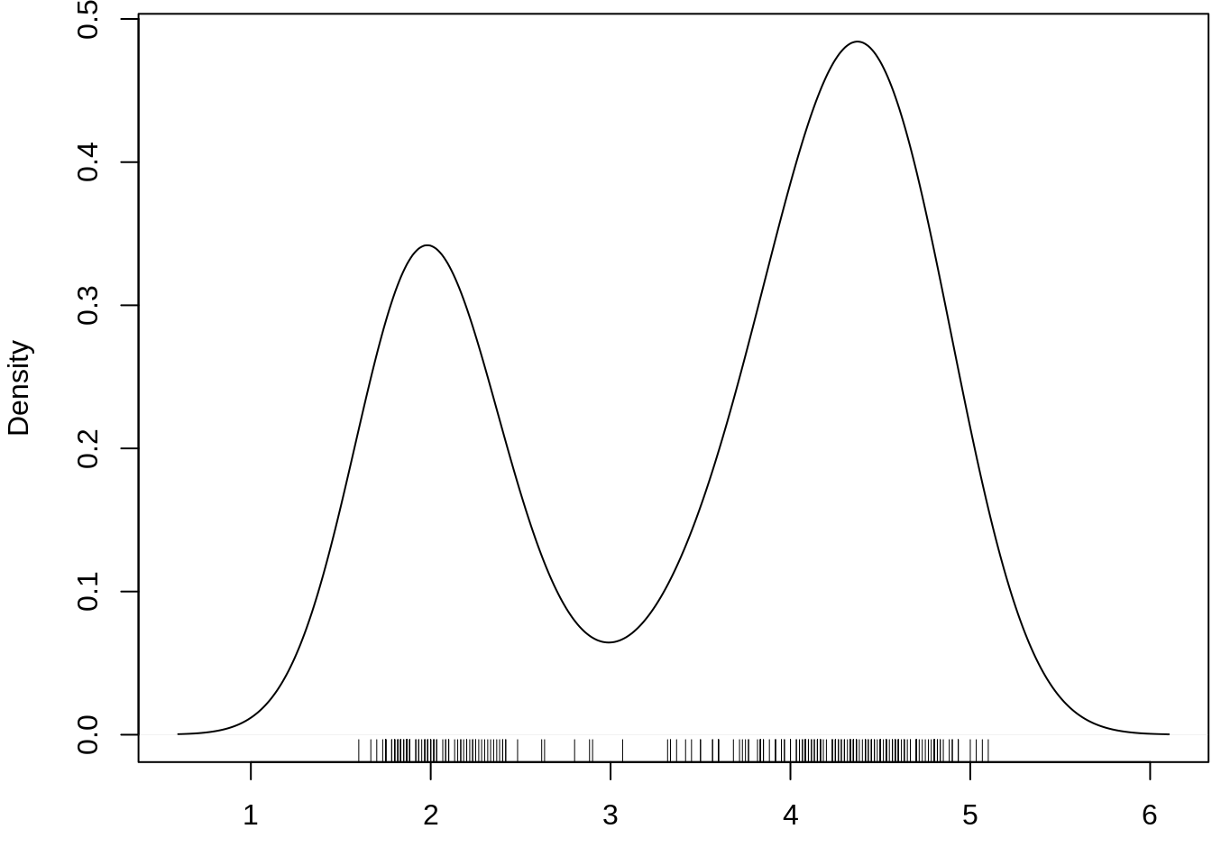
Ridgeline Plot or Joy Plot is a kind of chart that is used to visualize distributions of several groups of a category. Each category or group of a category produces a density curve overlapping with each other creating a beautiful piece of the plot.
ggplot2 function: geom_density_ridges()
ggplot(diamonds, aes(x = price, y = cut, fill = cut)) +
  geom_density_ridges() +
  theme_ridges() +
theme(legend.position = "none")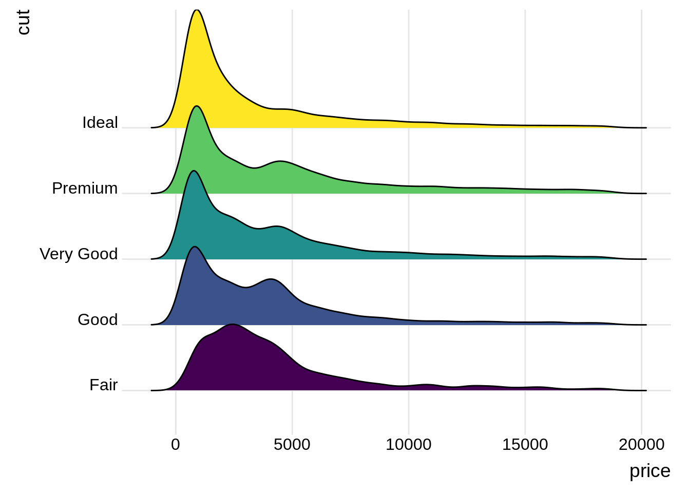 source:https://www.analyticsvidhya.com/blog/2021/06/ridgeline-plots-visualize-data-with-a-joy/
46.5 Q-Q plot
In statistics, a Q–Q (quantile-quantile) plot is a probability plot, which is a graphical method for comparing two probability distributions by plotting their quantiles against each other.
Base R function: qqnorm()
data(geyser, package = "MASS")
x <- scale(geyser$waiting)
qqnorm(x, cex = 0.7, asp = 1, main = "")
abline(0, 1)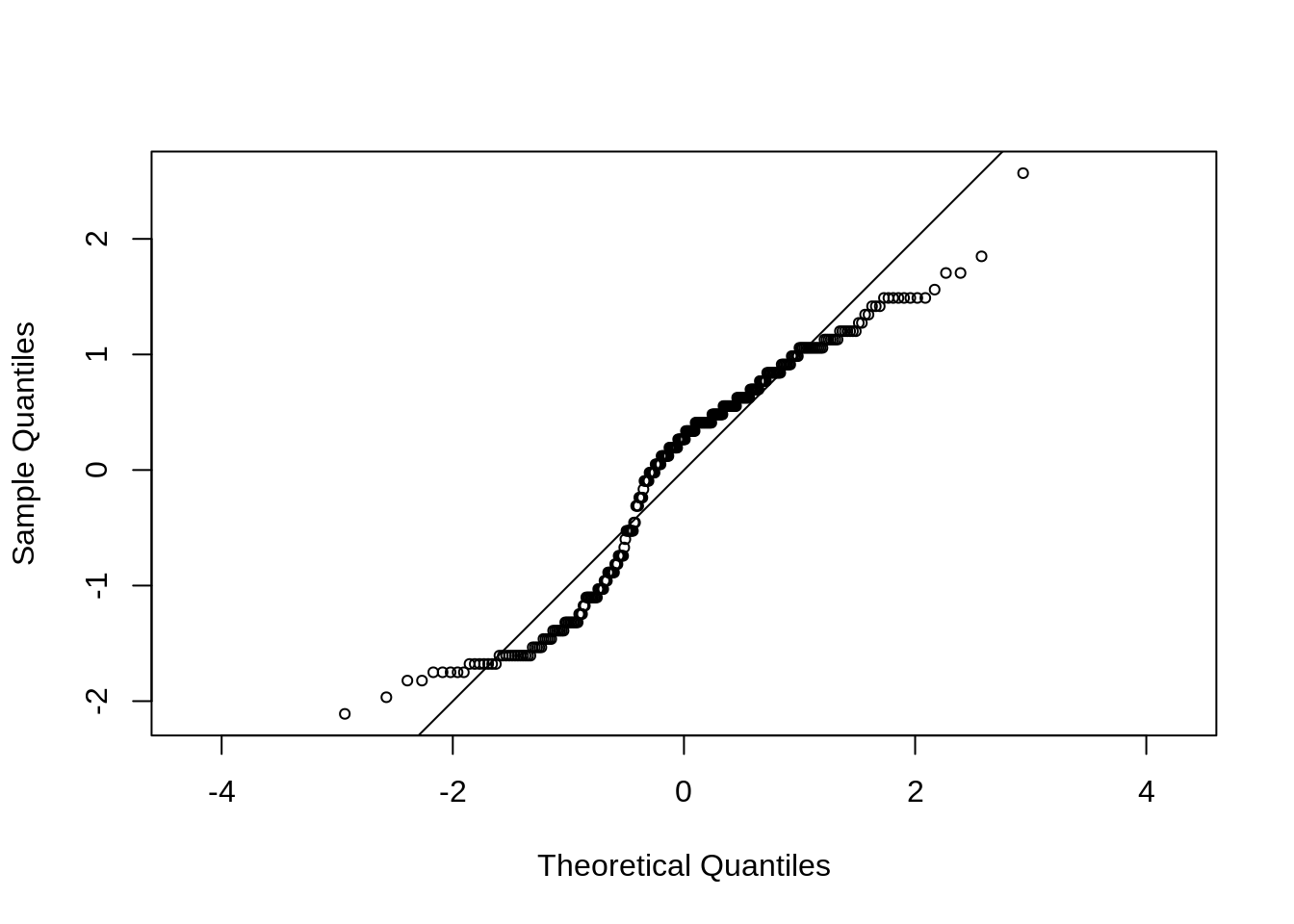
46.6 Scatter Plot
A scatter plot (aka scatter chart, scatter graph) uses dots to represent values for two different numeric variables. The position of each dot on the horizontal and vertical axis indicates values for an individual data point. Scatter plots are used to observe relationships between variables.
Base R function: plot()
plot(iris$Sepal.Length, iris$Sepal.Width, xlab = 'Sepal.Length', ylab = 'Sepal.Width')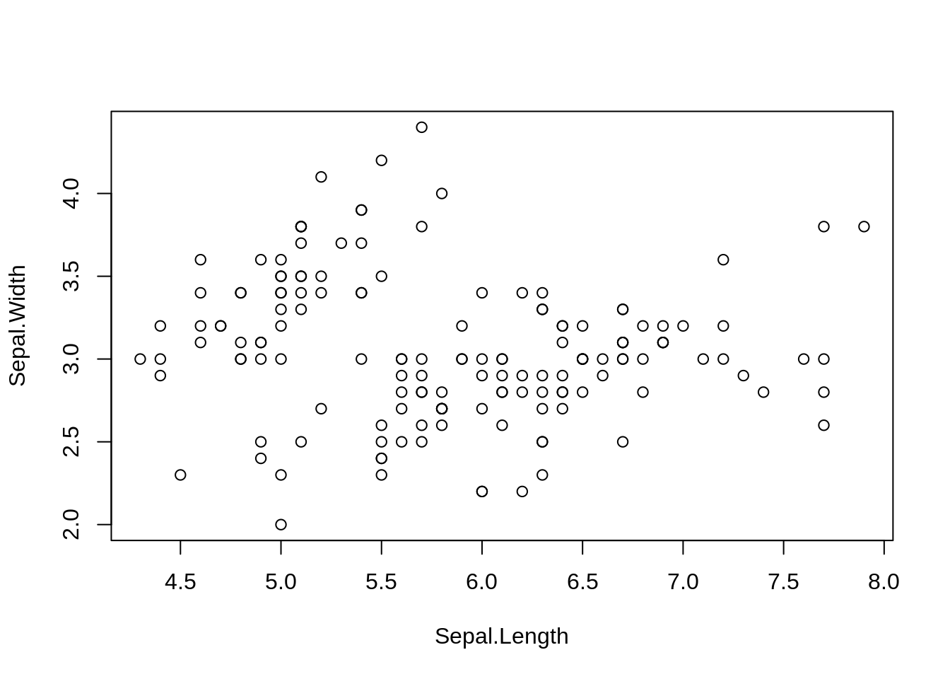
ggplot2 function: geom_point()
ggplot(iris, aes(Sepal.Length, Sepal.Width)) + geom_point()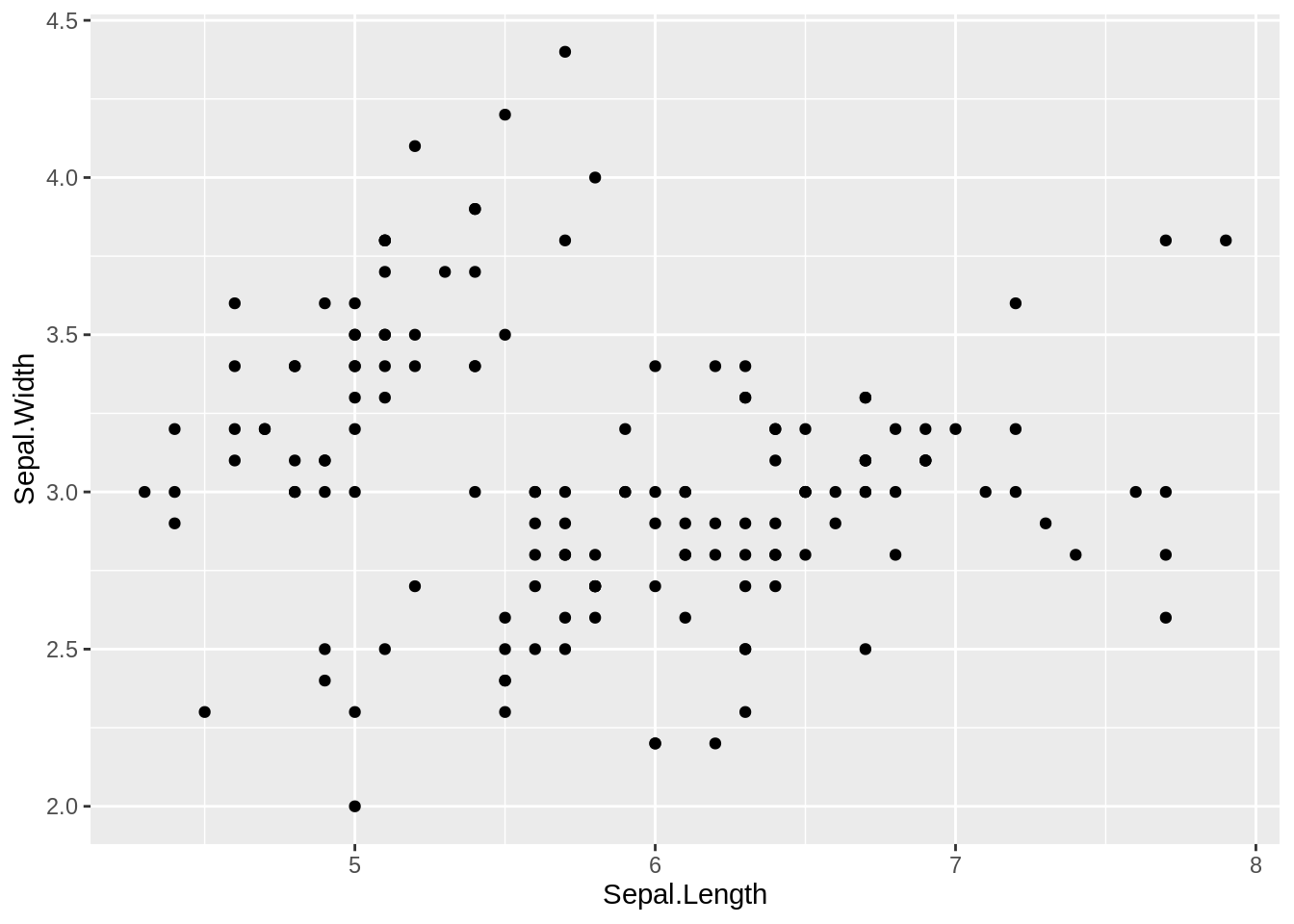
source: https://chartio.com/learn/charts/what-is-a-scatter-plot/
46.7 Interactive Plot
An interactive charts allows the user to perform actions: zooming, hovering a marker to get a tooltip, choosing a variable to display and more.
ggplot2 & plotly function: ggplotly()
set.seed(100)
d <- diamonds[sample(nrow(diamonds), 1000), ]

p <- ggplot(data = d, aes(x = carat, y = price)) +
  geom_point(aes(text = paste("Clarity:", clarity)), size = 4) +
  geom_smooth(aes(colour = cut, fill = cut)) + facet_wrap(~ cut)

ggplotly(p)46.8 Heatmaps
A heat map (or heatmap) is a data visualization technique that shows magnitude of a phenomenon as color in two dimensions. The variation in color may be by hue or intensity, giving obvious visual cues to the reader about how the phenomenon is clustered or varies over space.
Base R function: heatmap()
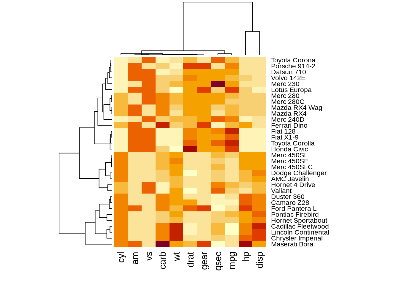
ggplot2 function: geom_tile()
# Dummy data
x <- LETTERS[1:20]
y <- paste0("var", seq(1,20))
data <- expand.grid(X=x, Y=y)
data$Z <- runif(400, 0, 5)

# Heatmap
ggplot(data, aes(X, Y, fill= Z)) +
  geom_tile()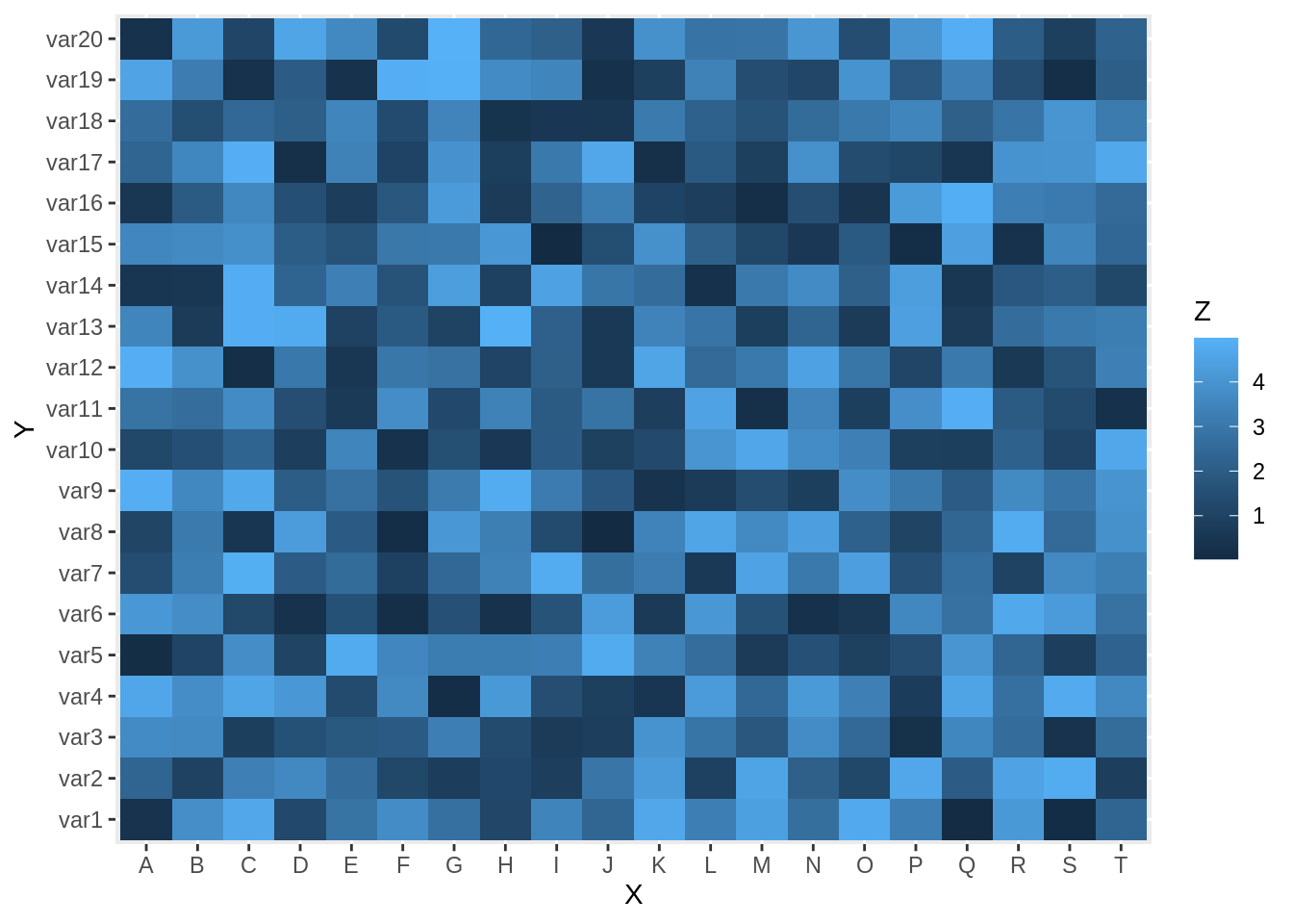
source:https://en.wikipedia.org/wiki/Heat_map https://r-graph-gallery.com/79-levelplot-with-ggplot2.html
46.9 Contour Plot and Contour Line
A contour plot is a graphical technique for representing a 3-dimensional surface by plotting constant z slices, called contours, on a 2-dimensional format. That is, given a value for z, lines are drawn for connecting the (x,y) coordinates where that z value occurs. A contour line is a line drawn on a topographic map to indicate ground elevation or depression. A contour interval is the vertical distance or difference in elevation between contour lines. Index contours are bold or thicker lines that appear at every fifth contour line.
Base R function: contour()
par(mar = c(4, 4, 0.2, 0.2))
data(ChinaLifeEdu)
x <- ChinaLifeEdu
est <- bkde2D(x, apply(x, 2, dpik))
contour(est$x1, est$x2, est$fhat,
  nlevels = 15, col = "darkgreen",
  vfont = c("sans serif", "plain")
)
points(x, pch = 20)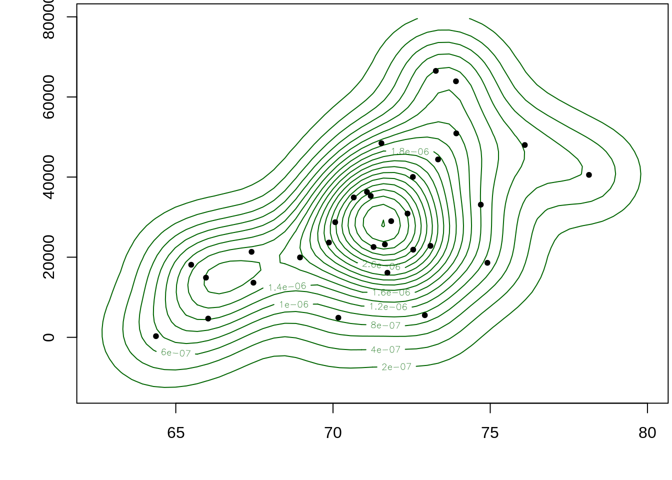
est_tidy <- data.frame(
  life = rep(est$x1, length(est$x2)),
  edu = rep(est$x2, each = length(est$x1)),
  z = as.vector(est$fhat)
)
ggplot function: geom_density_2d & geom_density_2d_fiiled
set.seed(1)
df <- data.frame(x = rnorm(200), y = rnorm(200))

ggplot(df, aes(x = x, y = y)) +
  geom_point() +
  geom_density_2d_filled(alpha = 0.4) +
  geom_density_2d(colour = "black")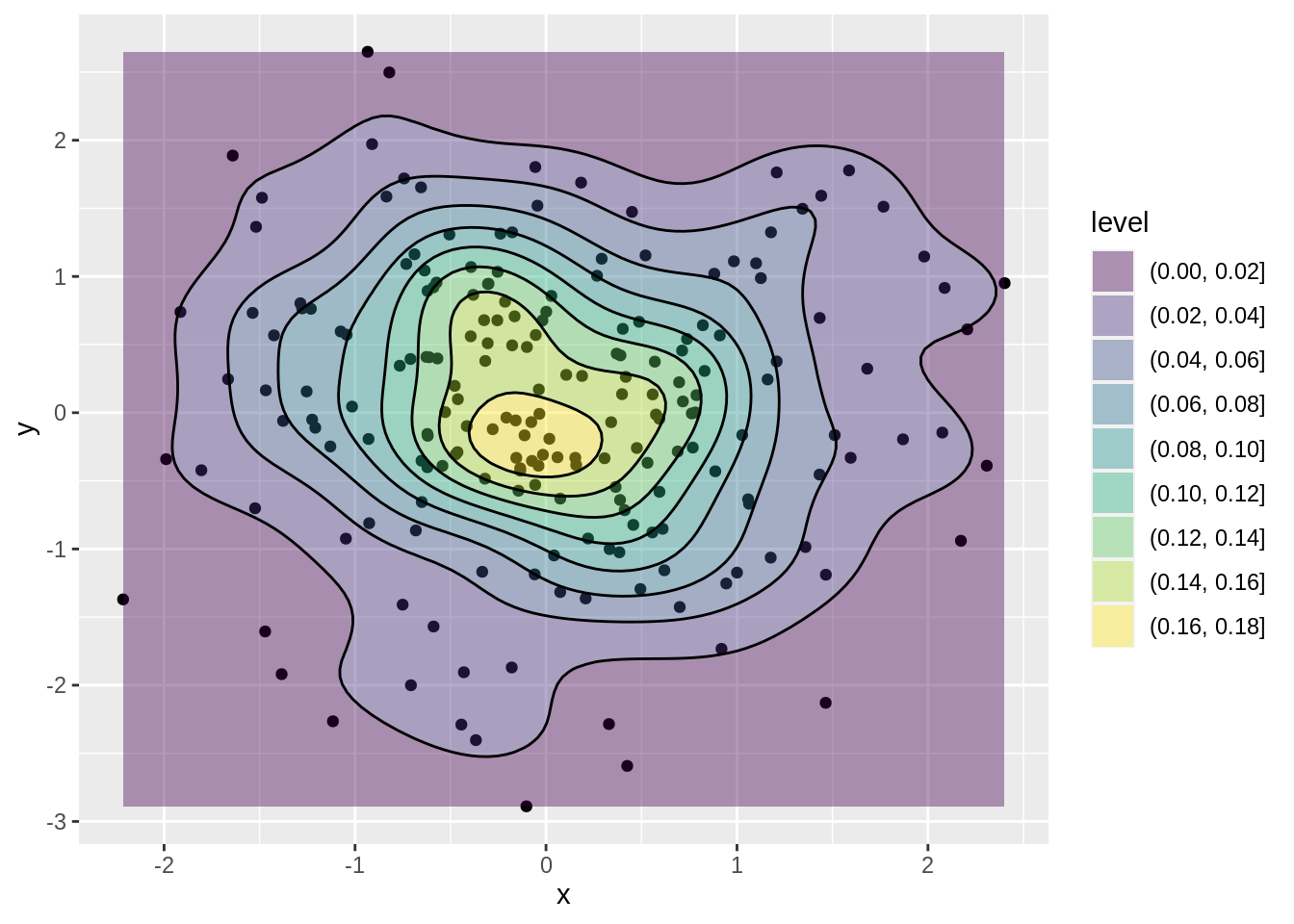
source: https://www.itl.nist.gov/div898/handbook/eda/section3/contour.html
https://www.nwcg.gov/course/ffm/mapping/55-contour-lines-and-intervals
46.10 Cleveland dot plot
Cleveland dot plots are an alternative to bar graphs that reduce visual clutter and can be easier to read.
Base R: dotchart()
par(mar = c(4, 4, 0.2, 0.2))
dotchart(t(VADeaths)[, 5:1], col = brewer.pal(4, "Set1"), pch = 19, cex = .65)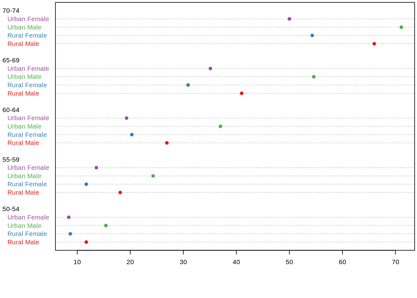 ggplot2:
tophit <- tophitters2001[1:25, ] # Take the top 25 from the tophitters data set
ggplot(tophit, aes(x = avg, y = name)) +
  geom_point()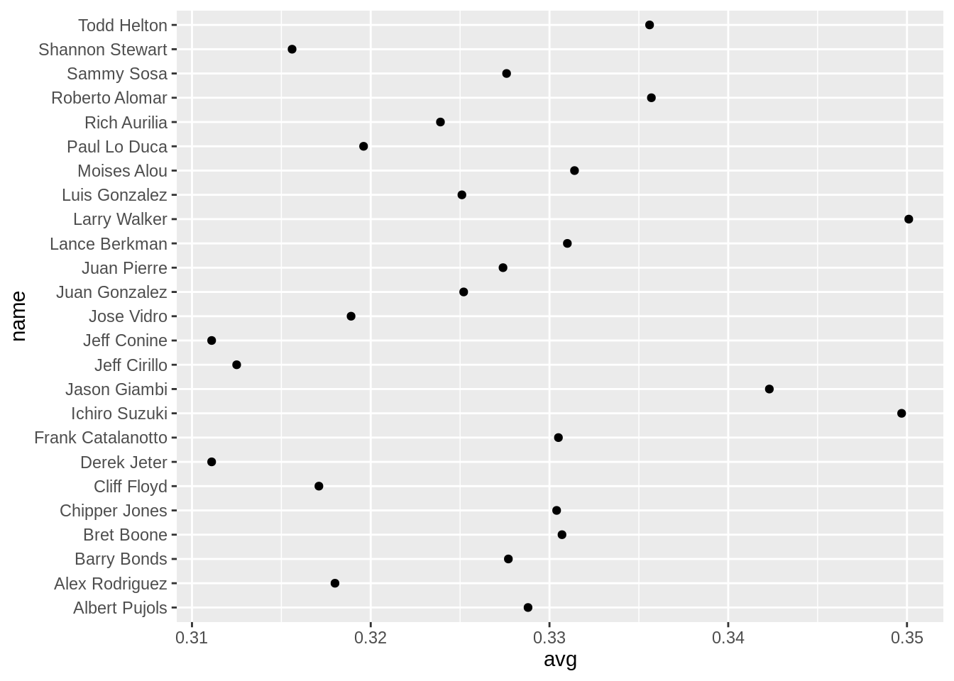
46.11 Scatterplot Matrix
A scatter plot matrix is a grid (or matrix) of scatter plots used to visualize bivariate relationships between combinations of variables. Each scatter plot in the matrix visualizes the relationship between a pair of variables, allowing many relationships to be explored in one chart.
Base R function: pairs()
panel.hist <- function(x, ...) {
usr <- par("usr")
on.exit(par(usr))
par(usr = c(usr[1:2], 0, 1.5))
h <- hist(x, plot = FALSE)
nB <- length(breaks <- h$breaks)
y <- h$counts / max(h$counts)
rect(breaks[-nB], 0, breaks[-1], y, col = "beige")
}
idx <- as.integer(iris[["Species"]])
pairs(iris[1:4],
upper.panel = function(x, y, ...)
points(x, y, pch = c(17, 16, 6)[idx], col = idx),
pch = 20, oma = c(2, 2, 2, 2),
lower.panel = panel.smooth, diag.panel = panel.hist
)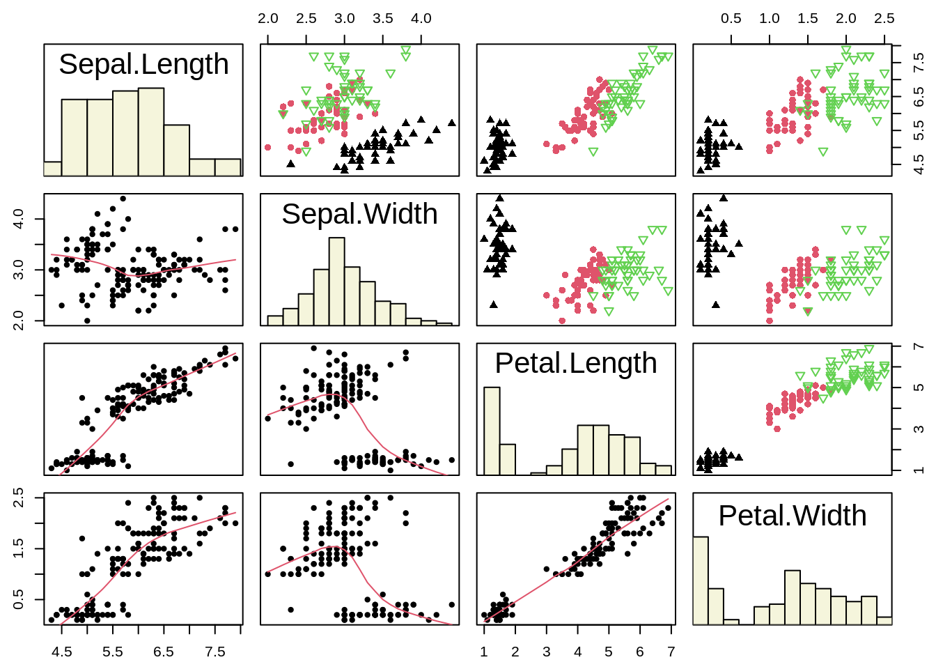 ggplot2 function: ggpairs()
data <- data.frame( var1 = 1:100 + rnorm(100,sd=20), v2 = 1:100 + rnorm(100,sd=27), v3 = rep(1, 100) + rnorm(100, sd = 1))
data$v4 = data$var1 ** 2
data$v5 = -(data$var1 ** 2)

p <- ggpairs(data, title="correlogram with ggpairs()")

ggplotly(p)
source: https://pro.arcgis.com/zh-cn/pro-app/2.6/help/analysis/geoprocessing/charts/scatter-plot-matrix.html
46.12 Bar Plot
A bar chart or bar graph is a chart or graph that presents categorical data with rectangular bars with heights or lengths proportional to the values that they represent. The bars can be plotted vertically or horizontally.
A bar graph shows comparisons among discrete categories. One axis of the chart shows the specific categories being compared, and the other axis represents a measured value.
Base R function: barplot()
par(mfrow = c(2, 1), mar = c(3, 2.5, 0.5, 0.1))
death <- t(VADeaths)[, 5:1]
barplot(death, col = brewer.pal(4, "Set1"))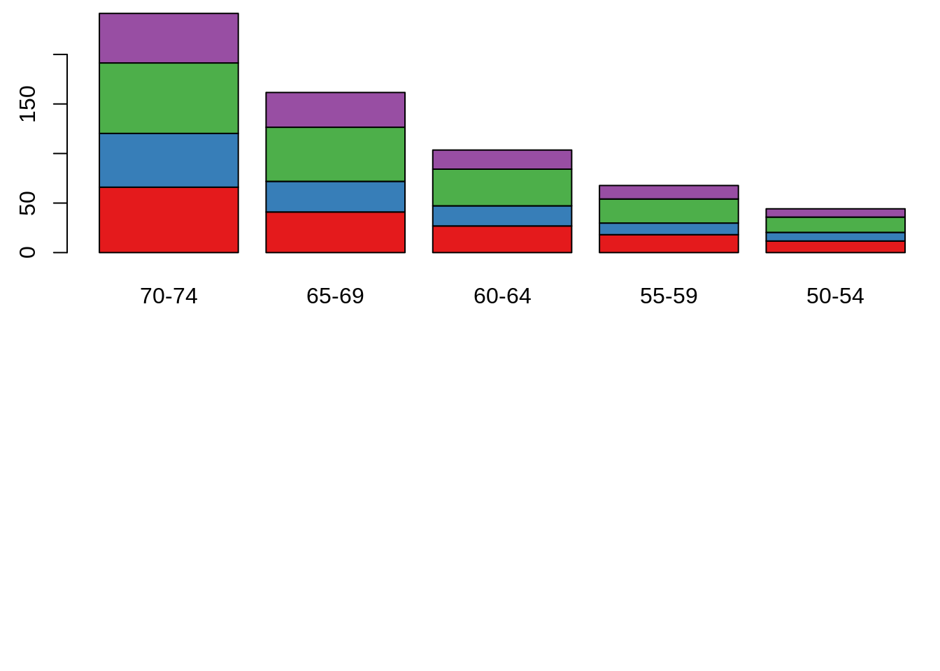
ggplot2 function: geom_bar()
ggplot(mtcars, aes(x=factor(cyl)))+
  geom_bar(stat="count", width=0.7, fill="steelblue")+
  theme_minimal()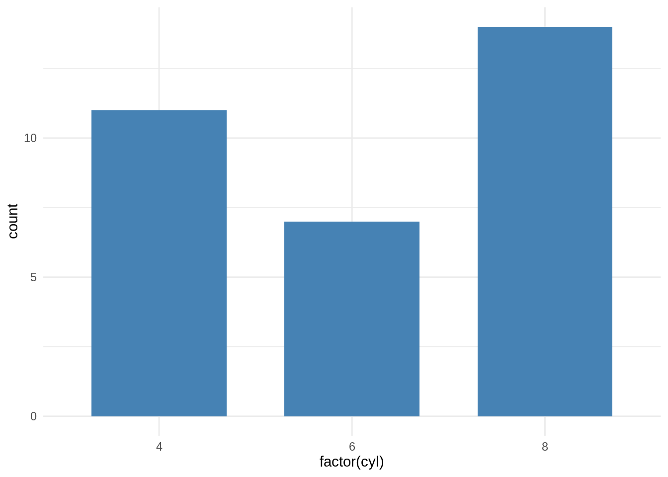
46.13 Parallel Coordinate Plot
A parallel coordinate plot maps each row in the data table as a line, or profile. Each attribute of a row is represented by a point on the line. This makes parallel coordinate plots similar in appearance to line charts, but the way data is translated into a plot is substantially different.
ggplot2 function: ggparcoord() & geom_line()
ggparcoord(iris, columns = 1:4, groupColumn = 5, scale = "uniminmax") +
  geom_line(size = 1.2)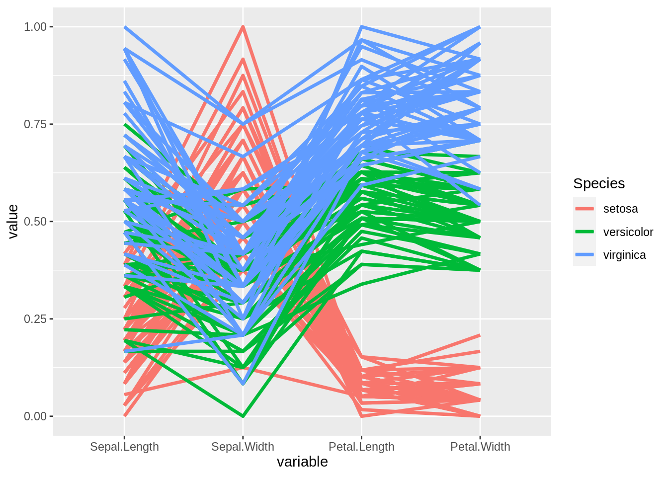
source:https://docs.tibco.com/pub/spotfire/6.5.2/doc/html/para/para_what_is_a_parallel_coordinate_plot.html
46.14 Biplot
Biplots are a type of exploratory graph used in statistics, a generalization of the simple two-variable scatterplot. A biplot allows information on both samples and variables of a data matrix to be displayed graphically. Samples are displayed as points while variables are displayed either as vectors, linear axes or nonlinear trajectories.
Base R function: biplot()
head(USArrests)## Murder Assault UrbanPop Rape
## Alabama 13.2 236 58 21.2
## Alaska 10.0 263 48 44.5
## Arizona 8.1 294 80 31.0
## Arkansas 8.8 190 50 19.5
## California 9.0 276 91 40.6
## Colorado 7.9 204 78 38.7
#perform PCA
results <- princomp(USArrests)

#create biplot with custom appearance
biplot(results,
       col=c('blue', 'red'),
       cex=c(1, 1.3),
       xlim=c(-.4, .4),
       main='PCA Results',
       xlab='First Component',
       ylab='Second Component',
       expand=1.2)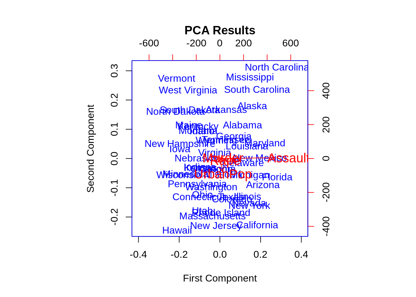
46.15 Mosaic plots
A mosaic plot (also known as a Marimekko diagram) is a graphical method for visualizing data from two or more qualitative variables. It is the multidimensional extension of spineplots, which graphically display the same information for only one variable.
Base R function: mosaicplot()
par(mar = c(2, 3.5, .1, .1))
mosaicplot(Titanic, shade = TRUE, main = "")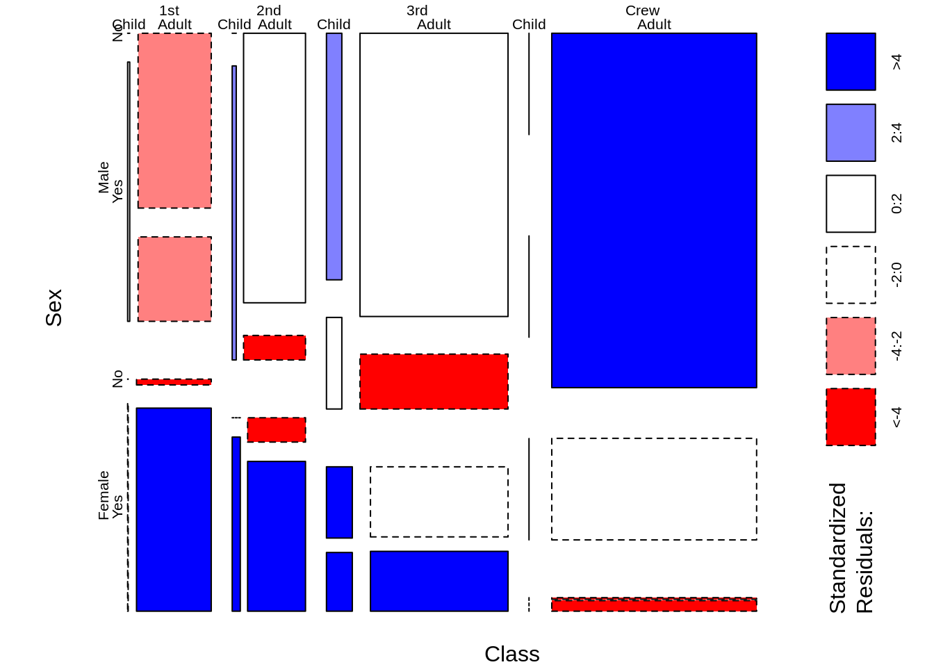 source:
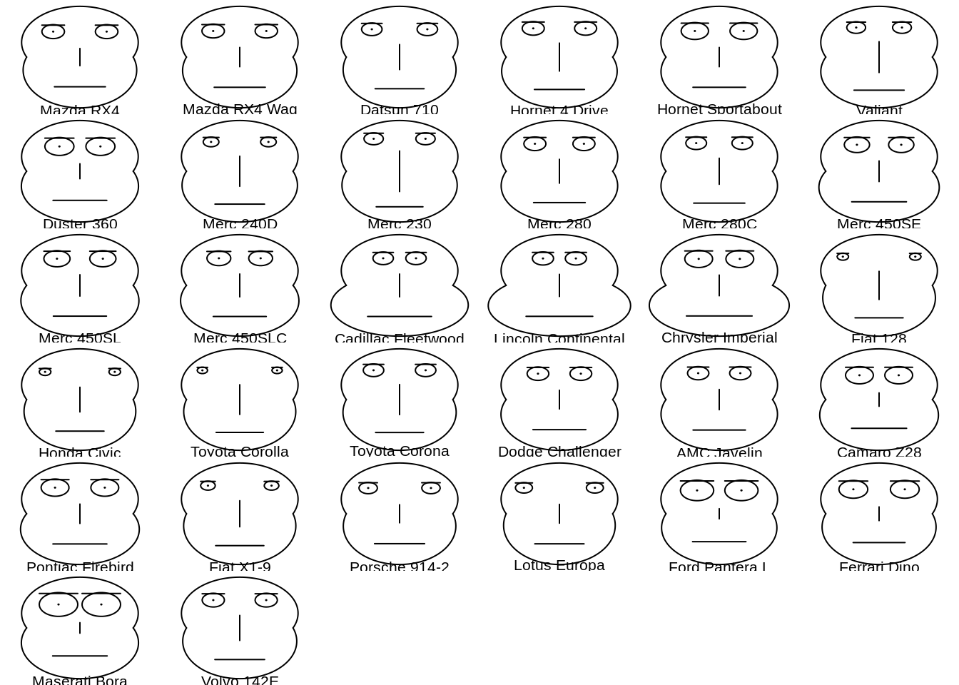
46.16 chernoff face
Chernoff faces, invented by applied mathematician, statistician and physicist Herman Chernoff in 1973, display multivariate data in the shape of a human face. The individual parts, such as eyes, ears, mouth and nose represent values of the variables by their shape, size, placement and orientation.
Base R function: faces2()
46.17 Rug Plot
A rug plot is a plot of data for a single quantitative variable, displayed as marks along an axis. It is used to visualise the distribution of the data. As such it is analogous to a histogram with zero-width bins, or a one-dimensional scatter plot.
Rug plots are often used in combination with two-dimensional scatter plots by placing a rug plot of the x values of the data along the x-axis, and similarly for the y values. This is the origin of the term “rug plot”, as these rug plots with perpendicular markers look like tassels along the edges of the rectangular “rug” of the scatter plot.
Base R function: rug()
ggplot2: geom_rug()
ggplot(data=iris, aes(x=Sepal.Length, Petal.Length)) +
  geom_point() +
  geom_rug(col="steelblue",alpha=0.1, size=1.5)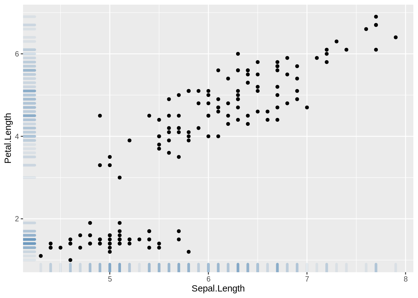
source: https://en.wikipedia.org/wiki/Rug_plot
https://r-graph-gallery.com/276-scatterplot-with-rug-ggplot2.html
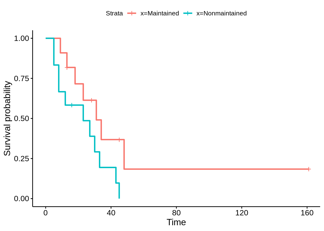
46.18 Survival Plot
We use the term survival plot to represent a group of plots that are constructed on time to event data. The most common survival plot is the Kaplan-Meier Curve. Others survival plots are the hazard function and hazard rate plots.
leukemia.surv <- survfit(Surv(time, status) ~ x, data = aml)
plot(leukemia.surv, lty = 1:2, xlab = "time")
legend("topright", c("Maintenance", "No Maintenance"), lty = 1:2, bty = "n")
survminer::ggsurvplot(leukemia.surv, data = aml)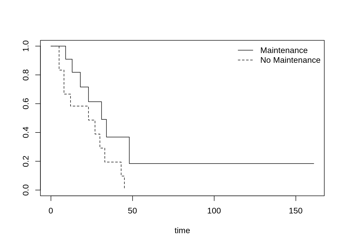
source: https://ncss-wpengine.netdna-ssl.com/wp-content/themes/ncss/pdf/Procedures/NCSS/Survival_Plots.pdf
46.19 Sunflower Scatter Plot
A sunflower plot is a type of scatterplot which tries to reduce overplotting. When there are multiple points that have the same (x, y) values, sunflower plots plot just one point there, but has little edges (or “petals”) coming out from the point to indicate how many points are really there.
Base R function: sunflowerplot()
sunflowerplot(mtcars$gear, mtcars$carb, main = "Plot of Carb vs. Gear")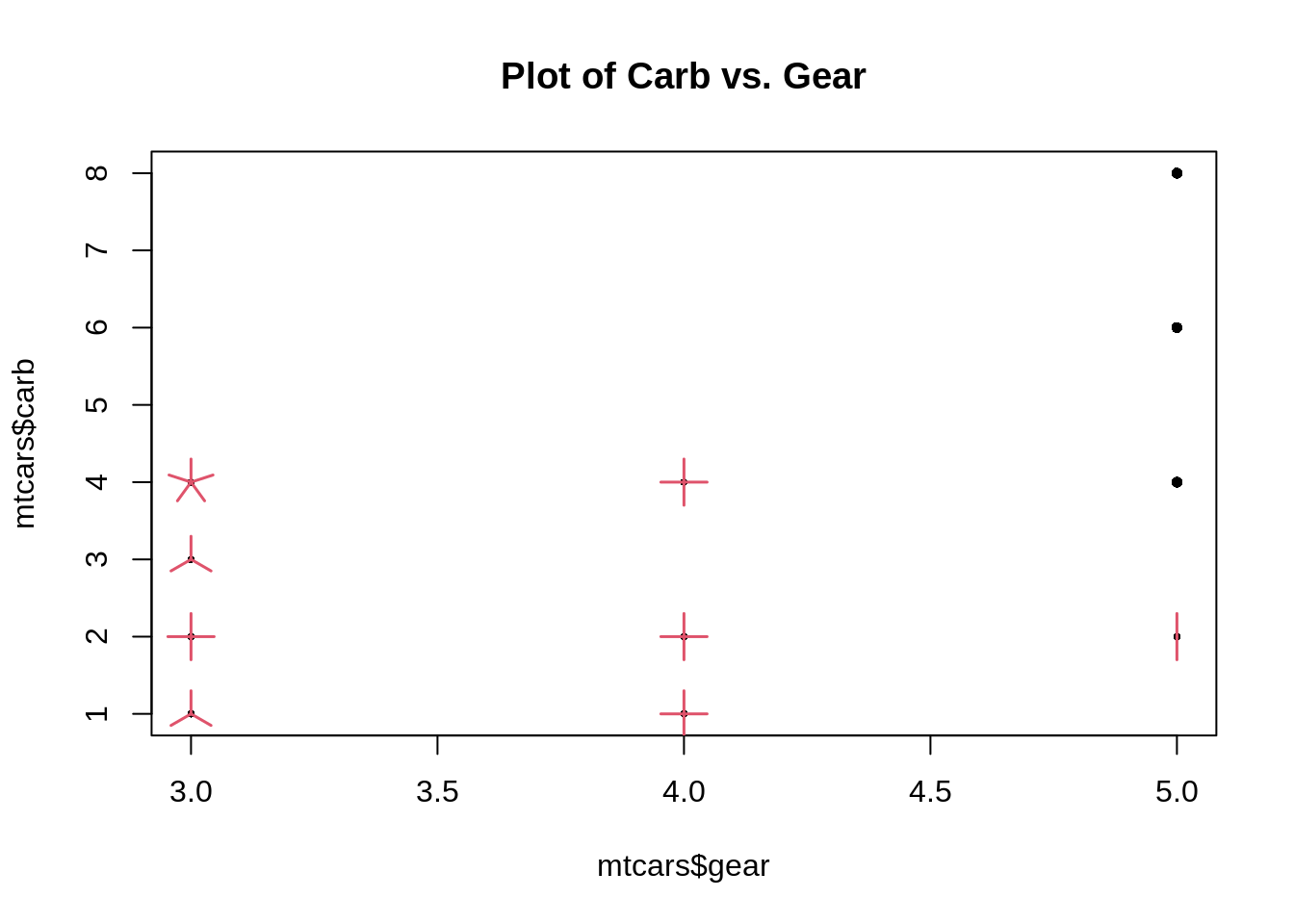
souce: https://statisticaloddsandends.wordpress.com/2021/02/05/what-is-a-sunflower-plot/
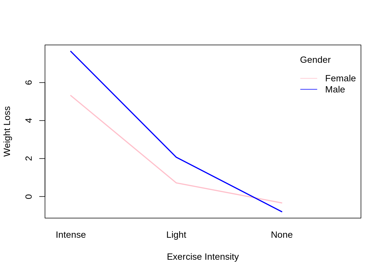
46.20 Interaction Plot
An interaction plot displays the levels of one variable on the X axis and has a separate line for the means of each level of the other variable. The Y axis is the dependent variable.
Base R function: interaction.plot()
#make this example reproducible
set.seed(10)

#create data frame
data <- data.frame(gender = rep(c("Male", "Female"), each = 30),
                   exercise = rep(c("None", "Light", "Intense"), each = 10, times = 2),
                   weight_loss = c(runif(10, -3, 3), runif(10, 0, 5), runif(10, 5, 9),
                                   runif(10, -4, 2), runif(10, 0, 3), runif(10, 3, 8)))
#fit the two-way ANOVA model
model <- aov(weight_loss ~ gender * exercise, data = data)

#view the model output
summary(model)
## Df Sum Sq Mean Sq F value Pr(>F)
## gender 1 15.8 15.80 11.197 0.0015 **
## exercise 2 505.6 252.78 179.087 <2e-16 ***
## gender:exercise 2 13.0 6.51 4.615 0.0141 *
## Residuals 54 76.2 1.41
## ---
## Signif. codes: 0 '***' 0.001 '**' 0.01 '*' 0.05 '.' 0.1 ' ' 1
interaction.plot(x.factor = data$exercise, #x-axis variable
                 trace.factor = data$gender, #variable for lines
                 response = data$weight_loss, #y-axis variable
                 fun = median, #metric to plot
                 ylab = "Weight Loss",
                 xlab = "Exercise Intensity",
                 col = c("pink", "blue"),
                 lty = 1, #line type
                 lwd = 2, #line width
                 trace.label = "Gender")