21 Visualizing Geographical Time Series Data With Messy Country Name
Jiachen Liu, Hao Chang and Yihui Xie
knitr::opts_chunk$set(echo = TRUE, message=FALSE)
library(tidyverse)
library(ggplot2)
library(maps)
library(readxl)
library(gganimate)
library(gifski)
library(plotly)
library(countrycode)
With the development of internet and acceleration of Internationalization process, many data nowadays are recorded based on countries. To better understand the geographical information contained in these data, a choropleth or geographic heatmap sometimes is unavoidable. Generally, geographic information is required for those maps, but such information does not always in the data when we get our hands on them. This tutorial is intented to solve this problem, helping you adding location information(Longitude and Latitude) to a simple country based data.
In this tutorial, we start with data downloading directly from The International Disaster Data Center, which have the death number of international disasters in the past 122 years and very messy country names. We will use the data to show and guide you through the process of data cleaning, adding location information, and finally produce a geographic heatmap with time change shown by animation.
21.1 Data Reading
# read in the dataset downloaded from the International Disaster Data Center
raw_data <- readxl::read_xlsx("resources/visualizing_geographic_time_series/emdat_public_2022_03_19_query_uid-LV4CQy.xlsx")
head(raw_data)## # A tibble: 6 × 50
## `Dis No` Year Seq Glide `Disaster Group` `Disaster Subg…` `Disaster Type`
## <chr> <chr> <chr> <lgl> <chr> <chr> <chr>
## 1 1900-9002… 1900 9002 NA Natural Climatological Drought
## 2 1900-9001… 1900 9001 NA Natural Climatological Drought
## 3 1902-0012… 1902 0012 NA Natural Geophysical Earthquake
## 4 1902-0003… 1902 0003 NA Natural Geophysical Volcanic activ…
## 5 1902-0010… 1902 0010 NA Natural Geophysical Volcanic activ…
## 6 1903-0006… 1903 0006 NA Natural Geophysical Mass movement …
## # … with 43 more variables: `Disaster Subtype` <chr>,
## # `Disaster Subsubtype` <chr>, `Event Name` <chr>, Country <chr>, ISO <chr>,
## # Region <chr>, Continent <chr>, Location <chr>, Origin <chr>,
## # `Associated Dis` <chr>, `Associated Dis2` <chr>, `OFDA Response` <chr>,
## # Appeal <chr>, Declaration <chr>, `Aid Contribution` <lgl>,
## # `Dis Mag Value` <dbl>, `Dis Mag Scale` <chr>, Latitude <chr>,
## # Longitude <chr>, `Local Time` <chr>, `River Basin` <chr>, …Here, we have 50 columns in the data, but we only focus on “Year”, “Country”, and “Total Deaths” in this tutorial. One thing you might notice is that there actually are “Latitude” and “Longitude” columns in this data, but there are too many NAs in those columns hence not usable.
21.2 Data Processing
Our target in this step is to add location information to the data. A simple way to achieve this is to find an existing dataset containing countries and Latitude/Longitude, and merge our data with that exiting data. This is a good thought, but our data actually recording countries names in a very different way from the existing data(e.g. write “United States of America” as “USA”). This is also a very common situation, and to deal with the problem, we need to clean our countries’ names first before we can do the merge.
For the existing dataset, we recommend using this data from ggplot2 to keep maps consistent.
# Read in the existing data from ggplot 2 in "latitude.longtitude.data"

latitude.longtitude.data <- map_data("world")
head(latitude.longtitude.data)
## long lat group order region subregion
## 1 -69.89912 12.45200 1 1 Aruba <NA>
## 2 -69.89571 12.42300 1 2 Aruba <NA>
## 3 -69.94219 12.43853 1 3 Aruba <NA>
## 4 -70.00415 12.50049 1 4 Aruba <NA>
## 5 -70.06612 12.54697 1 5 Aruba <NA>
## 6 -70.05088 12.59707 1 6 Aruba <NA>Read from above, the country column in the existing dataset is “region”.
21.2.1 Countrycode Package
Here we introduce a package called “countrycode”. This is package is written by Arel-Bundock, Vincent, Nils Enevoldsen, and CJ Yetman, it could standardizes country names into over 40 different coding schemes, and very helpful in our current situation. Let’s apply this package on both of the data to standardize them.
countryname(unique(raw_data$Country))
countryname(unique(latitude.longtitude.data$region))
The result output will show all the countries’ names, along with warning messages indicating the countries that fall to be matched.
There are several reasons for mismatching:
- First situation, the countries are too small to be included in the package.(e.g. “Azores”, “Canary Islands”)
- Second situation, the countries are no longer exist since our data contains data from 1900. (e.g. “Serbia Montenegro”, “Yemen P Dem Rep”)
- “Yemen P Dem Rep” merged with “Yemen Arab Rep” in 1990 and is called “Yemen” now.
- Third situation, this does not show up here, but we need to consider the situation that some of the countries disintegrated during the past 122 years. (e.g. “Czechoslovakia”, “Yugoslavia”) In this situation, we may need to change the data of one country into several. Our data do have information supporting us to achieve this type of splitting. If your data does not supporting, then you might need to find another way to deal with it or simply drop it.
- “Serbia Montenegro” split into two countries called “Serbia” and “Montengro” in 2006.
- “Yugoslavia” had split into six countries,“Slovenia”,“Croatia”, “Serbia”, “Montengro”, “Bosnia and Herzegovina” and “Macedonia”.
- “Czechoslovakia” had split into two countries, “Czech Republic” and “Slovakia”, in 1993.
21.2.2 Manual Adjustments
Based on the above three situation, we did some manual adjustment(splitting) on our data, and reread in the data.
Our splited countries are:“Czechoslovakia”, “Yugoslavia”,and “Serbia Montenegro”.
# data after splitting certain countries
datamap <- readxl::read_xlsx("resources/visualizing_geographic_time_series/cleared_data.xlsx")
data_temp <- map_data("world")

# some manual adjustments

# delete "Micronesia (Federated States of)" and "Tuvalu", which does not included in the existing data, hence do not have latitude and longitude information.
datamap_remove <- datamap[-which(datamap$Country %in% c("Micronesia (Federated States of)","Tuvalu")),]
# manual match some small contries
datamap_remove$Country[datamap_remove$Country == "Azores Islands"] <- "Azores"
datamap_remove$Country[datamap_remove$Country == "Canary Is"] <- "Canary Islands"
# merge "Yemen P Dem Rep" and "Yemen Arab Rep"
datamap_remove$Country[datamap_remove$Country %in% c("Yemen P Dem Rep","Yemen Arab Rep")] <- "Yemen"
# Virgin Islands are one area in existing data, so merge together
datamap_remove$Country[datamap_remove$Country == "Virgin Island (British)"] <- "Virgin Islands"
datamap_remove$Country[datamap_remove$Country == "Virgin Island (U.S.)"] <- "Virgin Islands"
# "Hong Kong" and "Macao" belong to China now
datamap_remove$Country[datamap_remove$Country == "Hong Kong"] <- "China"
datamap_remove$Country[datamap_remove$Country == "Macao"] <- "China"
# "Netherlands Antilles" belongs to "Caribbean Netherlands", but does not have independent geographic information, so including it in "Netherlands"
datamap_remove$Country[datamap_remove$Country == "Netherlands Antilles"] <- "Netherlands"
# same situation, including "Saint Martin (French part)" in "Saint Martin"
datamap_remove$Country[datamap_remove$Country == "Saint Martin (French Part)"] <- "Saint Martin"
# "Tokelau" is belong to "New Zealand"
datamap_remove$Country[datamap_remove$Country == "Tokelau"] <- "New Zealand"
21.2.3 Merge Data
After clean the country name column, we already finished the hardest part. Next step, we can merge our data with existing geographic data.
# adding a column called "countryname" to be the standard country names, and when mismatch then the country must be one of our adjusted countries, so just keep it as it is.
datamap_match <- datamap_remove %>% mutate(countryname = ifelse(is.na(countryname(datamap_remove$Country)),datamap_remove$Country,countryname(datamap_remove$Country)))
# adding the column "countryname" to both data so they can be matched later.
data_match <- mutate(data_temp,countryname = ifelse(is.na(countryname(data_temp$region)),data_temp$region,countryname(data_temp$region)))
# find those countries that is in both data, and create a data with them only
data_c_match <- data_match[data_match$countryname %in% unique(datamap_match$countryname),]

# tidy our data to only including Year, Country, deaths, and also created a summarized column that is the percentage of death in each country each year.
datamap_raw = datamap_match %>%
  group_by(Year) %>%
  mutate(alldeaths = sum(`Total Deaths`, na.rm = T)) %>%
  group_by(Year,countryname) %>%
  summarize(deathsprop = sum(`Total Deaths`, na.rm = T)/alldeaths, deaths = sum(`Total Deaths`, na.rm = T)) %>%
  unique()
head(datamap_raw)
## # A tibble: 6 × 4
## # Groups: Year, countryname [6]
## Year countryname deathsprop deaths
## <chr> <chr> <dbl> <dbl>
## 1 1900 Cape Verde 0.00868 11000
## 2 1900 India 0.986 1250000
## 3 1900 Jamaica 0.000260 330
## 4 1900 Japan 0.0000237 30
## 5 1900 Turkey 0.000110 140
## 6 1900 US 0.00473 6000
# summarized total death across years
datamap_rawall = datamap_match %>%
  mutate(alldeaths = sum(`Total Deaths`, na.rm = T)) %>%
  group_by(countryname) %>%
  summarize(deathsprop = sum(`Total Deaths`, na.rm = T)/alldeaths, deaths = sum(`Total Deaths`, na.rm = T)) %>%
  unique()
# Merge Data!

# create a list of all the countries
country = sort(unique(data_c_match$countryname))
# for each country, add year to create a basic dataframe
data = data.frame(Year = as.character(rep(seq(1900,2022), each = length(country))), Country = rep(country, 123))
# merge in our disaster data, and set NAs to 0 represent 0 deaths in that country that year
data1 = data %>% left_join(datamap_raw, by = c('Country' = 'countryname', 'Year' = 'Year'))
data1[is.na(data1)] = 0
# merge in the existing geographic data, and convert year to numbers
rawdata = left_join(data_c_match,data1,by=c("countryname" = "Country"))
rawdata$Year = as.numeric(rawdata$Year)

# A simpler way to produce a data for plotting
rawalldata = left_join(data_c_match,datamap_rawall)
head(rawalldata)
## long lat group order region subregion countryname deathsprop
## 1 74.89131 37.23164 2 12 Afghanistan <NA> Afghanistan 0.0007834703
## 2 74.84023 37.22505 2 13 Afghanistan <NA> Afghanistan 0.0007834703
## 3 74.76738 37.24917 2 14 Afghanistan <NA> Afghanistan 0.0007834703
## 4 74.73896 37.28564 2 15 Afghanistan <NA> Afghanistan 0.0007834703
## 5 74.72666 37.29072 2 16 Afghanistan <NA> Afghanistan 0.0007834703
## 6 74.66895 37.26670 2 17 Afghanistan <NA> Afghanistan 0.0007834703
## deaths
## 1 25424
## 2 25424
## 3 25424
## 4 25424
## 5 25424
## 6 25424Now, we finished the processing of data. This is a hard and time consuming process. It required some researching and historical knowledge. But as we shown in steps, it is doable and not as difficult as it may seems. Next step, we can use this processed data with geographic information to make a heatmap.
21.3 Mapping
# Read in backages
# here is a basic world map without any external data
ggplot(data_temp, aes(x = long, y = lat, group = group))+
  geom_polygon()+
  theme_classic()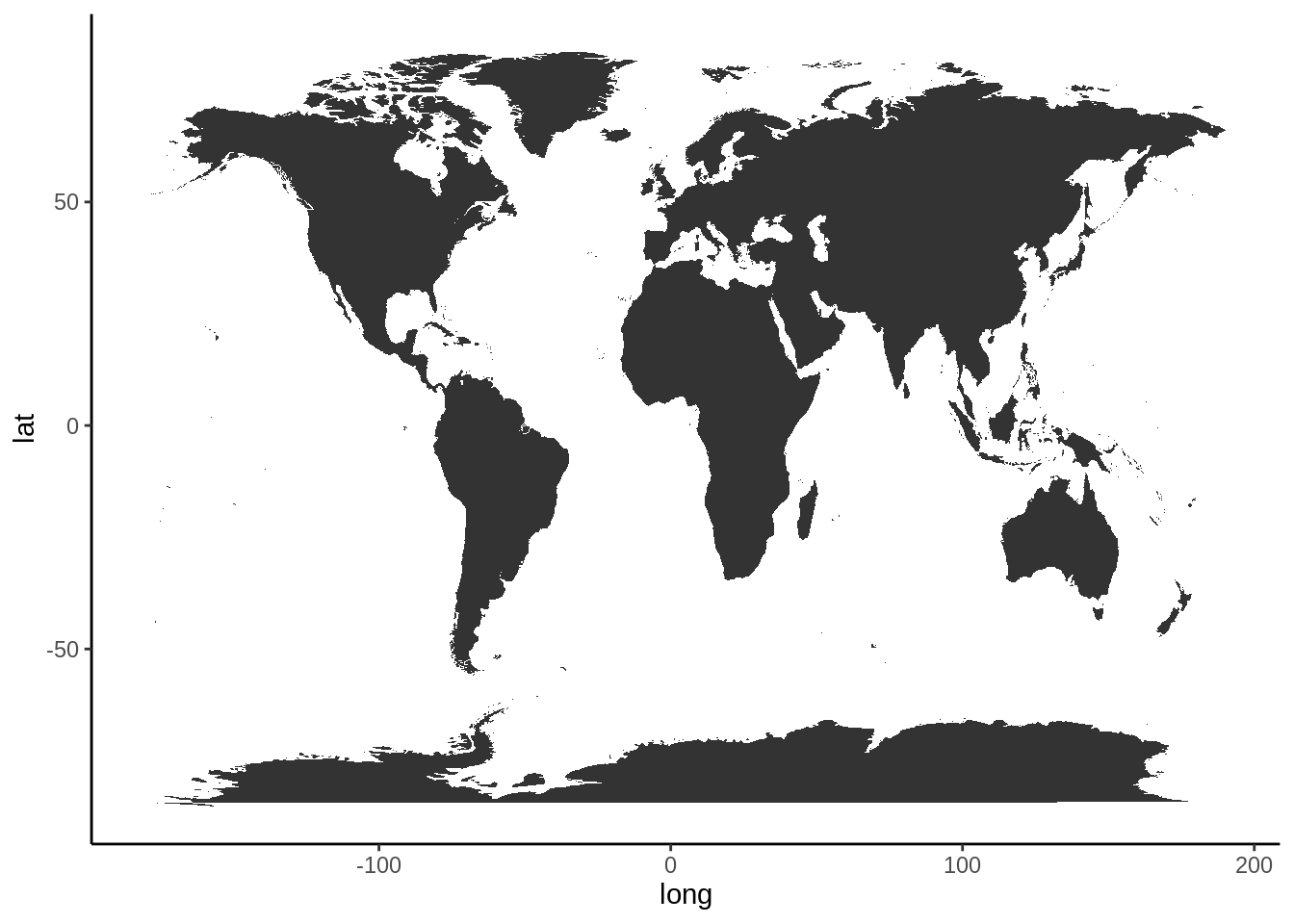
plot1data = rawalldata

g = ggplot(plot1data, aes(x = long, y = lat, group = group, text = countryname))+
  # take longitude and latitude as x and y, a certain region as a group
  geom_polygon(aes(fill = log10(deaths)), color = 'black')+
  # draw a map filled by log10(deaths), and separate each country by black lines
  scale_fill_gradient(low = '#FFF68F',high = '#FC4902') +
  # use a common used heat map color setting
  labs(title = 'Total Death Number for Every Country From 1900-2022')+
  # rename the plot
  ggdark::dark_theme_bw()
  # use a dark theme which can make the map more attractive

ggplotly(g, tooltip = c("text",'fill')) # create a interactive plot shown it's name and death number
Here we calculated the log10 of the death so the numbers will not be too far away from each other, and hence the color change would be clearer. This is a good way to handle data with large range.
21.4 time series data
plot2data = rawdata

g2 = ggplot(plot2data, aes(x = long, y = lat, group = group))+
  # the same as the setting with summary plot
  geom_polygon(aes(fill = log10(deaths)), color = 'black')+
  transition_manual(frames = Year) +
  # use year as the animation parameter
  scale_fill_gradient(low = '#FFF68F',high = '#FC4902') +
  labs(title = paste('Year:','{current_frame}')) +
  # make the title changes among different plot
  ggdark::dark_theme_bw()

animate(g2,fps = 3)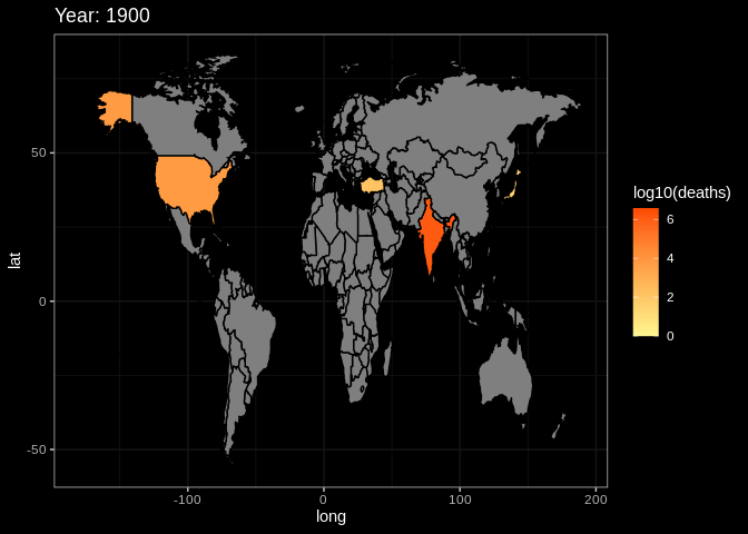
# set the fps=3 to make sure the that the plot will not change too quicklyThis is the end of the tutorial. Hope it can help you in someway. If you have other questions or thoughts, feel free to reach out to us through email or on github :)