26 Compare different ways of plotting Biplot, Mosaicplot, and Heatmap
Haoyue Wang
During the study of 5293, I found that we usually have different packages or functions to plot the same kind of plot. For example, while we want to plot a heatmap, we can use different functions like the heatmap() function in base R, geom_bin2d() in ggplot2, etc. But what is the difference between those packages? What kind of package or function we should use in a different situation? I decided to compare them and make a tutorial to help us better use different packages and functions in different plots. In this tutorial, I choose biplot, Mosaic plot, and Heatmap to do the comparison.
26.1 library()
library(ggplot2)
library(FactoMineR)
library(factoextra)
##remotes::install_github("jtr13/redav")
library(redav) # must be installed from source
library(devtools)
##remotes::install_github("vqv/ggbiplot")
library(ggbiplot)# must be installed from source
library(plyr)
library(scales)
library(grid)
library(vcd)
library(tidyverse)
library(openintro)
Now Let’s get started!
26.2 Biplot
Bigraph is an exploratory graph used in statistics. It is a generalization of a simple bivariate scatter graph.
We use Athletes’ performance during two sporting meetings to compare the difference between three ways of ploting biplot.
26.2.2 Base R biplot function
First of all, we plot a default biplot.
biplot(pca,main="default biplot made by biplot function")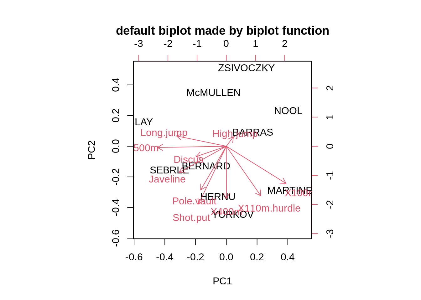
Adjusting the size of label(argument:cex), deciding whether show the arrows(argument:var.axes) and changing the color of x and y label(argument:col)
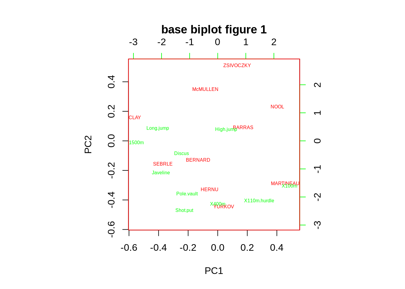
Adjusting the name of rowdim name of x(argument:xlabs) and the name of column name of y (argument:ylabs)
biplot(pca,cex=0.5,xlabs=c("x1","x2","x3","x4","x5","x6","x7","x8","x9","x10"),ylabs=c("y1","y2","y3","y4","y5","y6","y7","y8","y9","y10"),main="base biplot figure 2")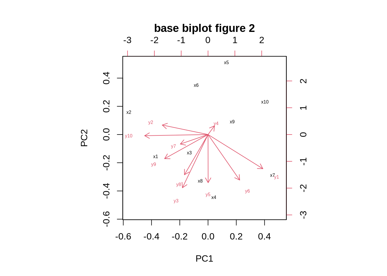
Tweaking the scaling of the two sets to a physically comparable scale(argument: expand) and adjusting the length of arrow heads (argument: arrow.len)
biplot(pca,cex=0.5,expand=0.5,arrow.len=0.01,main="base biplot figure 3")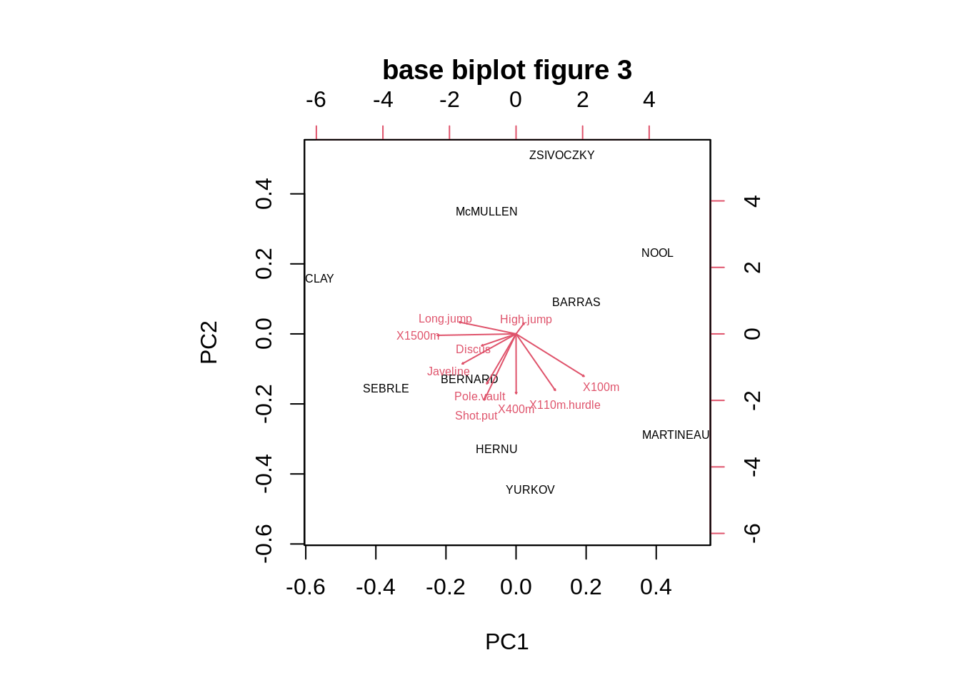 As we can see the biplot function in Base R only provide the most basic biplot with the first two PCs, and all the other arguments are adjusting the color of labels, Text size and etc.
26.2.3 Draw_biplot
Now we use draw_biplot function in redav package and compare these two ways of drawing biplot.
First of all, we plot a default biplot by draw_biplot
draw_biplot(data)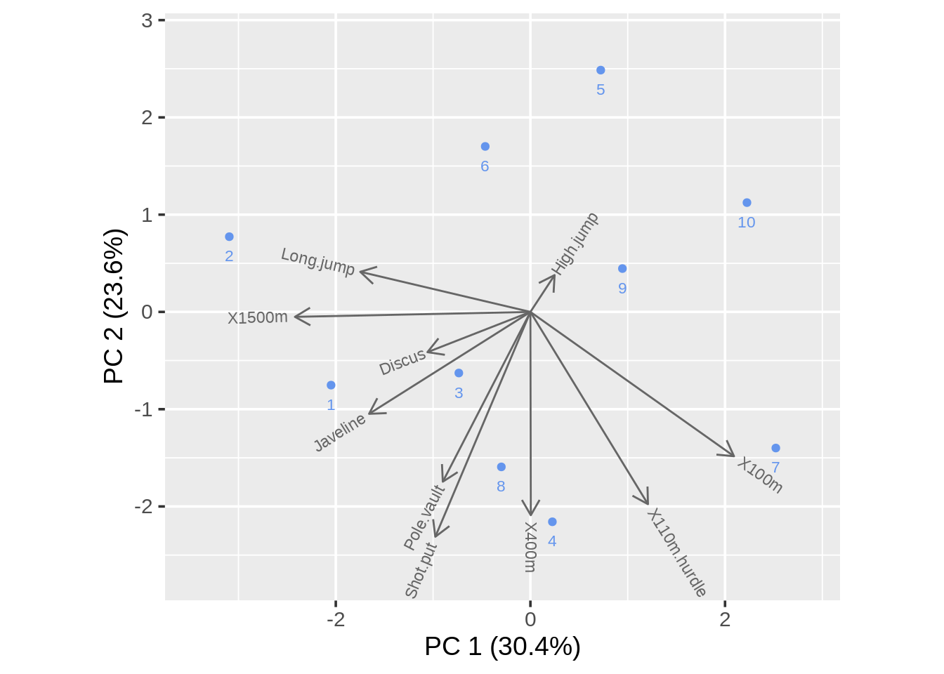
In draw_biplot we can get a similar plot in the biplot function. Here we adjust the argument vector_colors and point_color
draw_biplot(data,vector_colors="green",point_color = "red")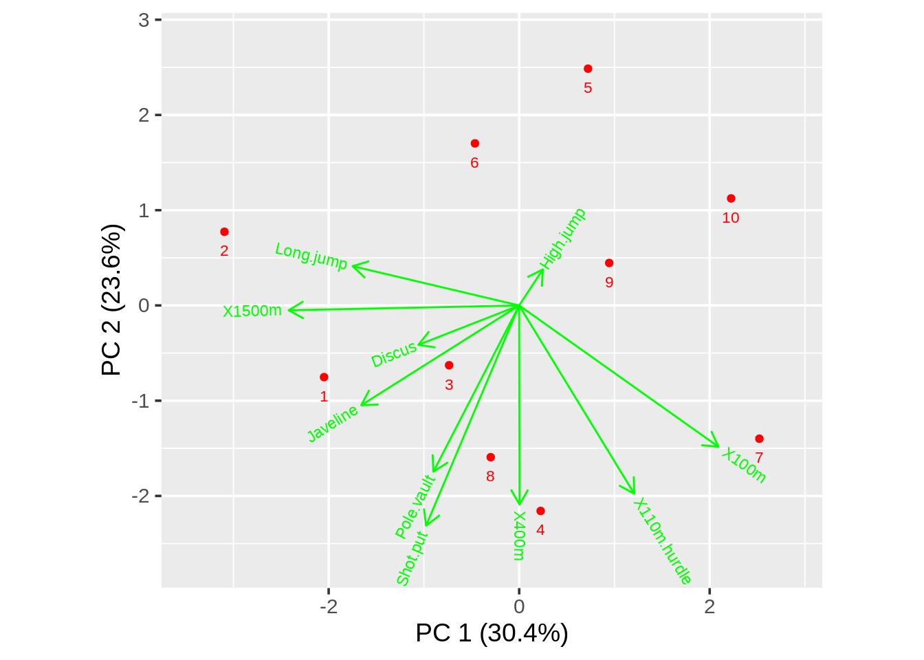
They are the same plot. But biplot gives us the name of each point and draw_biplot directly gives us the percentage of each PC.
The main difference between biplot function and draw_biplot() is that draw_biplot gives us an easy way to calibrate one of the axes. To do that, we need to adjust the argument key_axis. Here we also change ticklab argument to adjust axis breaks and tick labels for calibrated axis
draw_biplot(data,key_axis="X100m",ticklab=10:12)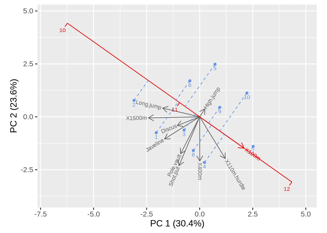
Then we could adjust the project argument to decide whether or not we’ll have projection lines and fix_sign argument to decide whether or not the first element of each loading is non-negative.
draw_biplot(data,key_axis="X100m",project=FALSE,fix_sign=TRUE)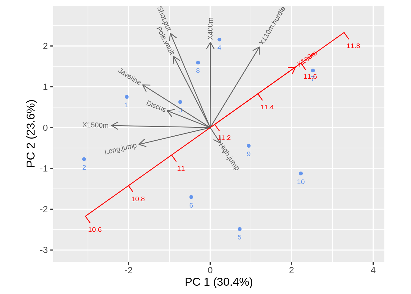
26.2.4 Ggbiplot
First of all, we plot a default biplot in ggbiplot
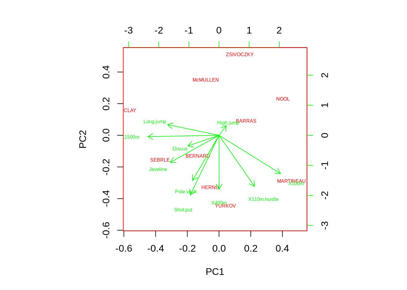
ggbiplot(pca)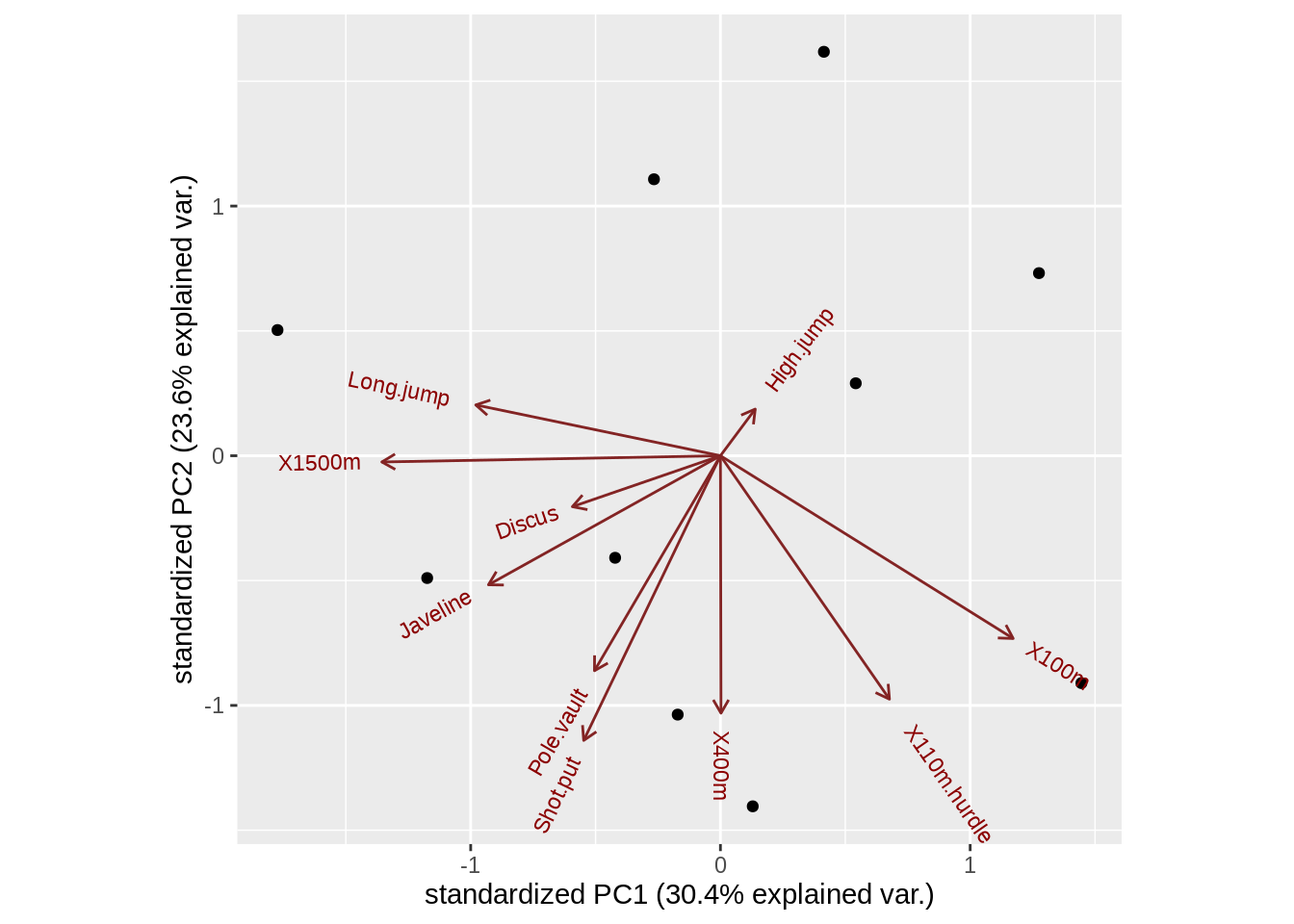
Here, we can know that the default biplot of biplot(), ggbiplot() and draw_biplot() is very similar. The difference are biplot() axis do not count the percentage of PCs. ggbiplot() do not give us the name of each point.
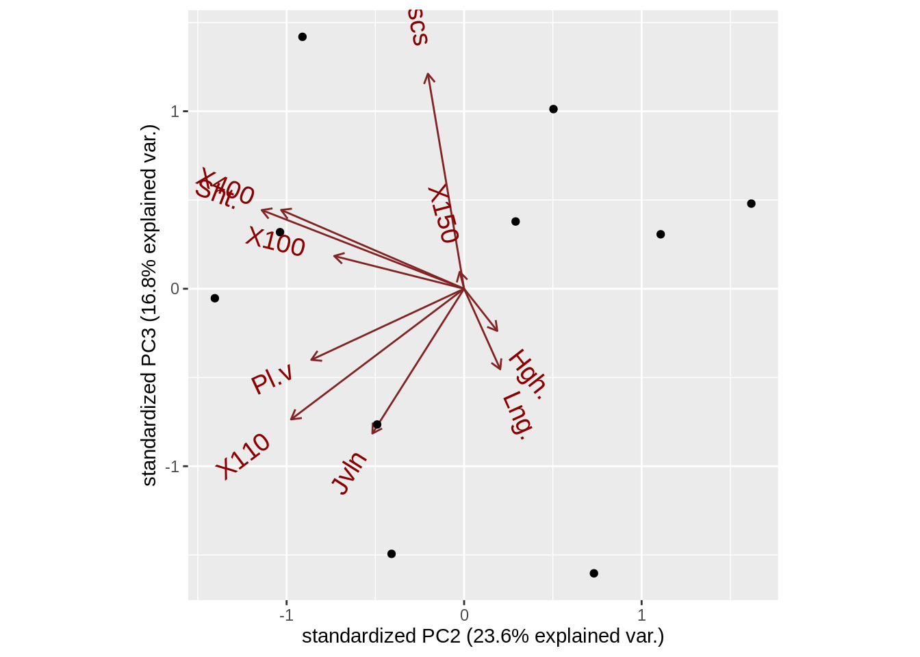
Here the thing that ggbiplot do is you can easily get not only the first two components but also any components you are interested in(argument choice), to adjust the details of the variable we can adjust to argument varname.abbrev(whether or not to abbreviate the variable names), varname.adjust(the distance between varname and arrow), var.scale(scale factor for variables),var.axes(if FALSE all the arrows are gonna disappear)
Here, circle is an argument that help us draw correlation circle
ggbiplot(pca, circle = TRUE) 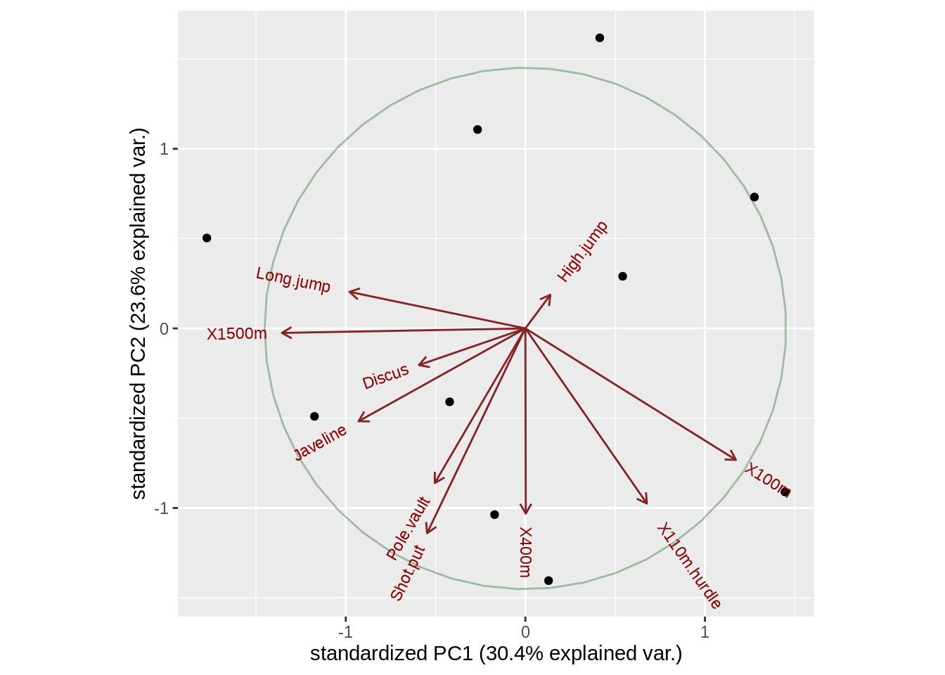
One important thing ggbiplot can do is when our observations have groups, groups argument will help the points be colored according to groups. and ellipse argument can draw normal data ellipse for each group. Using it with scale_color_discrete and theme function we can also gain the cluster for our observations.
data(wine)
wine.pca <- prcomp(wine, scale. = TRUE)
ggbiplot(wine.pca, obs.scale = 1, var.scale = 1,
  groups = wine.class, ellipse = TRUE, circle = TRUE) +
  scale_color_discrete(name = '') +
  theme(legend.direction = 'horizontal', legend.position = 'top')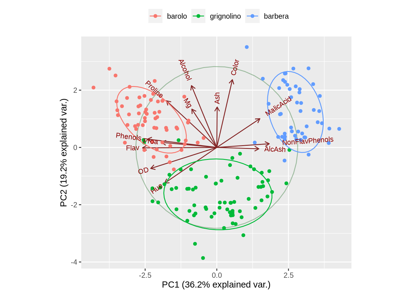
26.3 Mosaic plot
26.3.1 Base R mosaicplot function
Firstly, let us plot the default mosaic plot with Titanic data
mosaicplot(Titanic)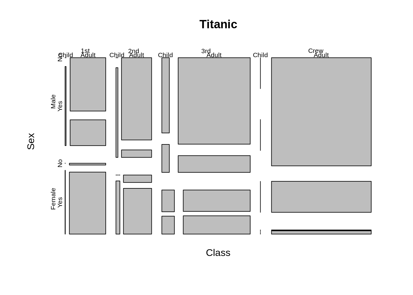
To change the order of variables, we could adjust sort argument and dir argument or just use a formula. Here we get the same plot by either changing the formula or changing sort and dir argument at the same time.
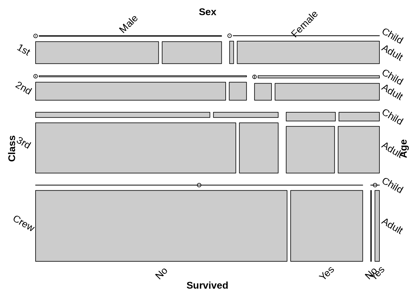
mosaicplot(~Sex+Class+Age+Survived,data=Titanic, main = "Survival on the Titanic")
mosaicplot(Titanic, main = "Survival on the Titanic", sort=c(2,1,3,4),dir=c("h","v","v","h"))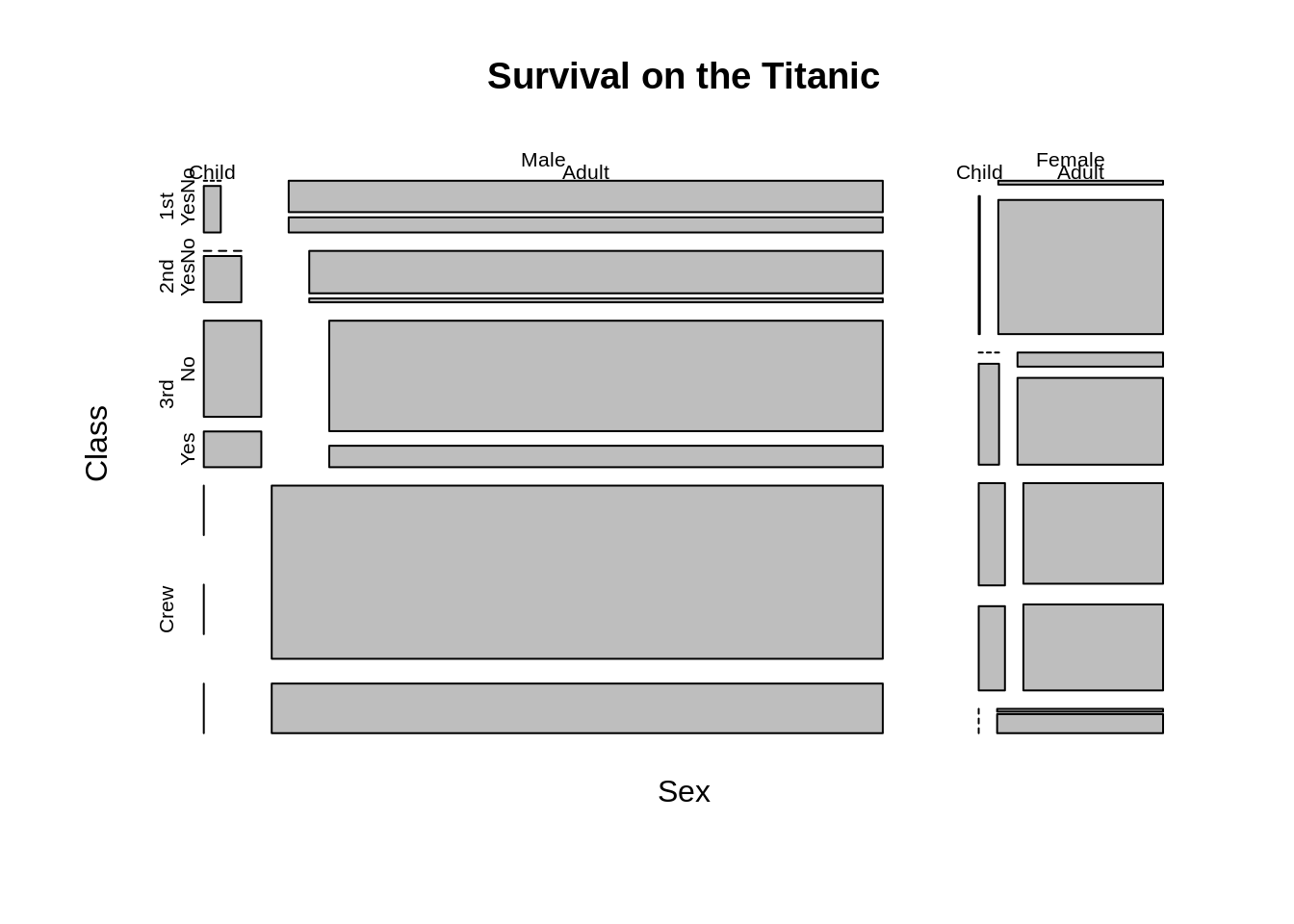
To adjust the distance between different mosaic we can adjust off argument, For color, color argument can change the color of each mosaic. besides, in the formula part, we can use only part of variables to see the relationship.
mosaicplot(~ Sex + Age + Survived, data = Titanic, color = TRUE,off=1)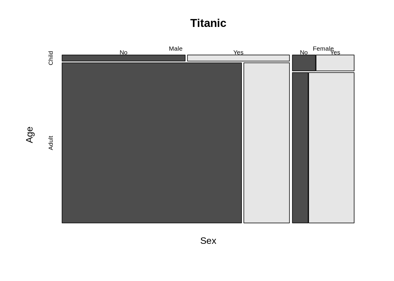
mosaicplot(~ Sex + Age + Survived, data = Titanic, shade=TRUE)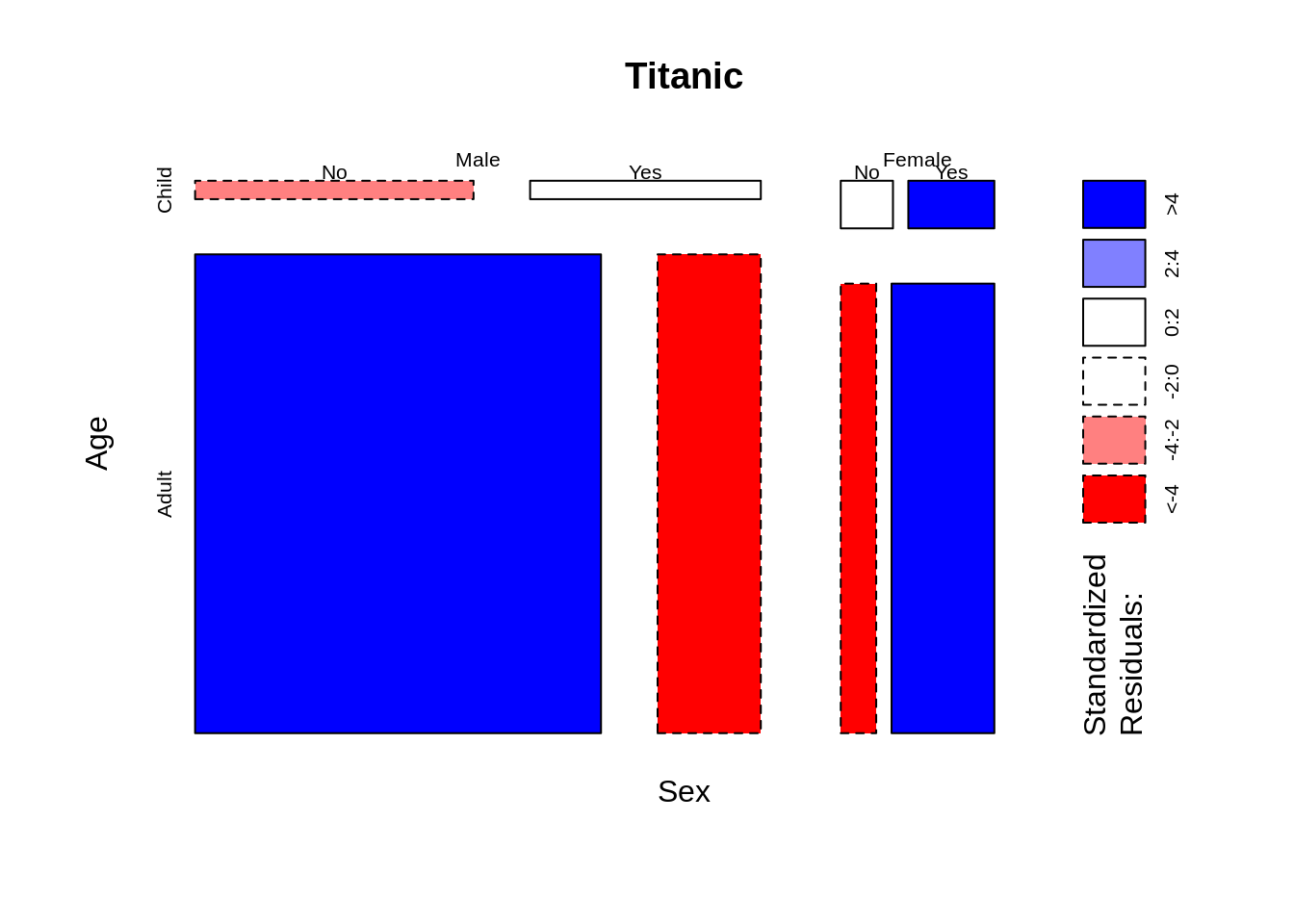
26.3.2 vcd package
Let’s see the default mosaic plot
The difference between two default plot are the order of the variable, Thus we can gain the same plot by adjusting the formula and the direction of vcd::mosaic
vcd::mosaic(~Class+Sex+Age+Survived,data=Titanic,direction = c("v", "h","v","h"),rot_labels=c(0,-30))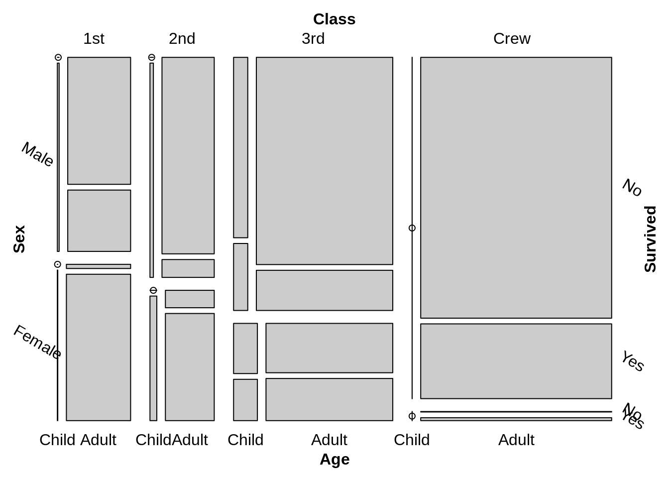
But vcd::mosaic can easily gain the conditioning formulas, which is way more convenient than the mosaicplot function in base R. And also in vcd::mosaic we can easily adjust the zero entries. (zero_size argument is to adjust the size of the bullets used for zero entries,zero_shade argument is to decide whether zero bullets should be shaded.)
vcd::mosaic( Age ~ Class | Sex , data = Titanic, zero_size = 1,zero_shade=FALSE,zero_split=TRUE)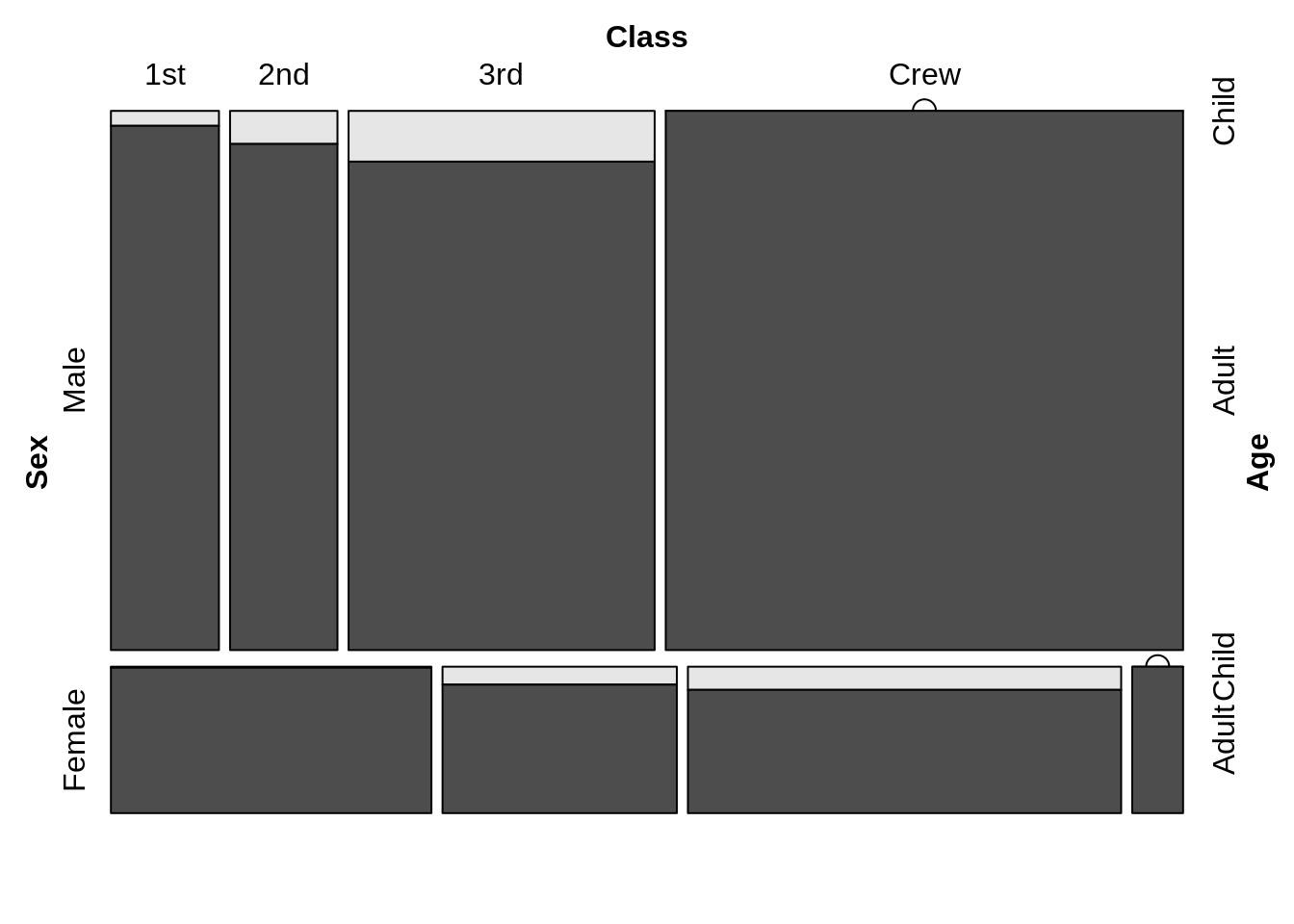
26.4 Heatmap
A heat map (or heat map) is a data visualization technique that shows the size of phenomena in two-dimensional colors.In This part we will compare three ways of drawing heatmap. Heatmap function in base R. geom_tile in ggplot2 and geom_bin2d in ggplot2
26.4.1 Base R heatmap()
The heatmap() function is natively provided in R. One important thing for heatmap() in base R is that it offers optiooptionsn for normalization, clustering and, Dendrogram. Scale argument help us normalize data when it equal to “none” it means.
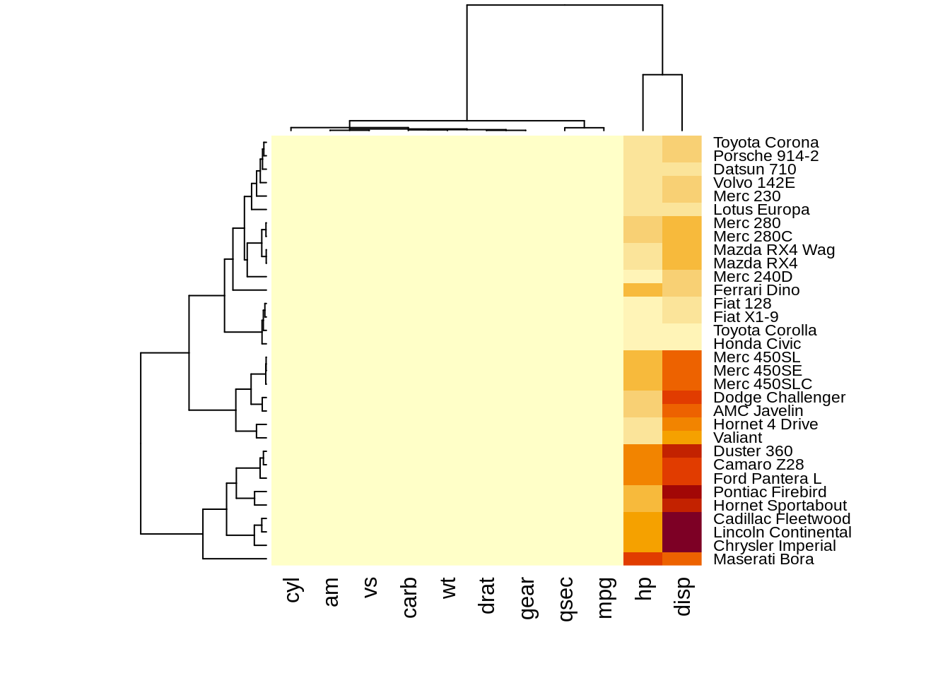
heatmap(df,scale="row")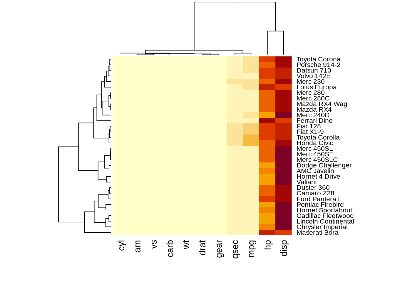
heatmap(df,scale="column")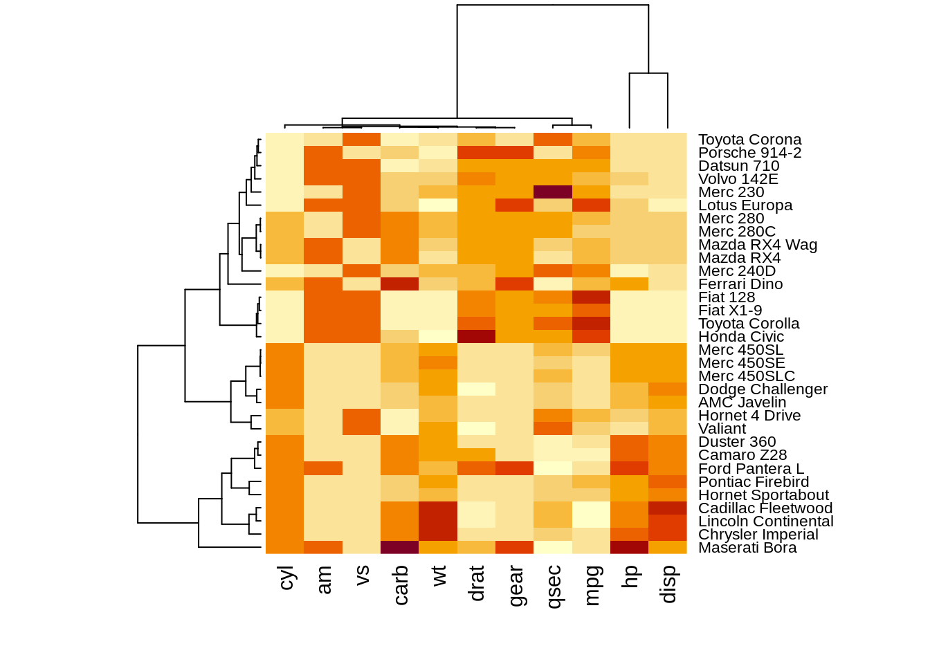 The results of normalizing in different directions are quite different. This function is convenience to do the normalization.However, we need to preprocessing the data into
A corresponding dendrograms is provided next to the heatmap, we can adjust the Colv and Rolv argument to not show it.To adjust the color, adjust col argument to terrain.color(), rainbow(), heat.colors(), topo.colors() or cm.colors())
heatmap(df, Colv = NA, Rowv = NA, scale="column")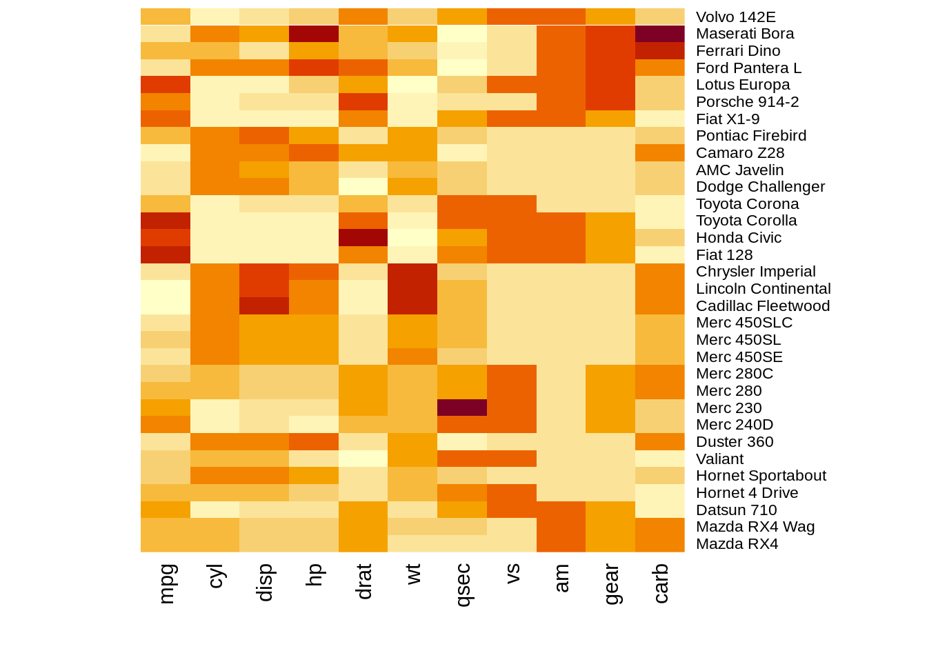
heatmap(df,col = terrain.colors(256), scale="column")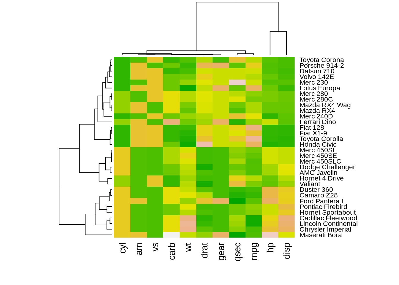
26.4.2 Geom_tile()
26.4.2.1 Data processing
x <- LETTERS[1:10]
y <- paste0("var", seq(1,10))
data <- expand.grid(X=x, Y=y)
data$Z <- runif(100, 0, 5)
26.4.2.2 Plot
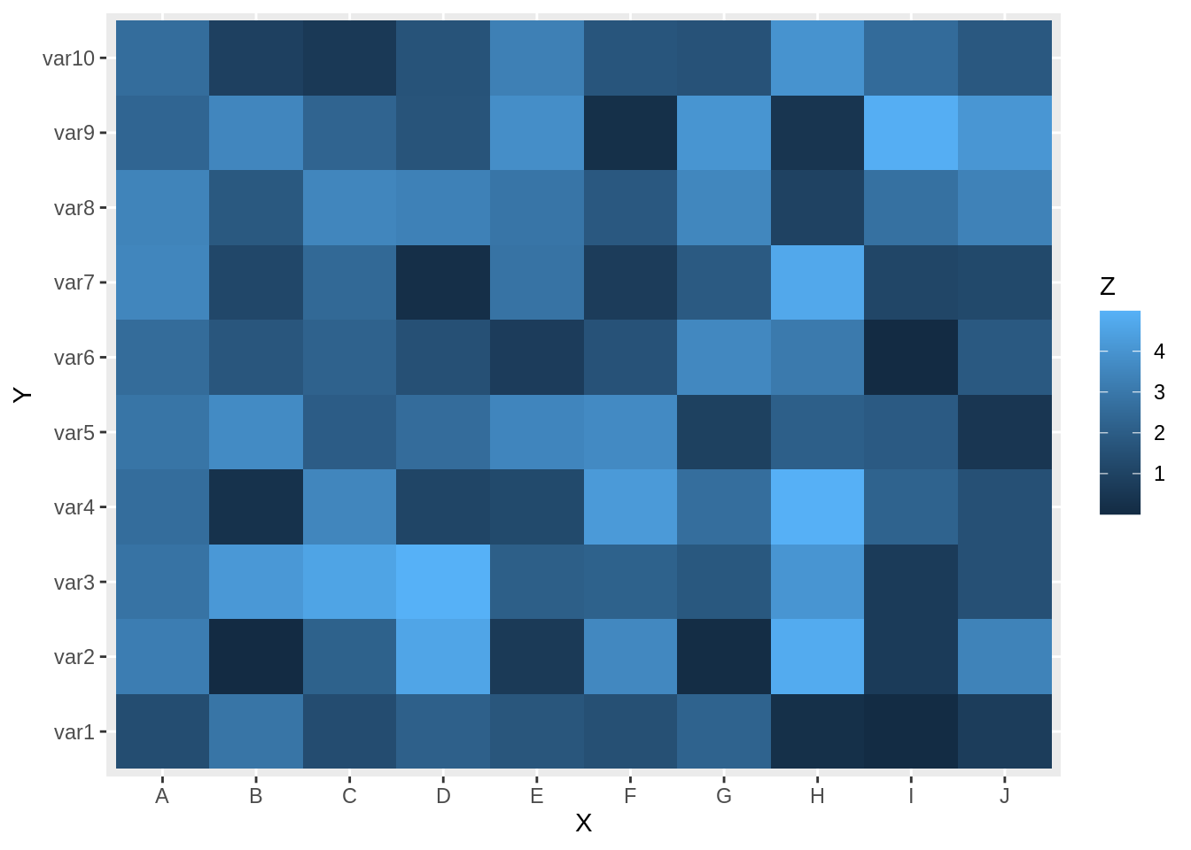
we can change the color in this plot by adding scale_fill_gradient() layer in ggplot2
gt+
scale_fill_gradient(low="white", high="blue") 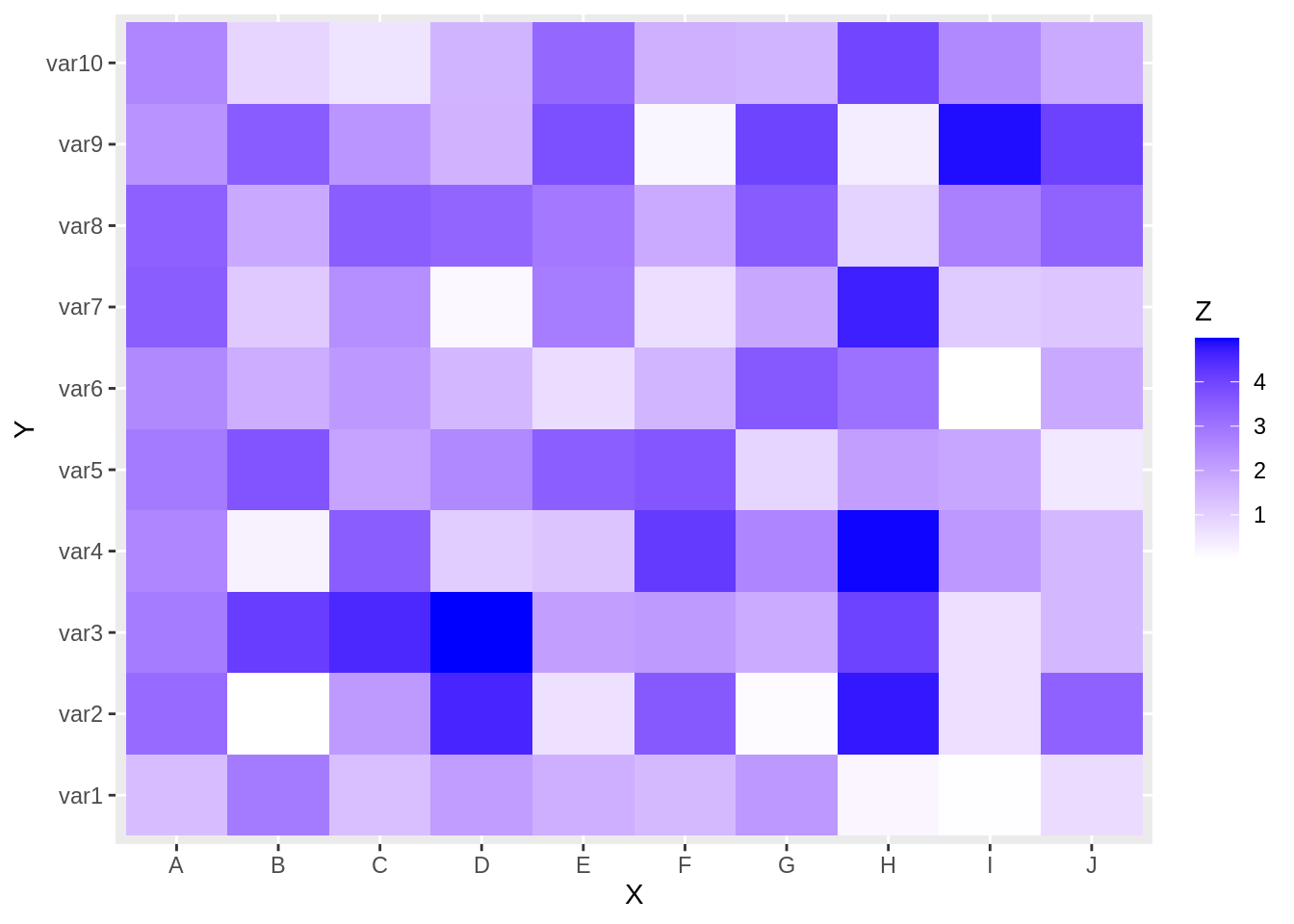
26.4.3 Geom_bin2d
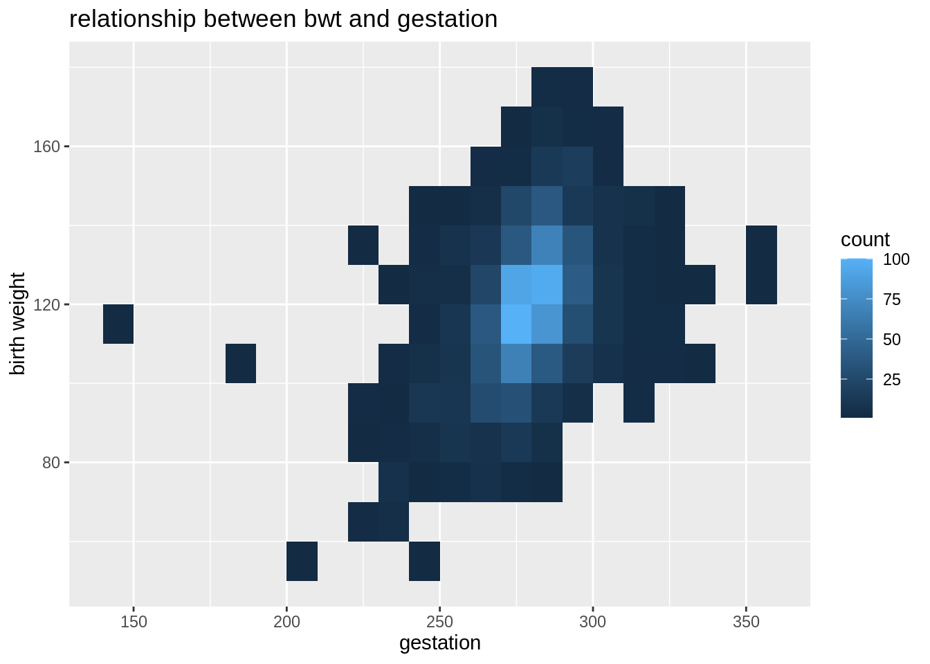
Geom_bin2d is a function that counting numbers of observations in a particular region of two-dimensional space and represented by a color gradient. It is also a kind of heatmap.
babies%>%
  ggplot(aes(y=bwt,x=gestation))+
  geom_bin2d(binwidth = c(10, 10))+
  labs(
    y="birth weight",
    title="relationship between bwt and gestation"
  )
As we can see the data that geom_tile, geom_bin2d and heatmap() deal with are very different. We need to decide which function to use at the very beginning.
head(data,5)## X Y Z
## 1 A var1 1.400612
## 2 B var1 2.874787
## 3 C var1 1.356499
## 4 D var1 2.106286
## 5 E var1 1.724270
head(df,5)## mpg cyl disp hp drat wt qsec vs am gear carb
## Mazda RX4 21.0 6 160 110 3.90 2.620 16.46 0 1 4 4
## Mazda RX4 Wag 21.0 6 160 110 3.90 2.875 17.02 0 1 4 4
## Datsun 710 22.8 4 108 93 3.85 2.320 18.61 1 1 4 1
## Hornet 4 Drive 21.4 6 258 110 3.08 3.215 19.44 1 0 3 1
## Hornet Sportabout 18.7 8 360 175 3.15 3.440 17.02 0 0 3 2## # A tibble: 5 × 2
## bwt gestation
## <int> <int>
## 1 120 284
## 2 113 282
## 3 128 279
## 4 123 NA
## 5 108 28226.5 Reference
1,https://www.rdocumentation.org/packages/stats/versions/3.6.2/topics/biplot 2,https://www.rdocumentation.org/packages/ggbiplot/versions/0.55 3,https://www.rdocumentation.org/packages/graphics/versions/3.6.2/topics/mosaicplot 4,https://rdrr.io/cran/vcd/man/mosaic.html 5,https://r-graph-gallery.com/heatmap.html#:~:text=A%20heatmap%20is%20a%20graphical,is%20natively%20provided%20in%20R.