28 Geographical Maps Packages Comparison: ggmap vs. ggplot vs tmap
Yujie Tu, Yuchen Meng
28.1 Introduction
Data can express information to the audience but if we only use the table to view the data, we may miss some important information and misunderstand data. Therefore, we can turn to maps especially when the data has the columns of geographical characteristics like States, longitude and latitude, etc. Maps are used in a variety of fields to express data in an appealing and interpretive way. Maps can add vital context by incorporating many variables into an easy to read and applicable context.
There are a lot of packages in R that can draw geographical maps. Let’s explore these different methods to draw maps.
28.2 Package ggmap
28.2.1 Interpretation and Examples
When trying to make customized maps, we can use the ggmap package. It provides a way to download static data from Google map or an open-source map called stamen (open street map is not supported currently). We can simply use ggmap::get_map and ggmap::ggmap to plot a map of any given location. Notice that the Google Maps Platform now requires a registered API key, so we need to register our own api key before using ggmap functions which use Google’s services. After acquiring your own api key and using ggmap::register_google to register your key, you can start to plot maps. For example:
# register_google(key = "some google map api")
# ggmap(get_map("columbia university, new york, ny", zoom = 18, source = "google"))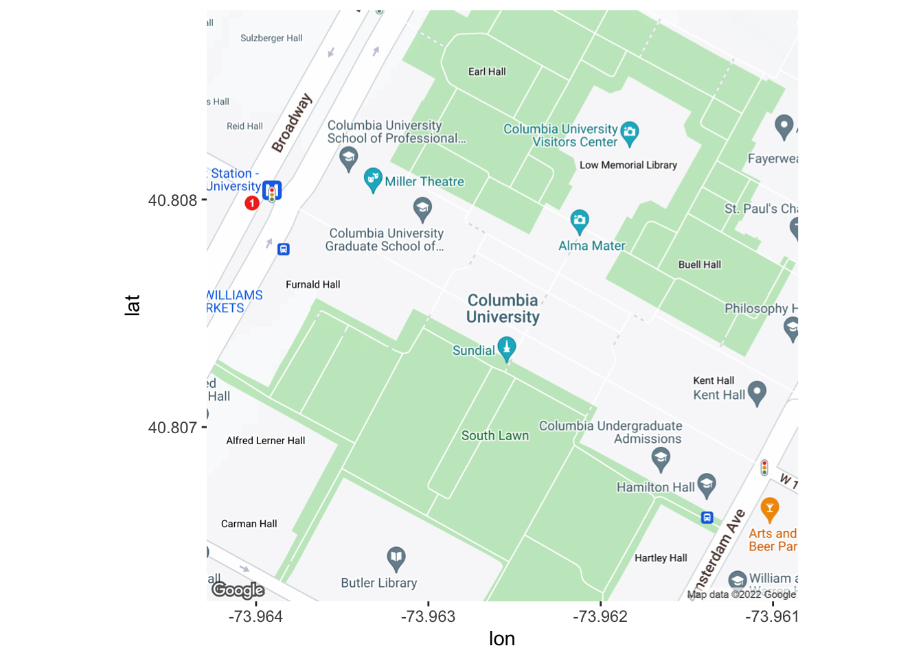
example of ggmap using google as source
Of course, you can still uses ggmap::get_map to download static maps from stamen map (simply specify source = “stamen”). But you will need to provide gps coordinates of the lower-left and upper-right points.
get_map(c(left = -73.96846472489304, bottom = 40.80507481834089, right = -73.95616654510266, top = 40.81006172001067),
        zoom = 16, source = "stamen") %>%
  ggmap()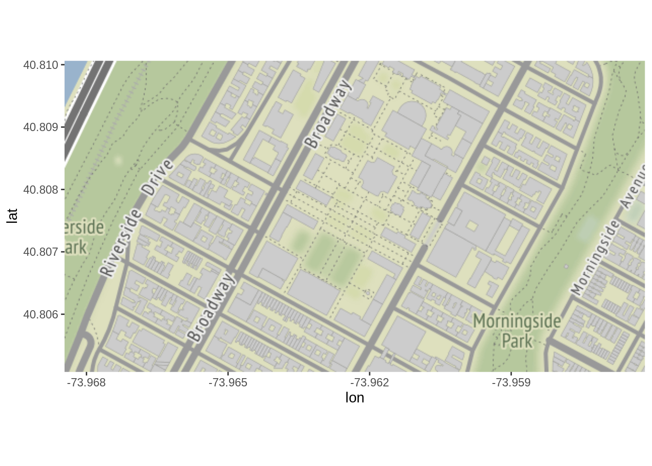
28.2.2 Combine With Other Plots
Since ggmap is based on ggplot, you can add all kinds of layer on tops of the map. And scatter plot goes along with ggmap very well, since the map usually has very high resolution and the area of the map can be customized, meaning it will be easy to see the exactly location. Furthermore, ggmap provides a very simple way to plot map with a scatter plot, using ggmap::qmplot, we can simply provide a data set, with each record containing a GPS coordinate:
# define helper
`%notin%` <- function(lhs, rhs) !(lhs %in% rhs)
# reduce crime to violent crimes in downtown houston
violent_crimes <- crime %>%
     filter(
         offense %notin% c("auto theft", "theft", "burglary"),
         -95.39681 <= lon & lon <= -95.34188,
         29.73631 <= lat & lat <=  29.78400
     ) %>%
     mutate(
         offense = fct_drop(offense),
         offense = fct_relevel(offense, c("robbery", "aggravated assault", "rape", "murder"))
     ) %>%
  select("offense", "lon", "lat")
head(violent_crimes)
## offense lon lat
## 1 aggravated assault -95.36348 29.77802
## 2 rape -95.34817 29.75505
## 3 robbery -95.37596 29.75143
## 4 robbery -95.36327 29.76328
## 5 aggravated assault -95.38217 29.78002
## 6 aggravated assault -95.37930 29.73745
# use qmplot to make a scatterplot on a map
g1 <- qmplot(lon, lat, group = offense, data = violent_crimes, color = I("red"))
g1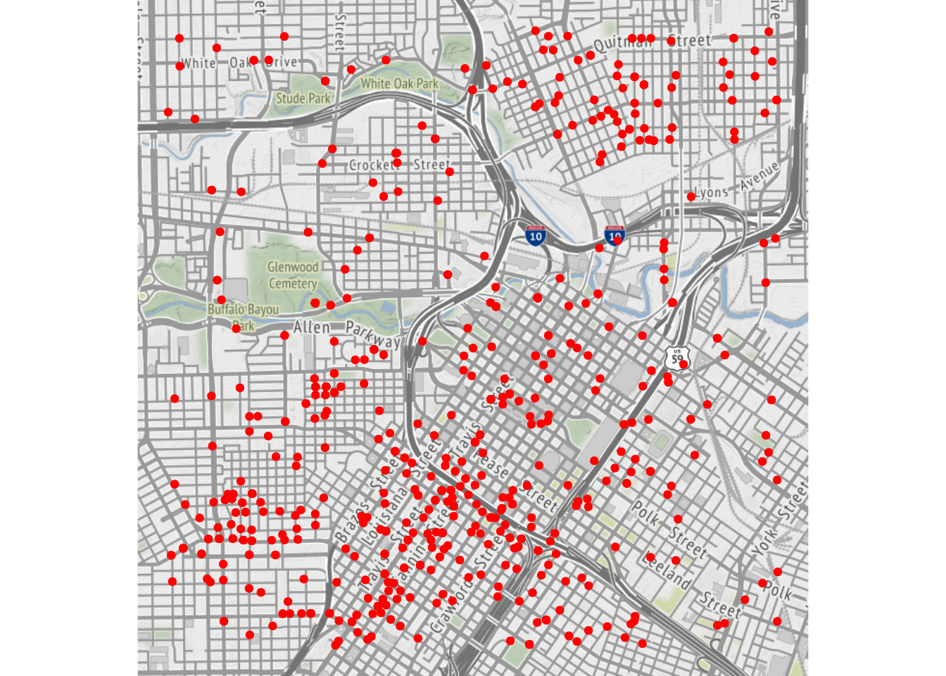
28.3 Package ggplot
28.3.1 Interpretation and Example
Of course, ggplot also provides its own function to plot maps, we can use ggplot::geom_map. But, the data needed to plot these maps are relatively hard to find. Package called maps provides some maps but the smallest granularity is states, meaning we cannot get more detailed information within each state.
us_states.map <- map_data("state")
ggplot(us_states.map, aes(map_id = region)) +
  geom_map(color = "white", map = us_states.map) +
  expand_limits(x = us_states.map$long, y = us_states.map$lat)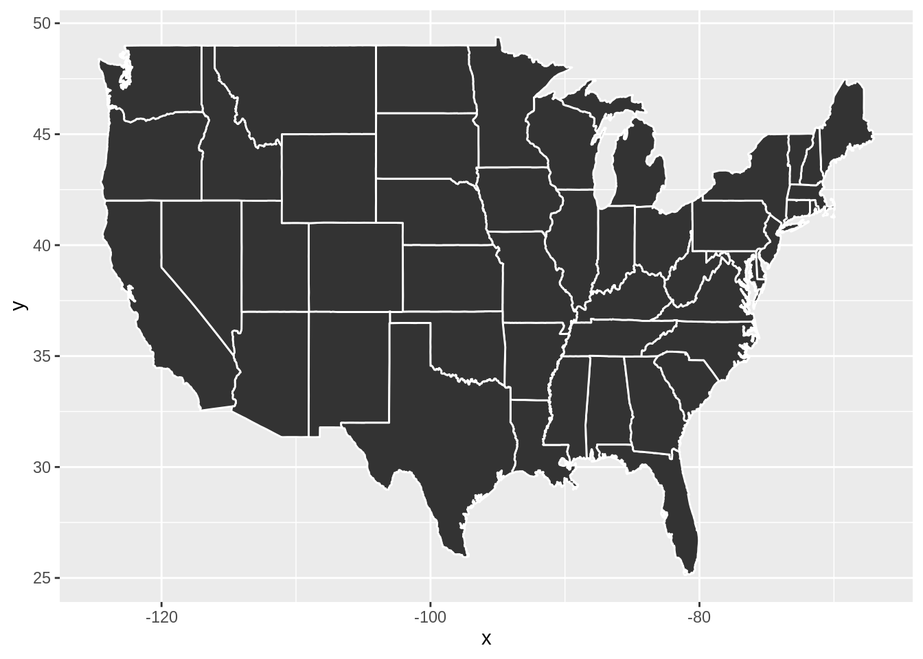
28.3.2 Combine With Other Plots
Since the map date we have generally comes in the form of dozens of polygons, heat map goes along with these kinds of maps very well. Using data containing each state’s certain statistics, we can easily plot a heat map of the United State with the help of maps and ggplot
data("state_stats")
states_selected <- state_stats %>%
  mutate(region = tolower(state)) %>%
  select(region,unempl,murder,nuclear)

states_map <- map_data("state")

states_selected %>%
  filter(region != "district of columbia") %>%
  ggplot(aes(fill = murder)) +
  geom_map(aes(map_id = region), map = states_map) +
  expand_limits(x = states_map$long, y = states_map$lat) +
  scale_fill_viridis_c() +
  labs(x = "", y = "", fill = "Murders\nper 100k")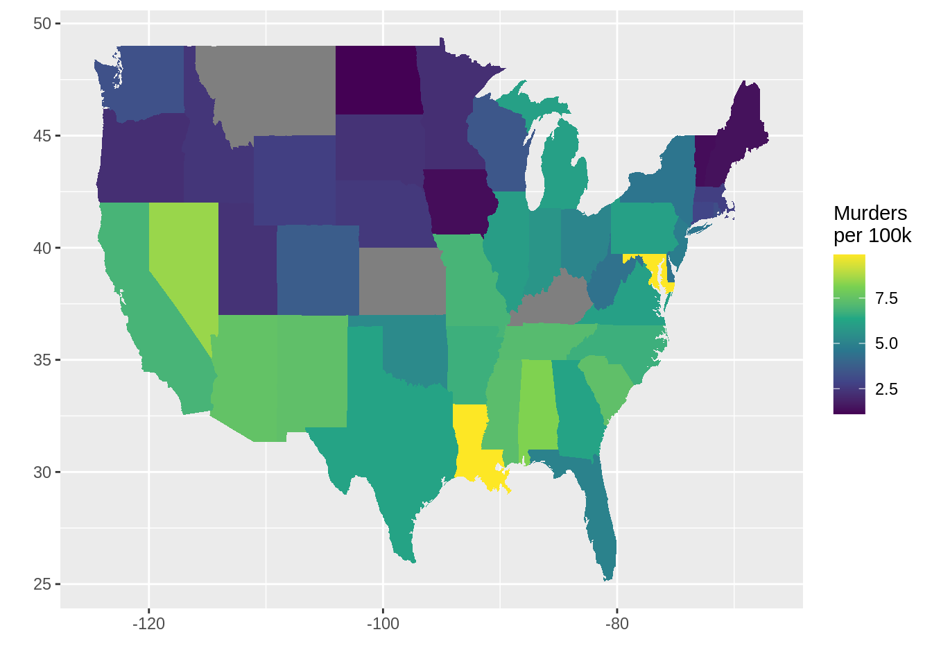

28.4 Package tmap
28.4.1 Interpretation and Example
The basic building block is tmap::tm_shape (which defines input data), followed by one or more layer elements such as tmap::tm_fill and tmap::tm_borders. The data it uses are objects from a class defined by the sf, stars, sp or raster package. Luckily, package called spData provides some maps that we can use, but similar to maps, the number of maps is limited and the smallest granularity is states.
tm_shape(us_states) +
  tm_borders()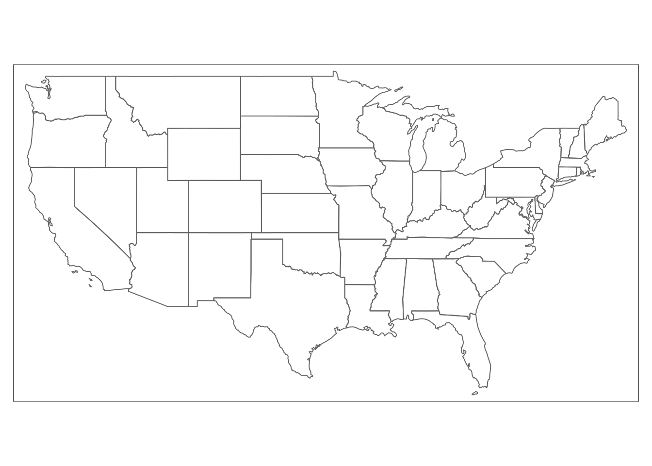
28.4.2 Combine With Other Plots
Similarly, we can also plot heatmap using tmap very easily.
data("state_stats")
us_states %>%
  inner_join(state_stats %>% select("state", "murder"), by = c("NAME" = "state")) %>%
  select("NAME", "geometry", "murder") %>%
  tm_shape() +
  tm_fill(col = "murder", breaks = seq(0, 10, 2.5), interactive = TRUE) +
  tm_borders()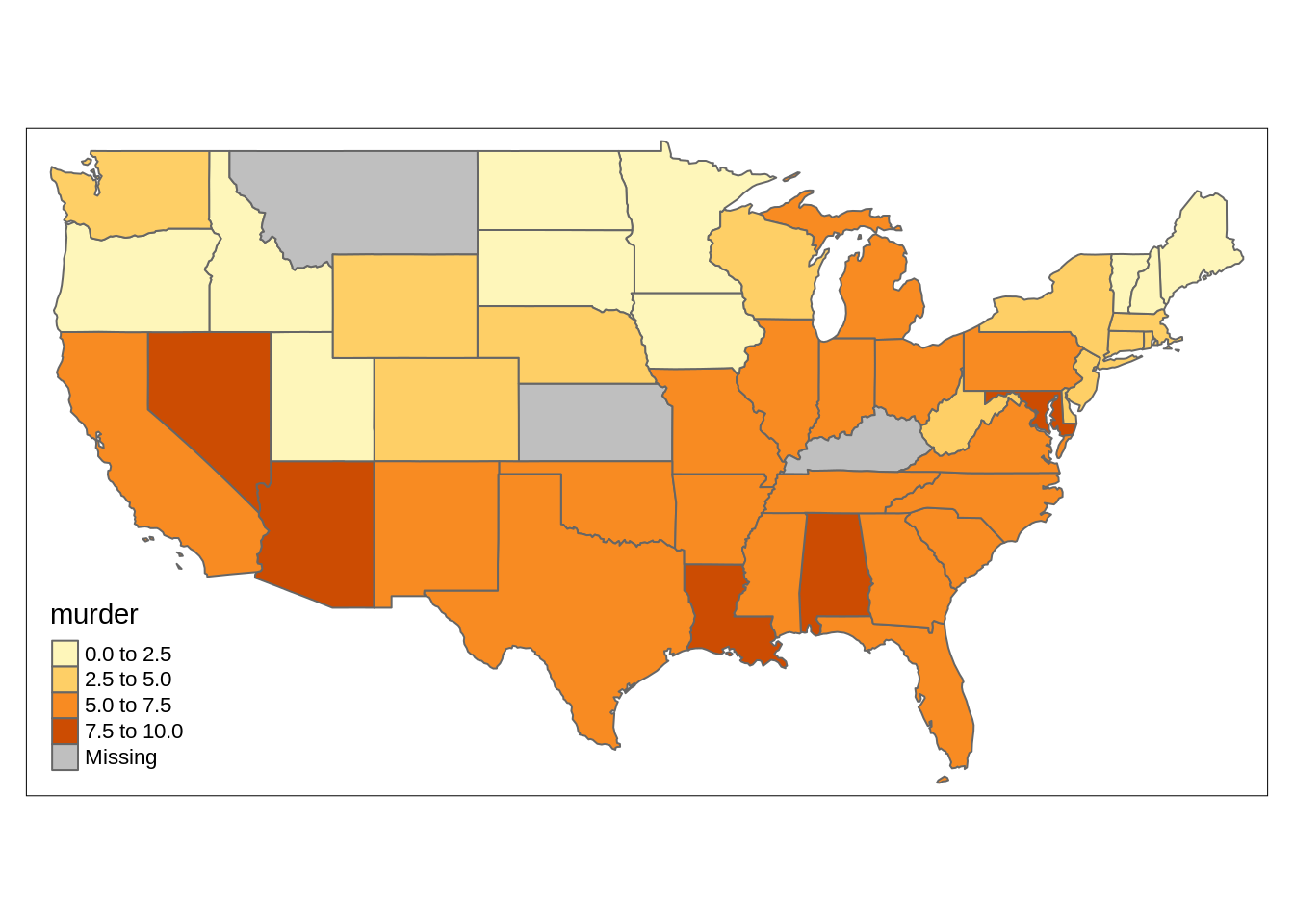
28.5 References
ggmap: The original github page for ggmap
Geocomputation with R, Chapter 9, by Robin Lovelace, et al.: A great introduction and tutorial to tmap and leaflet
Using Spatial Data with R, Chapter 3, Claudia A Engel: A tutorial to ggplot, ggmap, tmap, and leaflet
28.2.4 Comments
If you want to use ggmap, you will have to register with Google Cloud to get an API key and use
ggmap::register_google(key = "xxxxx").