96 A brief instruction for the half semester of EDAV5702
Siyuan Sang
96.1 Introduction
96.1.0.1 The Exploratory Data Analysis and Visualization(EDAV) is a very useful course for R users to get familiar with the techiques and rules we need to learn in terms of data visualization(honestly, anyone can figure out this from the name). In this instruction, instead of digging into some R vitualization skills, I’ll provide you with some useful suggestions and resources based on my first half of semester. I sincerely hope this instruction can help somebody out in the future.
96.2 The packages you should get familiar with
96.2.0.1 These two lines of code will appear on the top of your every homework assignment. Get familiar with them, ggplot2 is the base of graph in this course, and tidyverse is the core package of tidyverse.
96.2.0.3 For ggpolt2: https://r4ds.had.co.nz/data-visualisation.html
96.2.0.4 For tidyverse: https://r4ds.had.co.nz/introduction.html#the-tidyverse
96.3 Pay attention to the rules learned in class
96.3.0.1 In the process of data vatualization, there are some rules that you may ignore. However, many students(including me) lost points because of this. To make it more specific, I’ll quote my work and the correct one from my homework1 here to show you how it works.
96.3.0.2 My code goes like this:
library(openintro)
ggplot(loans_full_schema, aes(x =loan_purpose, y = loan_amount)) +
  geom_boxplot() +
  coord_flip()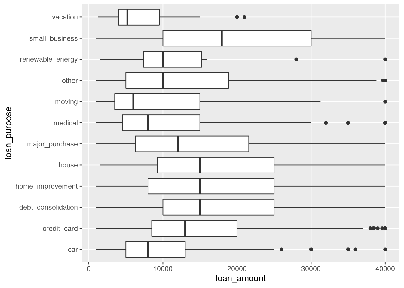
96.3.0.3 While the correct one should be:
library(openintro)
ggplot(loans_full_schema, aes(x = fct_reorder(loan_purpose, loan_amount), y = loan_amount)) +
  geom_boxplot() +
  coord_flip()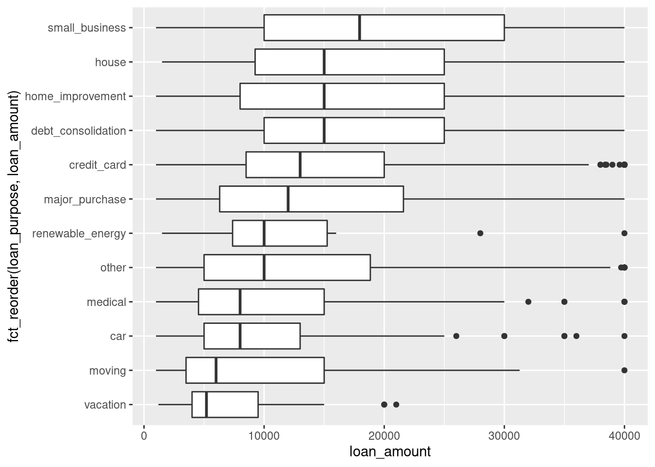
96.4 Try your best to imporve the graph
96.4.0.1 As a course of data vitualization, in my view, drawing a graph should never be the end of the story. There’re many ways to make your graphs look more clear and refined. Here I give an example of the scatterplot of housing price.
cor_df <- ames %>%
  group_by(Neighborhood) %>%
  summarize(cor = cor(area, price), beta = lm(price~area)$coefficients[2], meanprice = mean(price)) %>%
  ungroup() %>%
  arrange(beta)
ggplot(cor_df, aes(meanprice, beta)) +
  geom_point() +
  geom_smooth(method="lm", se= FALSE)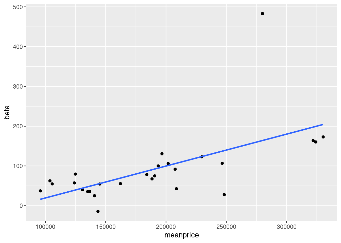
96.4.0.2 It’s now just a set of points with a line in this graph. Now I want to improve it. Considering our goal to make an analysis. It can be a good idea to put the names of Neighborhoods inside.
ggplot(cor_df, aes(meanprice, beta, label = Neighborhood)) +
geom_point() +
geom_text(nudge_y = 10, size = 3) +
geom_smooth(method="lm", se= FALSE)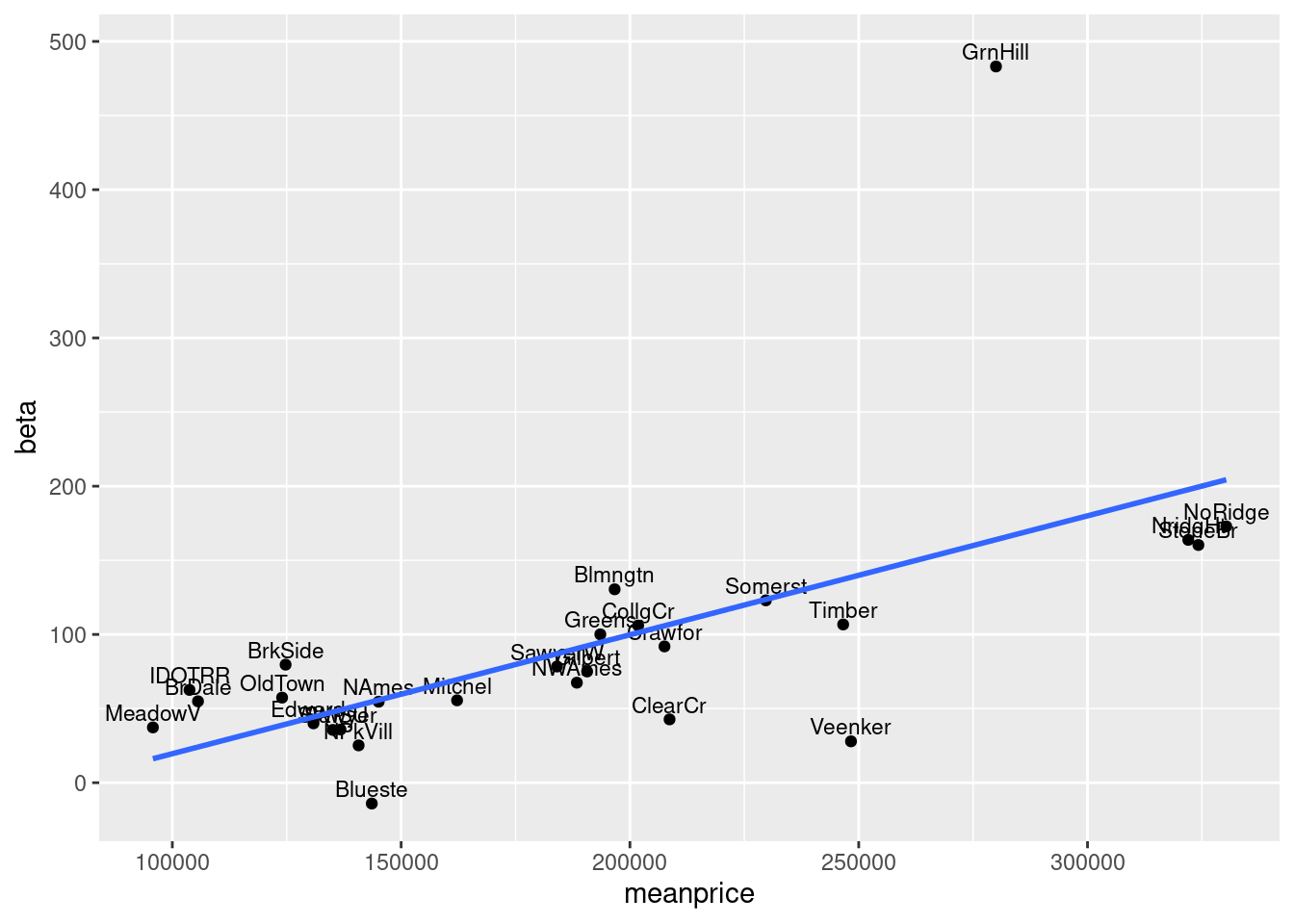 #### In this graph, although a lot names are in a mess, we can easily figure out the Neighborhood name of the oulier, which is an observable features of the dataset.