106 3D Visualization with rgl and scatterplot3d
Liyi Zhang
106.0.1 Introduction
In this tutorial, we:
- Learn to plot on 3 dimensions with a package providing html-friendly static graph
- Learn to plot on 3 dimensions with a different package that gives an interactive plot (but not knitted to html)
- Study how to input colors and texts into 3d plots
- Apply these plots to visualize latent structures learned by variational auto-encoders (VAE)
Notice that plots from rgl are not shown on the html file.
106.0.2 Toy Data
We first use a toy data to learn how to use the 3d plotting function plot3d and scatterplot3d.
First, we generate a 3d diagonal Gaussian. Note that the parameters are set such that datapoints at each dimension should be closely around 1, 2, 3, respectively:
plot3d and scatterplot3d both take as input N-by-3 data.
Coloring. Oftentimes, the N datapoints come from different classes, and we want to plot them with different colors. This can be done using the colors argument, which, in both functions, is an N-vector that looks like c('red', 'red', 'blue', ...).
# Get indices of colors, or classes. Right now classes are random, and the first 70 data points all come from class 1 (red)
classes <- sample(c(1,2,3), 100, replace=TRUE)
classes[1:70] <- 1
colors <- rainbow(3)[classes]
Plotting. We first plot with rgl:
# Plot with rgl
plot3d(X, col=colors)
Add text. In rgl, we can also add text to each point by using the text3d function, which takes the same data as input but also an N-vector of texts attached to each point:
# Plot with rgl:
plot3d(X, col=colors)
text3d(X, texts=as.character(classes))
Difference between plot3d and scatterplot3d. The above plot3d gives an interactive plot, but it does not appear on html. On the other hand, scatterplot3d appears on html but is not interactive. It is thus good to have both.
# Plot with scatterplot3d
scatterplot3d(X, color=colors)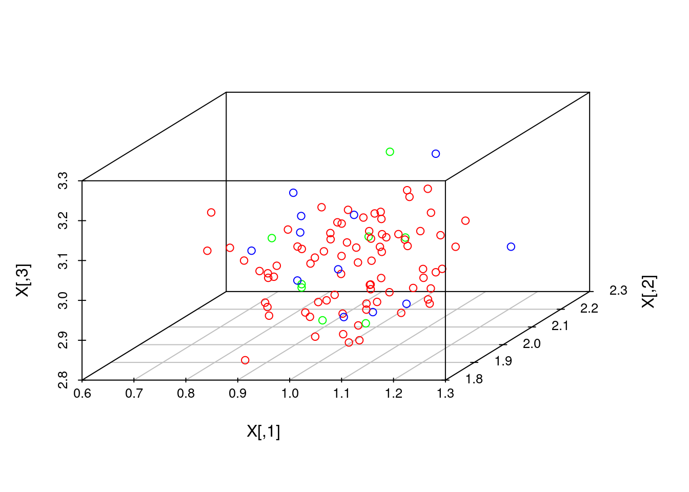
# Alternatively, a version with class names:
# scatterplot3d(X, color=colors, pch=as.character(classes))
106.0.3 Variational Auto-Encoder Representations on MNIST
We now look at an application of 3d visualization. MNIST is a dataset of pictures of handwritten digits, each picture being high-dimensional with 28 x 28 pixels. For each image, Variational Auto-Encoders (VAE) learn a low-dimensional latent variable which ‘generates’ the image through a neural network-parameterized probability function. We shall now plot 3d latent variables sampled from a trained VAE, each point supposedly to generate a picture of handwritten digit.
I trained the VAE with my own code in Python, and the training method follows the original papers (Kingma & Welling, 2014; Rezende, et al., 2014).
The visualizations that we learned will in fact show that this VAE has a number of problems. This example additionally shows that rgl interactive plots are more informative than the static plots on html, at least on this example.
# Load data:
test_labels <- as.numeric(unlist(read.table('https://raw.githubusercontent.com/jtr13/cc21fall2/main/resources/r_3d_visualization/test_labels.csv', header=FALSE)))
latents <- read.table('https://raw.githubusercontent.com/jtr13/cc21fall2/main/resources/r_3d_visualization/test_3d_latents.csv', header=FALSE)

# Select a subset of the data:
test_labels <- test_labels[1:1000]
latents <- latents[1:1000,]

# 10 classes are hard to visualize, so we record indices corresponding to classes and look at 2 classes at a time:
indices <- list()
for(i in 0:9){
  indices[[i+1]] <- which(test_labels==i)
}

# We choose digits '3' and '8':
indices1 <- c(indices[[4]],
              indices[[9]])
colors <- rainbow(10)[test_labels[indices1] + 1]
texts <- as.character(test_labels[indices1])

# Plot:
plot3d(latents[indices1,], col=colors)
text3d(latents[indices1,], texts=texts)

scatterplot3d(latents[indices1,], color=colors, pch=texts)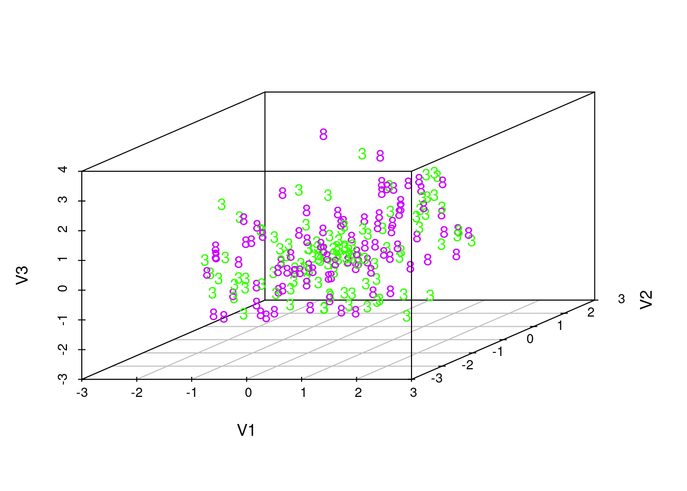
# We choose digits '4' and '8':
indices2 <- c(indices[[5]],
              indices[[9]])
colors <- rainbow(10)[test_labels[indices2] + 1]
texts <- as.character(test_labels[indices2])

plot3d(latents[indices2,], col=colors)
text3d(latents[indices2,], texts=texts)

scatterplot3d(latents[indices2,], color=colors, pch=texts)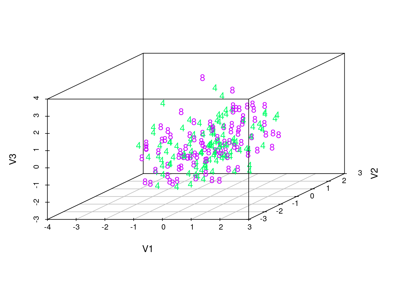
These visualizations show that the latent manifold does not clearly distinguish between classes. This is particularly evident as we rotate the rgl plots, which show that the points from two different classes are quite mixed together. This suggests that the VAE trained by maximizing an evidence lower bound with amortized variational inference is unable to give clear human-like interpretations. Indeed, as some previous research suggests, such training of VAE tends to favor reconstructing the image over learning a meaningful latent variable structure. Semi-supervised training or more advanced inference algorithms might improve the learning of latent structures.
106.0.4 References
On 3d plotting:
- https://planspace.org/2013/02/03/pca-3d-visualization-and-clustering-in-r/
- https://stackoverflow.com/questions/60589690/how-can-i-make-a-3d-plot-in-r-of-the-clusters-obtained-with-kmeans
On VAE:
- Diederik P. Kingma and M. Welling. Auto-encoding variational Bayes. CoRR, abs/1312.6114, 2014.
- Danilo Jimenez Rezende, S. Mohamed, and Daan Wierstra. Stochastic backpropagation and approximate inference in deep generative models. 2014.