84 Tutorial of radar chart
Pengyu Zou and Nuanyu Shou
84.1 Overview
Radar chart is a useful chart to display multivariate observations with an arbitrary number of variables. It consists of a sequence of equi-angular spokes, called radii, with each spoke representing one of the variables. The data length of a spoke is proportional to the magnitude of the variable for the data point relative to the maximum magnitude of the variable across all data points. Radar charts are widely used in sports to chart players’ strengths and weaknesses.
In this document, we will introduce how to draw a radar charts using package ggradar and fmsb. For each method, we will give instructions about installation, simple example and parameter usage tutorial. Besides, we explore how to use plotly to make the radar chart more readable and interactive.
84.2 Radar chart using ggradar
84.2.1 Installation
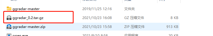
84.2.1.2 Unzip package in the R directory
84.2.1.2.2 Step2: Move the zip file ggradar-master.zip to the R directory ../R/bin/x64 and unzip it.
84.2.1.2.3 Step3: Open terminal(Mac) or Command(Windows) in this directory and run the following script.
Rcmd build ggradar-master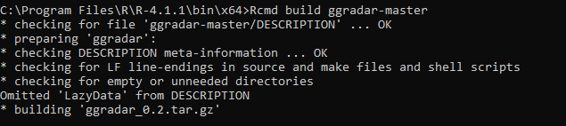
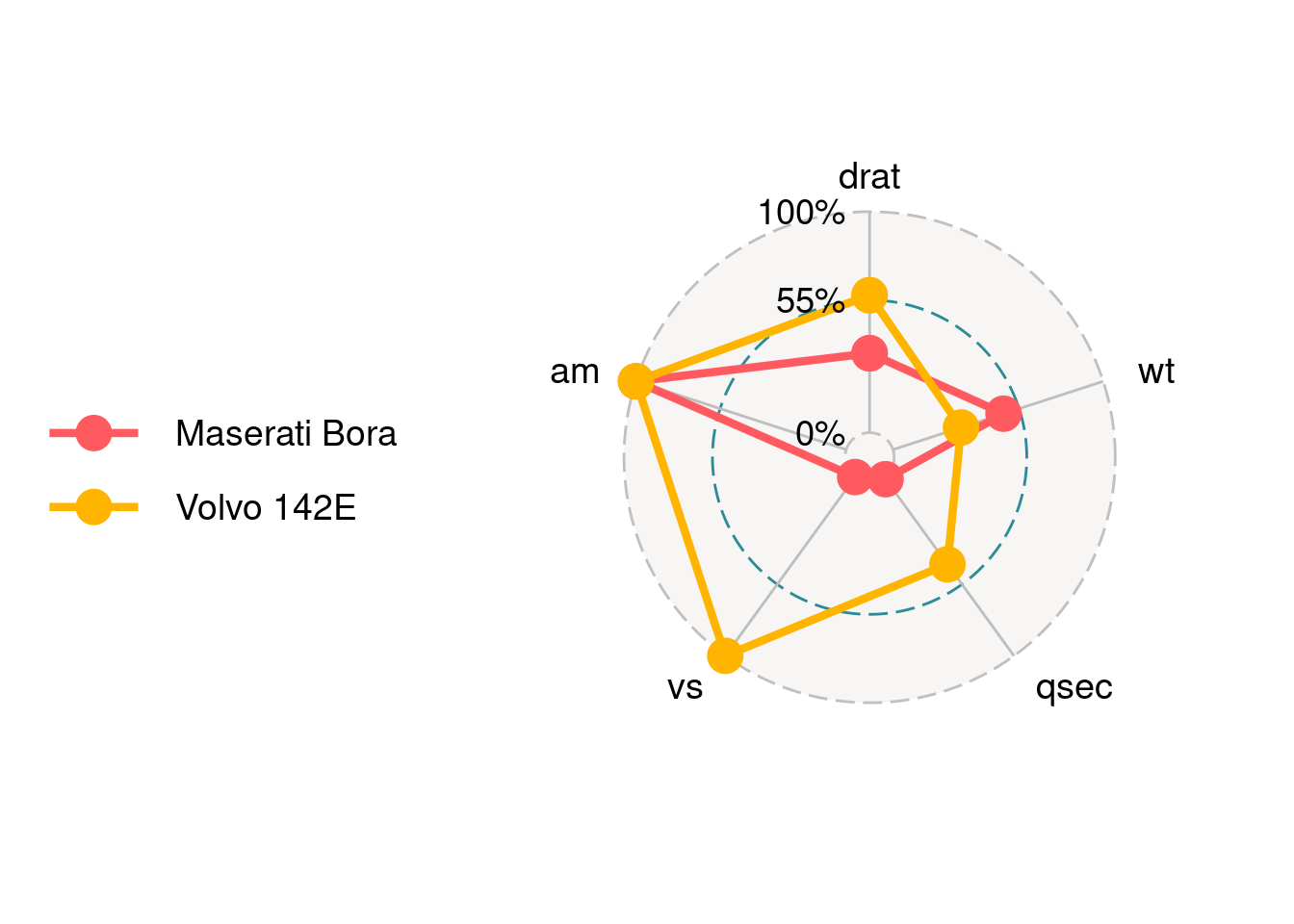
84.2.2 Simple Example
ggradar takes the first string column as group name and the rest numeric columns as different axes to plot. We take the columns from 6 to 10 in the mtcars dataset, and the first column as Group name.
#load data
mtcars_radar <- mtcars %>%
  as_tibble(rownames = "group") %>%
  mutate_at(vars(-group), rescale) %>%
  tail(2) %>%
  select(1,6:10)

#check data type with std() function
str(mtcars_radar)
## tibble [2 × 6] (S3: tbl_df/tbl/data.frame)
## $ group: chr [1:2] "Maserati Bora" "Volvo 142E"
## $ drat : num [1:2] 0.359 0.622
## $ wt : num [1:2] 0.526 0.324
## $ qsec : num [1:2] 0.0119 0.4881
## $ vs : num [1:2] 0 1
## $ am : num [1:2] 1 1
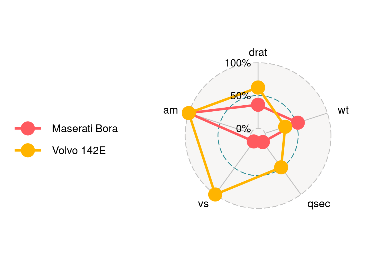
ggradar(mtcars_radar)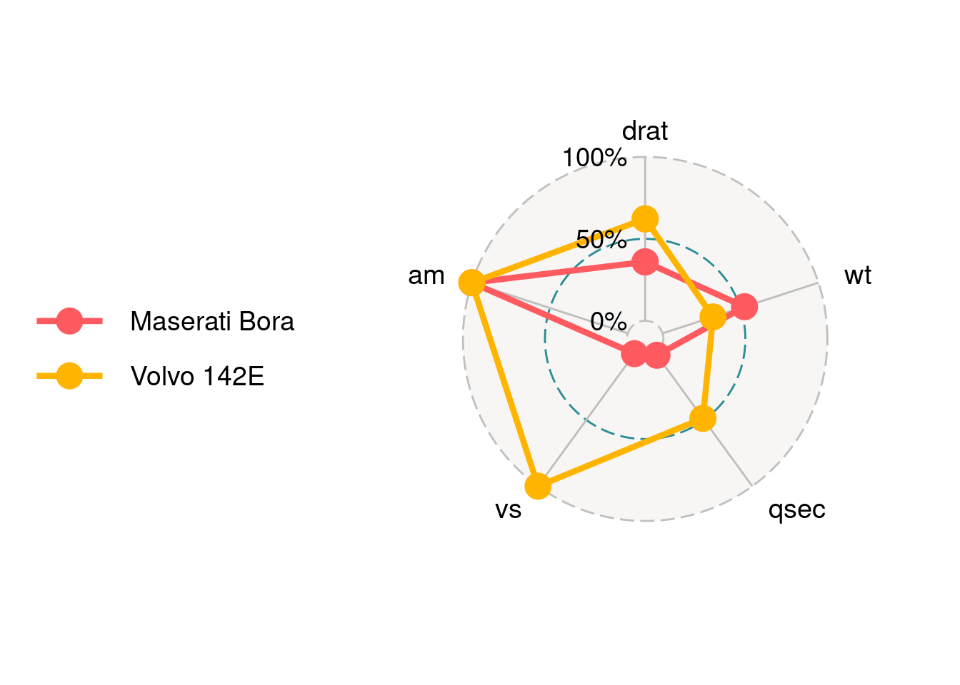
We can find that there are three circle lines in this radar chart, which stand for three bar values. Here are 0%, 50% and 100%. In addition, there are five axes corresponding to the five columns in the data. Each axis is connected with the inner layer with a solid line.
84.2.3 Parameters Usage
84.2.3.1 Change text size
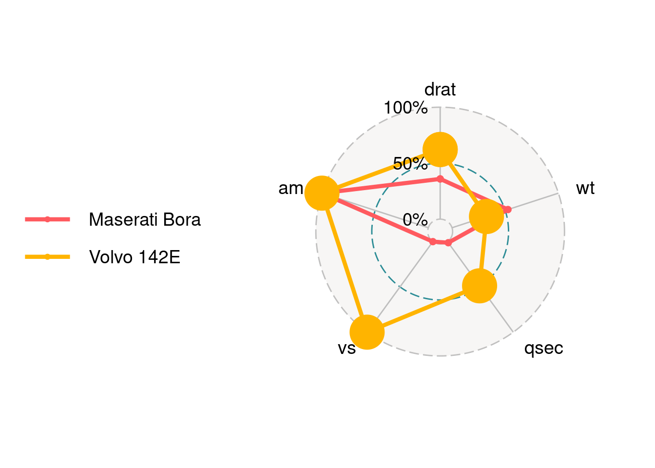
axis.label.size is for the axis text.
ggradar(mtcars_radar,axis.label.size = 10)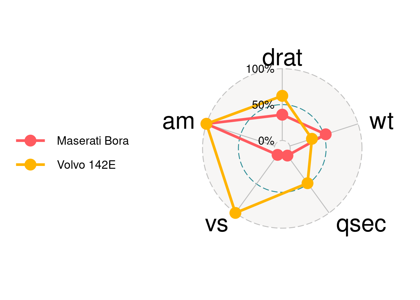
grid.label.size is for the text of three grids.
ggradar(mtcars_radar,grid.label.size = 10)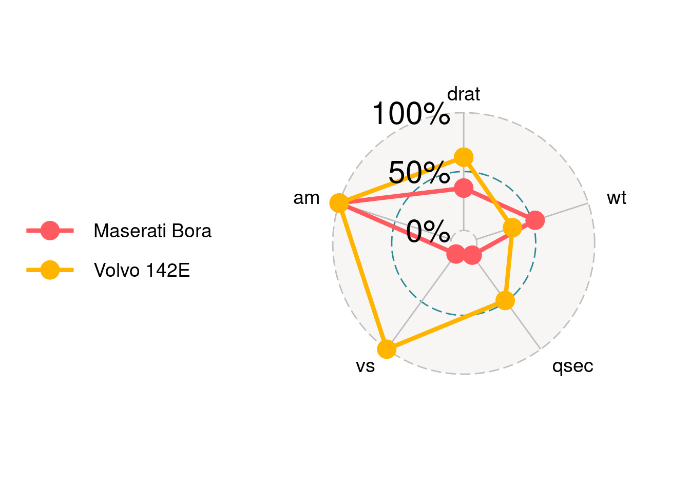
84.2.3.2 Set the bar value for each grid
values.radar is for setting the value for each grid. It only takes three values. If provide more than three, only the first three will be taken.
ggradar(mtcars_radar,
            # "125%" will be ignore.
            values.radar = c("33%","66%","100%","125%")
        )
84.2.3.3 Set the split ratio for each grid
Three grids will split data by ratio according to grid.max, grid.mid and grid.min. This should be correspond to values.radar.
ggradar(mtcars_radar,
            values.radar = c("0%","55%","100%"),
            grid.max = 1,
            grid.mid = 0.6,
            grid.min = 0
        )
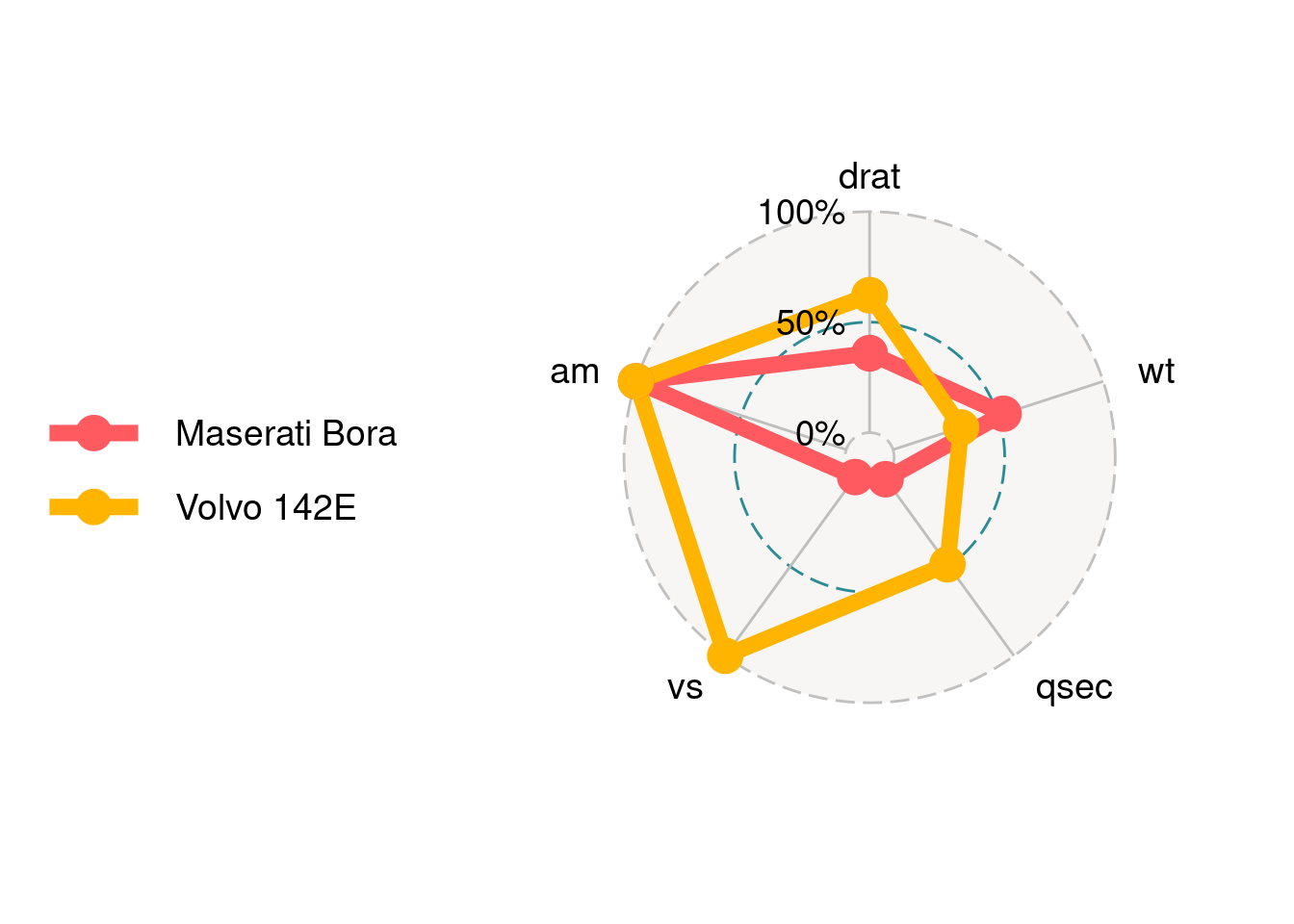
84.2.3.4 Legend
If you want to get rid of the legend you can set plot.legend = FALSE or legend.position = "none.
ggradar(mtcars_radar,
                plot.legend = FALSE)
ggradar(mtcars_radar,
                legend.position = "none")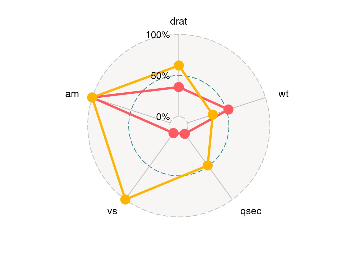
84.2.3.5 Background and styles of grid lines.
Use background.circle.colour to set the background color of the chart. gridline.max.colour, gridline.min.colour and gridline.max.colour are for the colors of three grid lines. gridline.min.linetype can set style of grid line to solid or longdash.
ggradar(mtcars_radar,
             background.circle.colour = 'yellow',
             gridline.min.colour = 'red',
             gridline.mid.colour = 'blue',
             gridline.max.colour = 'green',
             gridline.min.linetype = 'solid')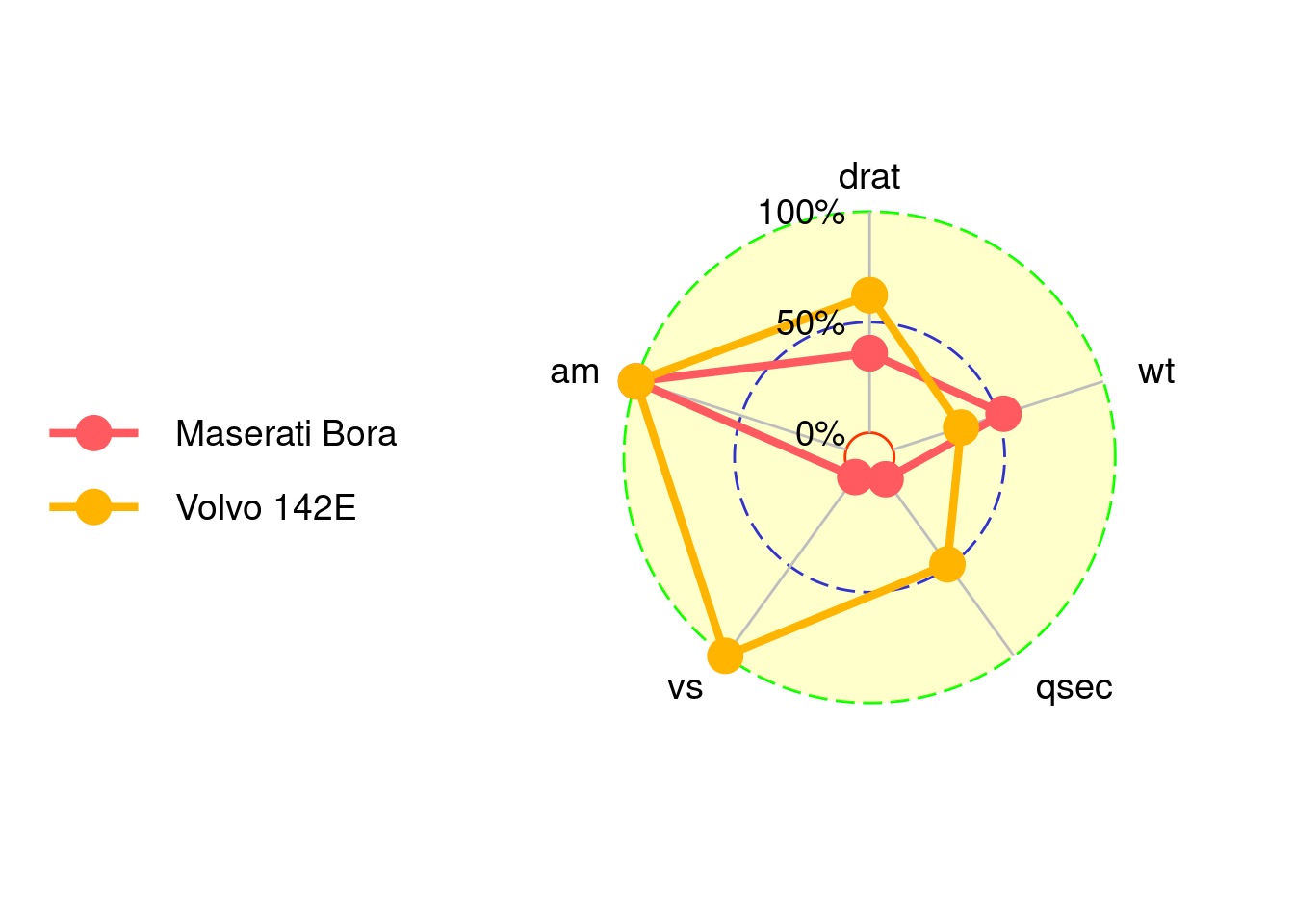
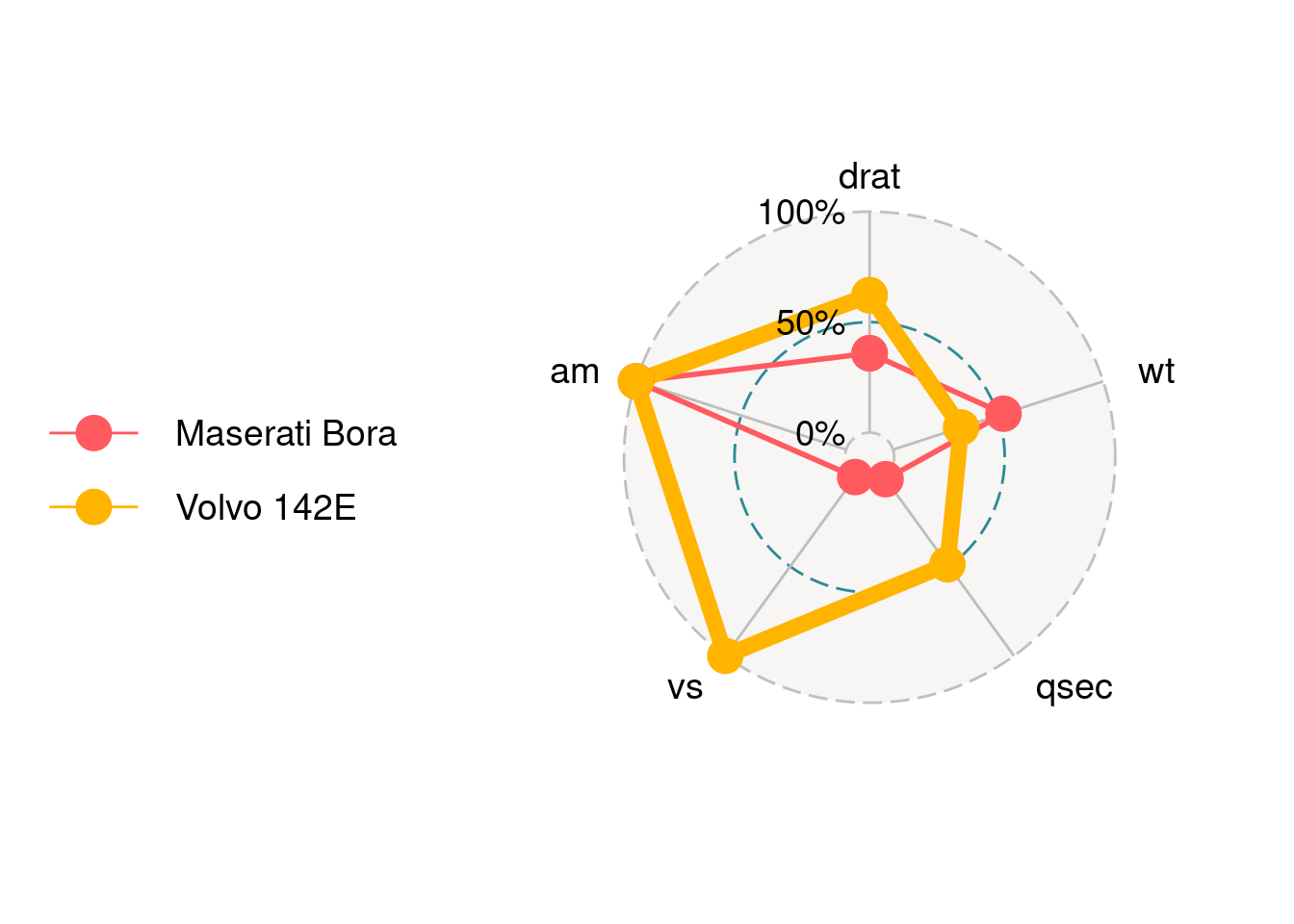
84.2.3.6 Set the colors of axes.
group.colours take a c() of colors for each group.
ggradar(mtcars_radar,
                  group.colours = c('red','blue'))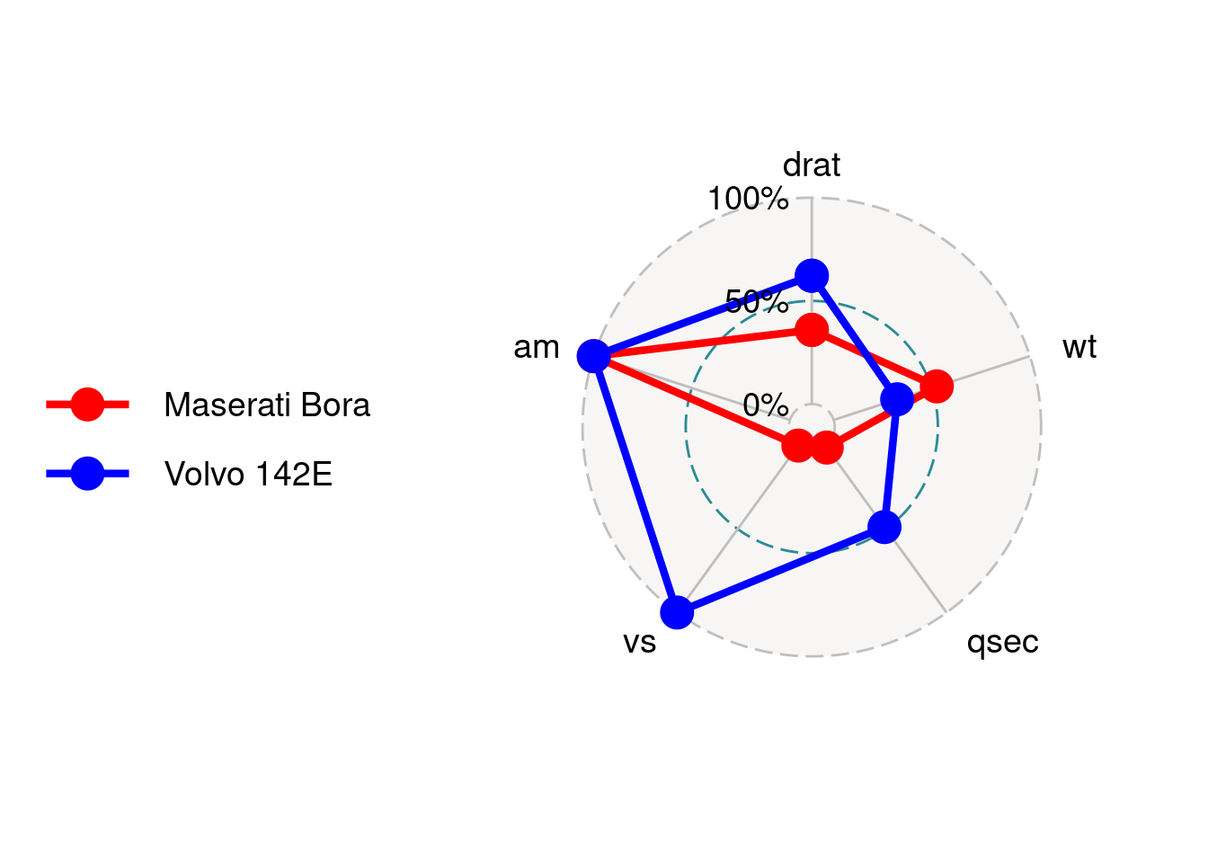
84.3 Radar chart using fmsb
84.3.2 Simple Example
By default, data frame must include maximum values as row 1 and minimum values as row 2 for each variables to create axis, and actual data should be given as row 3 and lower rows. So we should first modify the data and use fmsb::radarchart to draw the plot:
df_maxmin <- data.frame(
    drat = c(1, 0),
    wt = c(1, 0),
    qsec = c(1, 0),
    vs = c(1, 0),
    am = c(1, 0))

mtcars_radar <- mtcars_radar[,c('drat','wt','qsec','vs','am')]
mtcars_radar <- rbind(df_maxmin, mtcars_radar)
fmsb::radarchart(mtcars_radar)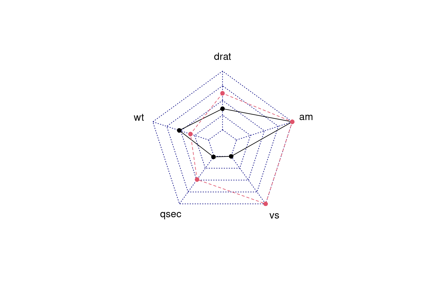
84.3.3 Parameters Usage
84.3.3.1 Change the axistype
We can change different axistype
0 – no axis label(Default)
1 – center axis label only
2 – around-the-chart label only
3 – both center and around-the-chart (peripheral) labels
4 – *.** format of axistype1
5 – *.** format of axistype3
par(mar = c(1, 2, 2, 1),mfrow = c(2, 2))
radarchart(mtcars_radar, axistype = 1)
radarchart(mtcars_radar, axistype = 2)
radarchart(mtcars_radar, axistype = 3)
radarchart(mtcars_radar, axistype = 4)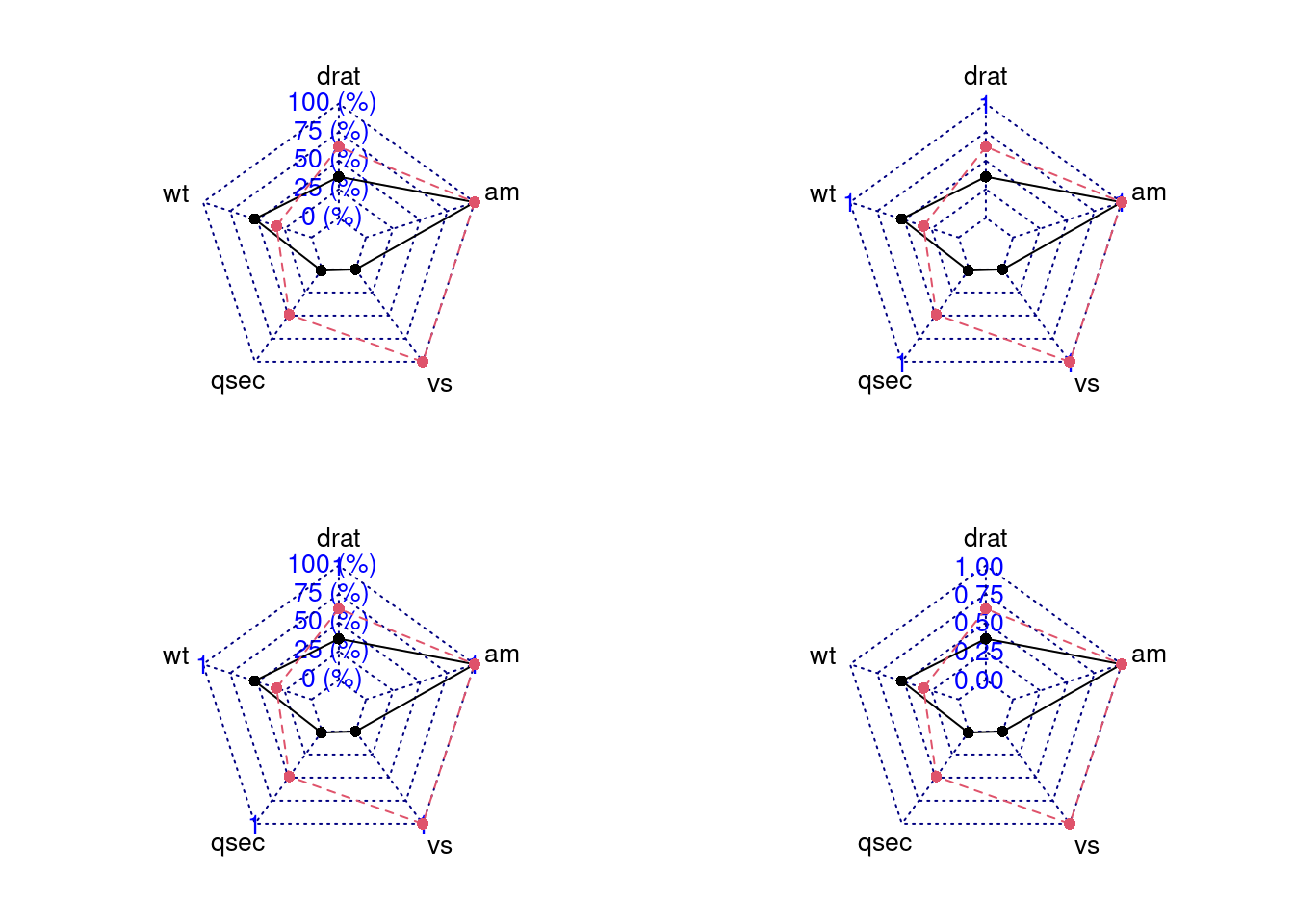
84.3.3.2 Change axis segments
We can modify seg to change the number of segments for each axis.
In the plot below, we can see we set the seg = 1 and then segments becomes less.
par(mar = c(1, 1, 2, 1),mfrow = c(1,2))
radarchart(mtcars_radar, axistype = 2)
radarchart(mtcars_radar, axistype = 2, seg = 1)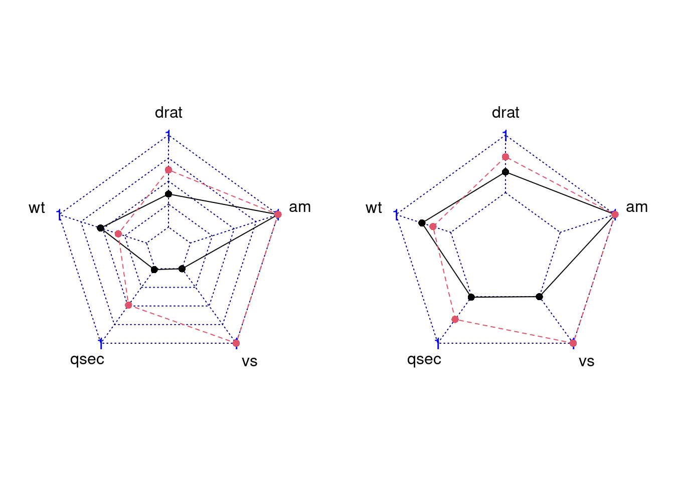
84.3.3.3 Set Points Symbol
We can modify pty to change point symbol. If you don’t plot data points, it should be 32. And the default value is 16. Besides, there are some other symbol you can try.
par(mar = c(1, 2, 2, 1),mfrow = c(2,2))
radarchart(mtcars_radar, axistype = 2) # default
radarchart(mtcars_radar, axistype = 2, pty = 32) # no points
radarchart(mtcars_radar, axistype = 2, pty = 24) # triangle
radarchart(mtcars_radar, axistype = 2, pty = 18) # square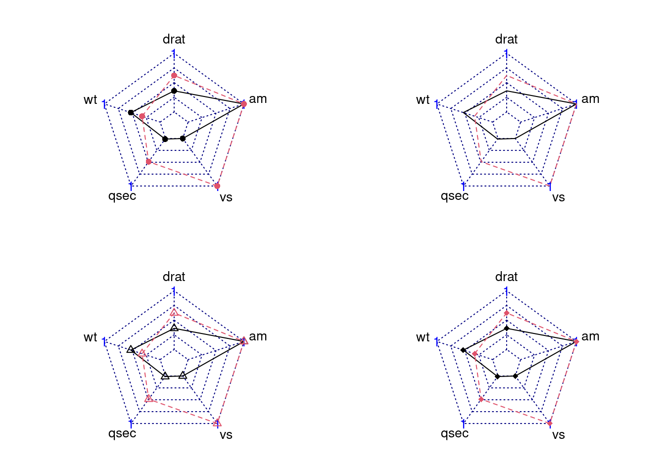
84.3.3.4 Modify Lines’ Apperance (color/type/width)
-
pcol: A vector of color codes for plot data -
plty: A vector of line types for plot data -
plwd: A vector of line widths for plot data
par(mar = c(1, 2, 2, 1),mfrow = c(2,2))
radarchart(mtcars_radar, axistype = 2)
radarchart(mtcars_radar, axistype = 2,  pcol = c('#7FBF3F', '#FFB602'), )
radarchart(mtcars_radar, axistype = 2, plty = c(1,1))
radarchart(mtcars_radar, axistype = 2, plwd = c(0.3,5))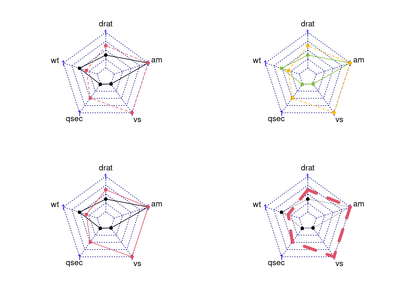
84.3.3.5 Modify the axislines (color/type/width)
We can change axislines appearance using these parameters:
-
cglcol:Line color for radar grids -
cglty:Line type for radar grids -
cglwd:Line width for radar grids
par(mar = c(1, 2, 2, 1),mfrow = c(2,2))
radarchart(mtcars_radar, axistype = 2, cglcol = '#000000')
radarchart(mtcars_radar, axistype = 2, cglty = 1, cglcol = '#7FBF3F')
radarchart(mtcars_radar, axistype = 2, cglty = 1, cglcol = '#000000')
radarchart(mtcars_radar, axistype = 2, cglty = 1, cglwd = 3, cglcol = '#000000')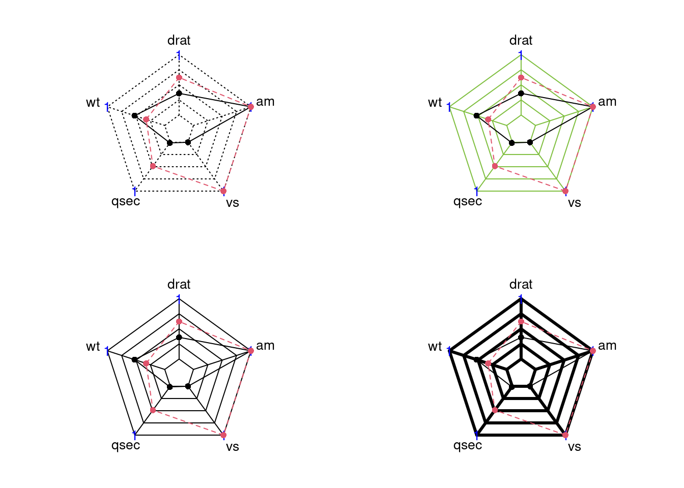
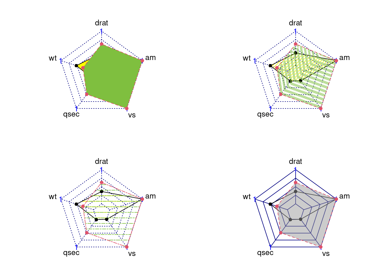
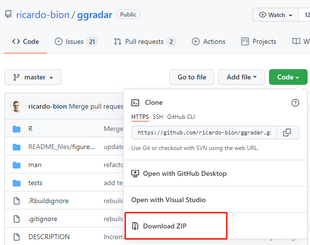
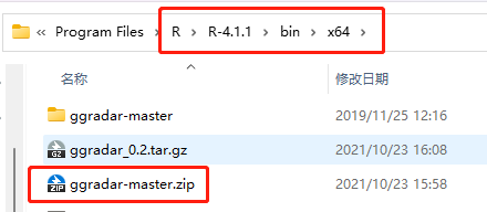
84.3.3.6 Filling Polygons
We can add filling polygons appearance using these parameters:
-
pfcol: A vector of color codes for filling polygons -
pdensity: A vector of filling density of polygons -
pangle: A vector of the angles of lines used as filling polygons
par(mar = c(1, 2, 2, 1),mfrow = c(2,2))
radarchart(mtcars_radar, axistype = 2,  pfcol = c('#FFFF00','#7FBF3F'))
radarchart(mtcars_radar, axistype = 2,  pfcol = c('#FFFF00','#7FBF3F'), pdensity= c(25,50))
radarchart(mtcars_radar, axistype = 2,  pfcol = c('#FFFF00','#7FBF3F'), pdensity= c(10,10), pangle = c(0,0), plty = c(1,6))
radarchart(mtcars_radar, axistype = 2,  pfcol = c(NA,'#99999980'), cglty=1)