94 How to animate your plots
Thomas Holvoet
library(ggplot2)
library(gganimate)
library(dplyr)
library(tidyverse)
library(wpp2019)
library(maps)
ggplot is amazing to create numerous visualizations of your data, ranging from histograms and scatter plots to parallel coordinate plots, mosaic plots, and more. However, visualizing time dependencies in a static plot is difficult. You could use one of the axes for time, but this limits the power of your visualization as the axes are your most valuable resource. By creating an animated plot, you gain an additional axis. This allows you to visualize the change over time of the relationship between the other variables, or gives you the real estate to inspect the dynamics of an additional variable. In this tutorial, I will show two ways in which you could animate your plots in R.
94.1 gganimate
The gganimate library provides an intuitive way to create animated plots. You simply need to specify the time axis as p + transition_time(time).
I start with a first example. It is no secret that the world population is rapidly rising. You could create a simple time series plot of the total population over time. However, another important insight is the age distribution of the population. The dynamics of this distribution over time are quite difficult to capture in a static plot. Animating this distribution over time yields some interesting insights. The world’s population shows a steady increase in all age categories. You can also see that the number of newborns (0-4) does not increase at a constant rate, but that it rather goes in waves. Moreover, we can see these newborns age into older age groups as child mortality continues to fall.
# Prepare the data: get the population per year, country, and age group
data("pop")

pop_by_age <- rbind(popF, popM)

# Some of the country names need to be changed (see later on)
pop_by_age$name <- recode(pop_by_age$name,
                          "United States of America" = "USA",
                          "United Kingdom" = "UK",
                          "Viet Nam" = "Vietnam",
                          "Bolivia (Plurinational State of)" = "Bolivia",
                          "Brunei Darussalam" = "Brunei",
                          "Iran (Islamic Republic of)" = "Iran",
                          "China, Hong Kong SAR" = "Hong Kong",
                          "China, Macao SAR" = "China",
                          "China, Taiwan Province of China" = "Taiwan",
                          "Dem. Republic of the Congo" = "Democratic Republic of the Congo",
                          "Dem. People's Rep. of Korea" = "North Korea",
                          "Lao People's Dem. Republic" = "Laos",
                          "Venezuela (Bolivarian Republic of)" = "Venezuela",
                          "United Republic of Tanzania" = "Tanzania",
                          "Trinidad and Tobago" = "Trinidad",
                          "Syrian Arab Republic" = "Syria",
                          "State of Palestine" = "Palestine",
                          "Russian Federation" = "Russia",
                          "Republic of Moldova" = "Moldova",
                          "Cote d'Ivoire" = "Ivory Coast",
                          "Czechia" = "Czech Republic",
                          "Congo" = "Republic of Congo"
                          )


pop_by_age <- pop_by_age %>%
  pivot_longer(cols = 4:18, names_to = "Year") %>%
  select(age, Year, name, value) %>%
  group_by(age, Year, name) %>%
  summarise(value = sum(value)) %>%
  ungroup() %>%
  mutate(age = fct_relevel(age, "5-9", after = 1)) %>%
  mutate(age = fct_relevel(age, "100+", after = Inf)) %>%
  mutate(Year = strtoi(Year))

# This function will plot the distribution over time for a certain area
plot_dynamic_distribution <- function(area) {
pop_by_age %>%
  filter(name == area) %>%
  ggplot(aes(x = age, y = 1000 * value)) +
  geom_bar(stat = 'identity', fill = "cornflowerblue") +
  transition_time(Year) +
  labs(title = paste(area, " Population in {frame_time}"), y = "Population", x = "Age") +
  theme(axis.text.x = element_text(angle = 90))
}
plot_dynamic_distribution("World")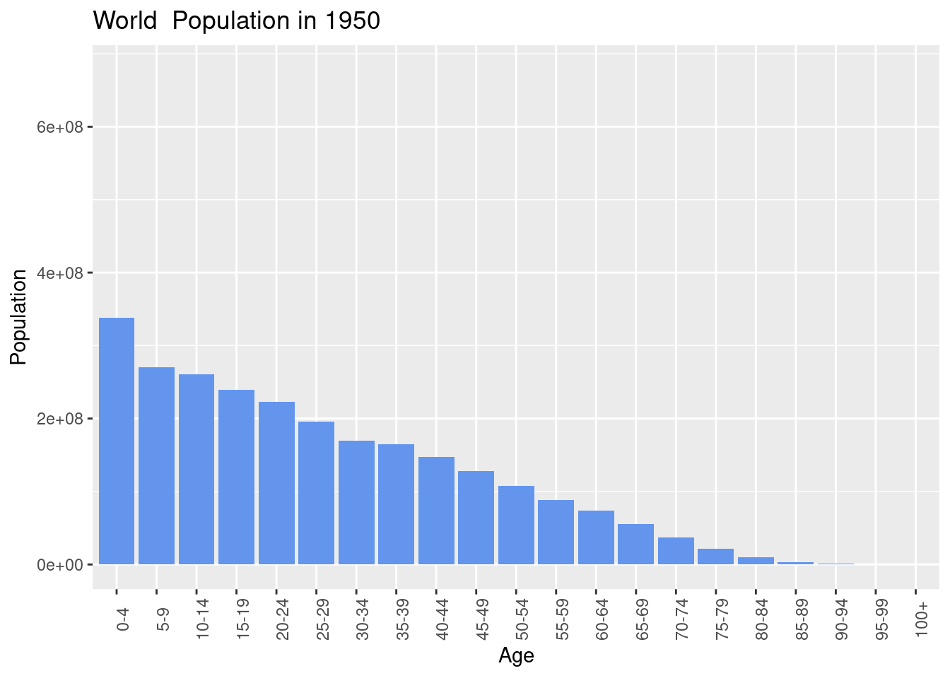
For the total population, the distribution does stay more or less the same over the years. Japan is contending with an aging population. This can be very clearly observed in the dynamic age distribution plot below. It starts off similar to the world population, but the younger population starts decreasing significantly as the weight shifts towards the elderly.
plot_dynamic_distribution("Japan")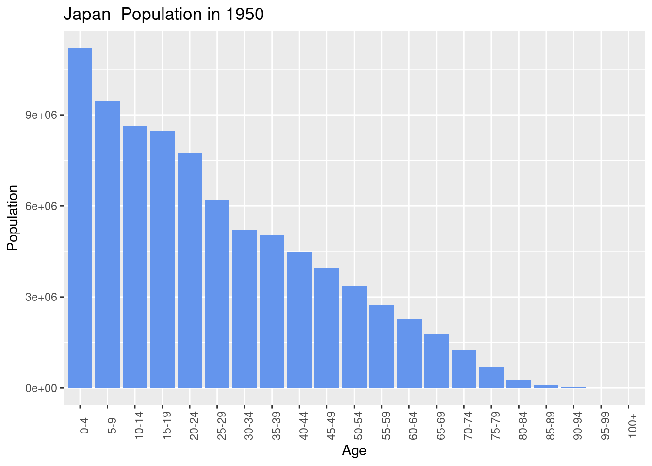
94.2 Using the animate.hook Hook
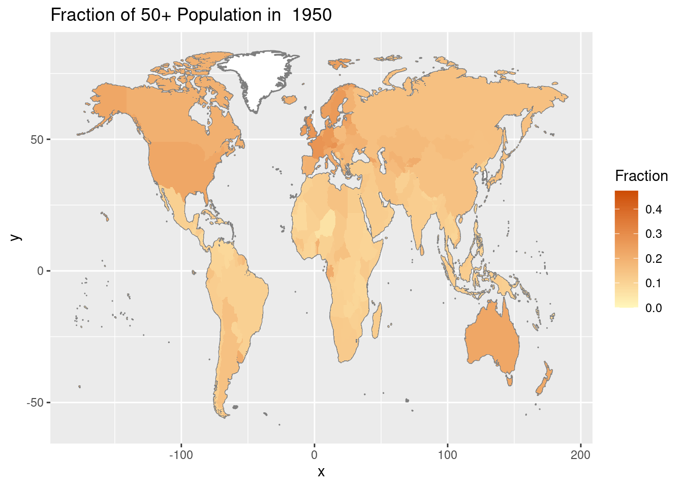
Maps are another great example where an additional time axis could come in handy. Generally, plots on maps are quite limiting. When color-coding the areas, only one variable can be plotted at a time. By creating an animation of the map the evolution over time of this variable can also be visualized.
The gganimate package does not allow for evolving the color over time. We can take a more flexible approach than gganimate to create an animated plot of the map. We first create multiple plots corresponding to different points in time. These plots are printed to the output of the R-markdown code block (do not forget actually printing them). We specify {r, animation.hook='gifski', interval=0.3} in the code block. This will combine all outputted plots into one GIF!
As an example, we will look at the fraction of 50+ population per country. We already saw that for Japan, the weight of the population shifted towards the elderly. What does this evolution look like on a world scale? We can see that population aging is a new phenomenon that mainly affects developed countries.
# Prepare the data: calculate the fraction of 50+ population per country, per year

pop_by_old <- pop_by_age

pop_by_old$old = as.numeric(pop_by_old$age) >= 11

pop_by_old <- pop_by_old %>%
  group_by(Year, name) %>%
  mutate(total = sum(value)) %>%
  ungroup()

pop_by_old <- pop_by_old %>%
  group_by(Year, old, name) %>%
  summarise(frac = sum(value) / total) %>% ungroup() %>%
  unique %>%
  filter(old)
world_map <- map_data("world")
world_map <- subset(world_map, region != "Antarctica")

# Iterate over the time axis to print multiple plots, these will be combined by the animation.hook

for (y in unique(pop_by_old$Year)) {
  print(pop_by_old %>%
    filter(Year == y) %>%
    filter(name %in% unique(world_map$region)) %>%
    select(Year, name, frac) %>%

    ggplot() +
    geom_map(
      dat = world_map, map = world_map, aes(map_id = region),
      fill = "white", color = "#7f7f7f"
    ) +
    geom_map(map = world_map, aes(map_id = name, fill = frac)) +
    scale_fill_gradient(low = "#fff7bc", high = "#cc4c02", name = "Fraction", limits = c(0, max(pop_by_old$frac))) +
    expand_limits(x = world_map$long, y = world_map$lat) +
    labs(title = paste("Fraction of 50+ Population in ", y)))
}
Creating animated plots is a very valuable skill in your data visualization toolkit. Using gganimate one can very easily animate ggplot plots. However, it does not work for all plot types. By using the animation.hook approach you can animate virtually any plot you create. Because let’s be honest, animated plots are cool :)
Used Resources
- On
gganimatehttps://www.datanovia.com/en/blog/gganimate-how-to-create-plots-with-beautiful-animation-in-r/ - For creating maps https://stackoverflow.com/questions/61838700/query-on-how-to-make-world-heat-map-using-ggplot-in-r
- On the
animation.hookhttps://bookdown.org/yihui/rmarkdown-cookbook/animation.html